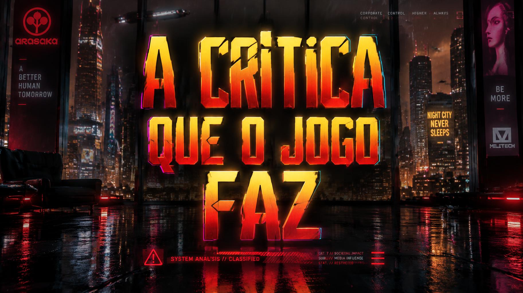
A critica que o jogo faz - サイバーパンク2077 Text Effect

この作品と同じ OpenAI GPT-Image-2.5 Sunburst を使用 · 15 クレジット
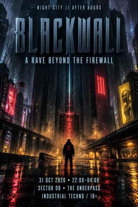
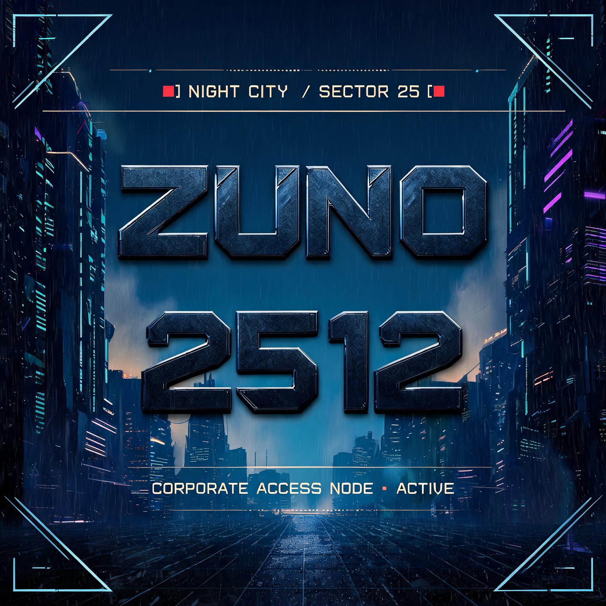
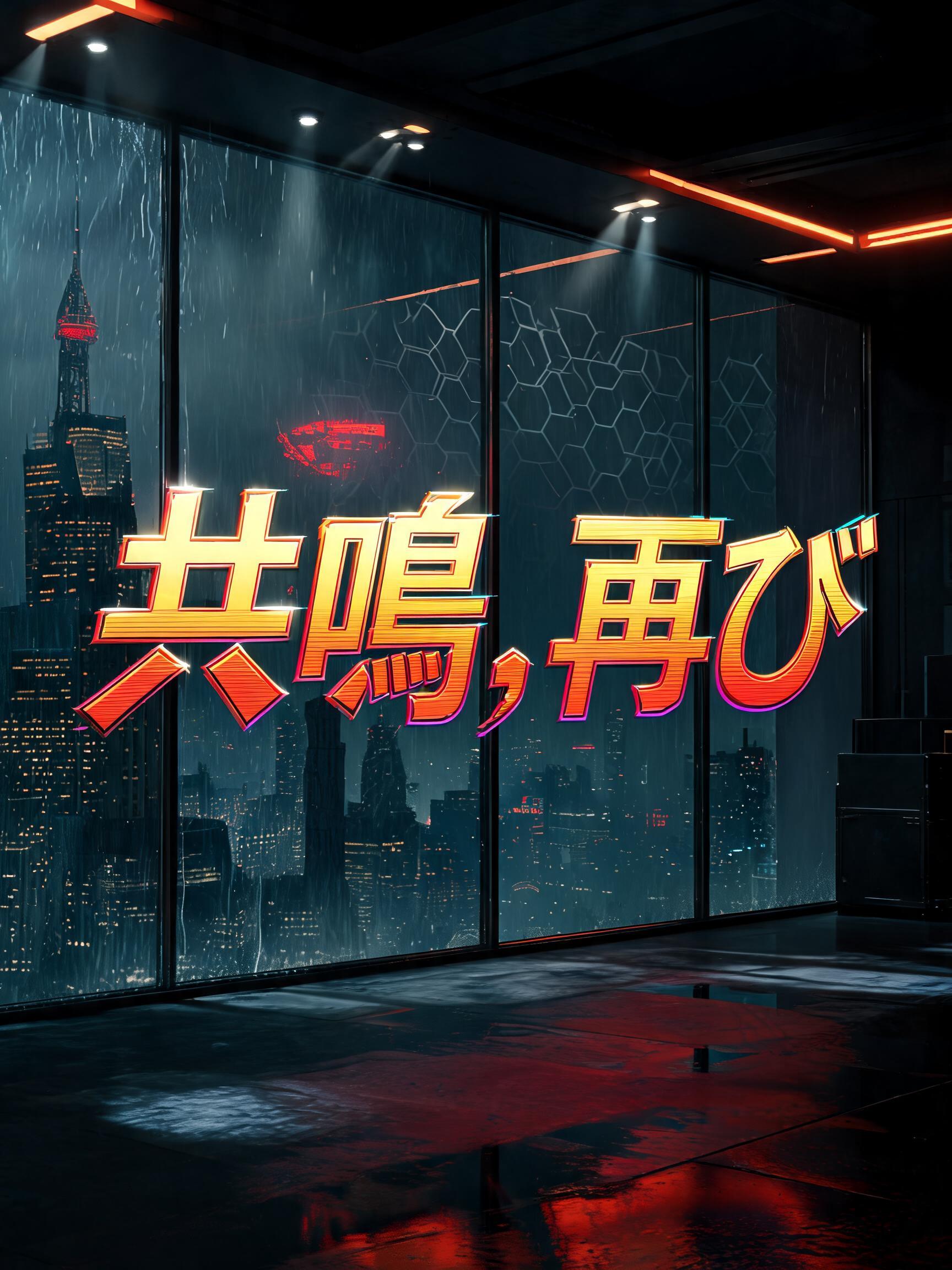


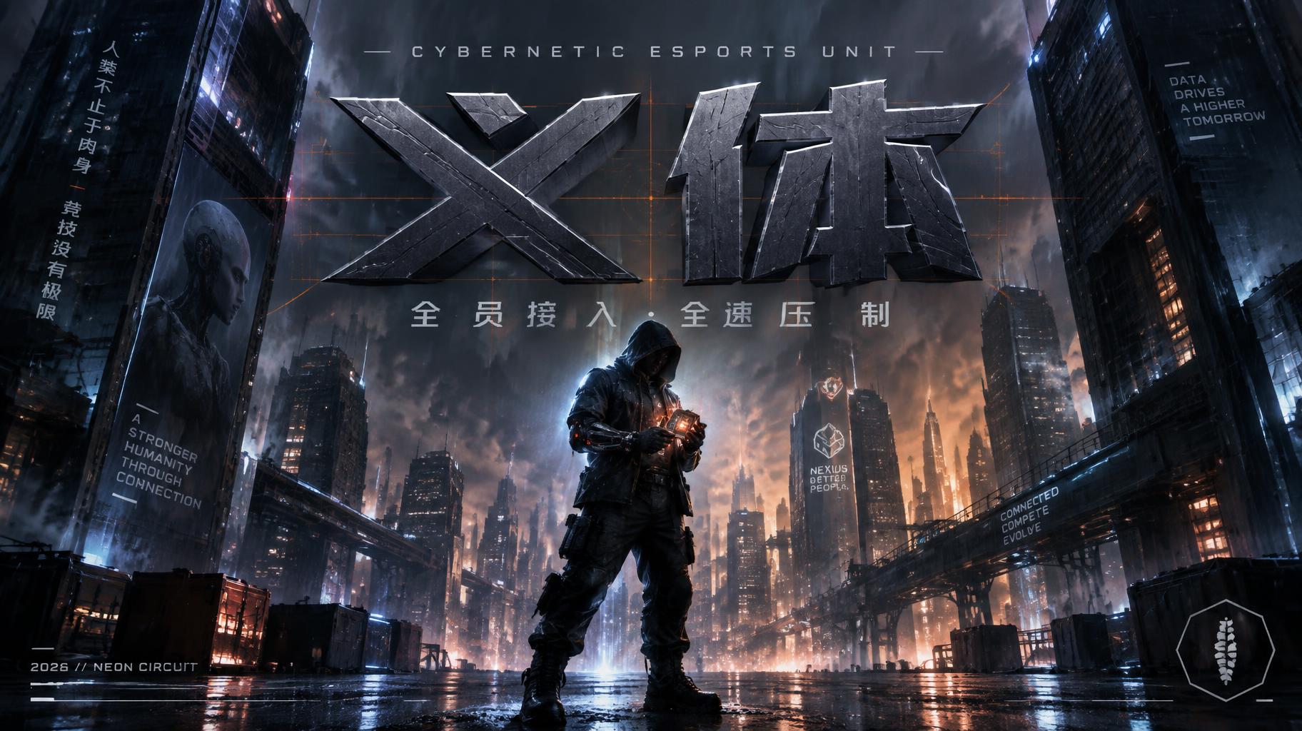




「A critica que o jogo faz」は FontVibe AI で作成したサイバーパンク2077の文字エフェクトです。象徴的なナイトシティの世界観からインスピレーションを得た、鋭角的なカットとネオンに満ちた雰囲気をまとうイエローレッドのクロム文字です。
Yellow-gold to hot-red gradient saturating every letterform face — the signature Night City commercial palette, running from chrome-bright gold at stroke tops to deep ember-red at stroke bases. Angular geometric cuts interrupt each letter: deliberate diagonal notches, beveled corner slices, and corporate logo incisions that follow the same design logic as Arasaka and Militech branding. Holographic edge fringe: a thin 1–2px chromatic aberration line along every letter edge — cyan on the upper-right, magenta on the lower-left — suggesting the text is projected by corporate UI rather than printed on any surface. Letter surfaces carry a polished hard-chrome quality: specular highlight razor-thin along the top plane of each stroke, deep shadow on the under-plane, zero diffuse scatter. The overall material read is: machined corporate hardware, not hand-crafted. When no specific material is defined by the font: default environment — yellow-gold to red gradient fill, angular geometric notch cuts, 1px holographic edge fringe, deep black background, faint corporate grid pattern at 8% opacity behind the letters. A midnight corporate arcade chamber overlooking Night City — towering black-glass megabuildings dissolve into amber rain fog beyond floor-to-ceiling windows, while cool violet billboard glow and teal transit trails cut through the distant urban canyon. Wet polished obsidian flooring catches fractured reflections of emergency-red status lights, server racks, and a faint blue corporate grid. The rendered text “A critica que o jogo faz” dominates the center across three measured lines, with “A critica” largest, “que o jogo” compressed beneath, and “faz” given a forceful final line. Every letter face runs from chrome-bright yellow-gold across the upper planes into saturated hot ember-red at the bases. Sharp diagonal notch cuts, beveled corner slices, and precise corporate incisions visibly break the forms. A razor-thin cyan fringe traces upper-right edges and magenta traces lower-left edges, making the title read as an expensive projected corporate interface. Hard white overhead light creates knife-edge highlights and dense black under-shadows. Beneath the title, small abstract warning bars and unreadable UI micro-marks hover like a censored system report. Threatening commercial polish, cool city background, warm hostile text.
用途: Cyberpunk 2077 フォントジェネレーター
2026年10月25日に生成 · 1824 × 1024 · JPEG · OpenAI GPT-Image-2.5 Sunburst · 制作者がシェア · 商用利用無料(CC BY 4.0)