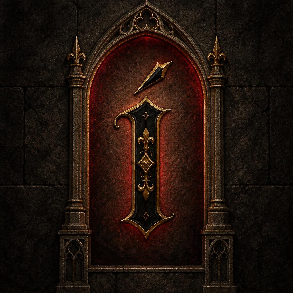
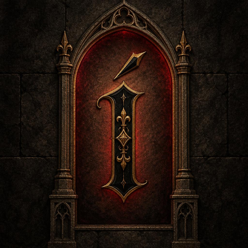
Í - ゴシックフォント Text Effect


この作品と同じ OpenAI GPT-Image-2.5 Sunburst を使用 · 15 クレジット





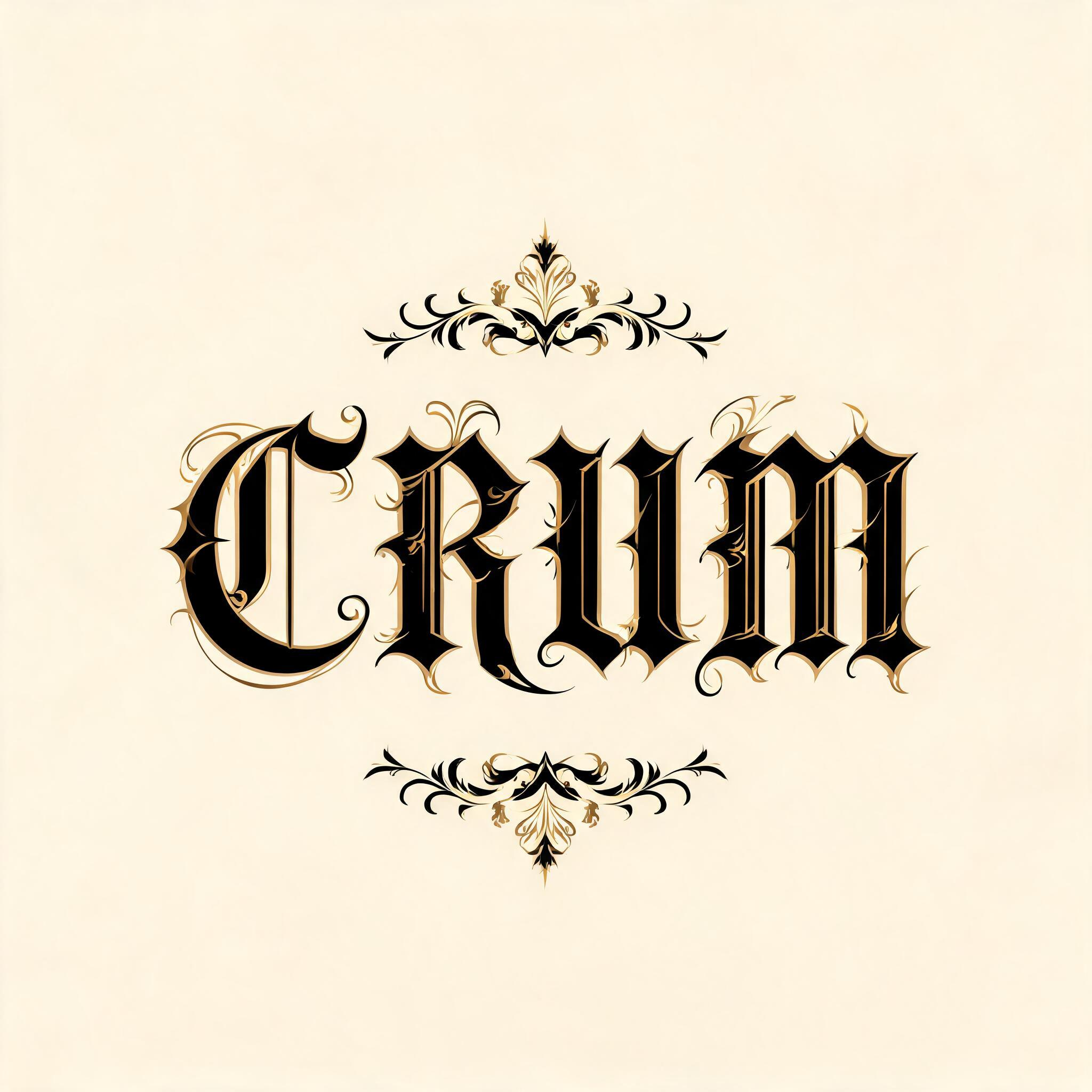

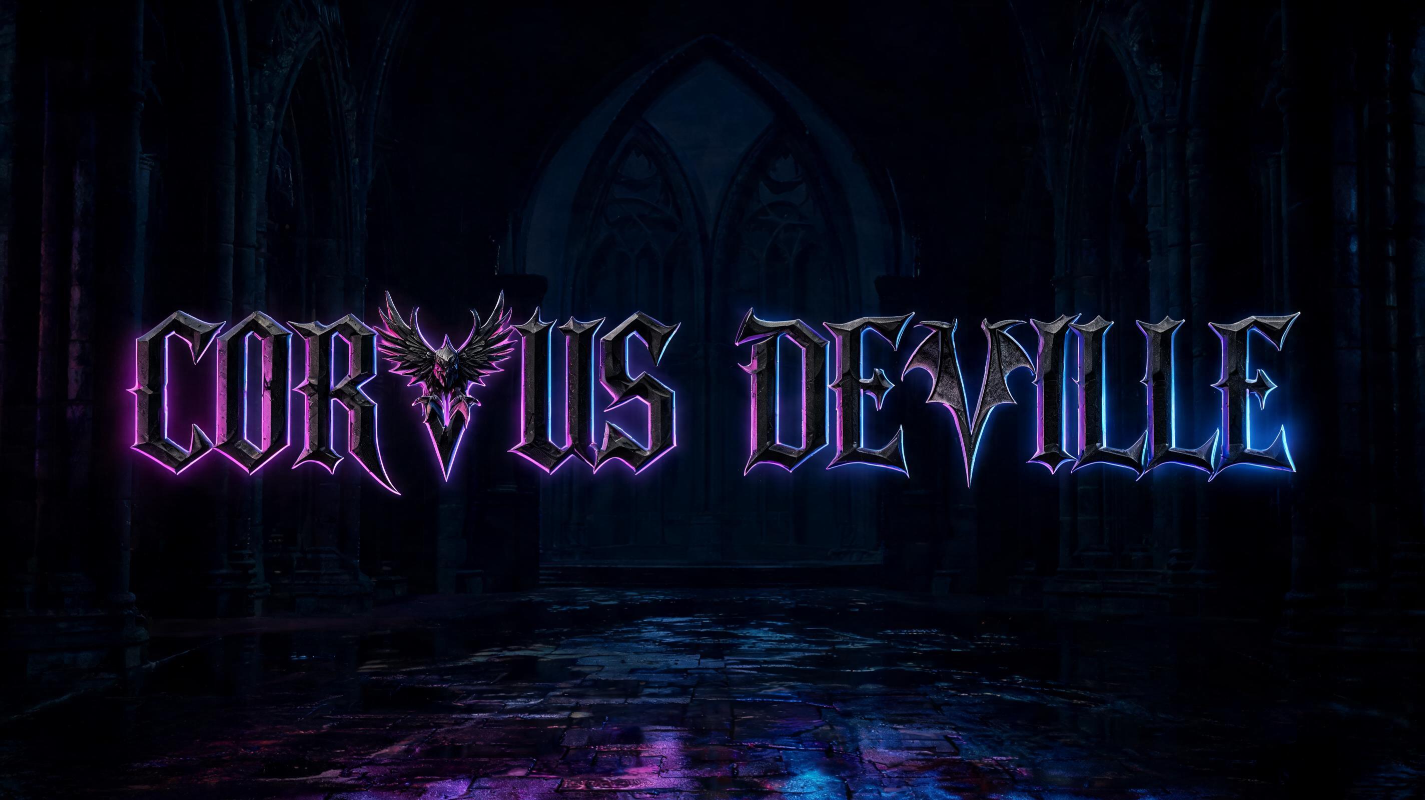


「Í」は FontVibe AI で作成したゴシックフォントの文字エフェクトです。端正なテクストゥーラのブラックレター。細く折れる線、菱形の筆端、強い太細の差を、金でふちどった黒インクで暗い古い羊皮紙に。
Create a finished square typographic emblem featuring exactly one readable character: “Í”. Make the uppercase I unmistakable as an ornate medieval blackletter, with the acute accent clearly separated above it and never mistaken for a flourish. Build the glyph with a strong medieval blackletter skeleton, deep heavy stems, pointed arch counters, sharp diamond terminals, Victorian ornamental overlays, and a small number of hairline swash extensions. The main strokes are rich black ink with warm depth on a dark, aged-parchment face; add restrained gold-ink edging and fine interior ornament. Preserve clear silhouette and legibility at small size. The hairline ornaments catch narrow, raking highlights while the broad stems stay shadow-rich. Set the letter centered inside a tall, narrow Gothic cathedral lancet arch, which frames but does not obscure it. Behind the arch, use a deep charcoal stone ground with a controlled crimson backlight halo, strongest at the arch’s inner edge. Keep the atmosphere stark and martial, with subtle parchment grain, dark stone texture, and precise medieval craftsmanship; no rust, cobwebs, fog, extra symbols, or additional lettering. The single Í is the dominant focal point, filling roughly 55% of the canvas height, with generous dark negative space around the arch. High contrast, crisp ornamental edges, restrained gold glints, no modern typography.
用途: ロンバルディック・ブラックレター
2026年10月28日に生成 · 1024 × 1024 · JPEG · OpenAI GPT-Image-2.5 Sunburst · レイアウト:Lancet Emblem · 制作者がシェア · 商用利用無料(CC BY 4.0)



