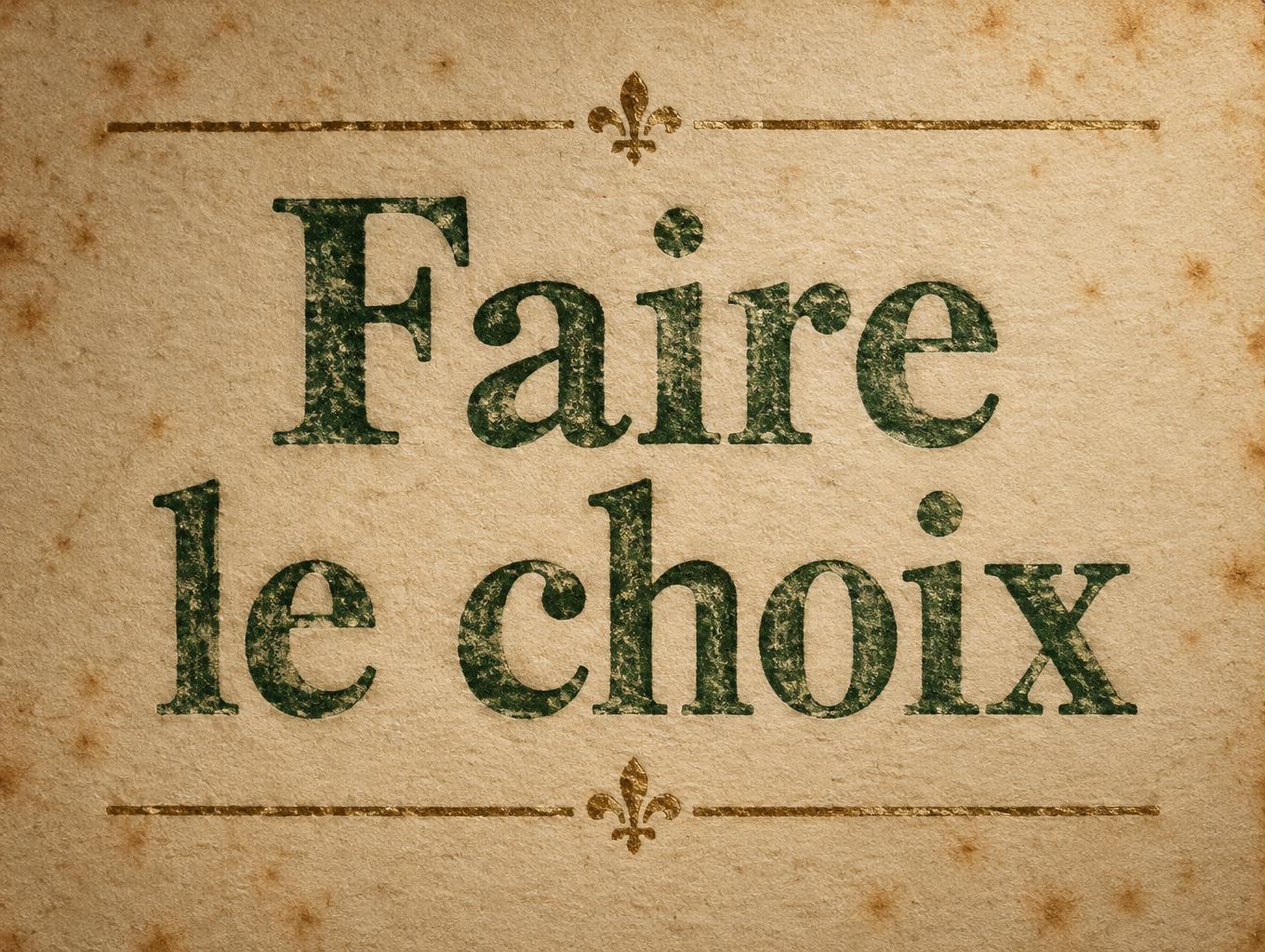
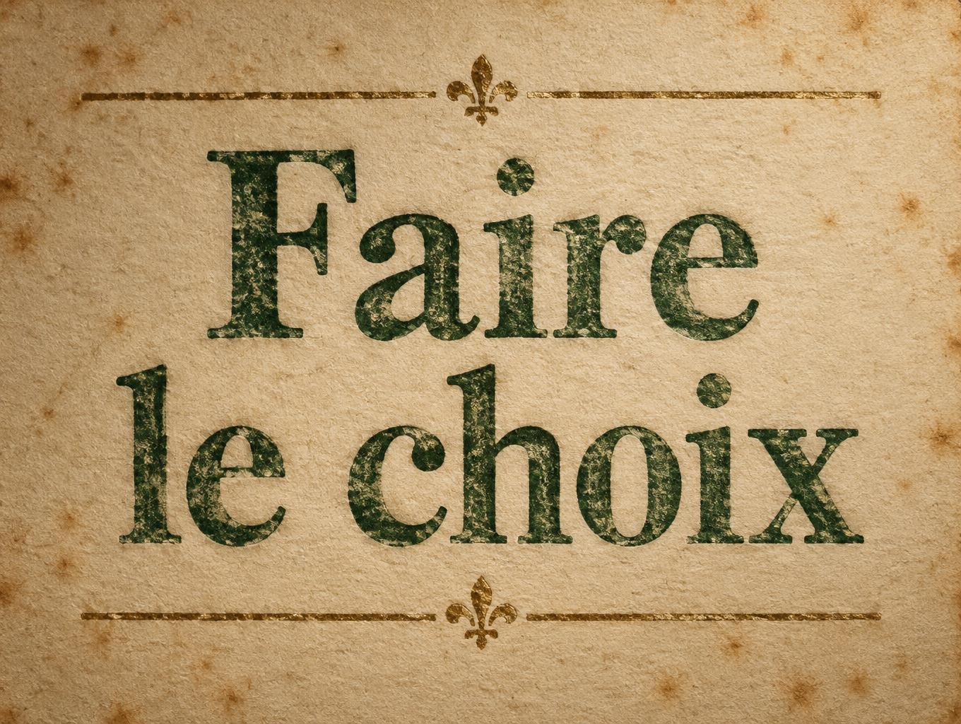
Faire le choix - ヴィンテージ Text Effect


この作品と同じ OpenAI GPT-Image-2.5 Sunburst を使用 · 15 クレジット

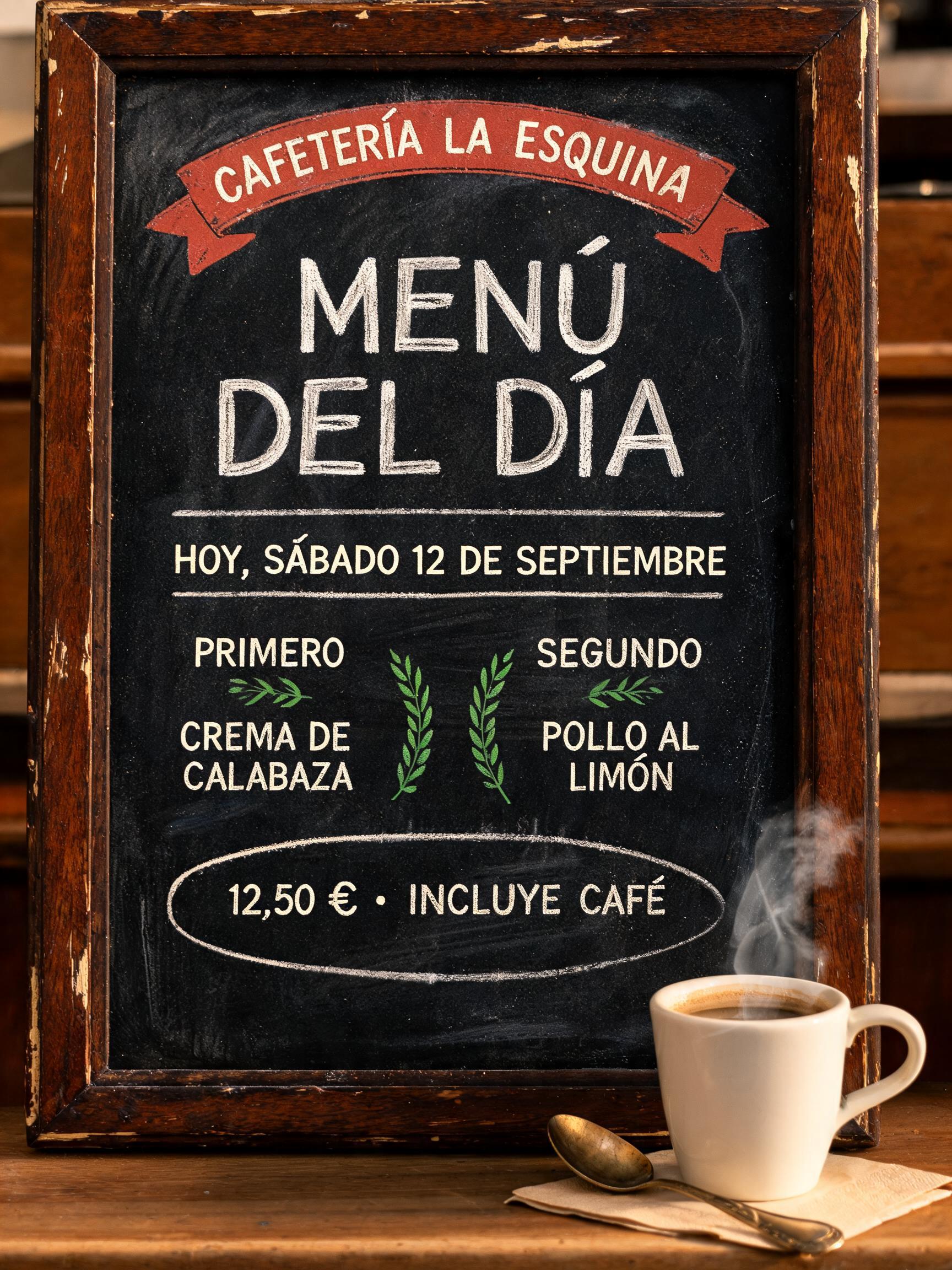
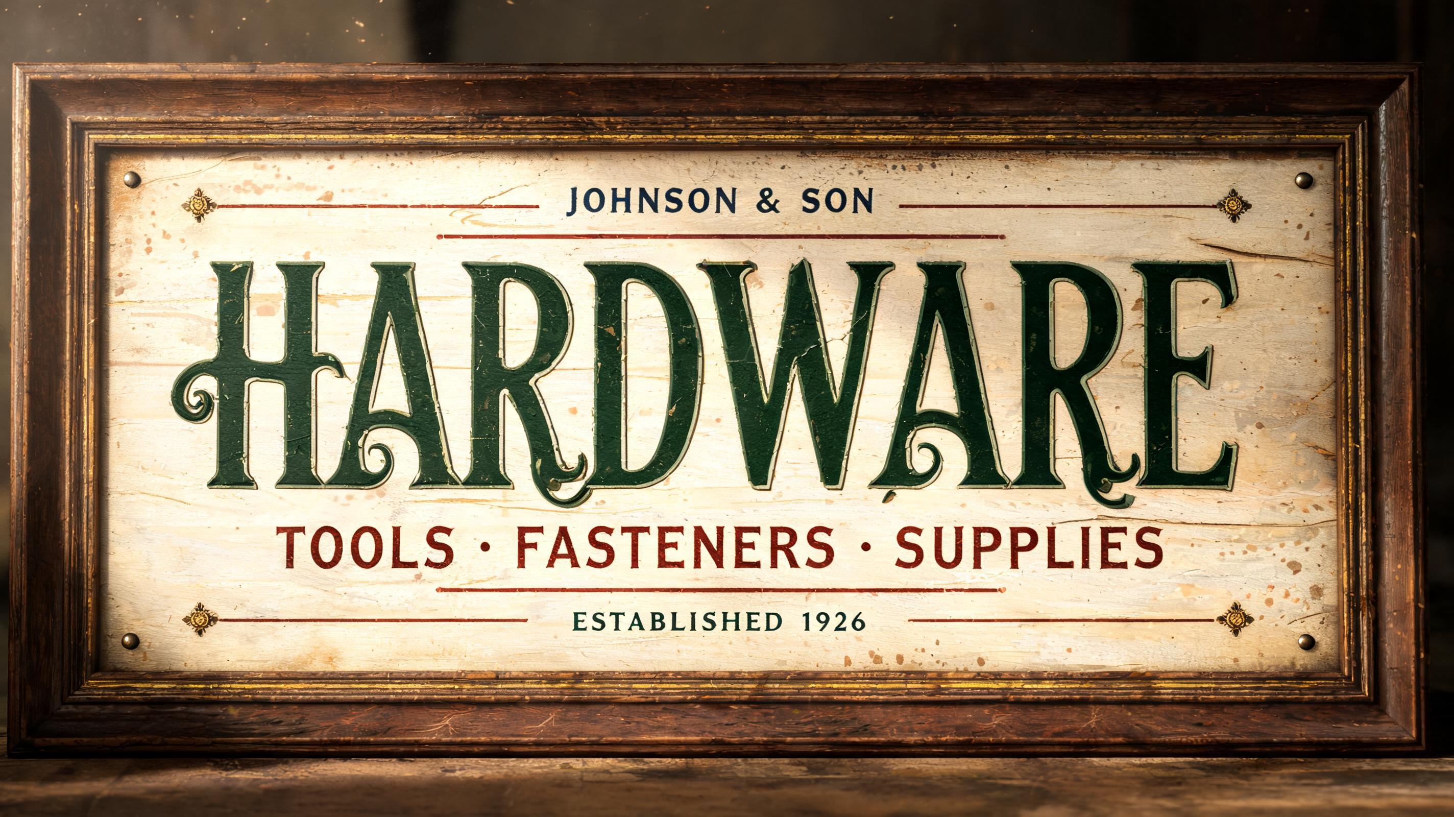
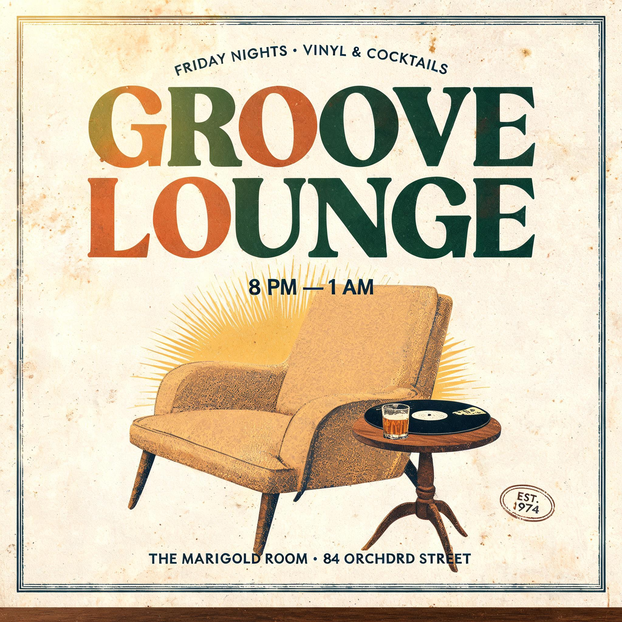
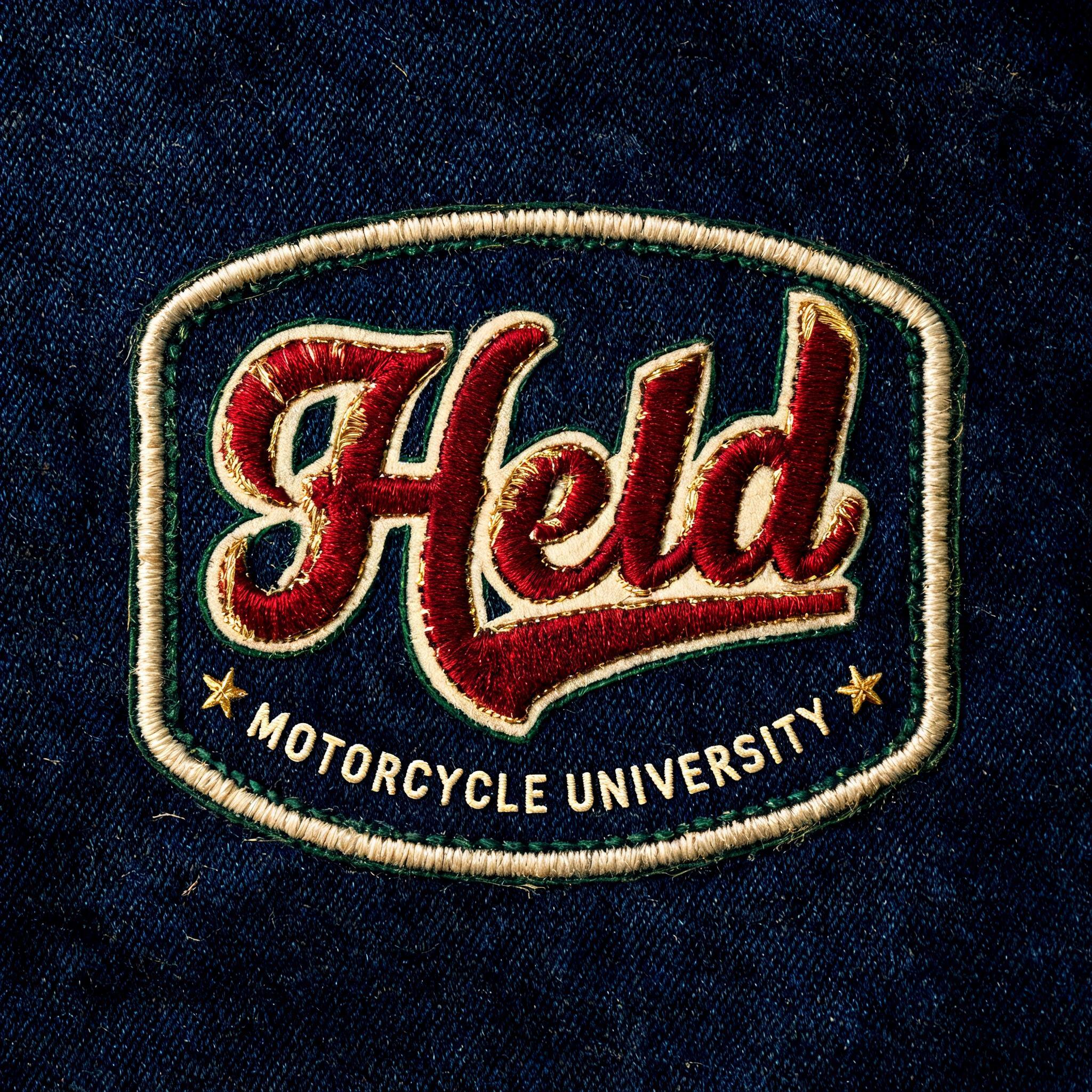
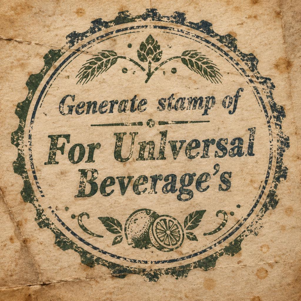
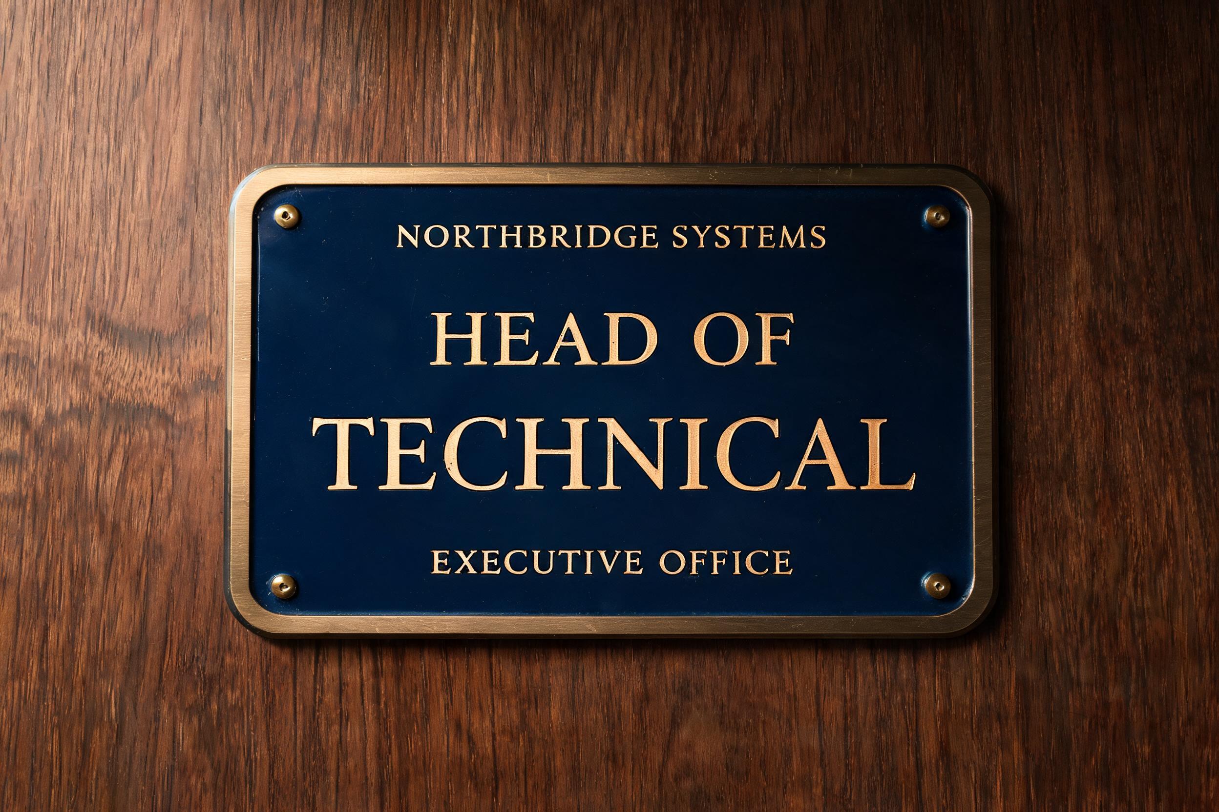
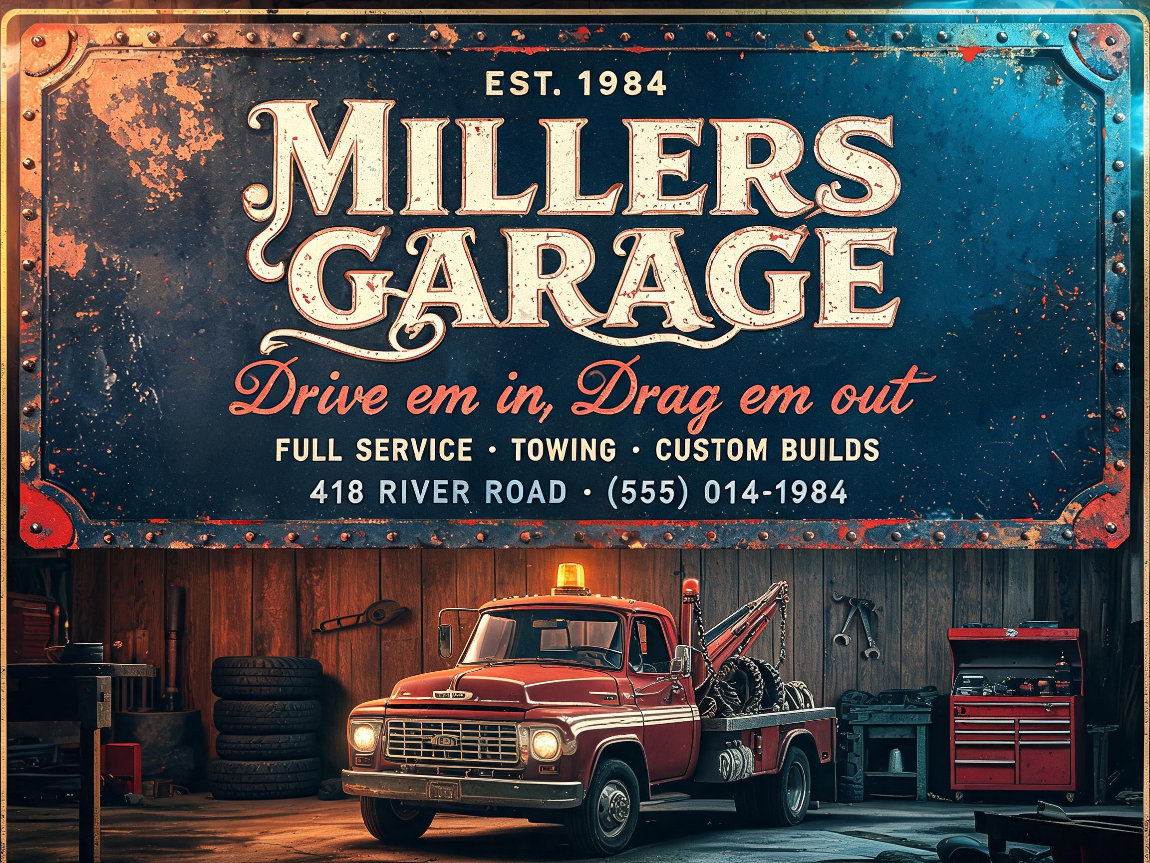
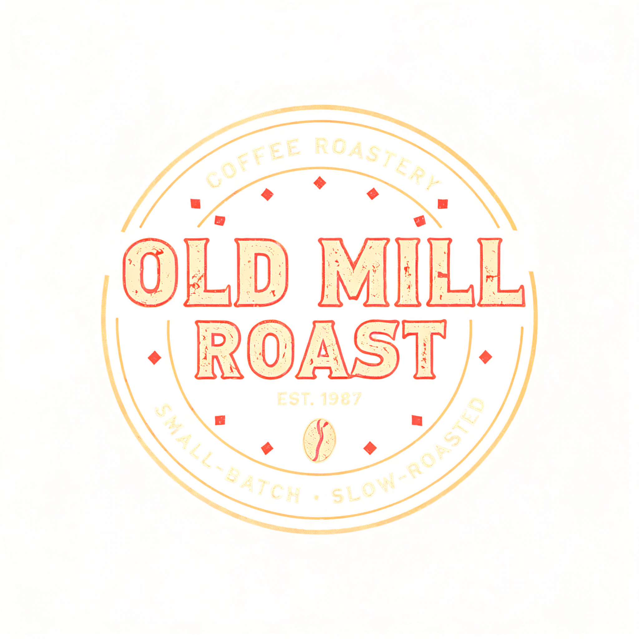
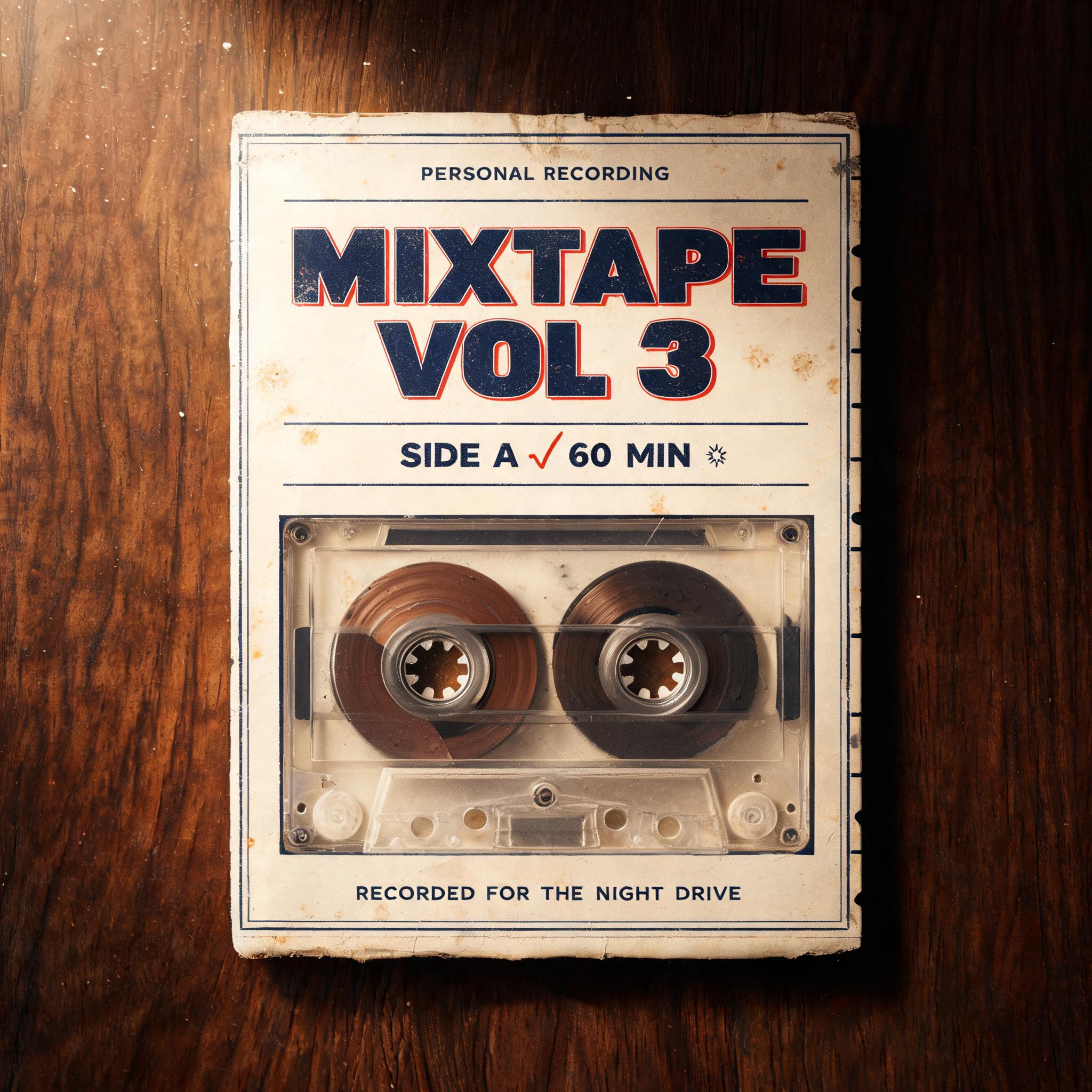
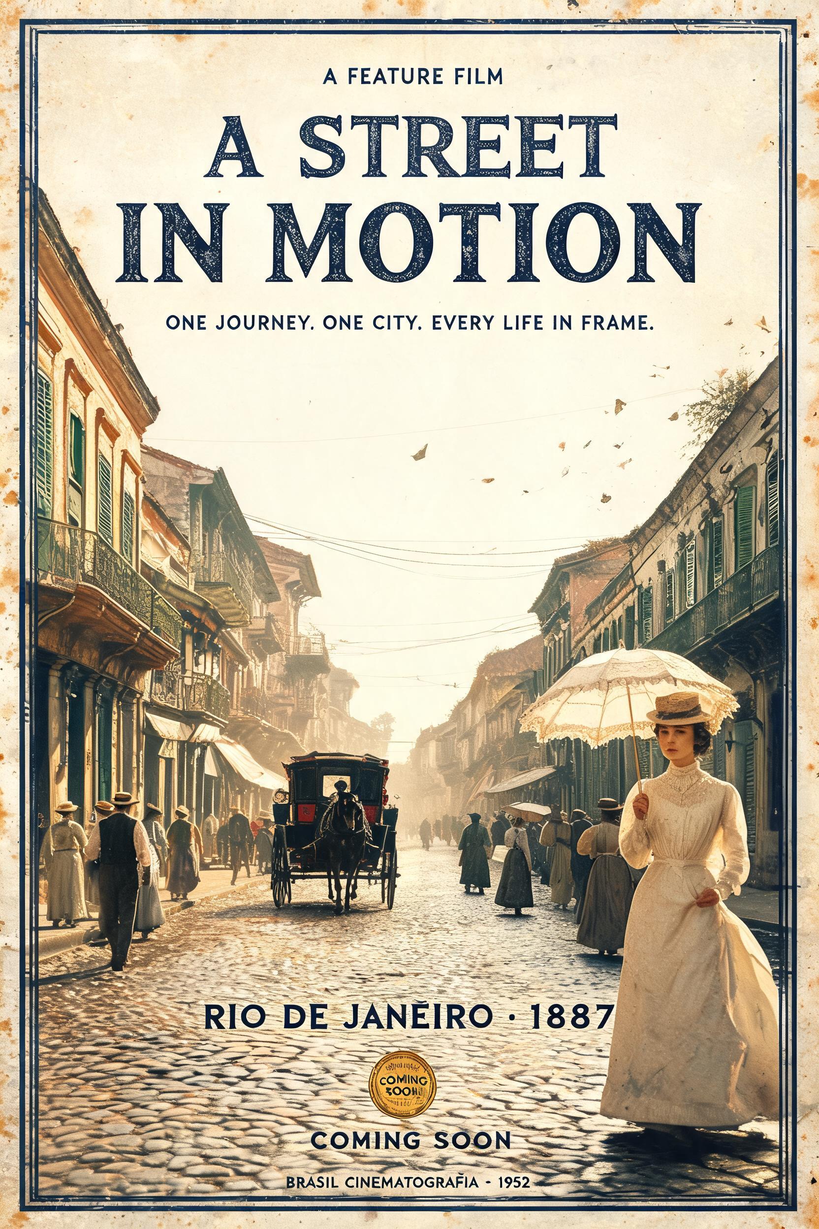
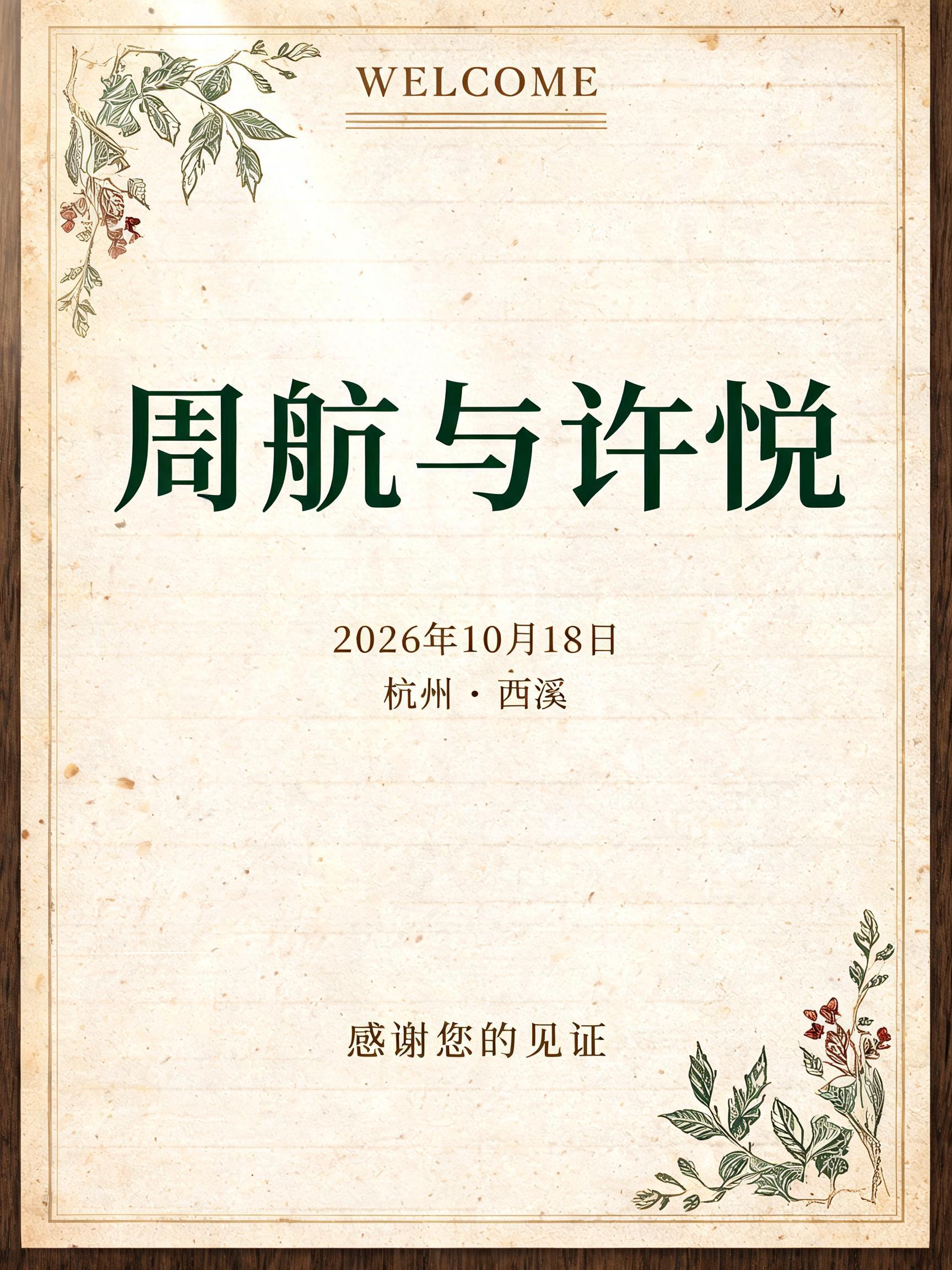
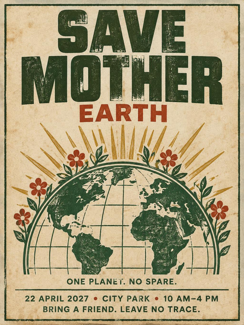
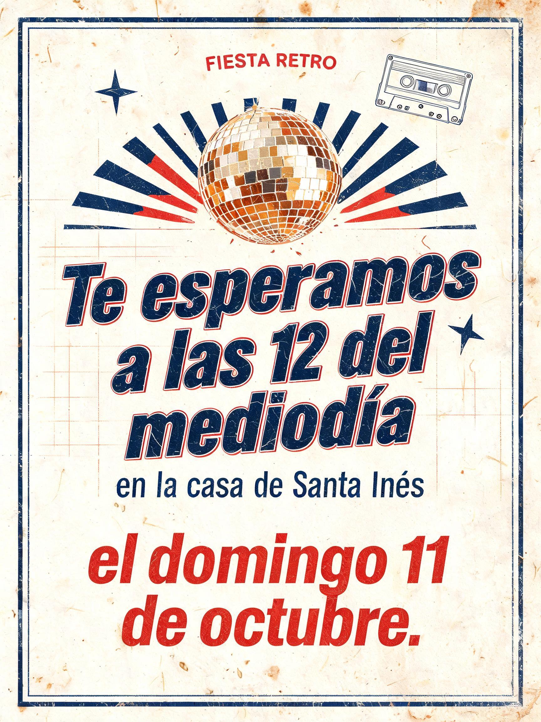
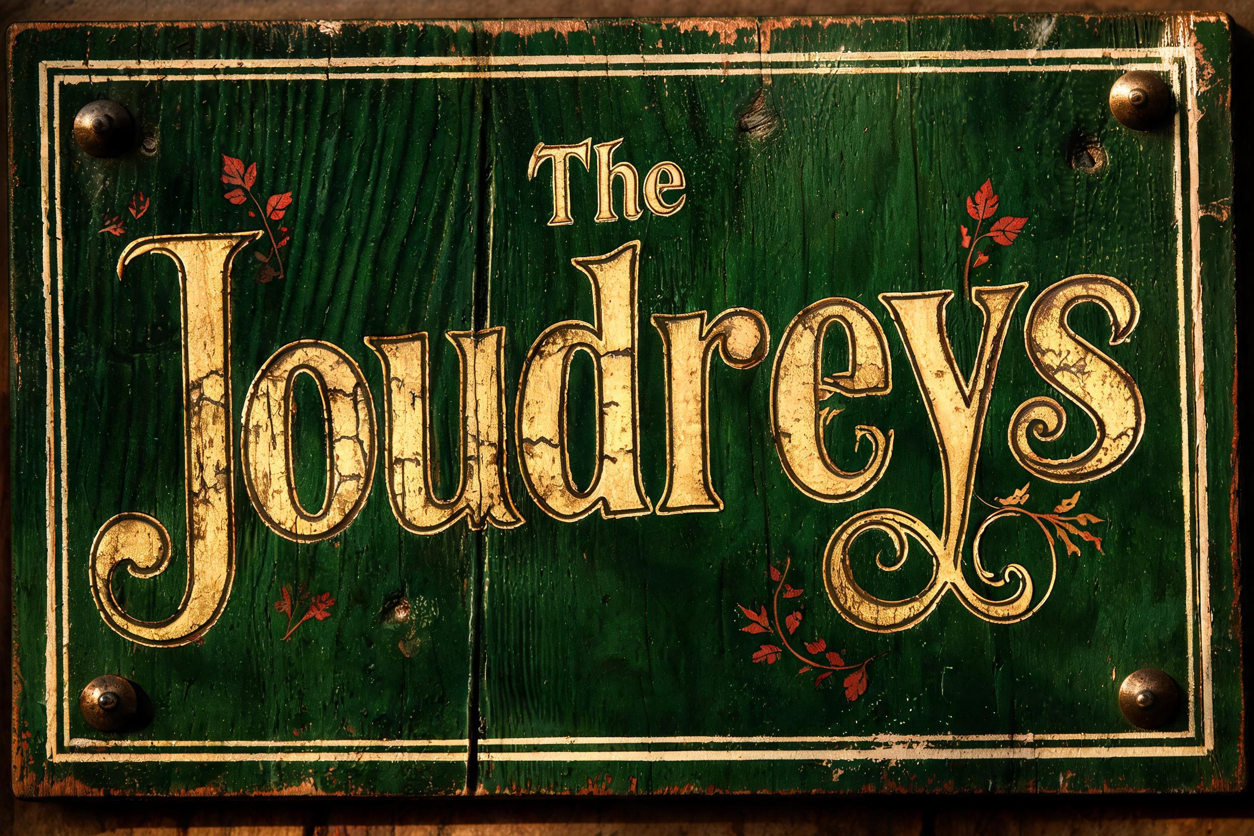
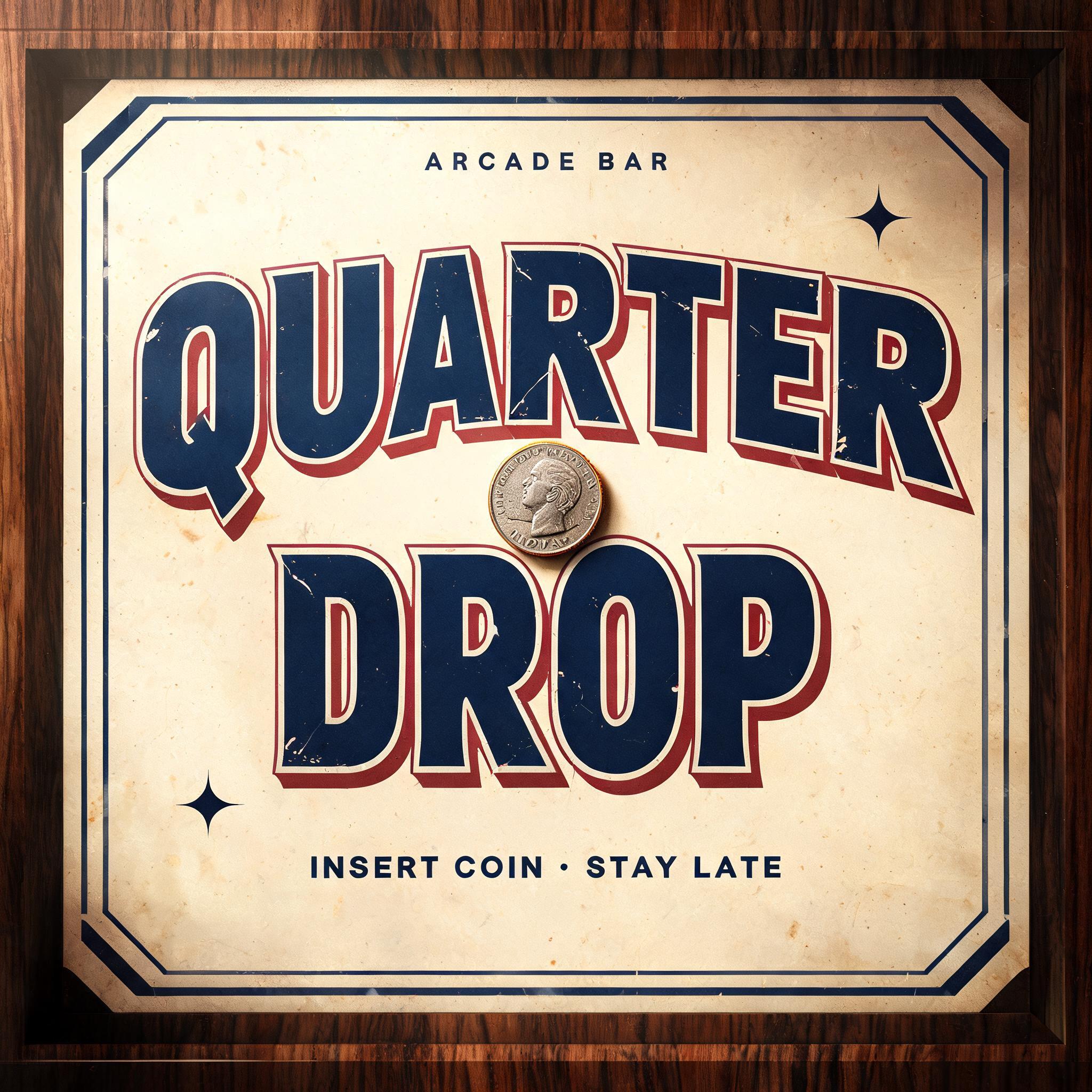
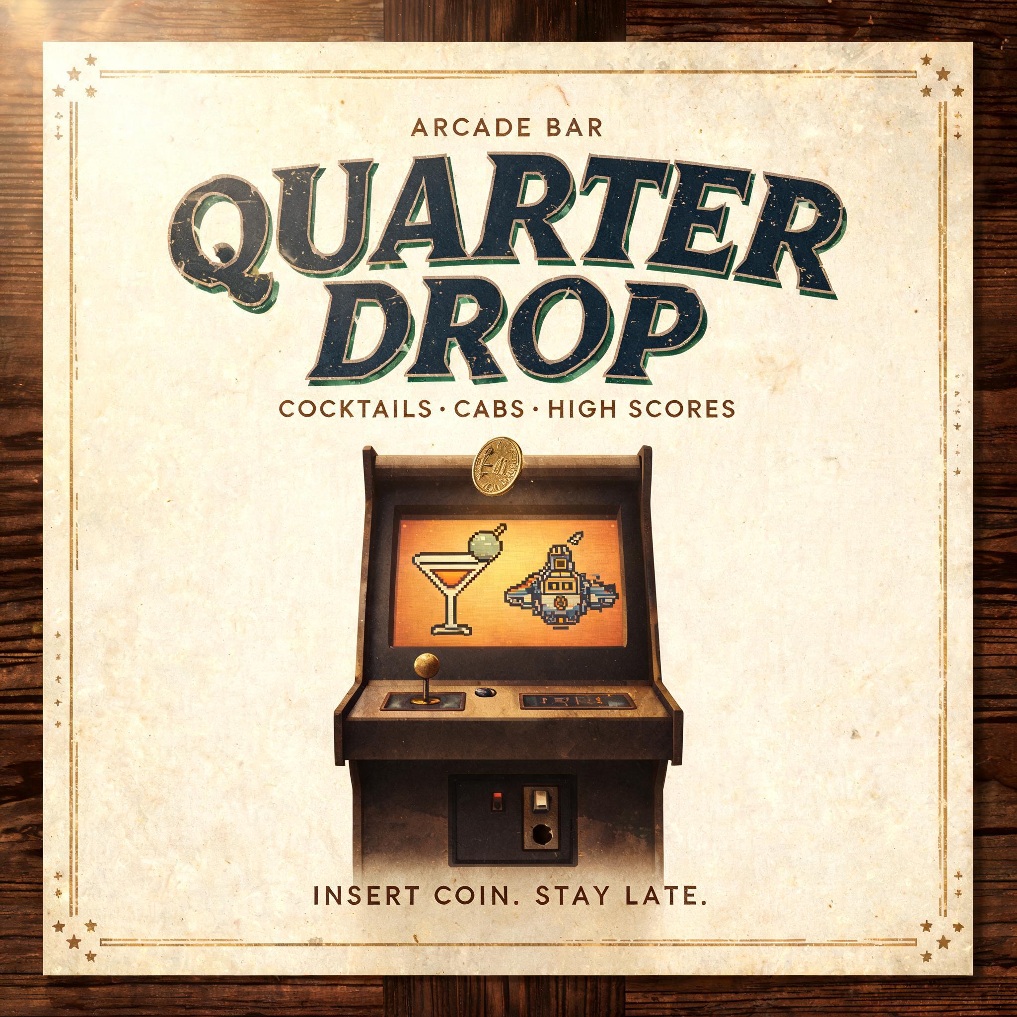
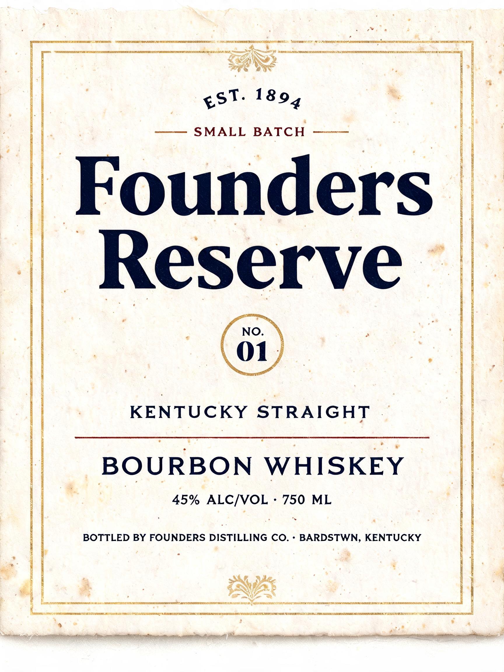
「Faire le choix」は FontVibe AI で作成したヴィンテージの文字エフェクトです。インクがわずかにかすれる活版でクリーム色のコットンカードに押し込んだセリフ体大文字。古い印刷機の版盤に置かれ、金属活字が散らばります。
a timeless vintage piece carrying the physical evidence of an older making — warm, aged and classic. SURFACE / STYLE: the lettering looks produced by a heritage craft and softened by time — a letterpress impression bitten into cotton paper with ink slightly broken up, weathered paint on aged metal or wood, a worn rubber-stamp or postal imprint, or warm gold leaf — carrying patina, foxing, grain and gentle wear. SCENE ATMOSPHERE: a warm nostalgic setting — aged cream or kraft paper, dark wood, soft amber light, faint dust and a faded heritage feel. PALETTE: warm aged tones — cream, kraft, sepia, faded red, forest green, navy, tan and antique gold — muted and time-softened, never neon-bright. LETTERFORM PRIORITY: when the chosen font carries its own treatment (western slab, art deco, art nouveau, letterpress, postal or rubber stamp, gold leaf, typewriter, hand-lettered script, grunge chalk), that font treatment takes absolute priority and owns the letters; this style supplies the warm aged tone, the time-worn surface and the nostalgic heritage scene. FALLBACK MATERIAL: if the font carries no material of its own, render the letters as a classic serif printed in warm faded ink on aged cream paper with a soft letterpress impression and gentle wear, so the timeless vintage feel always reads. A refined vintage typographic composition for the exact French phrase “Faire le choix,” set on two balanced lines: “Faire” above “le choix,” with the full phrase large and unmistakable. The lettering is pressed in warm, faded forest-green ink into aged cream cotton paper, with a visible letterpress bite, slight ink breakup along the edges, delicate paper grain and scattered soft foxing. A narrow antique-gold rule and tiny worn ornamental flourishes frame the words without competing with them. Gentle amber light grazes the paper from one side, revealing its tactile fibers and shallow impressions; soft shadows deepen toward the corners. Keep the palette muted—cream, sepia, forest green and antique gold—with generous breathing room and a calm, considered hierarchy. The overall feeling is thoughtful and quietly decisive, like a well-kept page from a historic French book or a heritage stationery label. No extra words, no modern objects, no bright colors.
用途: チョークフォントジェネレーター
2026年10月29日に生成 · 1360 × 1024 · JPEG · OpenAI GPT-Image-2.5 Sunburst · 制作者がシェア · 商用利用無料(CC BY 4.0)



