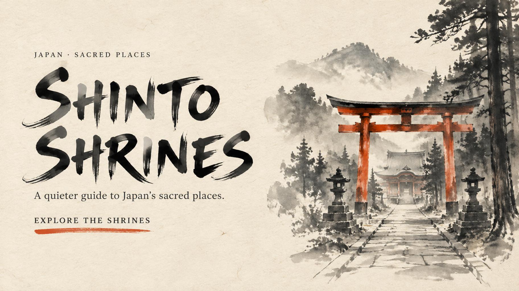
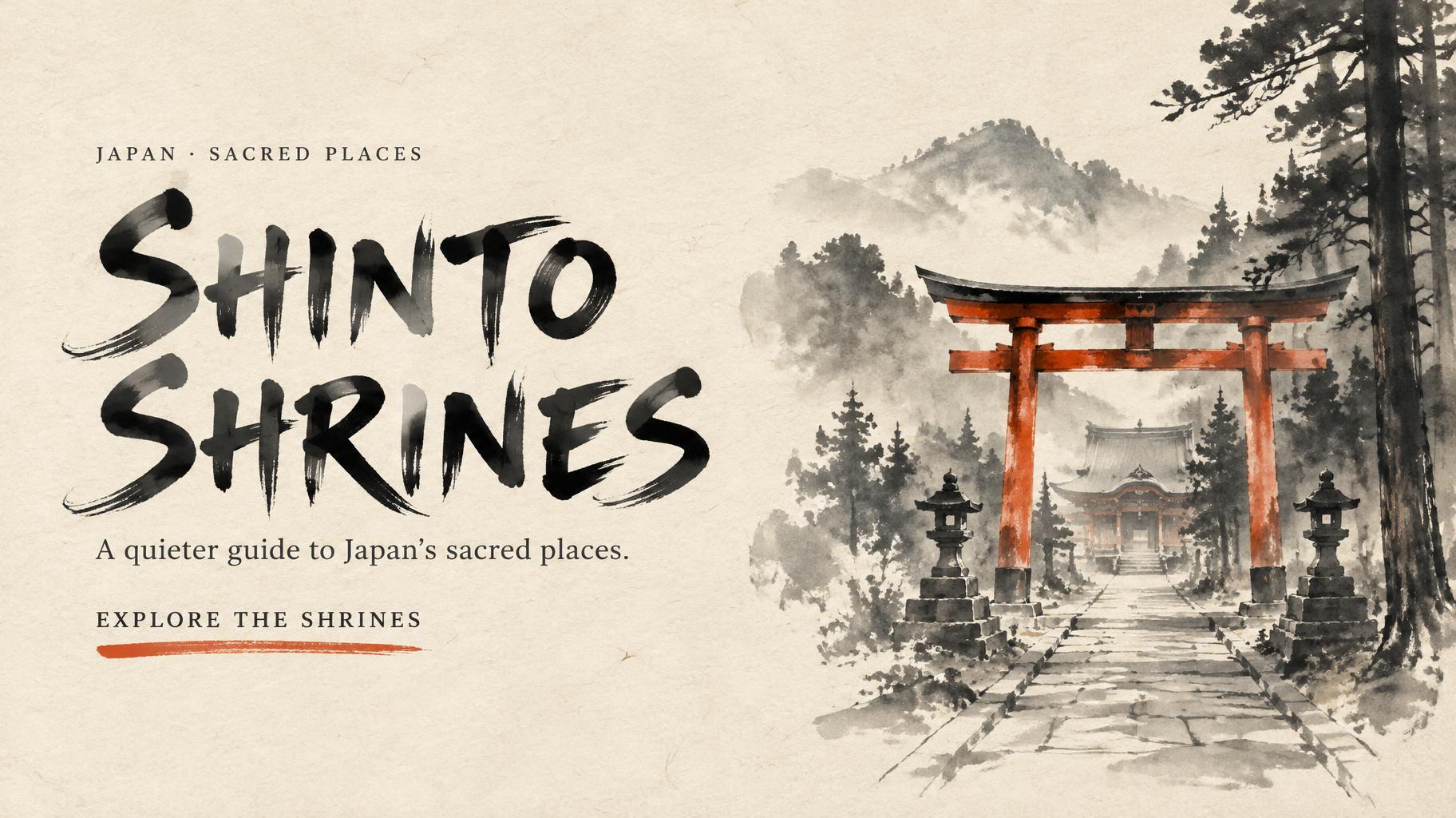
JAPAN · SACRED PLACES SHINTO SHRINES A quieter guide to Japan’s sacred places. EXPLORE THE SHRINES - 中国墨絵ブラシ Text Effect


この作品と同じ OpenAI GPT-Image-2.5 Sunburst を使用 · 15 クレジット






「JAPAN · SACRED PLACES SHINTO SHRINES A quieter guide to Japan’s sacred places. EXPLORE THE SHRINES」は FontVibe AI で作成した中国墨絵ブラシの文字エフェクトです。中国の墨(すみ)による筆文字書道のスタイルをラテン文字に応用しました。深い黒墨に本物の筆先の質感、太細のはっきりした筆致の変化、そして画仙紙の趣を備えています。中華レストランのブランディング、武術、ウェルネス、文化的なデザインに最適です。
Create a finished 16:9 homepage hero banner for a website introducing Japanese Shinto shrines. This is the artwork itself, not a browser mockup: no browser chrome, menus, or extra text. Use warm ivory xuan paper across the entire background, with visible fibers and generous luminous negative space. Build the scene in Chinese ink-brush language: wet-to-dry transitions, feathered brush ends, varied ink density, and a few decisive dark strokes. On the right half, paint a quiet Japanese Shinto shrine approach with a vermilion torii gate, cedar silhouettes, and a stone path fading into mist; keep it sparse, reverent, and clearly illustrative rather than photographic. Let a restrained vermilion wash accent the gate, surrounded by black and soft grey ink. On the left, set the exact headline “SHINTO SHRINES” on two lines, breaking after “SHINTO”. Make it the dominant element, around 40% of the canvas width. Form the Roman capitals as exemplary Japanese shodo brush lettering: upright and harmonious, controlled 5:1 thick-to-thin strokes, precise loaded-brush entries, deliberate mid-strokes, and committed fine harai tapers or upward hane. Each stroke appears made once, with dense black cores and slight bristle texture at the edges; preserve generous spacing between letters. Ink pools subtly at stroke starts and thins to grey at delicate ends, with paper fibers showing through the thinnest passages. Under the headline, set “A quieter guide to Japan’s sacred places.” in restrained, highly legible small lettering. Above the headline, add the small line “JAPAN · SACRED PLACES”. Below the supporting line, place “EXPLORE THE SHRINES” as a modest ink-stamped call to action with a short vermilion brush underline. Keep all lettering crisp enough to read at website-banner size. Left-align the three text tiers on one axis; let the shrine scene balance them on the right. Maintain broad open paper around the composition. No other words, symbols, or decorative clutter.
用途: 毛筆フォント
2026年10月29日に生成 · 1824 × 1024 · JPEG · OpenAI GPT-Image-2.5 Sunburst · レイアウト:Shrine Hero Split · 制作者がシェア · 商用利用無料(CC BY 4.0)



