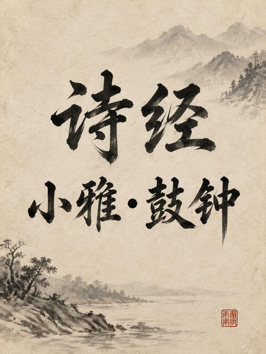
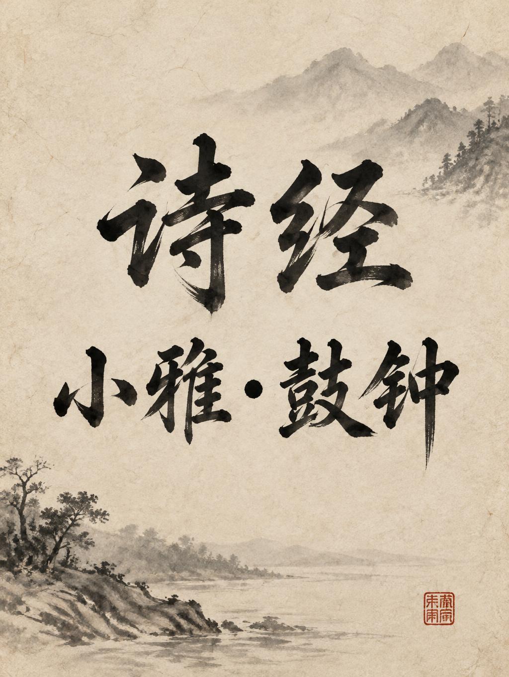
诗经 小雅·鼓钟 - 中国墨絵ブラシ Text Effect


この作品と同じ OpenAI GPT-Image-2.5 Sunburst を使用 · 15 クレジット


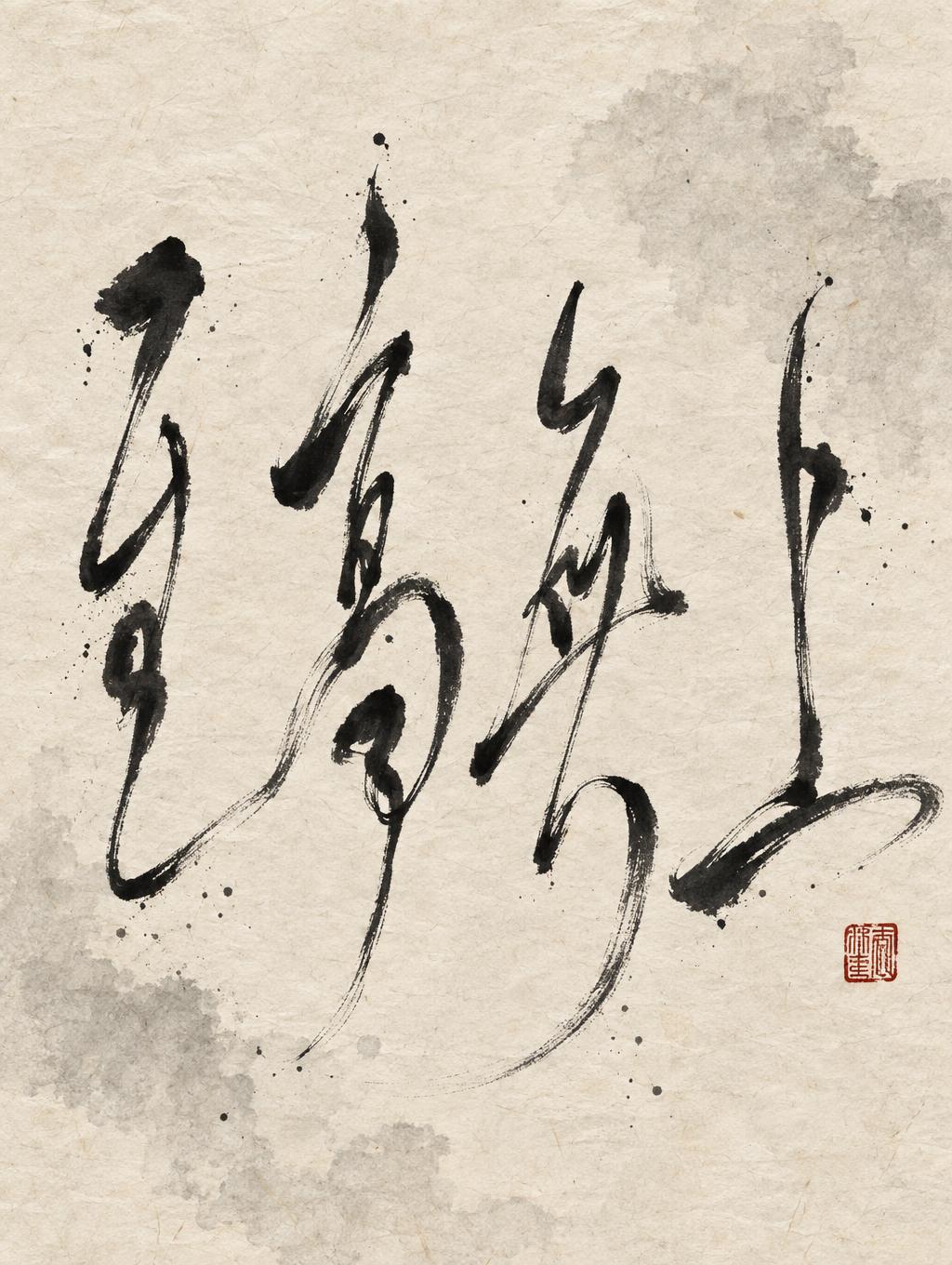




「诗经 小雅·鼓钟」は FontVibe AI で作成した中国墨絵ブラシの文字エフェクトです。中国の墨(すみ)による筆文字書道のスタイルをラテン文字に応用しました。深い黒墨に本物の筆先の質感、太細のはっきりした筆致の変化、そして画仙紙の趣を備えています。中華レストランのブランディング、武術、ウェルネス、文化的なデザインに最適です。
rendered in Chinese ink brush calligraphy style. Letterforms painted with a fully loaded sumi ink brush — deep black ink, visible bristle marks along stroke edges, wet ink pooling at stroke starts, feathered dry-brush trailing ends. Authentic ink density variation: thick rich black cores fading to grey at thin passages. Rice paper texture visible behind. Traditional Chinese calligraphy energy — each stroke confident, intentional, irreversible. LETTERFORM PRIORITY: when the chosen font carries its own treatment, that font's letterform shapes take priority and own the letters; this style governs the sumi ink medium, the bristle and ink-density behavior and the rice-paper ground. FALLBACK MATERIAL: if the font carries no material of its own, render the letters as deep black sumi brush strokes with visible bristle marks, wet ink pooling at stroke starts and feathered dry-brush trails on rice paper. COLOR PRIORITY: keep the font's own colors if specified; otherwise rich black ink fading to grey at thin passages. Vertical 3:4 composition. Render the exact text “诗经 小雅·鼓钟” prominently, arranged as two balanced lines: “诗经” above “小雅·鼓钟,” preserving every character and the centered dot. Set the inscription against warm ivory xuan paper with subtle visible fibers and faint age-toning. Paint the characters in expressive sumi ink: deep, concentrated black through broad passages, rich wet pooling at stroke beginnings, delicate bristle traces along irregular edges, and dry-brush tails that thin into soft gray. Let tiny areas of paper grain show through lighter ink, keeping the transitions from wet to dry vivid and natural. Behind the title, a restrained pale ink-wash suggestion of distant mountains and a quiet riverbank dissolves into the paper, leaving ample luminous negative space around the lettering. Add one small vermilion seal impression near the lower edge as a quiet accent. The overall feeling is ancient, composed, and resonant, like a surviving inscription from a classical songbook. No modern objects, extra lettering, or decorative border.
用途: 中国書道フォント
2026年10月31日に生成 · 1024 × 1360 · JPEG · OpenAI GPT-Image-2.5 Sunburst · 制作者がシェア · 商用利用無料(CC BY 4.0)



