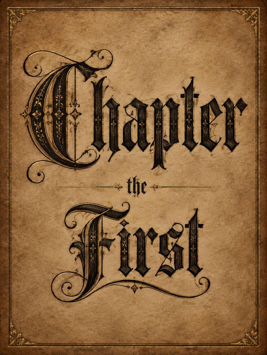
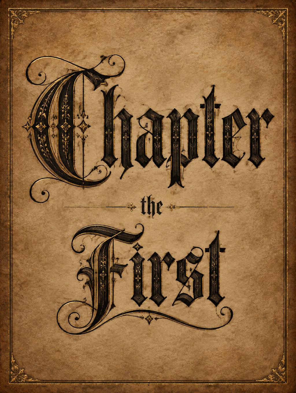
Chapter the First - ゴシックフォント Text Effect


この作品と同じ OpenAI GPT-Image-2.5 Sunburst を使用 · 15 クレジット




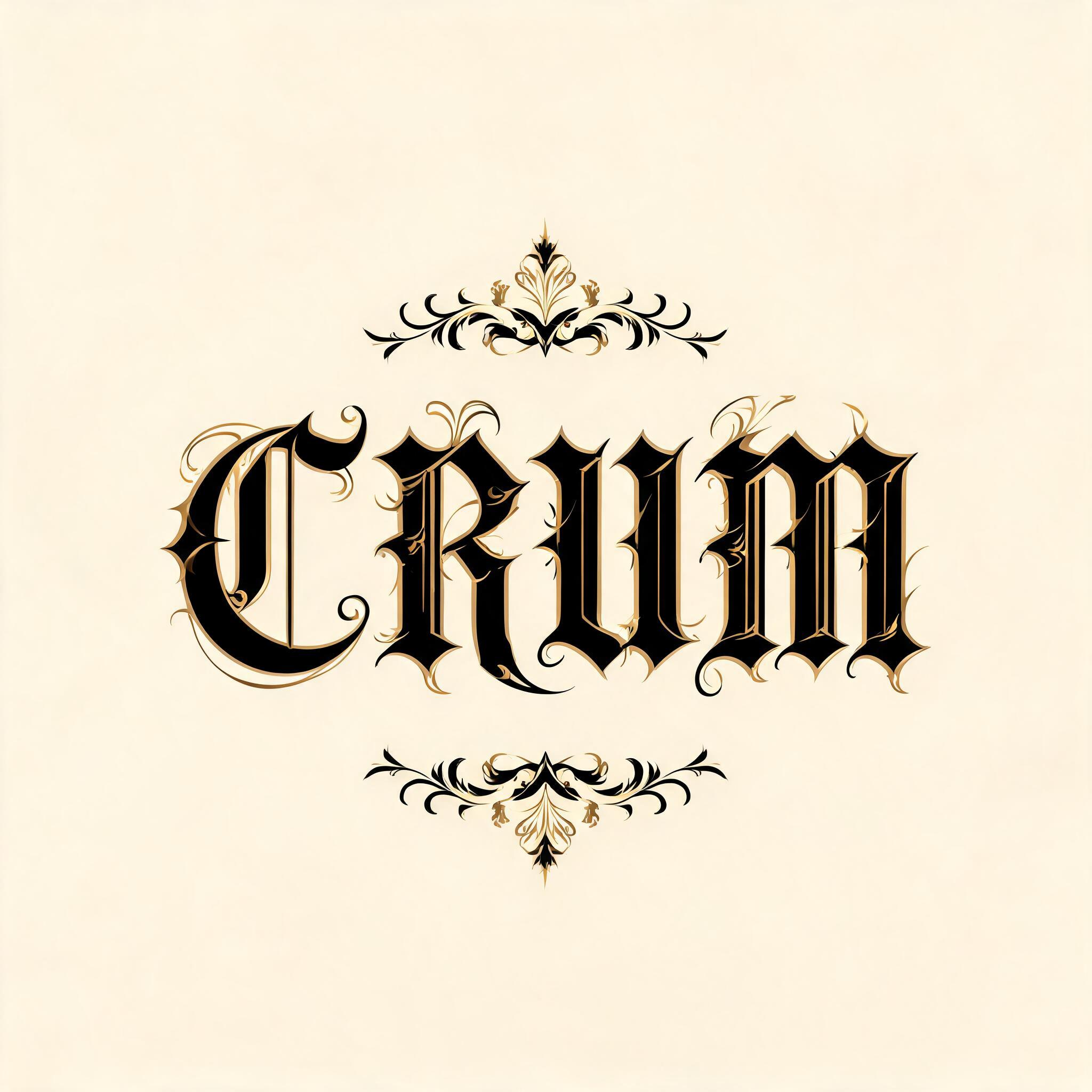

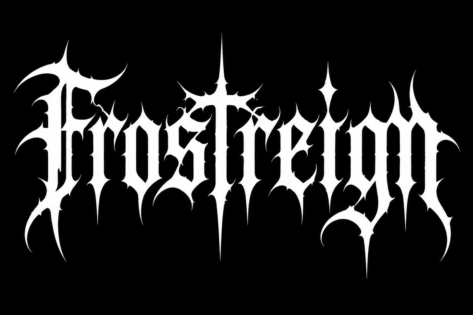

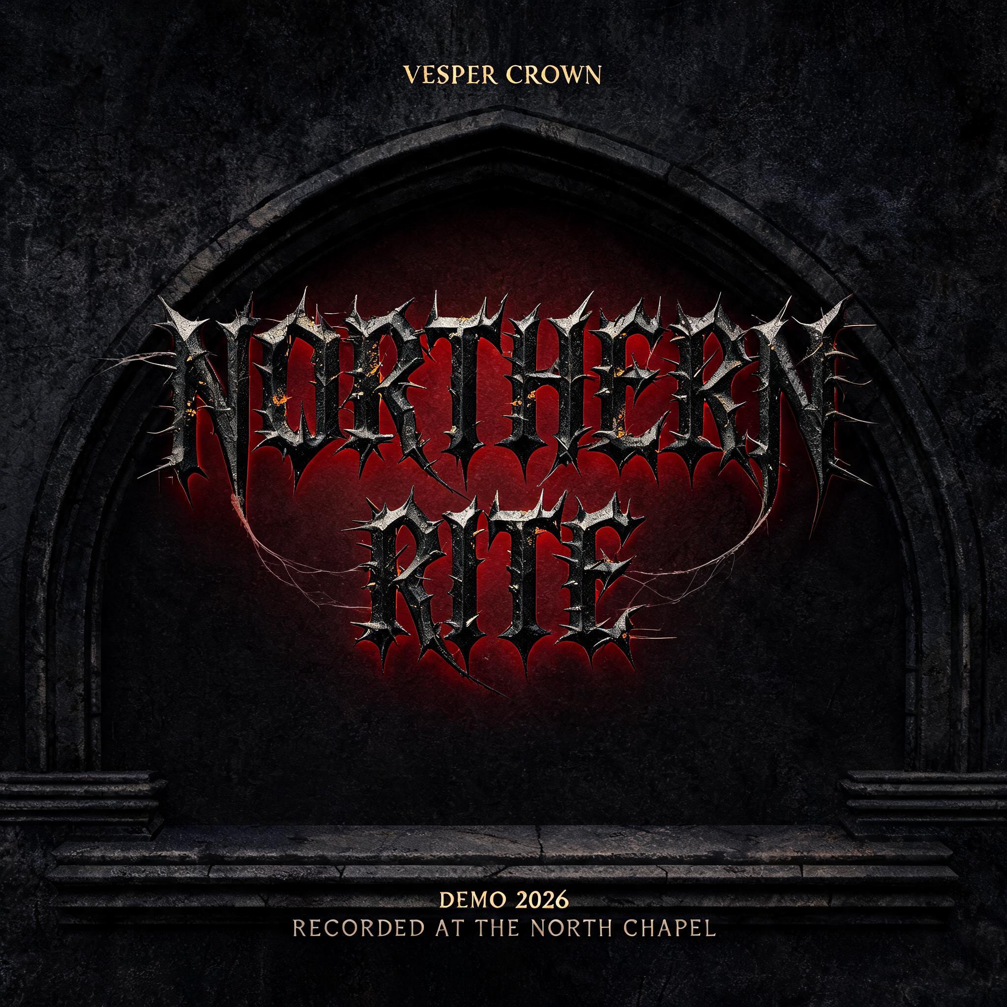
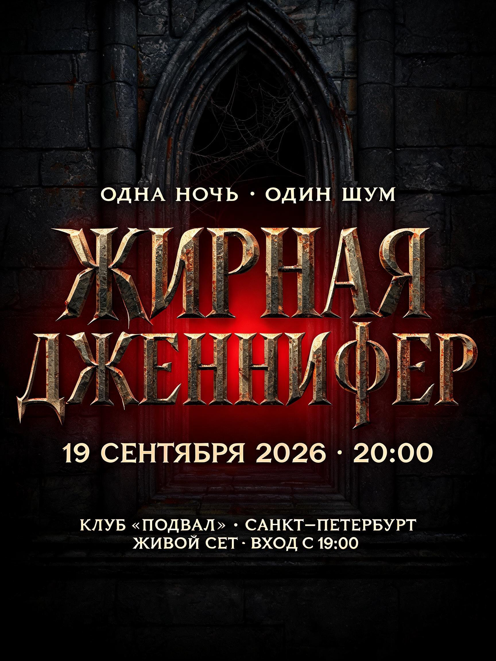


「Chapter the First」は FontVibe AI で作成したゴシックフォントの文字エフェクトです。端正なテクストゥーラのブラックレター。細く折れる線、菱形の筆端、強い太細の差を、金でふちどった黒インクで暗い古い羊皮紙に。
A finished book chapter-opening title page, portrait 3:4. The text reads exactly "Chapter the First" and nothing else, set in ornate Victorian gothic blackletter. Layout: a centered three-tier stack. "Chapter" is the dominant line, filling about 70% of the page width, with a huge swash capital C whose hairline extensions curl out into the margin. Below it, "the" is small, about 12% of the width, in a delicate lowercase blackletter, centered between two thin gold hairline rules. Below that, "First" is large, about 55% of the width, with a swash capital F whose hairline flourish sweeps under the whole word. Vertical proportions are about 5:1:3.5, with generous parchment margin around the stack. Letterforms: deep rich black ink stems with strong thick-thin contrast, diamond-shaped terminals, pointed arch counters. Inside the thick stems sit fine decorative fill patterns of tiny hatching and filigree vines, which catch raking light as hairline highlights while the stems stay deep and shadowed. The capitals C and F carry thin gold leaf inlays along their spines and hairline tips, with a faint warm metallic sheen. Ground: dark aged parchment with faint fibre texture and slightly darker, toned edges. A thin gold-and-black double-line frame sits inset from the page edge, with small filigree corner ornaments. Light is soft, even and warm, like a lit manuscript page from above. Palette: black ink, warm gold, deep umber parchment. Pure typographic craft, with no cobwebs, no rust, no fog, no figures.
用途: ロンバルディック・ブラックレター
2026年11月2日に生成 · 1024 × 1360 · JPEG · OpenAI GPT-Image-2.5 Sunburst · レイアウト:センター · 制作者がシェア · 商用利用無料(CC BY 4.0)



