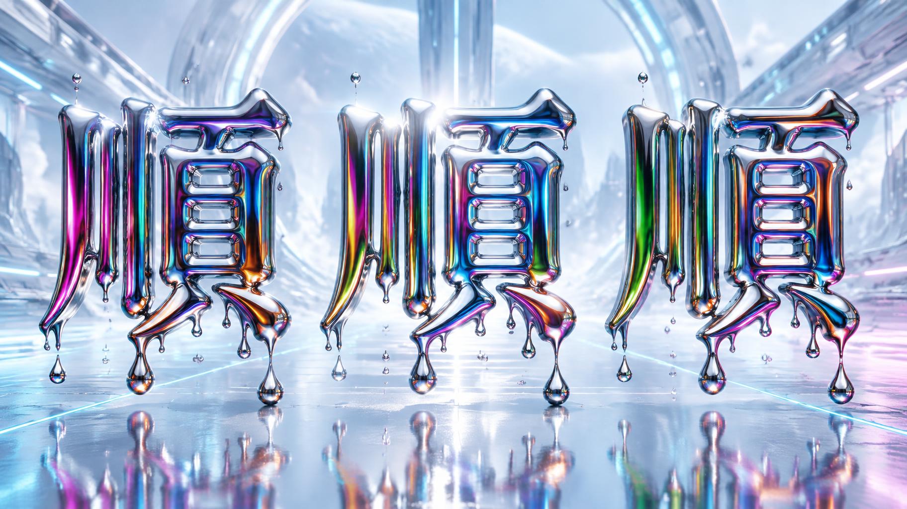
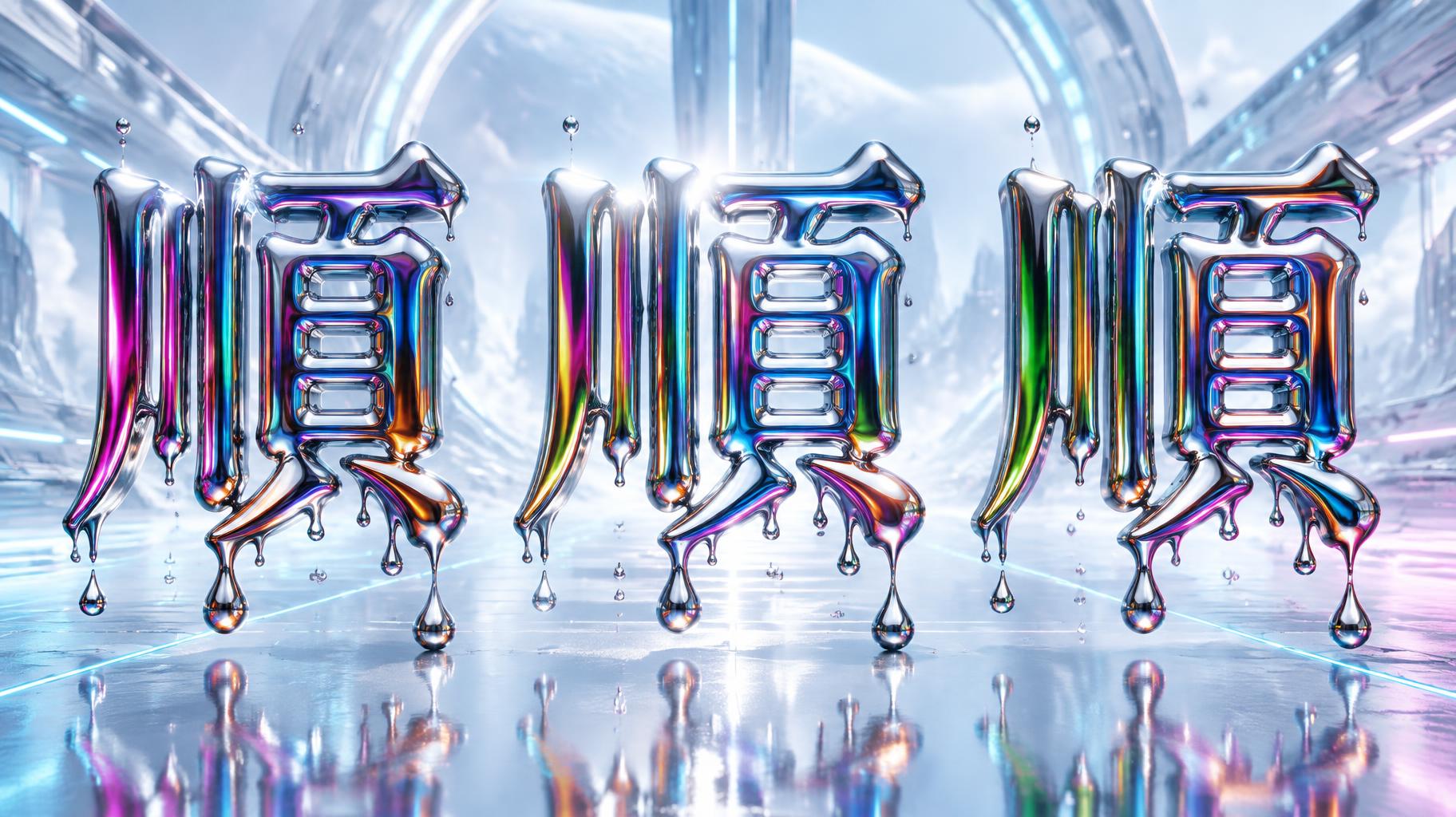
順順順 - Y2K クローム Text Effect


この作品と同じ OpenAI GPT-Image-2.5 Sunburst を使用 · 15 クレジット



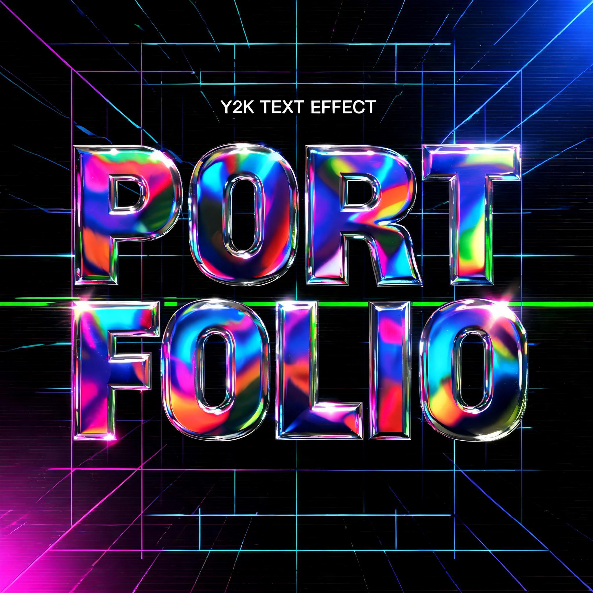


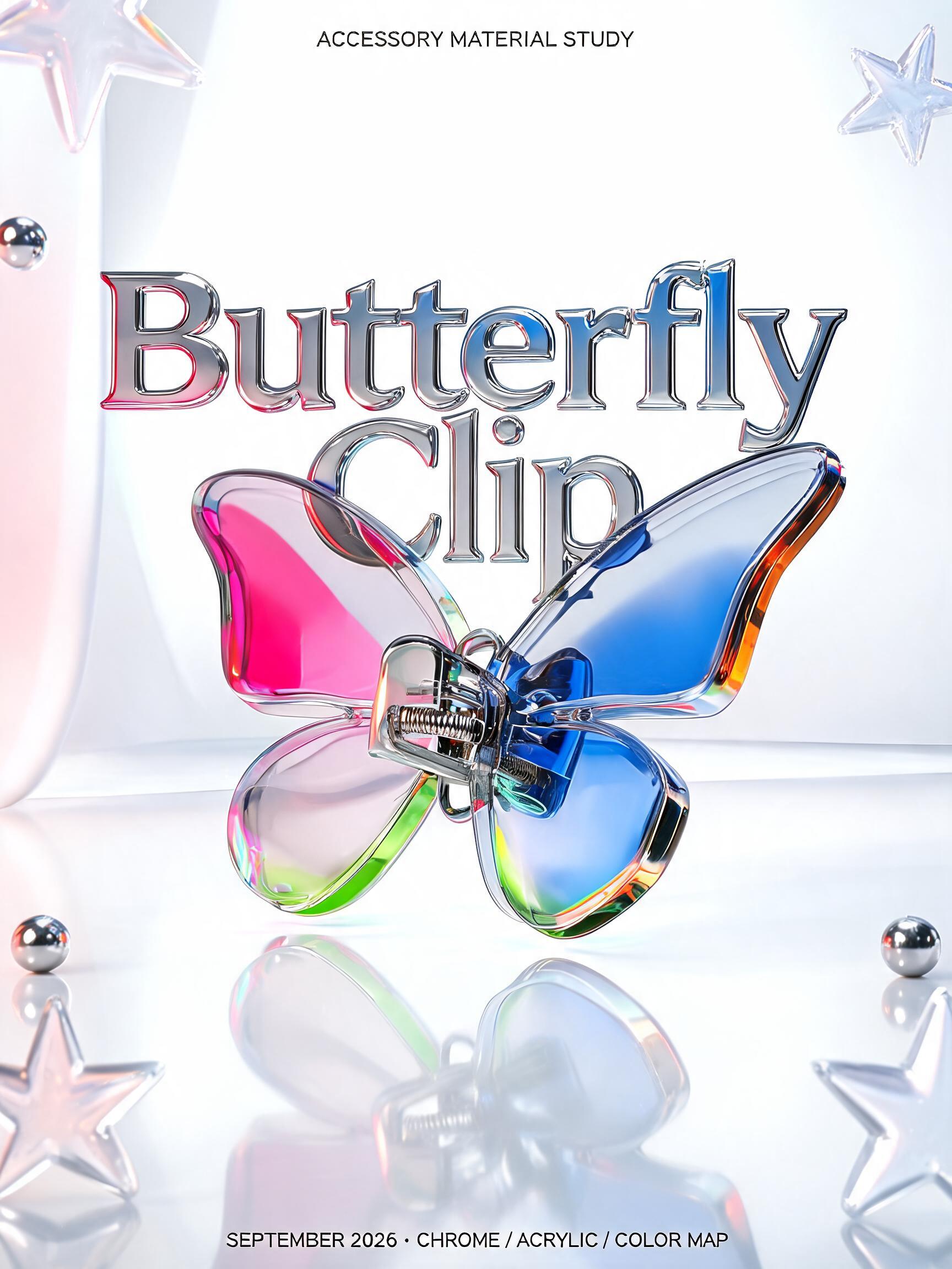
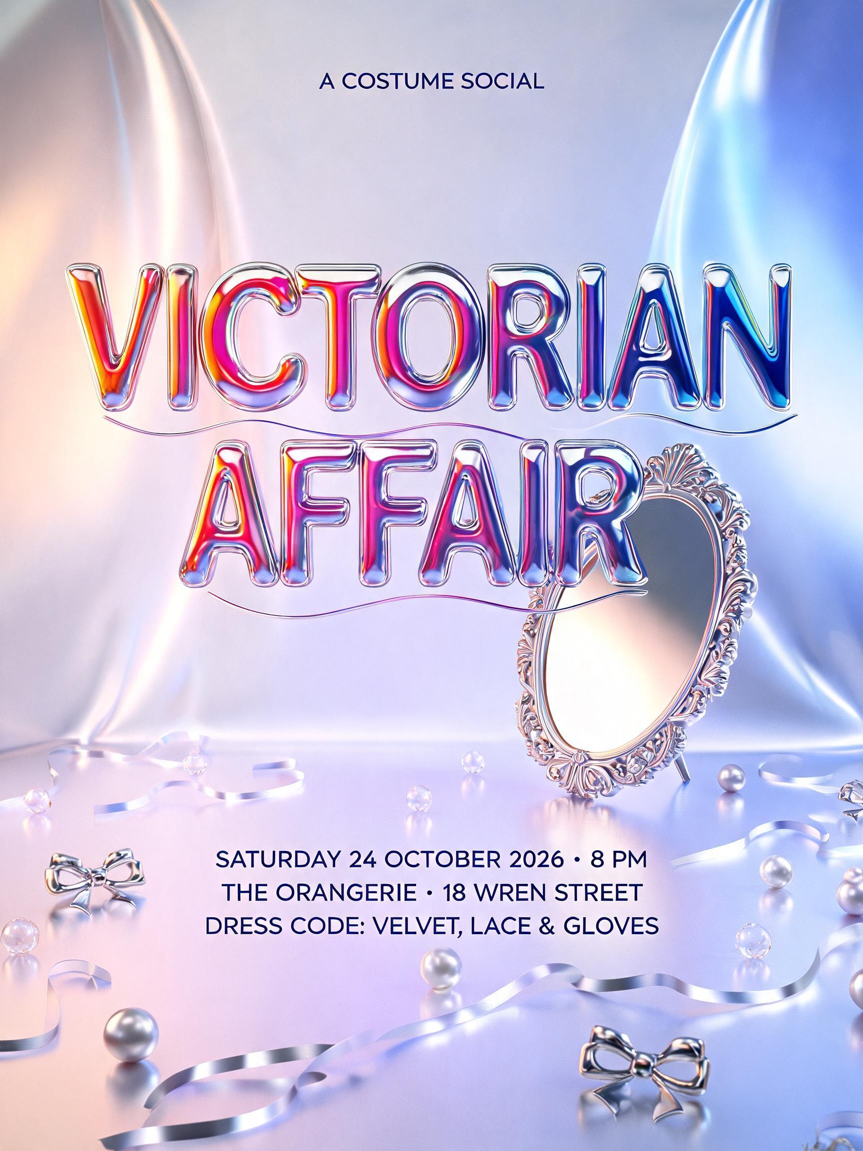
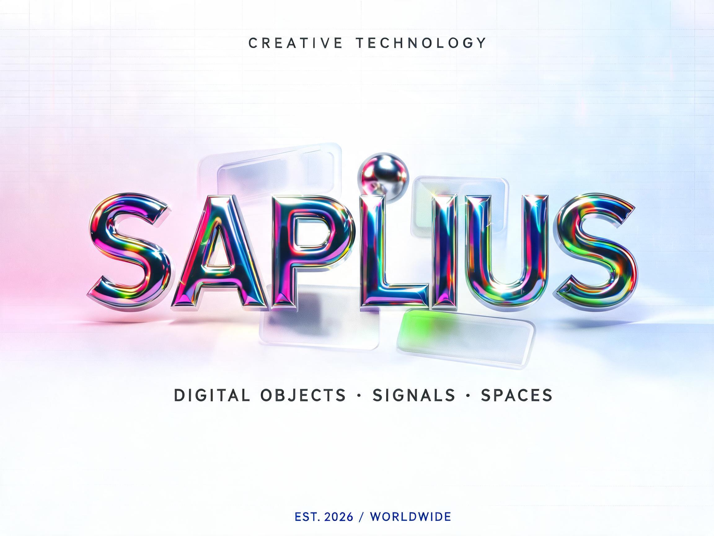
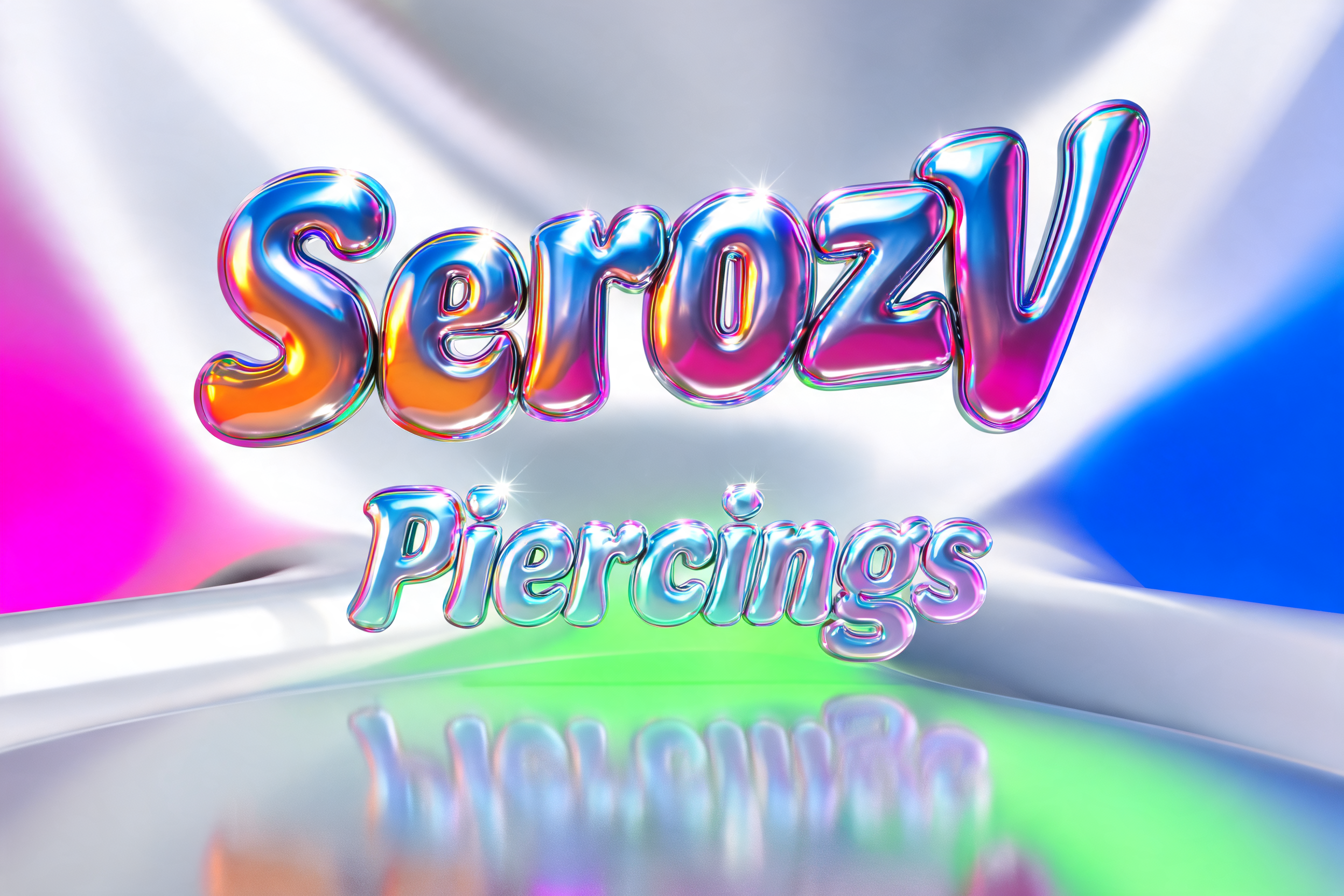


「順順順」は FontVibe AI で作成したY2K クロームの文字エフェクトです。ピンク、グリーン、ブルーの虹色反射をまとったふっくらしたクロームの大文字。明るい白からパステルの背景で柔らかく光ります。
A sci-fi game title card. The three Chinese characters「順順順」stand in one horizontal row, dead centre, filling about 80% of the frame width. Each character is a very heavy, bold, clean and fully legible Song/Hei hybrid skeleton with squared, confident strokes. The three characters are identical, with even wide spacing and a consistent baseline. The whole lettering is hyper-realistic liquid mercury chrome with a mirror-polished, zero-roughness surface. Every stroke end melts into smooth, heavy liquid drips and teardrop beads that hang below the characters, with a few drops falling in mid-air. The chrome reflects vivid razor-sharp colour zones warped by the convex surfaces: magenta, deep cobalt blue, acid green and molten orange, separated by ultra-thin rainbow spectral lines. Dominant white specular flares sit on the peak curves, with long streak highlights running along the horizontal strokes. The three characters vary subtly in their reflections, so the middle one catches the brightest key light. Background: a bright pearl-silver to pale-ice-blue gradient sweep, like a futuristic spaceship hangar bathed in soft light. Faint thin light panels and a pale geometric ring gate glow far behind in soft focus, and a few fine holographic grid lines run across the floor. A glossy reflective floor mirrors the lettering with a soft fading reflection, with cyan and pink light spilling in from the sides. Only the three characters are present, with no other text, logo or watermark. The look is premium and cinematic, with crisp mirror-metal detail and bright high-key lighting with no black voids.
用途: リキッドクロムフォント
2026年11月4日に生成 · 1824 × 1024 · JPEG · OpenAI GPT-Image-2.5 Sunburst · レイアウト:マッシブ · 制作者がシェア · 商用利用無料(CC BY 4.0)



