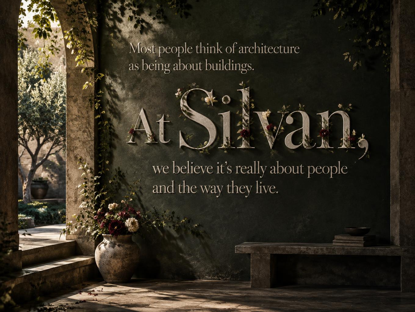
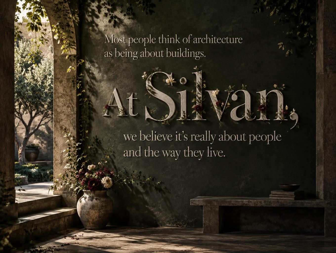
Most people think of architecture as being about buildings. At Silvan, we believe it’s really about people and the way they live. - 花柄 Text Effect


この作品と同じ OpenAI GPT-Image-2.5 Sunburst を使用 · 15 クレジット









「Most people think of architecture as being about buildings. At Silvan, we believe it’s really about people and the way they live.」は FontVibe AI で作成した花柄の文字エフェクトです。ワインレッドの牡丹、クリーム色のバラ、緑のつるが絡むクリーム色のセリフ体大文字。花は線の端から咲き、地は深い緑。
solid letterforms with botanical ornamentation — the letter strokes are the structural foundation, botanical elements are decoration growing FROM the surface, never replacing or obscuring the stroke. Letter outlines and counters must remain clearly readable at all times. Blooms cluster specifically at stroke terminals, junction points, and cap-height apexes; vines trail only along stroke edges without crossing into counter spaces; leaves emerge at stroke corners as thin accent details. Floral coverage rule: botanical elements visible on no more than 35% of any individual stroke face — the remaining 65% shows the clean letter surface beneath. Three-depth botanical layering: foreground accent blooms fully rendered with visible petal detail and stamens; mid-ground sprigs partially lit; background foliage dissolving into shadow. Default palette when no font specifies otherwise: deep jewel-toned botanicals against the letter surface — burgundy peonies, cream roses, forest-green leaves with venation, gold-dusted stamens — the restrained botanical ornament of Dutch Golden Age letter-painting, not a floral wreath that happens to spell a word. Create a refined editorial poster for a contemporary architecture studio, with the supplied sentence reproduced exactly and arranged in a calm, highly legible hierarchy. Set the opening thought as a smaller lead-in above the studio’s name, then give “Silvan” clear prominence, followed by the remaining words in compact, balanced lines. Preserve the original wording and punctuation; do not add any other text. Treat the text as the centerpiece of a finished architectural image, not as a caption laid over a photograph. Let restrained botanical details grow from the letter surfaces at their terminals and junctions, leaving the words crisp and unobstructed. Frame the composition with a shadowy architectural interior: a quiet courtyard seen through a deep-set opening, softened by climbing greenery, with a single sculptural branch and a few understated blooms near the base. Use dark forest-green and near-black surroundings, warm stone accents, and a directional upper-left light that grazes the scene and draws depth from the shadows. Keep generous breathing room around the long statement; use subtle stone or plaster texture and a thoughtful, human-scale atmosphere rather than a grand monumental building. The final image should feel like an art-directed studio identity poster about the relationship between architecture, nature, and everyday life.
2026年11月4日に生成 · 1360 × 1024 · JPEG · OpenAI GPT-Image-2.5 Sunburst · 制作者がシェア · 商用利用無料(CC BY 4.0)



