Spider-Man: Brand New Day Font & Logo — The Red-and-Blue Comic Title, Explained (+ Make Your Own Free)
Spider-Man: Brand New Day arrives July 31, 2026 — and its logo ditches the Home-trilogy look for a bold red-and-blue 3D comic masthead with a gold subtitle. Inside the Spider-Man Brand New Day font and logo design, plus how to make your own free.
The title card gives it away before the trailer says a word. Spider-Man: Brand New Daydrops the weathered, hand-drawn look of the Home trilogy and goes back to something older and louder — a bold red-and-blue 3D comic masthead with a gold subtitle underneath. It's a font choice, and it's a statement: this is a reset, a brand new day, drawn straight from the comic covers.
So what is the Spider-Man: Brand New Day font, why did they change it, and how do you make text in that exact red-and-blue comic style yourself? That's the whole article. Design breakdown first, then the free way to make your own.

When Does Spider-Man: Brand New Day Come Out?
Spider-Man: Brand New Day — the fourth MCU Spider-Man film, and the one everyone's been calling Spider-Man 4 — arrives July 31, 2026. The marketing rollout leaned on the title treatment early, which is why the red-and-blue comic logo was circulating long before most plot details. For a franchise this size, the logo is the first trailer.
The subtitle carries the whole message. "Brand New Day" is a fresh-start phrase — and the design says the same thing the words do. After the Home trilogy closed on a quiet, grounded note, Spider-Man 4 resets to the loud comic-book identity the character started with. When a title reads "brand new day" and looks like a 1960s comic cover reborn, that's not an accident. The typography is doing narrative work.
The Brand New Day Title Treatment, Broken Down
Two layers do all the work. Understand them and you understand the whole look.
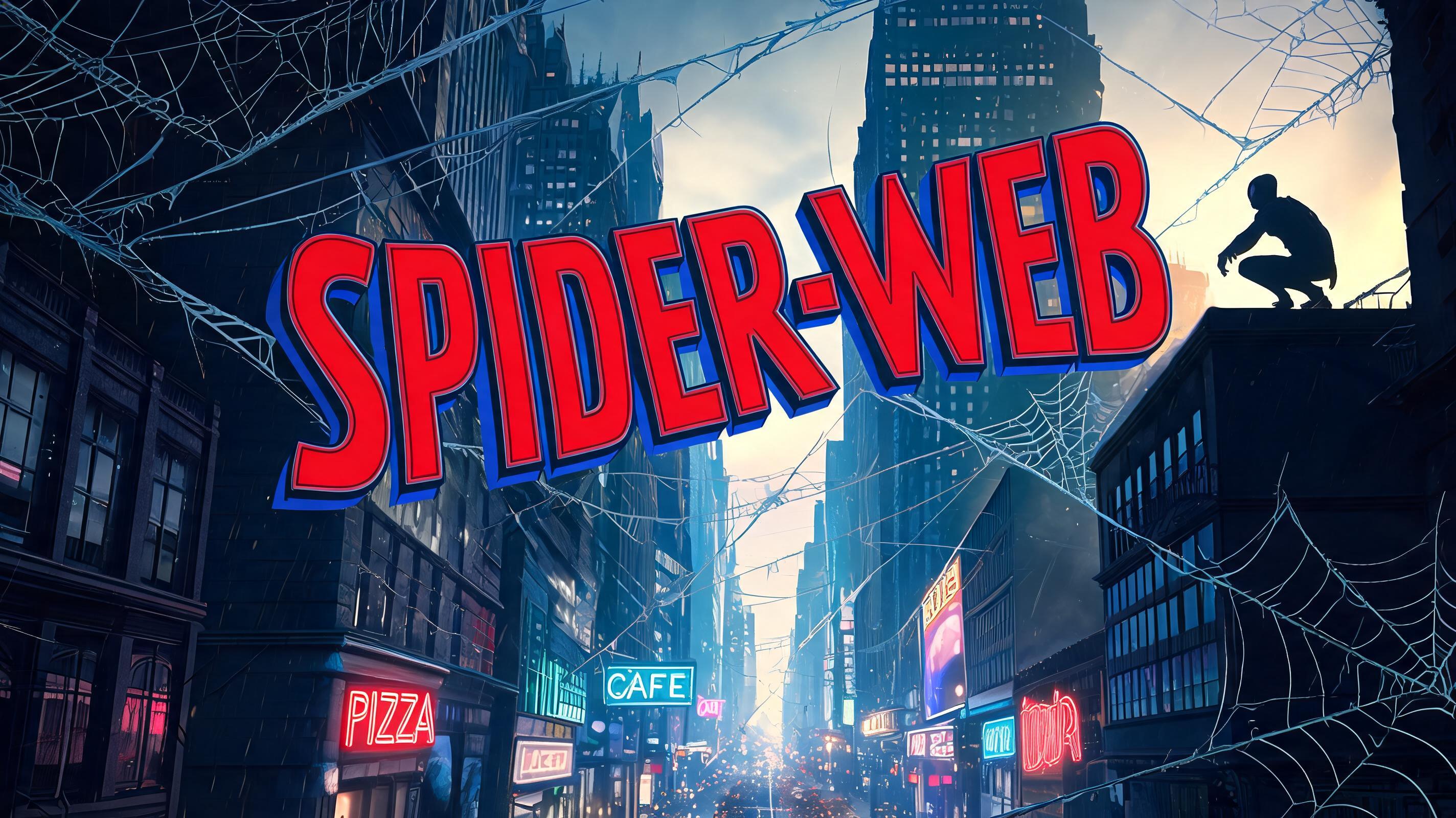
The main name — red-and-blue comic masthead. Each letter is a solid, flat front face in comic red, edged by a thin dark outline, with a royal-blue 3D depth block extruded along the lower edge. Not a red-top / blue-bottom split — a red face sitting on a blue side wall, like a comic logo lifted off the page. The letters are chunky and rounded, not spiky, and the word rides a gentle downward-bowing arc so the middle letters sit slightly lower than the ends. That arc is the single most-missed detail when people try to fake this look.

The subtitle — soaring gold. Under the main name sits a bright, warm gold wordmark, set in a clean rounded sans with a forward italic lean and a diving, in-flight feel. It's the "prestige" layer — the same trick award-season films use to say this one matters. Gold against the red-and-blue reads as premium without turning cartoonish.
What Font Does Spider-Man Use?
Here's the honest answer nobody likes: there is no single "Spider-Man font" you can download and type in. The logo is a custom lettering treatment, hand-built for the film — the red face, the blue extrusion, the arc, the outline weight, all tuned by a title designer, not typed from a typeface.
That's exactly why a generator beats hunting for a font file. Instead of finding one flat typeface and faking the depth in Photoshop, you describe the effect and let it build the whole red-and-blue 3D masthead — face color, depth block, outline, arc and all. FontVibe's Spiderman font generator does that in one step, free, and hands you a transparent PNG.
People search "spiderman font" expecting a .ttf and leave with a yellow drop shadow. The look isn't a font — it's a recipe. Get the recipe right and any word becomes a Spider-Man-style title.
Spider-Man Logos Through the Eras
The Brand New Day logo isn't new — it's a callback. Spider-Man's title design has swung between two poles for sixty years: comic-book flat and cinematic grounded.
The 1960s comics set the DNA — red-and-blue, blocky, a hero name that felt like a shout. Raimi's 2002 trilogy made it metallic and dimensional, silver-blue chrome with weight. The Amazing Spider-Man went thin and modern. The MCU Home trilogy — Homecoming, Far From Home, No Way Home — went quiet and grounded: a plain, almost handwritten look that faded into the poster. Brand New Day swings the pendulum hard the other way, back to the loud red-and-blue comic masthead. The name is the thesis. This is the comic-book Spider-Man again.
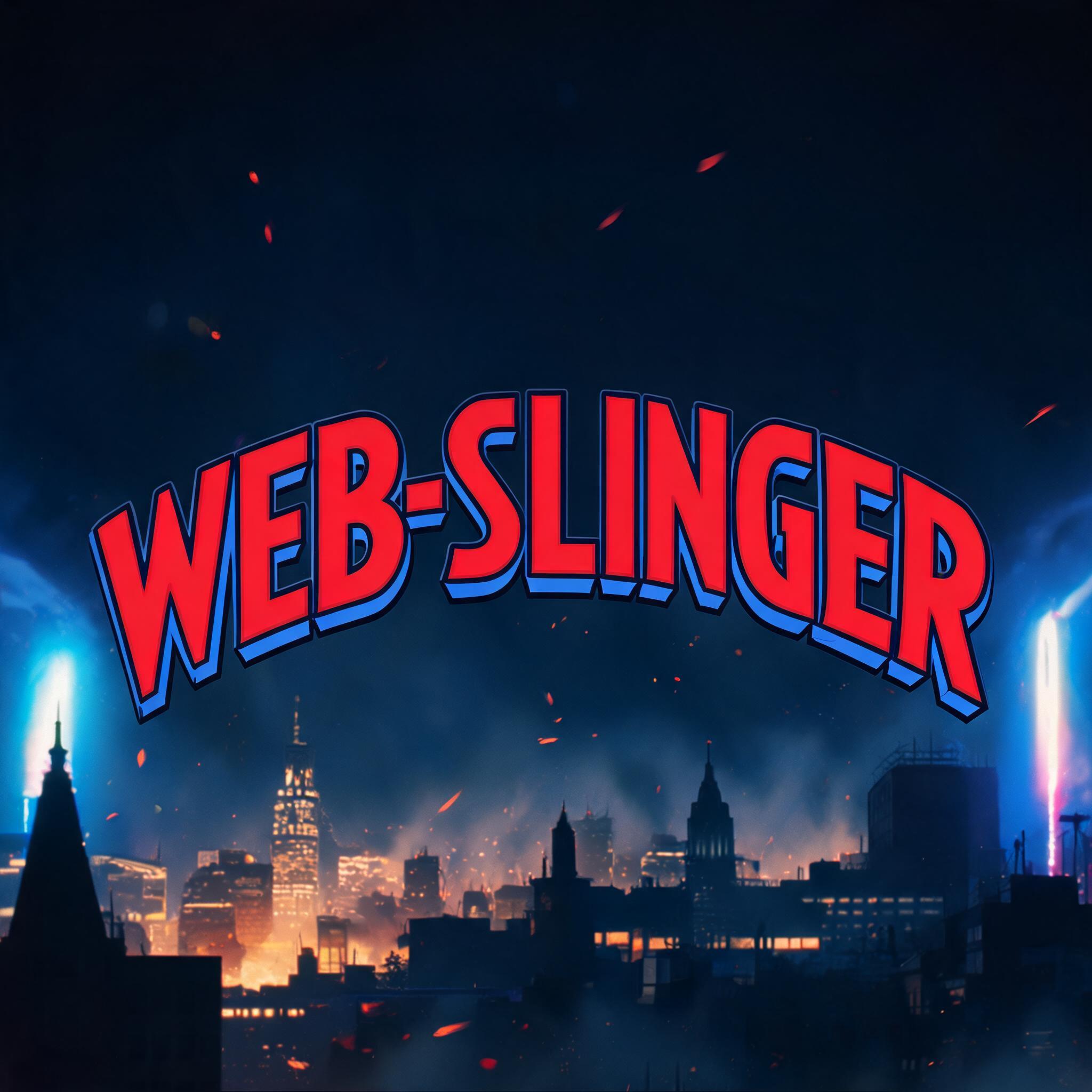
This is also why "spiderman logo" is one of the most-searched design queries every time a film drops. People don't just want the emblem — they want to make text in the logo's style: a name, a title, a thumbnail. The comic masthead is the part you can actually reuse.
Brand New Day vs the Home Trilogy Look
Put the two side by side and the shift is obvious. The Home trilogy — Homecoming, Far From Home, No Way Home — used a restrained, near-handwritten title that sat flat on the poster and let the photography lead. It was Spider-Man as a grounded MCU kid. Understated on purpose.
Brand New Day inverts every one of those choices. Flat becomes dimensional. Quiet becomes loud. Handwritten becomes comic masthead. Muted becomes primary red-and-blue. If the No Way Home font whispered, the Spider-Man Brand New Day font shouts — and the gold subtitle underlines it. Same character, opposite typographic thesis. That contrast is the fastest way to explain why the new logo feels like an event.
Why the Red-and-Blue Comic Look Works
Restraint is doing a lot here, even though the logo looks loud. Only two colors carry the identity — comic red and royal blue — and one accent, gold. No gradients, no chrome, no five-color explosion. The flatness is the point: it reads instantly at thumbnail size, on a phone, in a feed. A logo that survives being two centimeters tall is a logo doing its job.
The 3D depth block adds just enough dimension to feel like a movie title rather than a printed comic, without tipping into the heavy metallic look Raimi used. It's the exact middle: comic flatness plus cinematic weight. That balance is the whole trick, and it's why the comic book text style and a 3D comic letterstreatment are the two ingredients you're really combining.
How to Make Your Own Spider-Man Font Free
You don't need Photoshop, a font file, or a designer. Three steps.
1. Type your word. A name, a title, a gamer tag — keep it short. All-caps, one to three words, reads strongest as a hero logo.
2. Pick the Spider-Man style. Open the Spider-Man font style and the AI builds the red-front / blue-3D-depth comic masthead automatically — arc, outline and all. Add a second line and you get the gold subtitle layer too.
3. Download the PNG. Export a high-resolution transparent PNG. It drops onto a dark city background, a poster, a thumbnail — no white box, no watermark.
What to Make With It
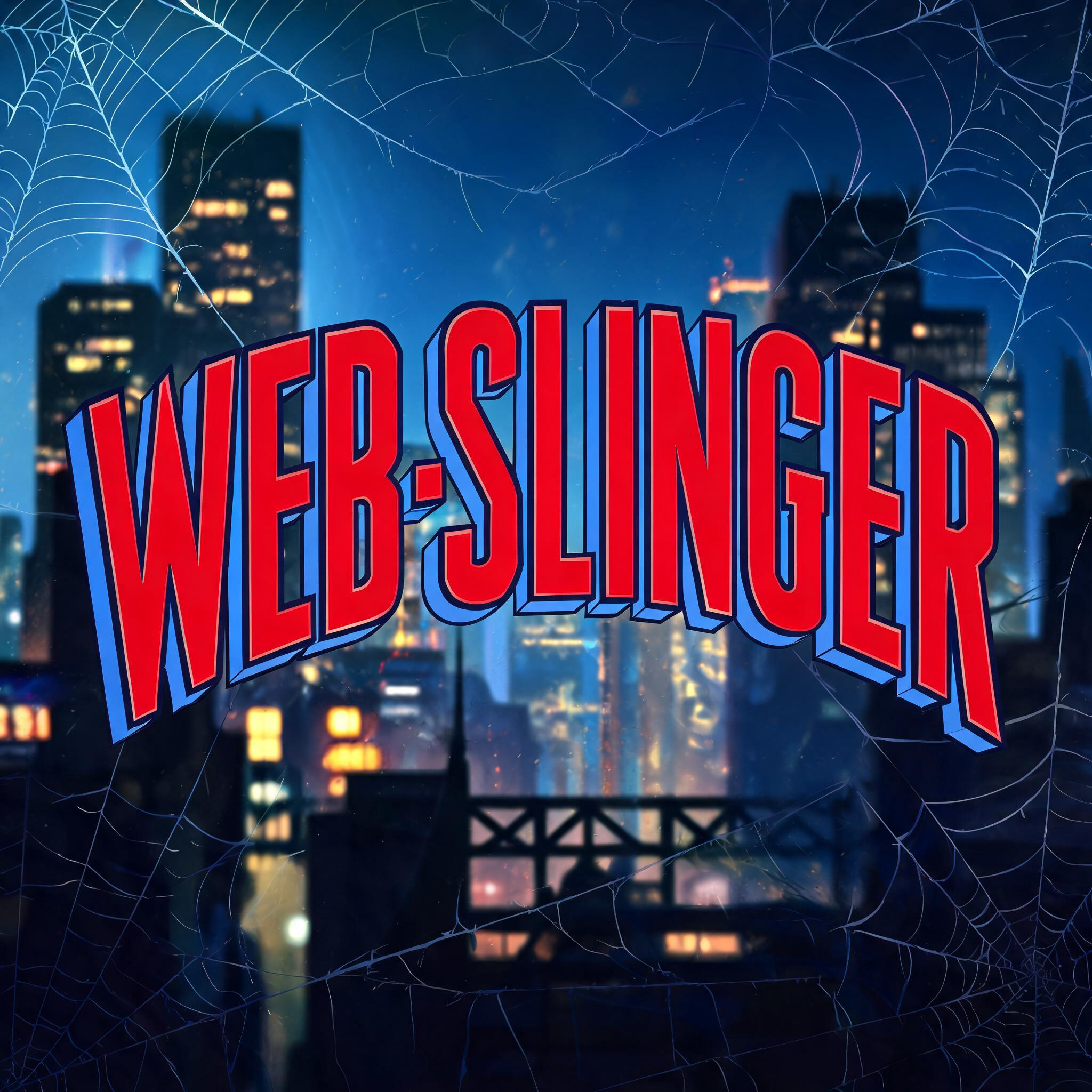
Fan posters and edits. A blockbuster-grade title card for your own cut, thumbnail, or wallpaper. This is where the grounded night-city look earns its keep — pair the title with a dark skyline and it looks like a real one-sheet.
YouTube thumbnails. The high-contrast red-and-blue is built for tiny sizes. It pops in a feed where a subtle title would vanish.
Birthday and party art.A superhero-themed banner with the birthday kid's name in the comic masthead beats a generic party font every time.
Gamer tags and logos. The comic-hero look carries a handle or a stream logo without any extra design work.
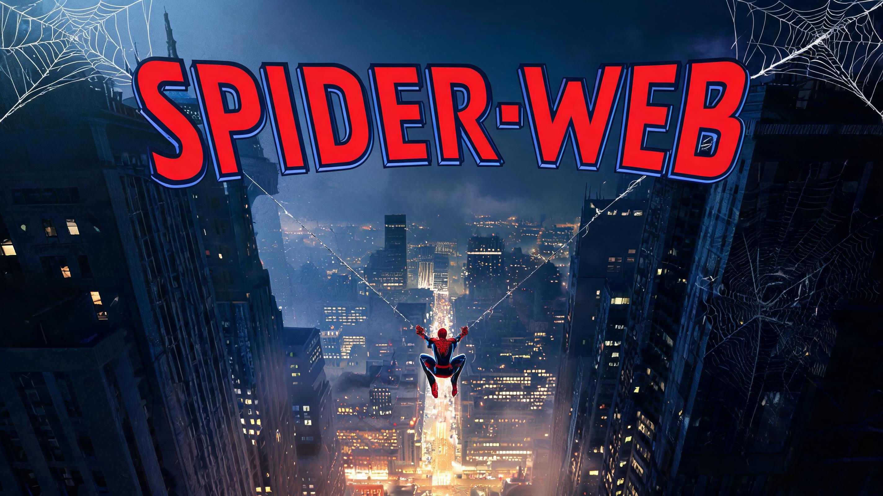
Two Layers, One Logo: Masthead + Gold Subtitle
A full Spider-Man logo in this style is two typefaces stacked, not one. The comic masthead carries the hero name; the gold subtitle carries the tagline. Get the relationship between them right and it reads as a real one-sheet; get it wrong and it reads as a meme.
The rule is simple: the masthead dominates, the gold subtitle supports. Give the red-and-blue name roughly two-thirds of the visual weight and let the gold line sit smaller beneath it, centered, breathing. Never let the subtitle compete — it's the whisper after the shout. When you build a Spider-Man logo this way, put the main word on line one and the subtitle on line two, and the generator stacks and scales them for you.

Getting the Red-and-Blue Right: Three Details Everyone Misses
Red is the face, blue is the depth.The number-one mistake is splitting letters red-on-top, blue-on-bottom. Wrong. The blue isn't a second color band — it's the 3D side wall the red face casts, like light hitting a block. Keep the whole front face red and let blue live only on the extruded edge.
Keep the blue depth thin. A fat blue block reads as clumsy 90s WordArt. The Brand New Day masthead uses a slim depth offset — just enough to lift the letters off the page. Restraint again.
Bow the baseline.That subtle downward arc, middle letters dipping below the ends, is what makes it read as a comic logo instead of a straight line of type. Miss the arc and the whole thing looks generic. It's the detail the Spider-Man style handles for you automatically — no manual warping.
Make Your Spider-Man Title Now
Type your word, pick the style, download a free transparent PNG — the whole red-and-blue comic masthead, built for you in seconds. Open the Spiderman font generator and have your title before the trailer finishes buffering.
FAQ
When does Spider-Man: Brand New Day come out?
Spider-Man: Brand New Day — the fourth MCU Spider-Man film, also known as Spider-Man 4 — releases July 31, 2026. Its red-and-blue comic logo was one of the first things revealed, well ahead of the trailer.
What font does Spider-Man: Brand New Day use?
It's not a single downloadable font — it's a custom logo treatment: red comic letter faces with a royal-blue 3D depth block, a thin dark outline and a gently arced baseline, paired with a bright gold italic subtitle. FontVibe's Spider-Man style recreates that exact look so you can type any word in it.
Is the Spiderman font generator free?
Yes. Type your text, generate the red-and-blue 3D comic title, and download a high-resolution transparent PNG — free, no account, no watermark.
Can I use the images commercially?
The images you generate are yours to use royalty-free — thumbnails, posters, fan art, merch mockups, party graphics. No attribution required.
Is this the official Spider-Man logo or font?
No. This is an original AI text effect inspired by the classic red-and-blue comic superhero title look. FontVibe is a fan tool — not affiliated with, endorsed by, or licensed by Marvel or Sony — and it does not reproduce any official logo, emblem, or artwork.
Ready to try it yourself?
Put these prompt techniques into practice — no account needed to start.
Try Spider-Man →