


AI Movie & Film Spider-Man Text Effect Generator
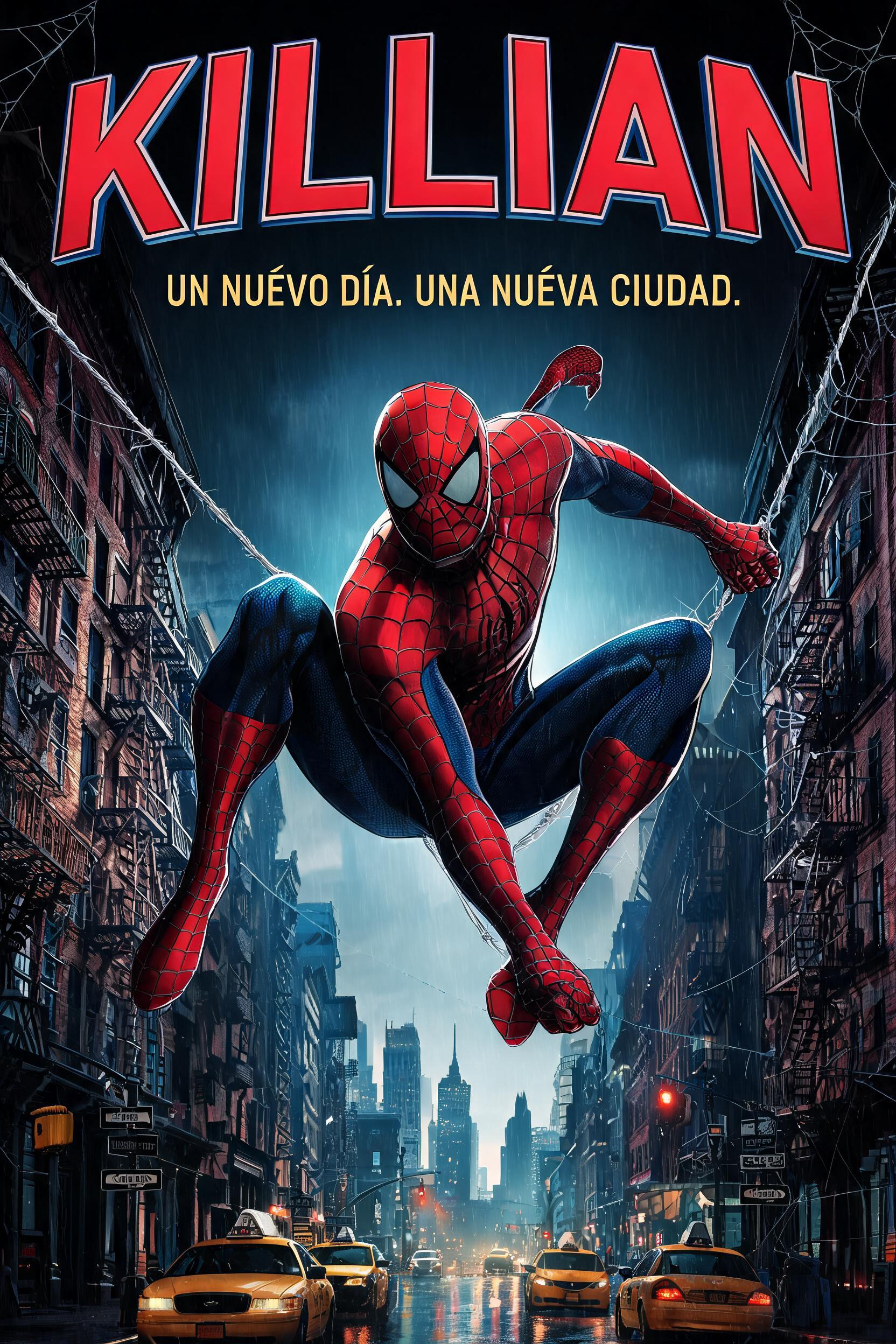
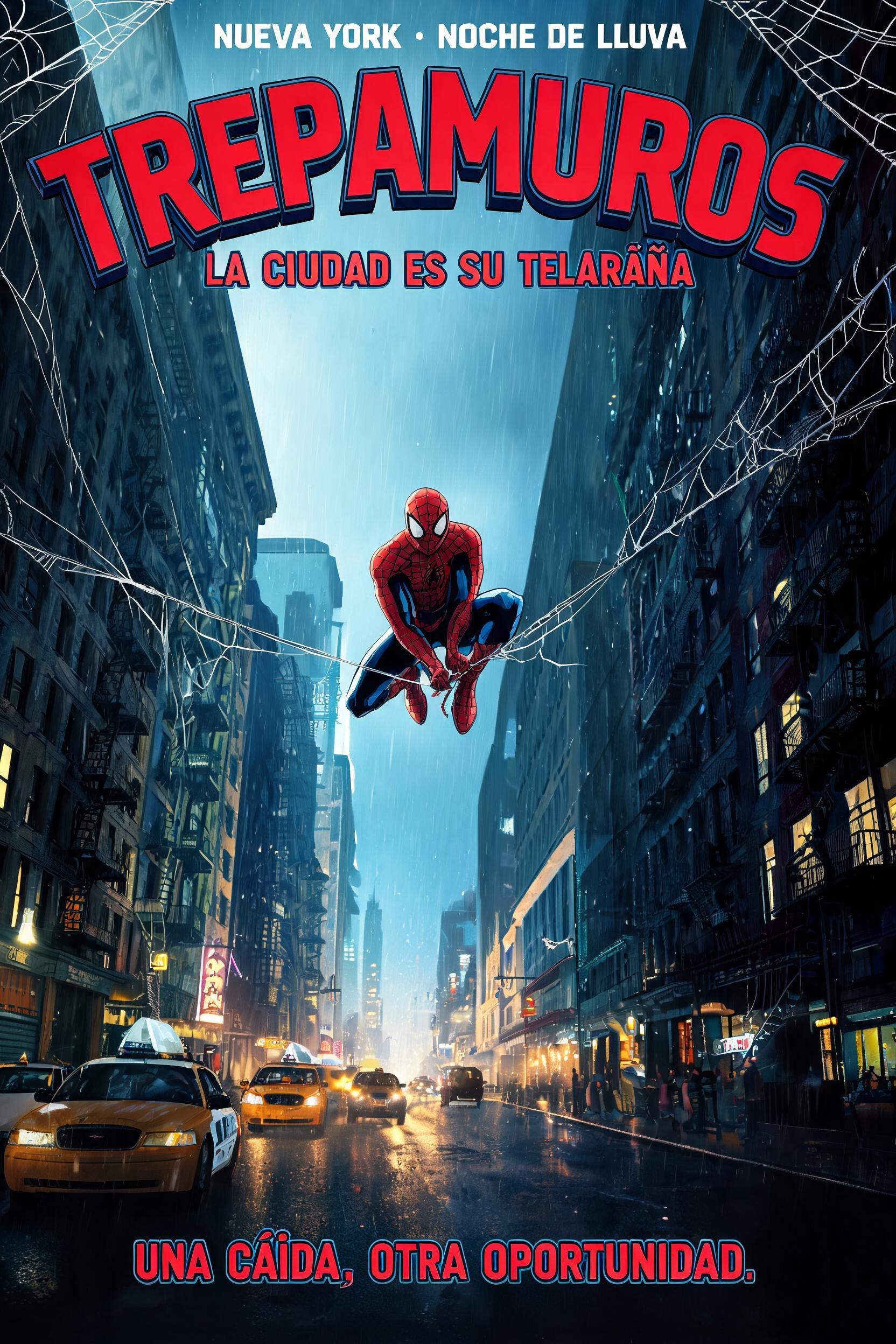
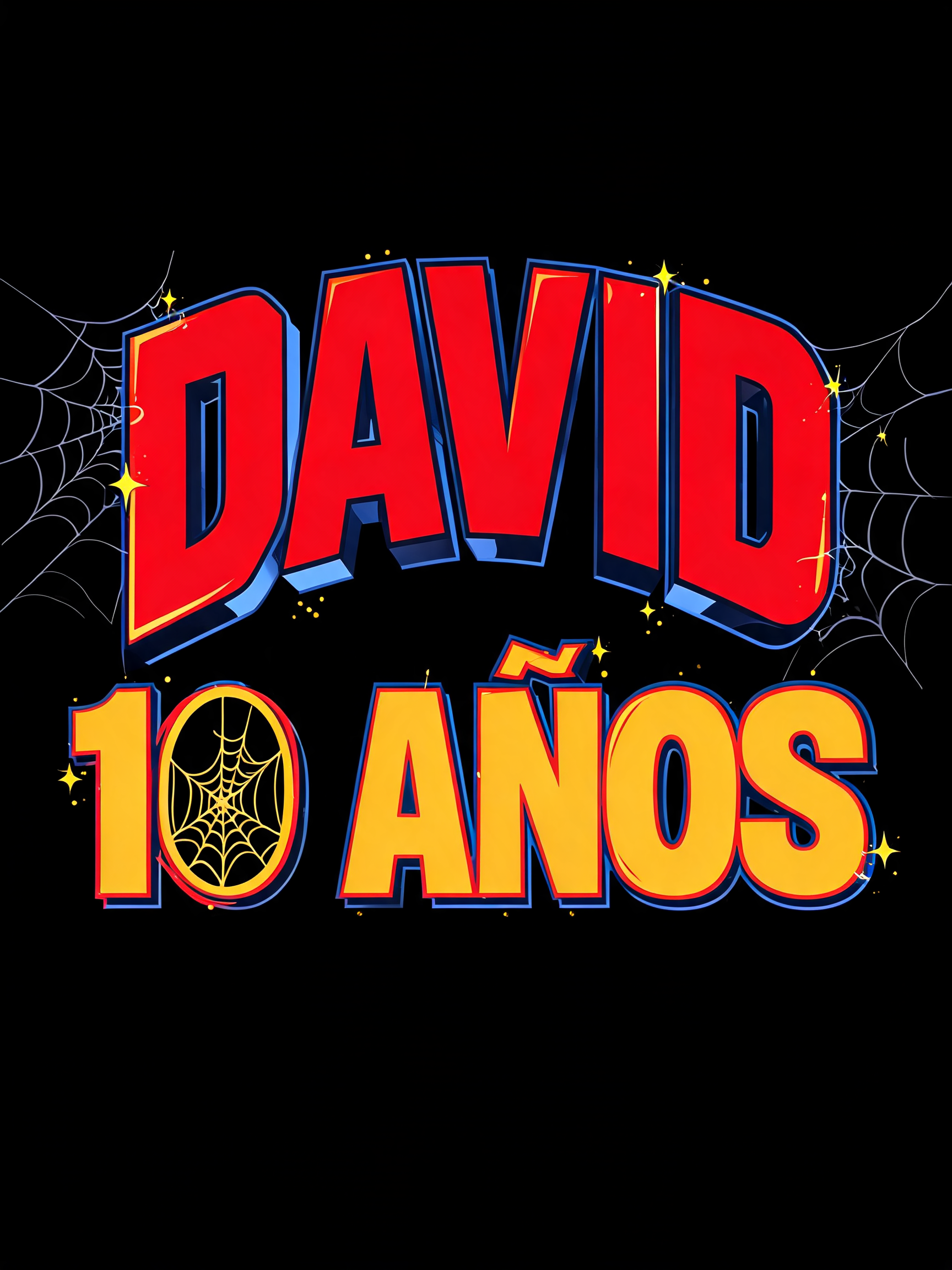
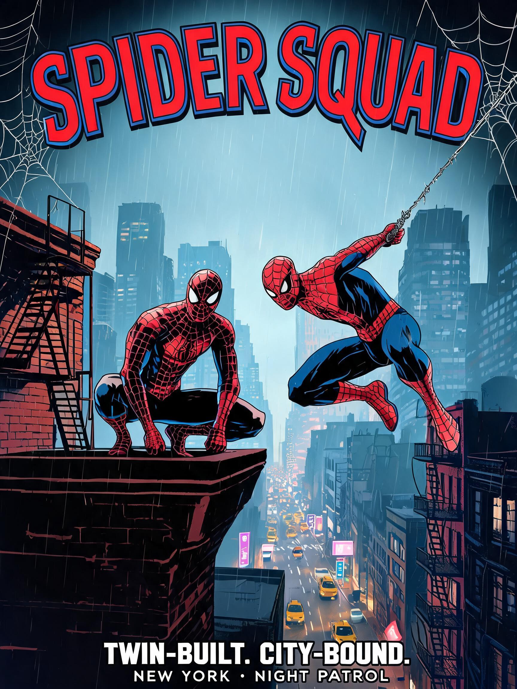
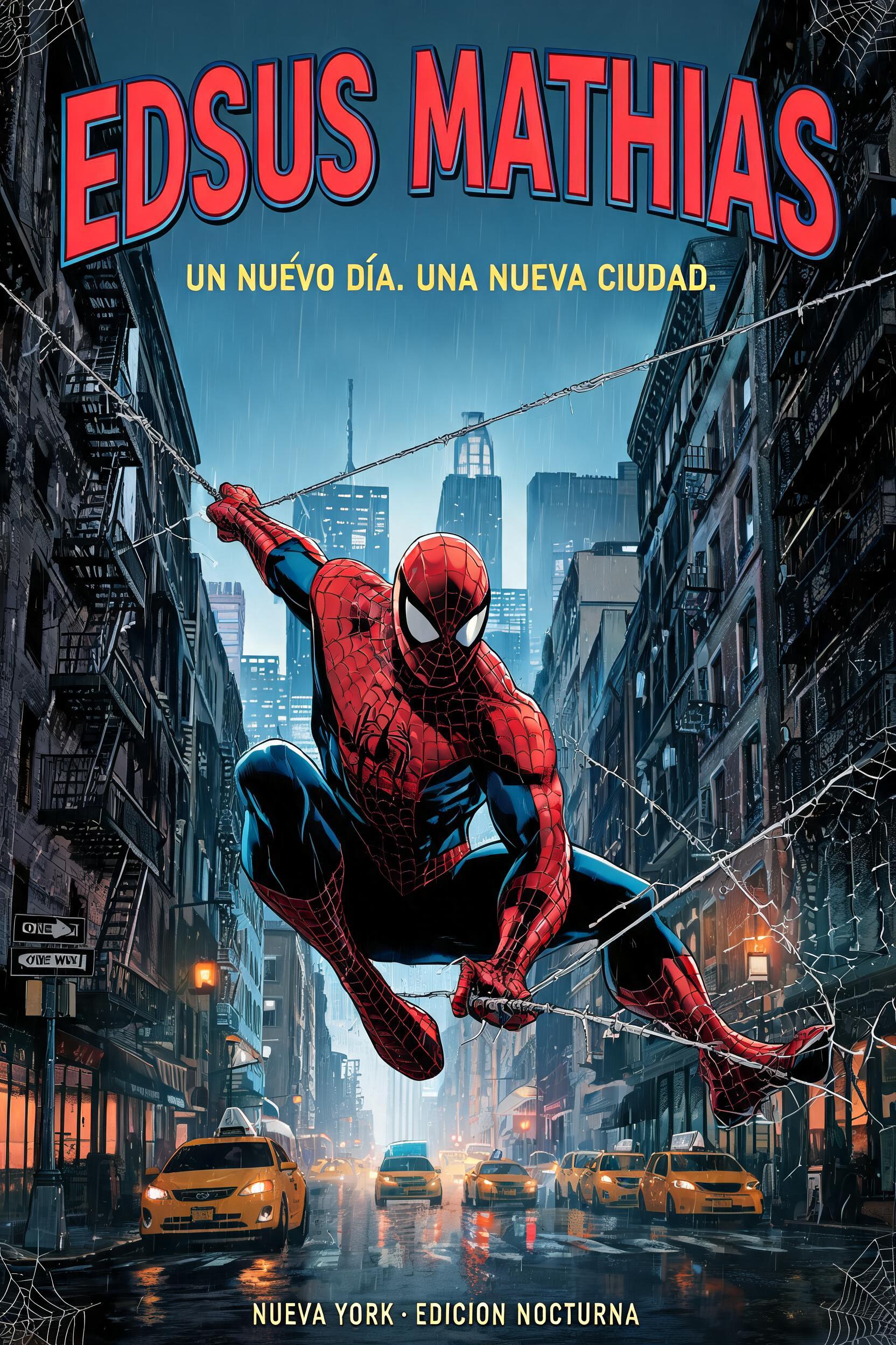
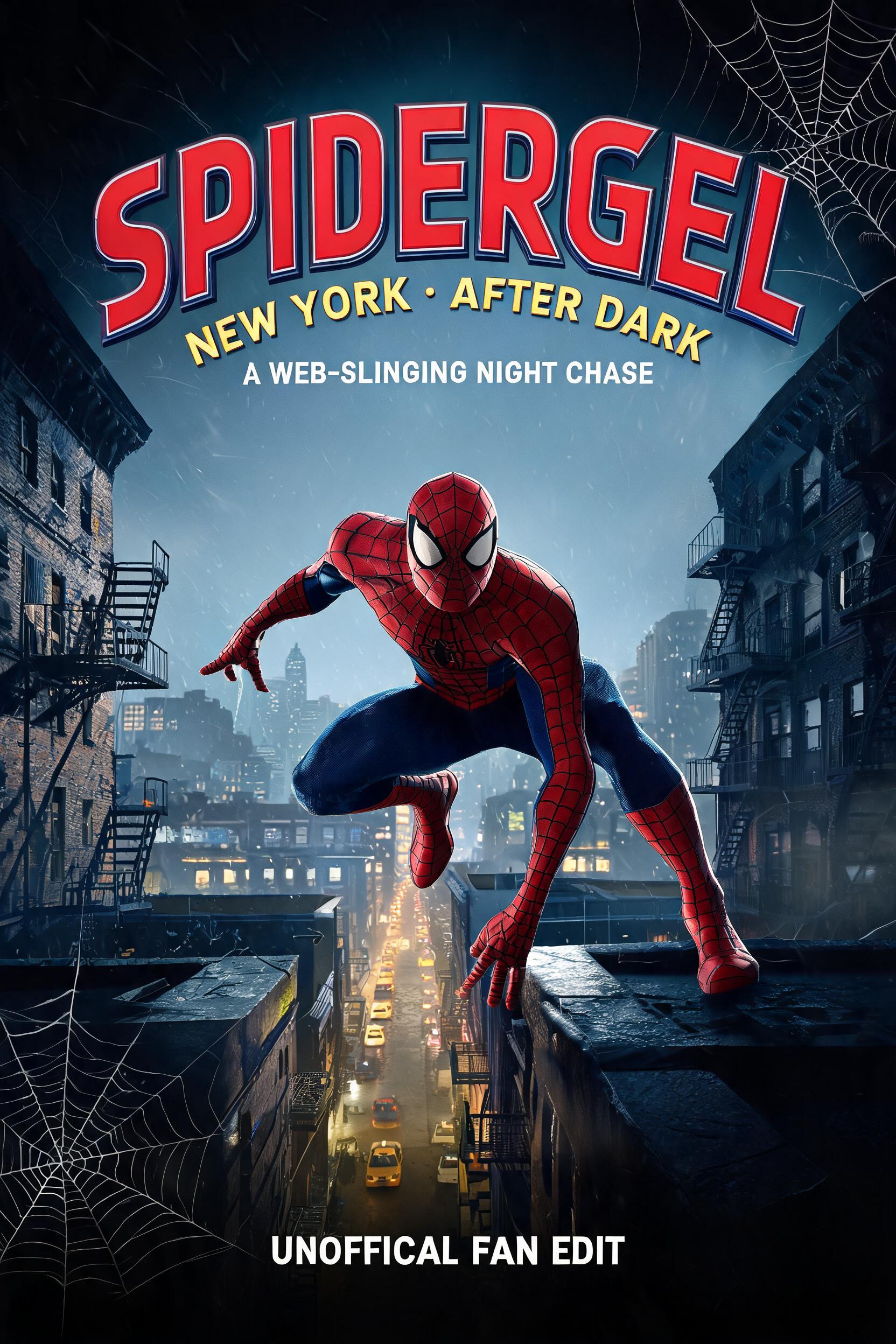
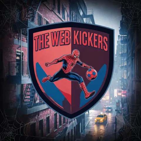
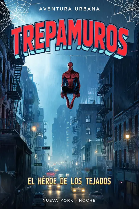
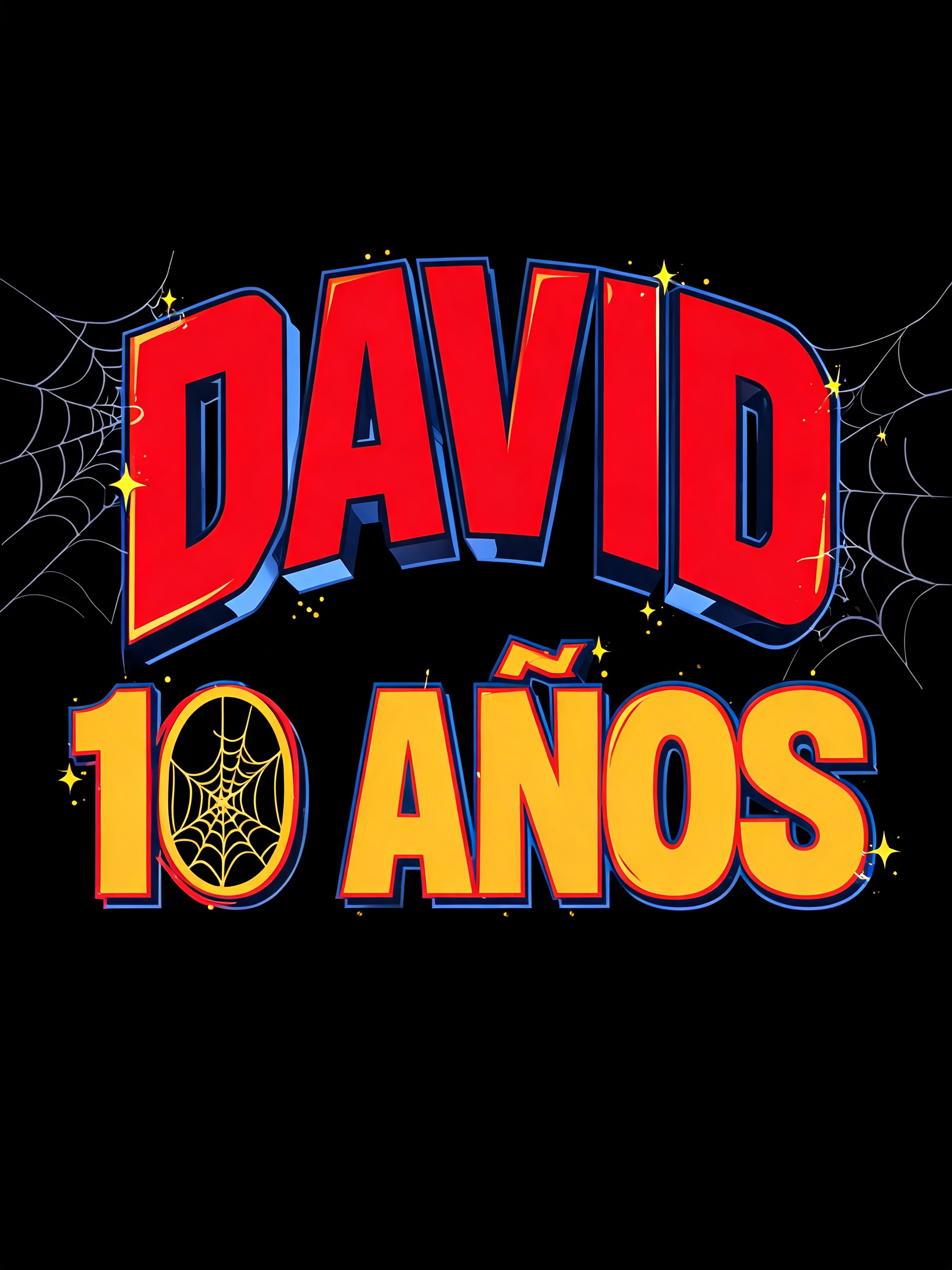
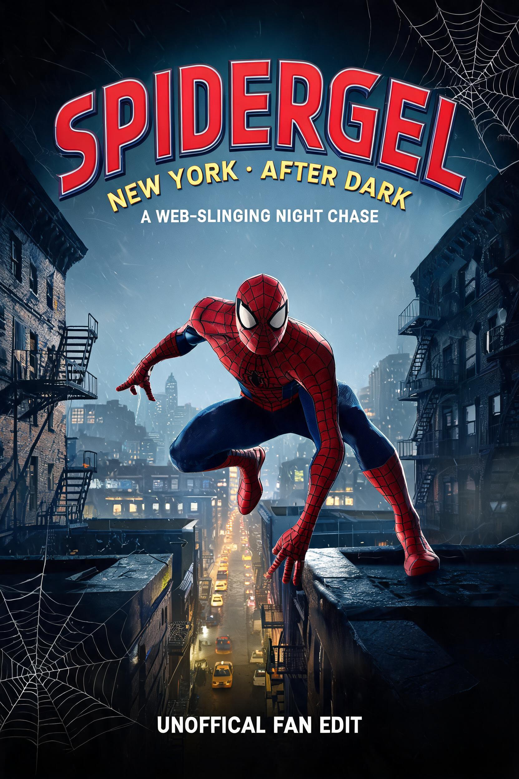
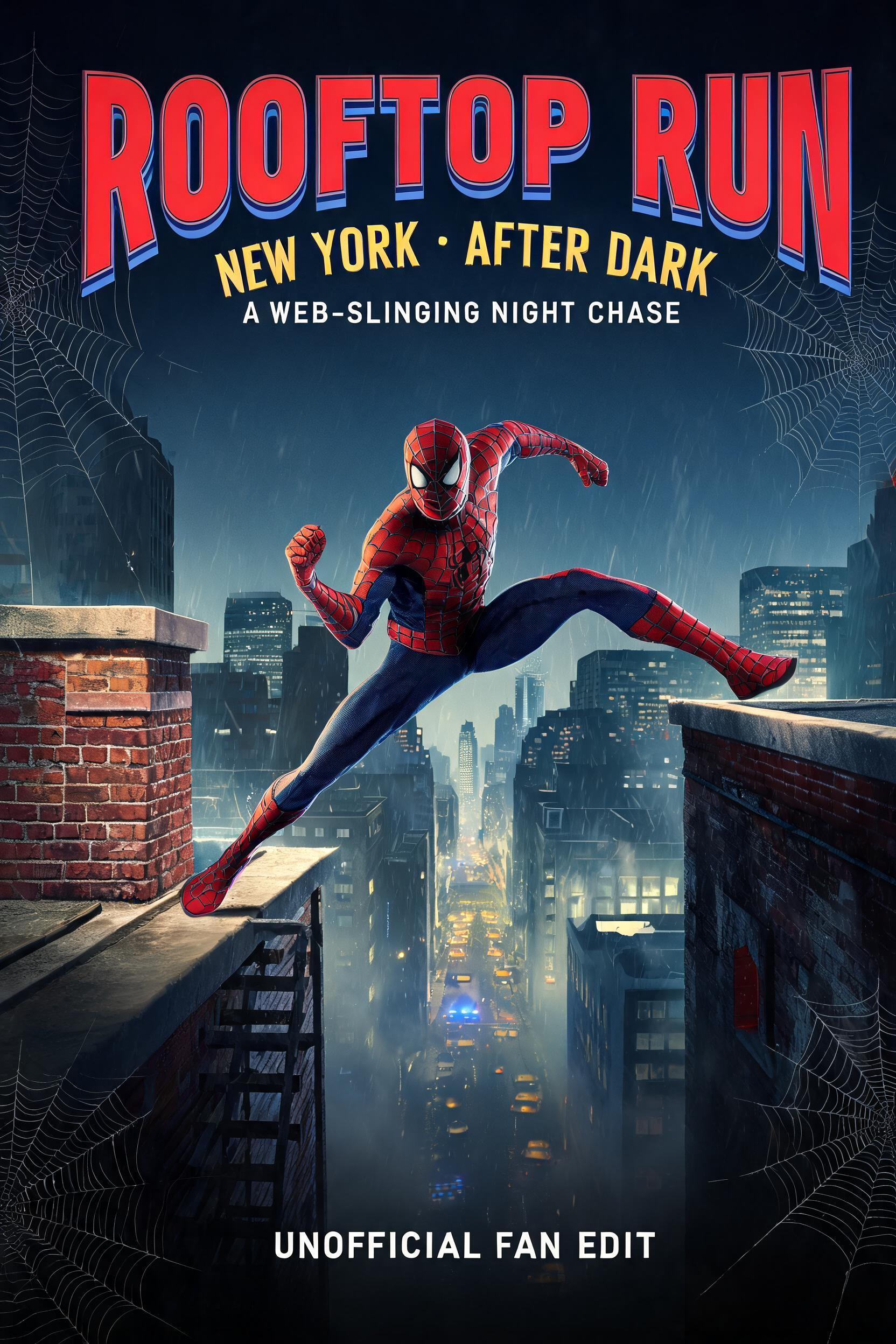
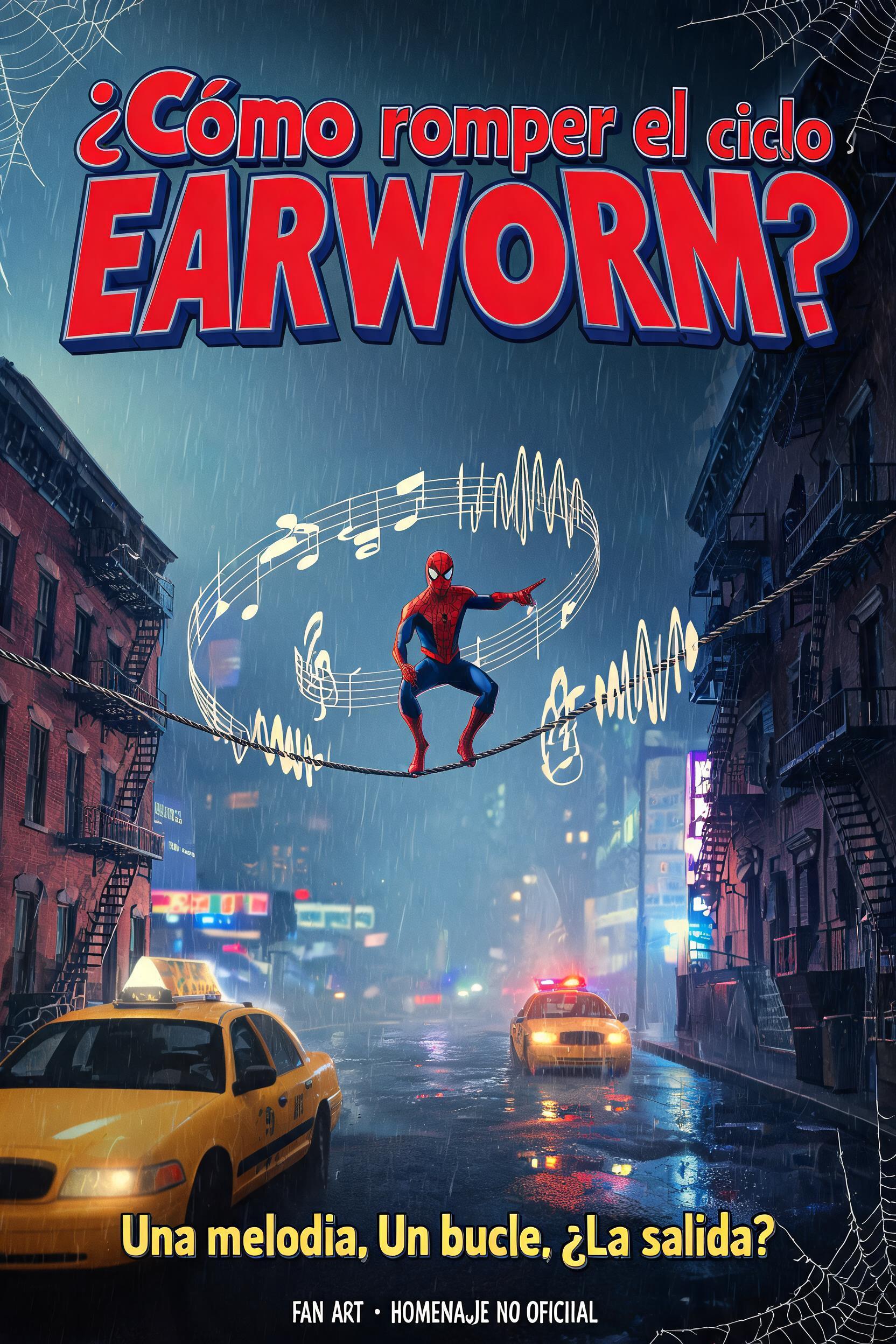
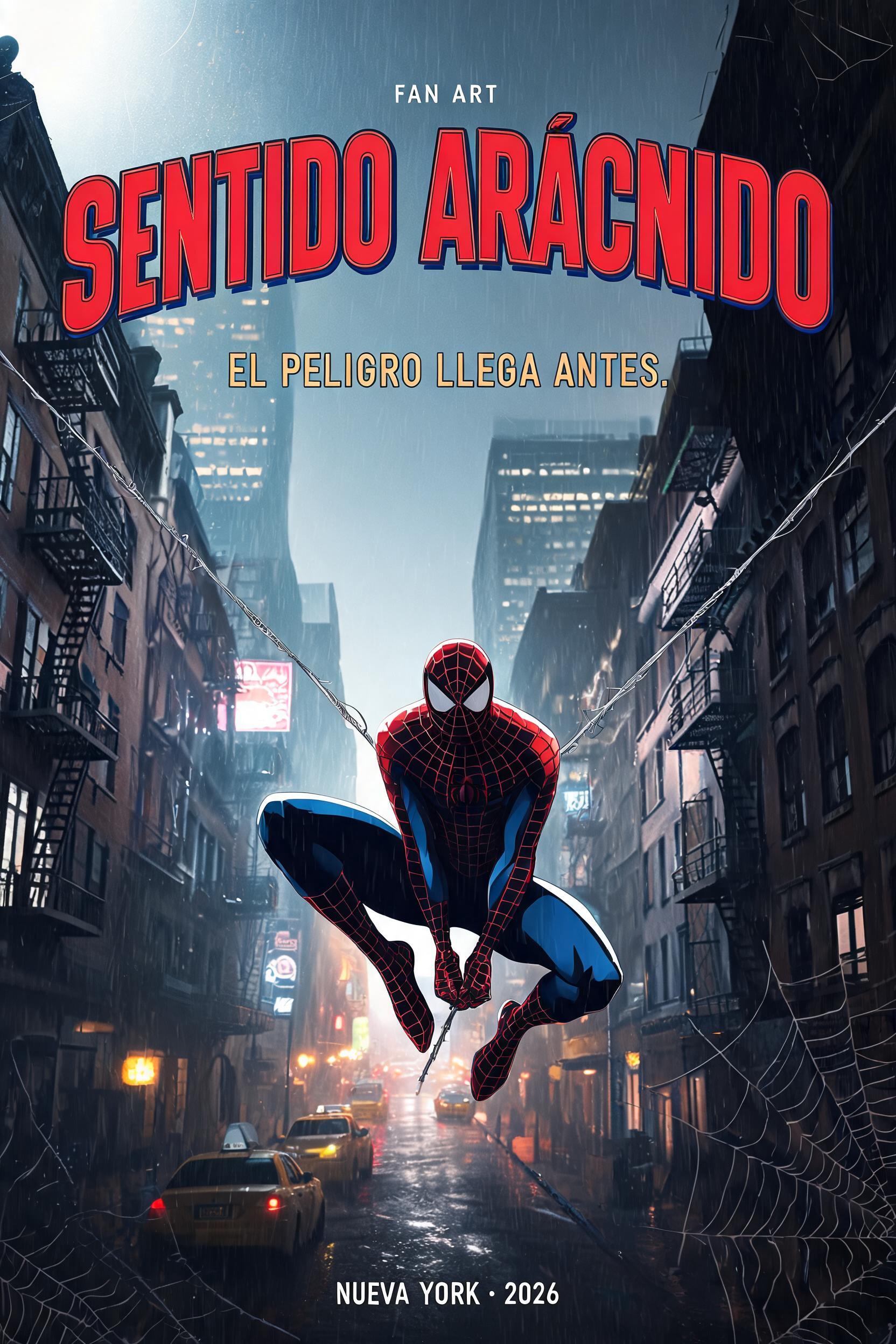
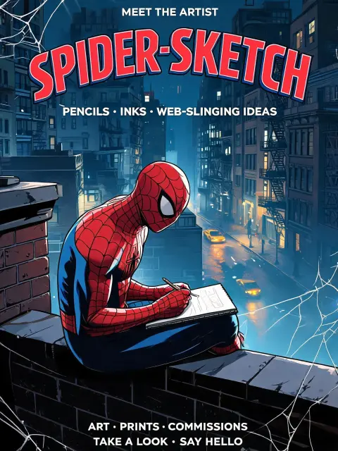
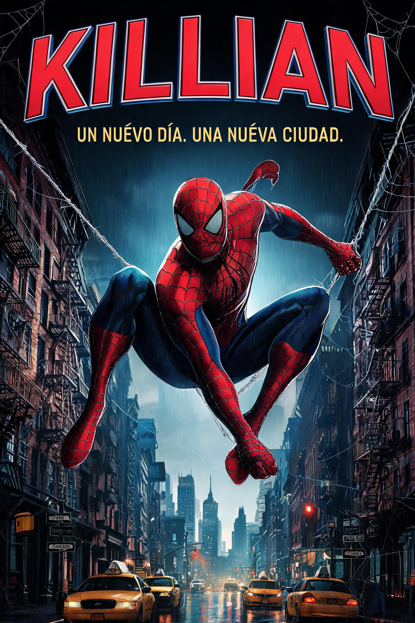
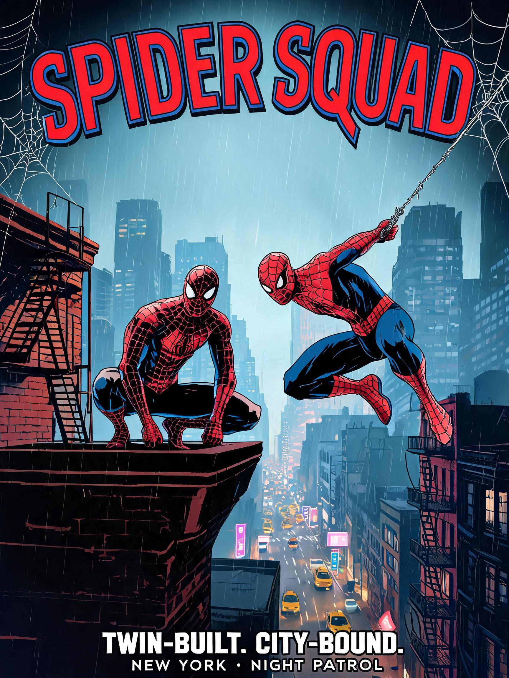
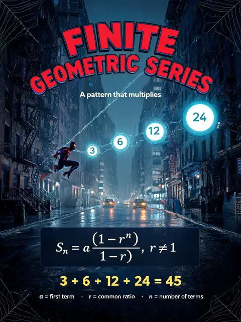
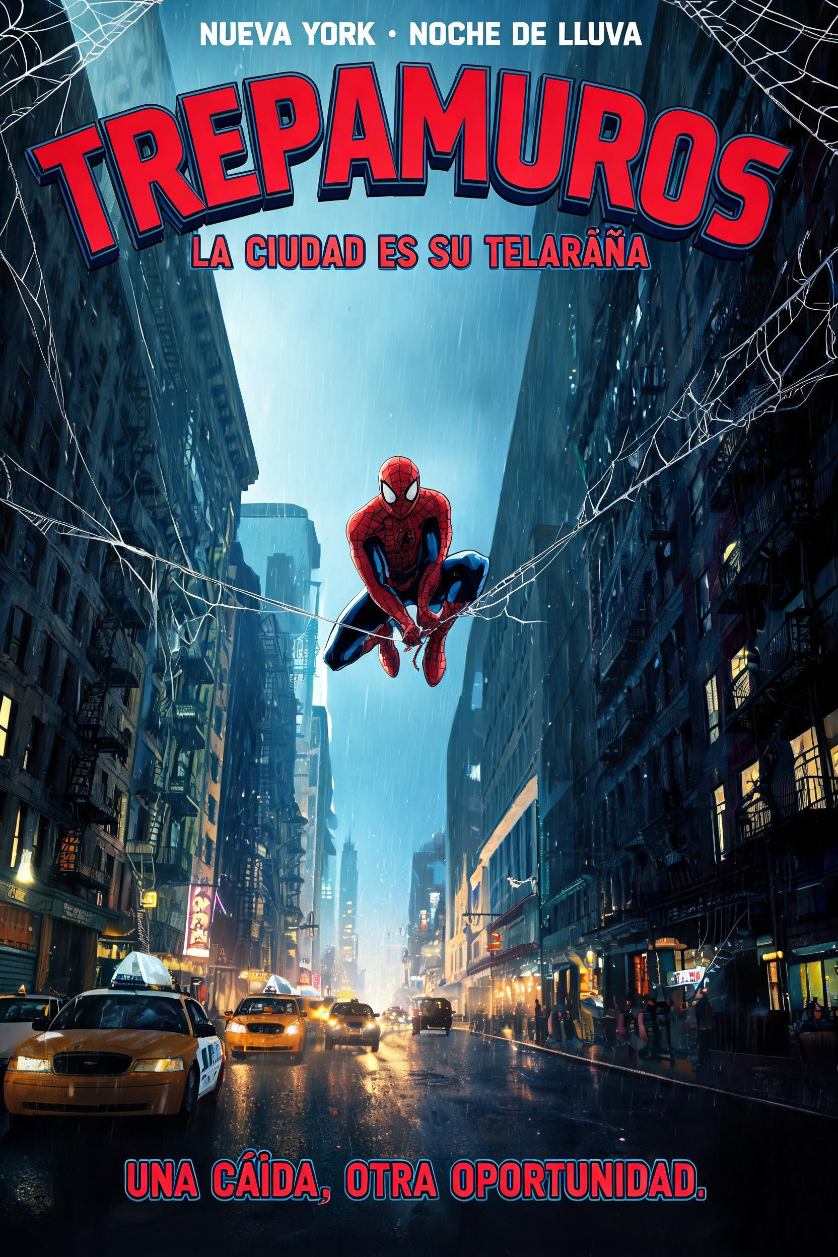
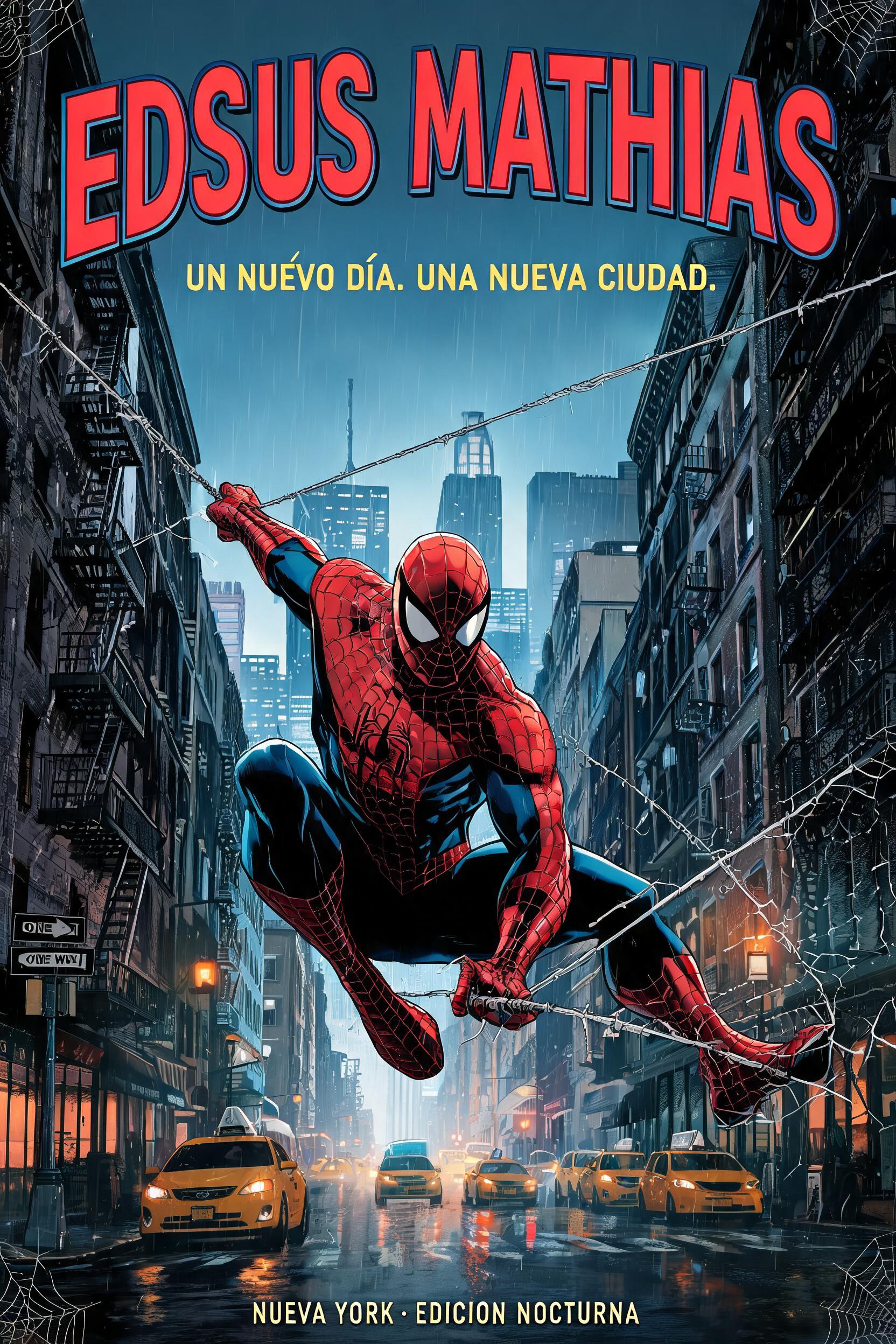
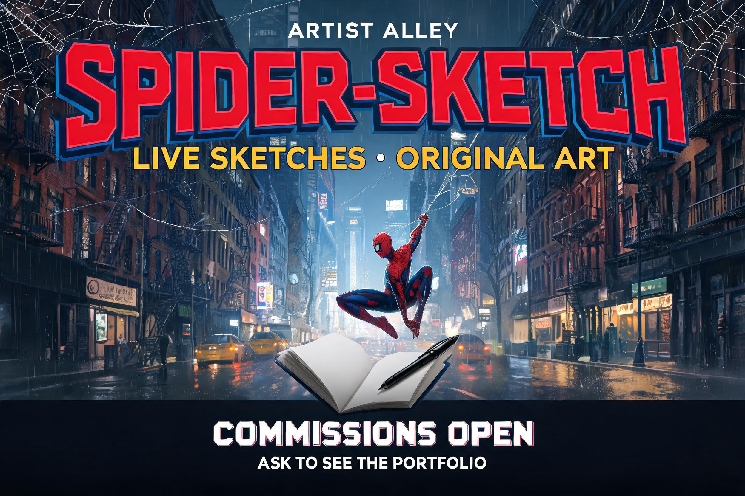
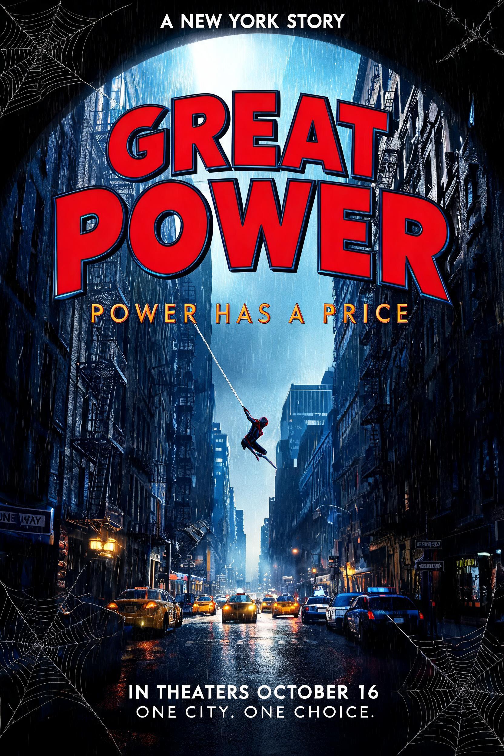
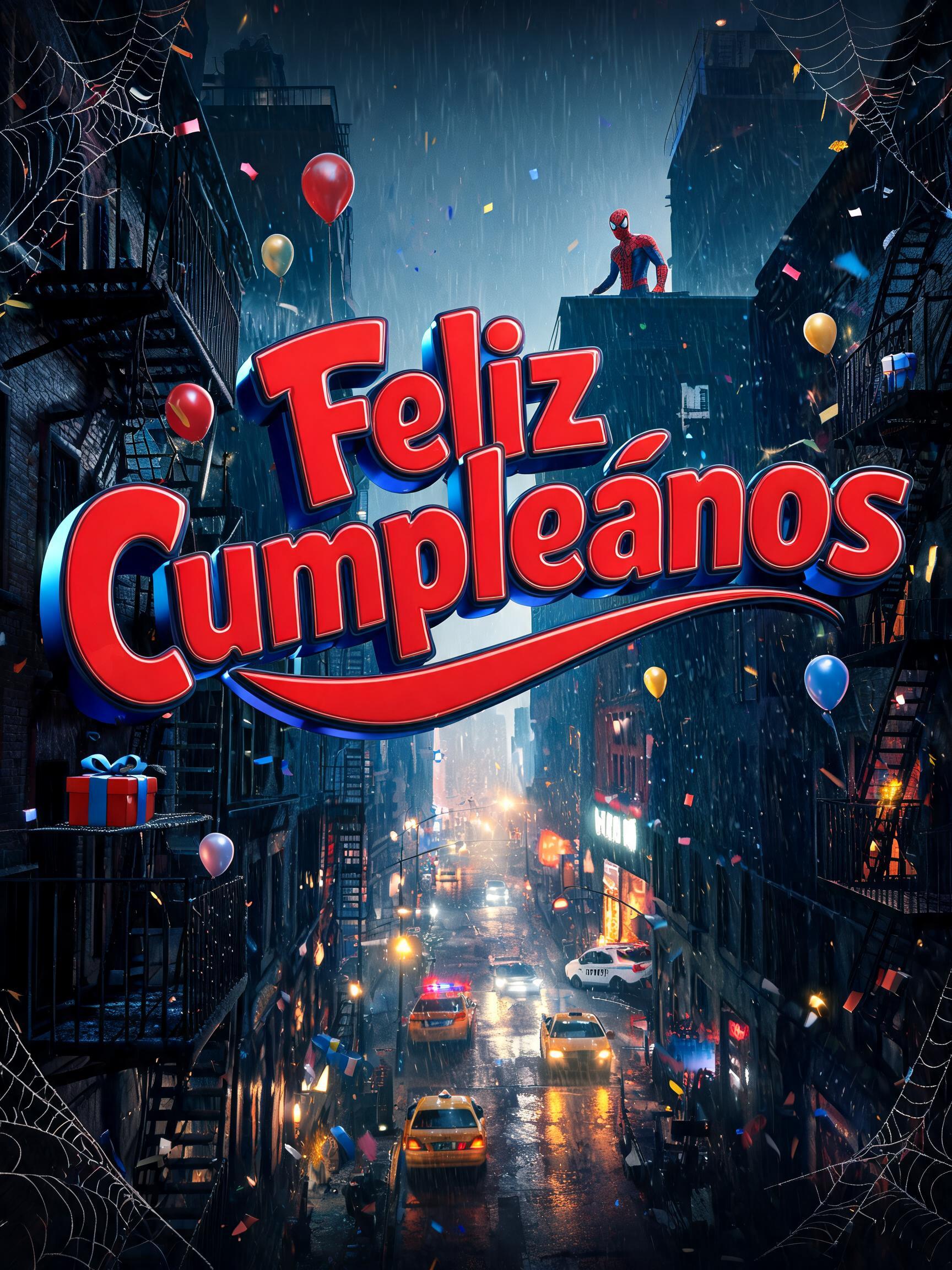
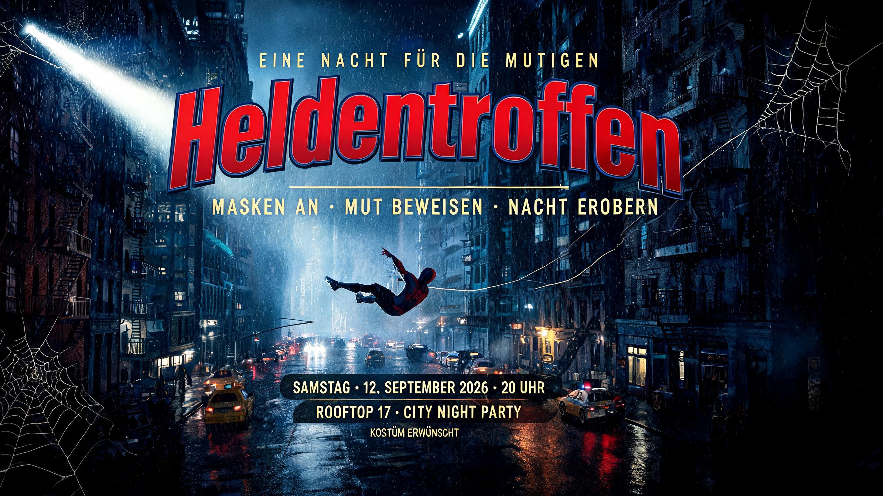
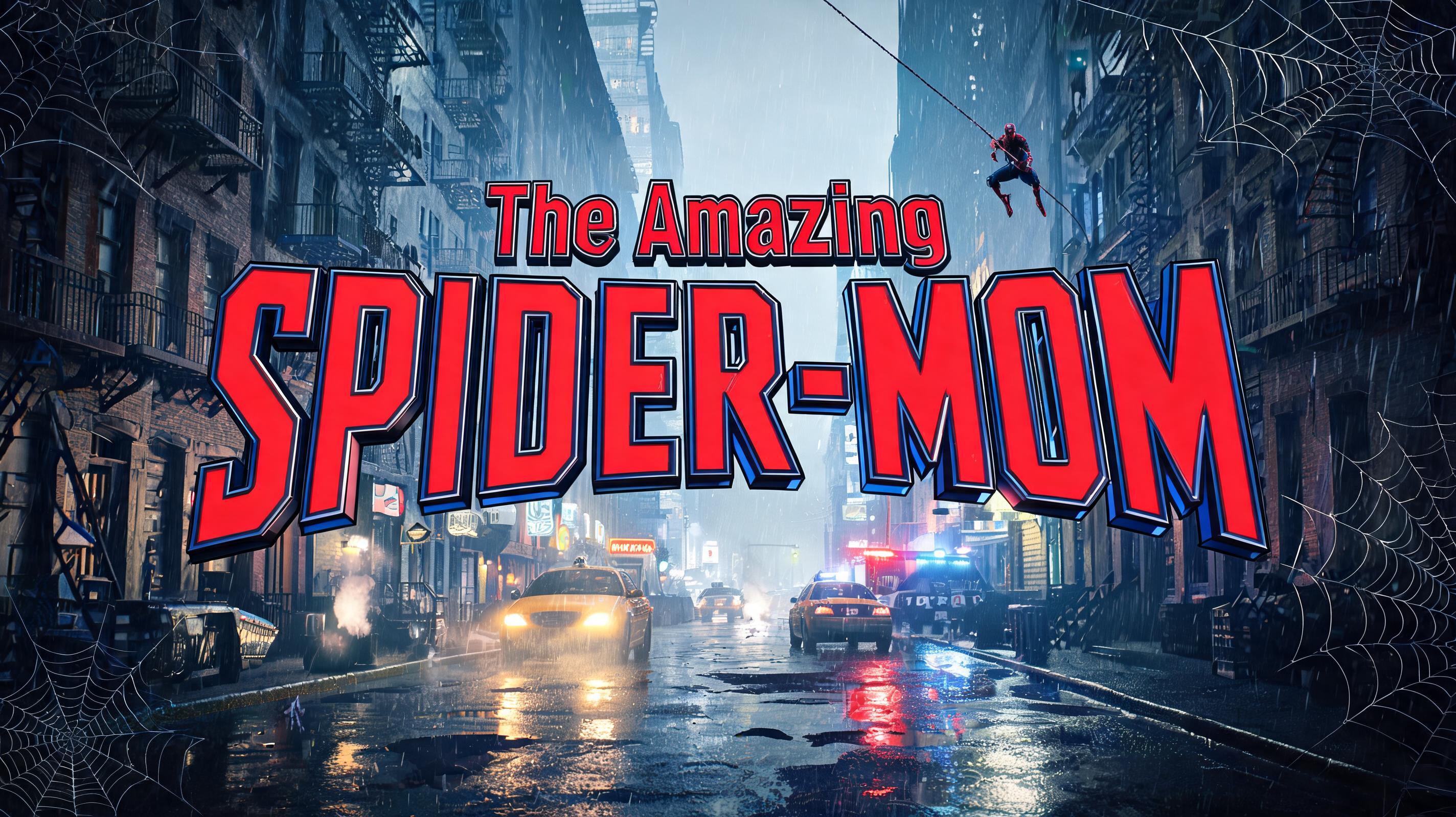
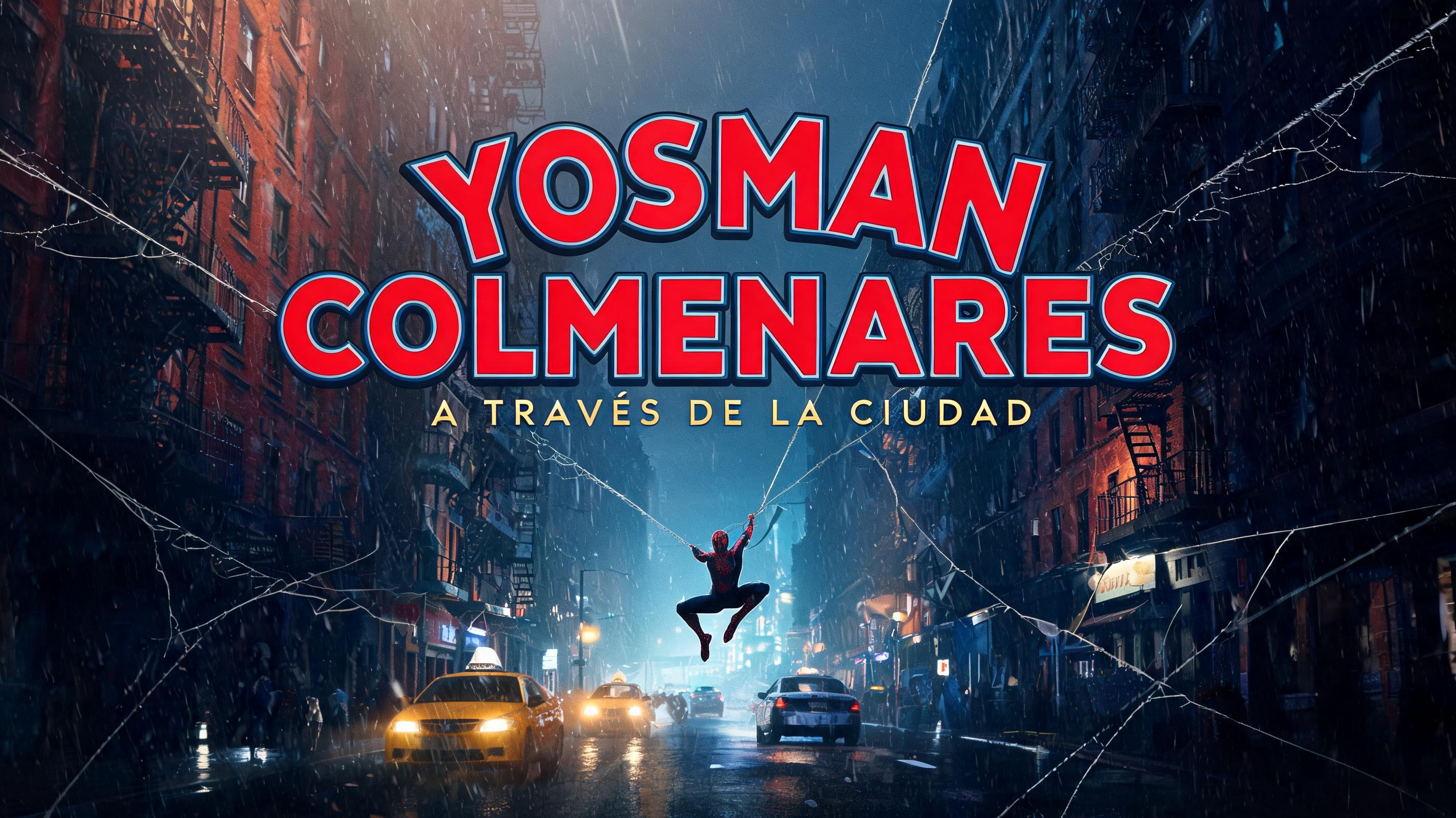
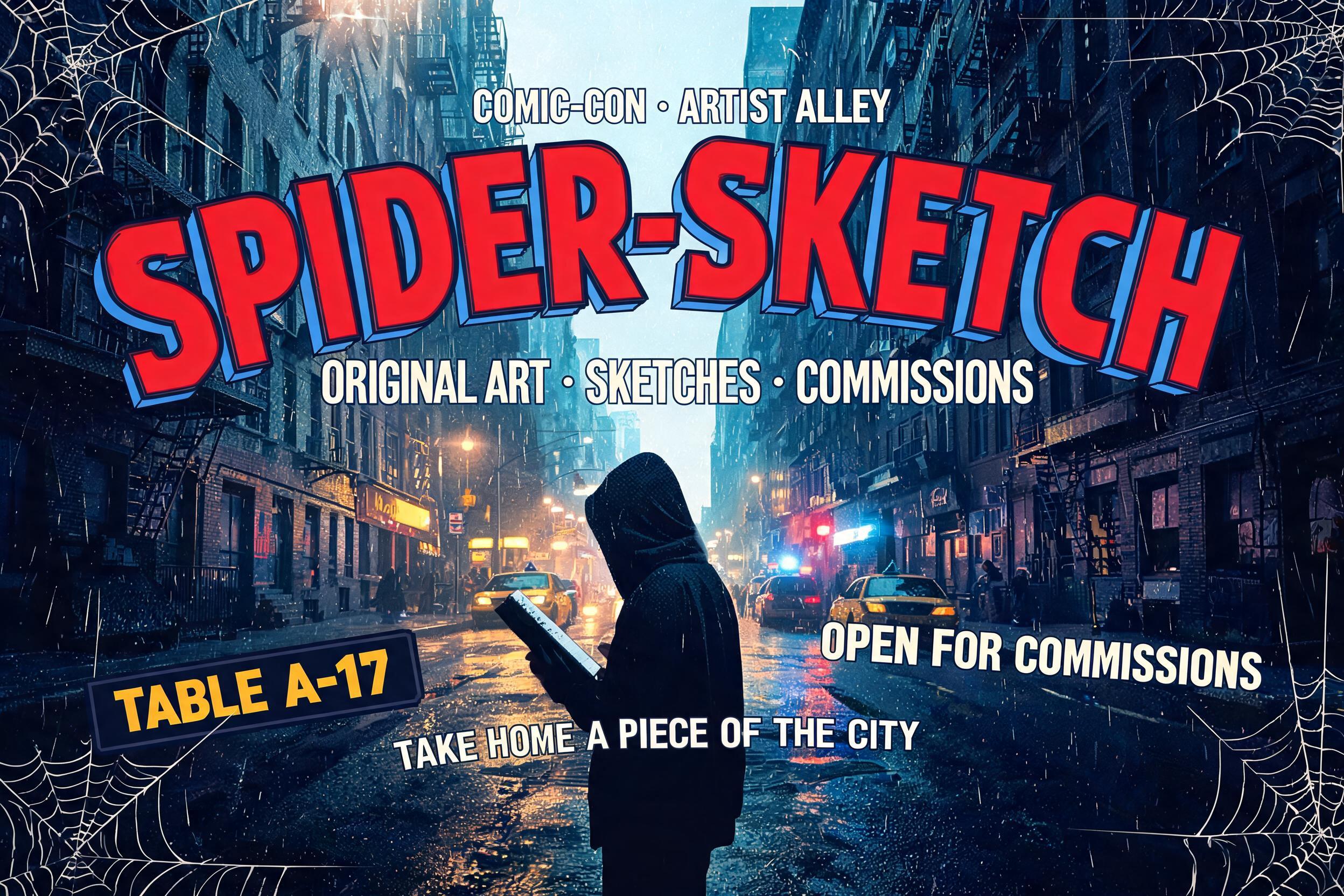
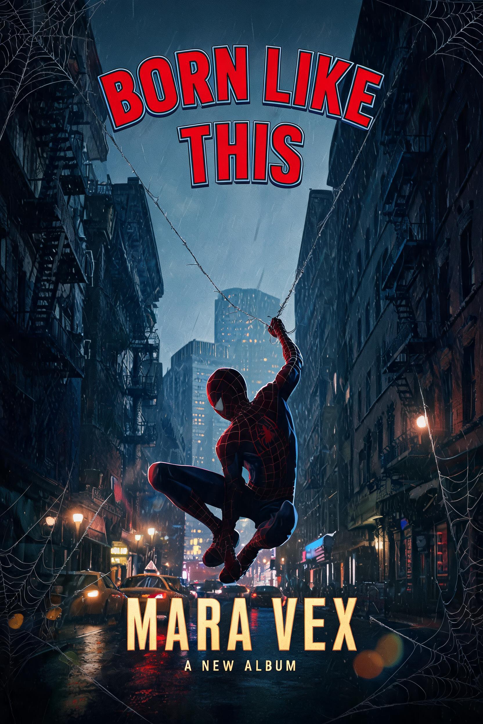
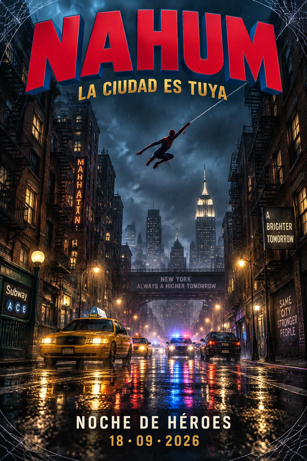
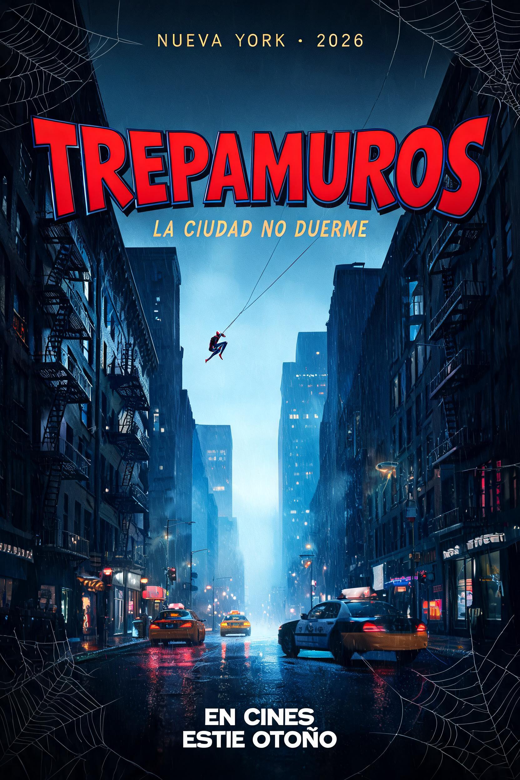
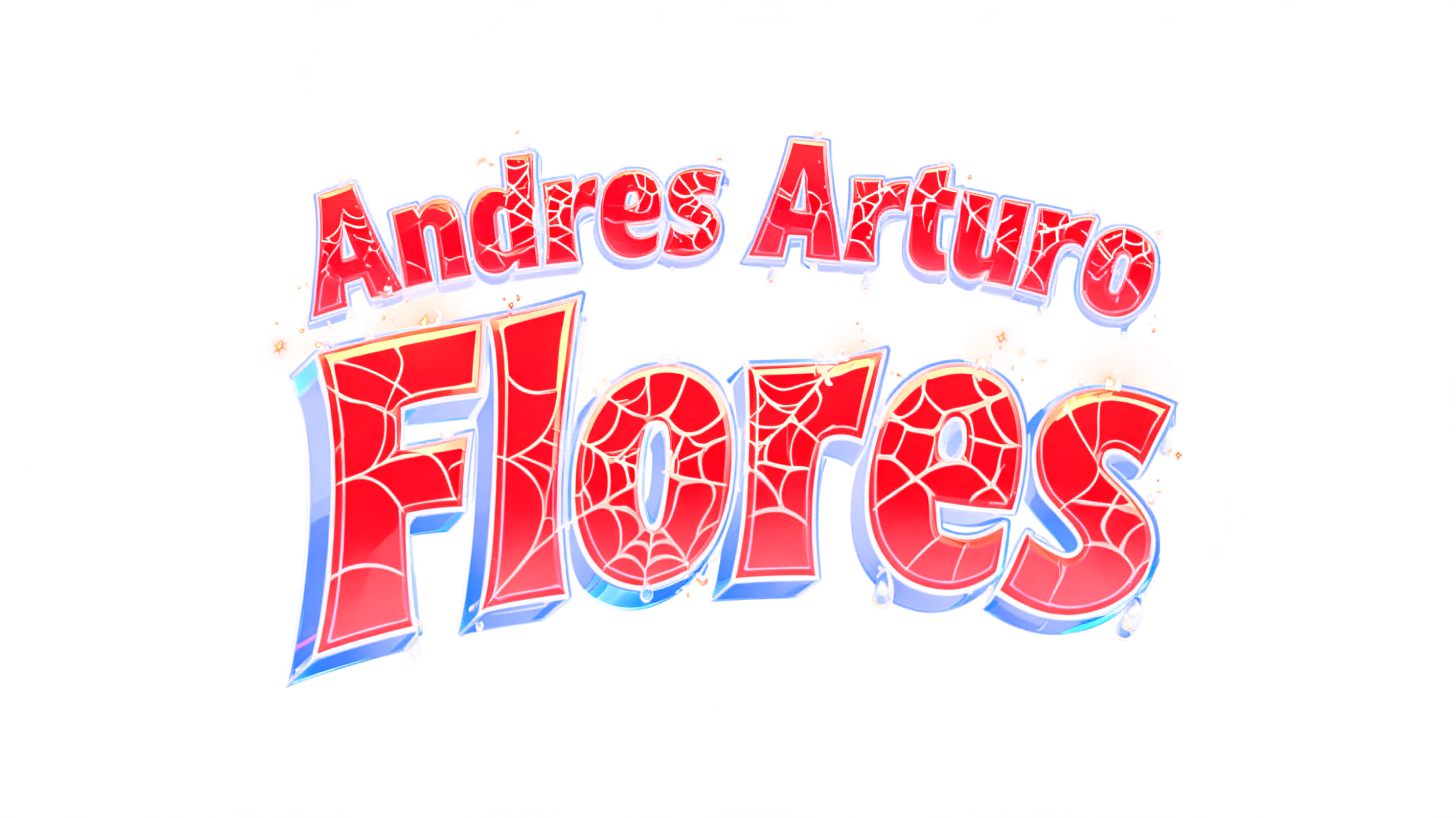
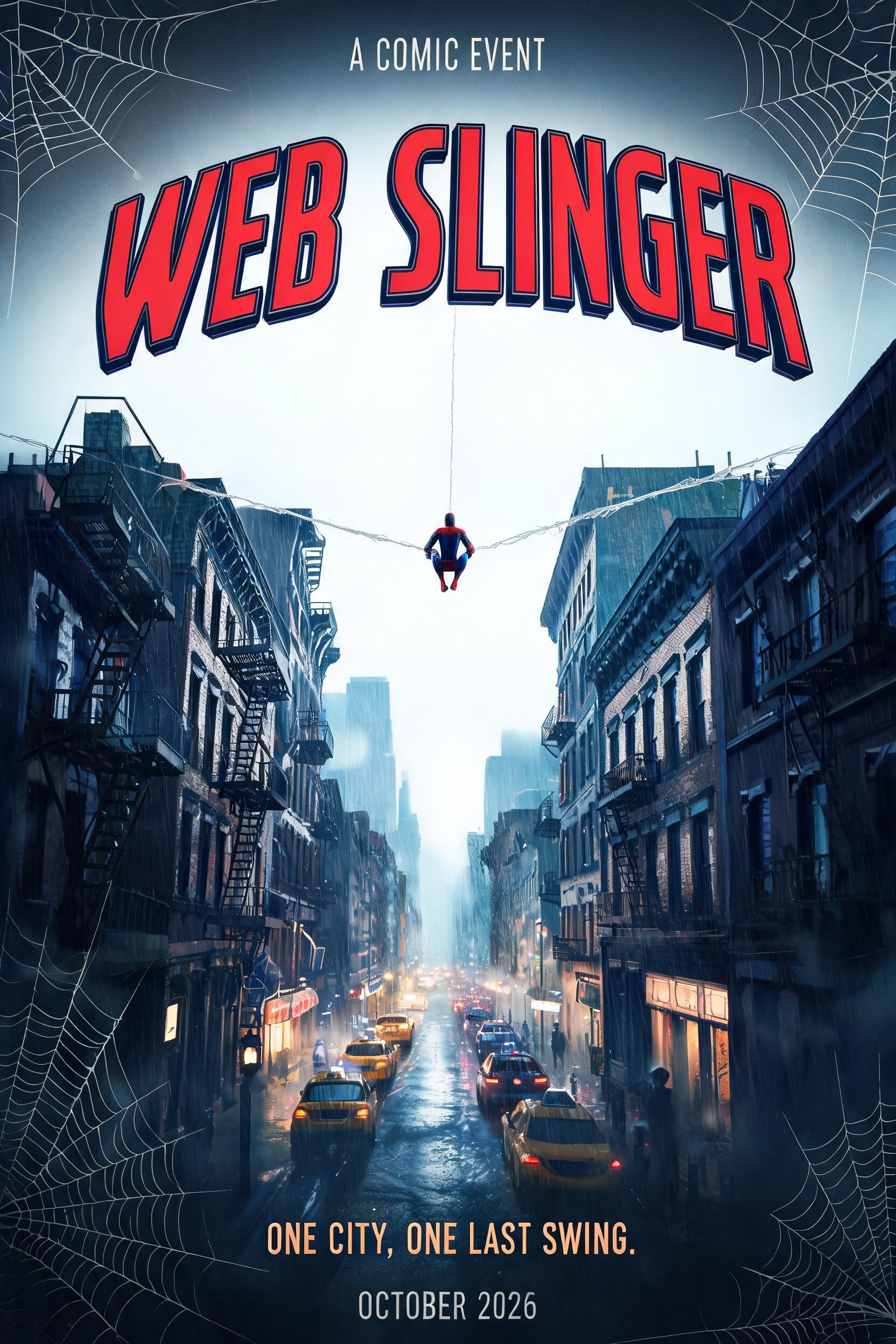
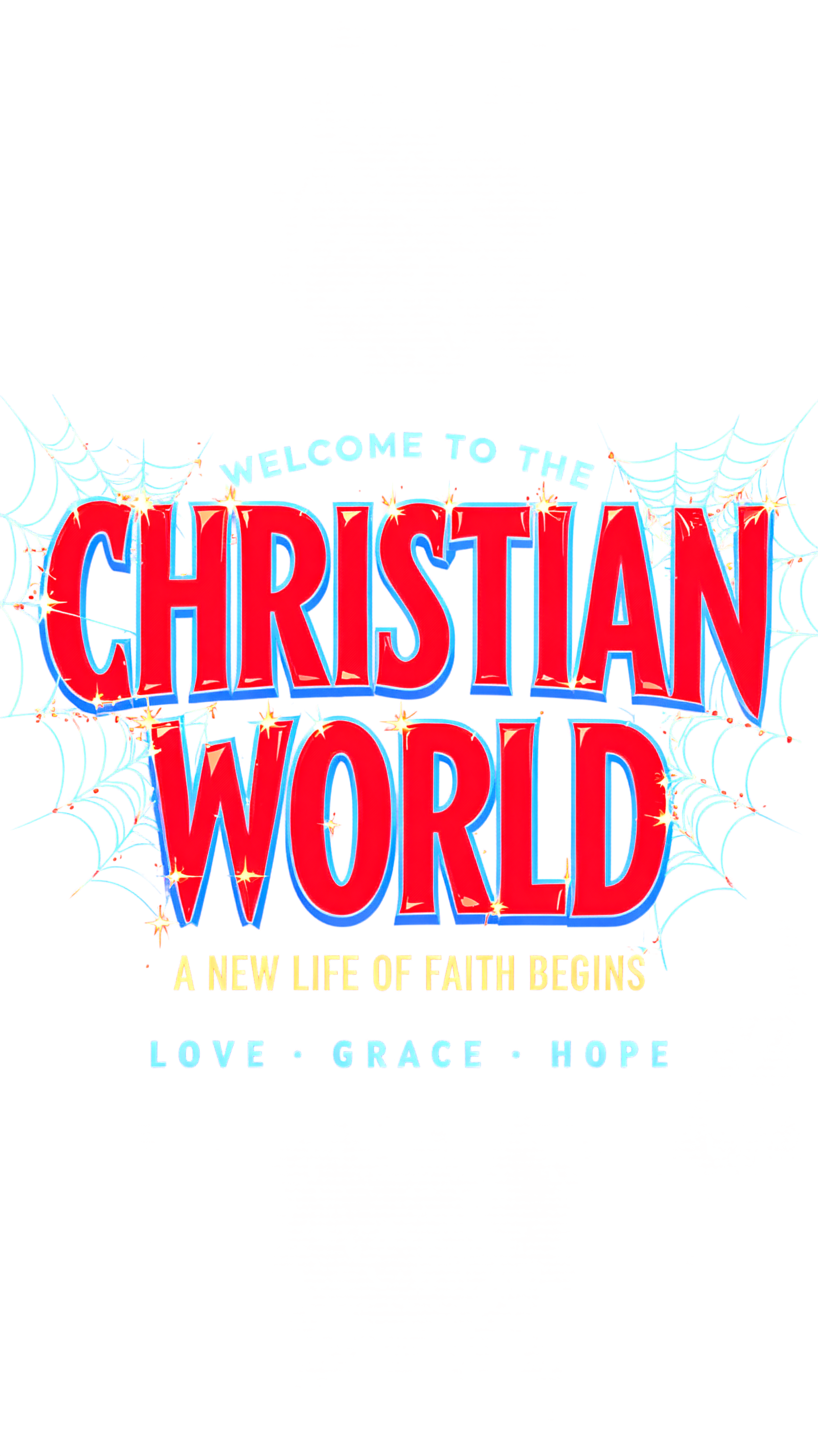
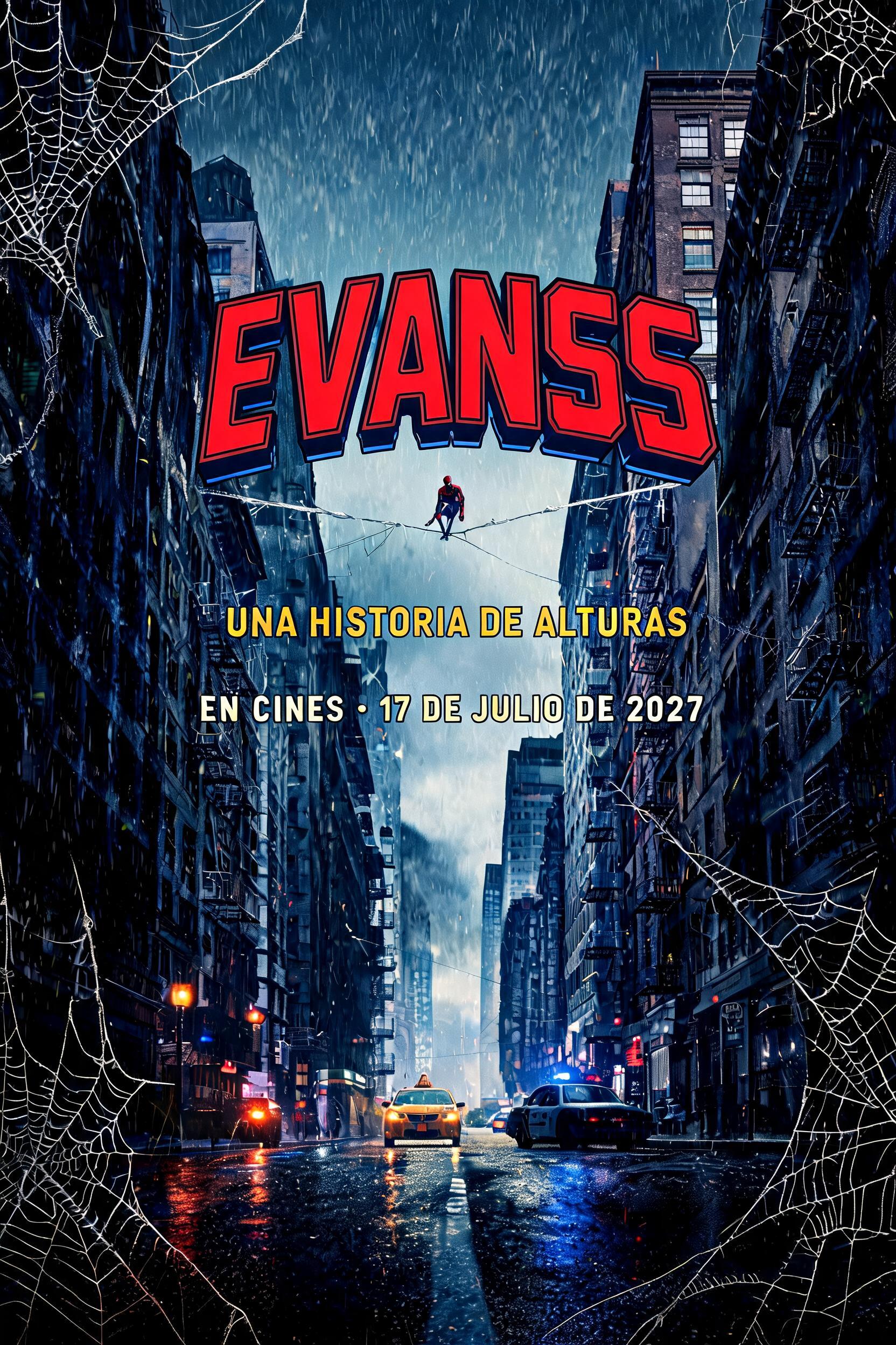
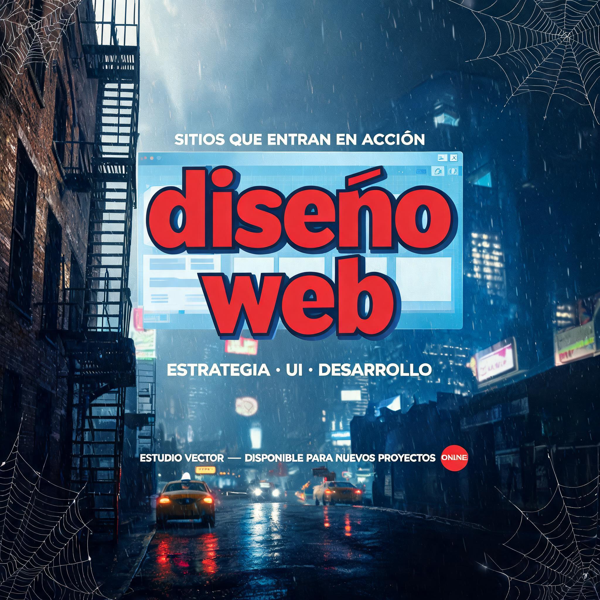
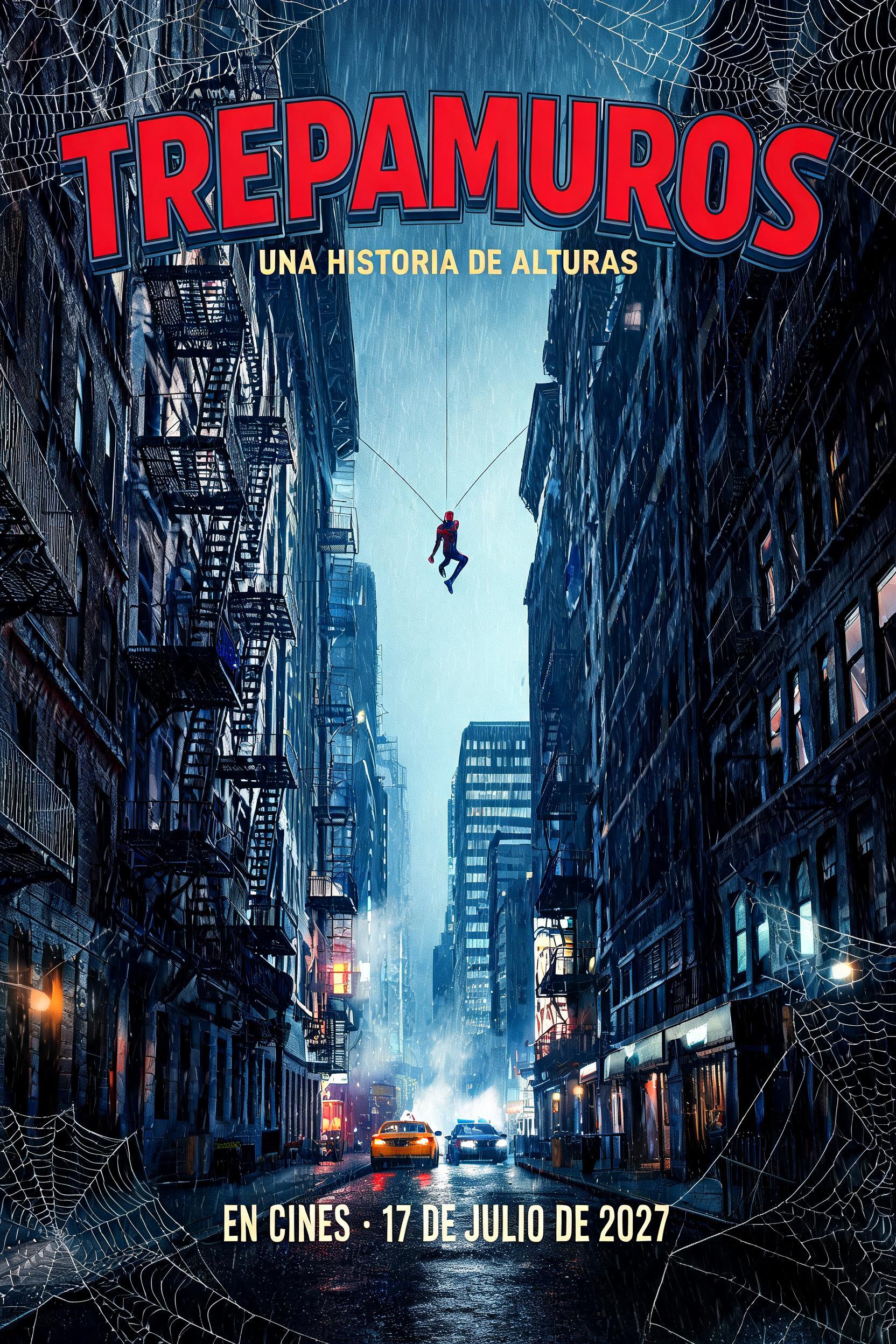
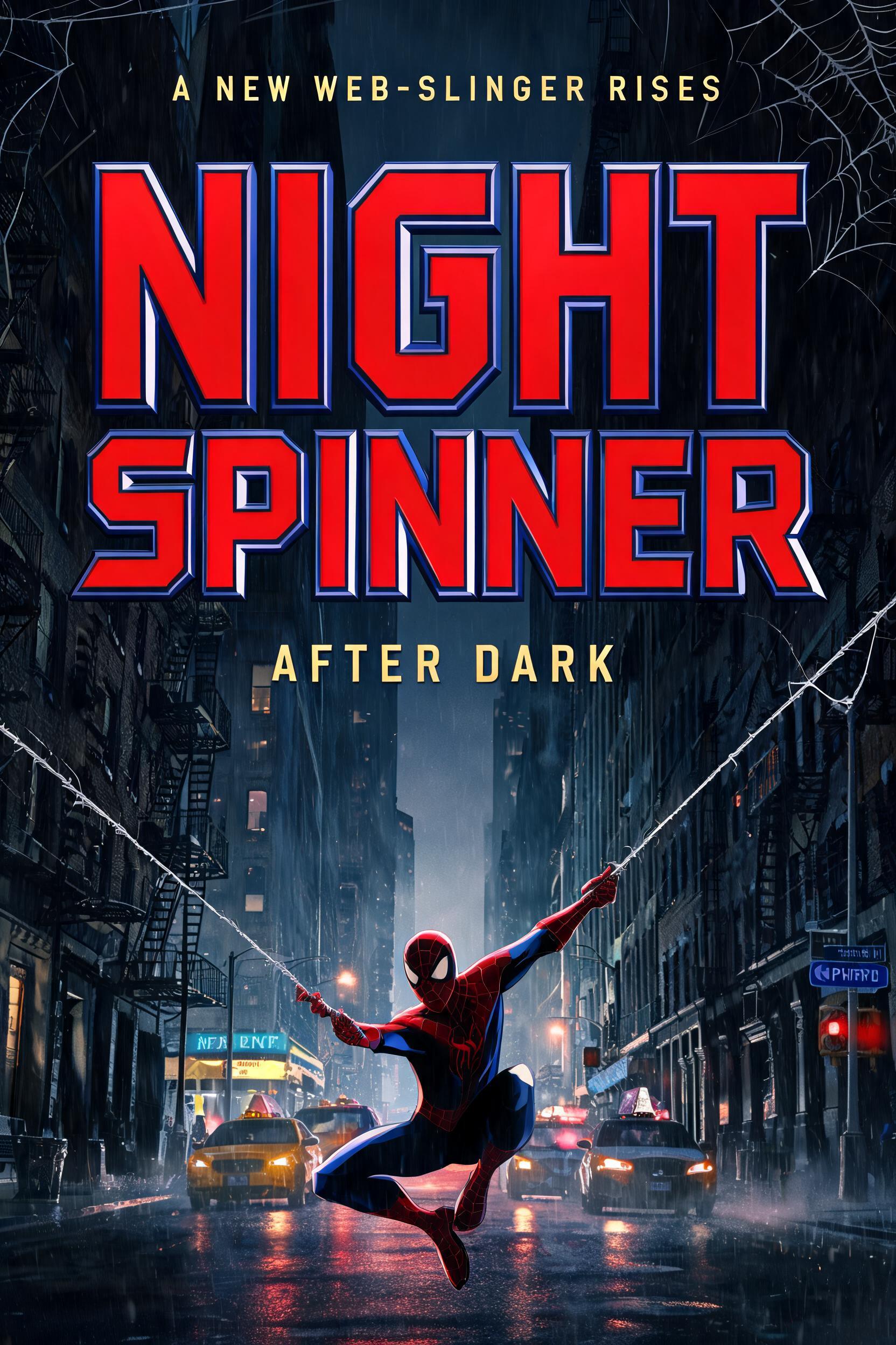
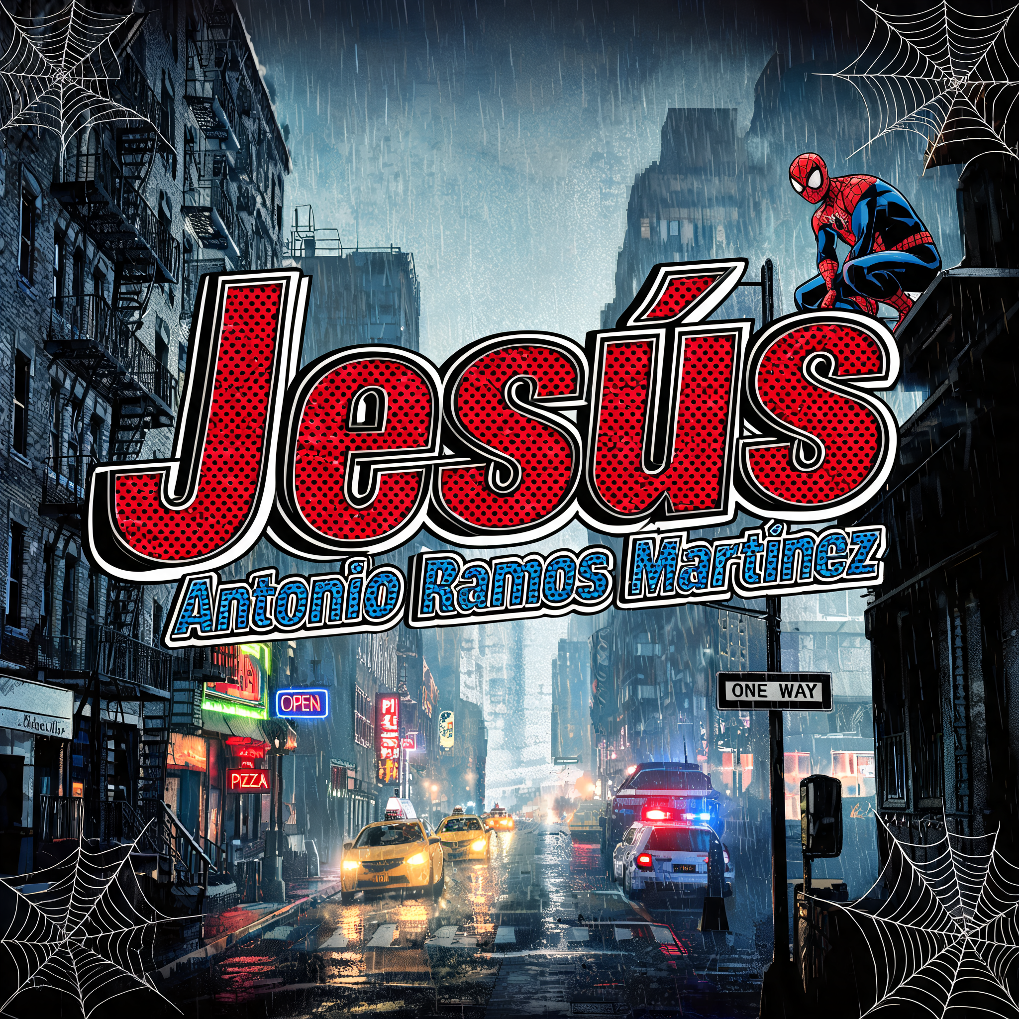
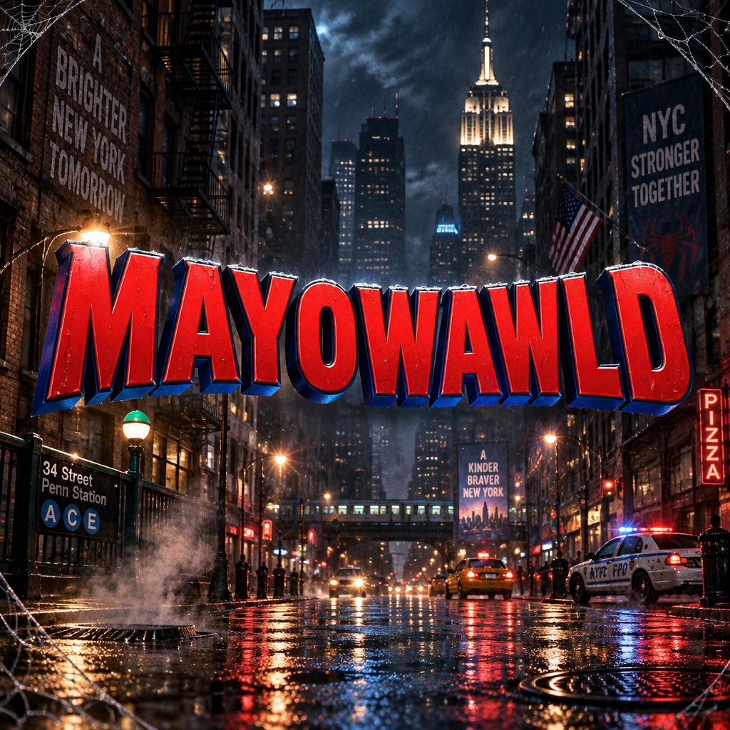
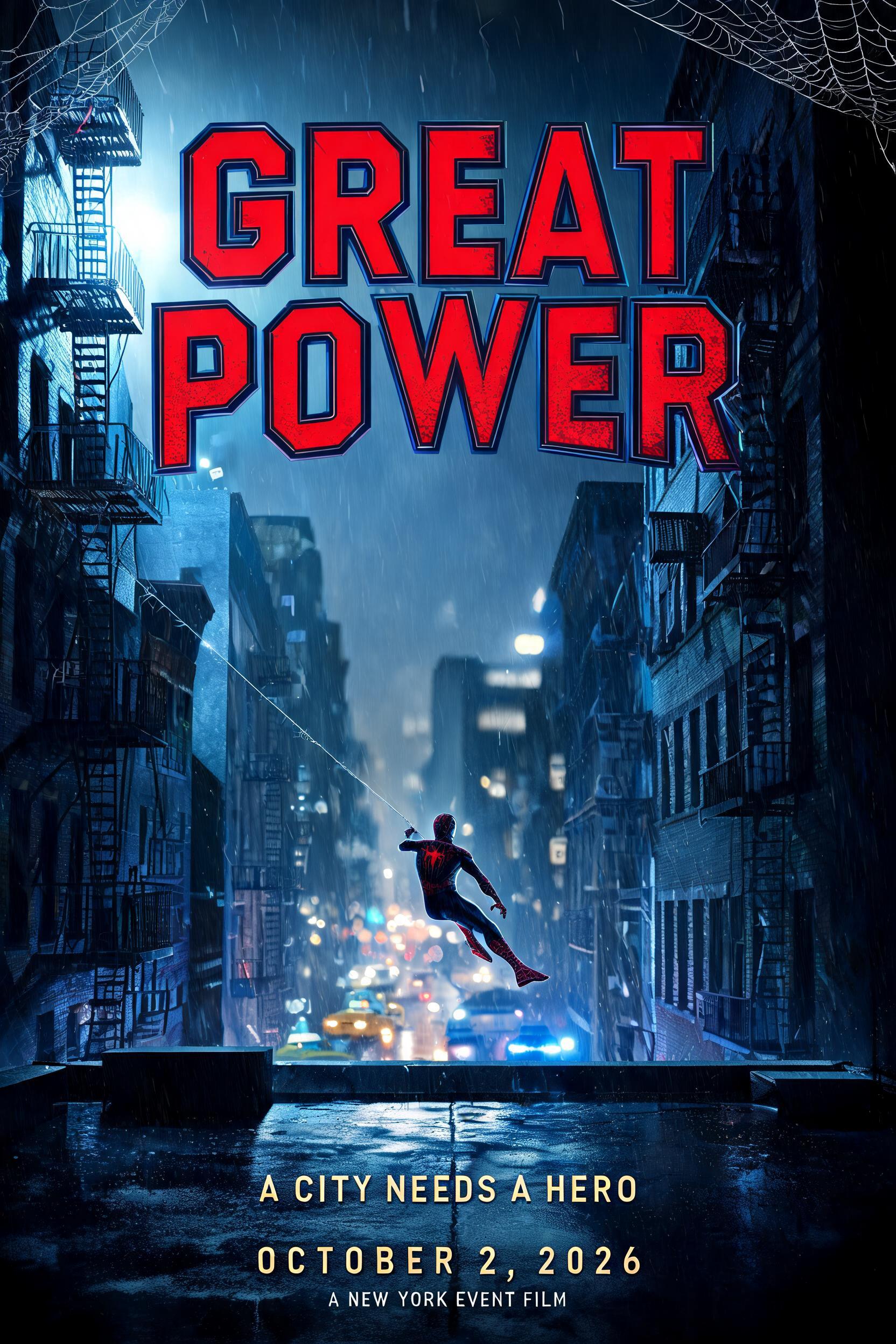
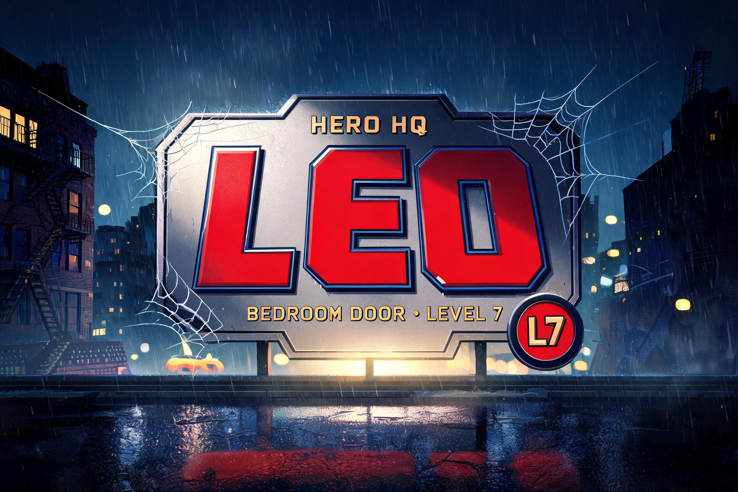
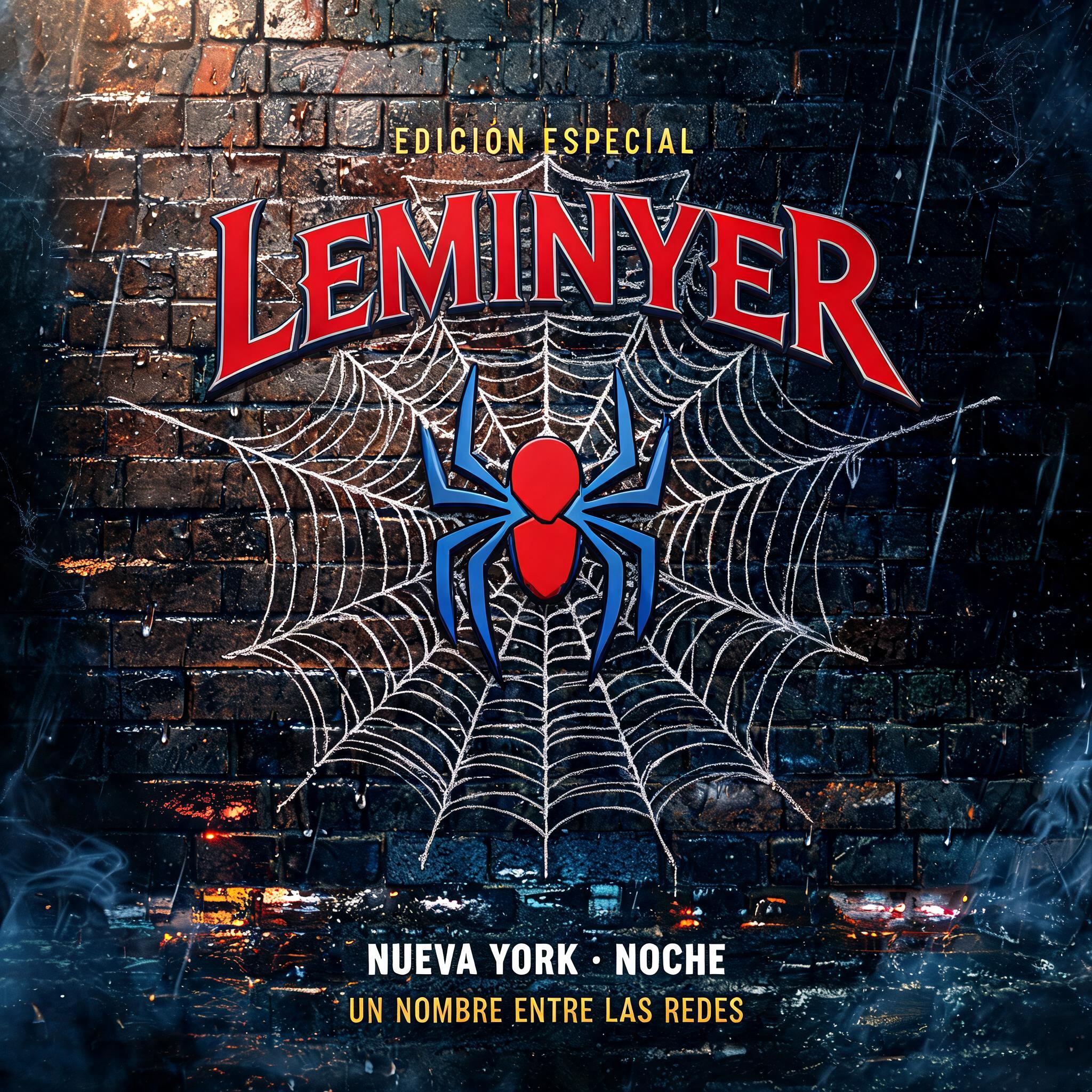
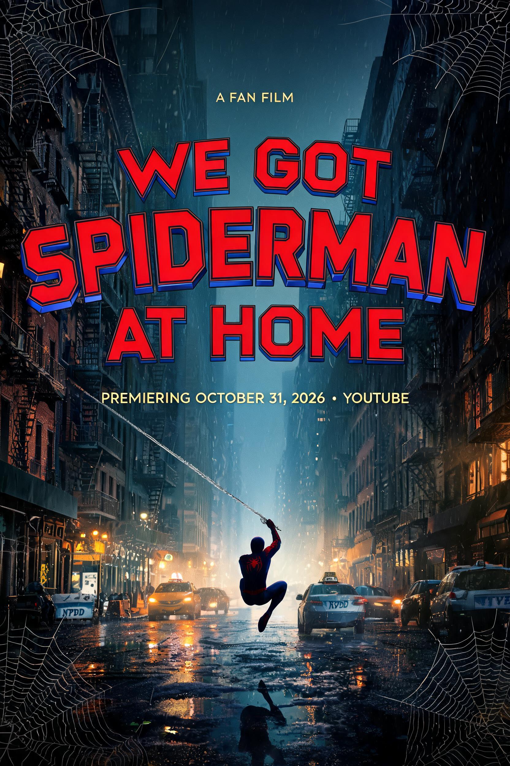
Heavy condensed red comic-title capitals with deep blue 3D depth and a black outline, set high over a rainy New York street canyon with web strands. — no font license needed.
Spider-Man in different AI fonts




Spider-Man Gallery
Real outputs from the Spider-Man style. Click any image to see details.
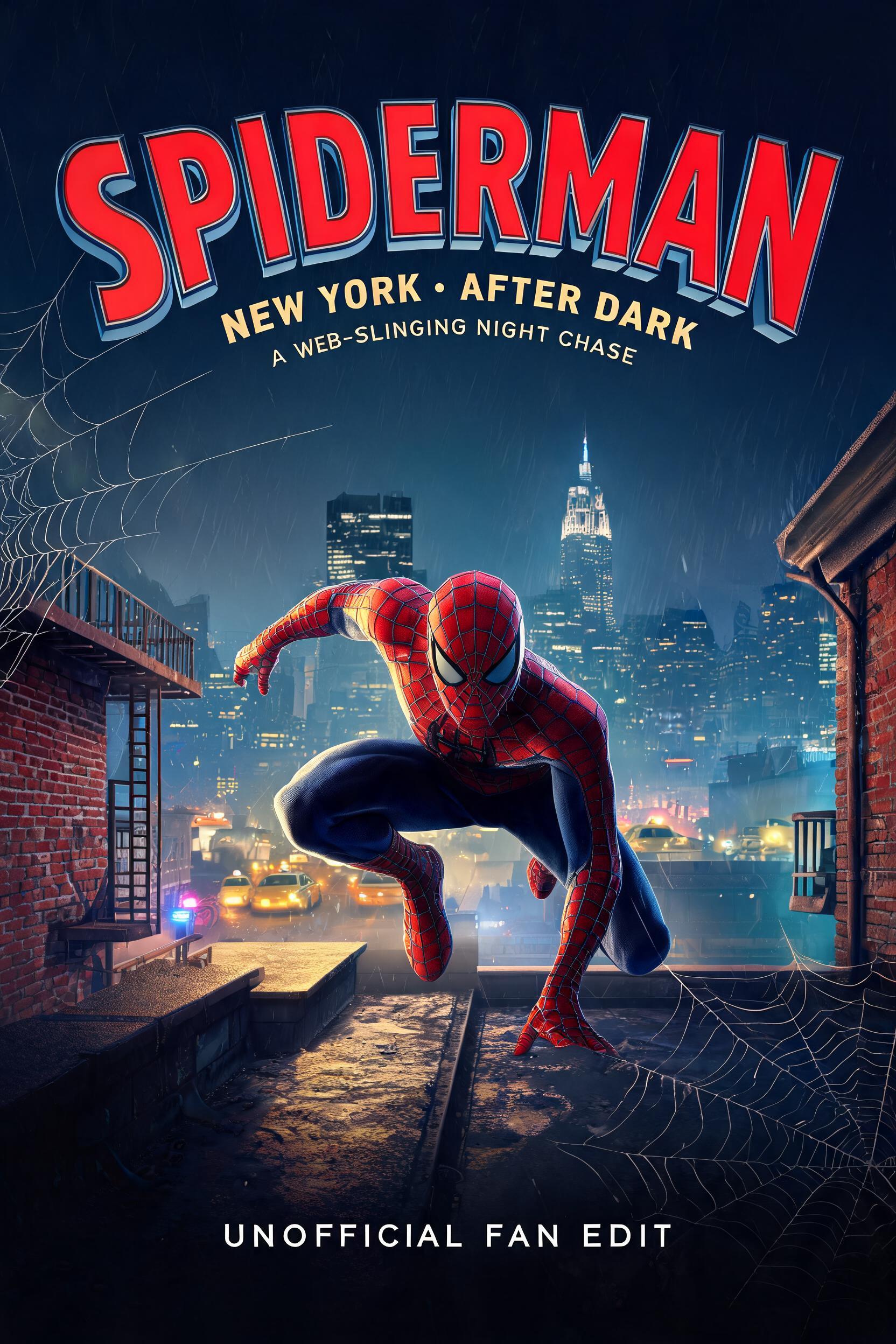
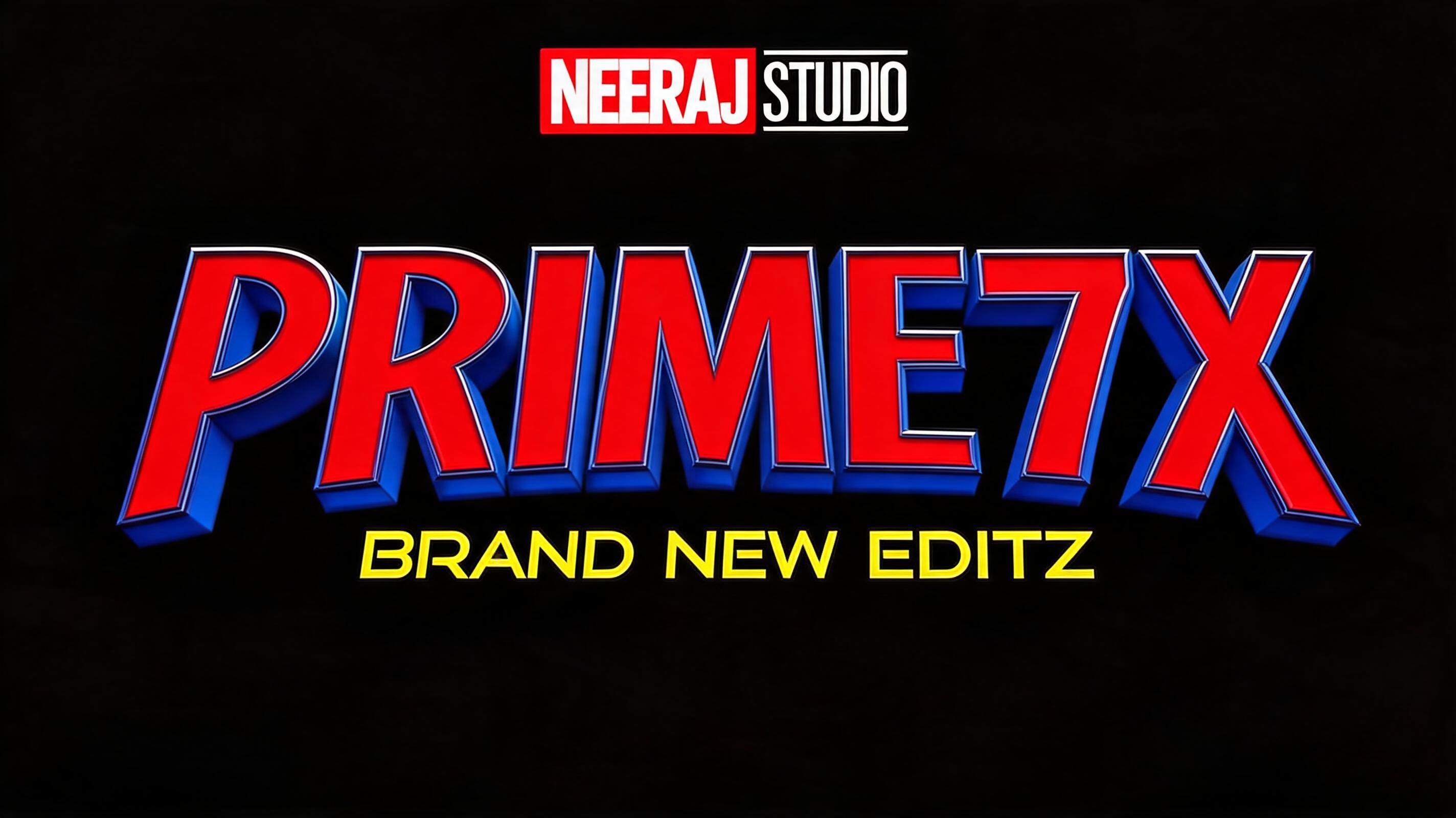
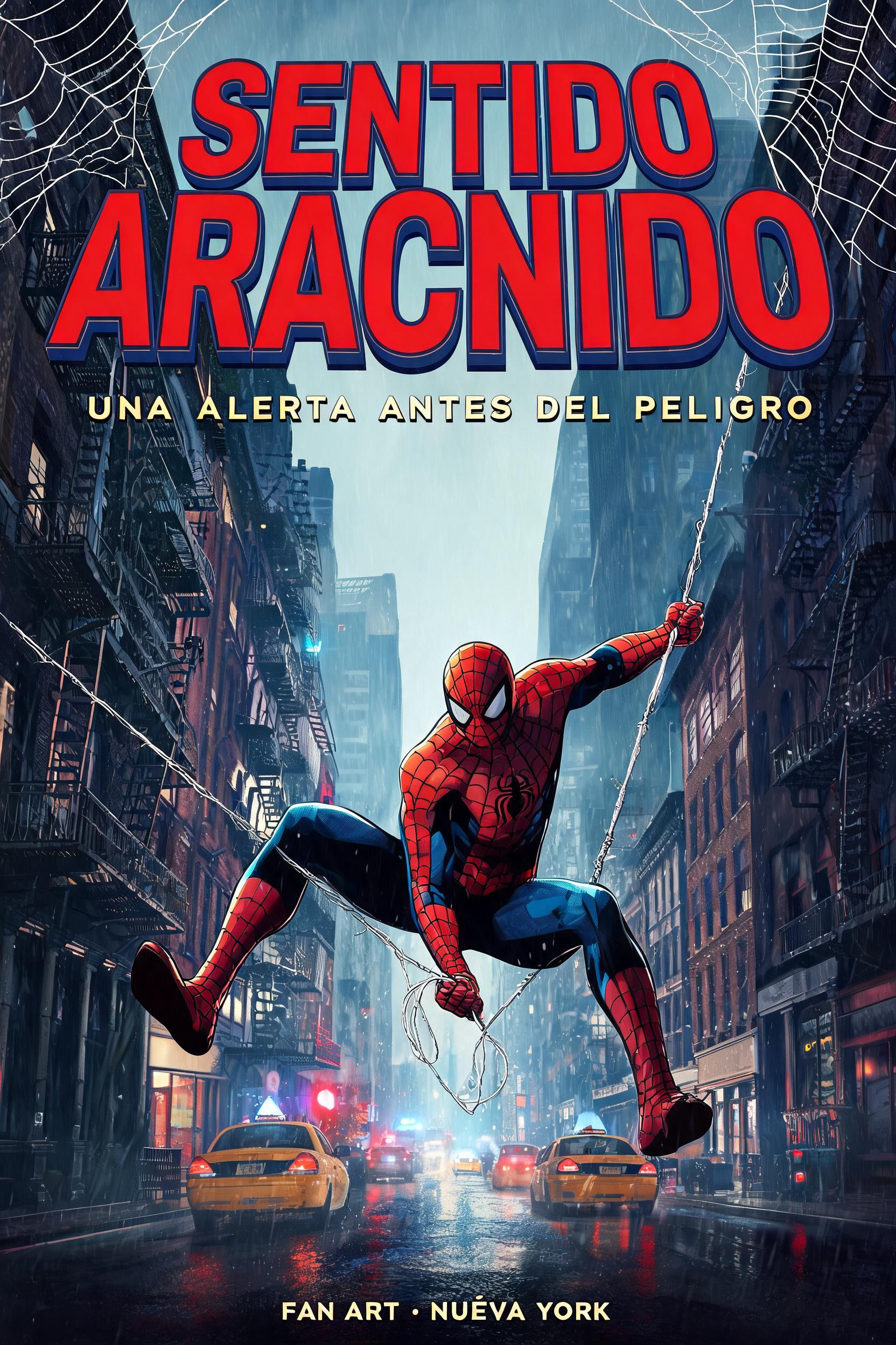
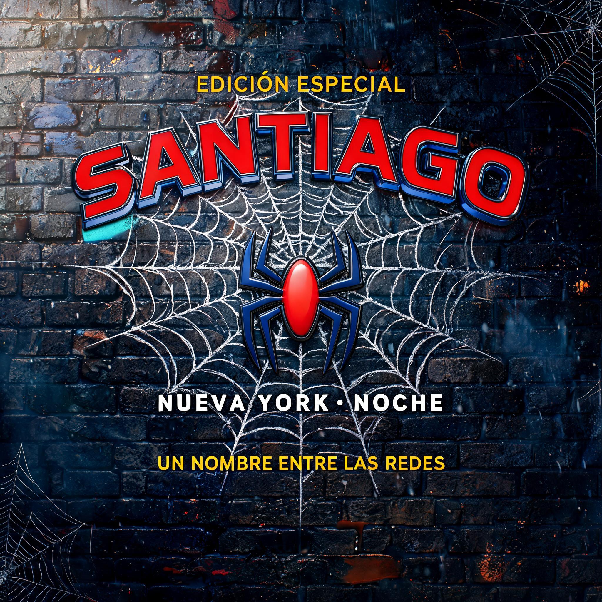
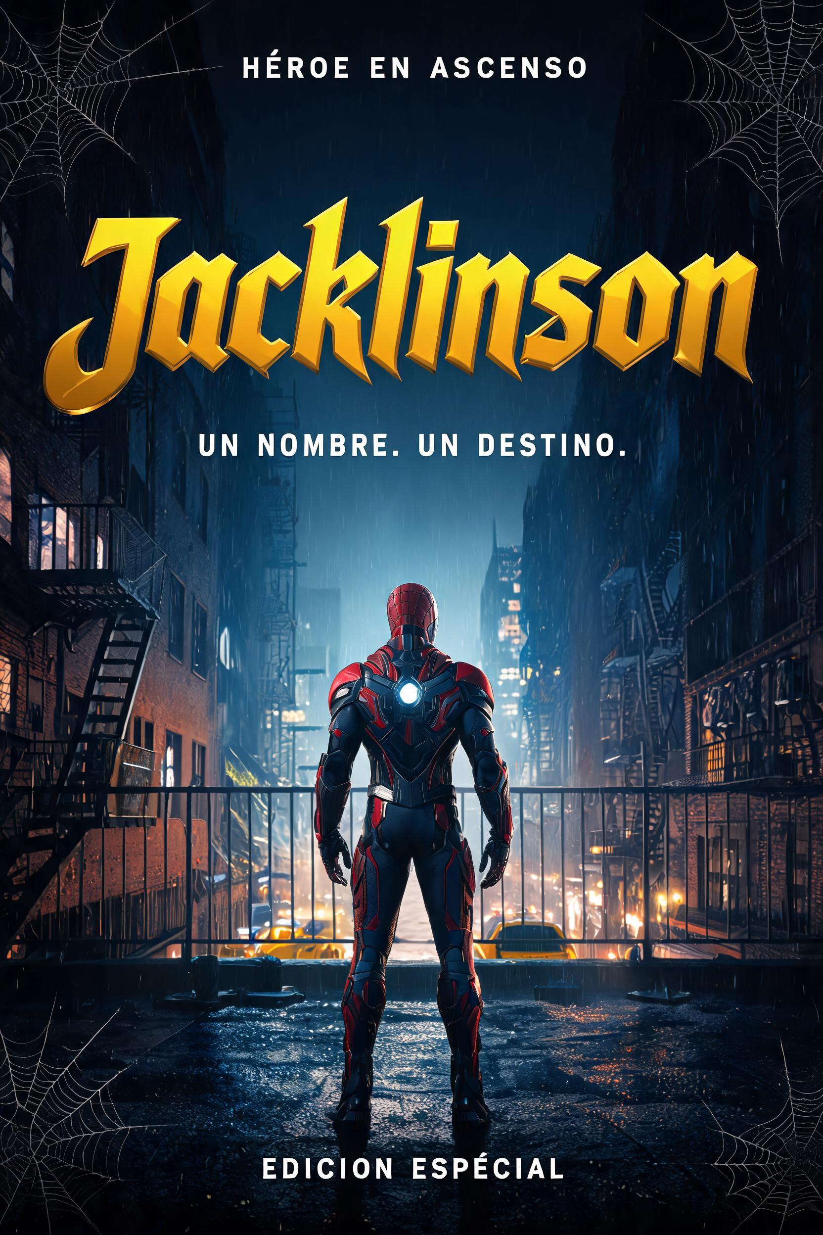
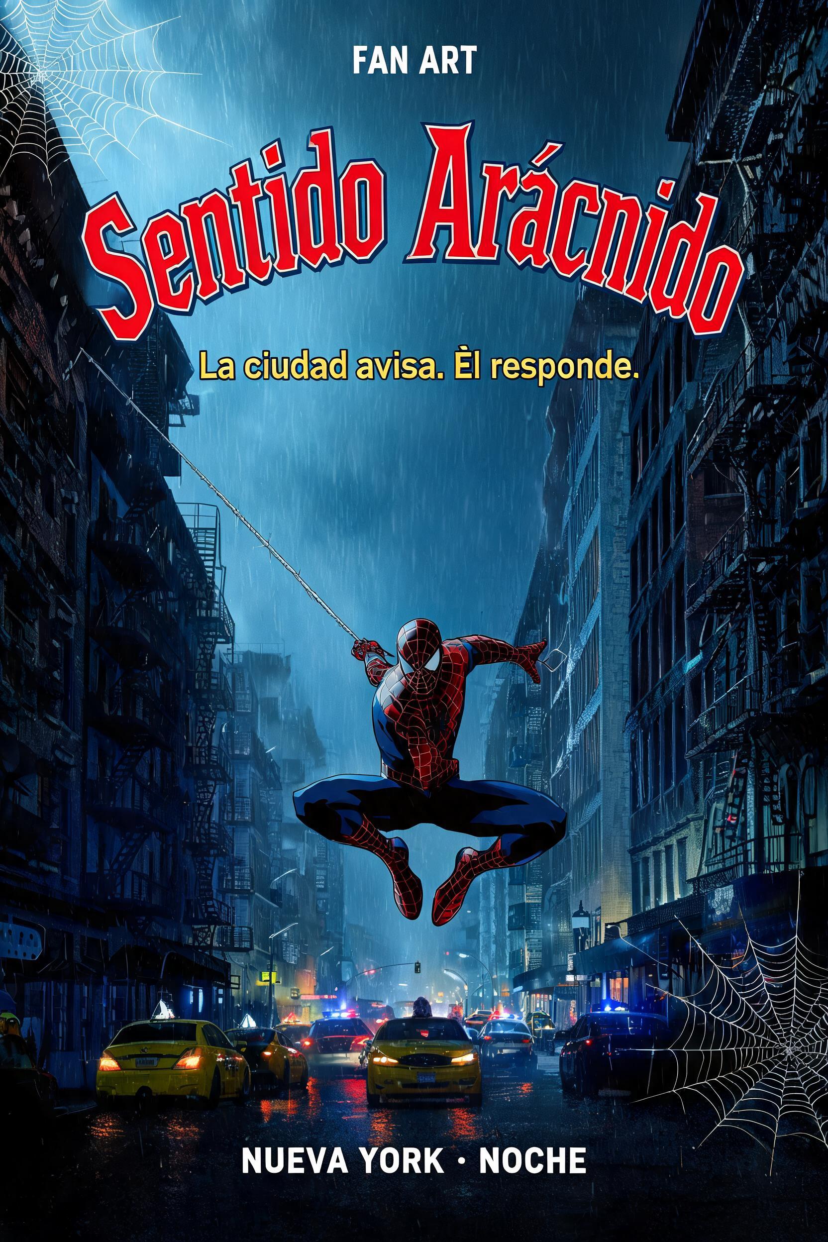


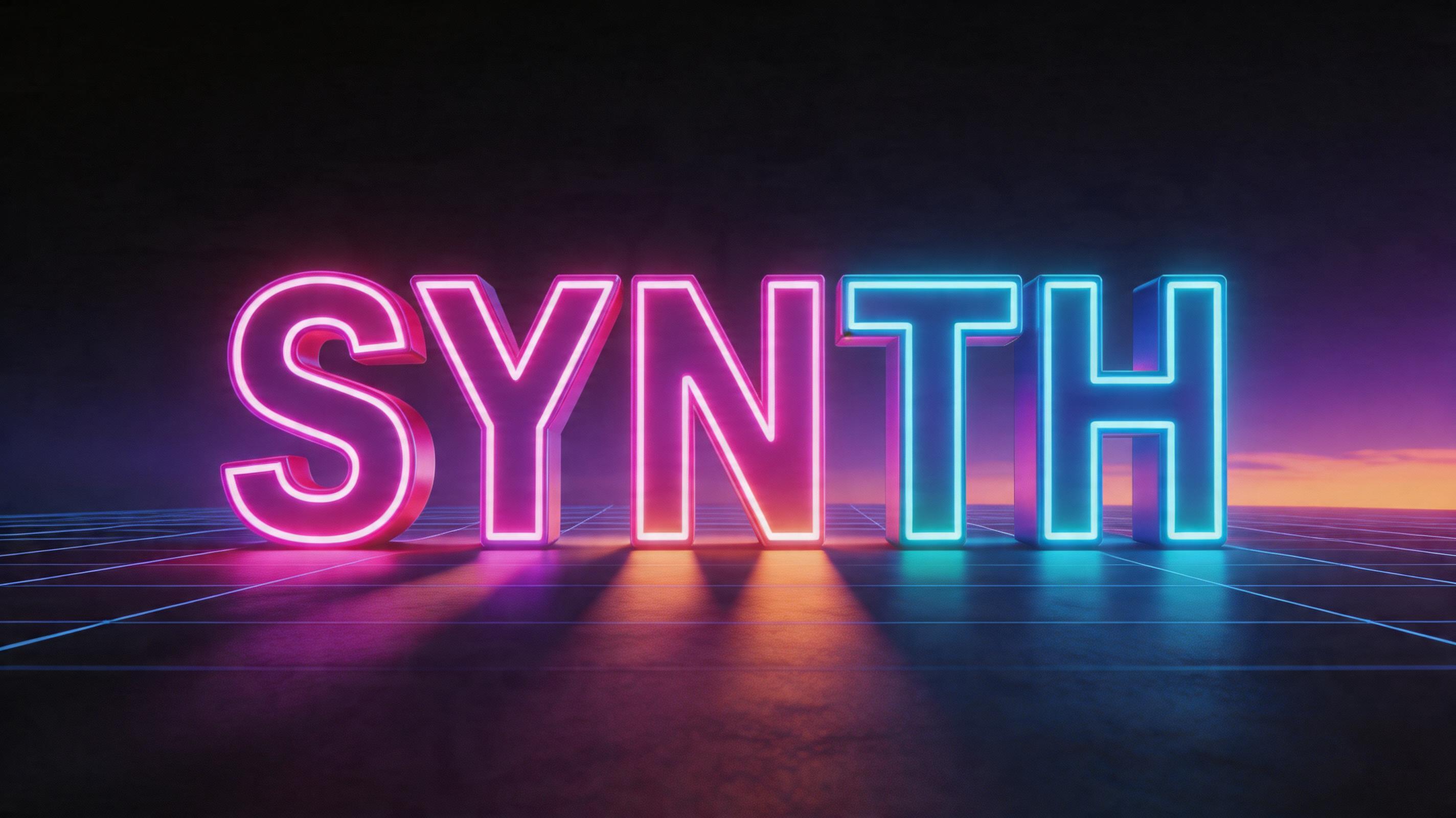

Looking for copy-paste fancy text? Try our free Font Generator Tools — cursive, gothic, bubble & 30+ styles.
Perfect for These Projects
Spider-Man Text Effect — FAQ
What is the Spider-Man Font Style?
The Spider-Man font style is a distinctive AI-generated typography effect. Heavy condensed red comic-title capitals with deep blue 3D depth and a black outline, set high over a rainy New York street canyon with web strands. Using FontVibe's AI spider-man generator you can create stunning text effects in seconds — no Photoshop, no font licensing, no design experience needed.
Explore the Spider-Man gallery for inspiration, or browse all 138+ AI text effect styles available on FontVibe.
How to Create Spider-Man Typography in FontVibe Studio
The Story Behind Spider-Man
History, visual DNA, and cultural context.
Where It Came From
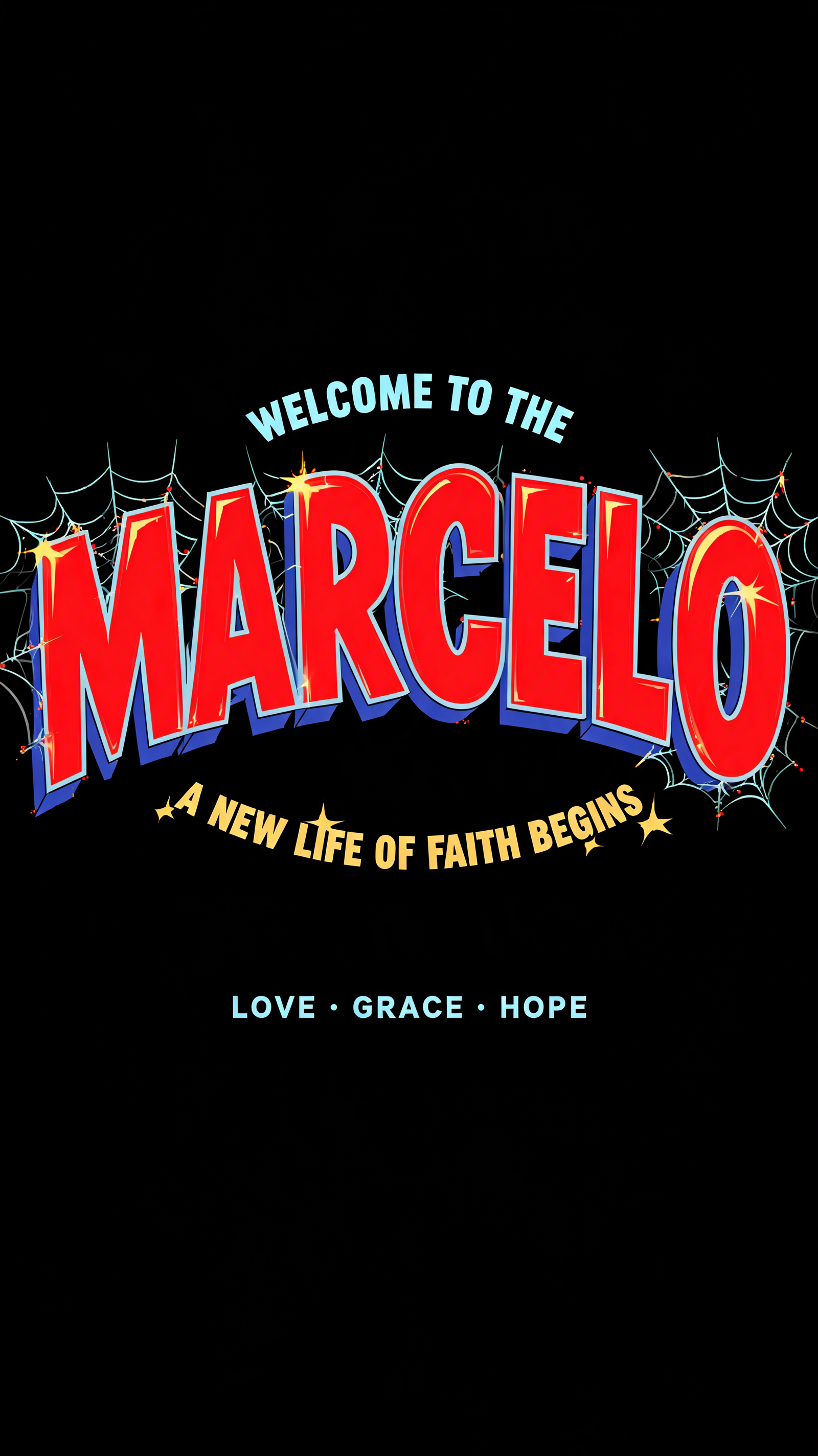
The Spider-Man title look is one of the most recognizable in comic and movie history: a bold red-and-blue 3D comic masthead — red letter faces stacked over a royal-blue extruded depth — often paired with a bright gold subtitle. It descends from decades of Marvel comic covers and modern superhero movie logos, blending printed-comic flatness with dimensional block depth.
Sources: Todd Klein — Logo Study: SPIDER-MAN Part 1 · Todd Klein — Logo Study: SPIDER-MAN Part 5
How to Make It
Type a short, punchy word or two, choose the Spider-Man style, and generate. The AI builds the red-front / blue-3D-depth comic masthead automatically; add a second line for a gold subtitle. Keep text short (1-3 words) for the strongest hero-logo impact, then download a free PNG.
Design Tips
Short all-caps words read best. Use the red-and-blue masthead for the main name and the gold subtitle for a tagline. Pair with a dark, grounded city background so the flat comic colors pop, and leave breathing room around the logo.
Typographic Landmarks
In Their Words
“He had nowhere to put the Comics Code Seal except over the N, which doesn't look very good.”
“The lowly webbing, relegated to the background, but always lending that familiar organic strangeness to otherwise fairly standard letterforms, in most cases.”
Things You Might Not Know
Amazing Fantasy #15 (August 1962) was the anthology's final issue — publisher Martin Goodman had already cancelled the title. Spider-Man sold so well that he got his own book, The Amazing Spider-Man, seven months later. Source ↗
The triangular logo on The Amazing Spider-Man #1 (March 1963) appeared on only that one issue. Letterer Todd Klein suspects it was replaced from issue #2 because the Comics Code Authority seal had nowhere to sit except on top of the letter N. Source ↗
In March 1994, letterer Todd Klein delivered a spiky Spider-Man logo modeled on his 1992 Sabretooth logo; it debuted on The Amazing Spider-Man #395 and is still the version he sees most on licensed Spider-Man products. His heavier-outline redraw from that January went unused. Source ↗
For Spider-Man (2002), Kyle Cooper and Imaginary Forces built the opening credits from flying letterforms caught in animated spider webs — the web becomes the layout grid for the type. Source ↗
Create Your Spider-Man Typography in Studio
Free to start. No design skills needed. Your artwork, your copyright.
AI Movie & Film Spider-Man Text Effect Generator
Heavy condensed red comic-title capitals with deep blue 3D depth and a black outline, set high over a rainy New York street canyon with web strands. — no font license needed.
Spider-Man in different AI fonts
Generate Your Spider-Man Text Effect
Type any word — see it transformed in seconds. No sign-up required.
Spider-Man Style Gallery
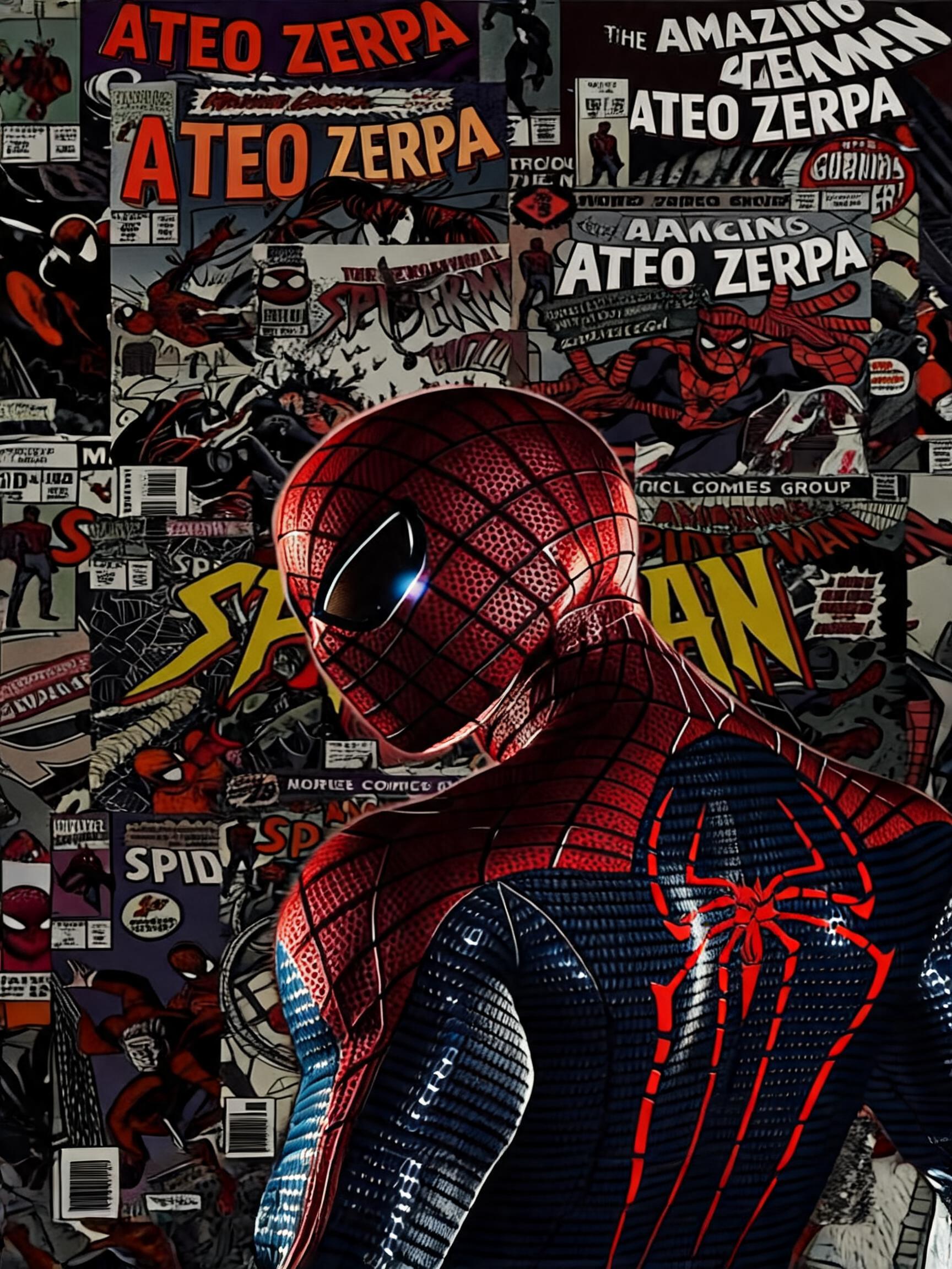
Real outputs from the Spider-Man style. Click any image to see details.
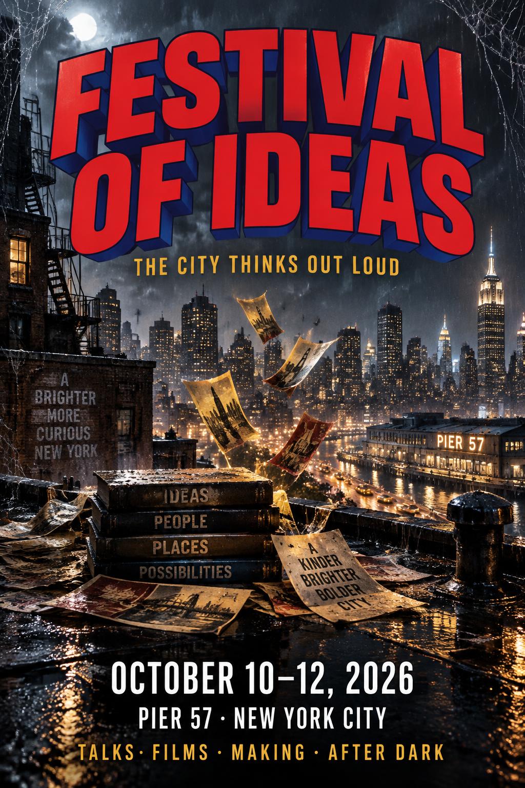
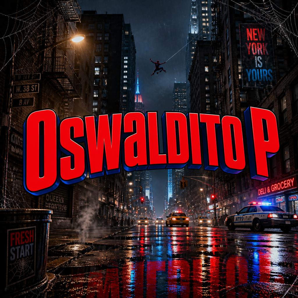

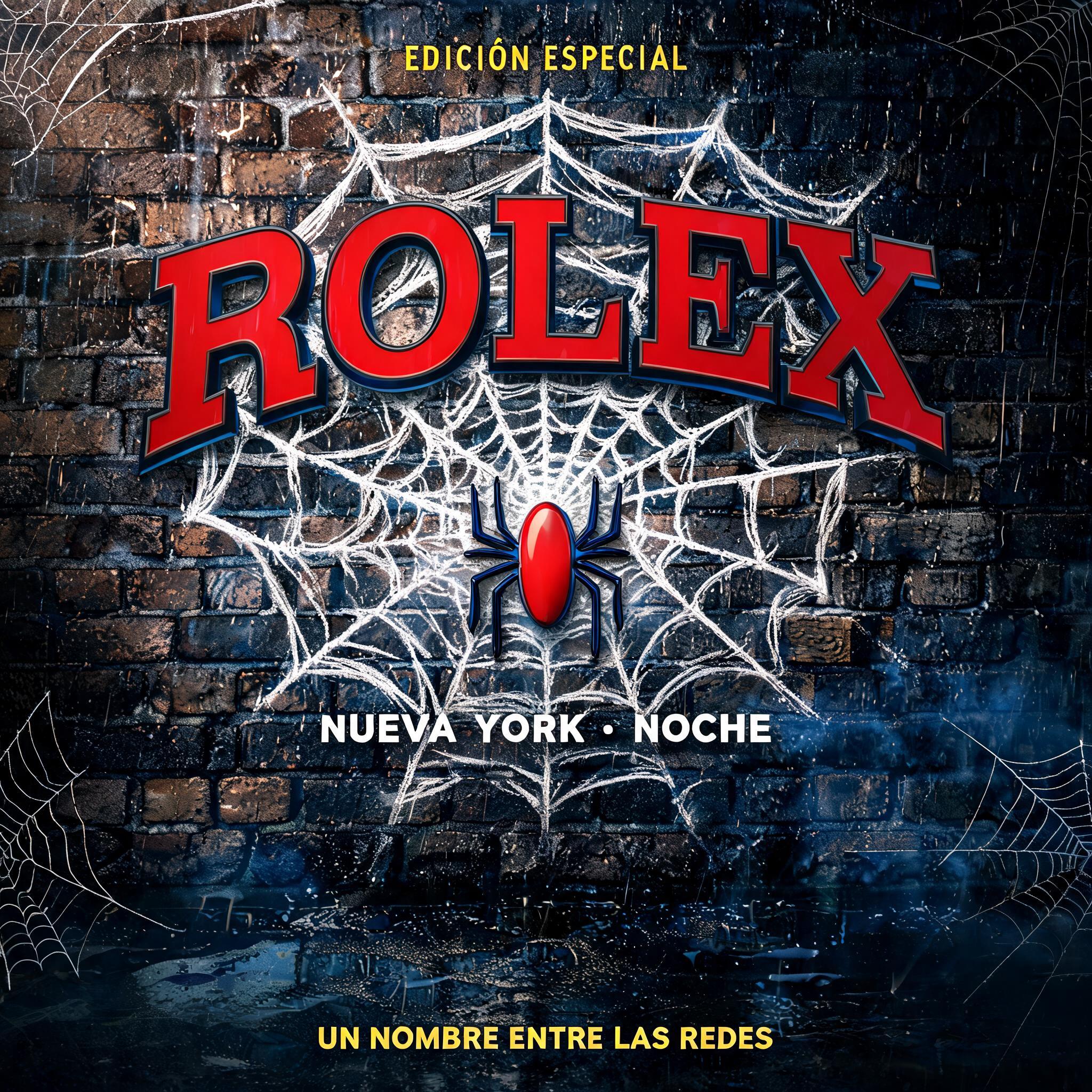
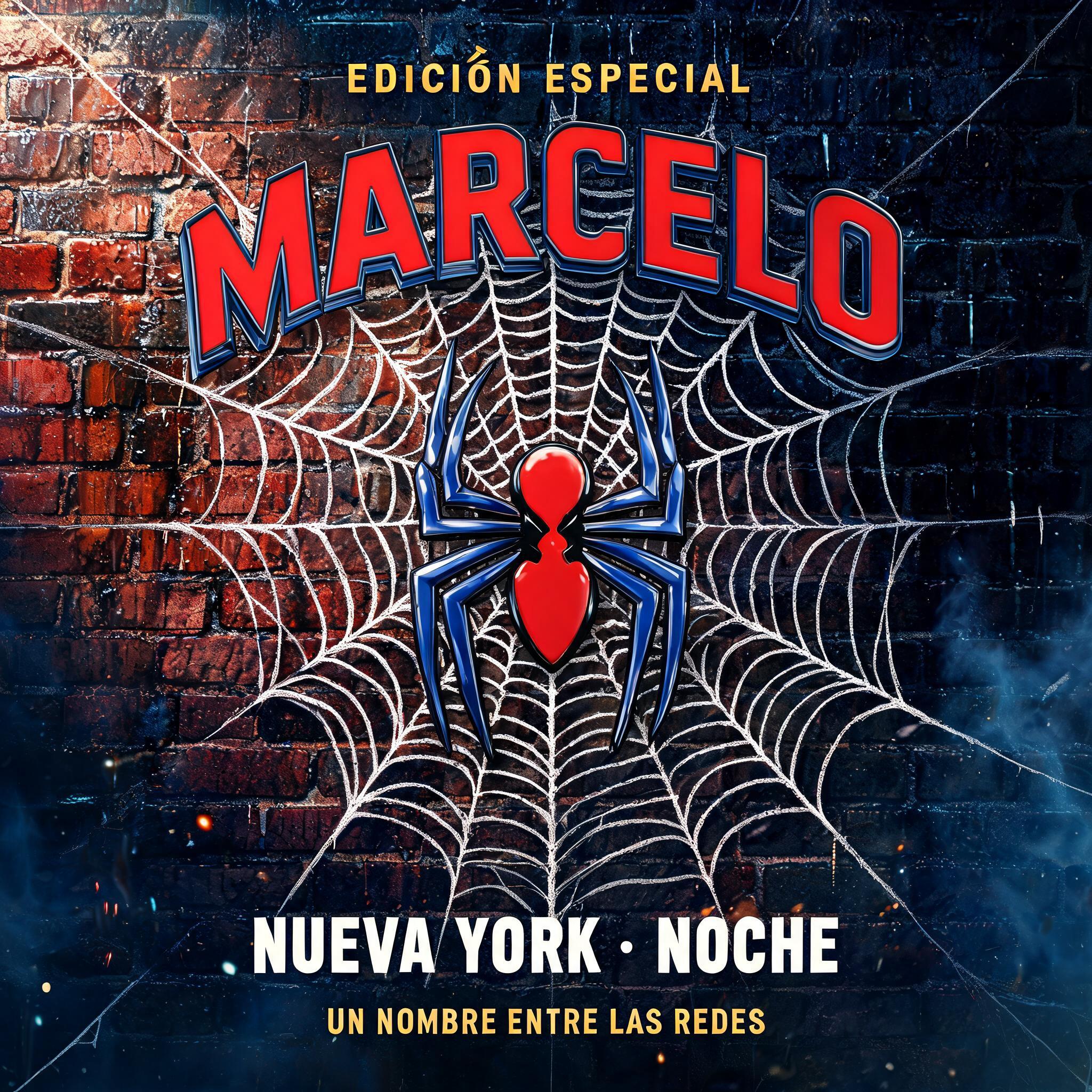
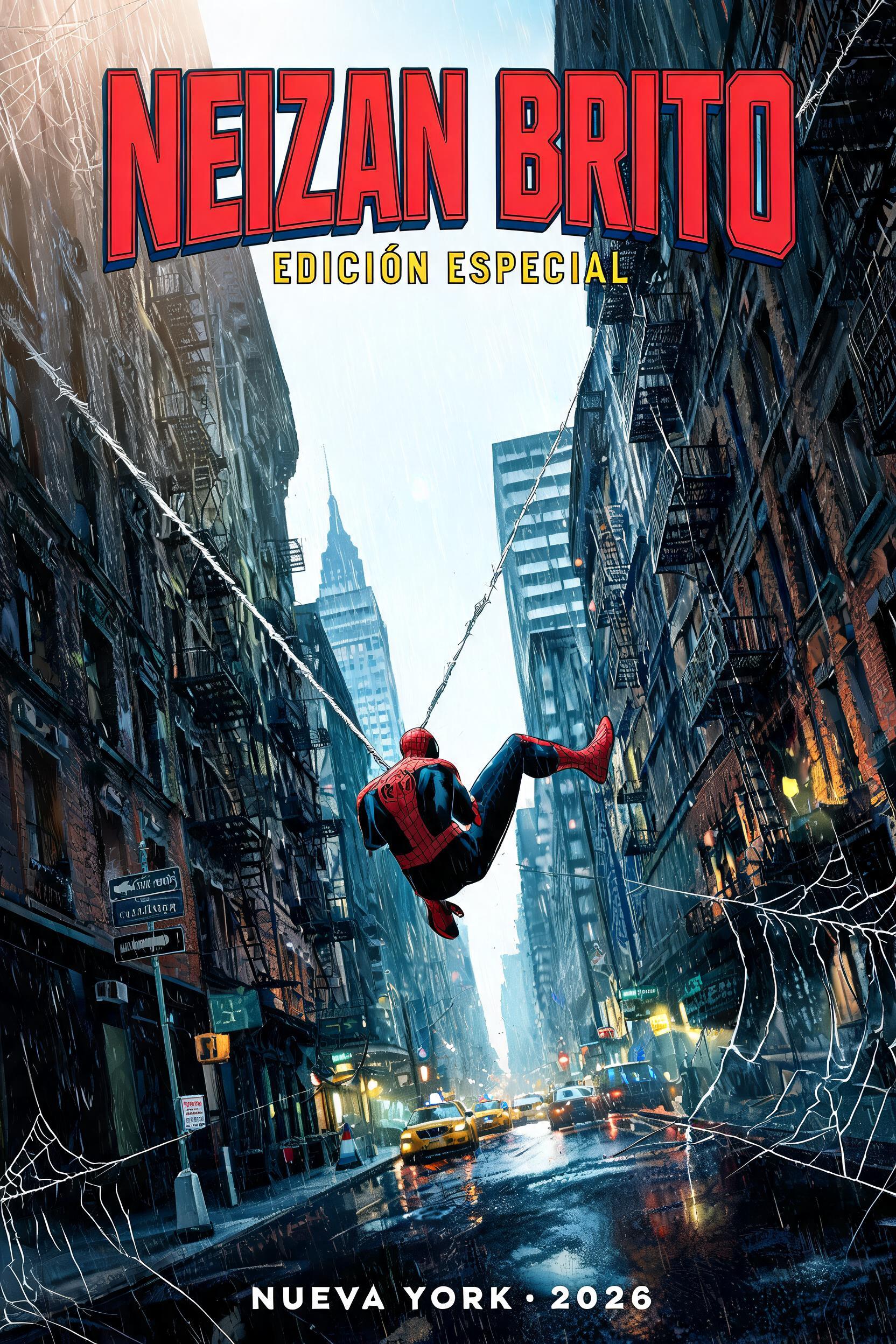
Similar Text Effect Styles
Try these styles and create your own AI-generated text effects.
Looking for copy-paste fancy text? Try our free Font Generator Tools — cursive, gothic, bubble & 30+ styles.
Perfect for These Projects
Spider-Man text effects are popular for creative projects where visual impact matters.
What is the Spider-Man Font Style?
The Spider-Man font style is a distinctive AI-generated typography effect. Heavy condensed red comic-title capitals with deep blue 3D depth and a black outline, set high over a rainy New York street canyon with web strands.
Using FontVibe's AI spider-man generator you can create stunning text effects in seconds — no Photoshop, no font licensing, no design experience needed.
Explore the Spider-Man gallery for inspiration, or browse all 138+ AI text effect styles available on FontVibe.
How to Create Spider-Man Typography in FontVibe Studio
1. Enter your text — Any word, phrase, or brand name. Works best with short, punchy text.
2. Select Spider-Man — From the style library. Optionally describe a mood in the custom prompt.
3. Generate and download. Your Spider-Man font artwork is ready in seconds. PNG, JPG, or transparent PNG.
Looking for something different? Browse the full font style library for more AI typography options.
Spider-Man Text Effect — FAQ
The Story Behind Spider-Man
History, visual DNA, and cultural context — everything that makes this style what it is.
Where It Came From
The Spider-Man title look is one of the most recognizable in comic and movie history: a bold red-and-blue 3D comic masthead — red letter faces stacked over a royal-blue extruded depth — often paired with a bright gold subtitle. It descends from decades of Marvel comic covers and modern superhero movie logos, blending printed-comic flatness with dimensional block depth.
Sources: Todd Klein — Logo Study: SPIDER-MAN Part 1 · Todd Klein — Logo Study: SPIDER-MAN Part 5
How to Make It
Type a short, punchy word or two, choose the Spider-Man style, and generate. The AI builds the red-front / blue-3D-depth comic masthead automatically; add a second line for a gold subtitle. Keep text short (1-3 words) for the strongest hero-logo impact, then download a free PNG.
Design Tips
Short all-caps words read best. Use the red-and-blue masthead for the main name and the gold subtitle for a tagline. Pair with a dark, grounded city background so the flat comic colors pop, and leave breathing room around the logo.
Typographic Landmarks
In Their Words
“He had nowhere to put the Comics Code Seal except over the N, which doesn't look very good.”
“The lowly webbing, relegated to the background, but always lending that familiar organic strangeness to otherwise fairly standard letterforms, in most cases.”
Things You Might Not Know
Amazing Fantasy #15 (August 1962) was the anthology's final issue — publisher Martin Goodman had already cancelled the title. Spider-Man sold so well that he got his own book, The Amazing Spider-Man, seven months later. Source ↗
The triangular logo on The Amazing Spider-Man #1 (March 1963) appeared on only that one issue. Letterer Todd Klein suspects it was replaced from issue #2 because the Comics Code Authority seal had nowhere to sit except on top of the letter N. Source ↗
In March 1994, letterer Todd Klein delivered a spiky Spider-Man logo modeled on his 1992 Sabretooth logo; it debuted on The Amazing Spider-Man #395 and is still the version he sees most on licensed Spider-Man products. His heavier-outline redraw from that January went unused. Source ↗
For Spider-Man (2002), Kyle Cooper and Imaginary Forces built the opening credits from flying letterforms caught in animated spider webs — the web becomes the layout grid for the type. Source ↗