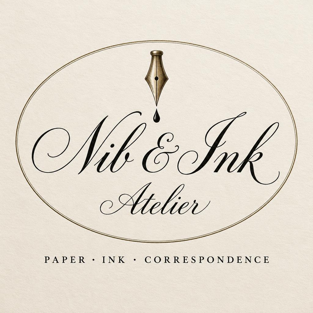
Nib & Ink Atelier PAPER · INK · CORRESPONDENCE - Kalligraphie-Schrift Text Effect


Nutzt OpenAI GPT-Image-2.5 Sunburst, das Modell dieses Werks · 15 Credits
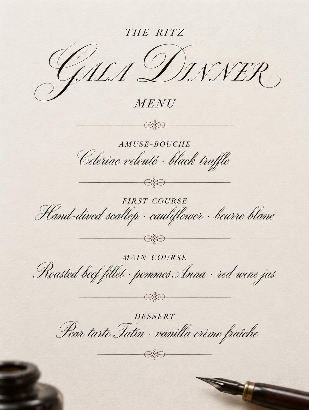
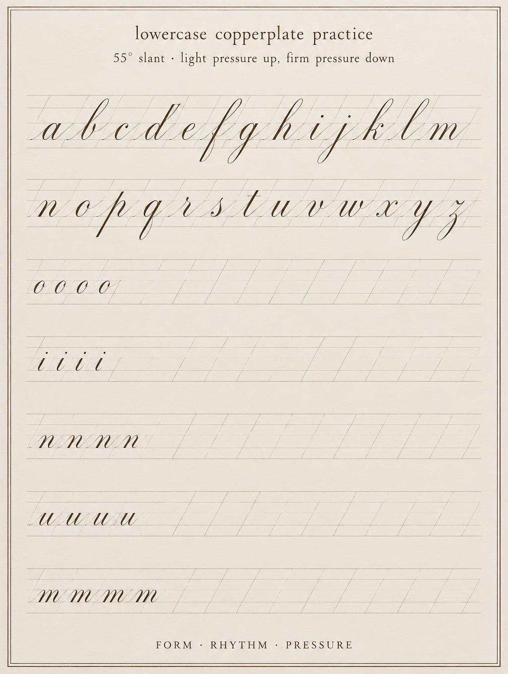
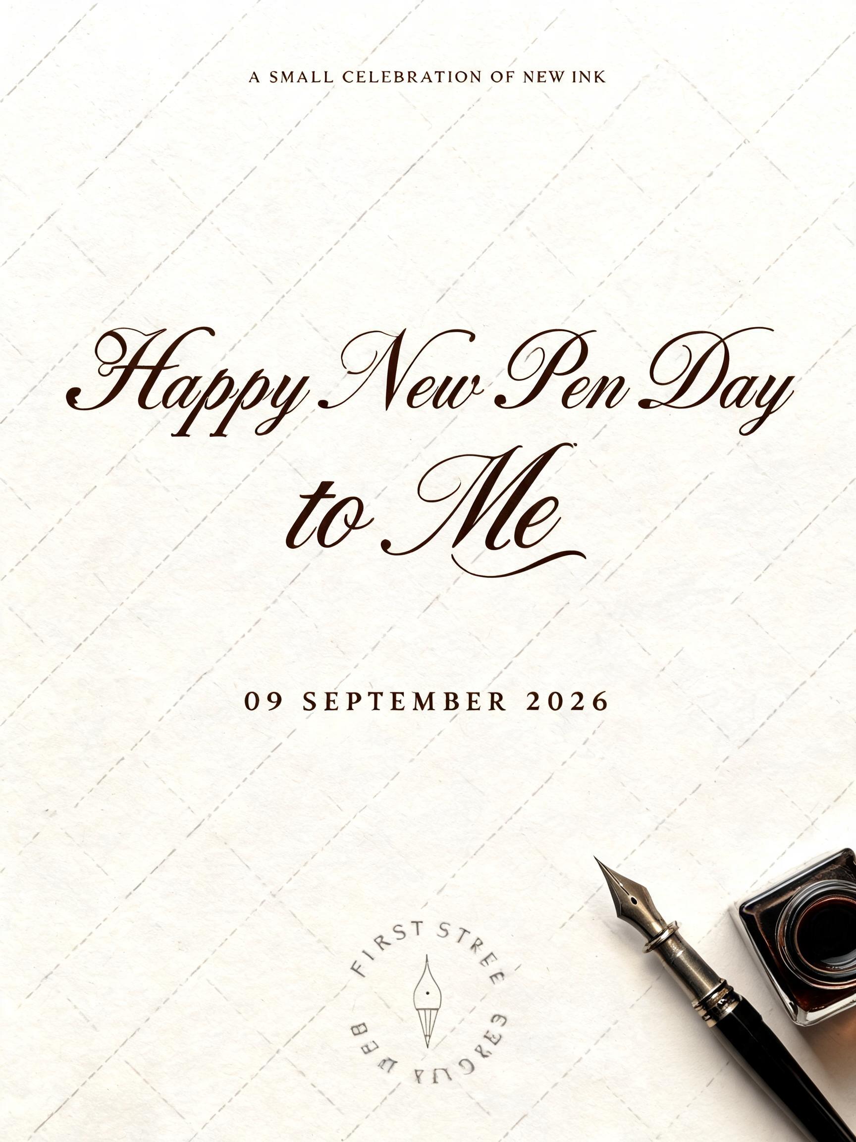
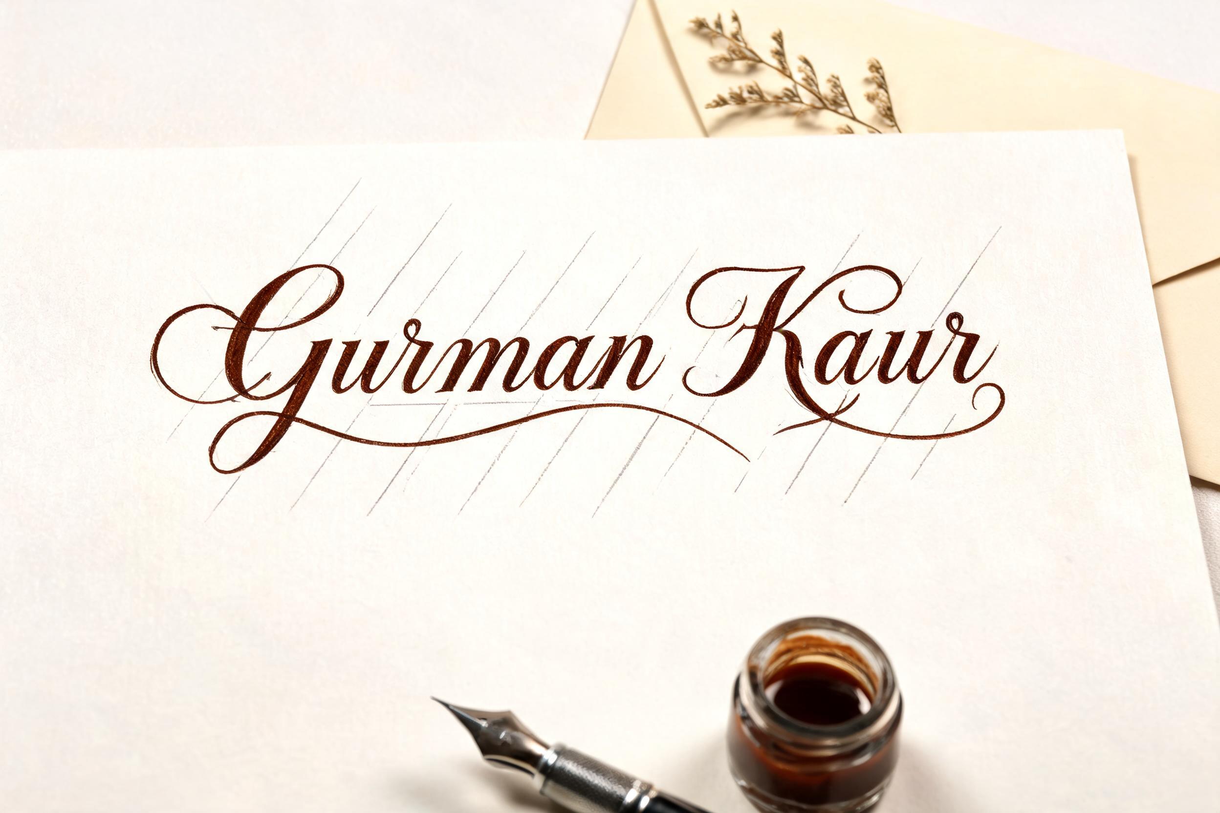
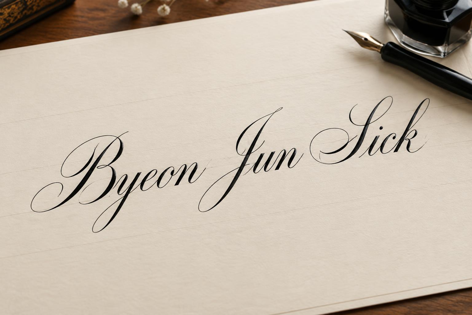
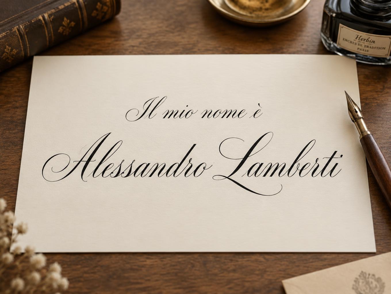
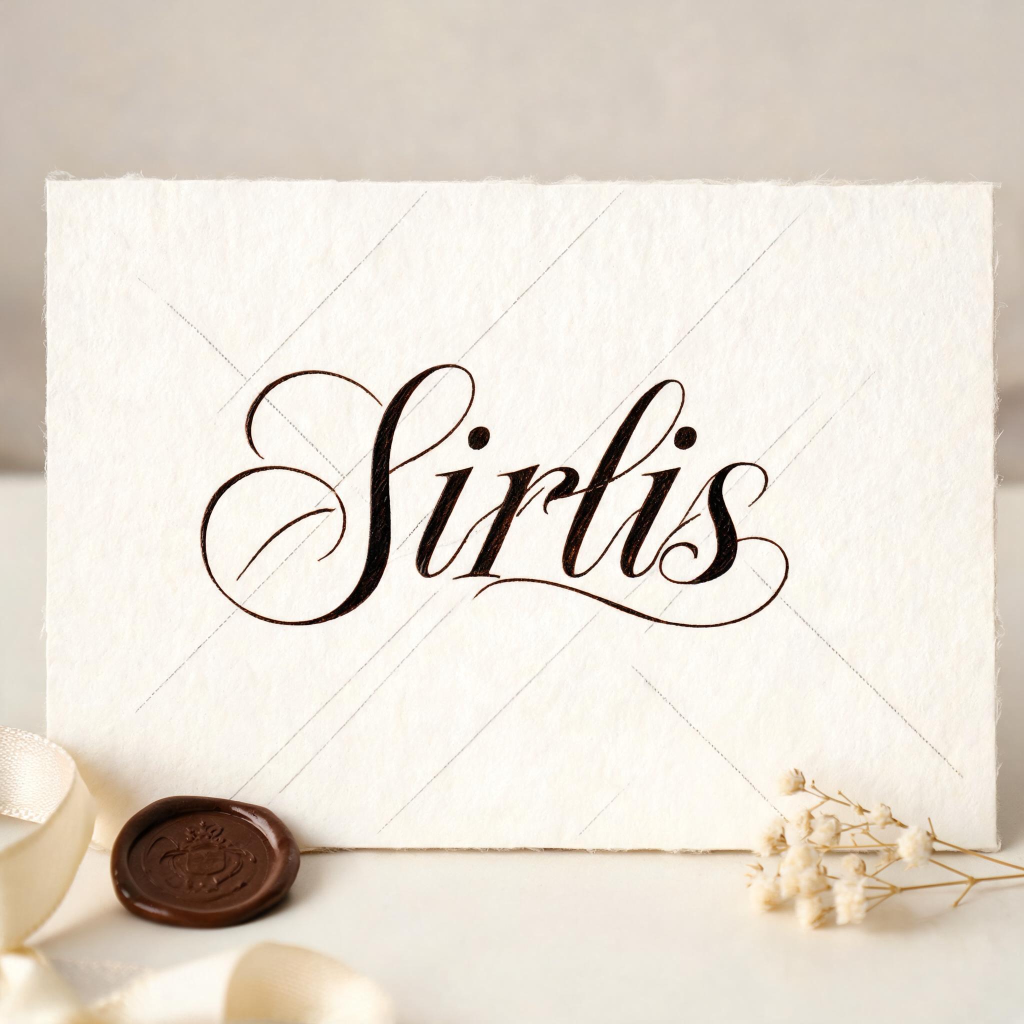
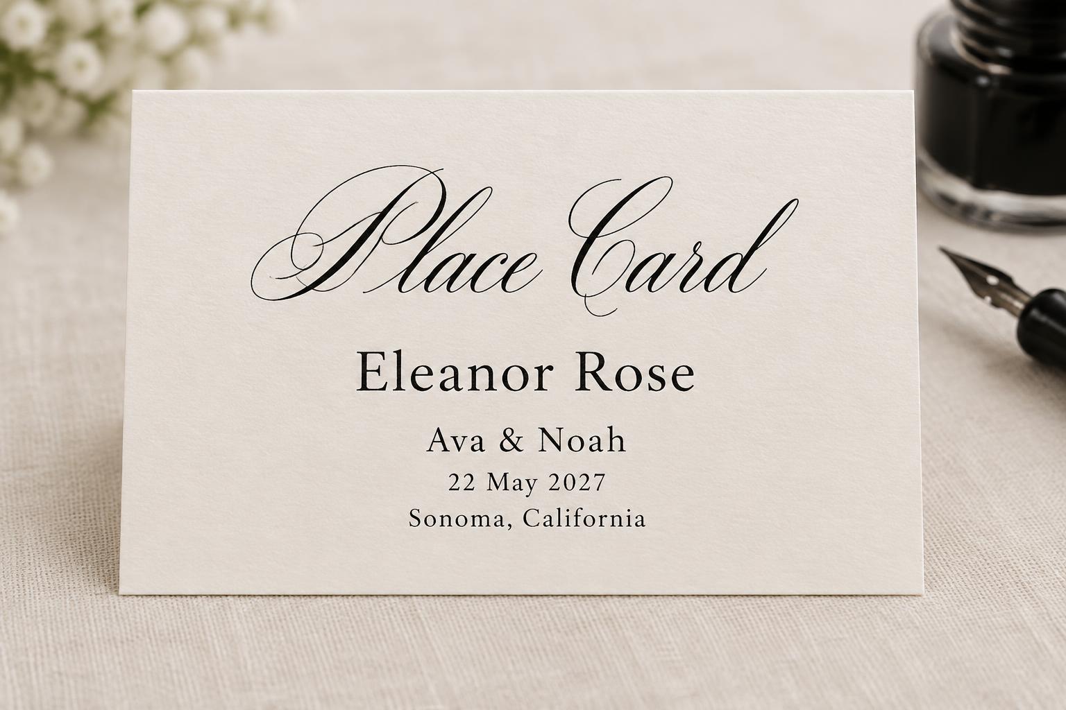
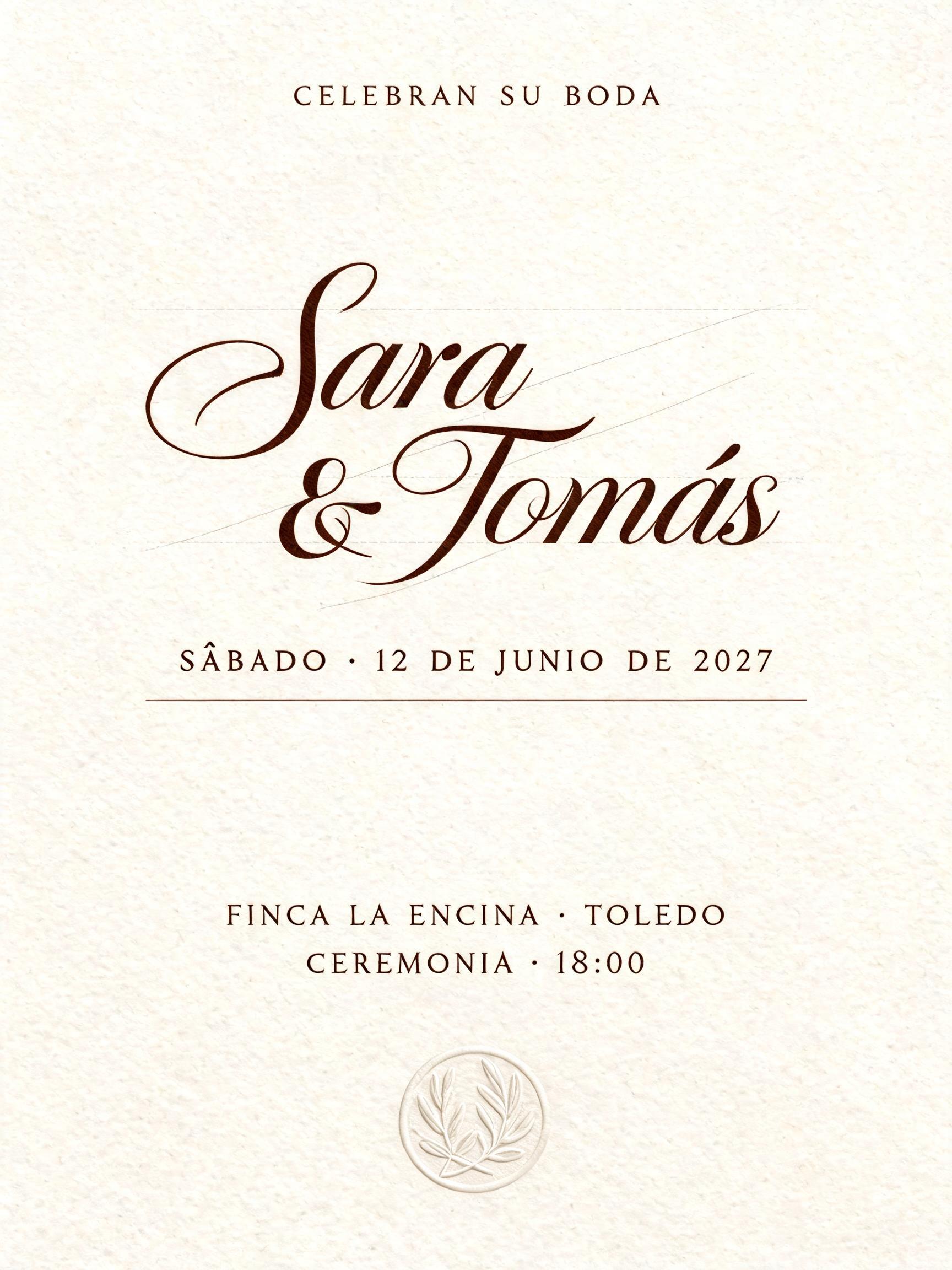
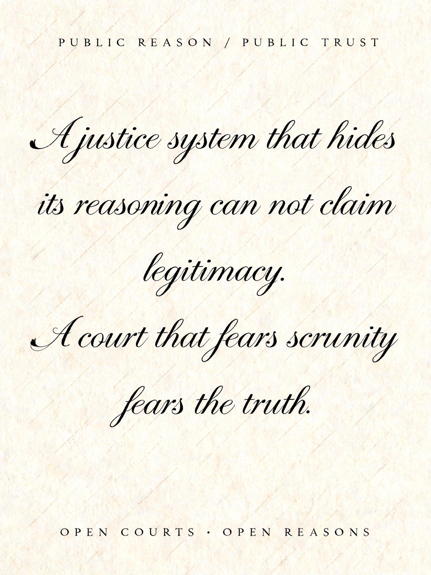
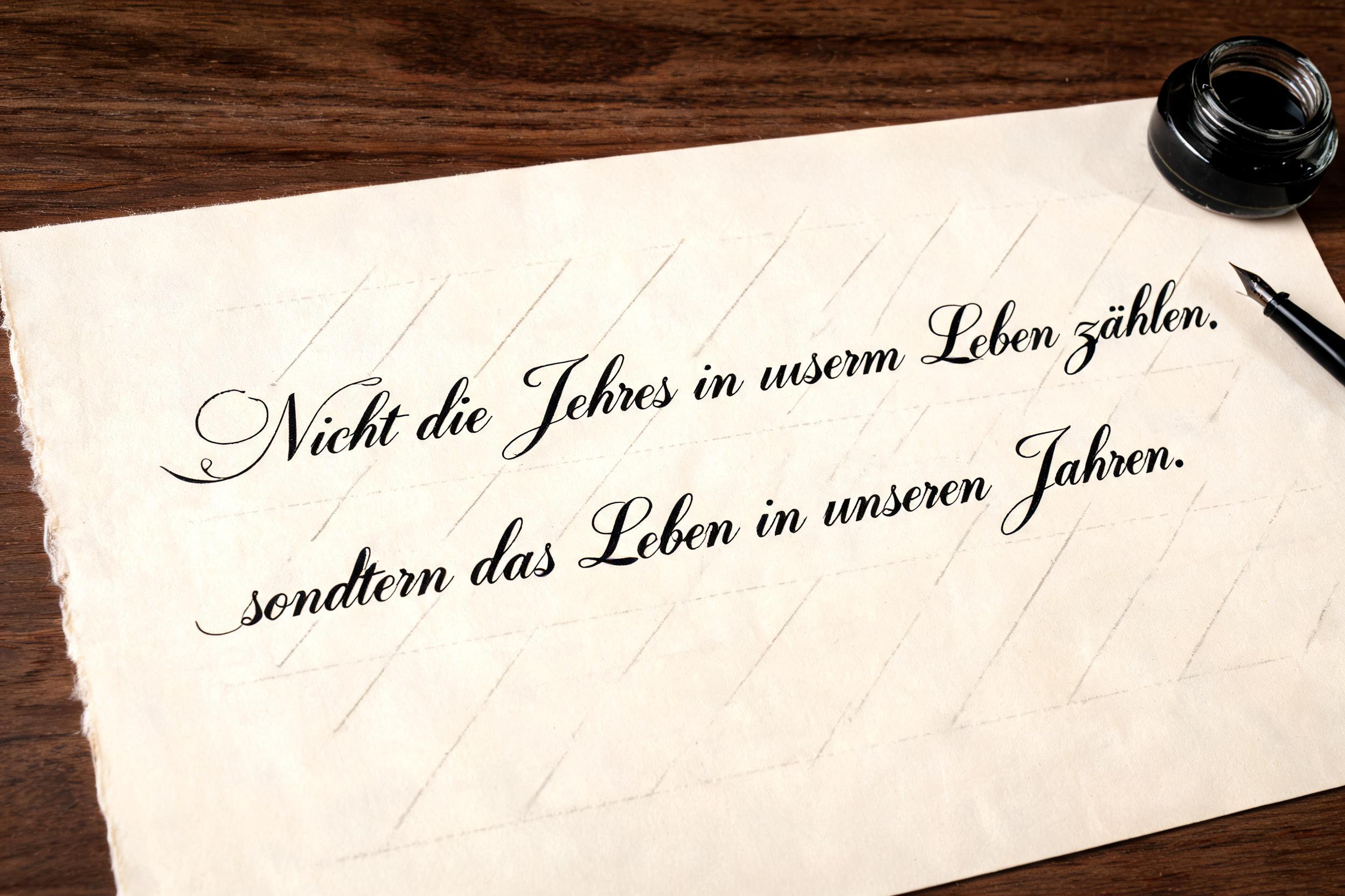
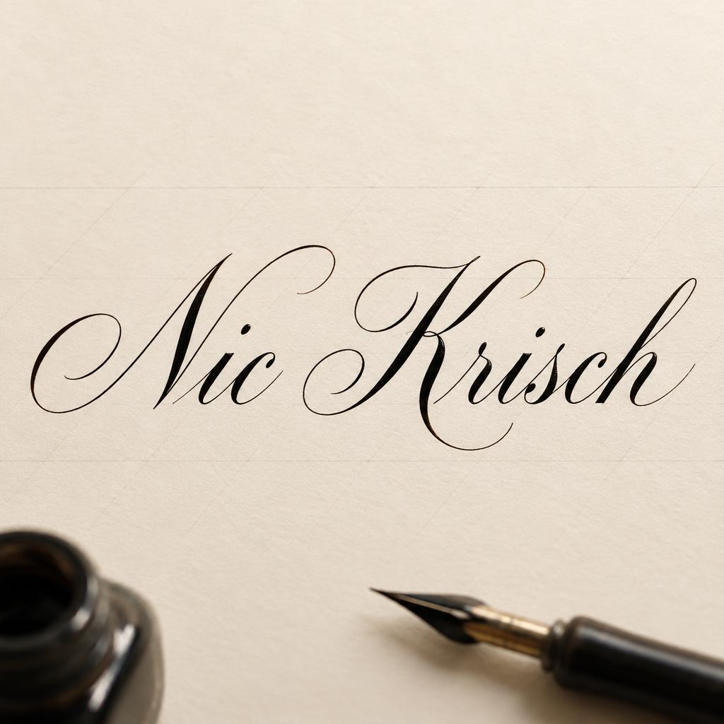
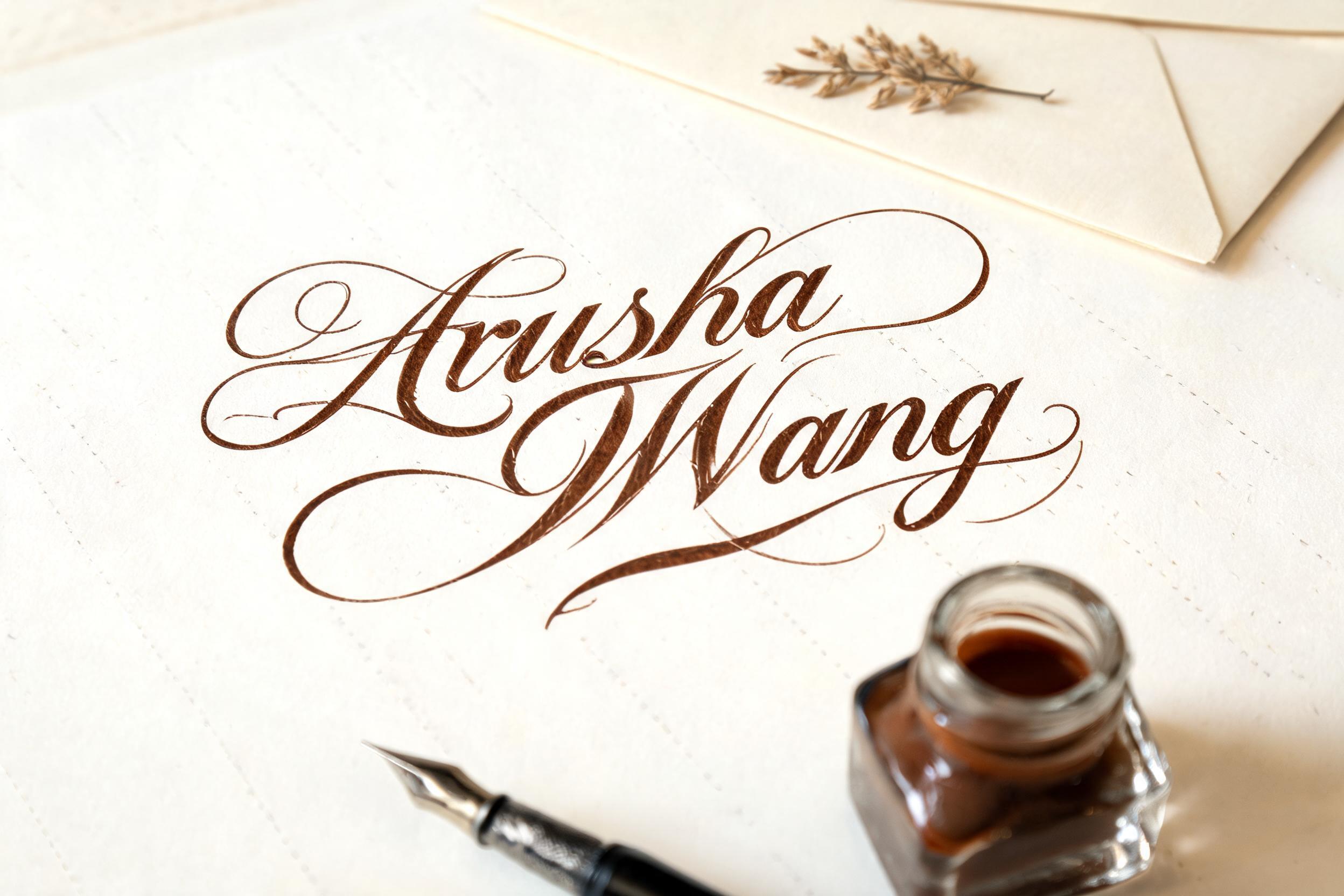
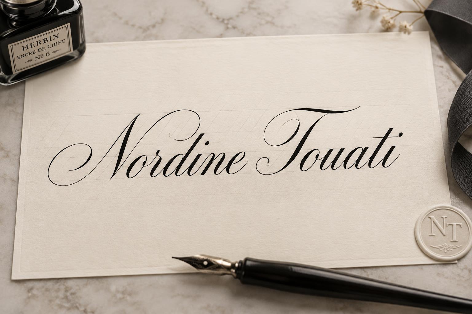
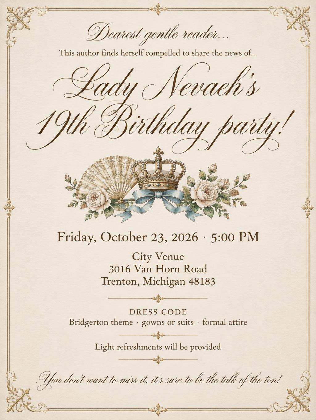
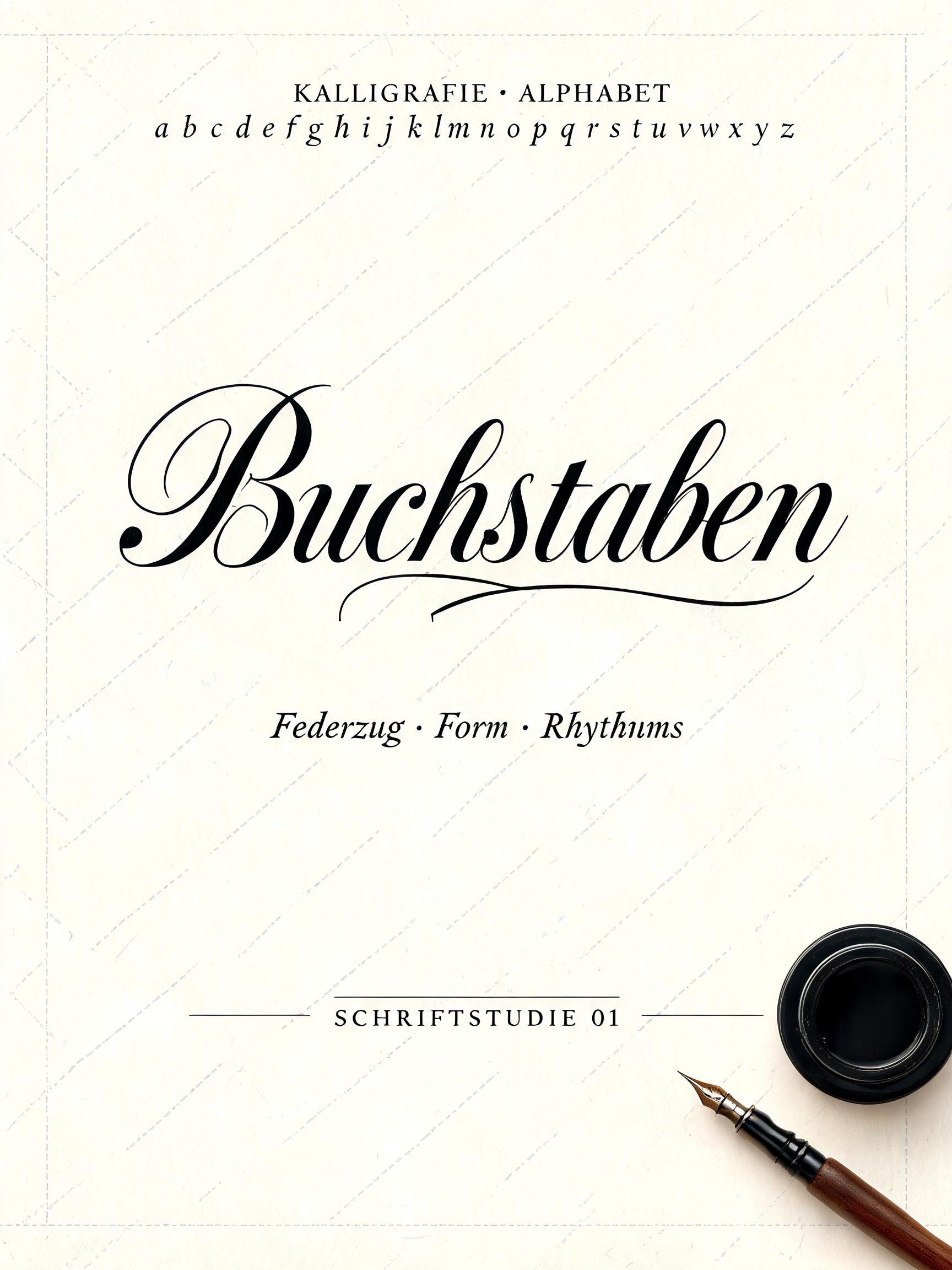
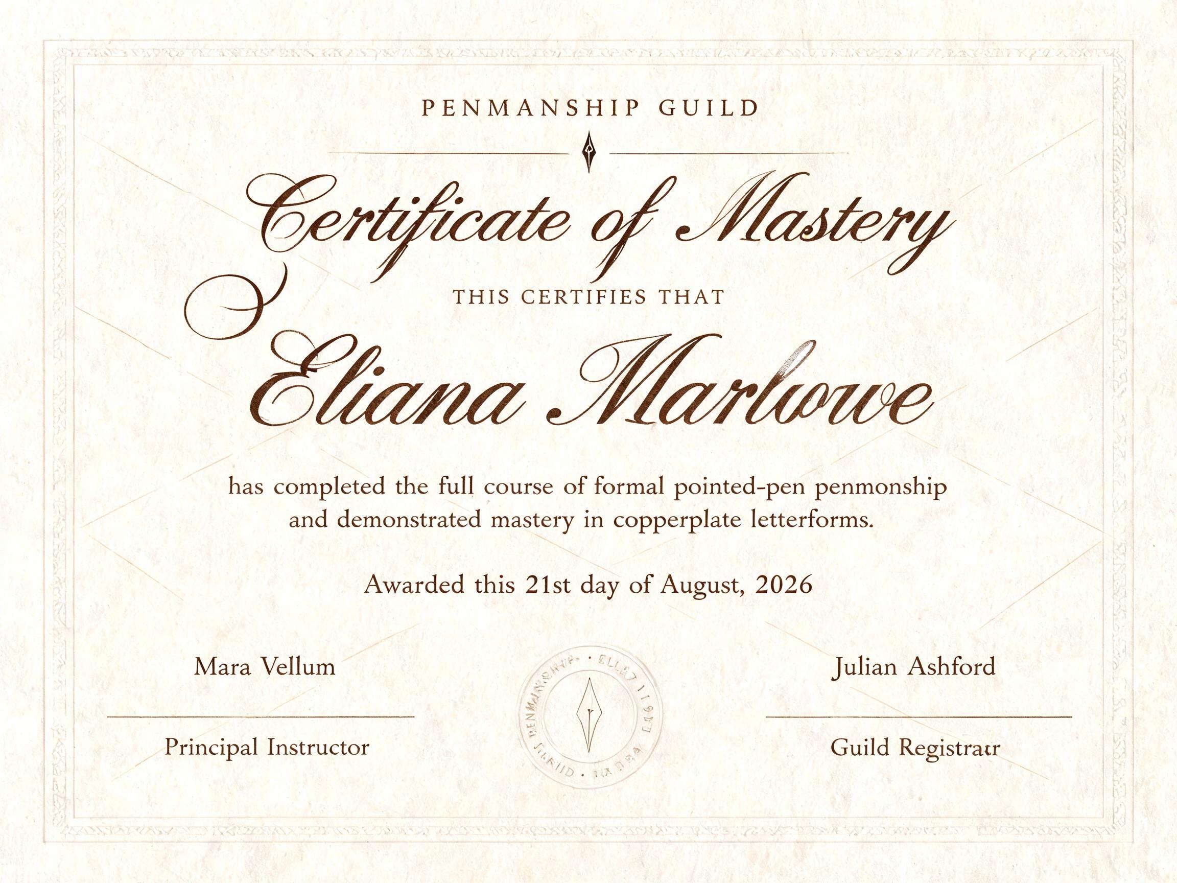
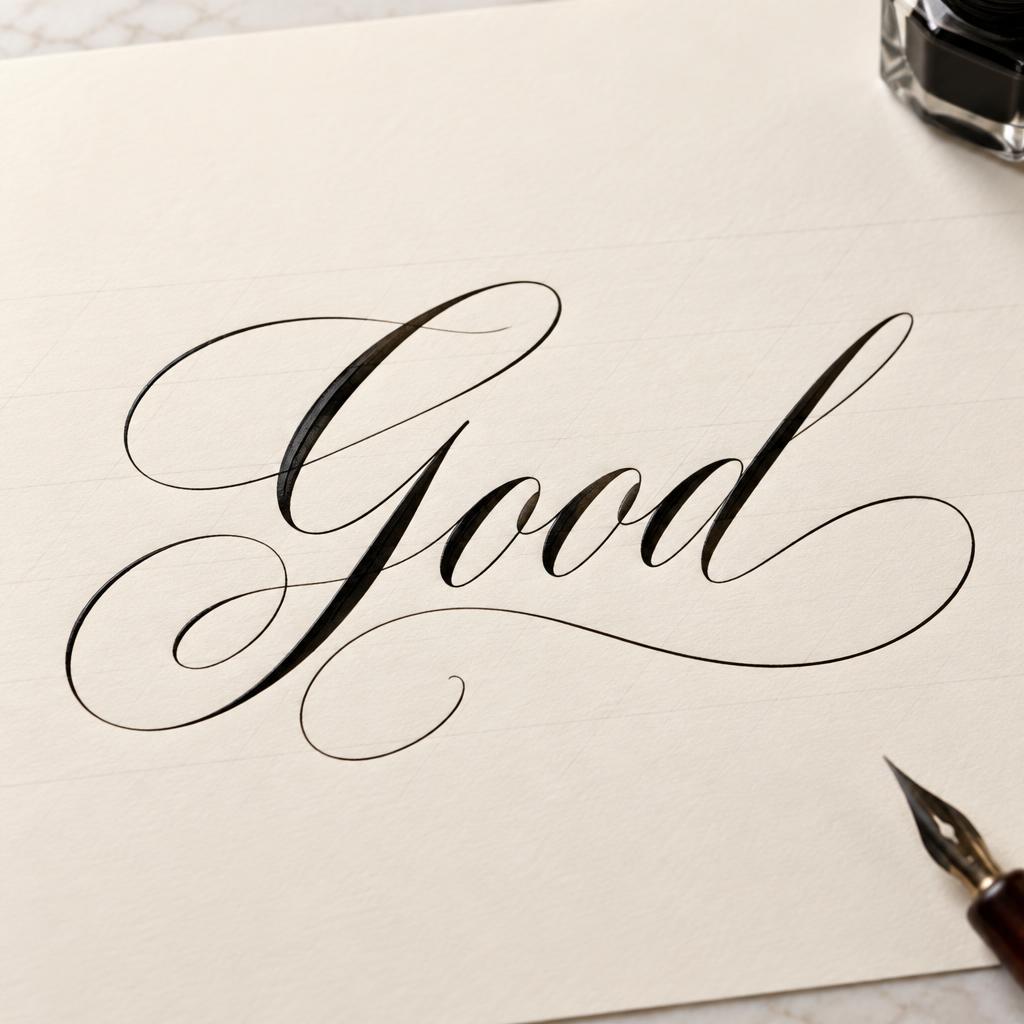
„Nib & Ink Atelier PAPER · INK · CORRESPONDENCE“ ist ein Kalligraphie-Schrift-Texteffekt, erstellt mit FontVibe KI. Formelle Copperplate mit Spitzfeder: starker Kontrast von dick und dünn, schräge ovale Buchstaben und geschwungene Versalien, klare schwarze Tinte auf cremefarbenem Papier mit feinen Hilfslinien.
Create a finished, refined square logo for a stationer. Set the exact wording on the artwork as three lines, with no other text: “Nib & Ink” as the large, unmistakable wordmark; “Atelier” centered beneath it in smaller formal calligraphy; and “PAPER · INK · CORRESPONDENCE” as a small, widely spaced uppercase descriptor. Preserve the spelling, capitalization, ampersand, and punctuation exactly. Draw both name lines in exacting formal copperplate pointed-pen calligraphy: oval-based letters with a consistent 55-degree right slant, rhythmic spacing and refined hairline connectors. Make “Nib & Ink” the dominant line, with dramatic, controlled thick downstrokes and whisper-fine upstrokes; use restrained, deliberate flourishes on the capitals without tangling the words. Give the smaller “Atelier” the same trained penmanship. Render every letter in deep warm-black ink, with crisp edges, subtly varied wet-ink sheen and fine pressure-shaped stroke edges. Use a centered, vertical logo lockup with generous margins. Place a small, elegant engraved dip-nib emblem with a single ink droplet above the wordmark; keep it clearly secondary and centered on the same axis. Set “Nib & Ink” across the central area, “Atelier” directly below with ample breathing room, and the descriptor as a neat small line near the bottom. Add a fine, understated oval hairline frame around the emblem and name, leaving the descriptor outside the frame. Keep the lettering clear and legible; no extra ornaments, props or copy. The ground is smooth cream hot-press cotton paper with subtle natural fiber texture and a faint warm ivory variation. Use soft, even studio light that reveals crisp ink edges and paper grain without dramatic shadows. Restrained palette of warm ivory, deep ink black and a barely perceptible antique-brass accent only on the nib emblem. The result feels formal, timeless and carefully crafted, like a master calligrapher's mark for a fine stationery atelier.
Gemacht für Copperplate-Kalligrafie
Generiert am 21. Oktober 2026 · 1024 × 1024 · JPEG · OpenAI GPT-Image-2.5 Sunburst · Layout: Nib-and-Wordmark Lockup · Von der erstellenden Person geteilt · Kostenlos kommerziell nutzbar (CC BY 4.0)


