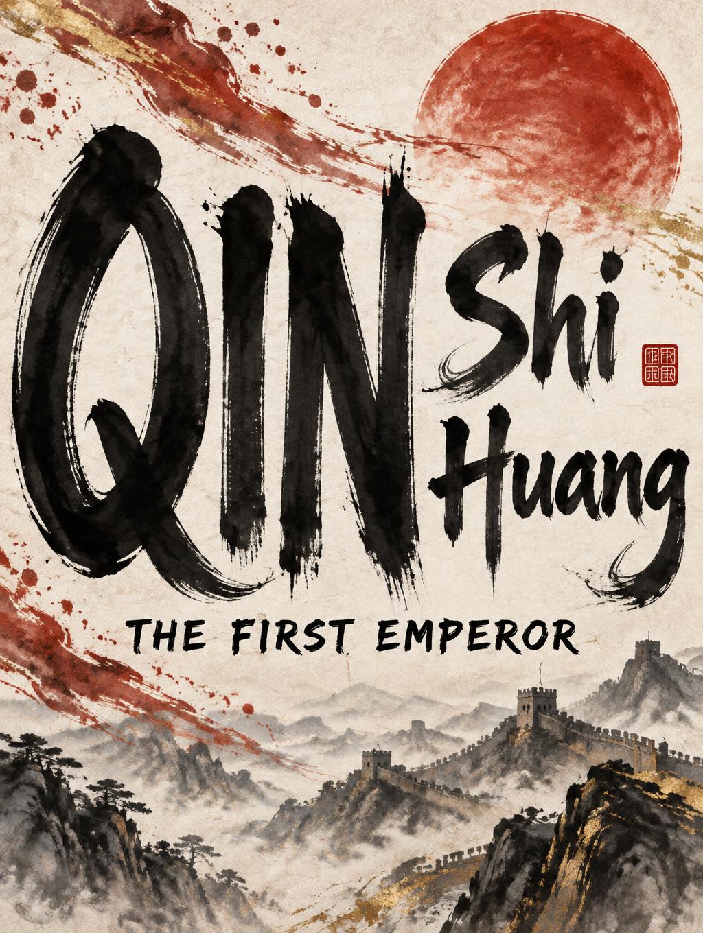
QIN Shi Huang THE FIRST EMPEROR - Pincel de Tinta China Text Effect


Usa OpenAI GPT-Image-2.5 Sunburst, el modelo de esta obra · 15 créditos


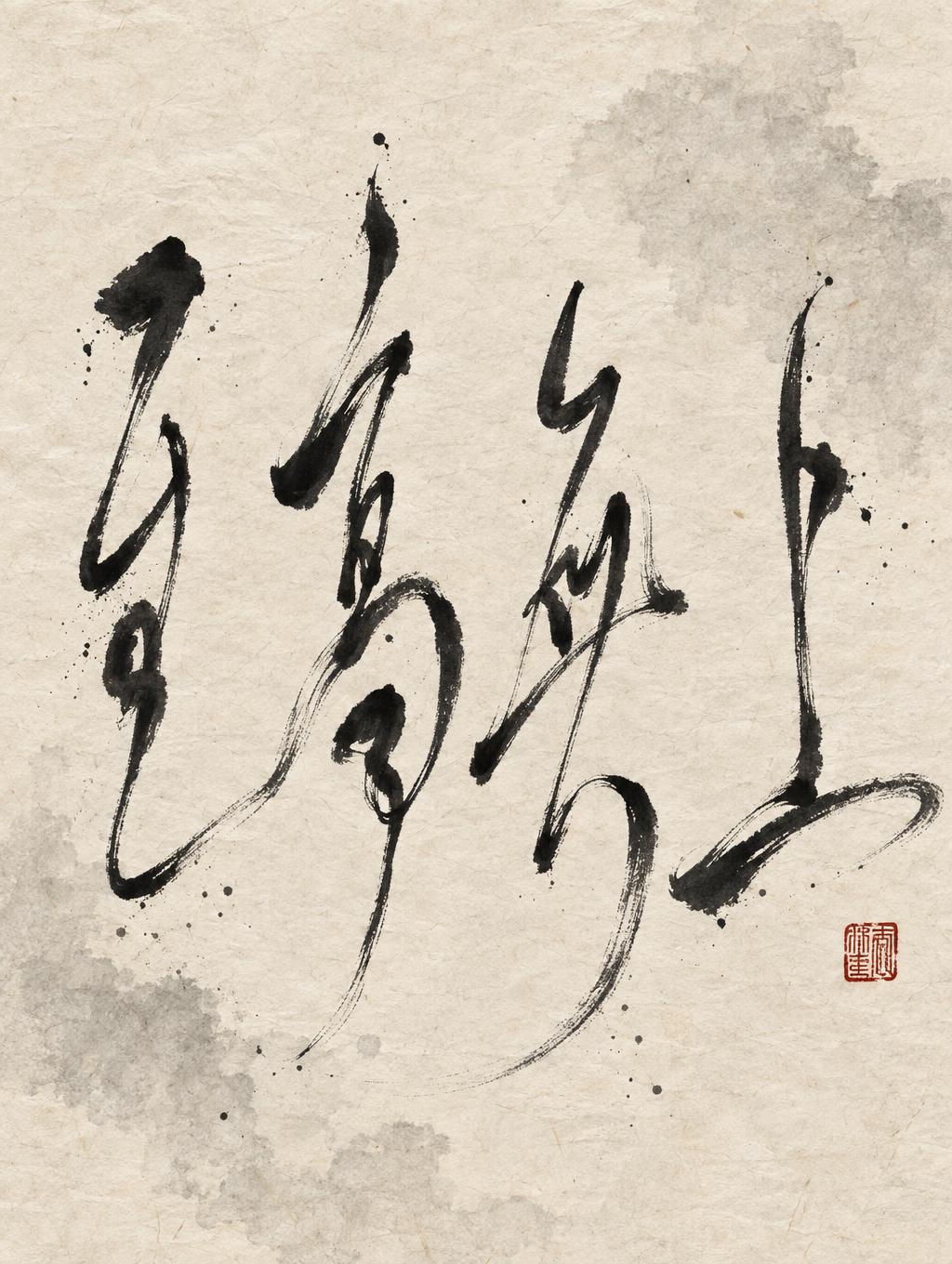




“QIN Shi Huang THE FIRST EMPEROR” is a Brush Chinese Ink text effect efecto de texto creado con FontVibe IA. El estilo de la caligrafía china con pincel de tinta sumi llevado a las letras latinas. Negro profundo con textura auténtica de cerdas, trazos que van de grueso a fino y ese aire de papel de arroz. Perfecto para marcas de restaurantes chinos, artes marciales, bienestar y diseño cultural.
Create a finished vertical 3:4 typographic title poster, not a standalone wordmark. Render only these exact text strings, with exact spelling and casing: “QIN”, “Shi”, “Huang”, “THE FIRST EMPEROR”. Arrange “QIN” as the dominant headline, very large, occupying the left half and most of the poster height. Place “Shi” beside the upper half of “QIN” on the right; place “Huang” beside its lower half on the right. Set “THE FIRST EMPEROR” as a smaller, clearly readable line centered beneath all of them. Keep all text distinct and unobscured. Shape every letter in controlled Japanese shodo-inspired Latin brush calligraphy: upright, harmonious forms; bold strokes with pronounced thick-to-thin variation; gradual loaded-brush entries, deliberate stroke bodies, and decisive tapered harai exits or hooked terminals. Execute each stroke once, with confident control and generous spacing. Render the letterforms in dense black sumi ink with slight dry-brush texture at the edges. Show genuine wet-to-dry transitions, ink pooling at stroke starts, visible bristle marks, and soft feathering at stroke ends; avoid clean digital edges and uniform fill. Stage the lettering on warm white xuan paper with visible fibers and subtle ink absorption. Add a flowing red ink-wash sweep and restrained gold-leaf brush accents around the lettering; make white, vermilion red, and warm gold clearly visible alongside the required black sumi. Include an abstract ink-wash landscape/ridge as a subdued scene element behind the text, plus a small unlettered red seal shape. Suggest animated brush-writing through a few controlled trailing ink strokes, frozen in motion without blurring the words. Keep the background quiet and the lettering dominant. High-contrast graphic composition, tactile paper and pigment, precise legibility, no extra lettering, no modern digital gradients.
Hecho para Generador de Letras de Dinastía
Generada el 4 de octubre de 2026 · 1024 × 1360 · JPEG · OpenAI GPT-Image-2.5 Sunburst · Diseño: Split Brush Title · Compartida por el creador · Uso comercial gratuito (CC BY 4.0)


