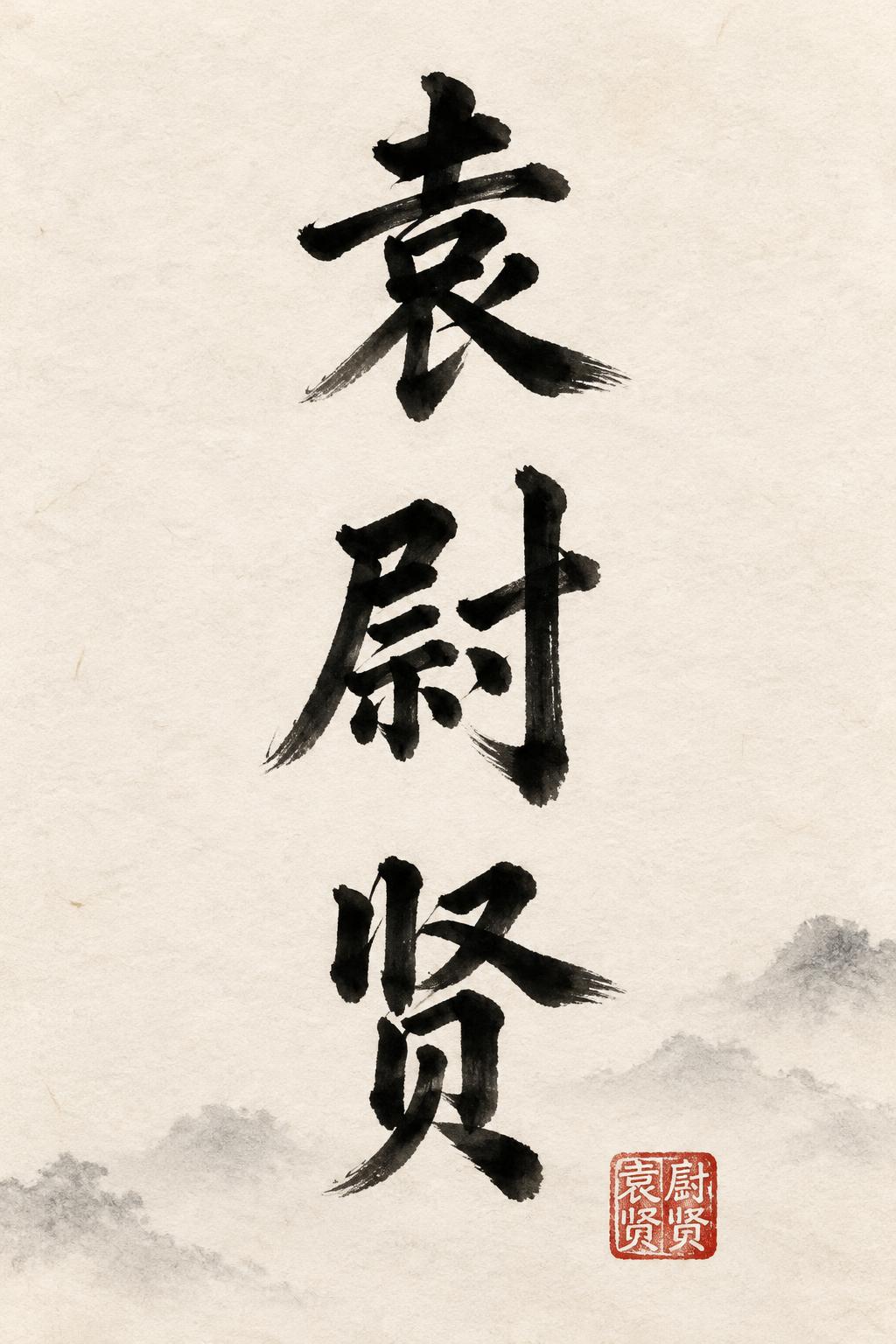
袁尉贤 - Pincel de Tinta China Text Effect


Usa OpenAI GPT-Image-2.5 Sunburst, el modelo de esta obra · 15 créditos
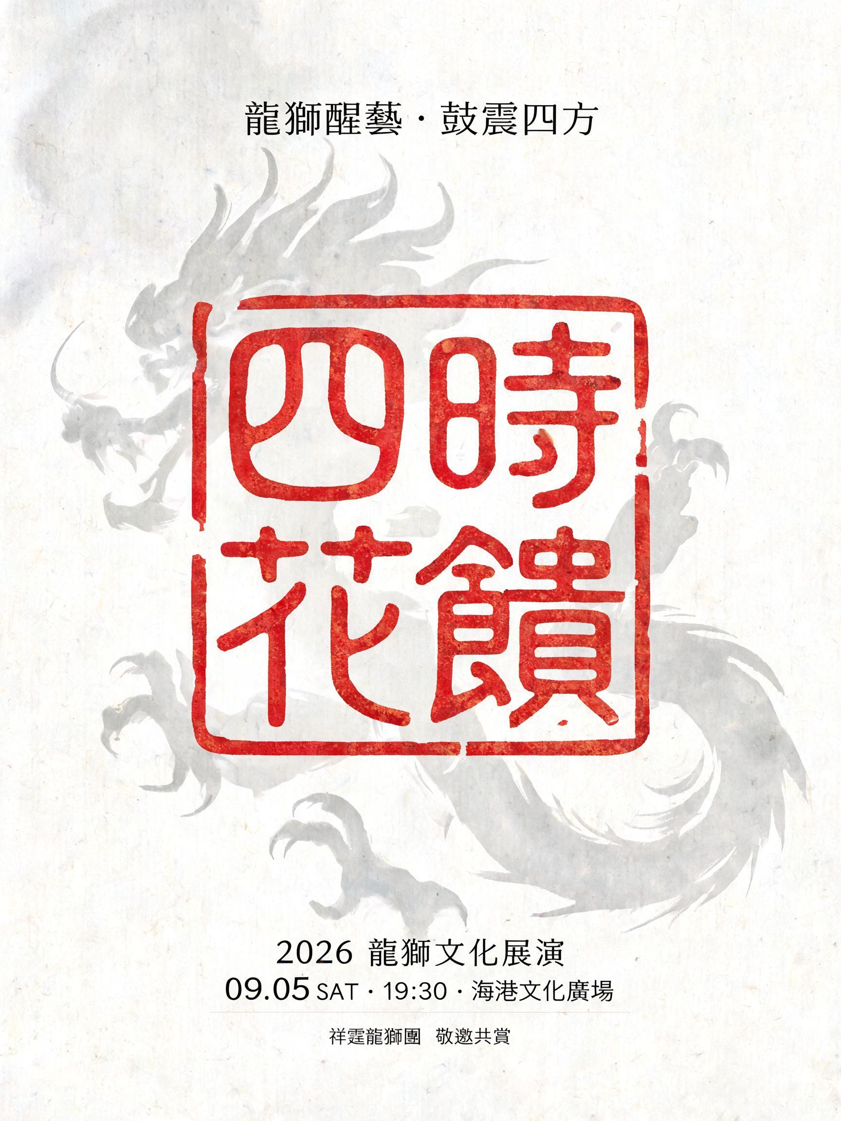
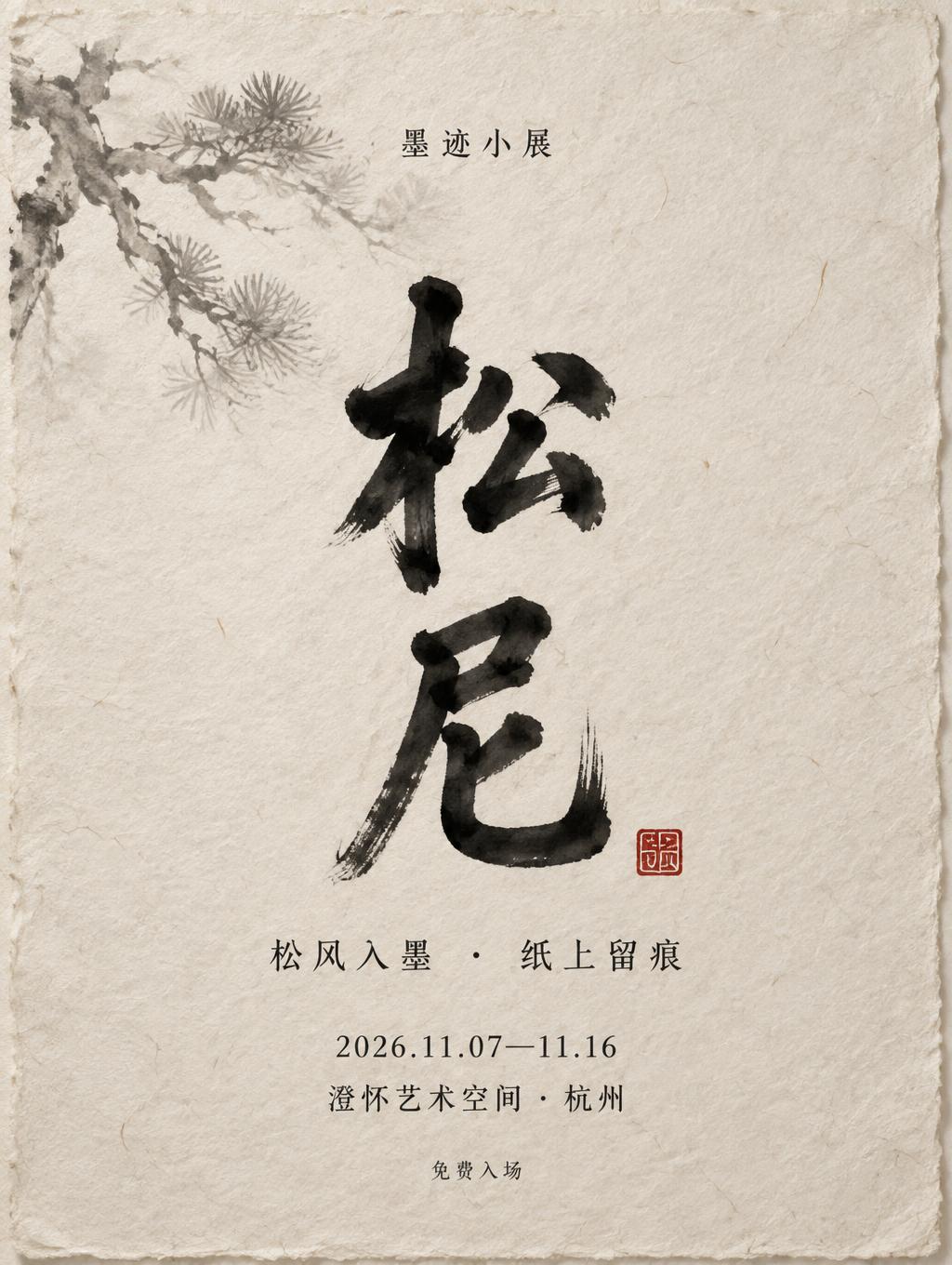
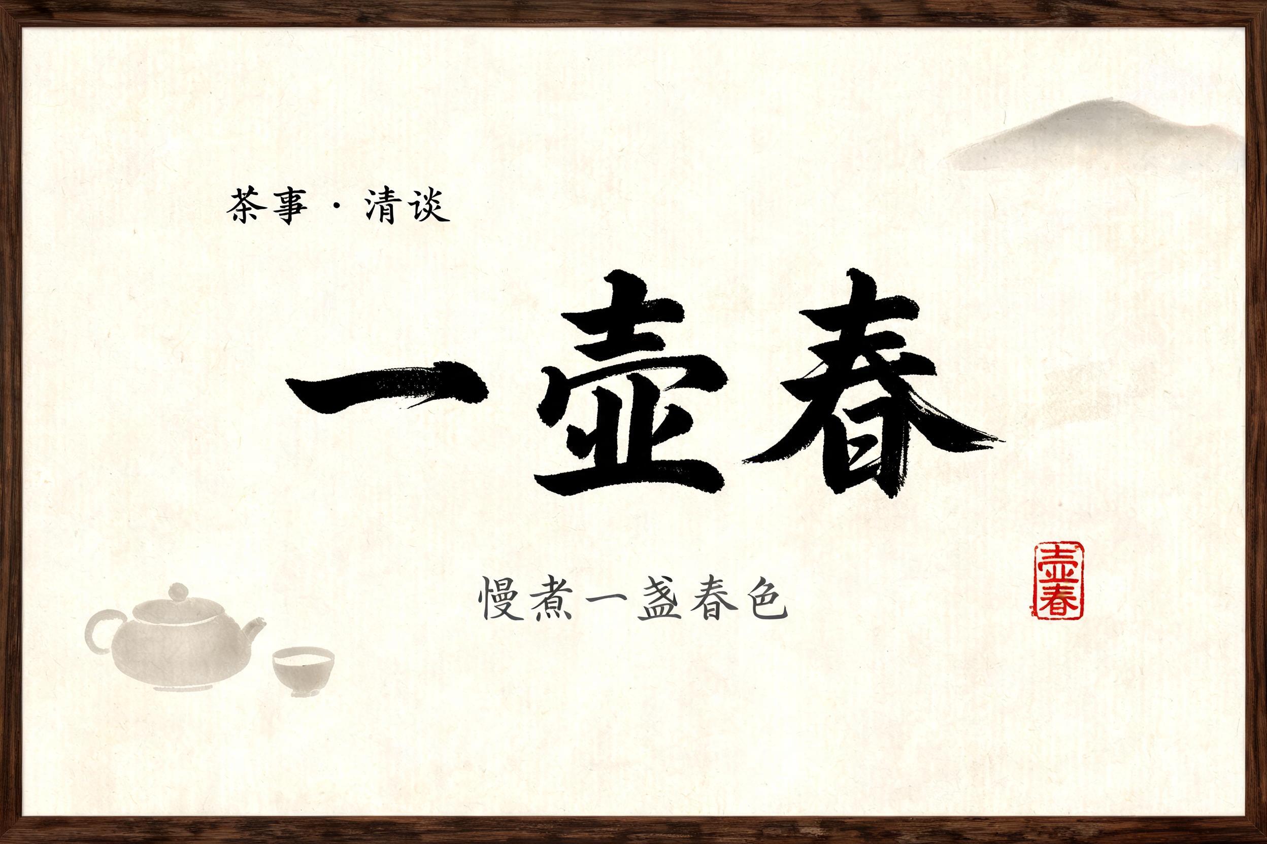


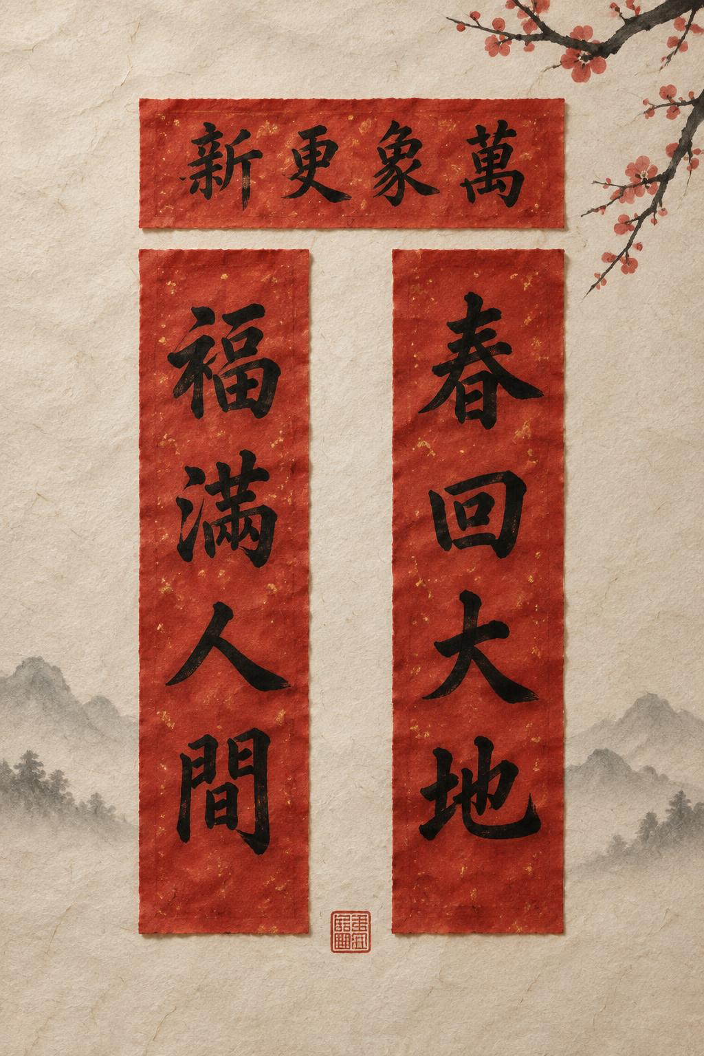
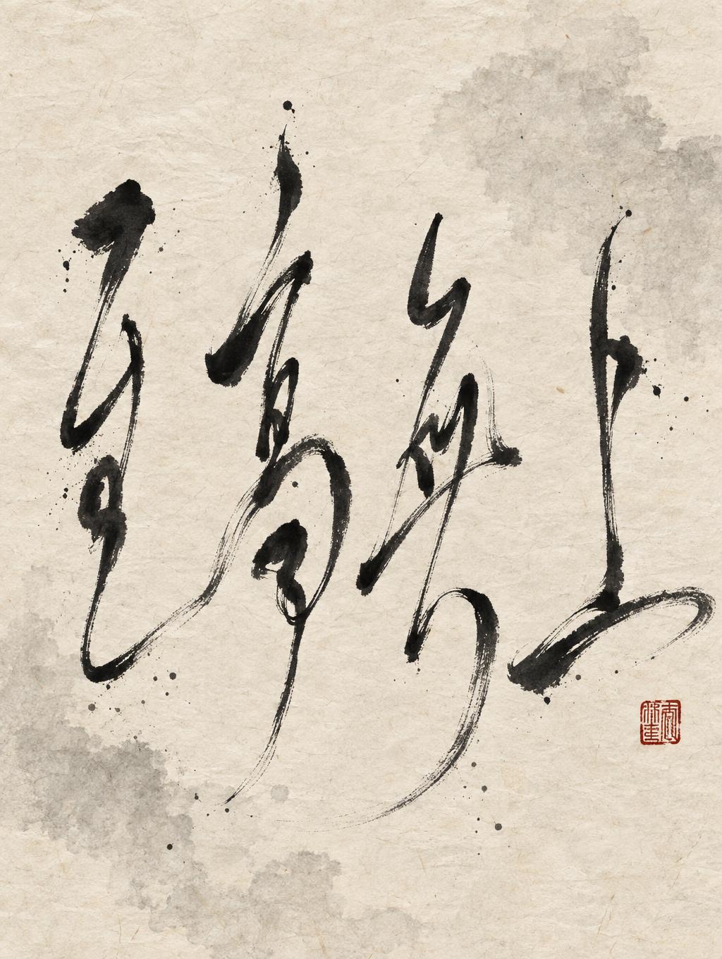
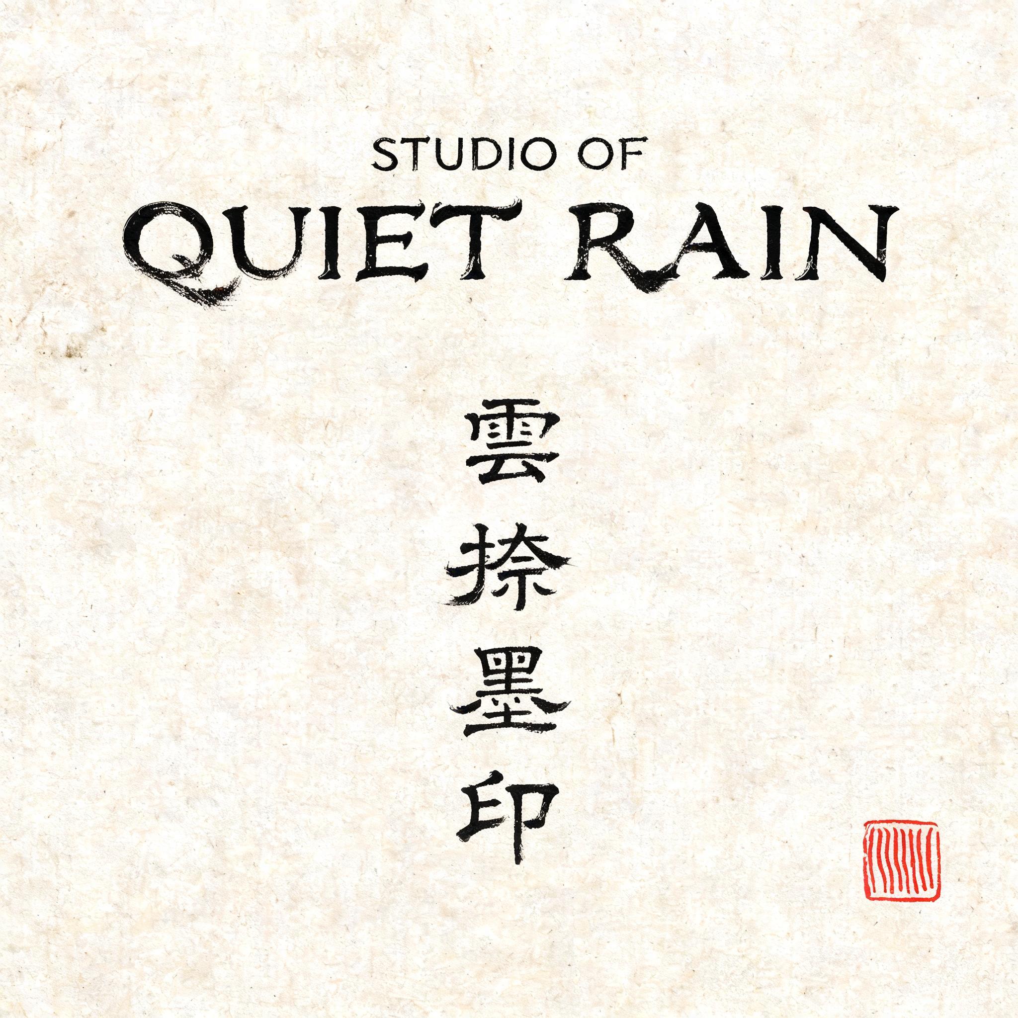

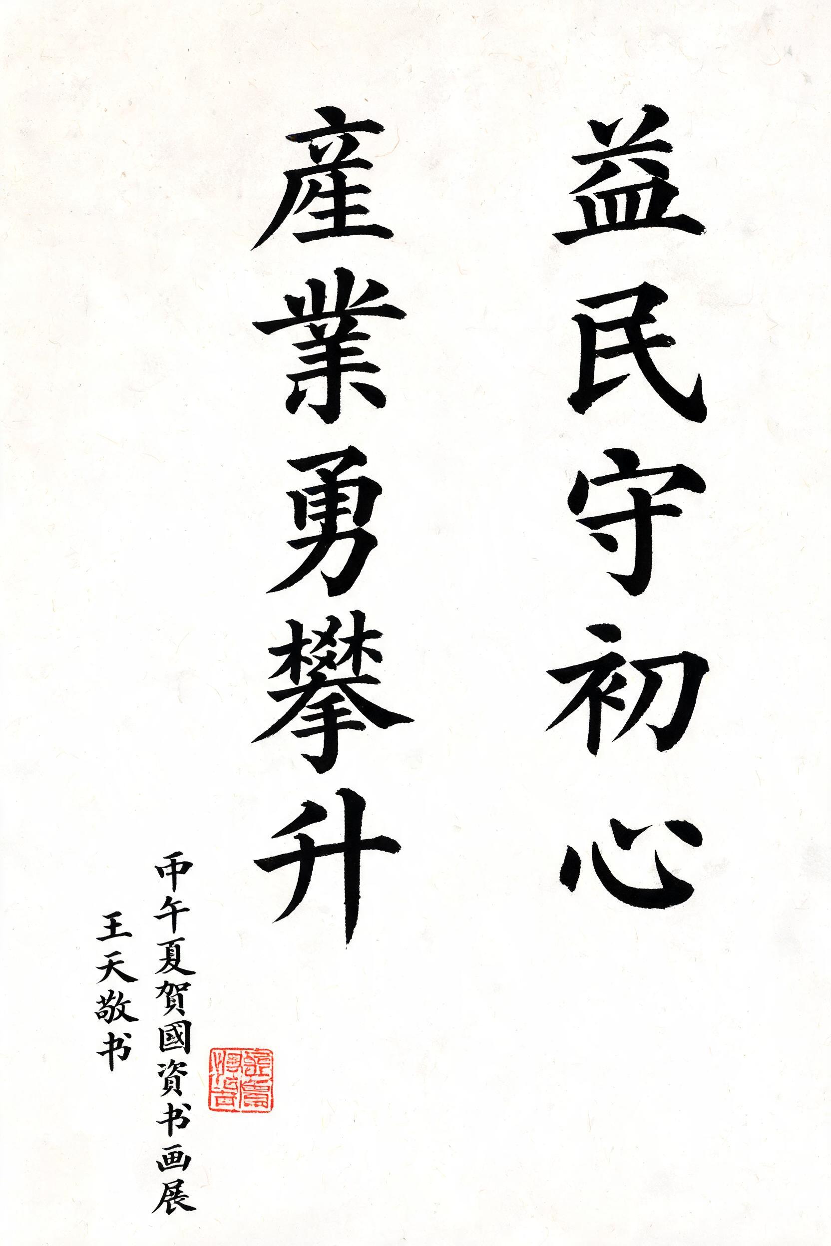
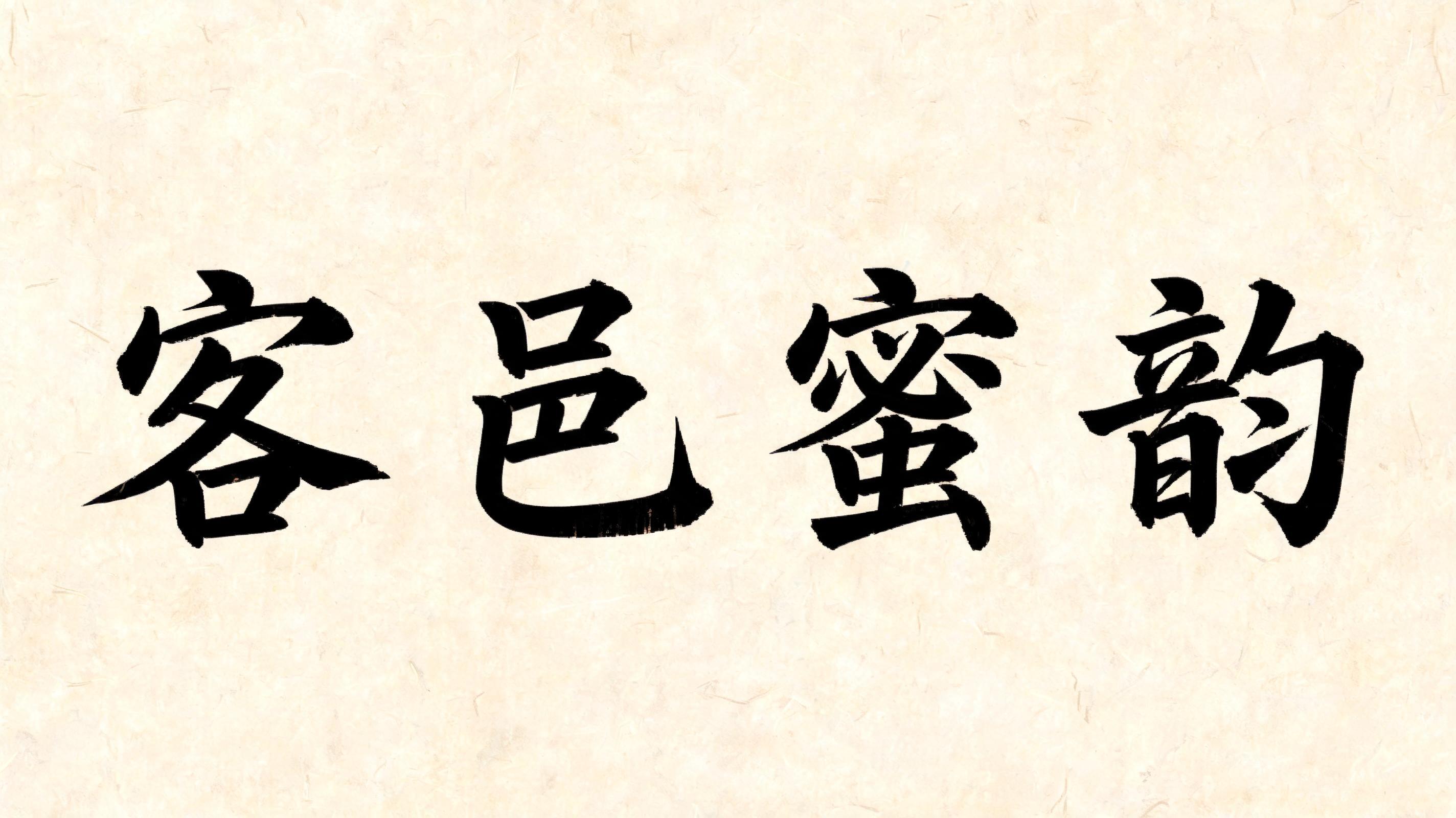

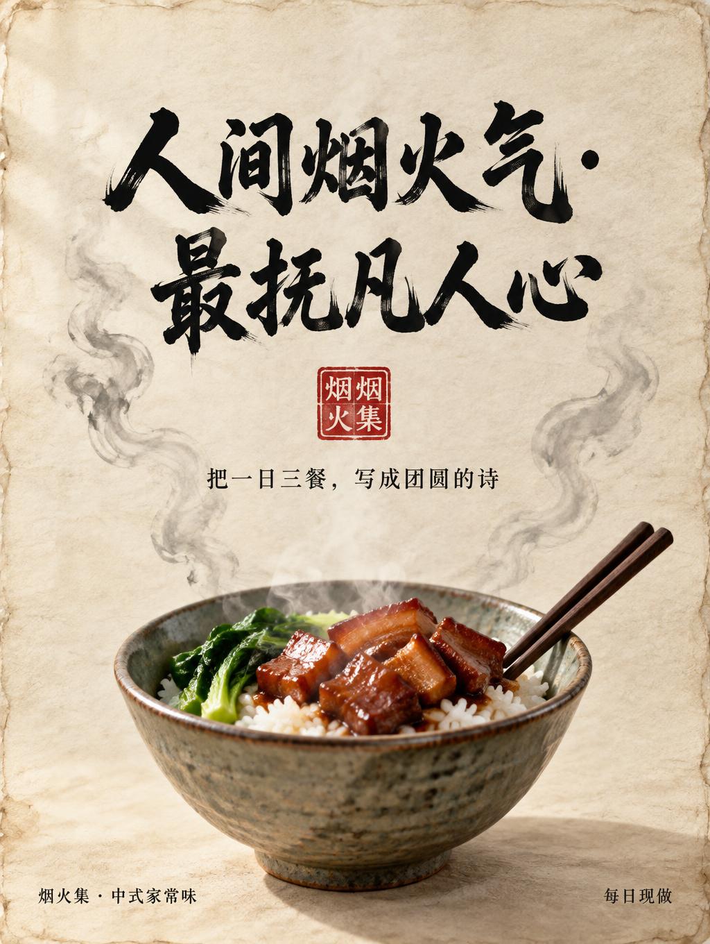
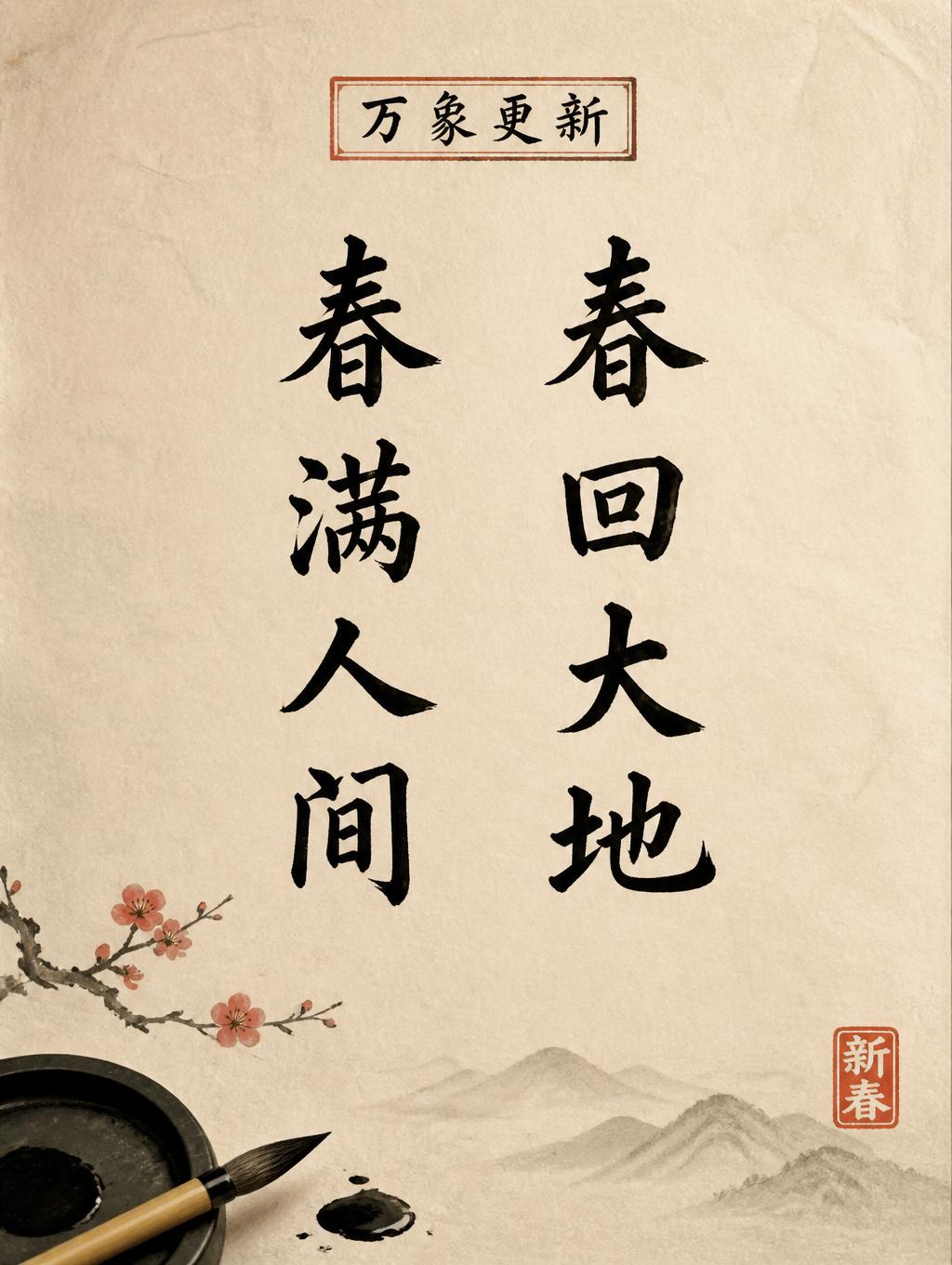


“袁尉贤” es un efecto de texto Pincel de Tinta China creado con FontVibe IA. El estilo de la caligrafía china con pincel de tinta sumi llevado a las letras latinas. Negro profundo con textura auténtica de cerdas, trazos que van de grueso a fino y ese aire de papel de arroz. Perfecto para marcas de restaurantes chinos, artes marciales, bienestar y diseño cultural.
rendered in Chinese ink brush calligraphy style. Letterforms painted with a fully loaded sumi ink brush — deep black ink, visible bristle marks along stroke edges, wet ink pooling at stroke starts, feathered dry-brush trailing ends. Authentic ink density variation: thick rich black cores fading to grey at thin passages. Rice paper texture visible behind. Traditional Chinese calligraphy energy — each stroke confident, intentional, irreversible. LETTERFORM PRIORITY: when the chosen font carries its own treatment, that font's letterform shapes take priority and own the letters; this style governs the sumi ink medium, the bristle and ink-density behavior and the rice-paper ground. FALLBACK MATERIAL: if the font carries no material of its own, render the letters as deep black sumi brush strokes with visible bristle marks, wet ink pooling at stroke starts and feathered dry-brush trails on rice paper. COLOR PRIORITY: keep the font's own colors if specified; otherwise rich black ink fading to grey at thin passages. Portrait 2:3. Three Chinese characters 袁尉贤 arranged in a graceful vertical column, with generous breathing room between the characters. Deep black sumi ink strokes show vivid wet-to-dry variation: rich, pooled black at forceful beginnings, smoky grey through thinner passages, and feathered brush-hair trails at the ends. Let individual bristle marks catch along select stroke edges, with slight ink bleed into visible xuan paper fibers. The ground is warm ivory rice paper, softly aged and nearly unmarked, with luminous paper showing through the lighter ink. A faint, restrained ink-wash haze gathers behind the lower strokes and dissolves into open negative space. Add a small vermilion seal near the lower edge as a quiet accent, separate from the main lettering. Keep the composition spare and balanced, preserving the characters as the unmistakable focal point; no uniform ink density, hard digital edges, or extra writing.
Hecho para Generador de letras de sello chino
Generada el 29 de octubre de 2026 · 1024 × 1536 · JPEG · OpenAI GPT-Image-2.5 Sunburst · Compartida por el creador · Uso comercial gratuito (CC BY 4.0)


