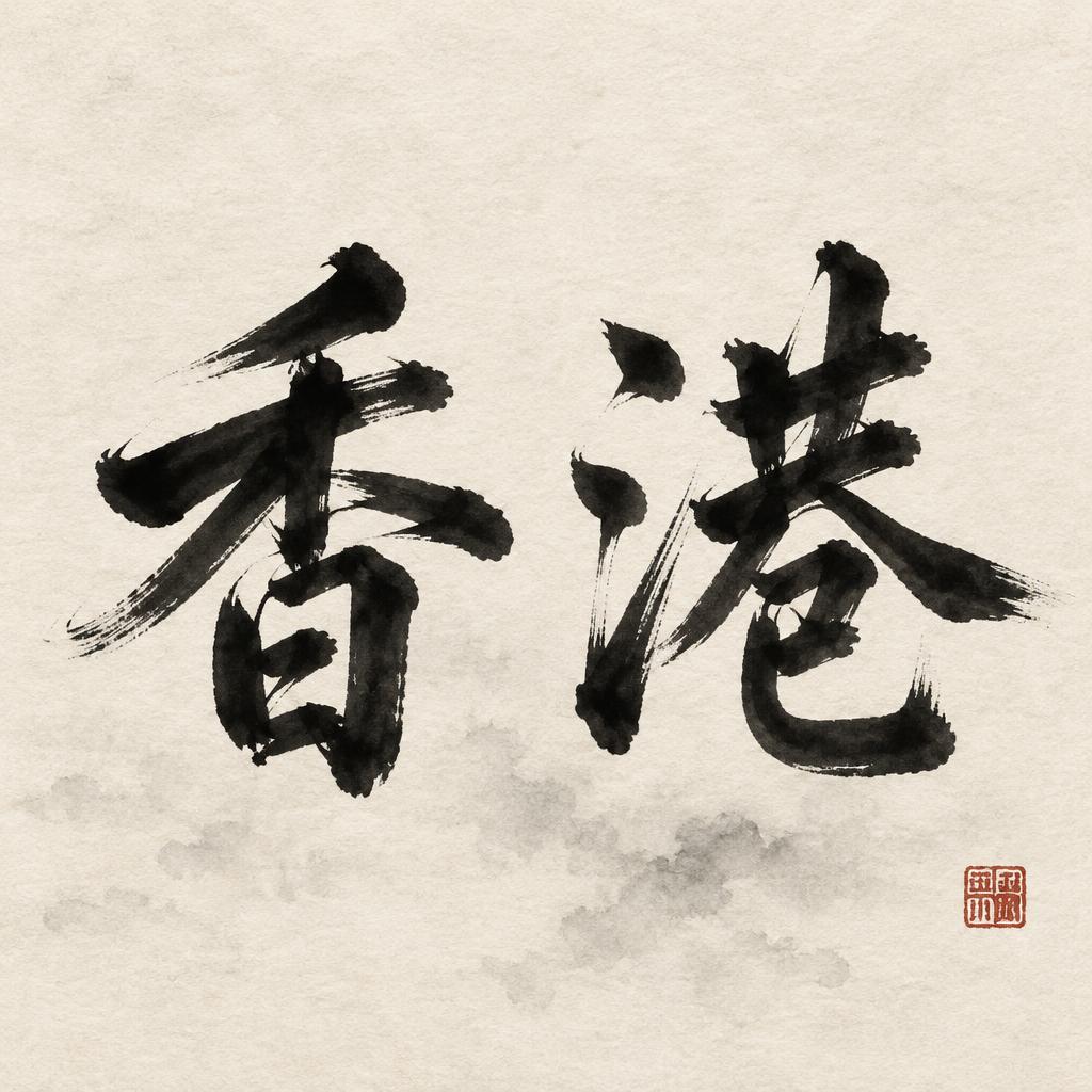
香港 - Pincel de Tinta China Text Effect


Usa OpenAI GPT-Image-2.5 Sunburst, el modelo de esta obra · 15 créditos
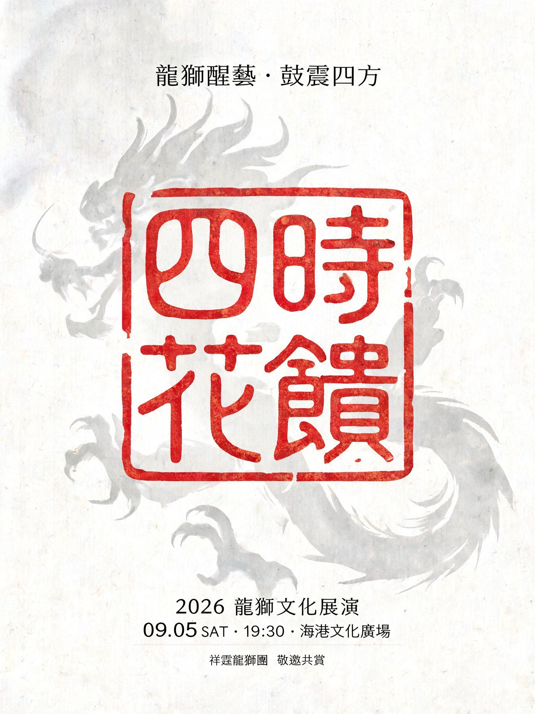
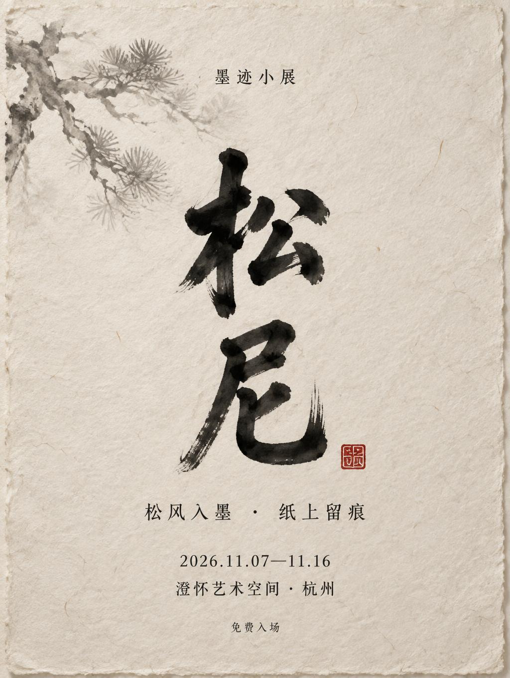
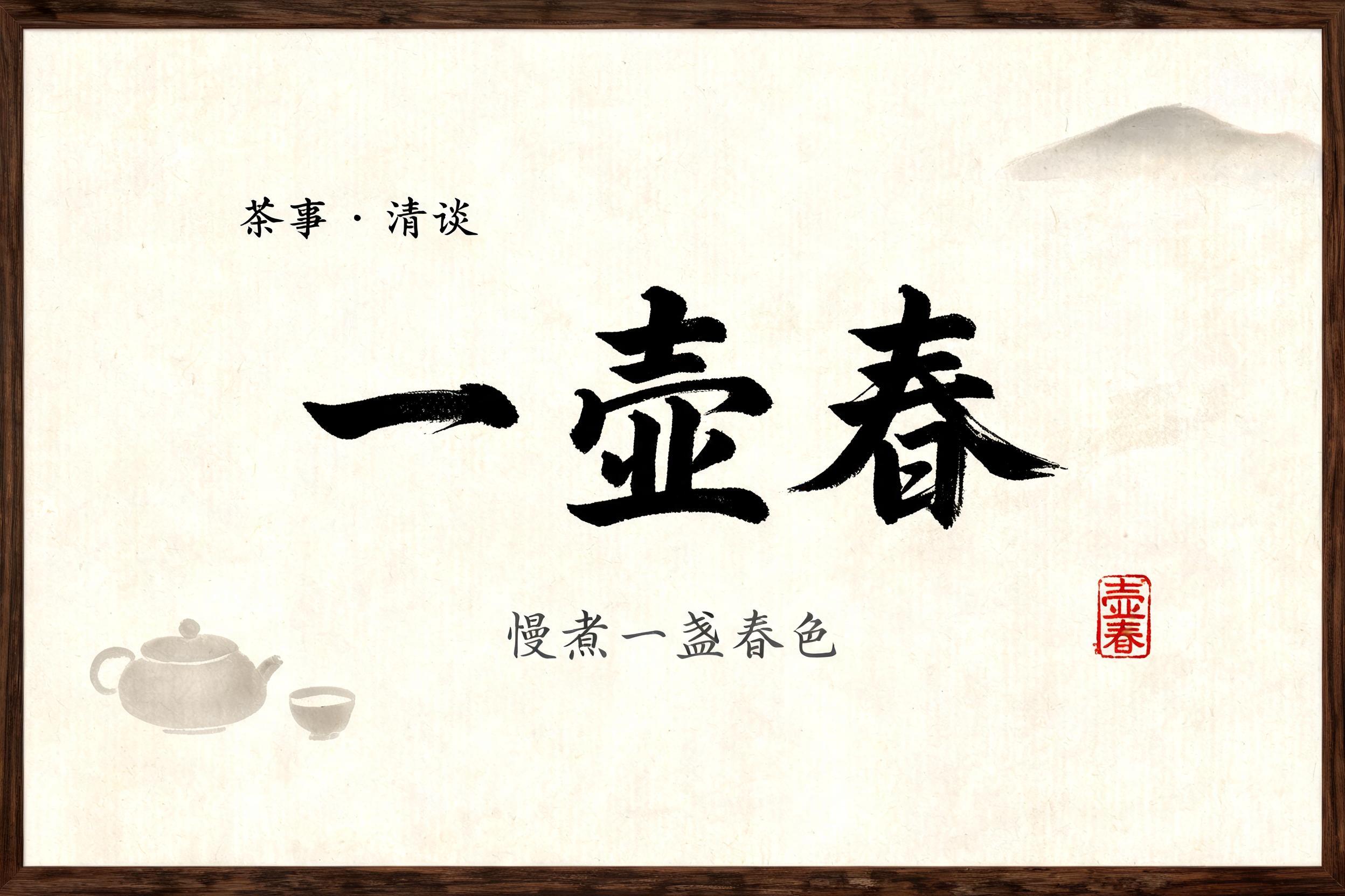


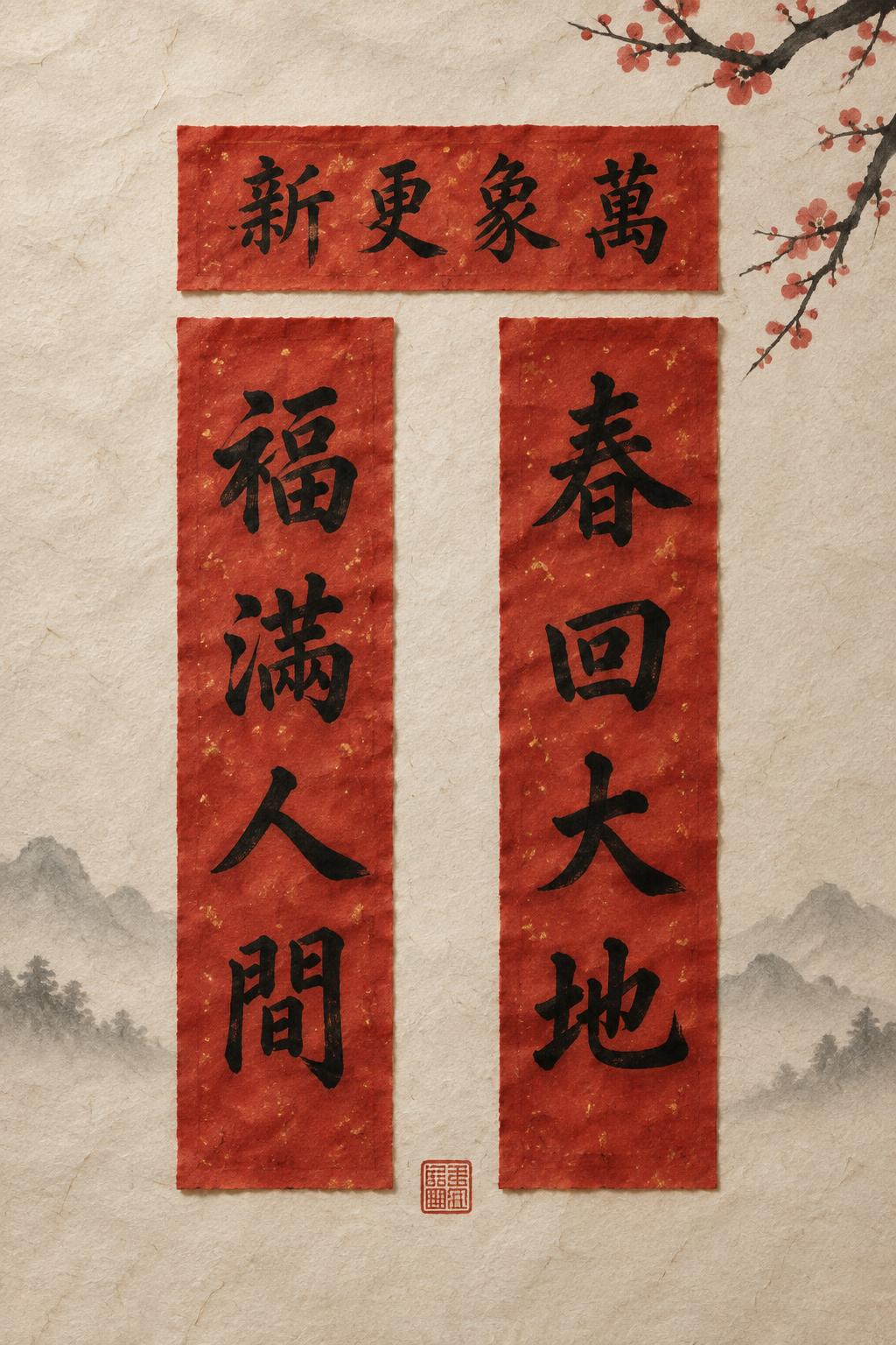
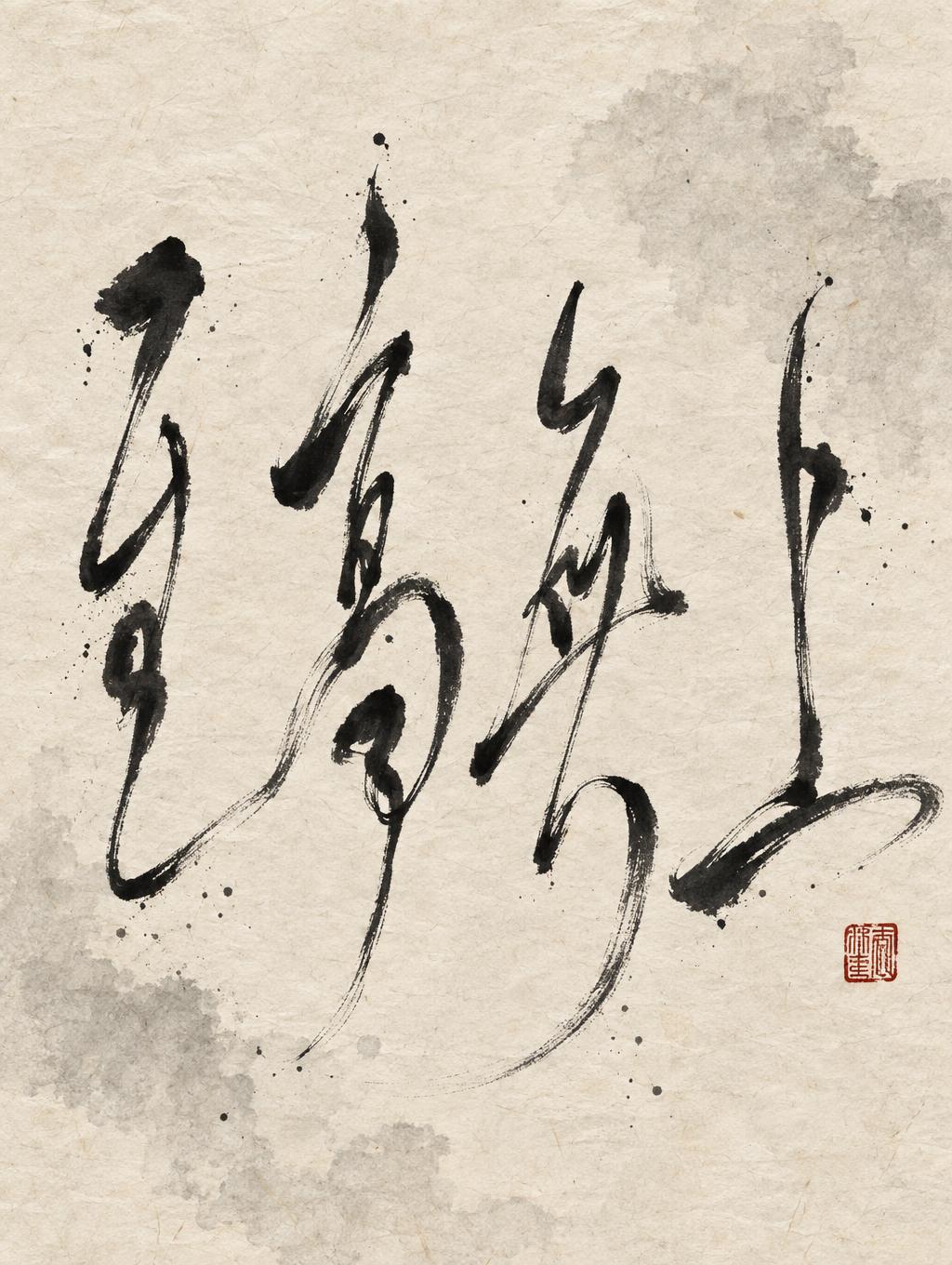
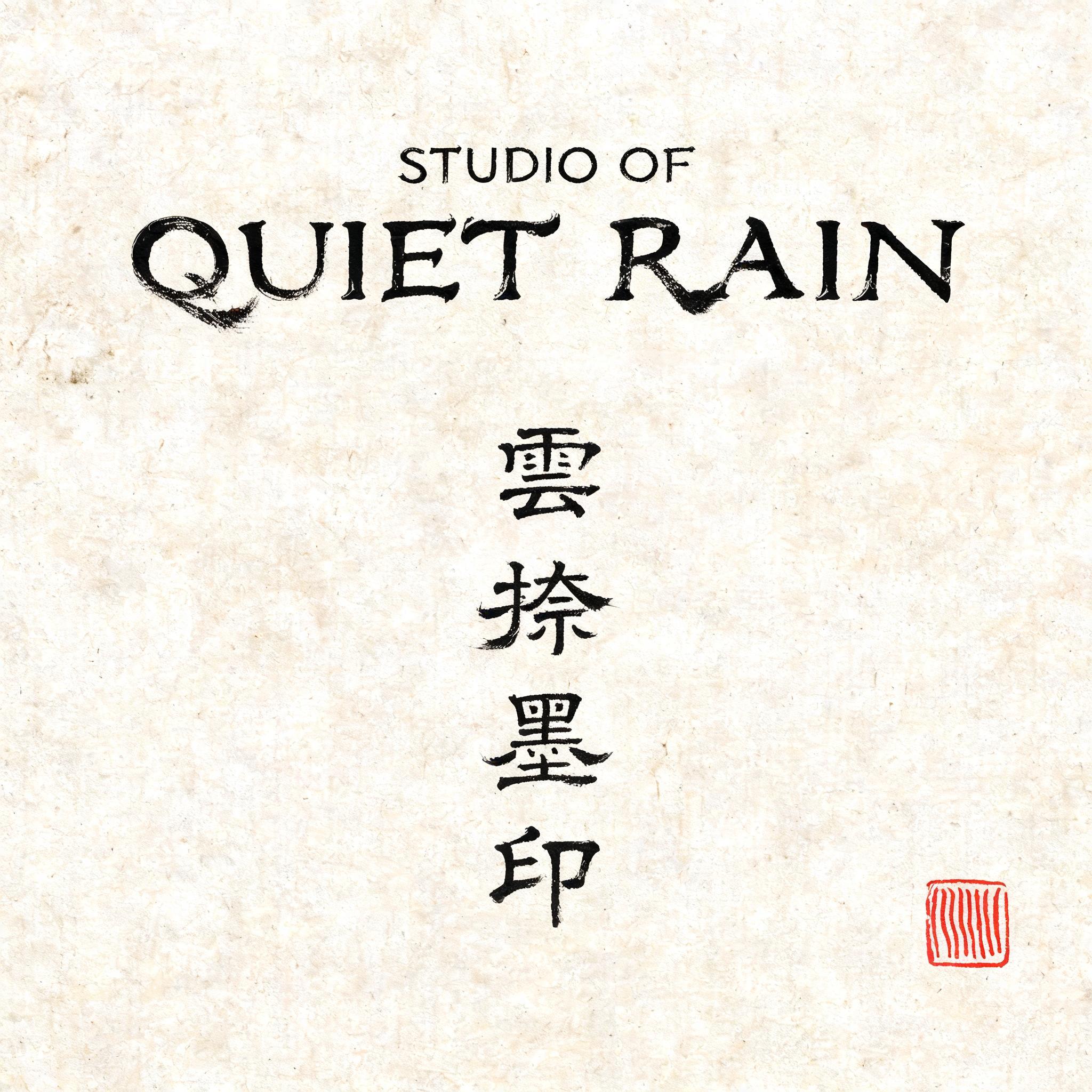

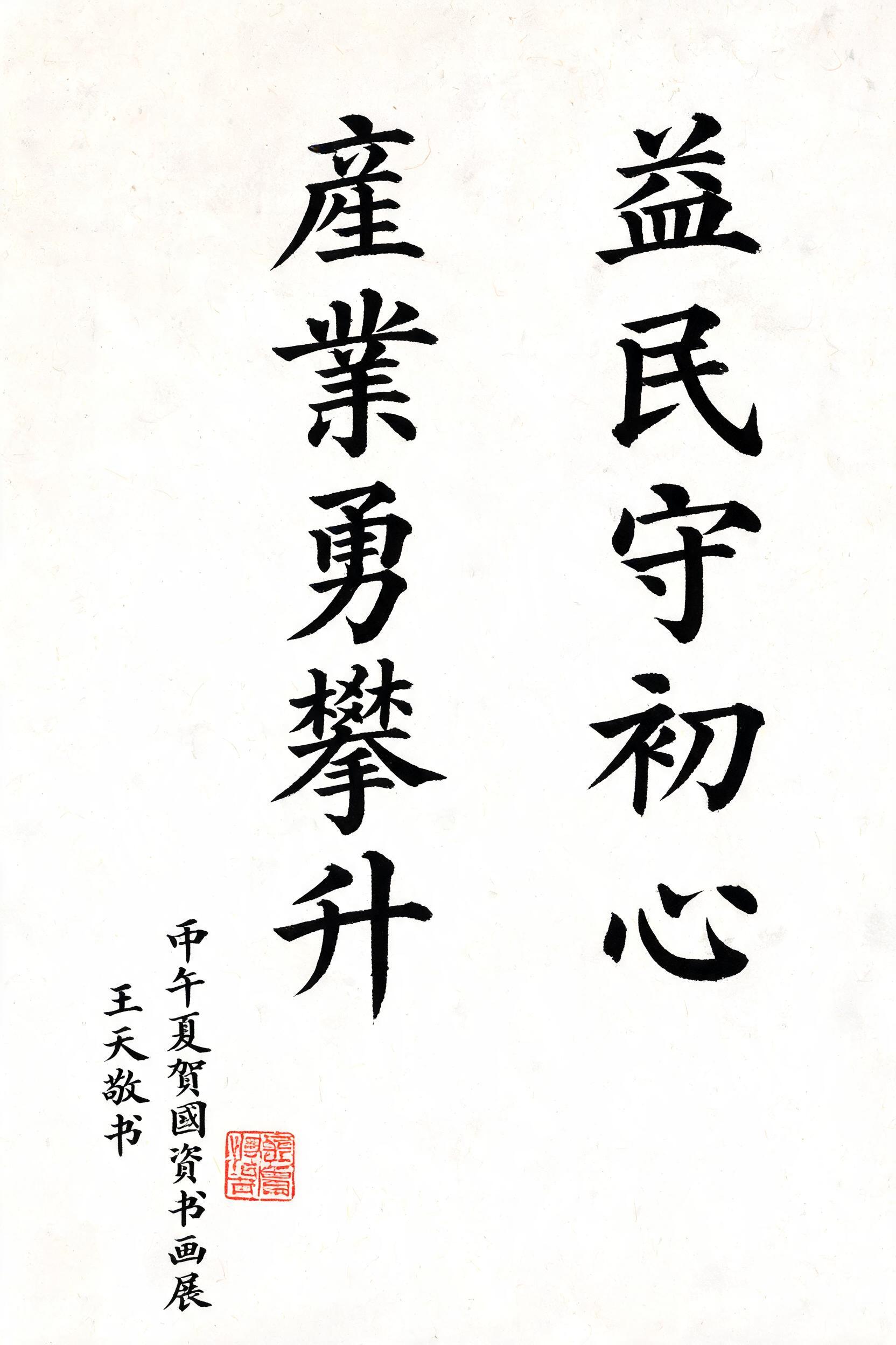
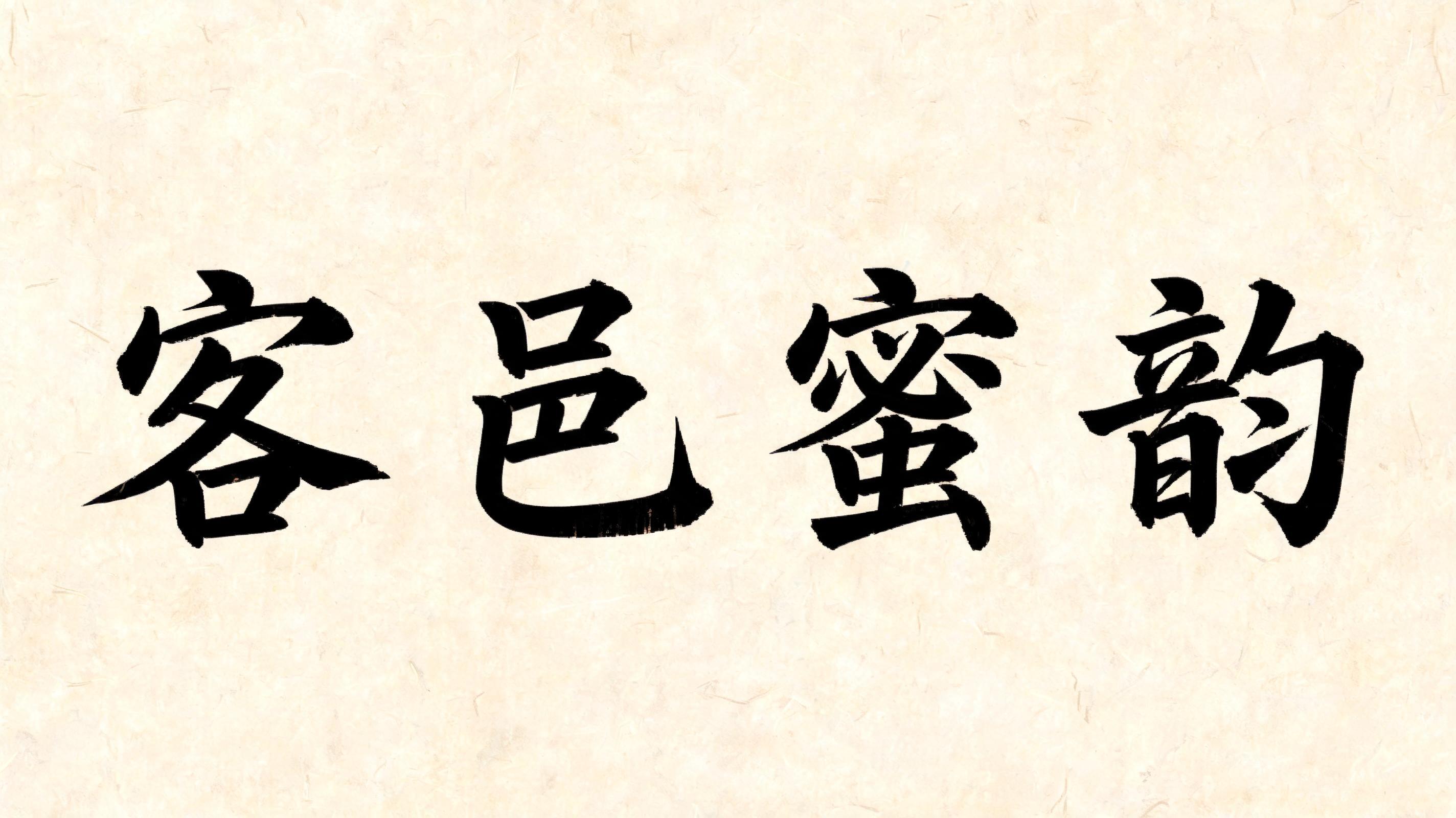

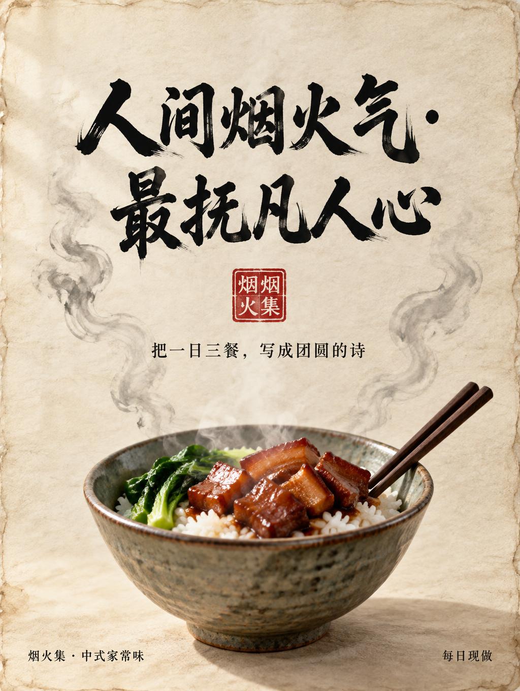
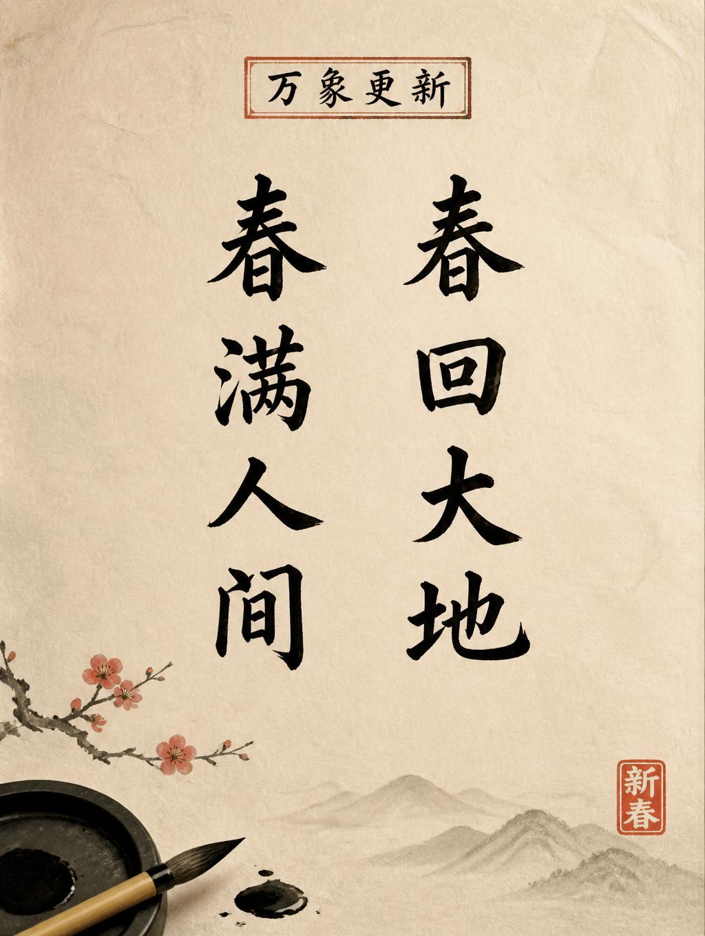


“香港” es un efecto de texto Pincel de Tinta China creado con FontVibe IA. El estilo de la caligrafía china con pincel de tinta sumi llevado a las letras latinas. Negro profundo con textura auténtica de cerdas, trazos que van de grueso a fino y ese aire de papel de arroz. Perfecto para marcas de restaurantes chinos, artes marciales, bienestar y diseño cultural.
rendered in Chinese ink brush calligraphy style. Letterforms painted with a fully loaded sumi ink brush — deep black ink, visible bristle marks along stroke edges, wet ink pooling at stroke starts, feathered dry-brush trailing ends. Authentic ink density variation: thick rich black cores fading to grey at thin passages. Rice paper texture visible behind. Traditional Chinese calligraphy energy — each stroke confident, intentional, irreversible. LETTERFORM PRIORITY: when the chosen font carries its own treatment, that font's letterform shapes take priority and own the letters; this style governs the sumi ink medium, the bristle and ink-density behavior and the rice-paper ground. FALLBACK MATERIAL: if the font carries no material of its own, render the letters as deep black sumi brush strokes with visible bristle marks, wet ink pooling at stroke starts and feathered dry-brush trails on rice paper. COLOR PRIORITY: keep the font's own colors if specified; otherwise rich black ink fading to grey at thin passages. Square 1:1 composition. Render the exact two Chinese characters 香港 prominently at the center, balanced side by side with spacious margins. Paint them in expressive Chinese ink brush calligraphy on warm ivory xuan paper, its fine woven fibers visible across the open background and through the thinner ink. Use rich, deep black sumi ink with confident, irreversible strokes: dense wet pools at stroke beginnings, subtle bristle marks and ragged edges, and tapered dry-brush trails that fade into soft gray. Preserve natural variations in ink density within every stroke; avoid uniform fills and digitally clean edges. A faint, restrained ink wash spreads beneath the characters, dissolving softly into the paper without reducing their clarity. Add a small vermilion seal impression near the lower right, visually secondary and without legible lettering. Keep the composition spare and contemplative, with generous luminous negative space and no additional text or scenery.
Hecho para Letras a Pincel Chino
Generada el 29 de octubre de 2026 · 1024 × 1024 · JPEG · OpenAI GPT-Image-2.5 Sunburst · Compartida por el creador · Uso comercial gratuito (CC BY 4.0)


