
🧪 Design something with Clarendon
Transparent Effect
✦ Transparent Effect
Generates a PNG with the background removed — only the text and its visual effects remain. The AI automatically selects the optimal background color for clean removal based on your style.
Output is always PNG for lossless transparency.



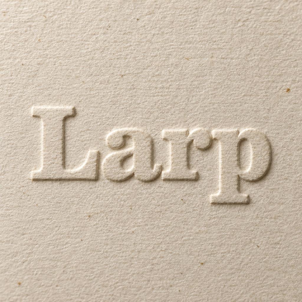
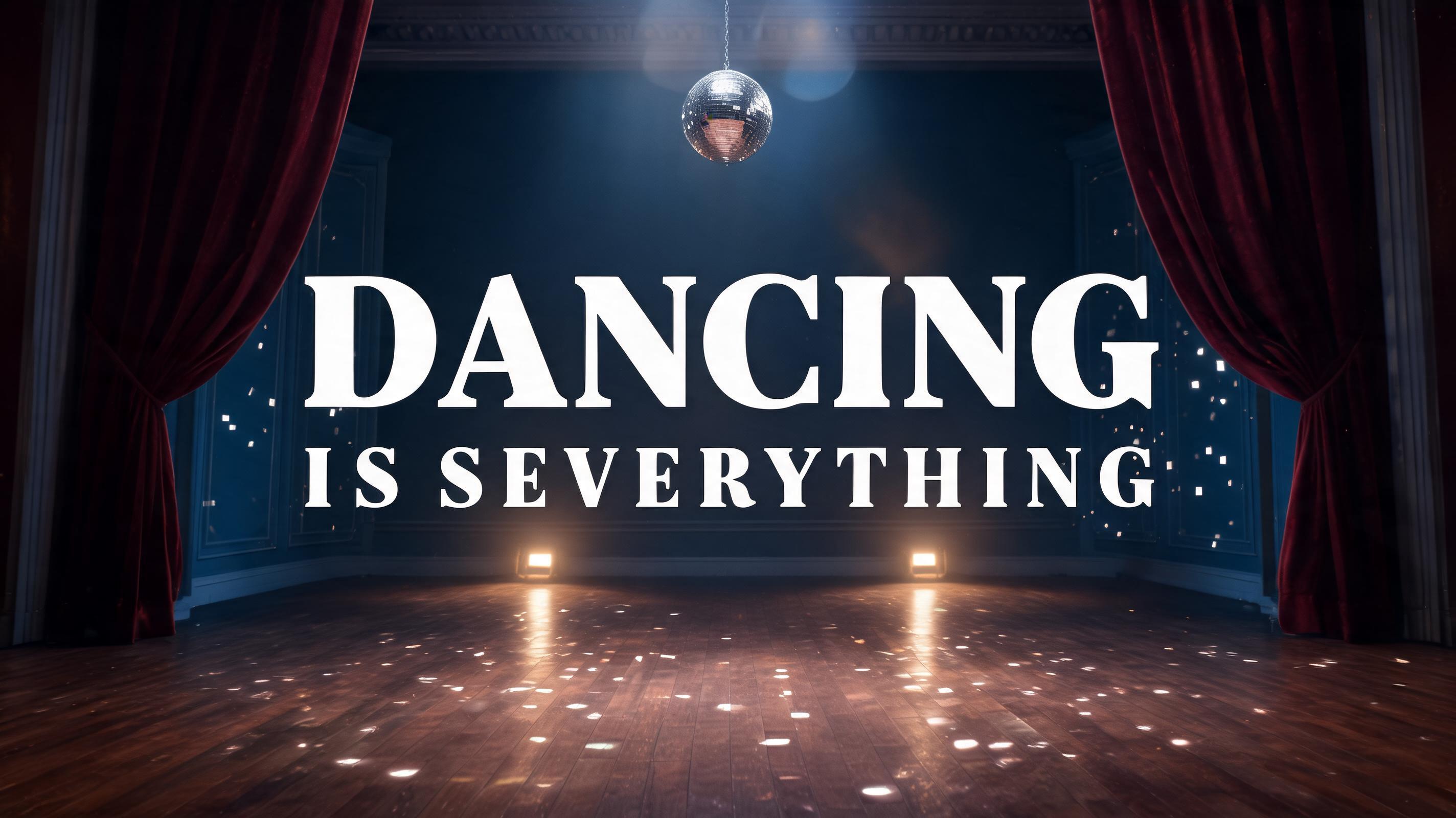
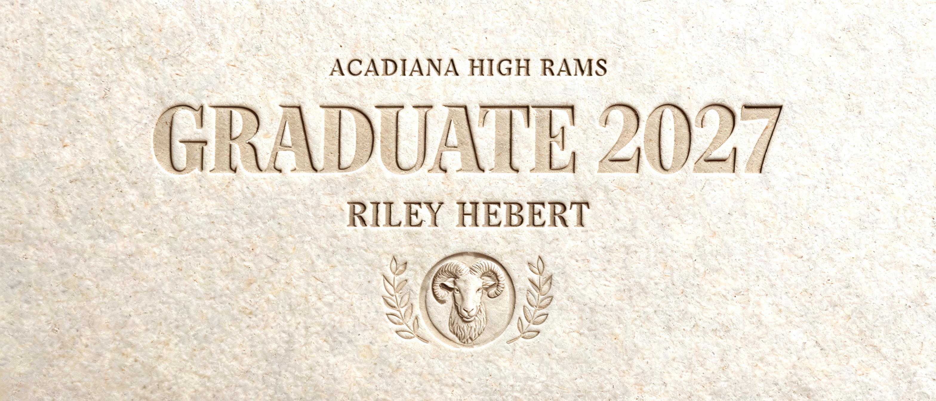
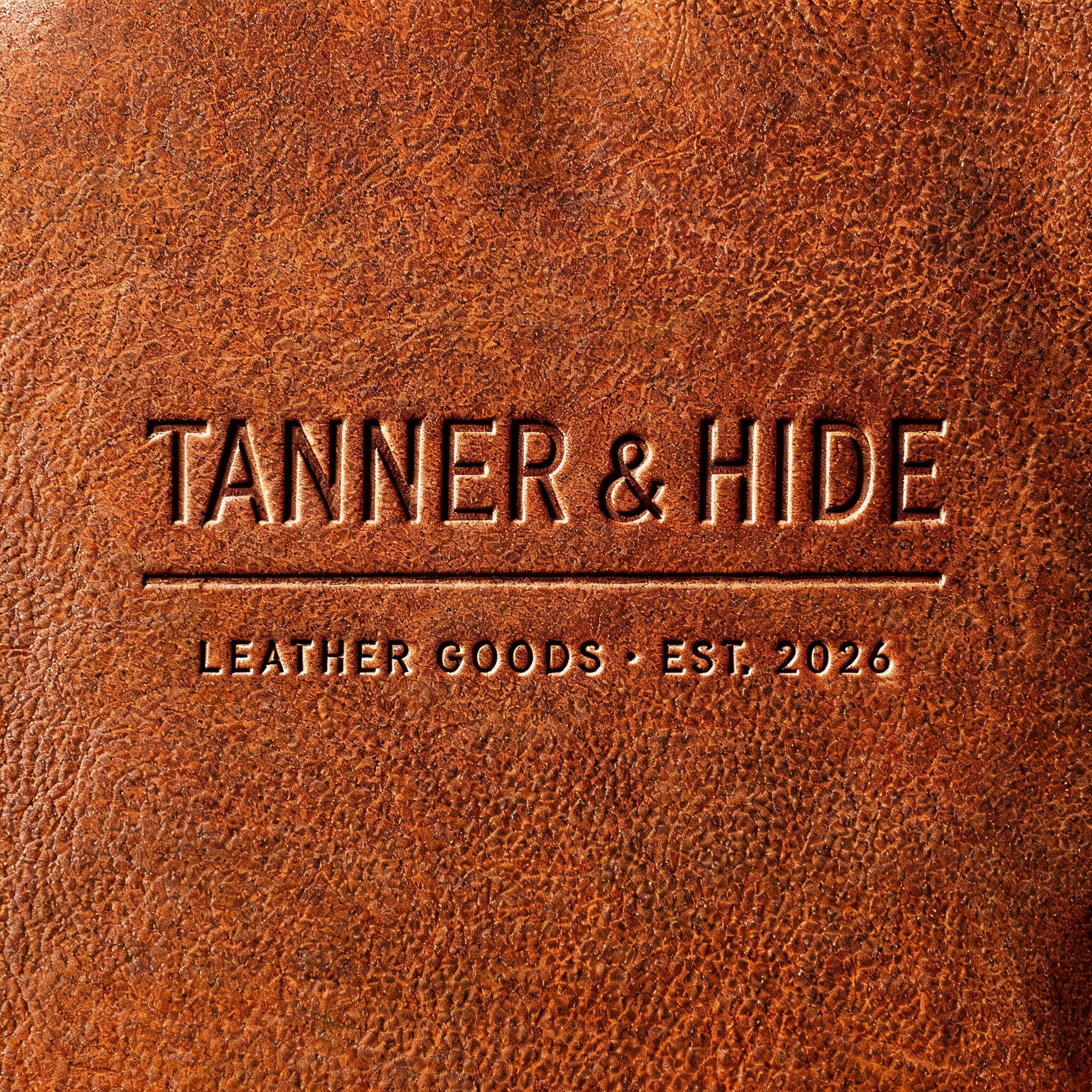
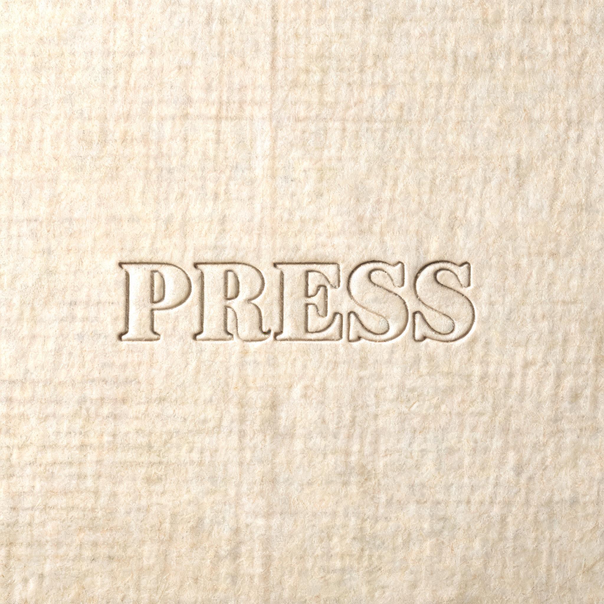

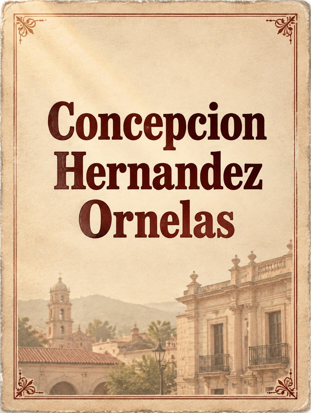



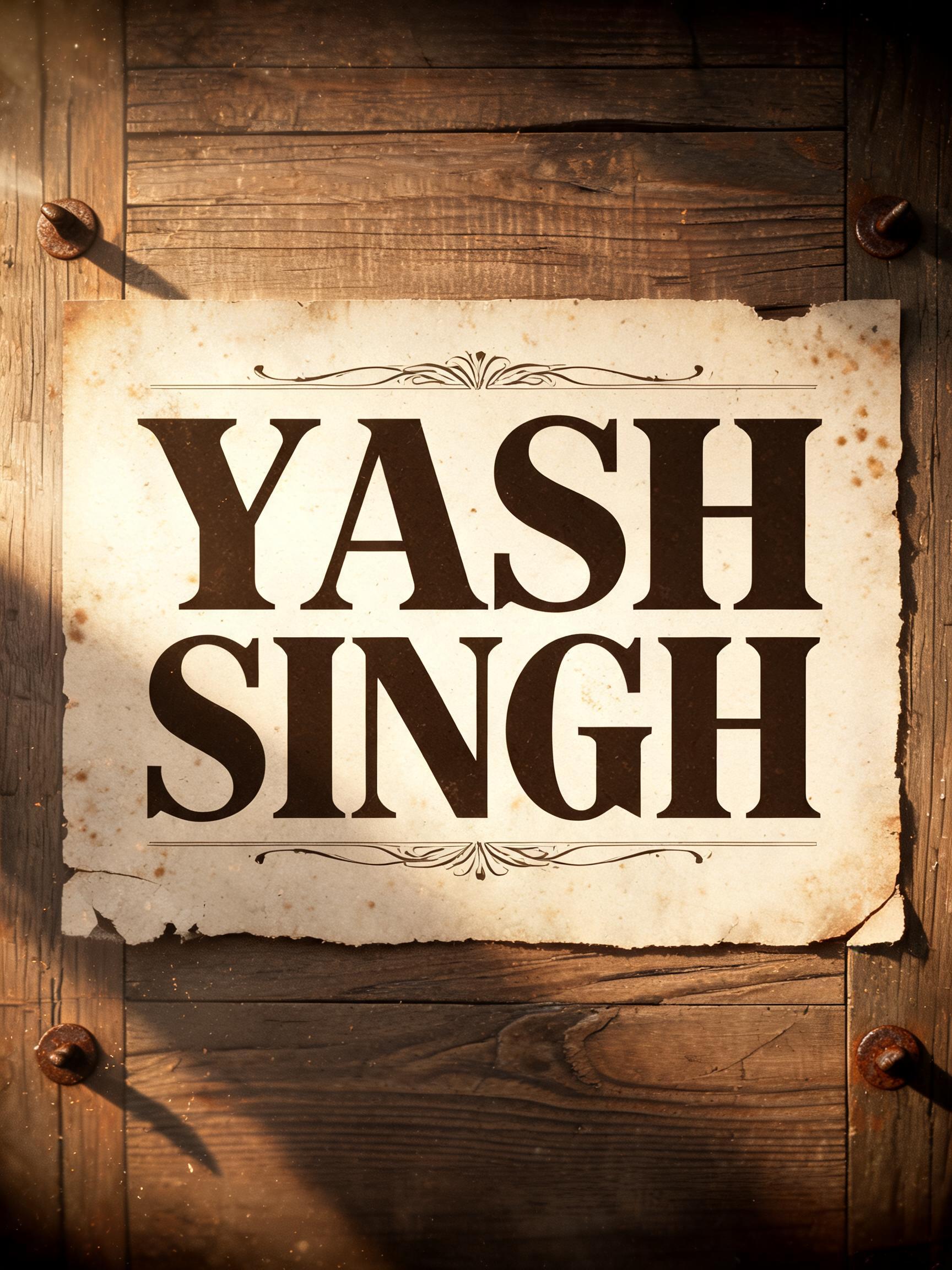
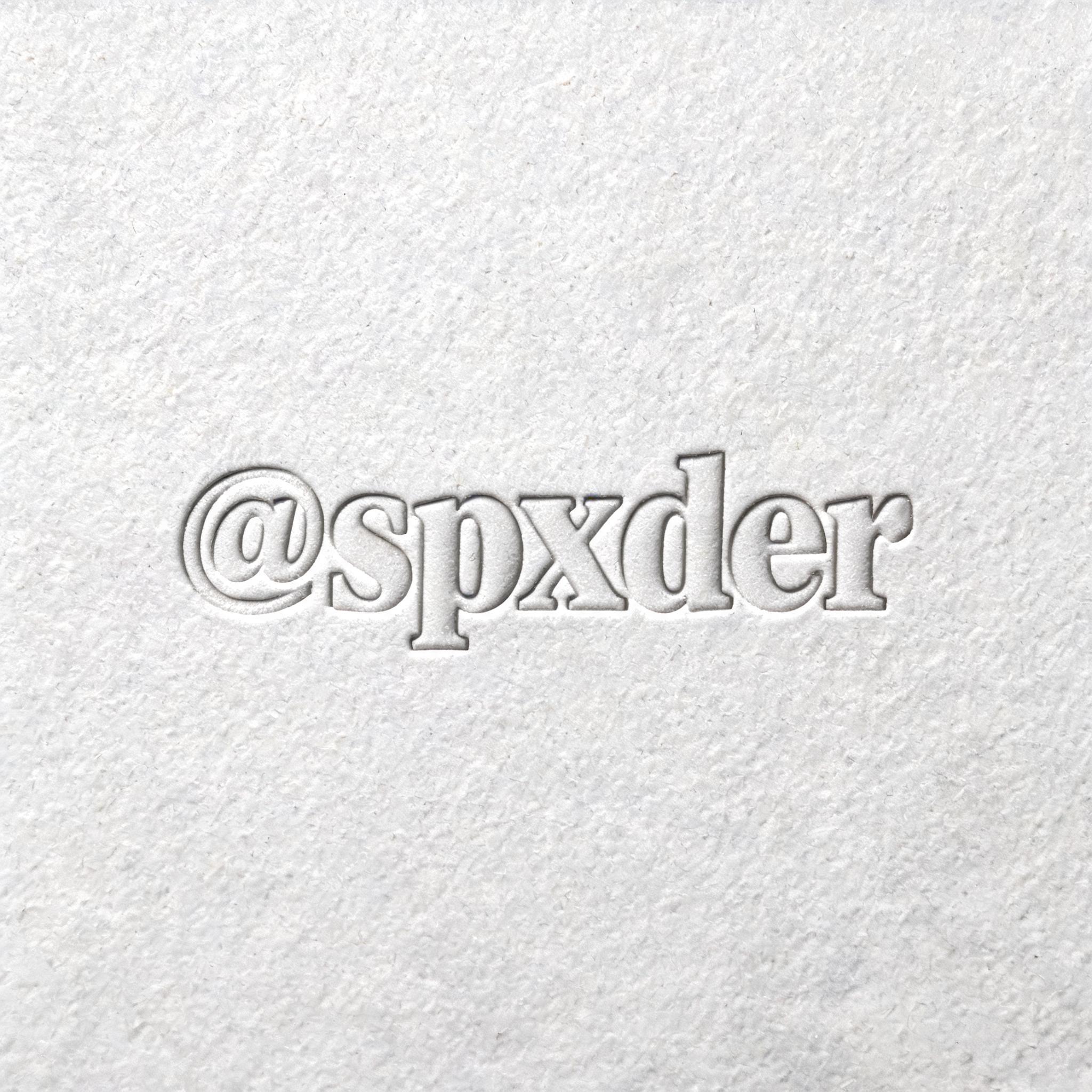
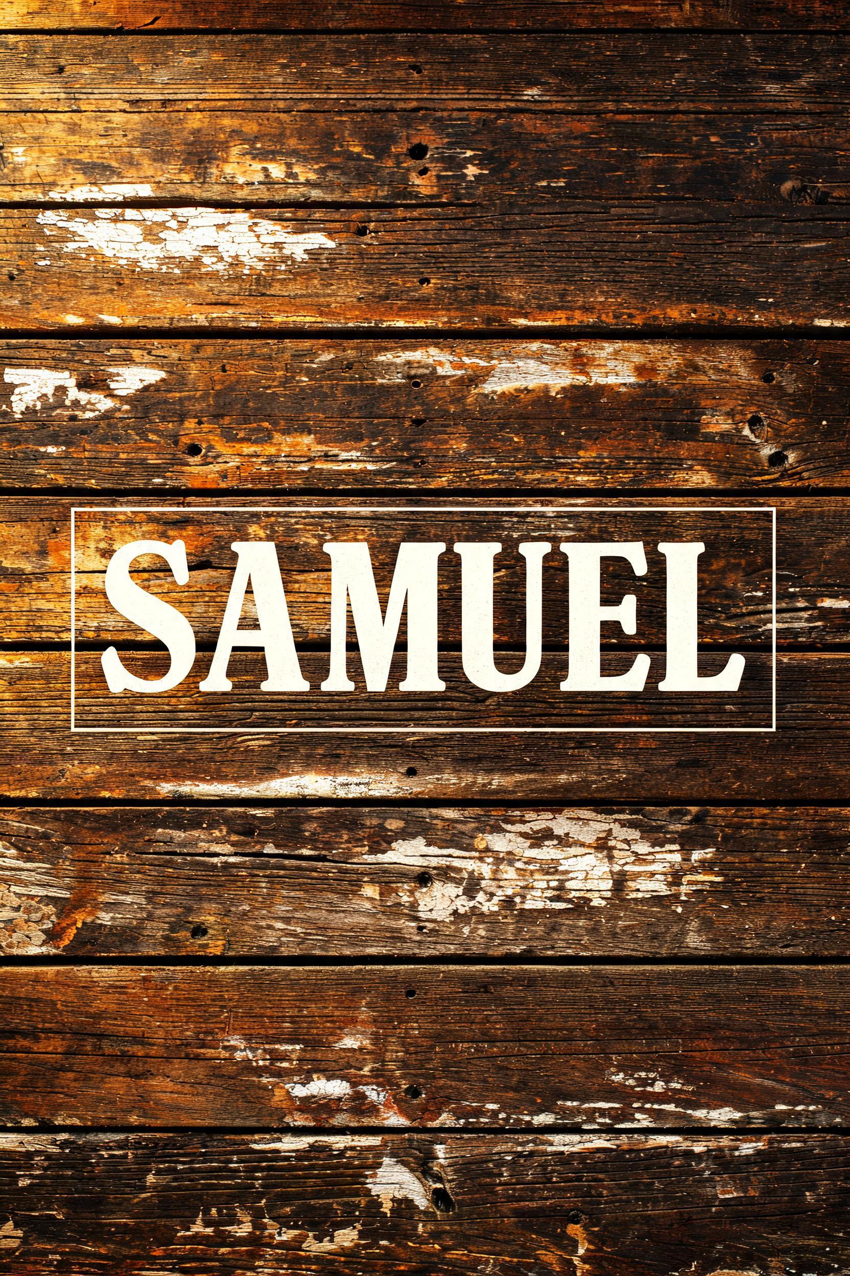

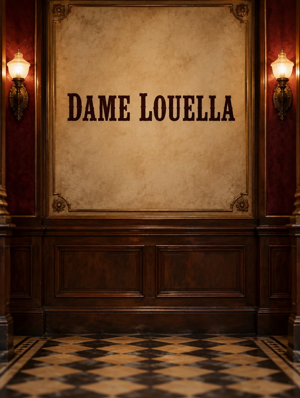
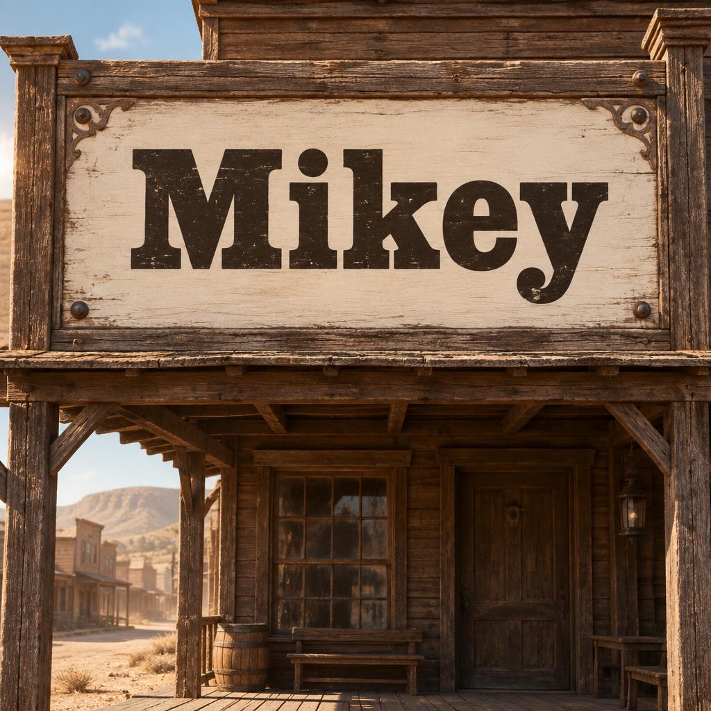
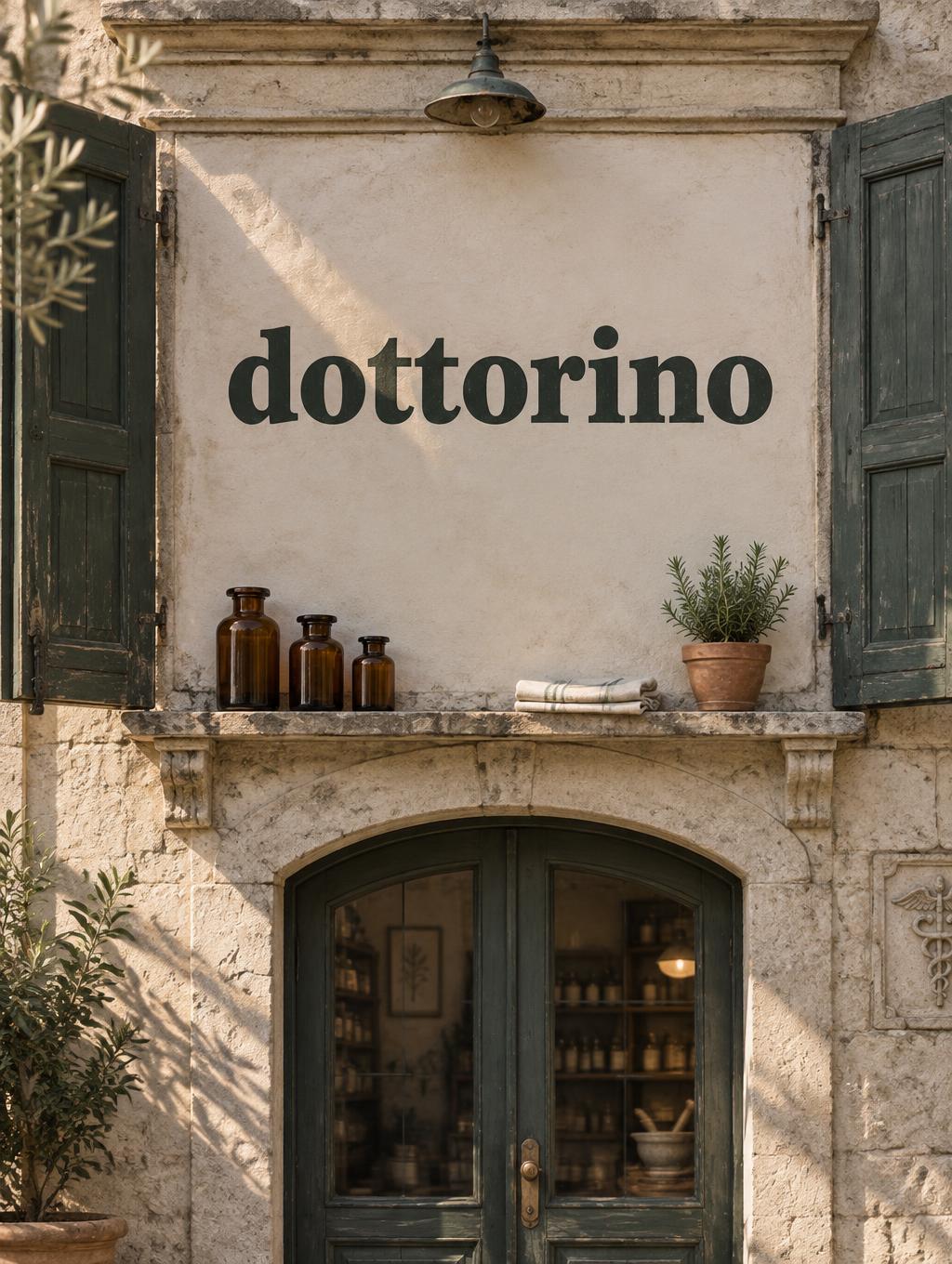
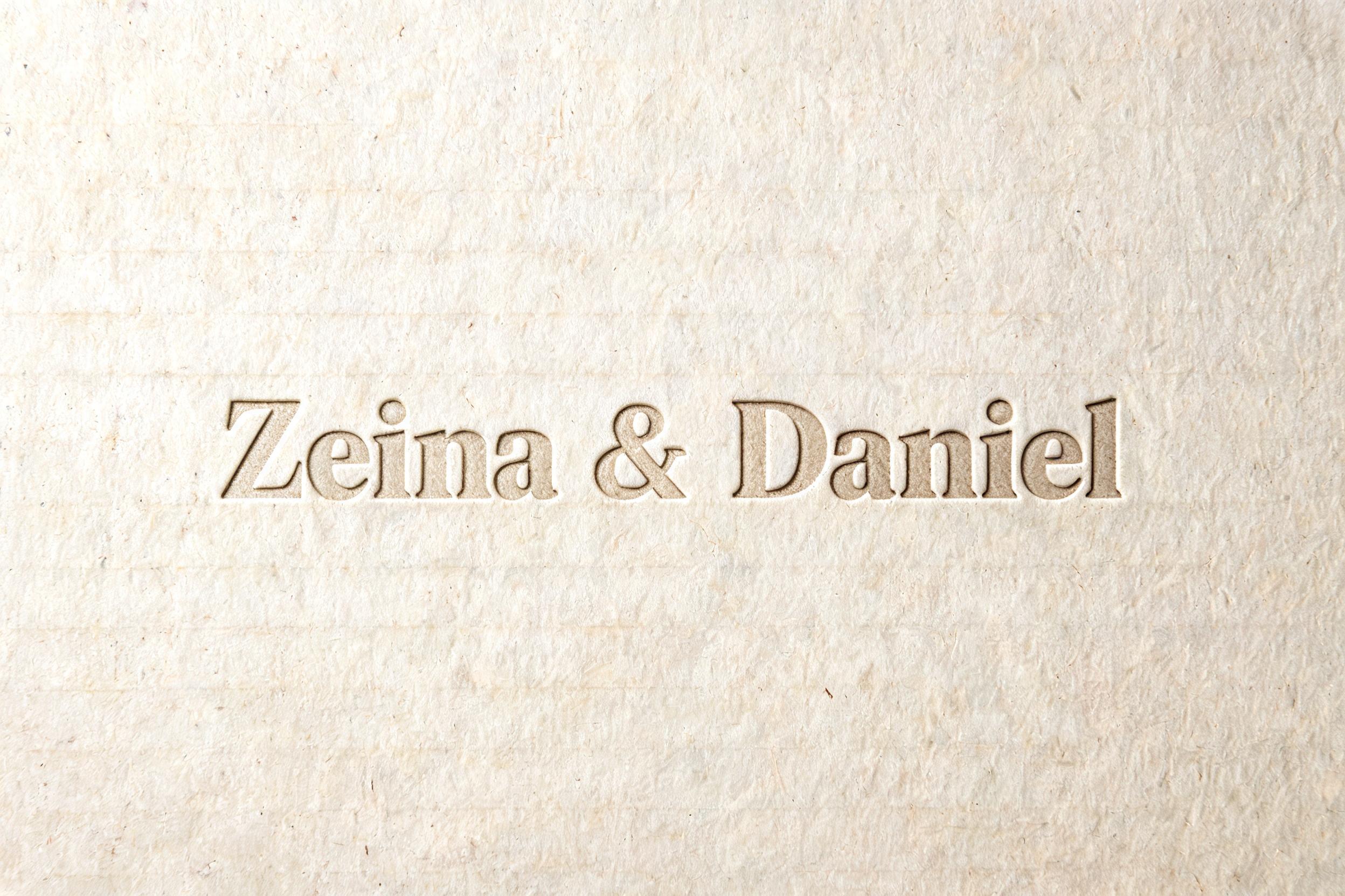
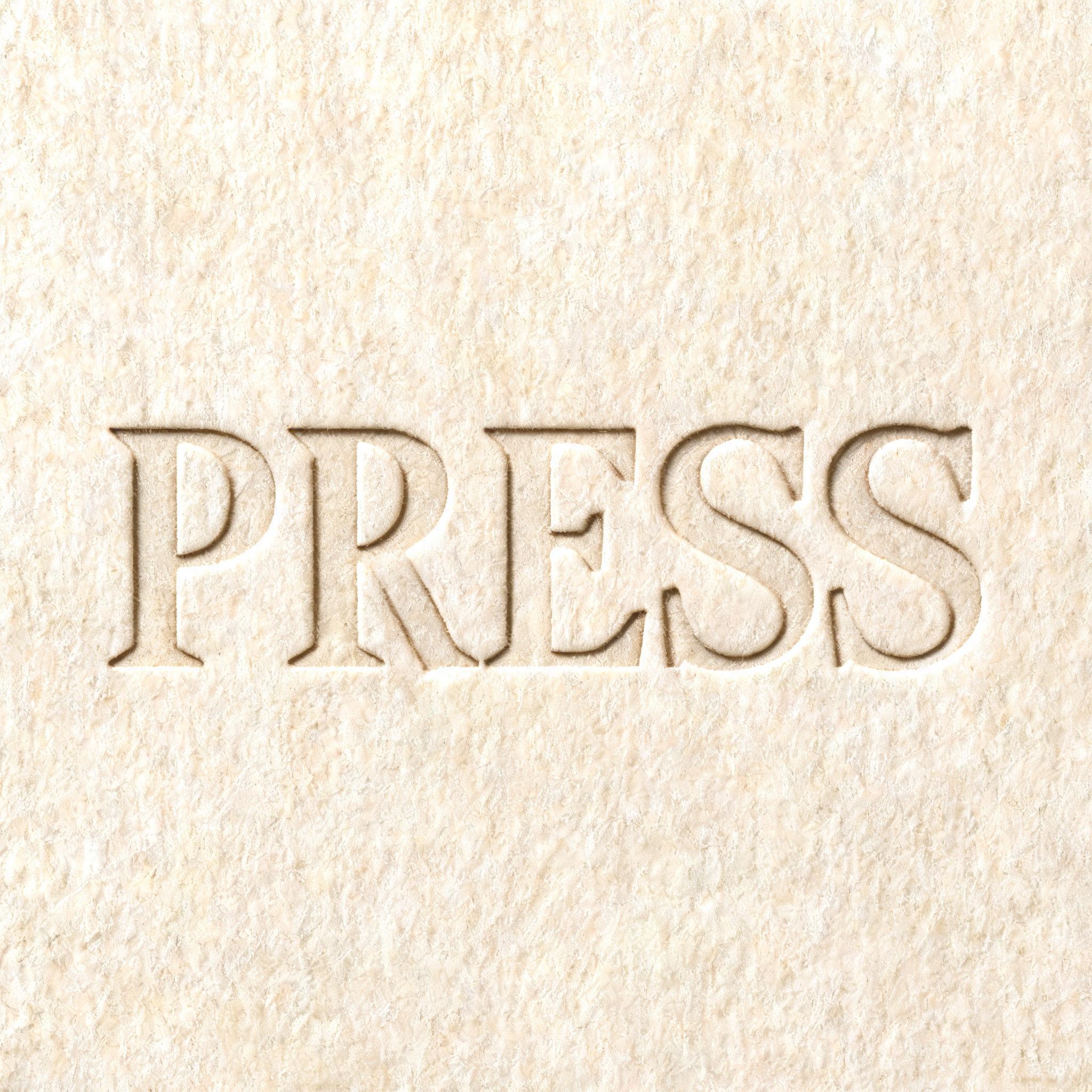
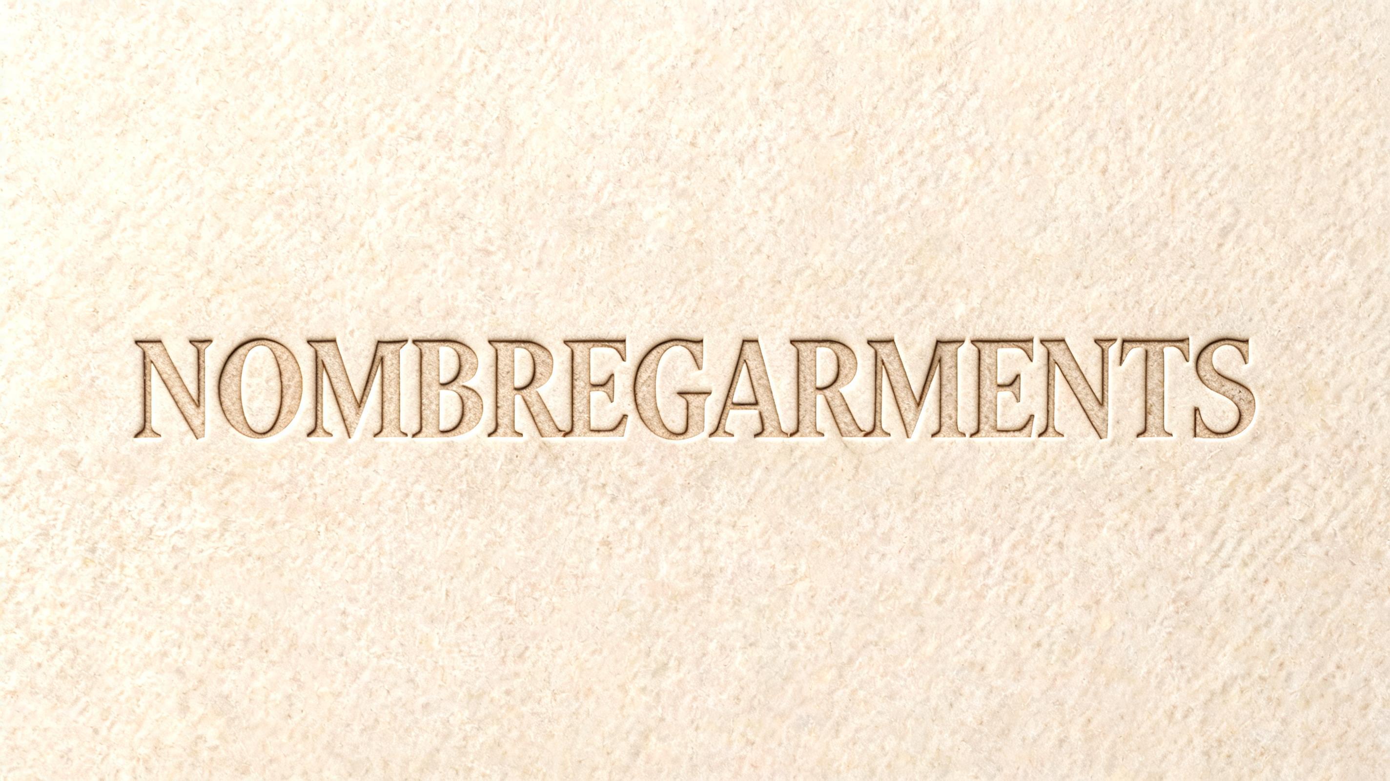
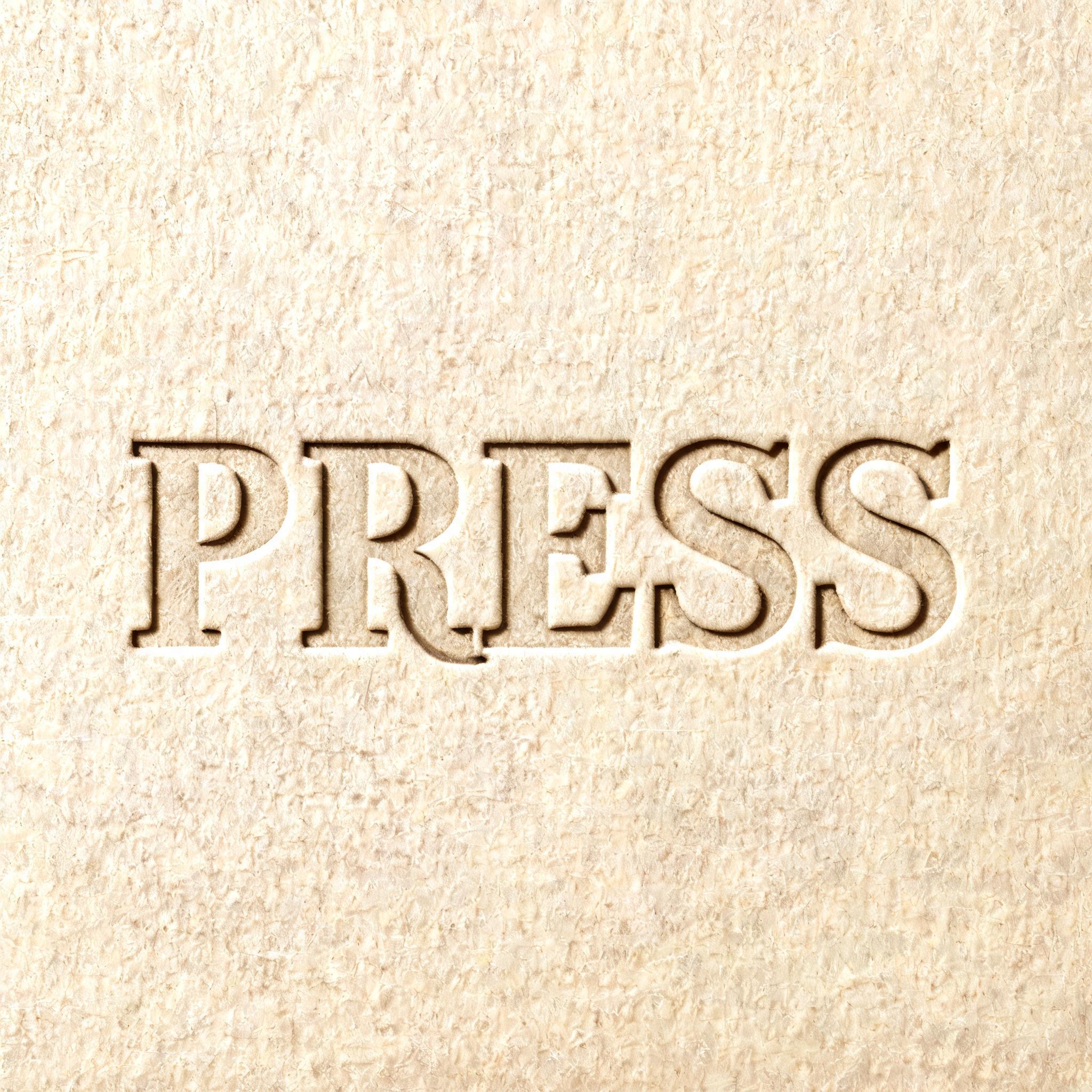


More AI fonts like Clarendon


Looking for copy-paste fancy text? Try our free Font Generator Tools — cursive, gothic, bubble & 30+ styles.
About Clarendon AI font
Victorian bold with authority. The slab serif of newspaper headlines and wanted posters.
Scene
Lettering
Letterforms
Vibe
FAQ
What is the Clarendon font?
It is a Victorian slab serif: sturdy strokes, short heavy serifs, and a small curved fillet where each serif meets the stem. It is the lettering of nineteenth-century newspaper headlines, wanted posters and shop fascias. FontVibe sets your text in that form and returns an image.
Can I download Clarendon as a .ttf or .otf file?
No. FontVibe is a generator: you get an image of your words already set, not a file to install.
Where does Clarendon work best?
Newspaper-style headers, western and wanted-poster artwork, retail sale signage, sports and heritage branding, and packaging that needs to look established rather than new.
Can I use Clarendon commercially?
Yes. FontVibe images carry no licence fee, royalty or attribution requirement.
Why do the serifs look moulded into the stem instead of stuck on?
That curved transition is called a bracket, and it is the defining feature of the style. Victorian wood type had to survive thousands of impressions, and a serif joined by a sharp right angle chipped at the corner. Rounding the join made the letter durable — and it is also why Clarendon feels solid and friendly where an unbracketed slab feels mechanical.
Which fonts are similar to Clarendon?
Rockwell Slab is the unbracketed counterpart, where the serifs meet the stem at a hard angle. Typewriter Bold shares the slab weight with the narrower, evenly spaced feel of a machine.