
🧪 Design something with Synthwave Outrun Grid
Transparent Effect
✦ Transparent Effect
Generates a PNG with the background removed — only the text and its visual effects remain. The AI automatically selects the optimal background color for clean removal based on your style.
Output is always PNG for lossless transparency.
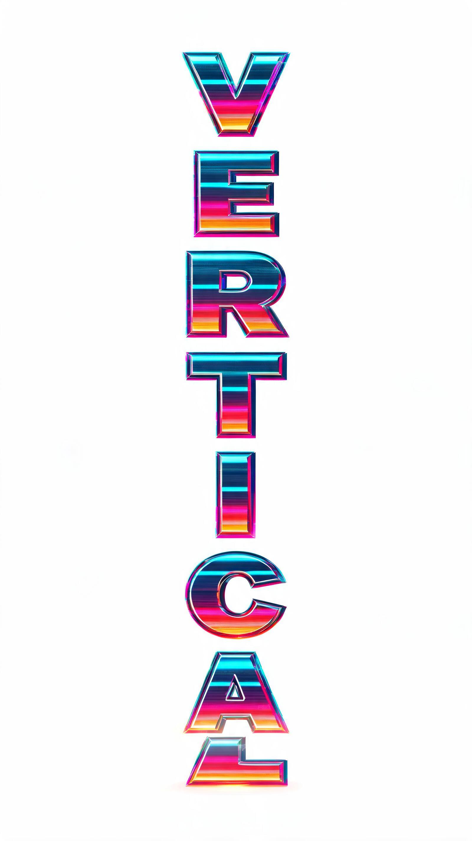
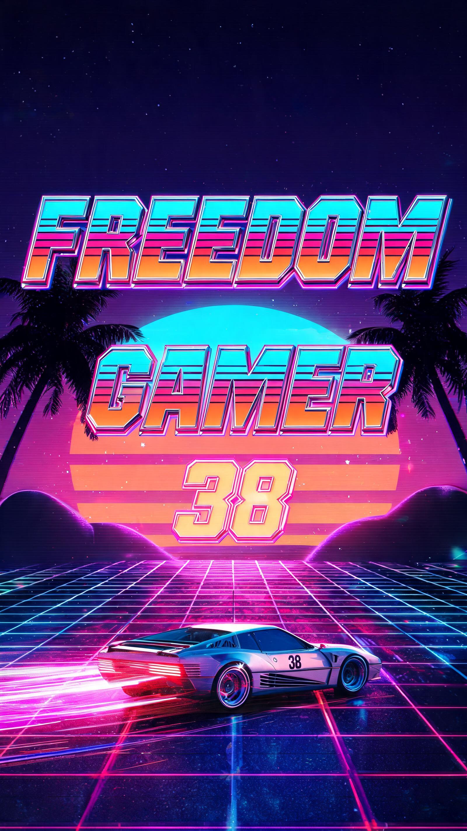


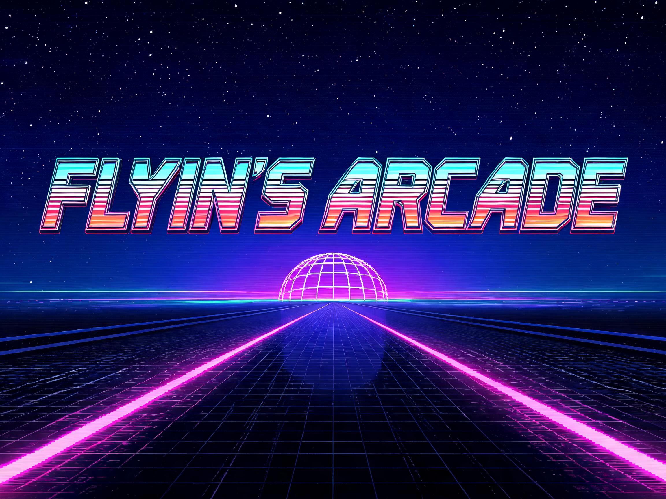


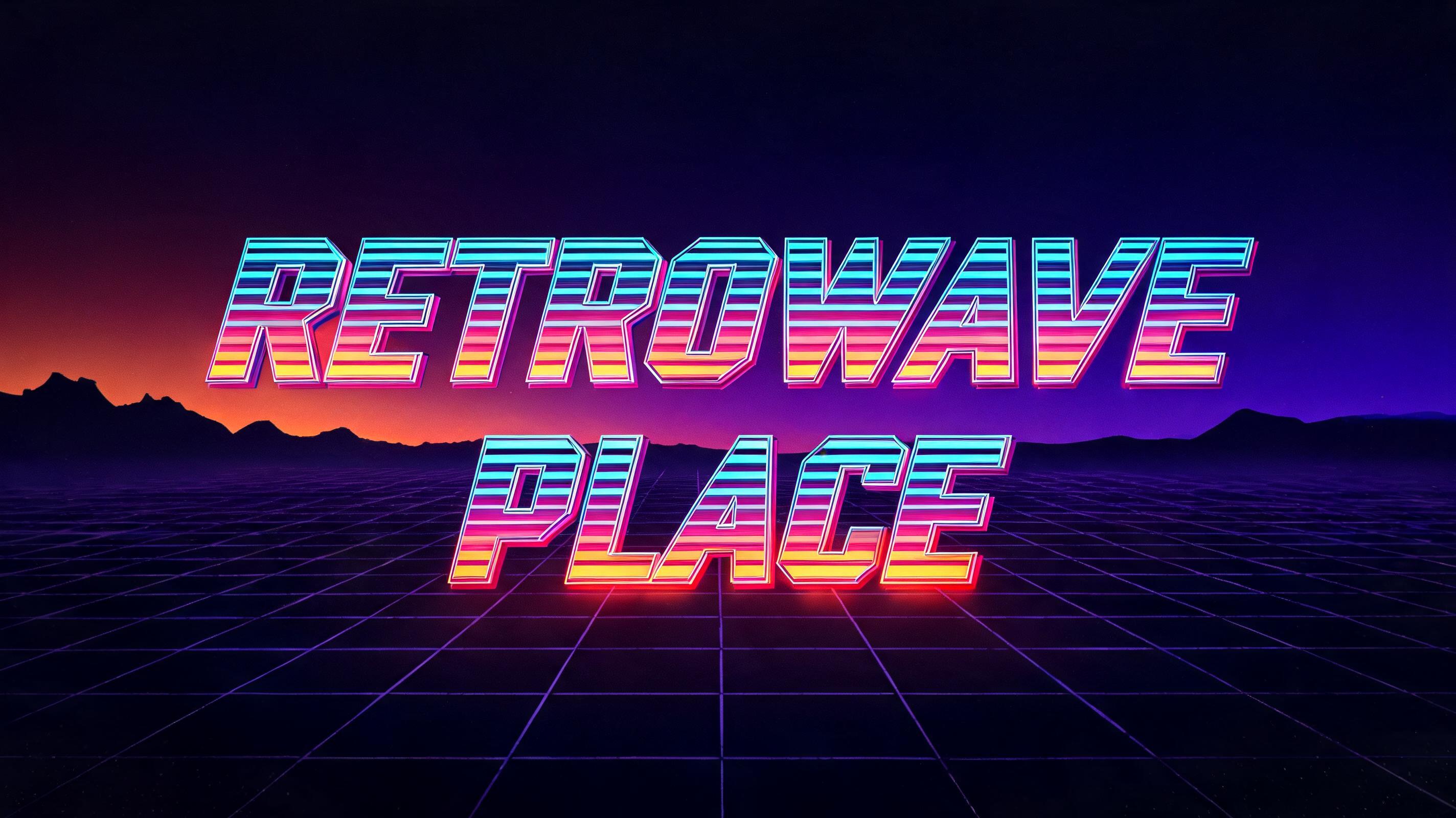

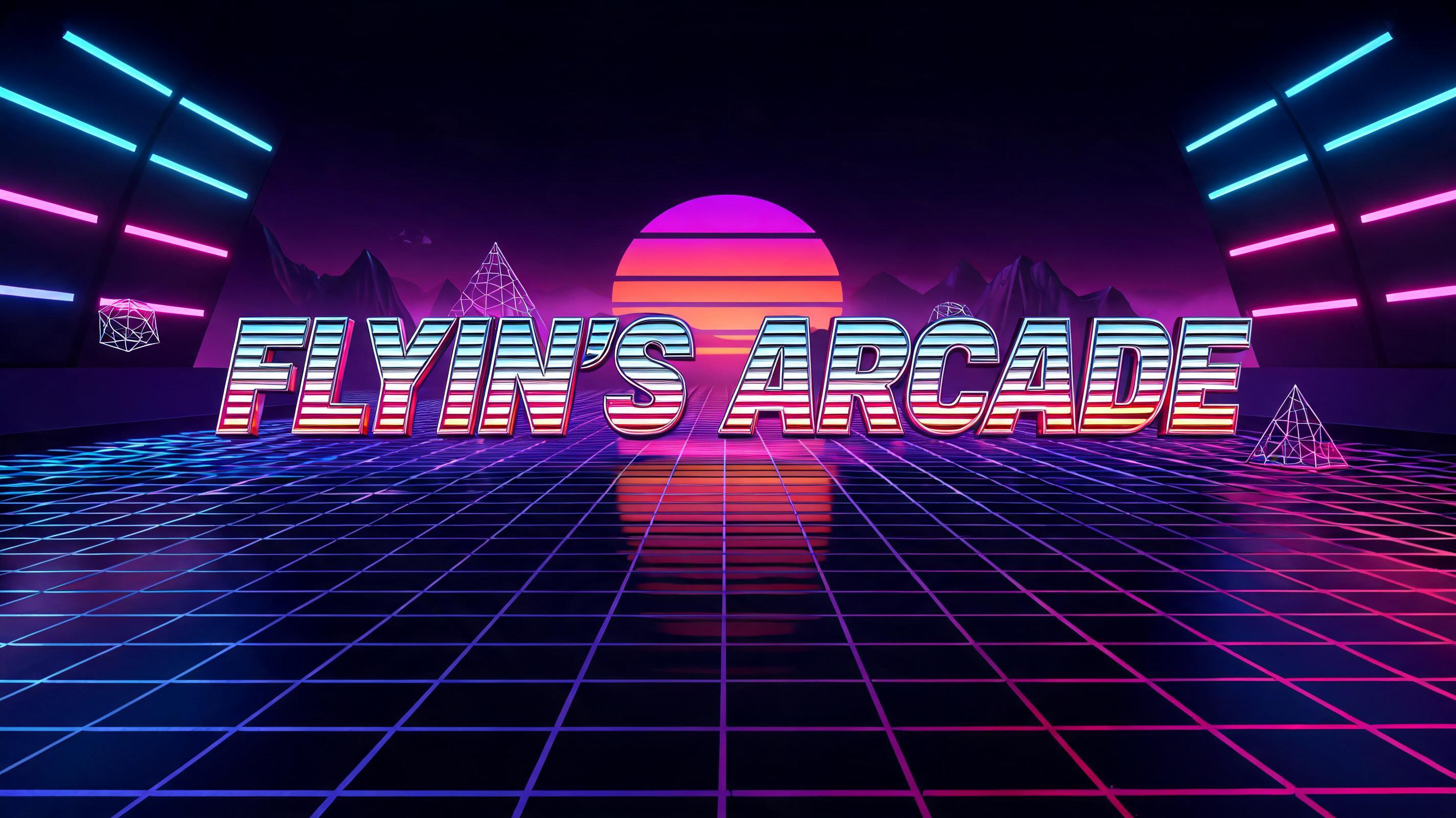
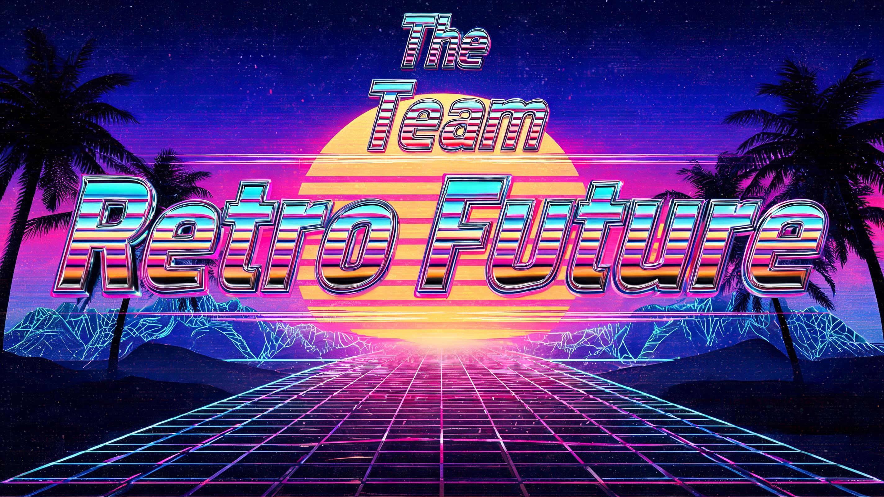
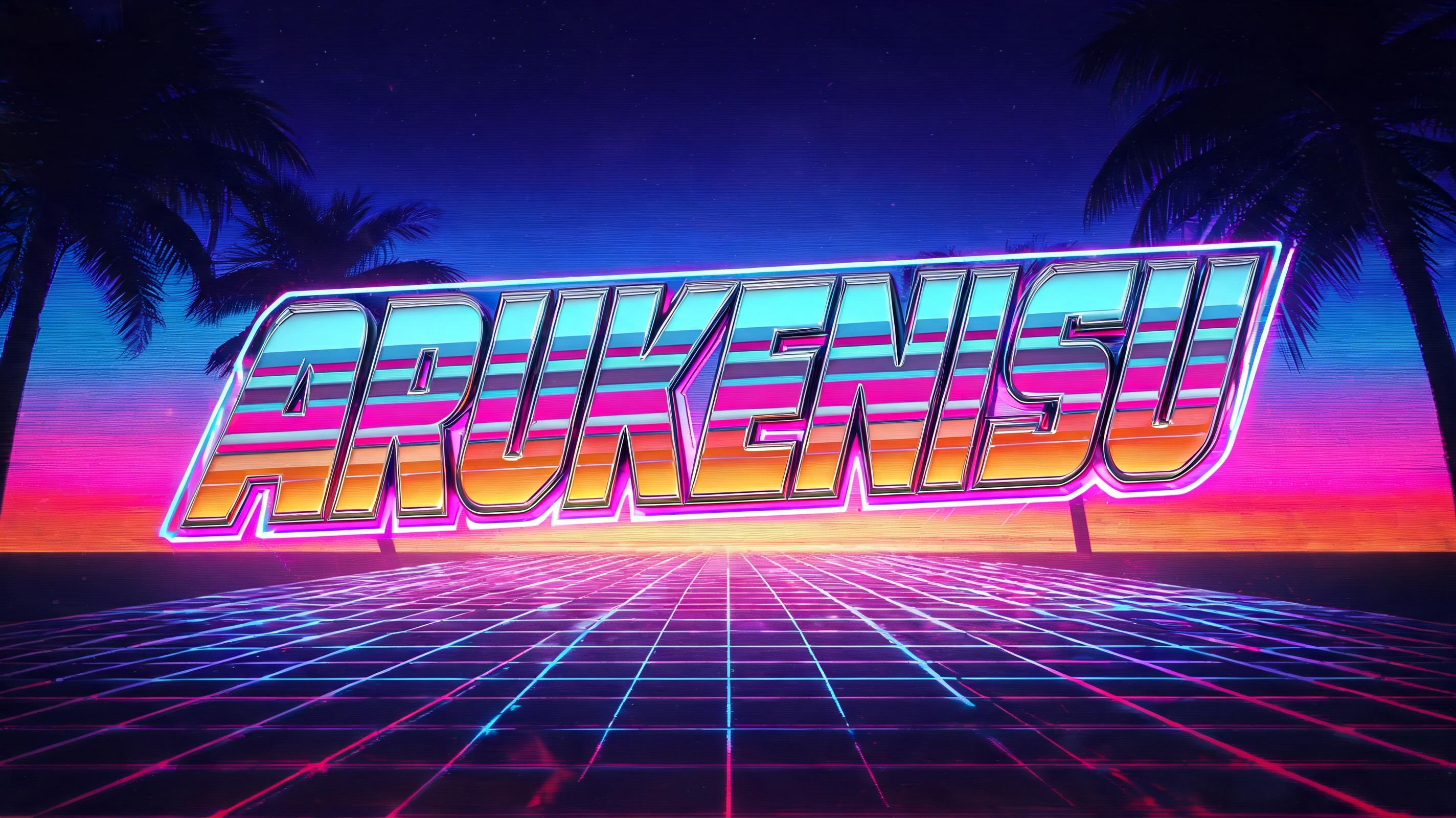

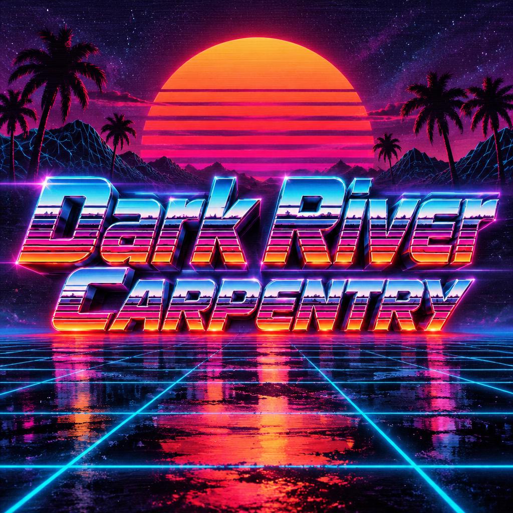
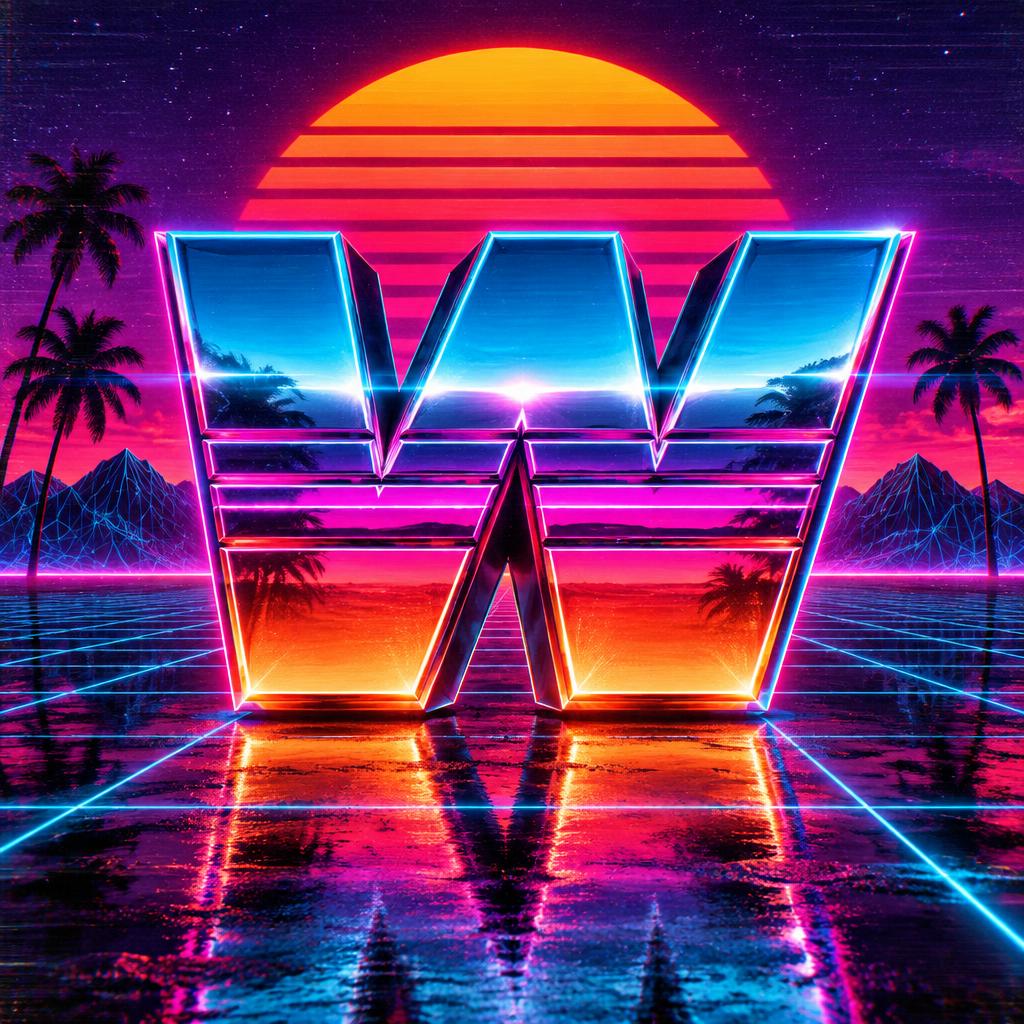



More AI fonts like Synthwave Outrun Grid




Looking for copy-paste fancy text? Try our free Font Generator Tools — cursive, gothic, bubble & 30+ styles.
About Synthwave Outrun Grid AI font
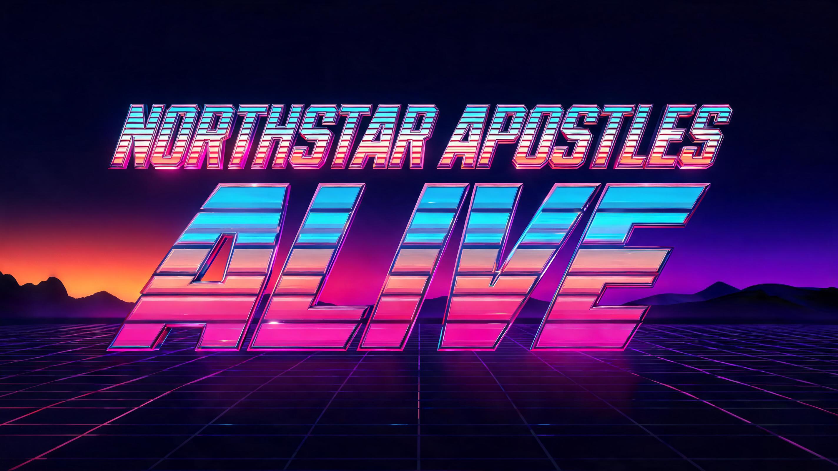
Ultra-wide geometric arcade-logo letterforms with horizontal speed-line stripe channels carved across each letter — cyan upper bands, magenta-orange lower bands, racing-forward motion. The OutRun cabinet masthead, self-contained.
FAQ
What is the Synthwave Outrun Grid font?
Synthwave Outrun Grid is an ultra-wide geometric arcade-logo letter with horizontal speed-line stripe channels carved across each shape — cyan upper bands, magenta-orange lower bands, racing forward. It is the OutRun-cabinet masthead, self-contained: 80s, neon and built for motion.
Can I download Synthwave Outrun Grid?
There is no installable file. You type your text and the generator builds the ultra-wide striped letters fitted to your actual shapes, and returns a high-resolution image. It reads best on a dark ground.
Where does this style work best?
Synthwave and retrowave music, 80s-themed events, racing and gaming graphics, esports and streaming, nostalgic branding, poster and social work. Set it large and short; the wide letters want room.
Can I use it for commercial work?
Yes. Generated images may be used commercially, including album art, video and merch. No licence or attribution is required.
Why are the letters stretched ultra-wide with horizontal stripes?
Because the style was born on the marquee of an arcade cabinet, and both the width and the stripes are engineered to say 'speed.' A game cabinet has a long, low horizontal panel above the screen for its logo, so arcade lettering was stretched wide to fill that shape — a format constraint that shaped the look. But the horizontal emphasis does double duty. In graphics, anything to do with racing borrows the visual language of motion: fast objects blur and streak along their direction of travel, and racing cars, jets and 80s sports graphics all use horizontal side-stripes to imply forward speed. Ultra-wide letters and horizontal stripe channels both drive the eye sideways, along the axis of movement, so the whole word feels like it is rushing forward. The proportion started as a practical fit for a cabinet marquee and became a deliberate speed cue, which is exactly why the OutRun look reads as pure velocity.
What fonts look similar?
For the mirror-chrome sunset version of synthwave, see Synthwave Sunset Chrome. For the diagonal-cut retro side of the era, try Retro 80s.