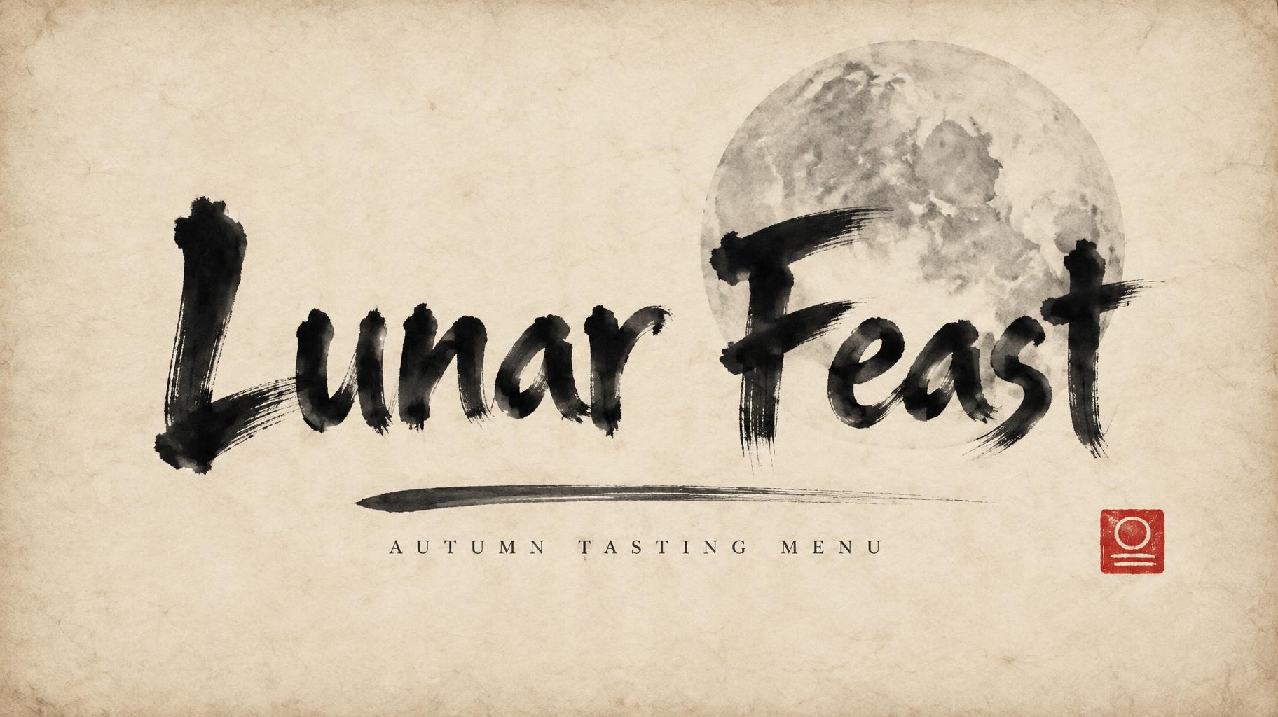
Lunar Feast AUTUMN TASTING MENU - 中国墨絵ブラシ Text Effect


この作品と同じ OpenAI GPT-Image-2.5 Sunburst を使用 · 15 クレジット
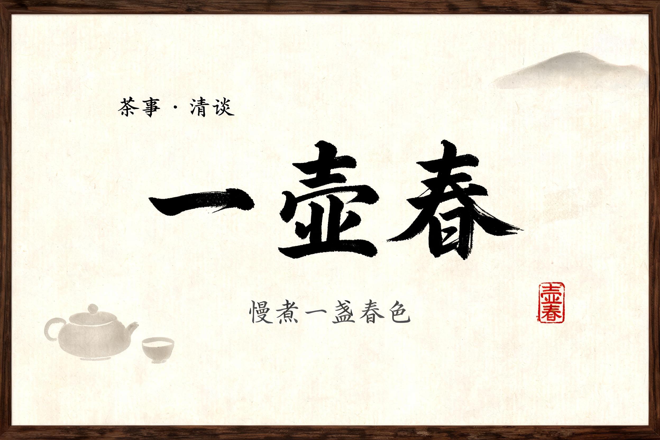


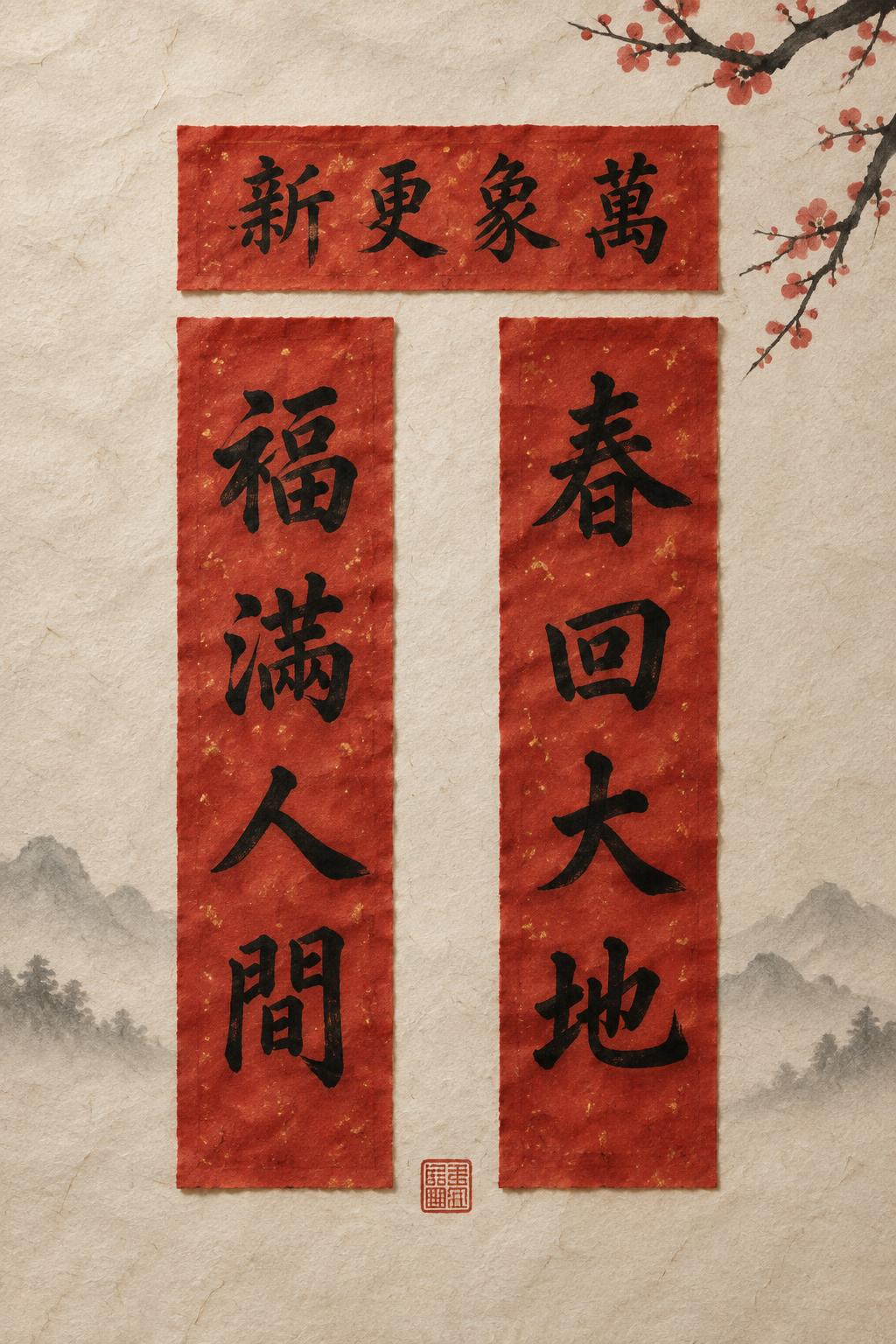
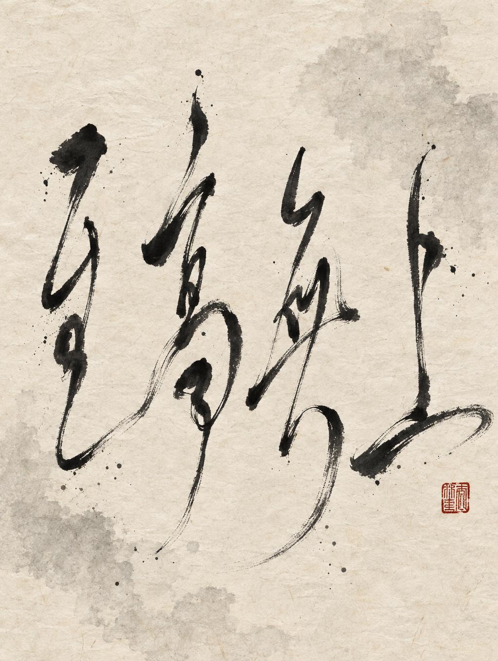
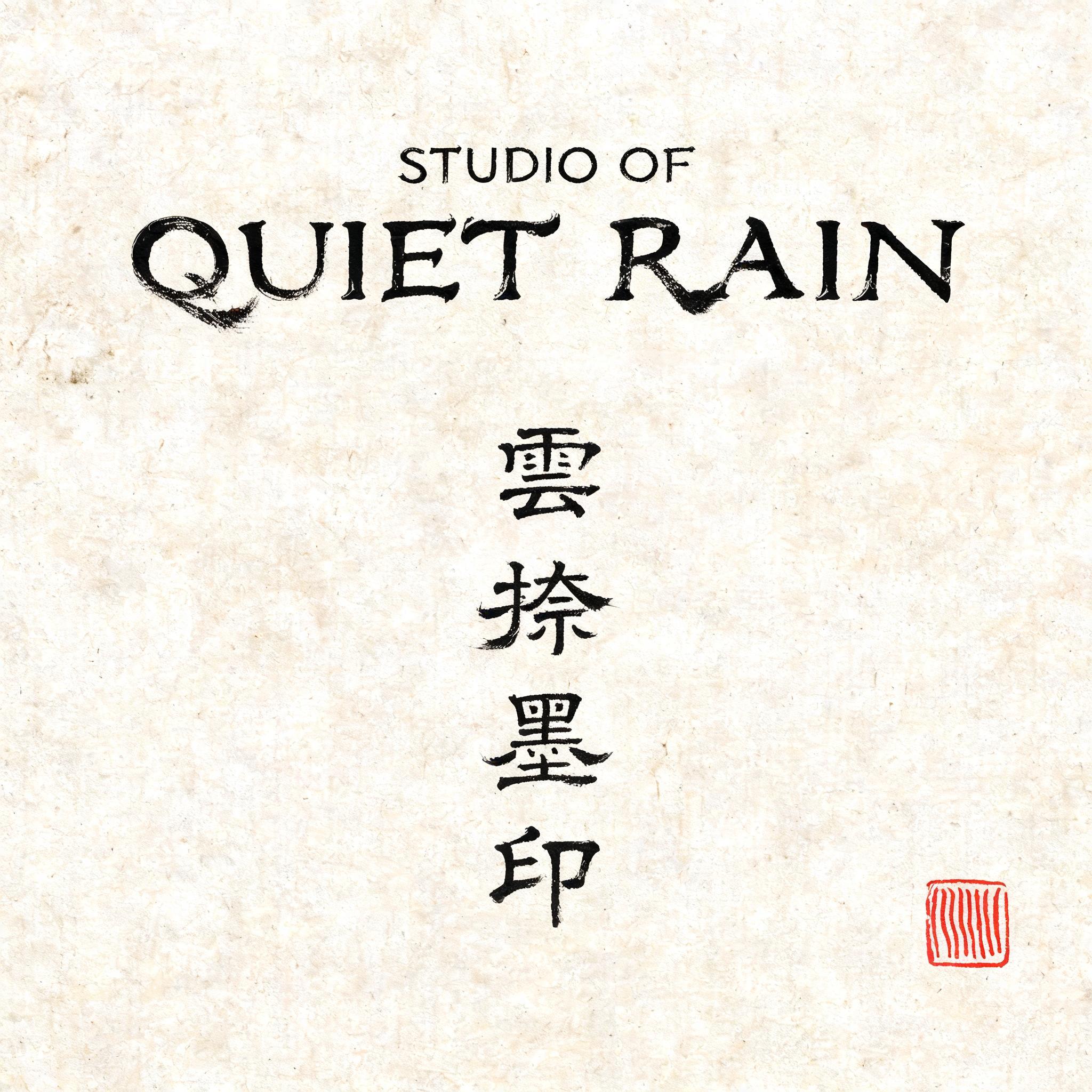




「Lunar Feast AUTUMN TASTING MENU」は FontVibe AI で作成した中国墨絵ブラシの文字エフェクトです。中国の墨(すみ)による筆文字書道のスタイルをラテン文字に応用しました。深い黒墨に本物の筆先の質感、太細のはっきりした筆致の変化、そして画仙紙の趣を備えています。中華レストランのブランディング、武術、ウェルネス、文化的なデザインに最適です。
A finished menu header banner, 16:9 landscape. The main title "Lunar Feast" is painted in East Asian commercial brush-ink Latin lettering: upright, slightly condensed, solid and legible, thick-to-thin ratio about 3:1 with near-uniform stroke weight through the body and clean decisive terminal stops, like Japanese izakaya sign calligraphy. Deep black sumi ink with wet glossy pooling at stroke starts, visible bristle streaks along the edges, and feathered dry-brush trails at stroke ends. Ink density varies from rich black cores to soft grey at thin passages, with slight bleed into the paper fibres. The title spans about 68% of the canvas width, centred slightly above the middle, on one line, with a generous gap between the two words. Behind the lettering, offset to the upper right, sits a large pale full-moon disc drawn as a single soft ink-wash circle in light grey, with a faint mottled texture, partly overlapped by the letters. Beneath the title, a thin hand-brushed horizontal stroke tapers from thick to a dry-brush wisp, about 40% of the width. Below it, in small refined spaced capitals in dark charcoal ink, the tagline "AUTUMN TASTING MENU". At the lower right sits one small vermilion-red square seal stamp with a simple abstract mark, the only colour accent. The background is aged xuan rice paper in a warm ivory tone with visible long fibres, subtle mottling and soft edge darkening. Generous empty space, with no other decoration. Calm, ceremonial, zen simplicity, with no digital-clean edges.
用途: 中国語フォントジェネレーター
2026年11月3日に生成 · 1824 × 1024 · JPEG · OpenAI GPT-Image-2.5 Sunburst · レイアウト:ポスター · 制作者がシェア · 商用利用無料(CC BY 4.0)


