根源 の誓い - 日本の墨筆 Text Effect


この作品と同じ OpenAI GPT-Image-2.5 Sunburst を使用 · 15 クレジット











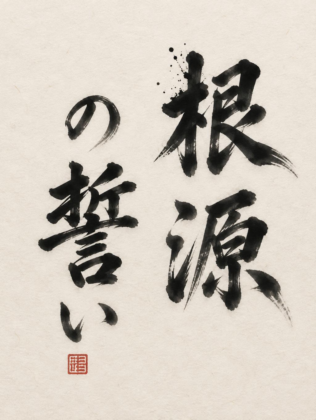
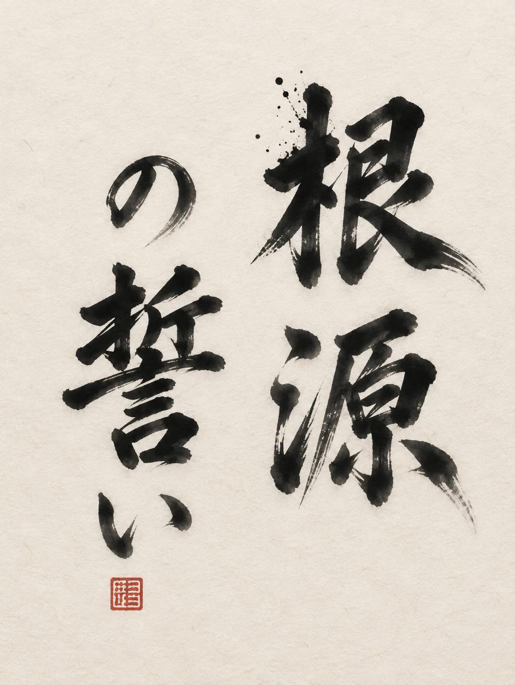
「根源 の誓い」は FontVibe AI で作成した日本の墨筆の文字エフェクトです。日本の書道の墨筆による筆致をラテン文字に応用したスタイルです。深い墨黒のインクに本格的な筆のエネルギー、一方向に制御された筆運び、そして和紙の雰囲気が宿ります。日本食レストランのブランディング、タトゥーデザイン、アニメ、武道、文化系プロジェクトに最適です。
A finished shodo calligraphy piece on warm cream washi paper with visible paper fibres, lit by soft shadowless north-facing studio light. The Japanese text 「根源の誓い」 is written in large vertical columns, each character a single decisive brush stroke sequence by a master hand. Two columns read right to left: the right column holds 「根源」, two large kanji stacked, and the left column holds 「の誓い」, stacked and slightly smaller, with the small hiragana の and い sitting lighter than the heavy kanji 誓. The columns together fill about 60% of the canvas height, and the remaining space stays quiet, with generous empty margins in the ma spirit. Strokes are in dense sumi black at the core, with bold 5:1 thick-to-thin contrast. Entries are loaded and heavy with ink compression, and exits taper by harai to a fine point or end in an upward hane flick. Dry-brush streaks with fine white fibre gaps appear only at the outermost stroke edges. The ink moves in gradation from near-black in the centres to charcoal and light grey in the pull-away tails, and it blooms into a soft absorbed border at every edge. The matte ink has no gloss. A few small ink splatter droplets mark the energetic entry stroke of 根. A small vermilion-red square hanko seal sits at the lower end of the left column, bearing an abstract carved mark with no legible text. No other decoration, no frame and no extra text. The mood is power and stillness together, authoritative and meditative.
用途: 書道フォント
2026年11月6日に生成 · 1024 × 1360 · JPEG · OpenAI GPT-Image-2.5 Sunburst · レイアウト:禅 · 制作者がシェア · 商用利用無料(CC BY 4.0)



