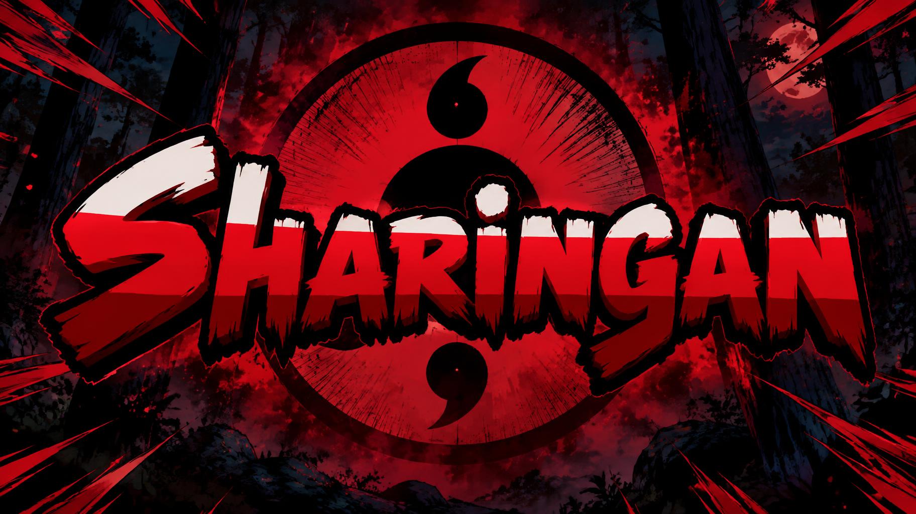
Sharingan - アニメ Text Effect


この作品と同じ OpenAI GPT-Image-2.5 Sunburst を使用 · 15 クレジット

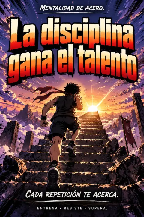

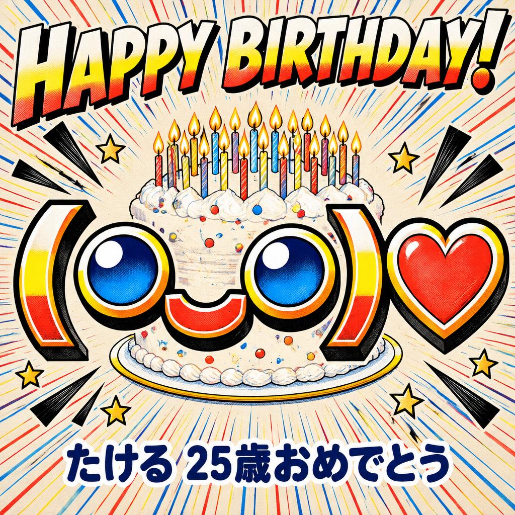
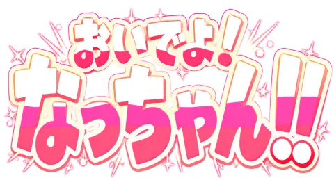
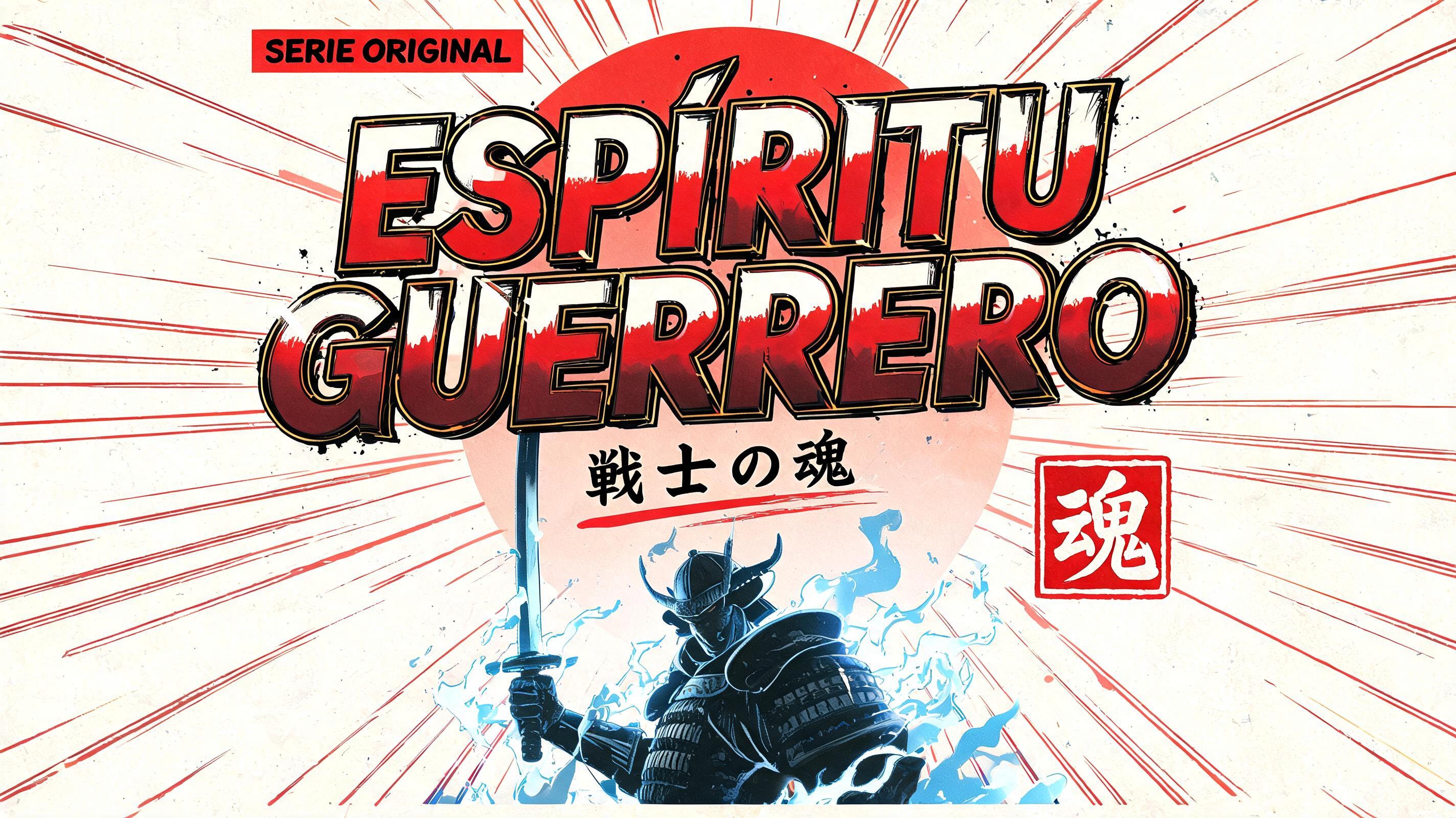

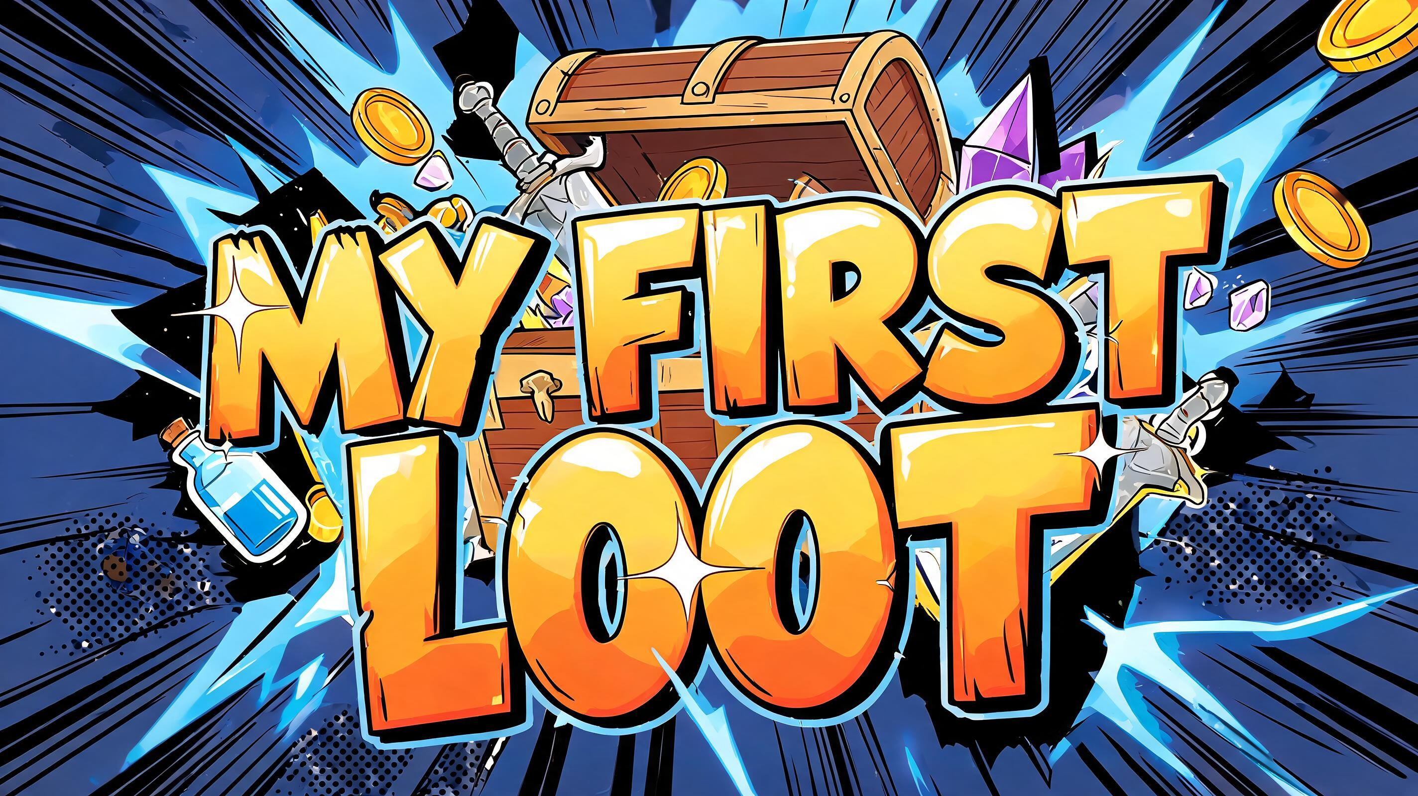
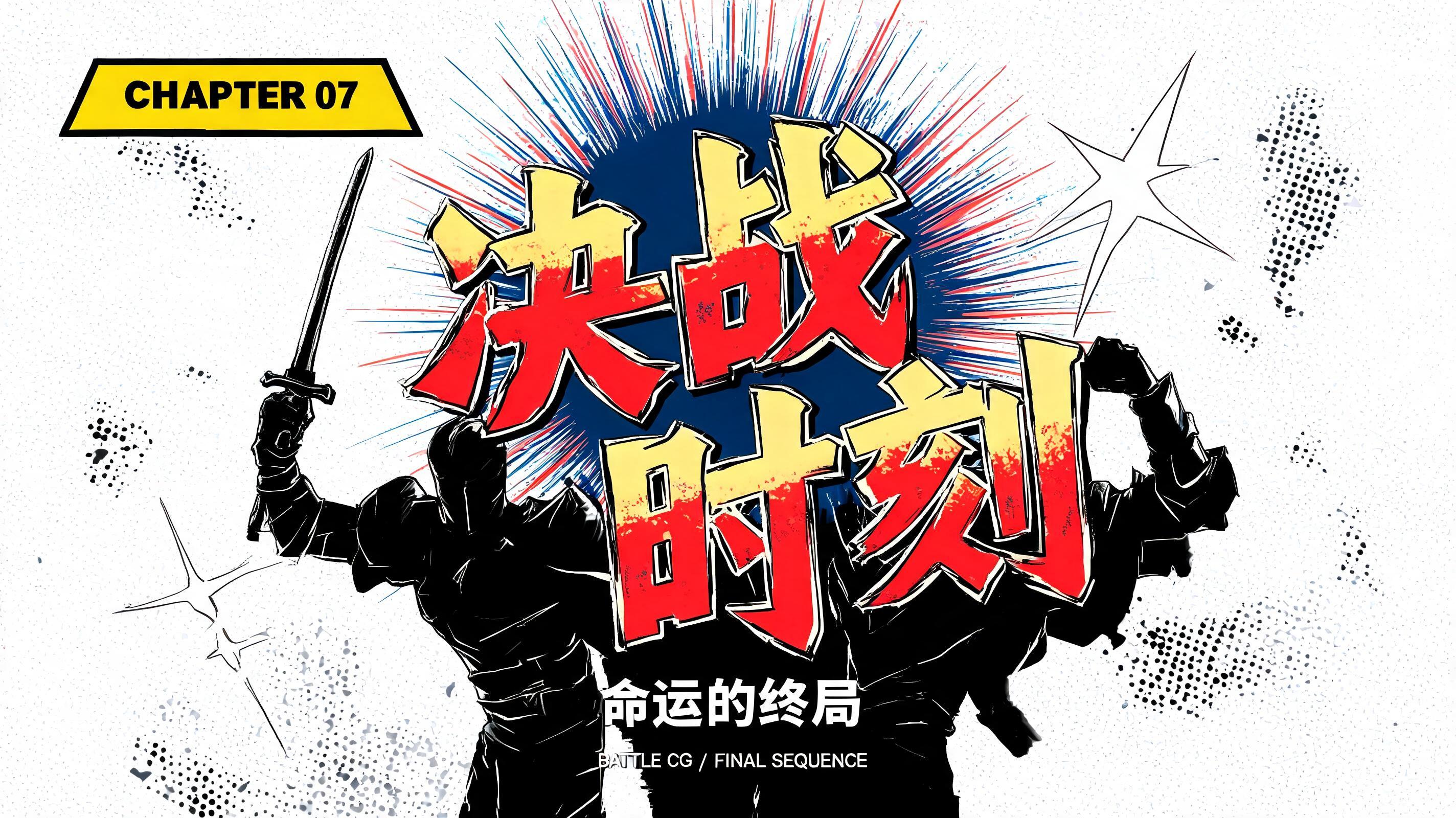
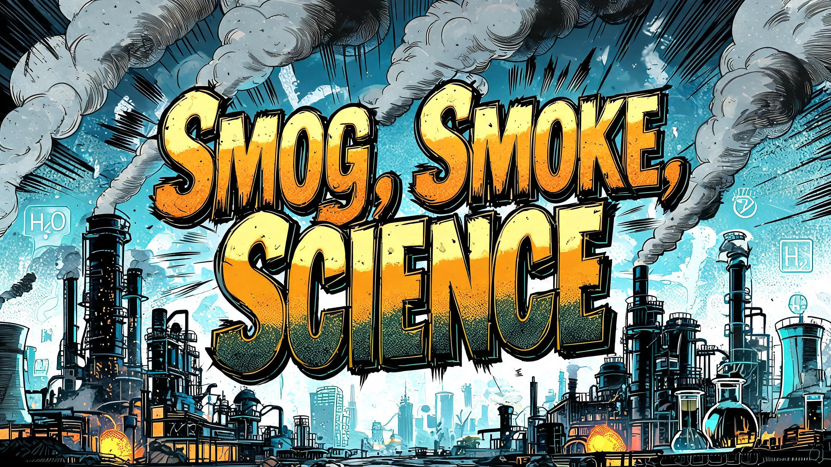
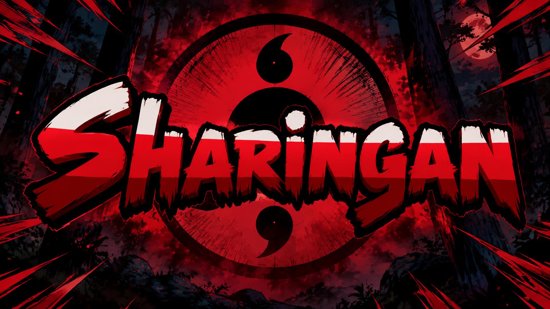
「Sharingan」は FontVibe AI で作成したアニメの文字エフェクトです。少年マンガのタイトル文字。手描きの太い黒フチ、ハイライトと影をくっきり分けたセルシェーディング、勢いよく傾いた文字と、白地に放射状の集中線。
rendered as Japanese shounen anime title treatment — bold hand-inked manga lettering with authentic cel-shaded visual energy. Letter construction follows classic Shonen Jump title card standards: thick black ink outline with natural brush-weight variation defining each letter boundary; flat cel-shading fill with three hard-edge zones — bright highlight zone on upper letter face, highly saturated primary color zone at center, deep shadow zone at lower edge; all zone boundaries knife-edge hard, zero gradient blur, pure flat offset-print ink physics. Energy signature: high-contrast color + thick ink outline = letters that look physically printed on manga paper. The typographic language of Dragon Ball, Naruto, One Piece, Demon Slayer, Jujutsu Kaisen title cards — maximum manga kinetic energy, iconic and immediately recognizable as Japanese anime title typography. LETTERFORM PRIORITY: when the chosen font carries its own treatment, that font's letterform shapes take priority and own the letters; this style governs the inked manga outline, the three-zone cel-shading and the kinetic energy. FALLBACK MATERIAL: if the font carries no material of its own, render the letters as bold hand-inked shounen title lettering with a thick black brush outline and hard three-zone cel-shading. COLOR PRIORITY: keep the font's own colors if specified; otherwise a high-saturation primary fill with hard highlight and shadow zones. Create a finished anime-series title card centered on the single exact word “Sharingan.” Give the title the clear, immediate hierarchy: large, commanding, and occupying roughly three quarters of the canvas width, with generous breathing room around every edge. Set the scene in a shadowed forest at night, where a few dark trunks recede into deep indigo and black. Behind the word, place one enormous red eye motif, stylized as a clean graphic emblem rather than a realistic face; its dark pupil and three curved comma-like marks form a circular focal point visible through the open spaces around the lettering. A concentrated crimson flare burns behind the eye, while sharp black and red manga speed lines sweep inward from the corners toward the title. Add a handful of small ink-splatter flecks and angular impact marks, keeping them clear of the word. The title remains the unmistakable foreground hero, crisp against the darker setting, with its lettering treatment consistent with the chosen shounen anime style. Use a compact palette of scarlet, black, and deep indigo, with hard cel-shaded shapes and strong separation between foreground and background. No other words, symbols, characters, borders, or logos.
用途: アニメフォントジェネレーター
2026年11月6日に生成 · 1824 × 1024 · JPEG · OpenAI GPT-Image-2.5 Sunburst · 制作者がシェア · 商用利用無料(CC BY 4.0)



