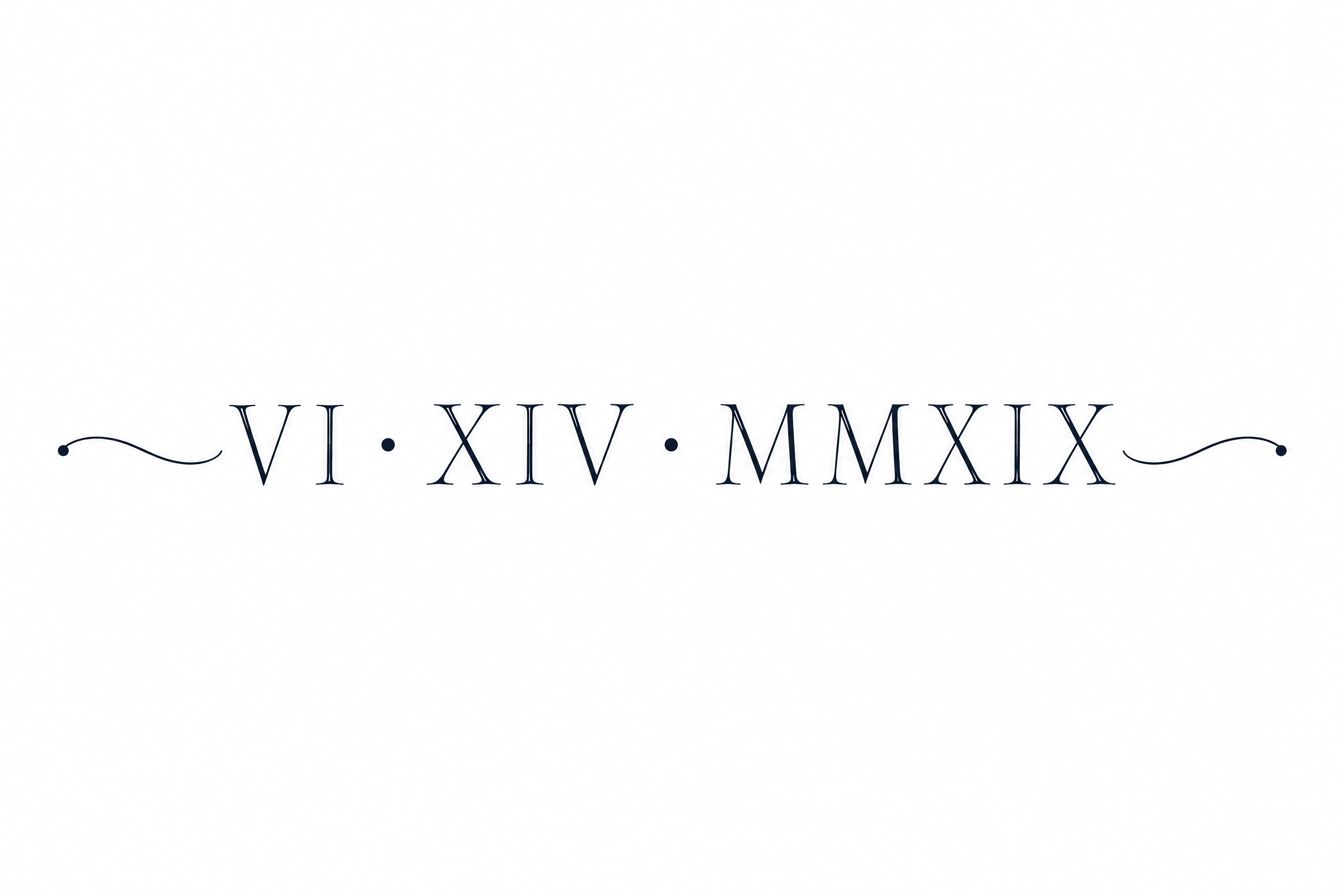
VI · XIV · MMXIX - ミニマル Text Effect

この作品と同じ OpenAI GPT-Image-2.5 Sunburst を使用 · 80 クレジット

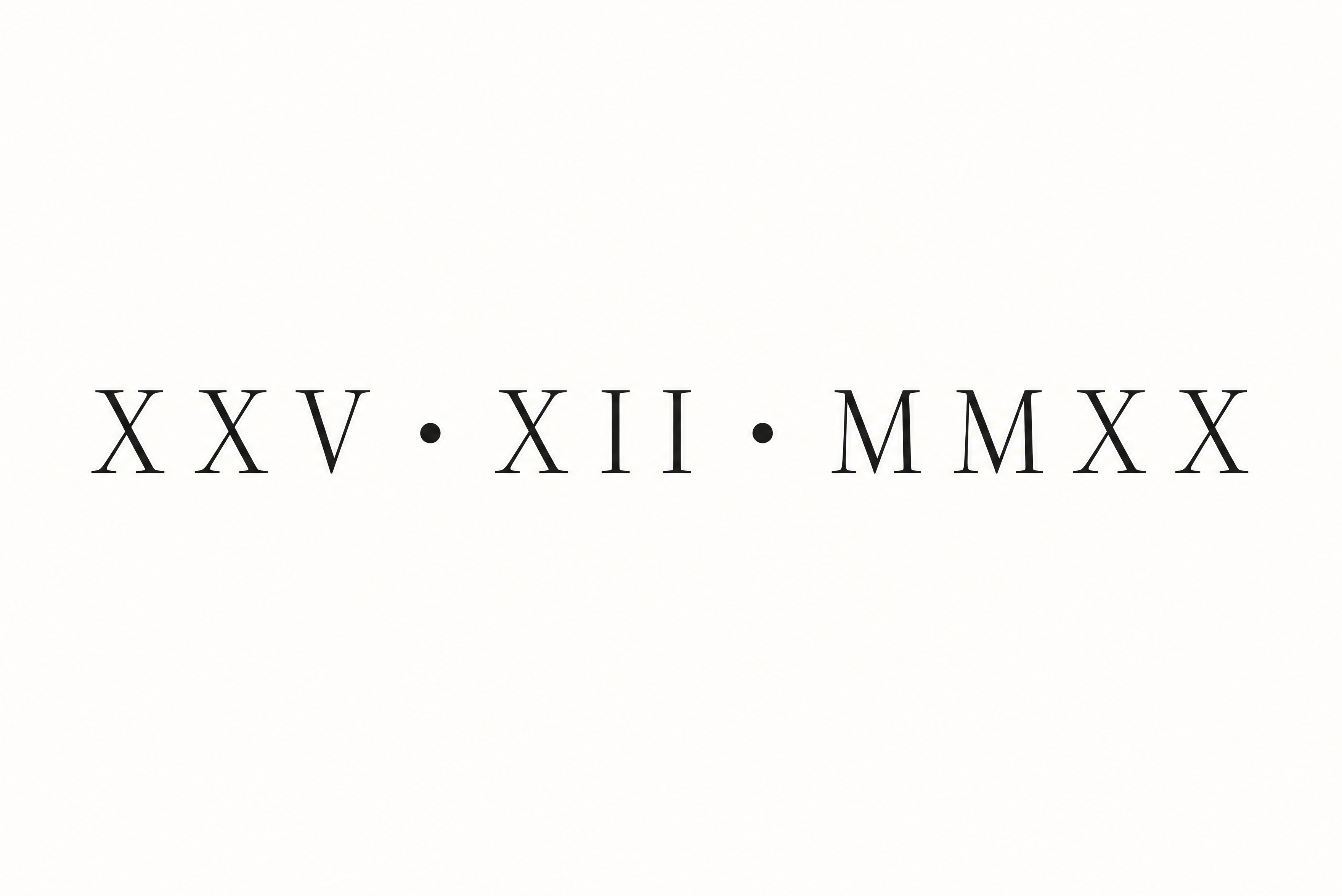



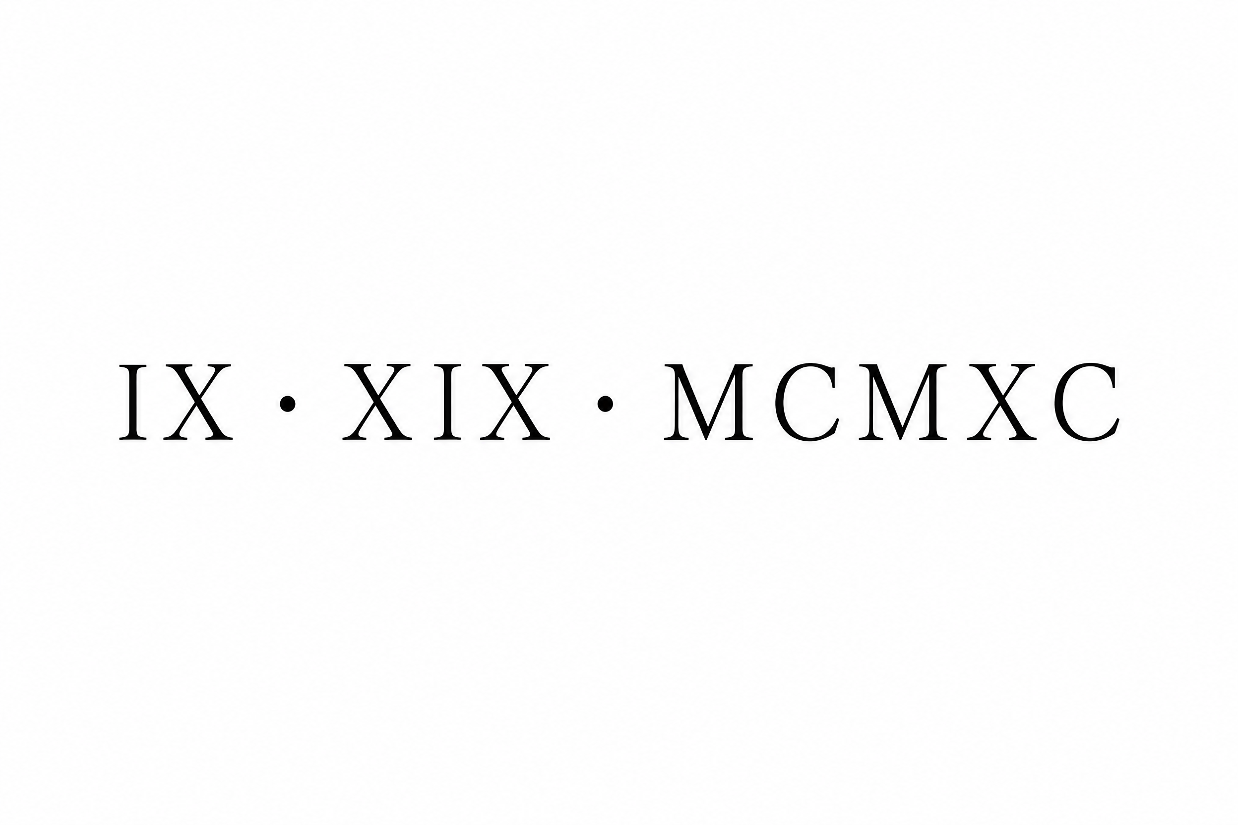





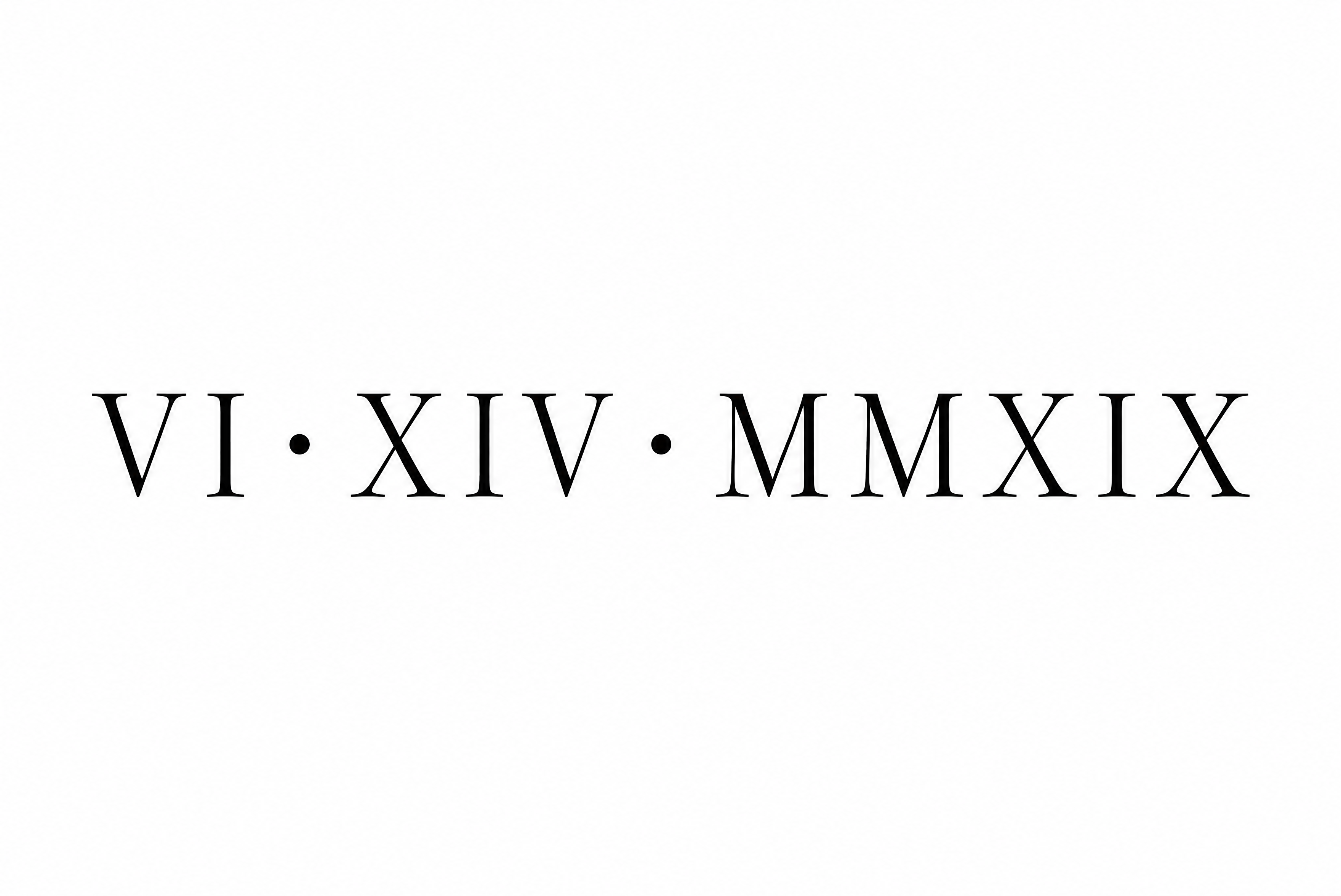
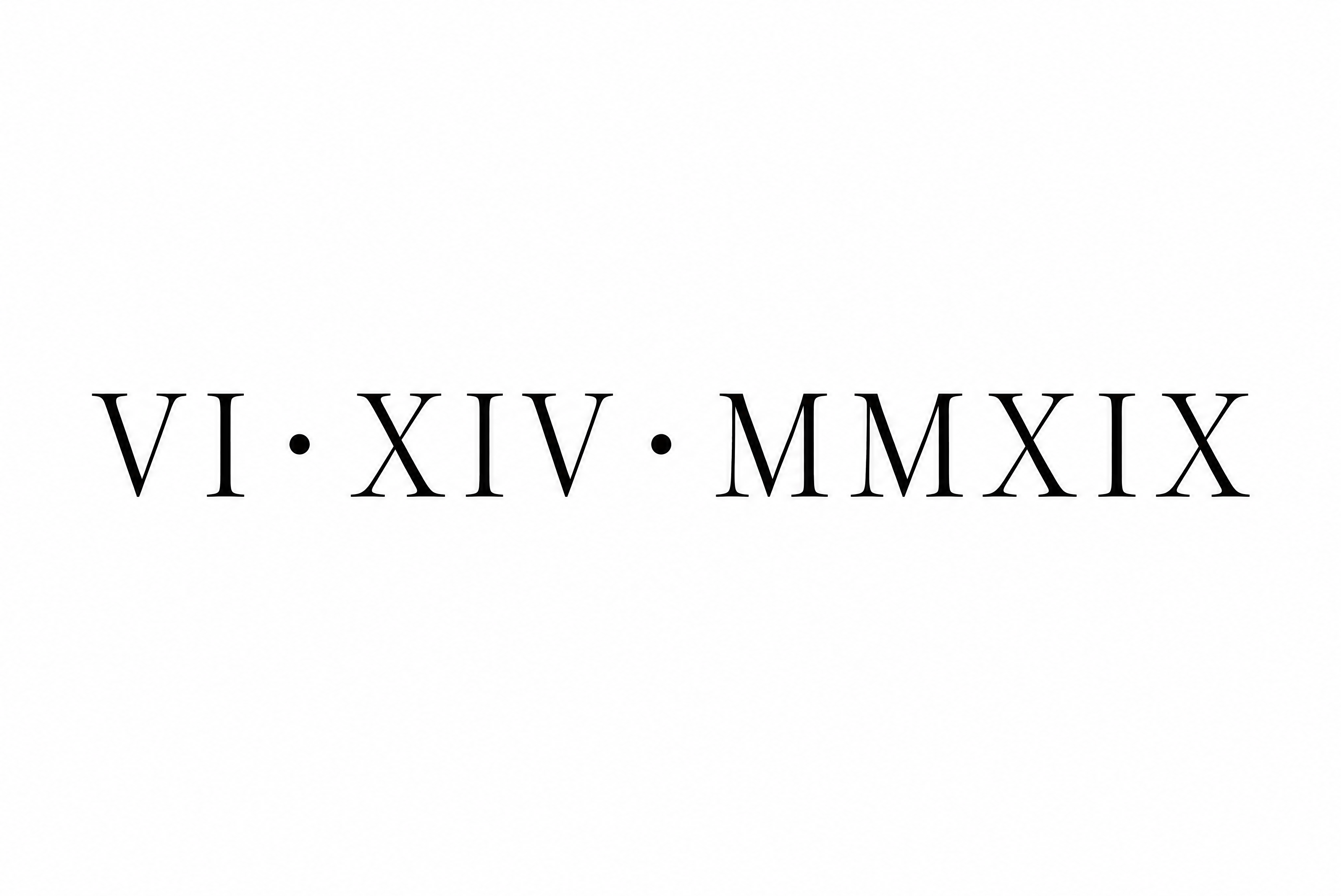
黒いローマ数字で日付「VI · XIV · MMXIX」をクラシックなセリフ体で書いたタトゥーのレタリングデザインです。字間の広い大文字が一行に並び、2つの太い丸い点で区切られ、繊細なセリフと穏やかな太細のコントラストがあり、無地の白地です。自分の日付をローマ数字に替え、同じセリフ体で清潔なステンシルにできます。
A tattoo lettering reference sheet on a flat pure white background, with no skin, no body, no shadow and no texture. One single horizontal line of Roman numeral text reads exactly: "VI · XIV · MMXIX". Keep the numerals and the two middle dots character for character, with no extra words. The line is centred and spans about 78% of the canvas width, with generous empty margins on all sides. The letterforms are a thin Roman serif in the Didone tradition: vertical stress axis, crisp unbracketed serifs and a clear contrast between thin and slightly thicker stems. Every stroke is solid, uniform dark ink-black, drawn as clean fine-line vector work with a firm minimum line weight, so it reads as a real tattoo needle line. Hairlines are never fainter than the thinnest stroke that could survive in skin. Serifs are short and open. Spacing is wide: a clear gap between every letter, so adjacent strokes never touch, and especially between the I, V, X and M strokes. The three groups, VI, XIV and MMXIX, are separated by small solid round middle dots placed at mid-height of the capitals, each dot about the diameter of a thick stem and set with ample space on both sides. Letter height is consistent across the line, with the baseline perfectly straight. No outline, no fill gradient, no glow, no shading, no ornaments, no flourishes, no underline. Flat matte black on pure white, minimalist, elegant, easy for a tattoo artist to trace and stencil.
タグ
2026年11月6日に生成 · 3520 × 2352 · PNG · 透過 PNG · OpenAI GPT-Image-2.5 Sunburst · レイアウト:Collarbone Single Line · 制作者がシェア · 商用利用無料(CC BY 4.0)