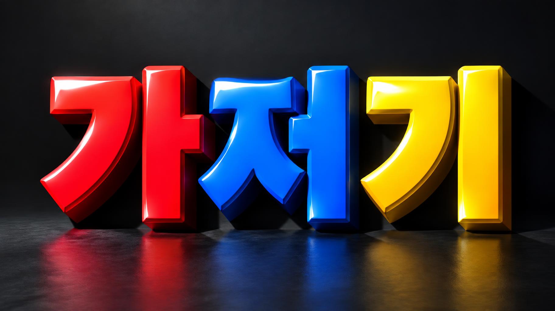
가저기 - 3D 太字 Text Effect


この作品と同じ OpenAI GPT-Image-2.5 Sunburst を使用 · 15 クレジット



「가저기」は FontVibe AI で作成した3D 太字の文字エフェクトです。深く押し出された極太のブロック体大文字。一文字ずつ艶のあるキャンディカラーで、上からの光がハイライトを丸い角に走らせ、床に色の映り込みが広がります。
Massive chunky 3D block letters with heavyweight extruded presence — thick uniform extrusion depth of 50-60% of letter height. Front face finished in ultra-glossy lacquer, catching directional key light with natural specular reflections that graduate from bright highlight to deep saturated color — the surface quality of hard candy coating or high-gloss toy paint. Side extrusion planes in a noticeably darker shade of the same hue, creating crisp face-to-depth contrast that reads immediately as three-dimensional volume. Adjacent letters each carry a different vivid saturated color, maximizing chromatic contrast across the word — no two adjacent letters share the same hue family. Hard sharp corner edges where face meets extrusion, no beveling. Long dramatic cast shadows at consistent 45-degree angle, shadow depth approximately 40-50% of letter height. Strong directional key light from upper left. Bold, high-contrast, maximum visual impact. LETTERFORM PRIORITY: when the chosen font carries its own treatment, that font's letterform shapes take priority and own the letters; this style governs the glossy 3D extrusion, the directional lighting and the multi-color scheme. FALLBACK MATERIAL: if the font carries no material of its own, render the letters as thick glossy extruded 3D blocks with hard candy-lacquer faces and darker extrusion sides. COLOR PRIORITY: if the font specifies its own colors, keep them; otherwise give each adjacent letter a different vivid saturated hue. Create a finished typographic title image featuring exactly the Korean text “가저기,” arranged as one large, compact line and centered across the canvas. Preserve every character clearly and faithfully, with no additional words, symbols, or lettering. Let the three characters dominate the composition, occupying about three-quarters of the image width, with generous clear space around their outer edges so each glossy, multicolored form reads immediately. Keep neighboring characters in distinct vivid hue families, with rich saturated color across the faces and darker matching sides that make the deep extrusion unmistakable. A strong directional light from the upper left lays bright natural highlights across the polished surfaces and throws long, crisp diagonal shadows down and to the right. Set the lettering just above a simple, nearly black charcoal studio floor, with restrained reflections directly beneath it. The background remains minimal and uncluttered: a smooth dark studio field, subtly lighter behind the text for separation, without scenery or decorative objects. Use a straight-on view with a slight low angle, crisp edges, strong contrast, and a balanced, premium title-card finish. Keep the Korean text as the sole focal point.
用途: 大きな3D文字
2026年11月8日に生成 · 1824 × 1024 · JPEG · OpenAI GPT-Image-2.5 Sunburst · 制作者がシェア · 商用利用無料(CC BY 4.0)