快放我下来 - アニメ Text Effect


この作品と同じ OpenAI GPT-Image-2.5 Sunburst を使用 · 15 クレジット
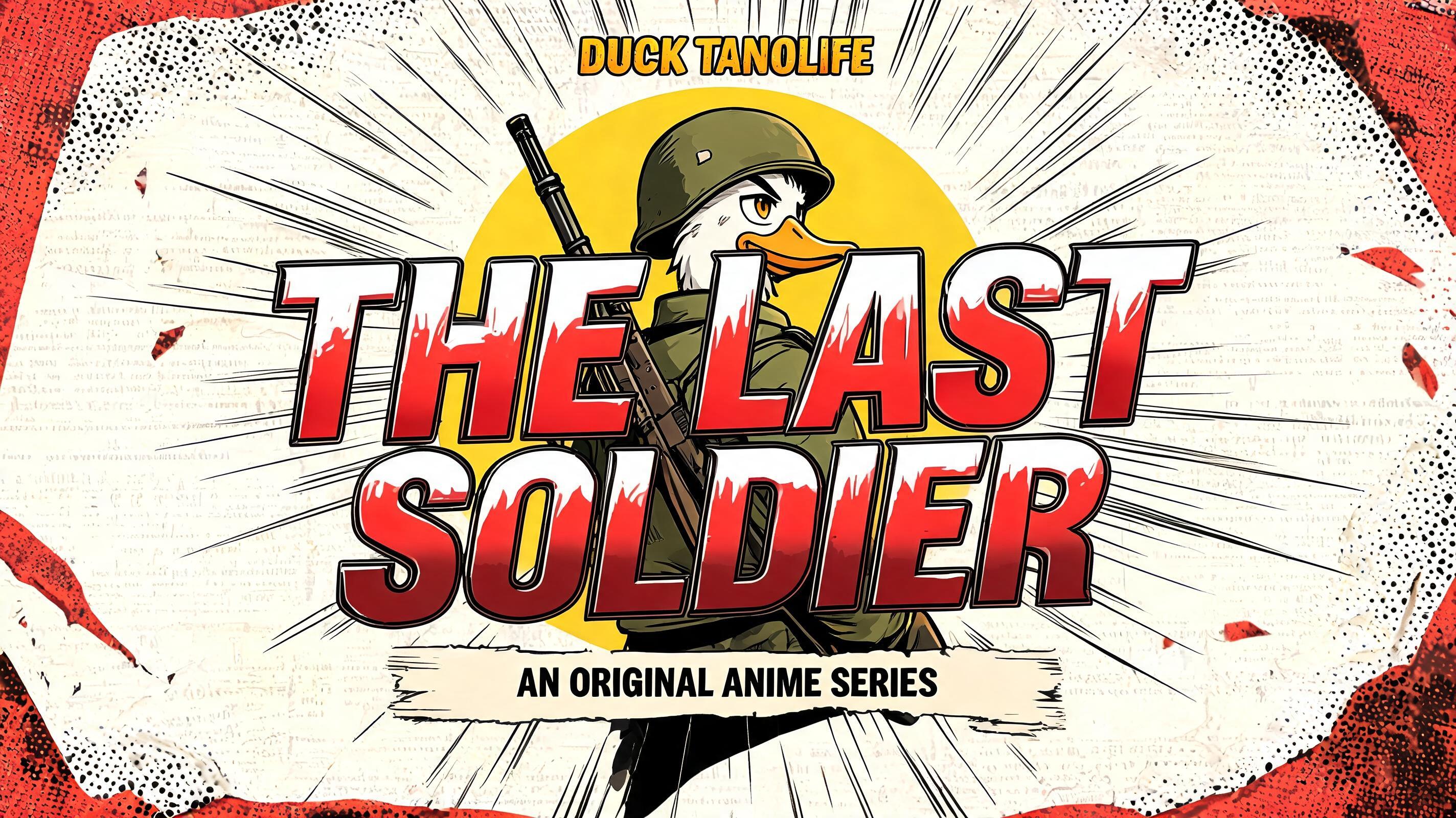
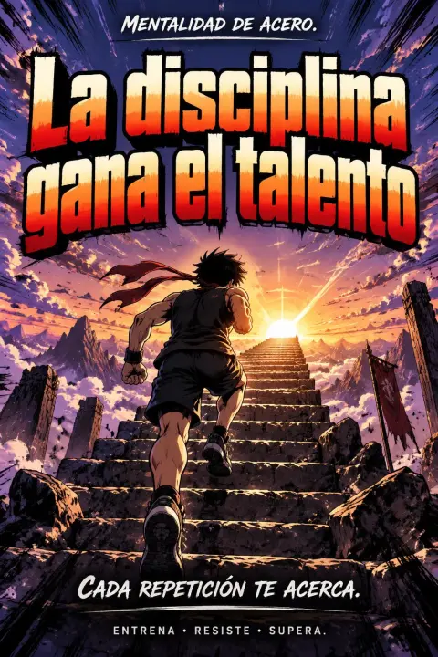
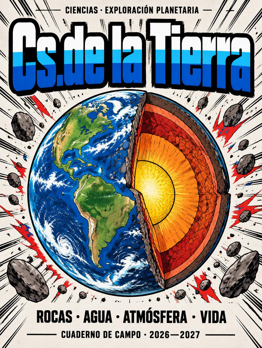
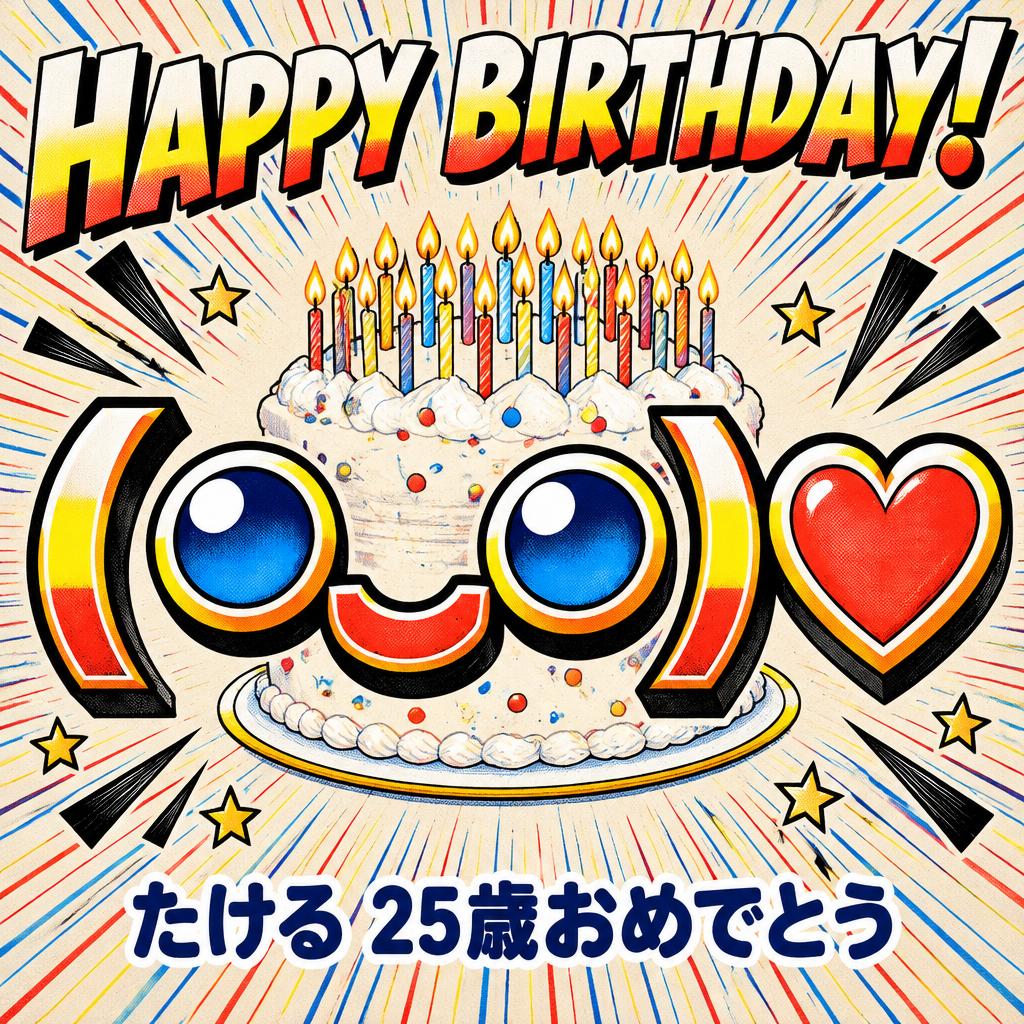
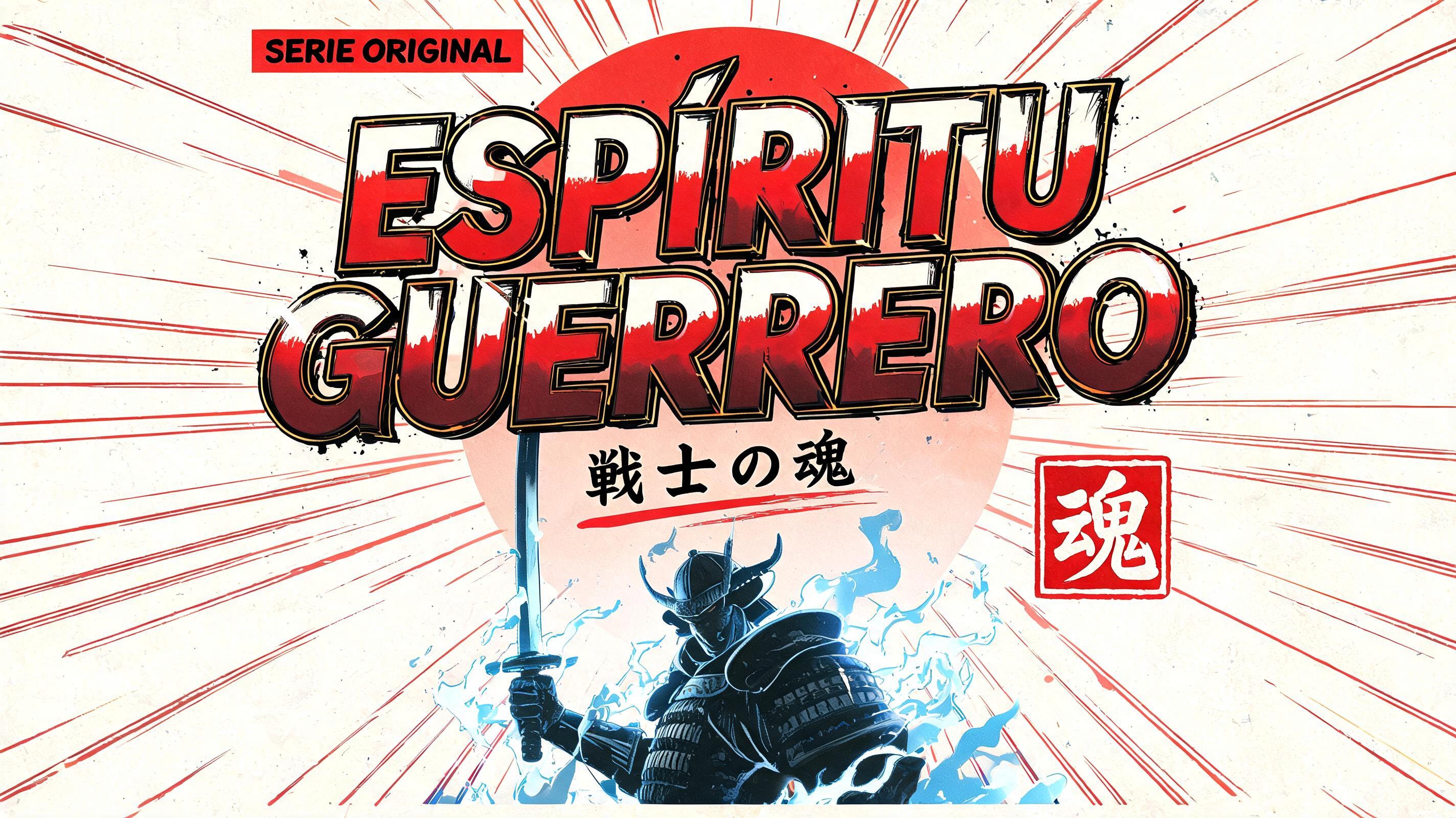
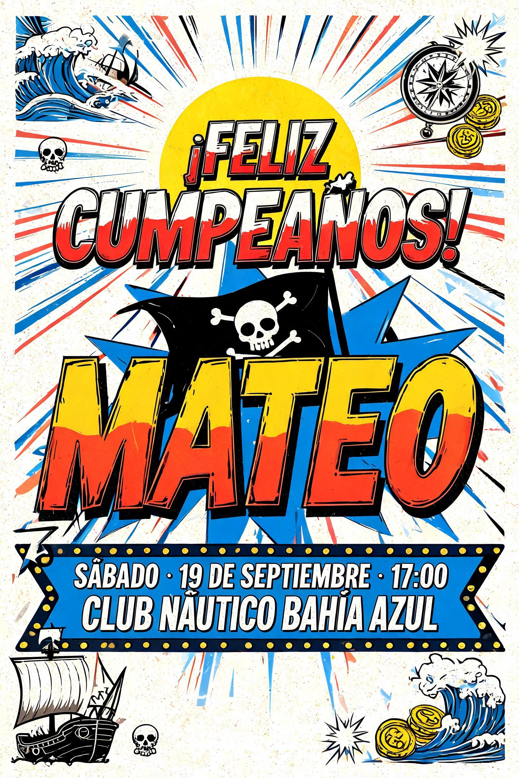
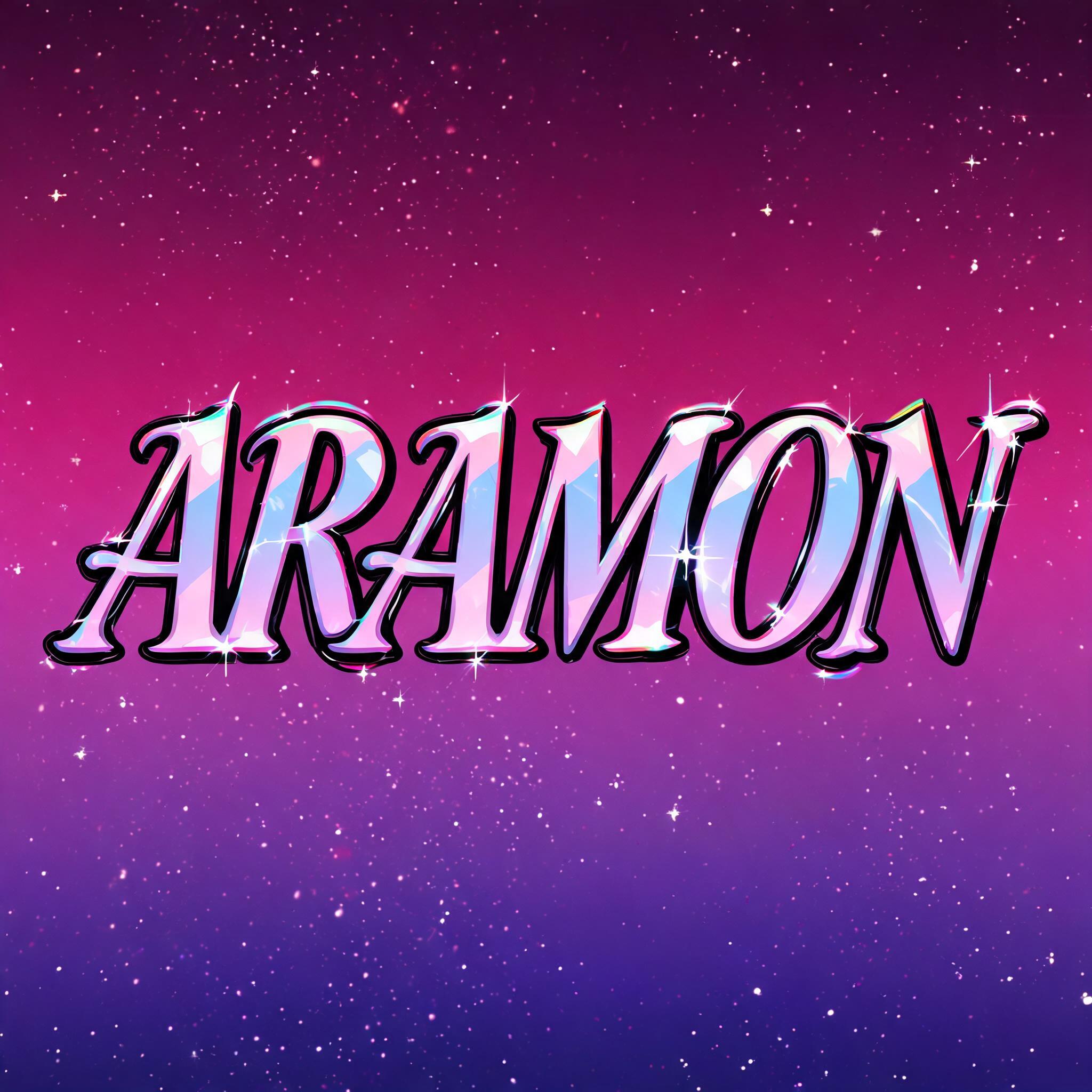
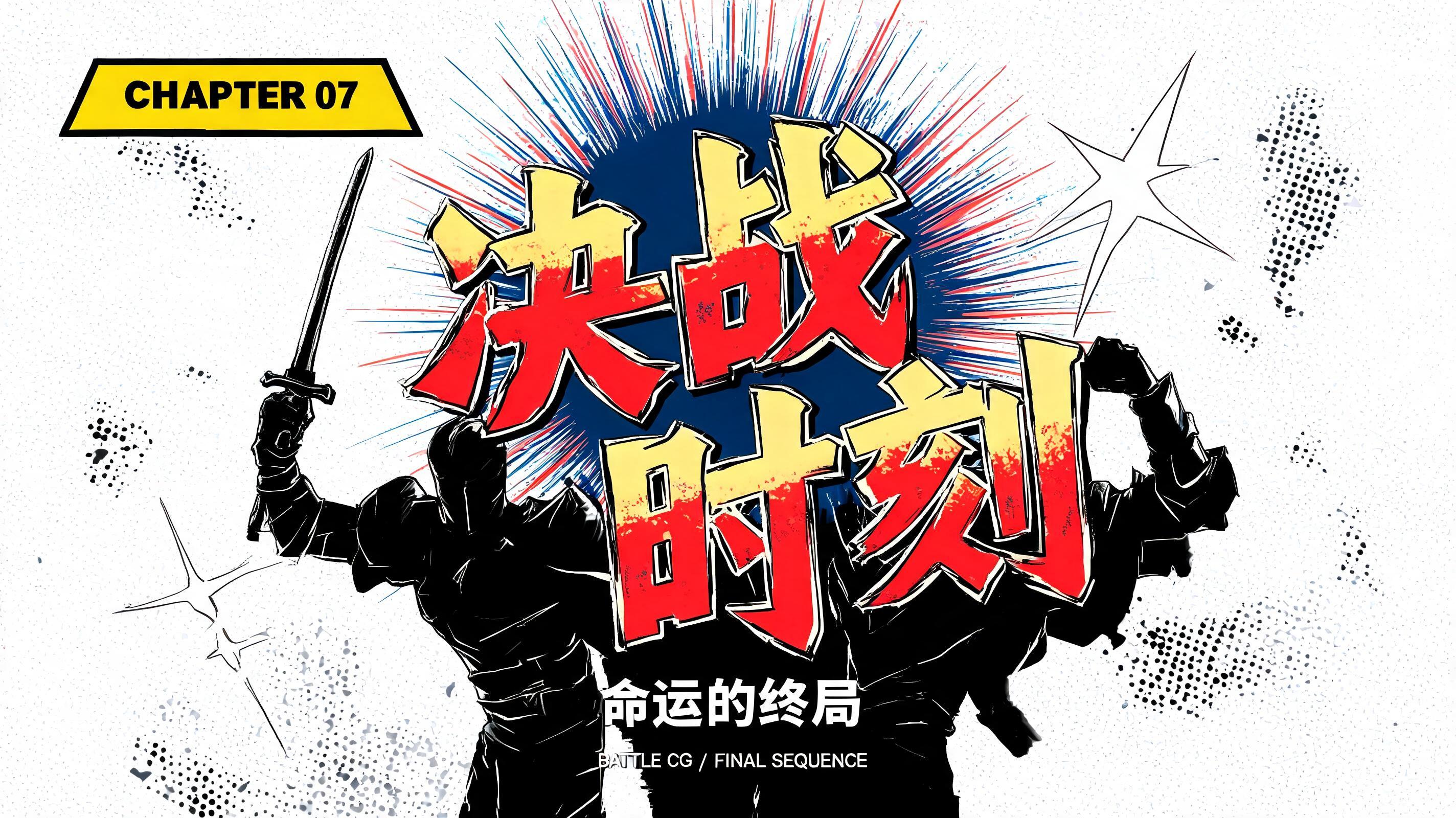
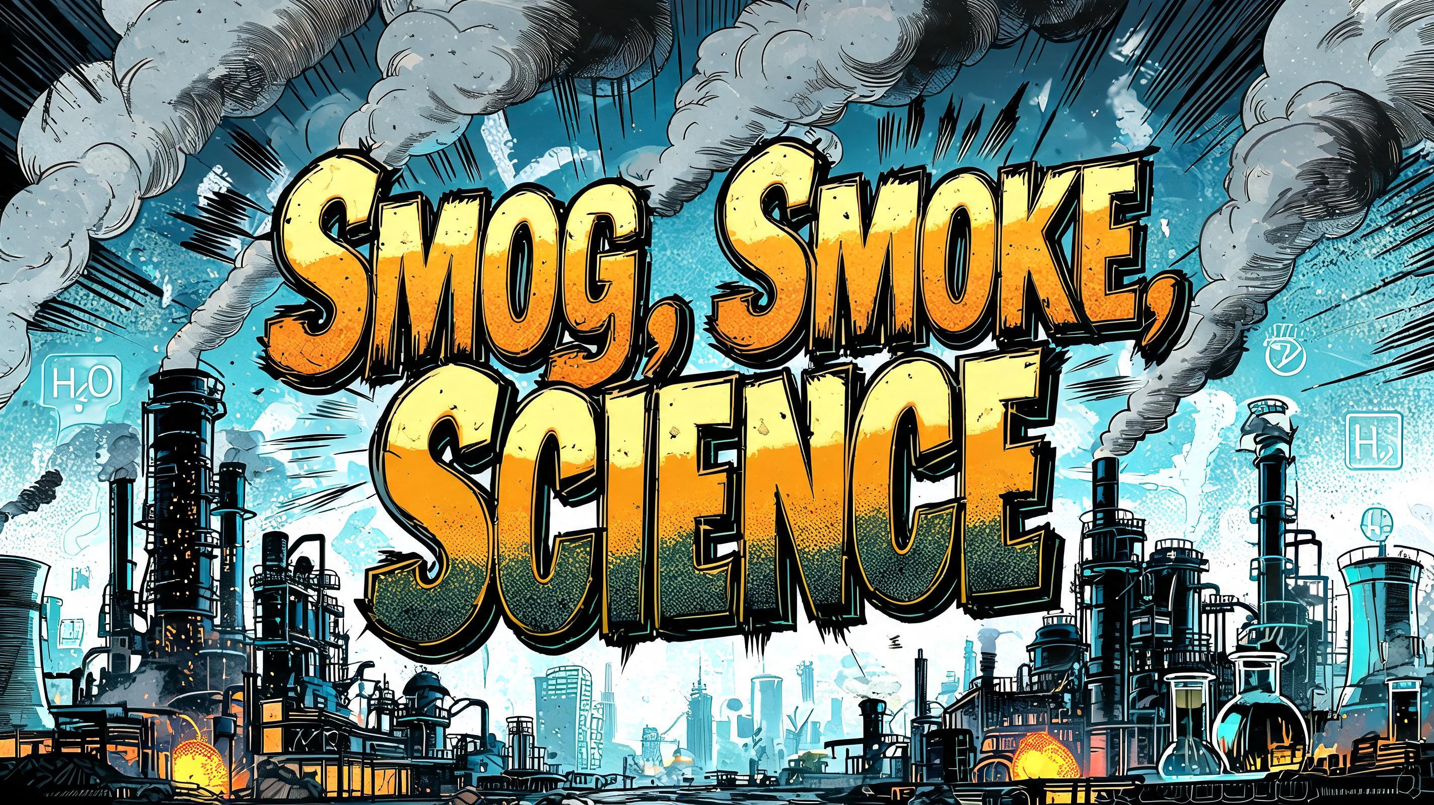
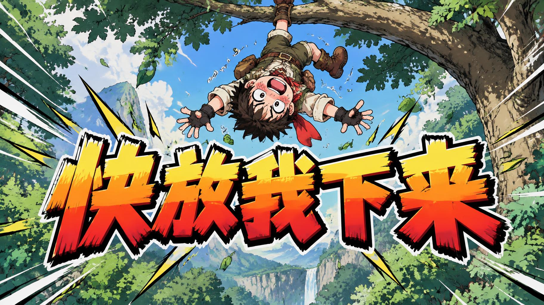
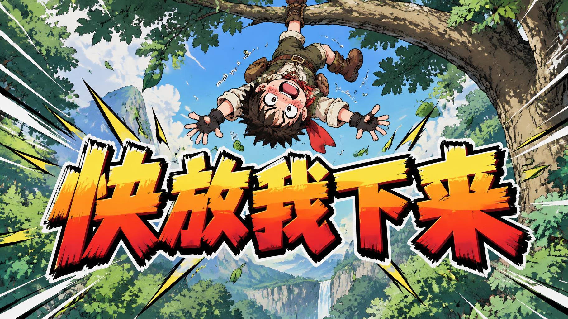
「快放我下来」は FontVibe AI で作成したアニメの文字エフェクトです。少年マンガのタイトル文字。手描きの太い黒フチ、ハイライトと影をくっきり分けたセルシェーディング、勢いよく傾いた文字と、白地に放射状の集中線。
rendered as Japanese shounen anime title treatment — bold hand-inked manga lettering with authentic cel-shaded visual energy. Letter construction follows classic Shonen Jump title card standards: thick black ink outline with natural brush-weight variation defining each letter boundary; flat cel-shading fill with three hard-edge zones — bright highlight zone on upper letter face, highly saturated primary color zone at center, deep shadow zone at lower edge; all zone boundaries knife-edge hard, zero gradient blur, pure flat offset-print ink physics. Energy signature: high-contrast color + thick ink outline = letters that look physically printed on manga paper. The typographic language of Dragon Ball, Naruto, One Piece, Demon Slayer, Jujutsu Kaisen title cards — maximum manga kinetic energy, iconic and immediately recognizable as Japanese anime title typography. LETTERFORM PRIORITY: when the chosen font carries its own treatment, that font's letterform shapes take priority and own the letters; this style governs the inked manga outline, the three-zone cel-shading and the kinetic energy. FALLBACK MATERIAL: if the font carries no material of its own, render the letters as bold hand-inked shounen title lettering with a thick black brush outline and hard three-zone cel-shading. COLOR PRIORITY: keep the font's own colors if specified; otherwise a high-saturation primary fill with hard highlight and shadow zones. Create a dramatic anime reaction image built around the exact Chinese text “快放我下来” (“Put me down now”), keeping every character intact and clearly legible. Arrange the four characters in one compact horizontal line across the center, occupying about 80% of the canvas width; make the lettering the unmistakable focal point. Behind it, show a startled young adventurer dangling upside down by one ankle from a thick tree branch, arms flailing and cheeks flushed with comic embarrassment. Their expression and pose should feel lively and humorous, not distressed. Place the branch and figure in the upper half so they frame the words without obscuring any character. Use a clean cel-shaded forest backdrop with layered emerald leaves, a few scattered leaf shapes, and a bright patch of sky; keep background detail restrained around the lettering. Add energetic manga speed lines and small impact marks radiating toward the text, while preserving generous negative space and strong separation between foreground and background. The composition should read instantly at thumbnail size, like a polished shounen anime episode gag card, with the Chinese phrase rendered exactly as supplied and no other visible writing.
用途: アニメ文字ジェネレーター
2026年11月9日に生成 · 1824 × 1024 · JPEG · OpenAI GPT-Image-2.5 Sunburst · 制作者がシェア · 商用利用無料(CC BY 4.0)



