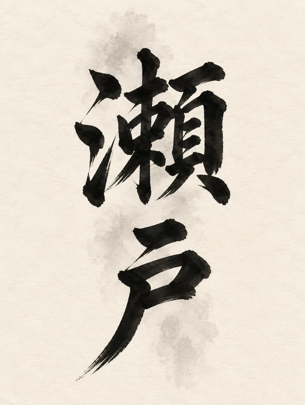
瀬戸 - 日本の墨筆 Text Effect


この作品と同じ OpenAI GPT-Image-2.5 Sunburst を使用 · 15 クレジット











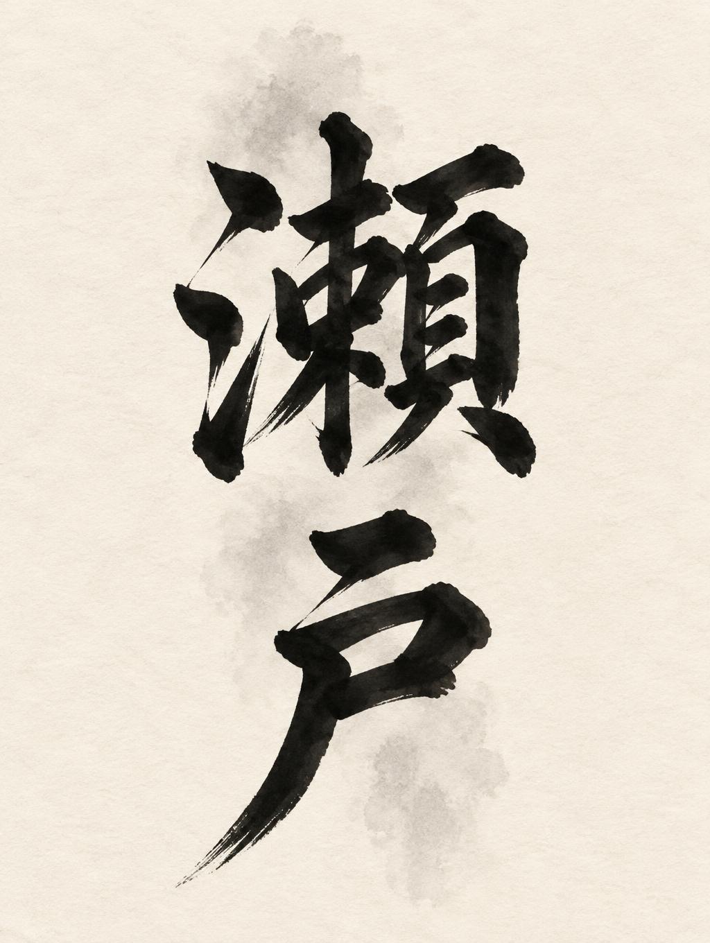
「瀬戸」は FontVibe AI で作成した日本の墨筆の文字エフェクトです。日本の書道の墨筆による筆致をラテン文字に応用したスタイルです。深い墨黒のインクに本格的な筆のエネルギー、一方向に制御された筆運び、そして和紙の雰囲気が宿ります。日本食レストランのブランディング、タトゥーデザイン、アニメ、武道、文化系プロジェクトに最適です。
Japanese ink brush aesthetic — the visual language of sumi calligraphy on washi paper. INK MEDIUM: sumi pigment in deep black to charcoal range — richest density at mark centers, naturally transitioning outward as ink supply depletes. Fully matte, absorbed into paper surface, producing a tonal range from dense opaque black to transparent grey depending on dilution and brush load. PAPER SURFACE: natural washi — warm cream-white base with visible paper fiber structure giving slight texture. The absorbent surface creates the characteristic soft border quality of East Asian brush work at all mark edges. LIGHT ATMOSPHERE: soft diffuse north-facing studio light — the traditional calligrapher's light source. Even, shadowless, allowing the full tonal range of ink marks to read clearly. Warm cream paper tone contrasts against deep sumi black. AESTHETIC REGISTER: the ma principle — the space between and around marks is as considered as the marks themselves. Compositions have breathing room and deliberate quietness. When no specific material is defined by the font: default environment — deep sumi black marks on warm cream washi paper, soft diffuse overhead light, meditative studio atmosphere. Create a finished Japanese ink-brush title image featuring exactly the two characters 「瀬戸」, set large in a vertical column and read top to bottom. Let the pair command the center of the warm cream washi sheet, with the upper character slightly above center and the lower character anchoring the composition. Make the brushwork feel decisive and alive: dense near-black sumi at the forceful stroke entries, shifting through charcoal gray into soft, thinning tails where the brush lifts. Preserve clear character forms and natural, controlled ink absorption into the visible paper fibers. Surround the lettering with generous, carefully balanced ma; let the quiet paper remain an essential part of the design. Add only a faint, irregular gray ink wash behind part of the vertical column, subtle enough to support the movement without reducing legibility. Keep the sheet otherwise spare: no border, objects, extra writing, decorative motifs, or added text. Soft diffuse studio light falls evenly across the paper, allowing the matte ink tones and delicate texture to read. The result is a poised, powerful shodo composition with stillness in its open space.
用途: 書道フォント
2026年11月10日に生成 · 1024 × 1360 · JPEG · OpenAI GPT-Image-2.5 Sunburst · 制作者がシェア · 商用利用無料(CC BY 4.0)