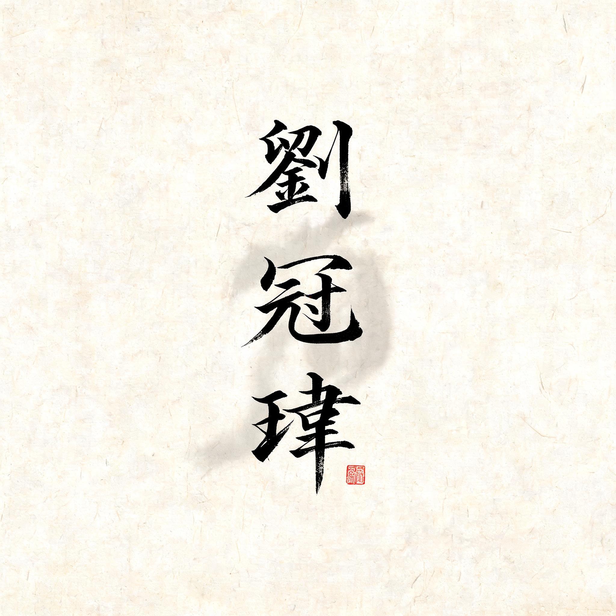
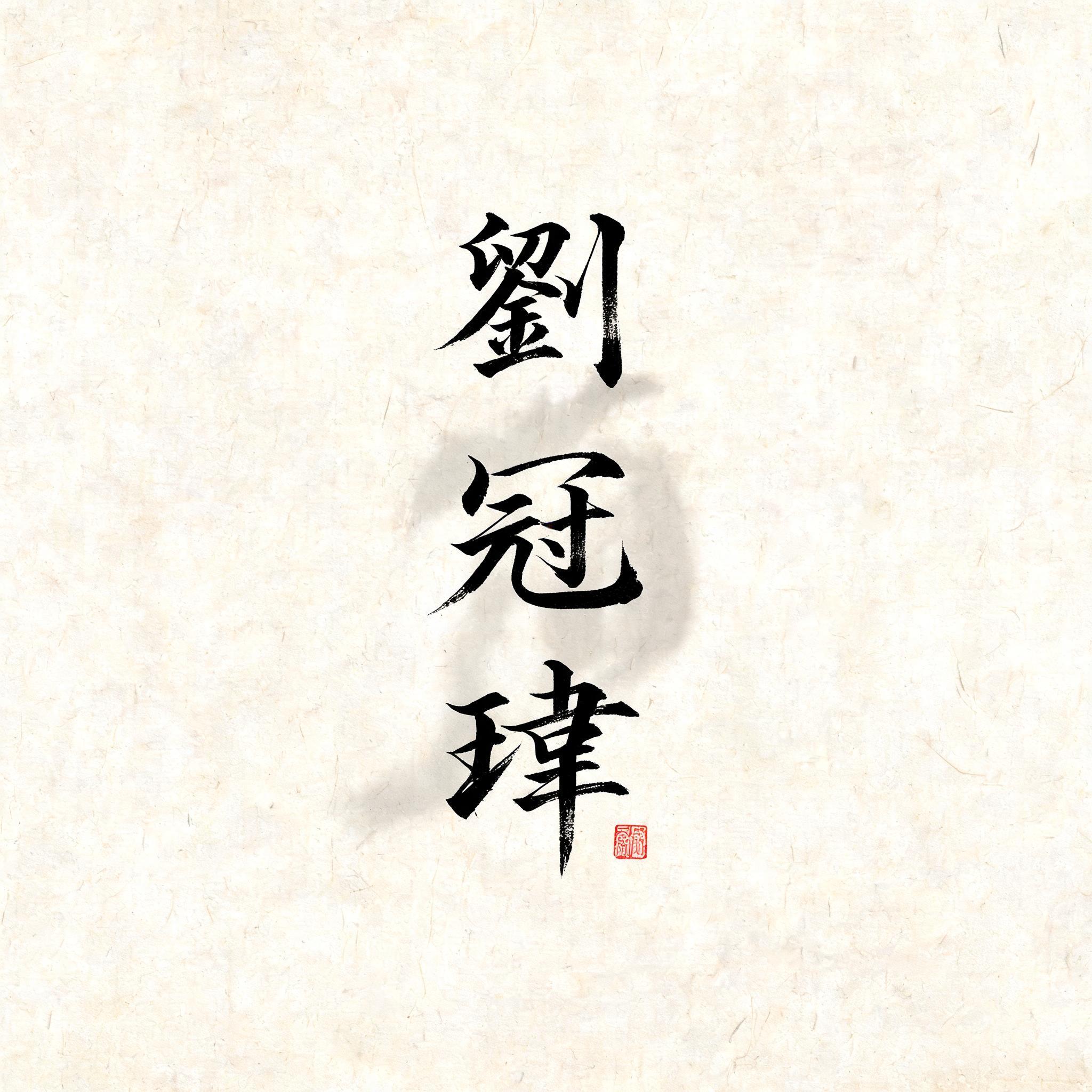
劉冠瑋 - 日本の墨筆 Text Effect


この作品と同じ BytePlus Seedream 5.0 を使用 · 15 クレジット











「劉冠瑋」は FontVibe AI で作成した日本の墨筆の文字エフェクトです。日本の書道の墨筆による筆致をラテン文字に応用したスタイルです。深い墨黒のインクに本格的な筆のエネルギー、一方向に制御された筆運び、そして和紙の雰囲気が宿ります。日本食レストランのブランディング、タトゥーデザイン、アニメ、武道、文化系プロジェクトに最適です。
Rendered in formal Japanese Shodo calligraphy style. Letterforms executed with maximum brush discipline — controlled powerful strokes following classical calligraphy principles. Deep sumi ink, densest at stroke origin, feathering dry at endings. Washi paper background with subtle fiber texture. Ceremonial quality: the kind of brushwork seen on a hanging scroll or official document. Each letter carries weight and intentionality. Formal, dignified, deeply rooted in the Japanese calligraphy tradition. Create a formal portrait-format Japanese calligraphy composition featuring the exact three characters “劉冠瑋” in a single vertical column, read from top to bottom. Keep the characters large and dominant, centered slightly above the midpoint, with generous breathing room around the brushwork and a quiet expanse of warm, off-white washi paper. Preserve every character clearly and faithfully; do not add any other writing. Let the column feel deliberate and ceremonial, with subtle variations in scale and spacing that give the composition a poised, human rhythm. Beneath the lowest character, place one small vermilion artist’s seal, visually subordinate and without legible added text. A faint, restrained gray ink wash may gather behind the column, dissolving softly into the paper fibers without obscuring the lettering. Keep the outer margins calm and clean, with no props, borders, or decorative motifs. The overall image should feel like a finished hanging-scroll inscription: disciplined, weighty, and still, with the force of the brush balanced by broad, untouched negative space.
2026年11月12日に生成 · 2048 × 2048 · JPEG · BytePlus Seedream 5.0 · 制作者がシェア · 商用利用無料(CC BY 4.0)