UNIT - アニメ Text Effect


この作品と同じ BytePlus Seedream 5.0 を使用 · 15 クレジット
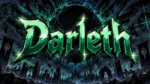
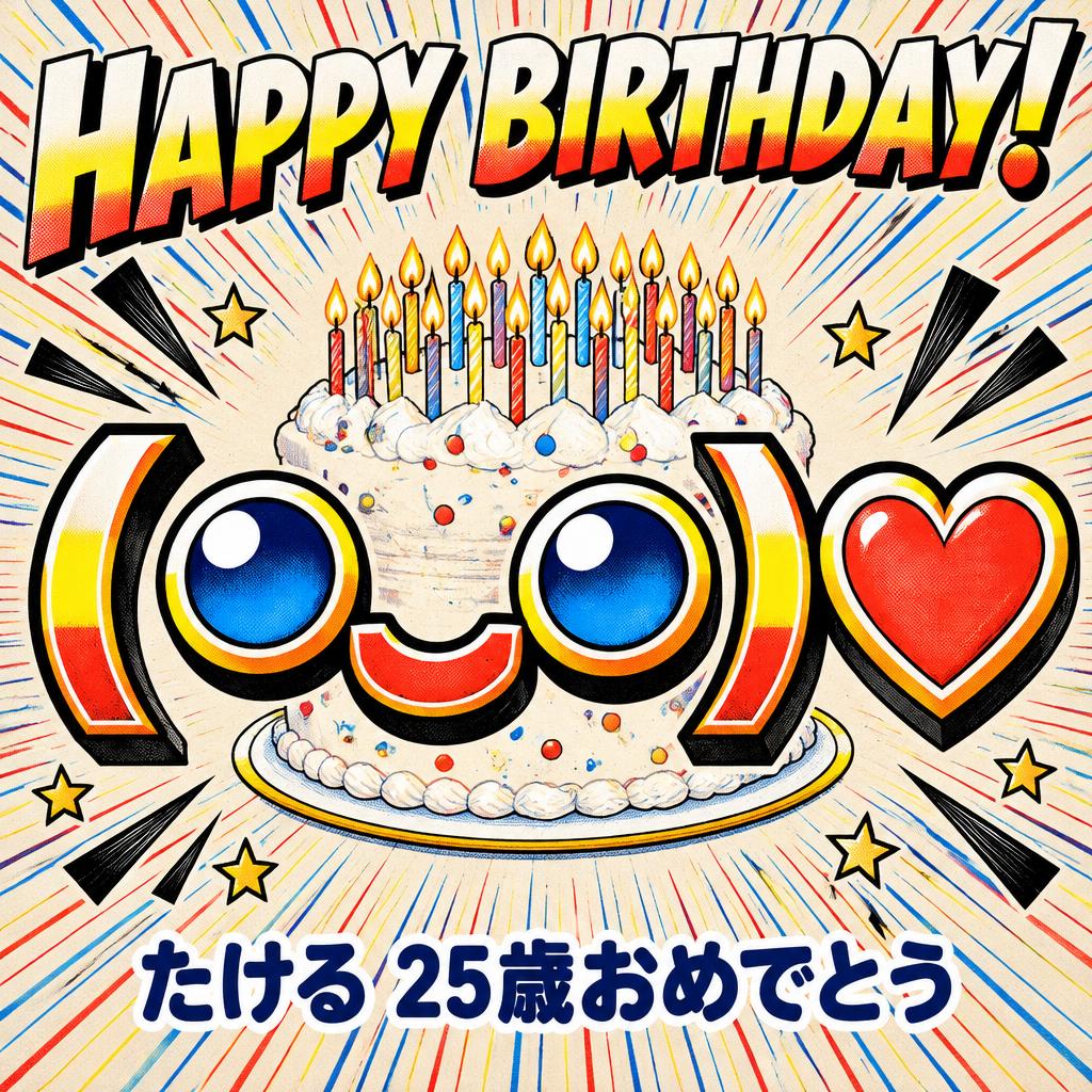
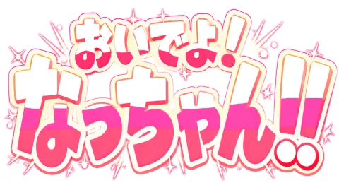
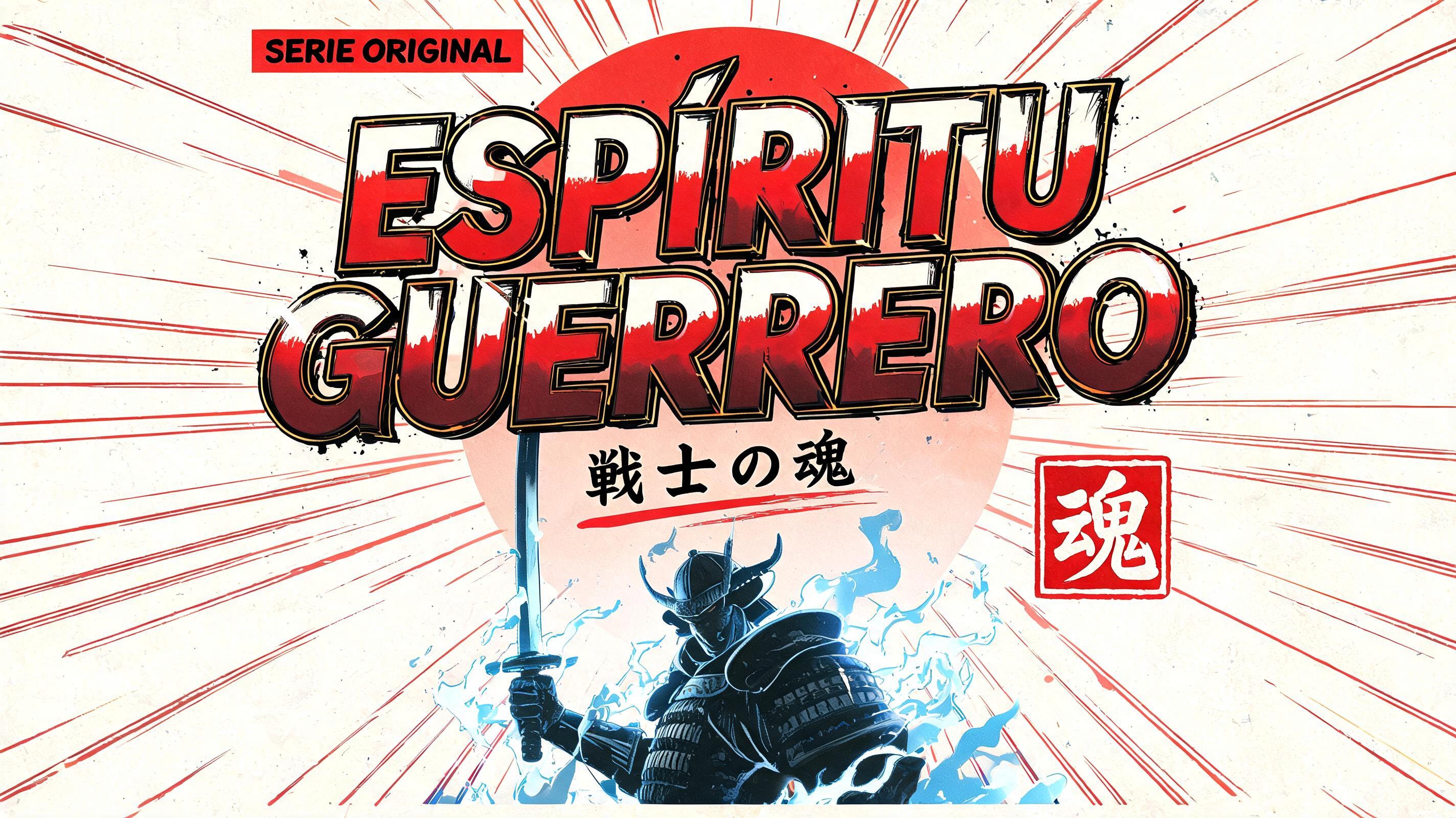
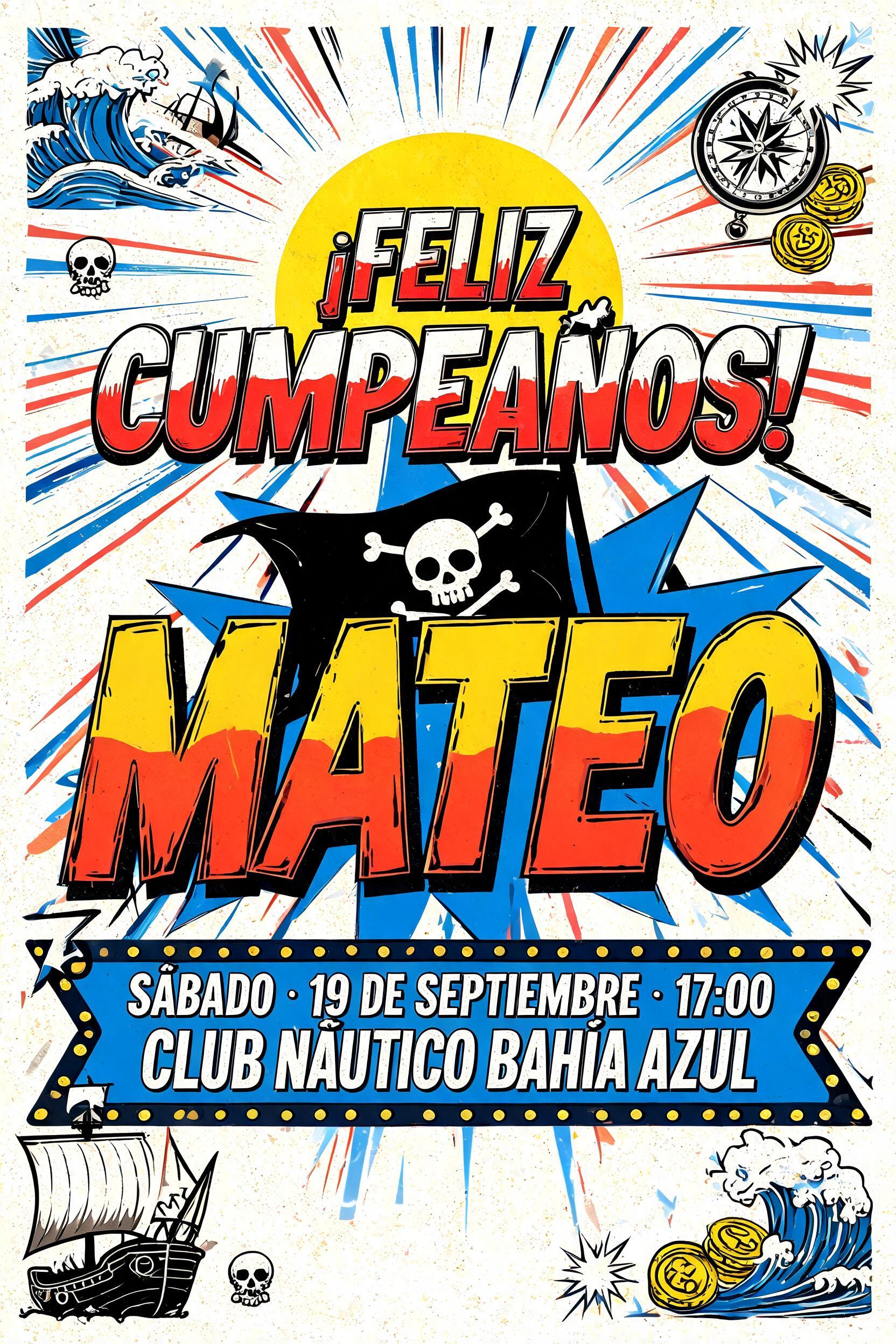
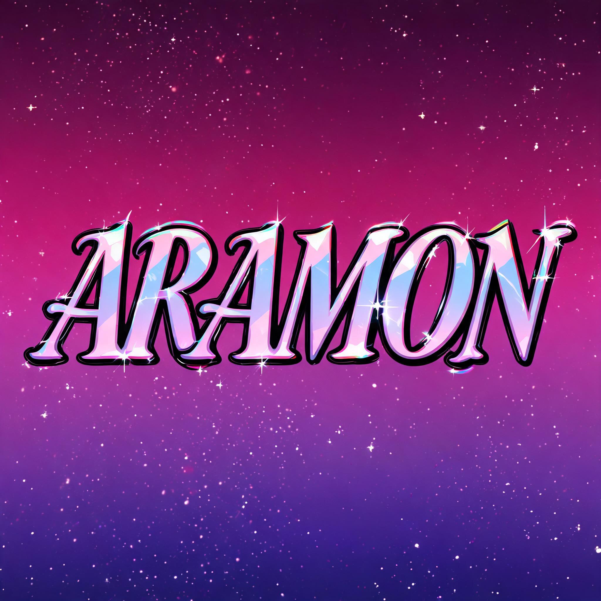
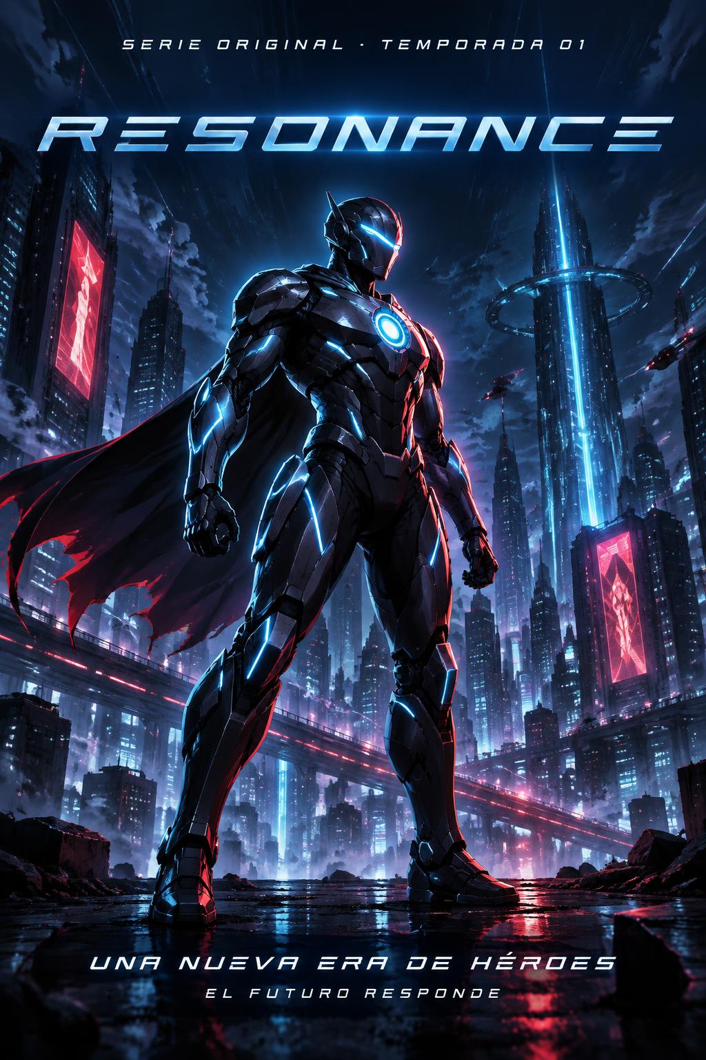
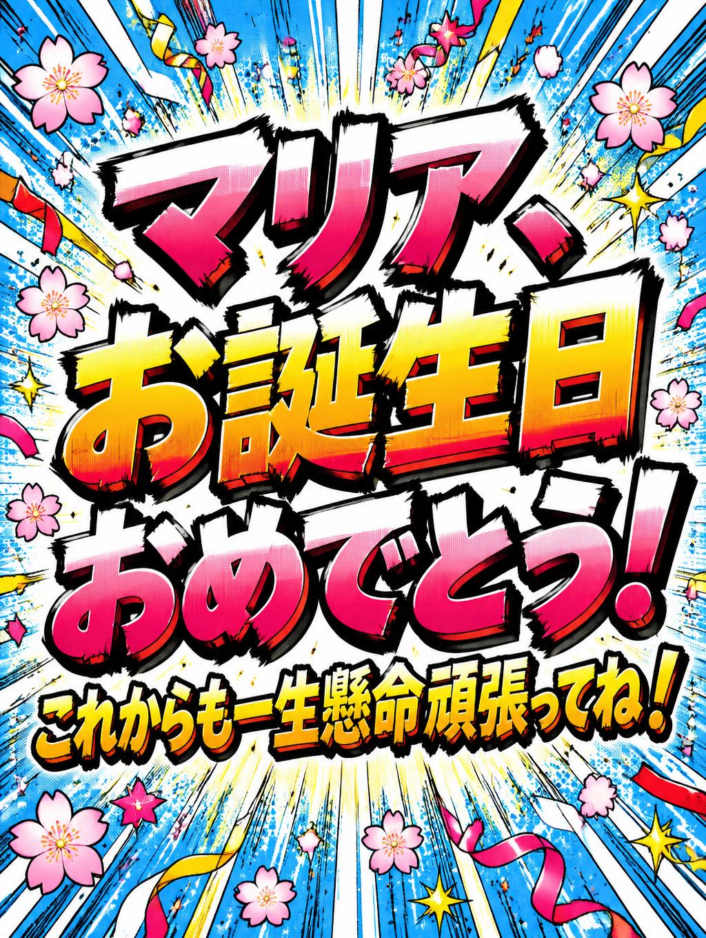
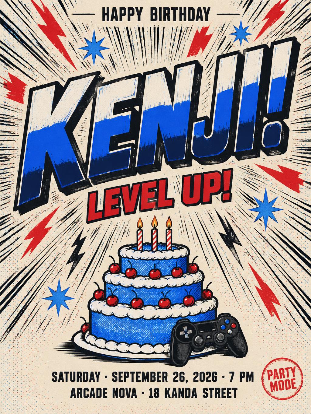
「UNIT」は FontVibe AI で作成したアニメの文字エフェクトです。少年マンガのタイトル文字。手描きの太い黒フチ、ハイライトと影をくっきり分けたセルシェーディング、勢いよく傾いた文字と、白地に放射状の集中線。
rendered as Japanese shounen anime title treatment — bold hand-inked manga lettering with authentic cel-shaded visual energy. Letter construction follows classic Shonen Jump title card standards: thick black ink outline with natural brush-weight variation defining each letter boundary; flat cel-shading fill with three hard-edge zones — bright highlight zone on upper letter face, highly saturated primary color zone at center, deep shadow zone at lower edge; all zone boundaries knife-edge hard, zero gradient blur, pure flat offset-print ink physics. Energy signature: high-contrast color + thick ink outline = letters that look physically printed on manga paper. The typographic language of Dragon Ball, Naruto, One Piece, Demon Slayer, Jujutsu Kaisen title cards — maximum manga kinetic energy, iconic and immediately recognizable as Japanese anime title typography. UNIT as mecha anime HUD display letterforms centered at 70% width in wide cinematic frame. Near-black background with horizontal CRT scan-band texture visible across the full frame — active tactical display panel atmosphere. Each letter: flat fill with horizontal raster scan bands at 3px intervals; sharp neon outline with asymmetric bloom (1px inner bright / 8-10px outer exponential decay); inner surface orthogonal holographic grid at 8-10px spacing; machined 45-degree terminal cuts catching narrow specular reflection. Neon outline glow is the primary light source against the dark background. Wide frame shows the full HUD tactical display context. Mecha anime font for EVA, Gundam, sci-fi cockpit themes.
2026年5月23日に生成 · 2848 × 1600 · JPEG · BytePlus Seedream 5.0 · 制作者がシェア · 商用利用無料(CC BY 4.0)