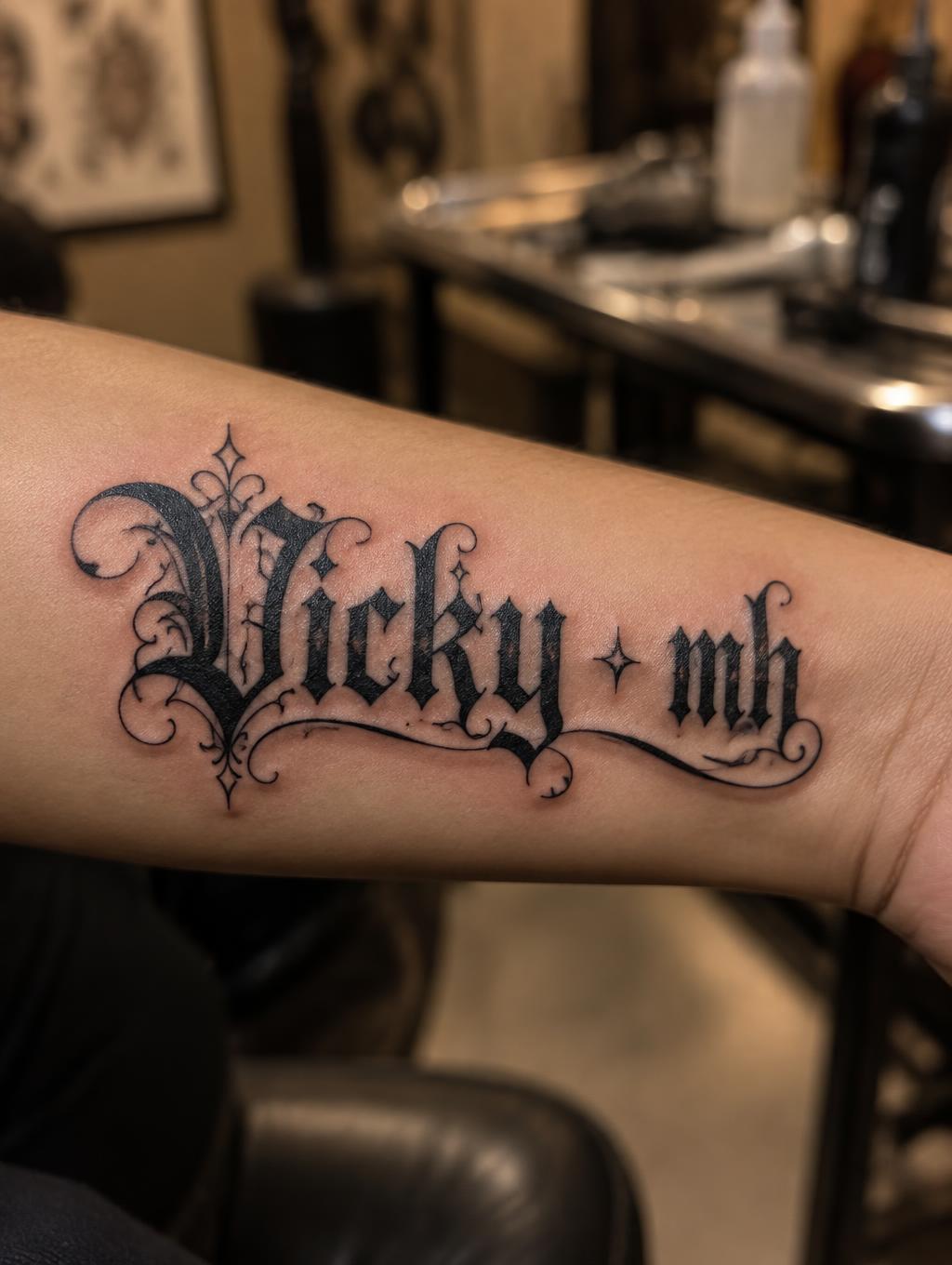
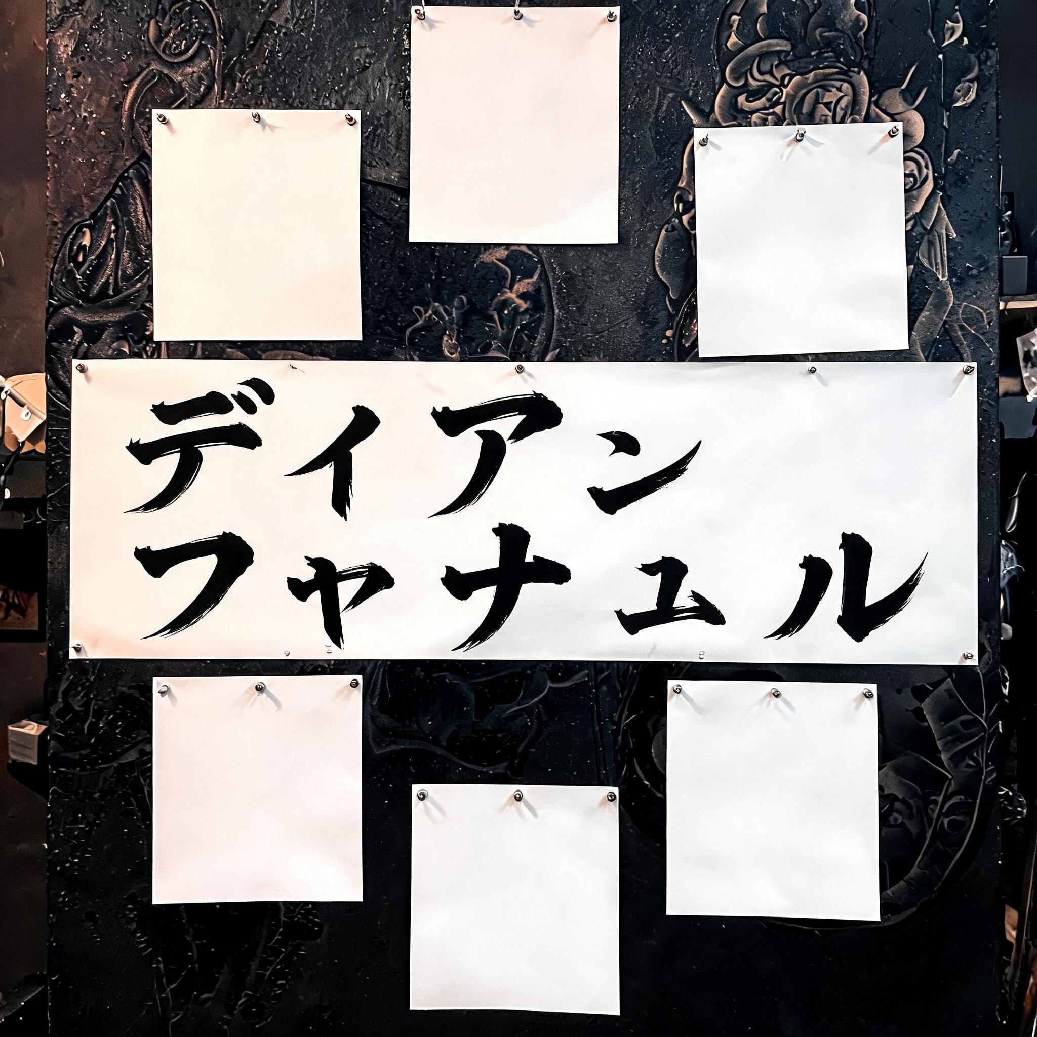
Buat dengan beberapa fnot ティアラ ファトゥル - 日本の墨筆 Text Effect


この作品と同じ BytePlus Seedream 5.0 を使用 · 15 クレジット











「Buat dengan beberapa fnot ティアラ ファトゥル」は FontVibe AI で作成した日本の墨筆の文字エフェクトです。日本の書道の墨筆による筆致をラテン文字に応用したスタイルです。深い墨黒のインクに本格的な筆のエネルギー、一方向に制御された筆運び、そして和紙の雰囲気が宿ります。日本食レストランのブランディング、タトゥーデザイン、アニメ、武道、文化系プロジェクトに最適です。
Japanese Shodo ink brush style optimized for tattoo reference and body art. Letterforms bold, fully filled, maximum-black sumi ink throughout — no translucency, no fading, every stroke reads clearly at small scale. Clean precise brush endings, no fraying. Each letterform self-contained and readable as an independent unit. Background: clean white or neutral skin-tone surface. Built like a tattoo master's flash sheet — bold, unambiguous, permanent-ready. Traditional Japanese calligraphy dignity with tattoo art functionality. Clean neutral cream background — like premium tattoo flash sheet paper, smooth and professional. Flat overhead studio lighting, even and sharp, showing every detail of the brushwork with clinical clarity. Top-center: tiny label "TATTOO REFERENCE" at 40% canvas width, clean precise caps, reference sheet style. Center: two-line dominant brush letters perfectly centered — first line "Buat dengan beberapa fnot" at 60% canvas width, second line "ティアラ ファトゥル" at 45% canvas width — maximum-black sumi ink throughout, fully solid fills, no translucency, no fading, every stroke bold and unambiguous. Clean precise brush endings — permanent-ready. Bottom-center: small reference label "BRUSH CALLIGRAPHY" at 25% canvas width. Vertical spacing ratio approximately 1:5:1.5. The piece reads like a premium Japanese tattoo flash sheet — bold, unambiguous, ready for the needle. Traditional calligraphy dignity with tattoo art functionality.
用途: 日本のタトゥーフォント
2026年6月23日に生成 · 2048 × 2048 · JPEG · BytePlus Seedream 5.0 · 制作者がシェア · 商用利用無料(CC BY 4.0)