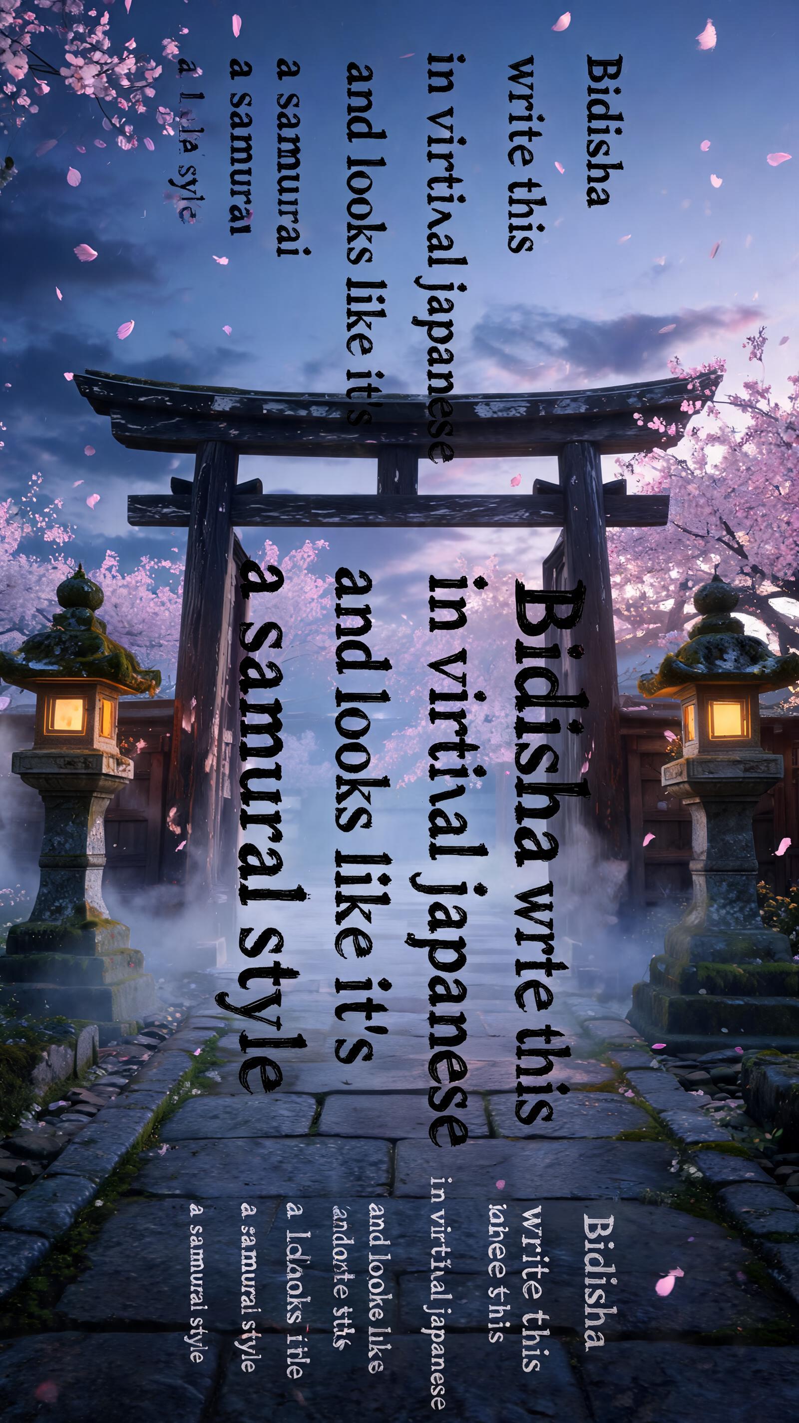
Bidisha write this in vertical japanese and looks like it's a samurai style - 日本の墨筆 Text Effect


この作品と同じ BytePlus Seedream 5.0 を使用 · 15 クレジット











「Bidisha write this in vertical japanese and looks like it's a samurai style」は FontVibe AI で作成した日本の墨筆の文字エフェクトです。日本の書道の墨筆による筆致をラテン文字に応用したスタイルです。深い墨黒のインクに本格的な筆のエネルギー、一方向に制御された筆運び、そして和紙の雰囲気が宿ります。日本食レストランのブランディング、タトゥーデザイン、アニメ、武道、文化系プロジェクトに最適です。
Rendered in Japanese ink brush style channeling samurai warrior energy. Letterforms executed with sword-like precision and decisive force — each stroke purposeful, controlled, final. Deep sumi black ink, maximum pressure on key strokes creating bold intense marks. Brush endings sharp and clean like a blade edge. Washi paper background slightly aged or textured. The aesthetic: the discipline of the bushido code expressed through calligraphy. Powerful, uncompromising, carrying the weight of warrior tradition. Ancient Japanese temple gate at dusk — weathered dark timber pillars, stone lanterns flanking the path, cherry blossom petals drifting in slow motion. Deep indigo sky at the transition between day and night, warm amber lantern light from below contrasting with cool dusk. Brushed stone ground with moss at the edges, mist curling at the base of the pillars. Top tier: "Bidisha write this in vertical japanese and looks like it's a samurai style" — tiny refined ink caps at 40% canvas width, upper-center, delicate presence. Middle tier: "Bidisha write this in vertical japanese and looks like it's a samurai style" — massive dominant sumi ink brush letters stacked in vertical columns reading top-to-bottom, right-to-left at 65% canvas width, centered, commanding — each stroke powerful and decisive, thick pressure at entry tapering to sharp exit, arranged as three vertical columns: column one "Bidisha" / column two "write this" / column three "in vertical japanese" / column four "and looks like it's" / column five "a samurai style" — the vertical columns unified as a single centered composition. Bottom tier: "Bidisha write this in vertical japanese and looks like it's a samurai style" — small caps at 30% canvas width, below the main title, balanced weight. Vertical spacing ratio approximately 1:5:1.5. The composition reads as a cinematic Japanese film title card — austere, honorable, timeless.
用途: Samuraiフォント
2026年8月2日に生成 · 1600 × 2848 · JPEG · BytePlus Seedream 5.0 · 制作者がシェア · 商用利用無料(CC BY 4.0)



