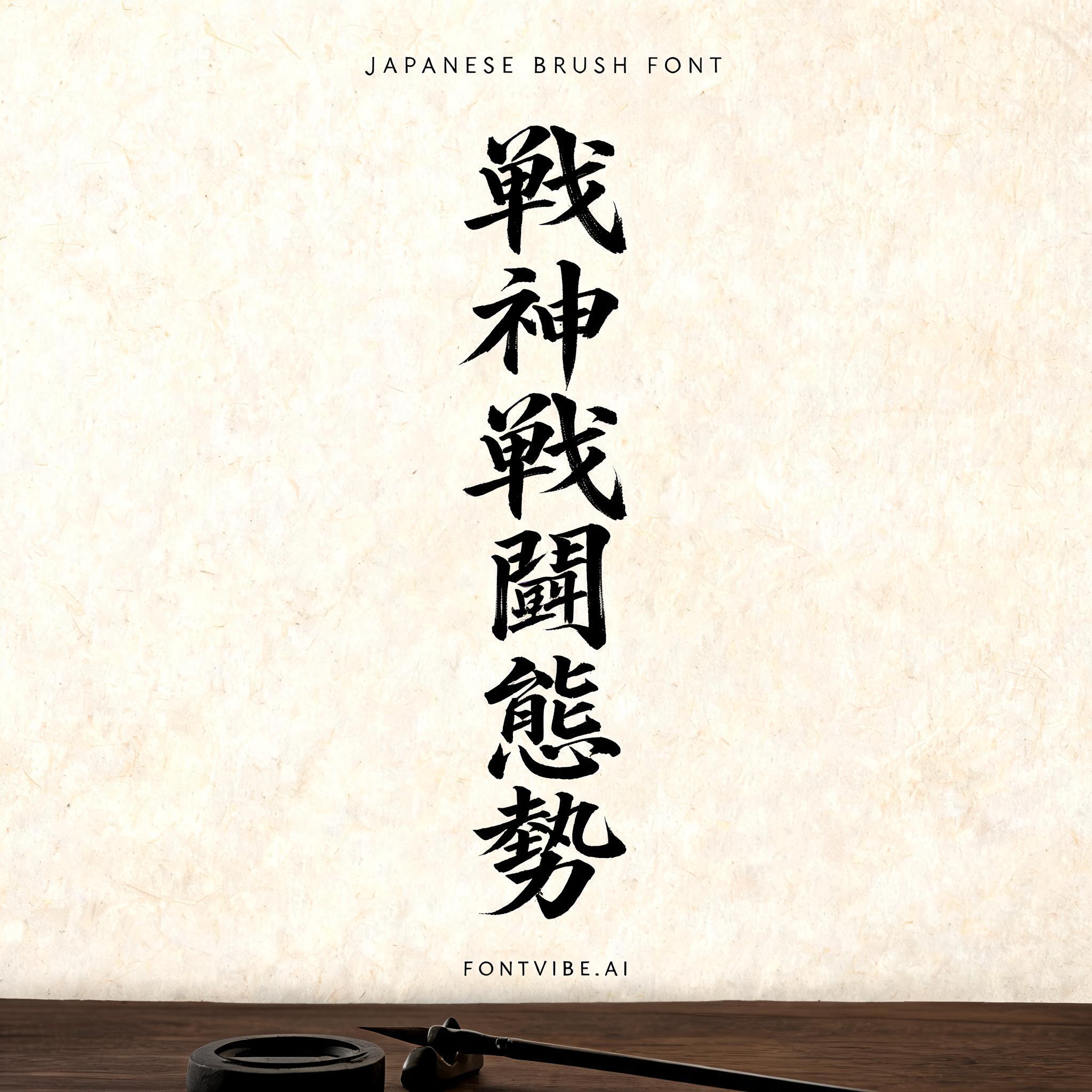
戦 神 戦 闘 態 勢 - 日本の墨筆 Text Effect


この作品と同じ BytePlus Seedream 5.0 を使用 · 15 クレジット











“戦 神 戦 闘 態 勢” is a Brush Japanese Ink text effect FontVibe AIで作成した文字エフェクト. 日本の書道の墨筆による筆致をラテン文字に応用したスタイルです。深い墨黒のインクに本格的な筆のエネルギー、一方向に制御された筆運び、そして和紙の雰囲気が宿ります。日本食レストランのブランディング、タトゥーデザイン、アニメ、武道、文化系プロジェクトに最適です.
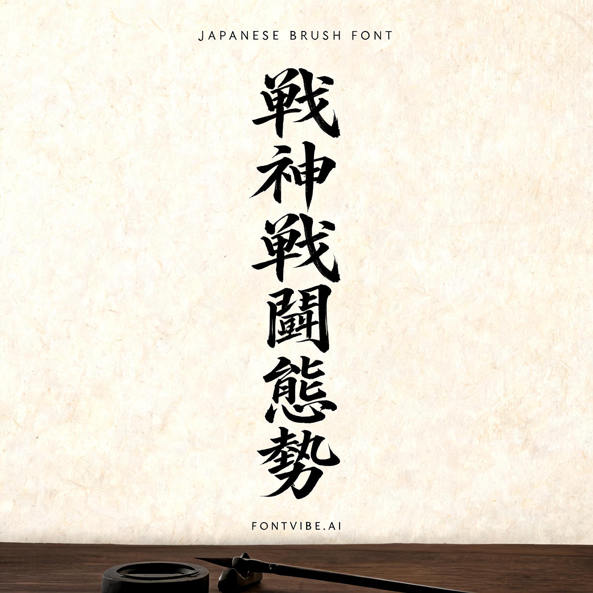
Rendered in Japanese Shodo ink brush style with broad appeal. Letterforms painted with loaded fude brush, deep sumi black ink on warm washi paper texture. Each stroke shows authentic Japanese calligraphy energy — thick decisive downstrokes, expressive brush endings, bristle marks visible in the ink. Generous negative space (ma) surrounds the character. The aesthetic bridges traditional Japanese art with modern Latin typography — elegant, authoritative, unmistakably Japanese. Natural washi paper surface under soft diffused north-facing studio light — warm ivory tone with faint fiber grain visible across the surface, subtle ink absorption halos where brushstrokes meet paper. Quiet calligraphy studio atmosphere: the paper sits on a dark polished wooden table, faint shadow cast by the page edge, a barely-visible ink stone and brush rest at the edge of frame. Top-center: tiny label "JAPANESE BRUSH FONT" at 45% canvas width, hair-thin ink strokes, refined and delicate. Center: a stacked vertical column of massive dominant sumi ink brush characters — "戦" / "神" / "戦" / "闘" / "態" / "勢" — each character set at 30% canvas width, perfectly centered on the vertical axis, each stroke loaded with deep black ink, bristle marks visible at stroke edges, confident single-direction pressure, uniform scale and spacing flowing downward in the traditional tategumi reading direction. Bottom-center: small refined tagline "FONTVIBE.AI" at 20% canvas width, minimal ink weight. Vertical spacing ratio approximately 1:6:1.5. All tiers centered on the same vertical axis. The negative space around the letters breathes — the beauty of ma.
2026年8月16日に生成 · 2048 × 2048 · JPEG · BytePlus Seedream 5.0 · 制作者がシェア · 商用利用無料(CC BY 4.0)


