ZAFURA - 日本の墨筆 Text Effect


この作品と同じ BytePlus Seedream 5.0 を使用 · 15 クレジット











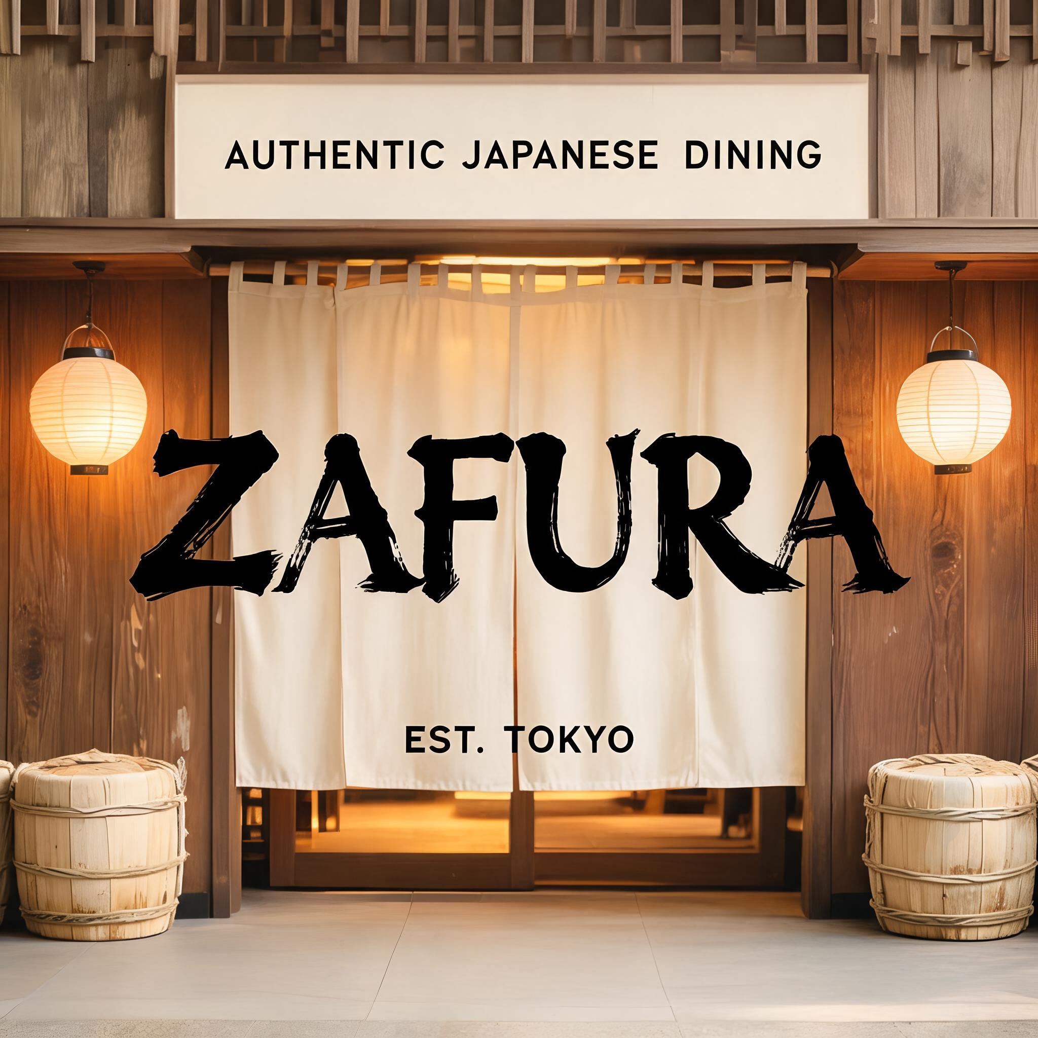
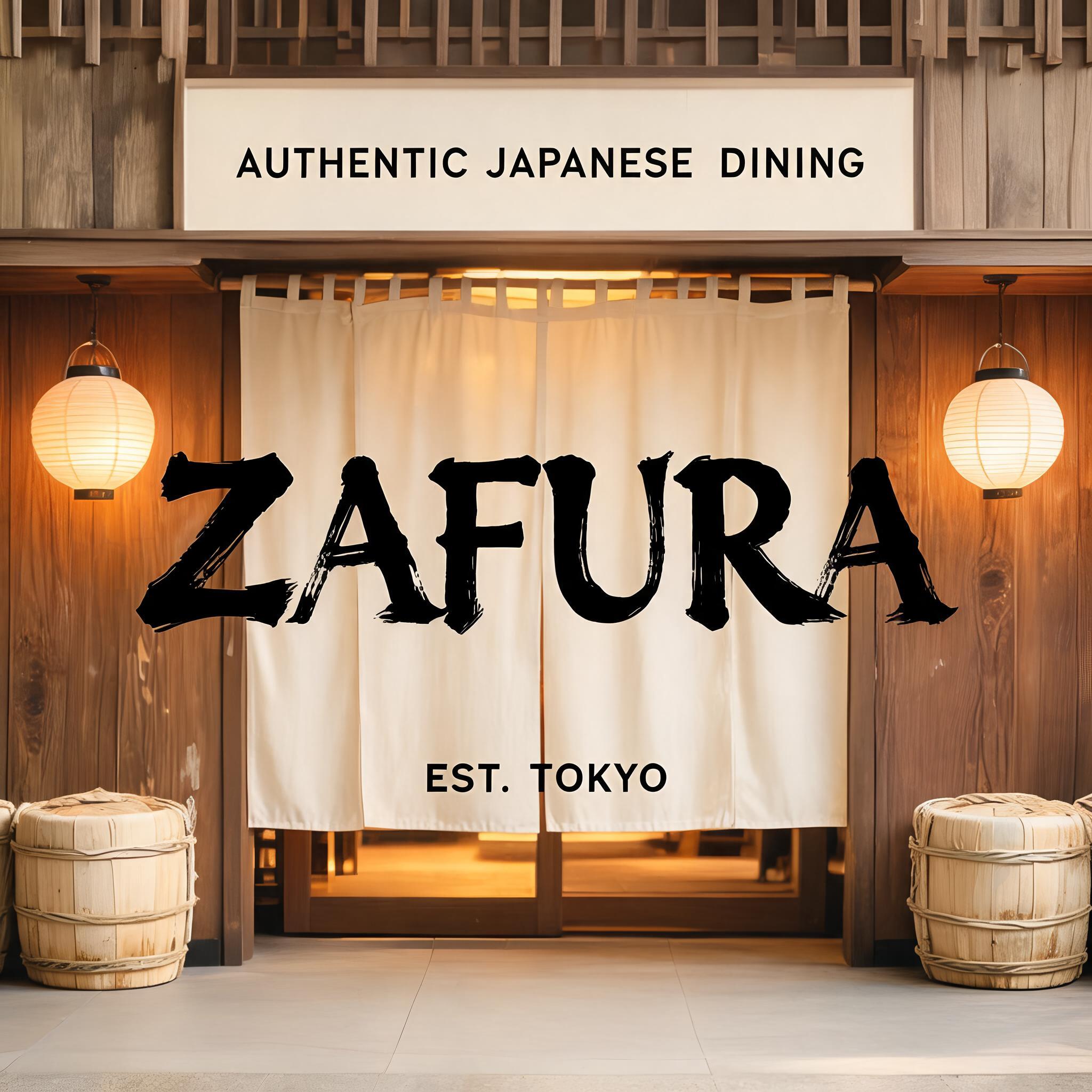
「ZAFURA」は FontVibe AI で作成した日本の墨筆の文字エフェクトです。日本の書道の墨筆による筆致をラテン文字に応用したスタイルです。深い墨黒のインクに本格的な筆のエネルギー、一方向に制御された筆運び、そして和紙の雰囲気が宿ります。日本食レストランのブランディング、タトゥーデザイン、アニメ、武道、文化系プロジェクトに最適です。
Japanese Shodo ink brush style optimized for restaurant and commercial hospitality branding. Letterforms balanced between traditional dignity and modern commercial legibility — not as heavy as warrior styles, not as delicate as geisha. Strokes confident and clear, ink consistent and professional, with just enough brush texture to feel authentic rather than digital. Background: neutral warm white or pale cream, clean enough for professional use. The aesthetic: the typographic equivalent of a respected Japanese restaurant's facade — welcoming, quality-signaling, trustworthy. Formal enough for a high-end kaiseki restaurant; approachable enough for a neighborhood sushi bar. Premium Japanese izakaya entrance — a welcoming noren curtain doorway, warm interior glow behind. Aged wood paneling, paper lanterns on either side, subtle sake barrel decorations. The restaurant name "ZAFURA" rendered in the commercial hospitality ink brush style — balanced between traditional dignity and modern commercial legibility. Top-center: tiny restaurant category label "AUTHENTIC JAPANESE DINING" at 45% canvas width, clean commercial caps, inviting. Center: "ZAFURA" as massive dominant brush letters at 65% canvas width, centered — strokes confident and clear, ink balances brush authenticity with commercial readability, the kind of brushwork seen on a premium Tokyo restaurant signboard. Bottom-center: "EST. TOKYO" at 20% canvas width, small establishment marker. Vertical spacing ratio approximately 1:5:1.5. The composition reads as the exterior signage of a premium Japanese restaurant — authentic, commercial, warm, welcoming.
用途: 和食レストランフォント
2026年8月21日に生成 · 2048 × 2048 · JPEG · BytePlus Seedream 5.0 · 制作者がシェア · 商用利用無料(CC BY 4.0)



