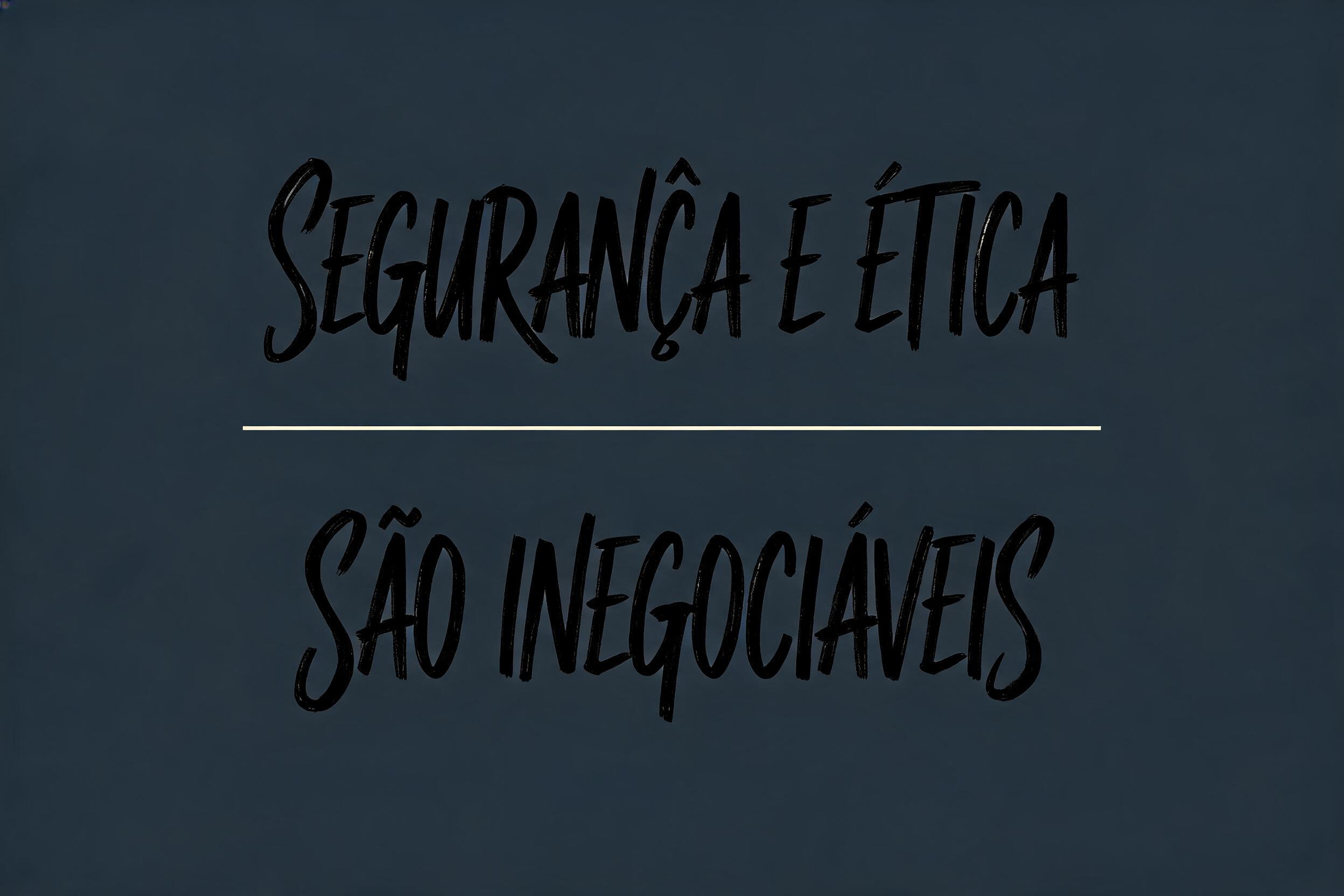
SEGURANÇA E ÉTICA SÃO INEGOCIÁVEIS - モダン筆記体 Text Effect


この作品と同じ BytePlus Seedream 5.0 を使用 · 15 クレジット

“SEGURANÇA E ÉTICA SÃO INEGOCIÁVEIS” is a Cursive Modern text effect FontVibe AIで作成した文字エフェクト. 太く現代的なブラシ筆記体。たっぷり墨を含んだ太い線、上下に弾むベースライン、筆を離す所のかすれ。明るく清潔な地にマットな黒インク.
grounded in bold, contemporary brush-lettering ink. SURFACE / INK: rich, confident ink laid down with a loaded brush — mostly matte with a faint fresh-ink sheen, a subtle brushed texture in the strokes and a touch of dry-brush grain where they lift, energetic and hand-made. GROUND: a clean, modern surface — a bright studio backdrop, a soft neutral, a bold flat colour block, or a contemporary branding/packaging context — with generous space so the lettering pops. LIGHT: clean, even, contemporary studio light — punchy and bright, minimal drama. ATMOSPHERE: current, confident and commercial — the look of modern brand lettering, apparel graphics, packaging and social content. LETTERFORM PRIORITY: when the chosen font carries its own treatment, that font's letterform shapes take priority and own the letters; this style governs only the ink surface, ground and light, never the letter shapes. When no specific material is defined by the font: rich confident brush ink, mostly matte with a subtle brushed texture, on the clean modern ground. COLOR: if the font declares its own color keep it; otherwise the lettering reads as a bold contemporary tone — deep black or a single confident colour — on the clean ground. 'SEGURANÇA E ÉTICA / SÃO INEGOCIÁVEIS' rendered as bold, loaded-brush lettering across two commanding lines, each phrase given strong visual weight with the second line echoing and anchoring the first — a clear two-tier typographic hierarchy on a single punchy composition. The ink is deep obsidian black, laid down with a fully charged brush — matte body with a faint fresh-ink sheen along the thickest downstrokes, subtle bristle-drag texture visible where the brush lifts at terminals and cross-strokes, energetic and hand-made. Ground: a clean bold flat colour block in a deep slate-charcoal, almost near-black with a cool blue-grey undertone, giving the black ink a dramatic tonal contrast through material weight rather than hue shift — generous breathing room framing the lettering on all sides. Accents: the diacritical marks — Ã, Ê, Á — are treated with the same loaded-brush confidence as the base letterforms, integrated naturally, not afterthoughts. Light: even, punchy studio light, frontal and clean, no harsh shadows, mild ambient fill keeping the surface flat and commercial. A hairline rule or minimal graphic device in off-white or warm cream optionally separates the two lines, reinforcing hierarchy without competing. Atmosphere: authoritative, current, bold — the visual language of a statement brand manifesto, institutional poster, or compliance-driven corporate identity campaign. Modern hand-lettered energy grounded by the declarative weight of the words themselves.
2026年8月27日に生成 · 2496 × 1664 · JPEG · BytePlus Seedream 5.0 · 制作者がシェア · 商用利用無料(CC BY 4.0)


