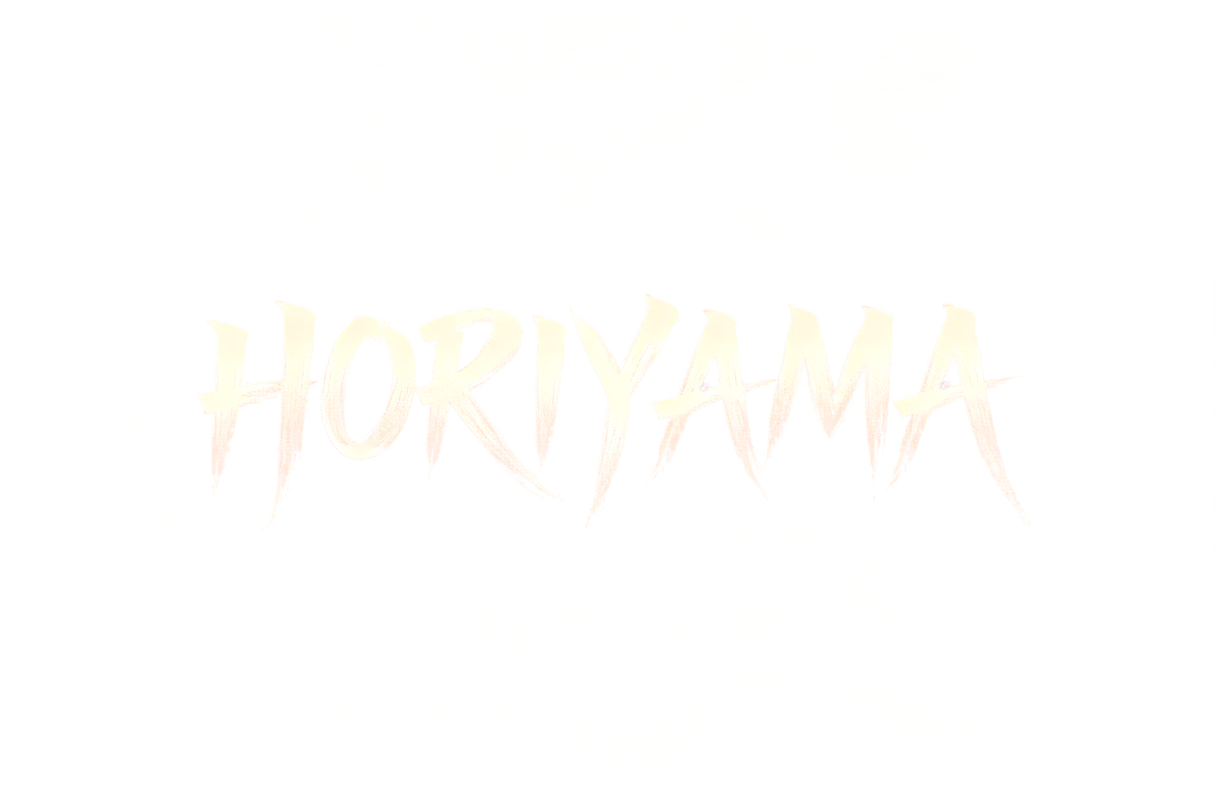
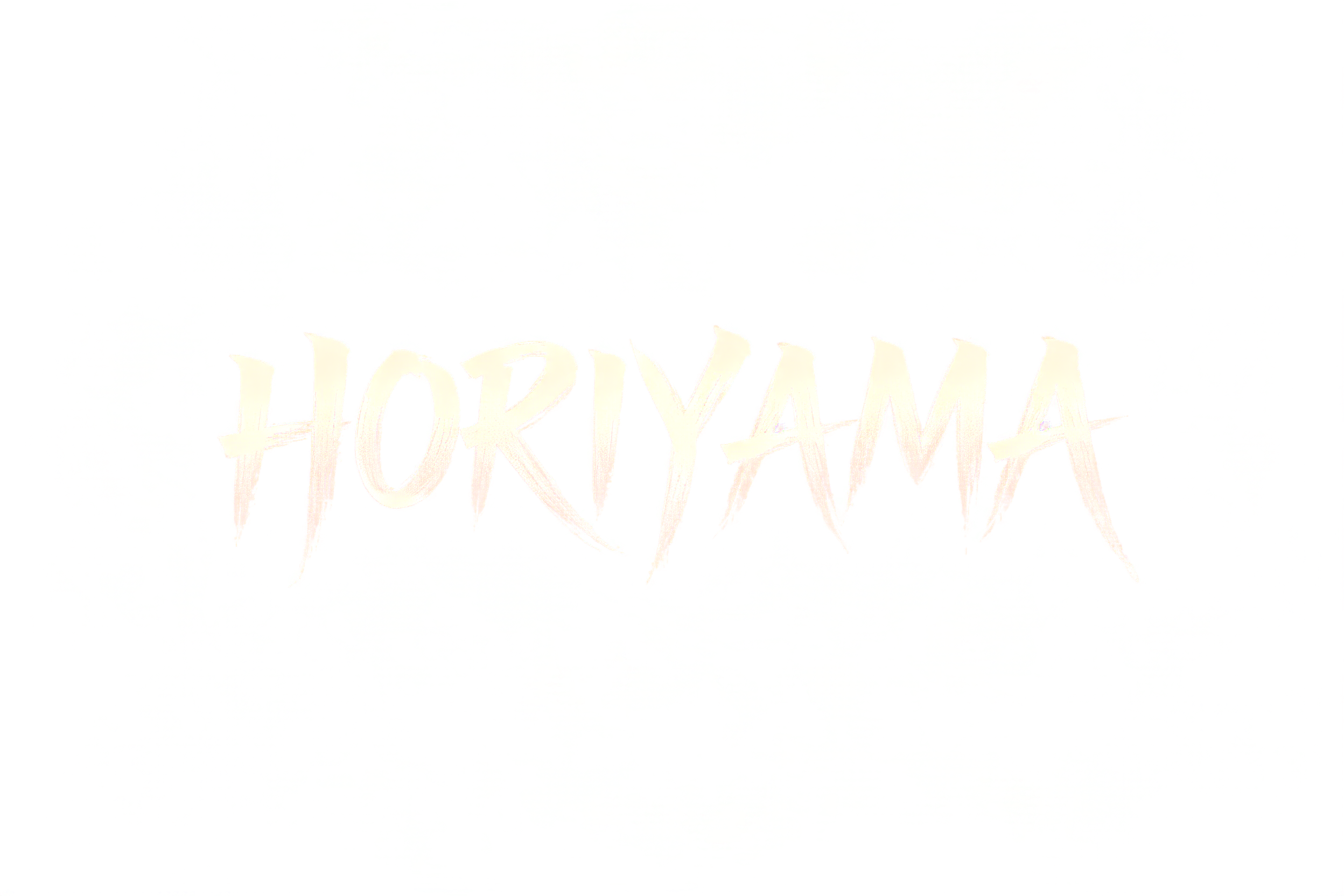
HORIYAMA - 日本の墨筆 Text Effect


この作品と同じ BytePlus Seedream 5.0 を使用 · 15 クレジット











「HORIYAMA」は FontVibe AI で作成した日本の墨筆の文字エフェクトです。日本の書道の墨筆による筆致をラテン文字に応用したスタイルです。深い墨黒のインクに本格的な筆のエネルギー、一方向に制御された筆運び、そして和紙の雰囲気が宿ります。日本食レストランのブランディング、タトゥーデザイン、アニメ、武道、文化系プロジェクトに最適です。
Create a cut-out typographic wordmark in a wide 3:2 composition. Render exactly one text string: “HORIYAMA”. Place it centered horizontally and slightly above the vertical center, occupying 78% of canvas width. No other words, symbols, seal marks, border, ground, scene, paper, or decorative objects. Lettering: custom Western display letters executed as authoritative Japanese shodo brush calligraphy, upright and harmoniously spaced. Each letter is a definitive master-hand form with a bold 5:1 thick-to-thin stroke ratio. Use gradual loaded-brush compression at each entry, steady broad mid-strokes, and long precise harai exit tapers that end in sharp hairline points; add a few restrained upward hane hooks on suitable terminals. The “H”, “R”, “Y”, and final “A” carry the longest sharp tails, extending outward without colliding with neighboring letters. One committed stroke per stroke path: no doubled outlines, no hesitant revisions, no decorative flourishes. Material and finish: luminous warm ivory ink pigment with bright white-hot cores, fading through pearl gray and translucent silver-white at the dry-brush outer edges. Fully matte brush texture, subtly fibrous bristle striations at stroke perimeters, opaque loaded centers, thin broken pigment at the final tail tips. Attach only a minimal pale ivory edge glow directly to the strokes and a sparse spray of tiny ivory pigment flecks immediately at a few forceful stroke entries; every fleck must visibly originate from and remain fused to a letterform. High precision, clean silhouette, generous empty space. Background is a perfectly flat pure BLACK #000000 void with nothing else.
用途: 日本の筆フォント
2026年9月6日に生成 · 2496 × 1664 · PNG · 透過 PNG · BytePlus Seedream 5.0 · 制作者がシェア · 商用利用無料(CC BY 4.0)



