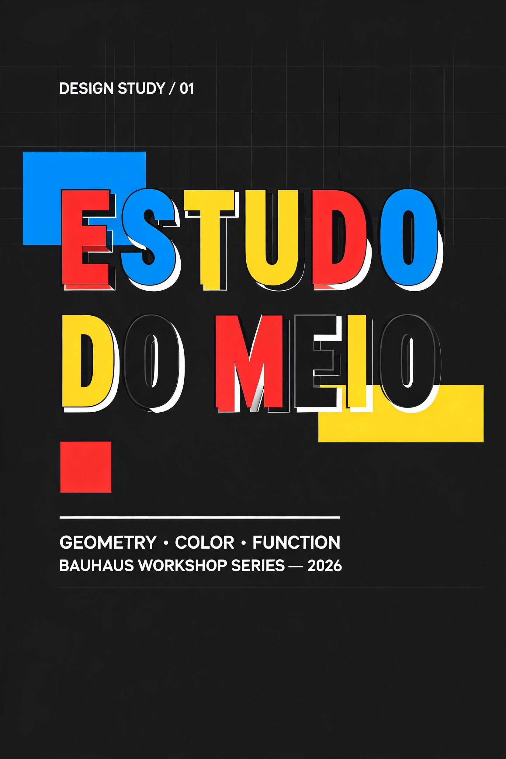
ESTUDO DO MEIO - ジオメトリック Text Effect


この作品と同じ BytePlus Seedream 5.0 を使用 · 15 クレジット


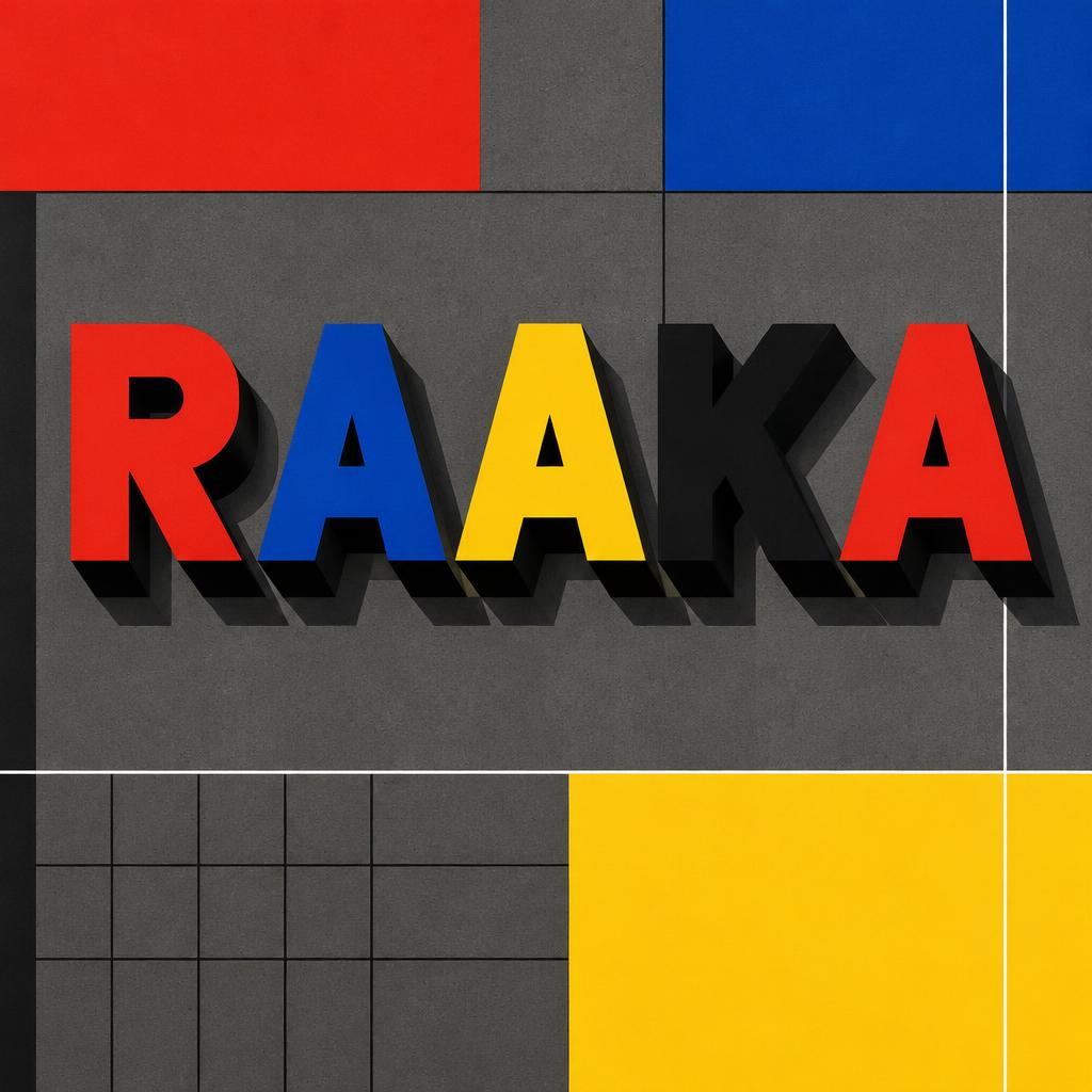
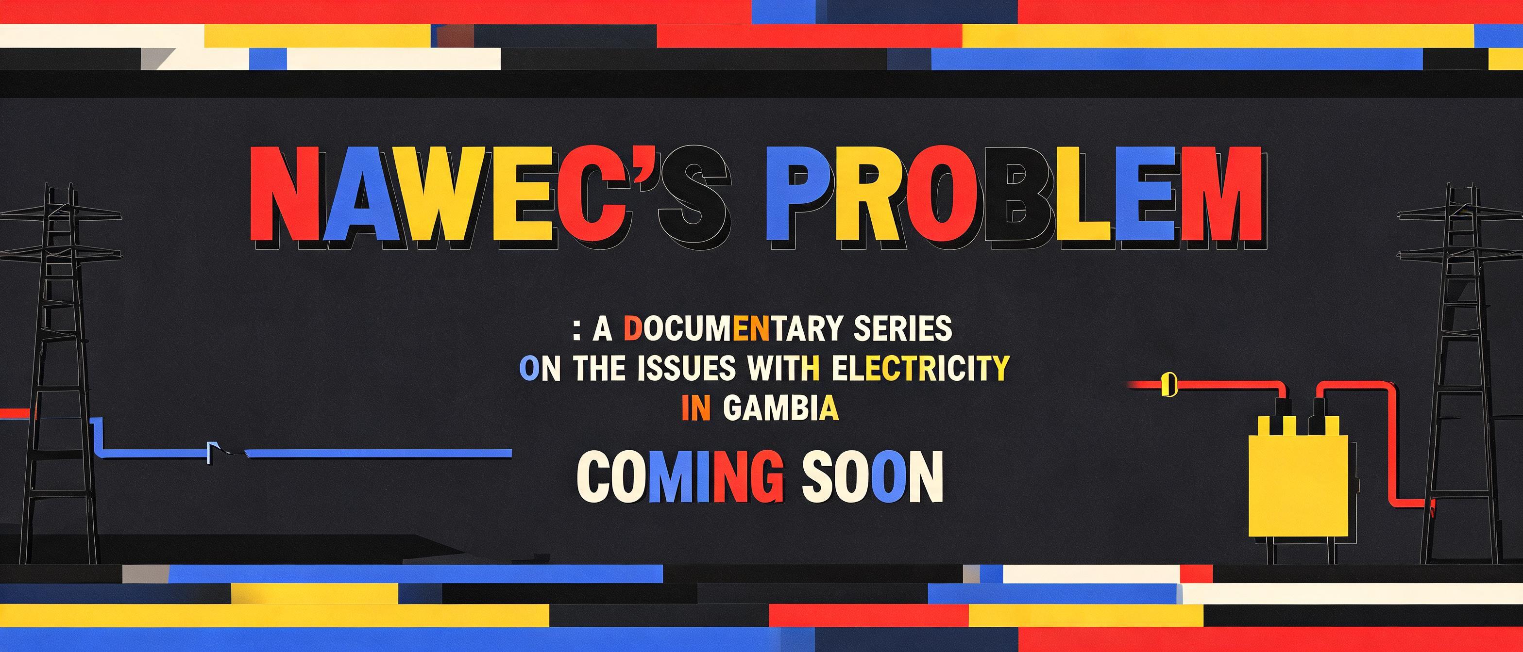
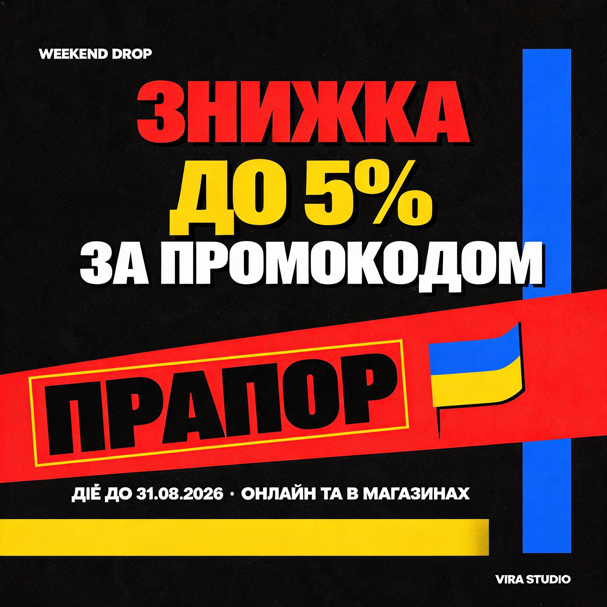


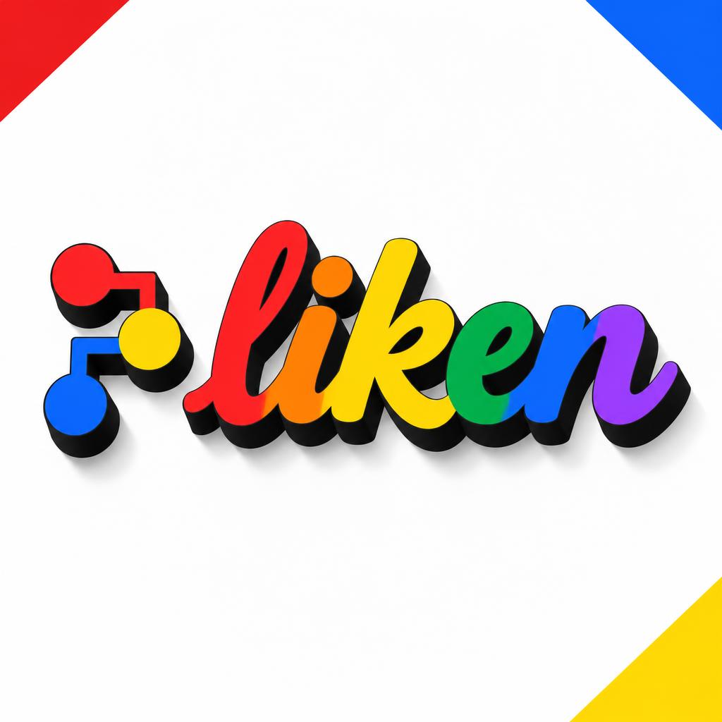


“ESTUDO DO MEIO” is a Geometric text effect FontVibe AIで作成した文字エフェクト. 円、四角、直線で組み立てたバウハウス風の大文字。赤・青・黄・黒のベタ塗りで、硬いトップライトの下に積み木のように立ちます.
Create a finished vertical Bauhaus poster, 2:3 ratio, head-on orthographic view, Swiss-grid precision. Deep matte-black background plane, no gradient, no haze, no texture, no reflections. Across the upper-left quadrant, set a small uppercase label: "DESIGN STUDY / 01" in narrow white geometric sans lettering. The dominant headline occupies the central 72% of the canvas, stacked on two left-aligned lines: "FORM" then "FOLLOWS". Design every glyph as custom bold Bauhaus geometric lettering: uniform heavy strokes, circular counters, flat-cut 90-degree terminals, tight measured spacing. Each letter is a flat matte acrylic-painted slab, cycling cadmium red, cobalt blue, cadmium yellow, and black across the words; no sheen and no gradients. Every letter has a hard 45-degree isometric extrusion dropping down-right, pure-black sidewalls exactly 25% of letter height, with sharply machined face-to-wall edges. A single cold-white overhead directional light creates crisp, ruler-sharp geometric shadows directly below and to the right of the extrusions. Build the composition with flat architectural color geometry: a vertical cobalt-blue rectangle behind the left edge of "FORM"; a cadmium-yellow horizontal bar projecting from the right of "FOLLOWS"; a signal-red square tucked into the lower-left negative space. These planes are matte, opaque, perfectly flat, and never overlap letter readability. Add thin near-black orthographic grid lines in the upper field only. At the bottom, separated by a thin white rule, set "GEOMETRY · COLOR · FUNCTION" in small white uppercase geometric sans. Beneath it set "BAUHAUS WORKSHOP SERIES — 2026" even smaller. Strict flat poster surface, Constructivist and De Stijl geometry, no people, no objects, no organic marks, no bokeh, no warm light, no bevel shine, no photographic effects. Render razor-sharp print key art with exact, legible text. Create a finished vertical Bauhaus poster, 2:3 ratio, head-on orthographic view, Swiss-grid precision. Deep matte-black background plane, no gradient, no haze, no texture, no reflections. Across the upper-left quadrant, set a small uppercase label: "DESIGN STUDY / 01" in narrow white geometric sans lettering. The dominant headline occupies the central 72% of the canvas, stacked on two left-aligned lines: "ESTUDO" then "DO MEIO". Design every glyph as custom bold Bauhaus geometric lettering: uniform heavy strokes, circular counters, flat-cut 90-degree terminals, tight measured spacing. Each letter is a flat matte acrylic-painted slab, cycling cadmium red, cobalt blue, cadmium yellow, and black across the words; no sheen and no gradients. Every letter has a hard 45-degree isometric extrusion dropping down-right, pure-black sidewalls exactly 25% of letter height, with sharply machined face-to-wall edges. A single cold-white overhead directional light creates crisp, ruler-sharp geometric shadows directly below and to the right of the extrusions. Build the composition with flat architectural color geometry: a vertical cobalt-blue rectangle behind the left edge of "ESTUDO"; a cadmium-yellow horizontal bar projecting from the right of "DO MEIO"; a signal-red square tucked into the lower-left negative space. These planes are matte, opaque, perfectly flat, and never overlap letter readability. Add thin near-black orthographic grid lines in the upper field only. At the bottom, separated by a thin white rule, set "GEOMETRY · COLOR · FUNCTION" in small white uppercase geometric sans. Beneath it set "BAUHAUS WORKSHOP SERIES — 2026" even smaller. Strict flat poster surface, Constructivist and De Stijl geometry, no people, no objects, no organic marks, no bokeh, no warm light, no bevel shine, no photographic effects. Render razor-sharp print key art with exact, legible text.
2026年9月6日に生成 · 1664 × 2496 · JPEG · BytePlus Seedream 5.0 · 制作者がシェア · 商用利用無料(CC BY 4.0)


