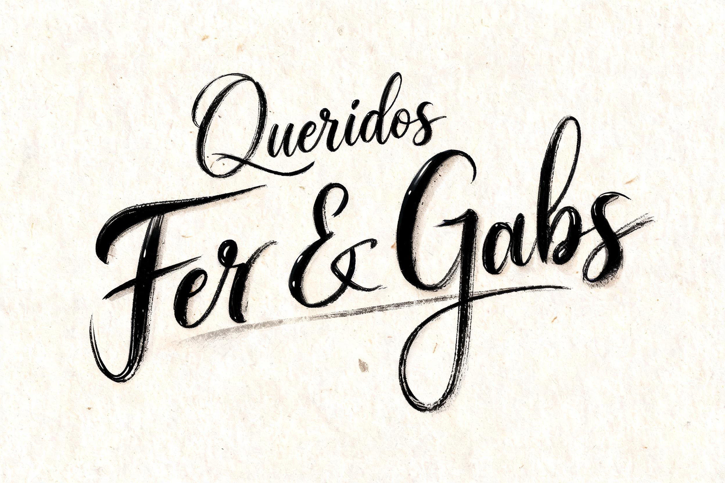
Queridos Fer & Gabs - ブラッシュスクリプト Text Effect


この作品と同じ BytePlus Seedream 5.0 を使用 · 15 クレジット






「Queridos Fer & Gabs」は FontVibe AI で作成したブラッシュスクリプトの文字エフェクトです。文字がつながる西洋の筆記体。筆圧の強い太い下ろし、髪の毛ほど細い上げ、筆の毛の筋とかすれを、温かみのある黒インクで質感のある紙に。
rendered as expressive Western brush script lettering with fluid connected strokes. Visible bristle texture with authentic thick-to-thin pressure variation — thick downstrokes, thin upstrokes, just like a loaded calligraphy brush. Ink slightly wet and glistening. Natural ink pooling at stroke starts, feathered dry-brush ending trails. Warm off-black ink on visible surface texture. Hand-crafted artisan energy with real brush imperfection. LETTERFORM PRIORITY: when the chosen font carries its own treatment, that font's letterform shapes take priority and own the letters; this style governs the brush-script medium, the thick-to-thin pressure variation and the ink wetness. FALLBACK MATERIAL: if the font carries no material of its own, render the letters as fluid connected brush-script strokes with thick downstrokes, thin upstrokes, wet pooling at starts and feathered dry-brush trails in warm off-black ink. COLOR PRIORITY: keep the font's own colors if specified; otherwise warm off-black ink on a textured surface. A tactile hand-lettered title treatment for the exact text “Queridos Fer & Gabs”, rendered in freshly applied warm off-black brush ink across heavyweight natural cotton paper. The connected brush strokes carry pronounced pressure changes: dense, swelling ink masses through each downstroke and narrow lifted hairlines through upward turns, with small pooled beads of glossy ink at joins and curve reversals. Fine individual bristle striations interrupt the outer edges, while several terminal sweeps dissolve into feathered dry-brush fibers. The ink surface catches a restrained raking highlight, revealing wet satin reflections only on the thickest painted passages. The paper is soft ivory with visible deckled pulp fibers, faint warm gray speckles, and shallow absorbent ink bleed around selected edges. Make “Fer & Gabs” carry greater visual dominance through scale and ink density, while “Queridos” reads as an intimate opening phrase with lighter spatial rhythm. Include a few restrained loose ink flecks and a subtle translucent wash halo near the lettering, as if painted by hand moments ago. Clean studio presentation, shallow paper relief, high-resolution macro material detail, no extra words, no printed border, no icons.
2026年9月9日に生成 · 2496 × 1664 · JPEG · BytePlus Seedream 5.0 · 制作者がシェア · 商用利用無料(CC BY 4.0)



