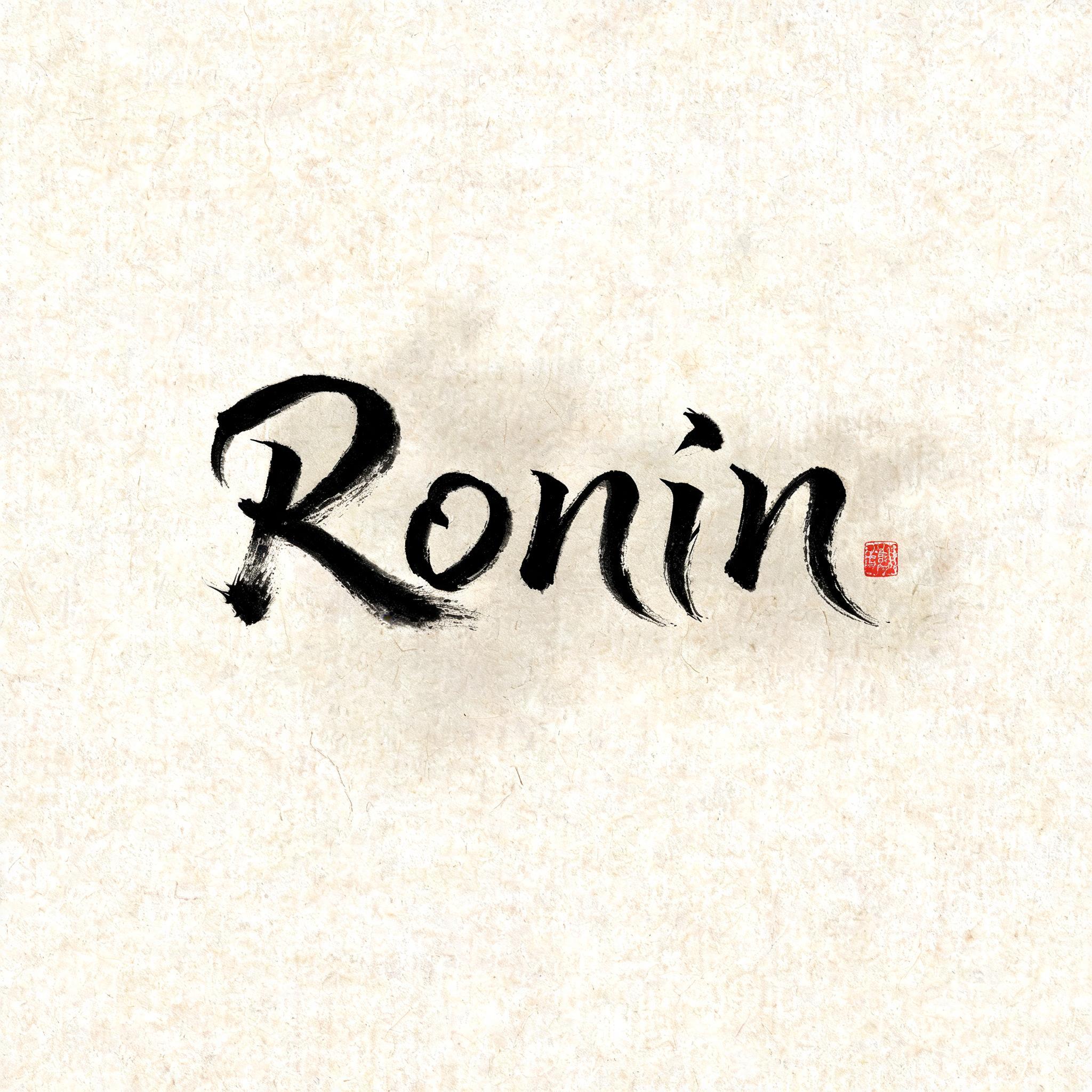
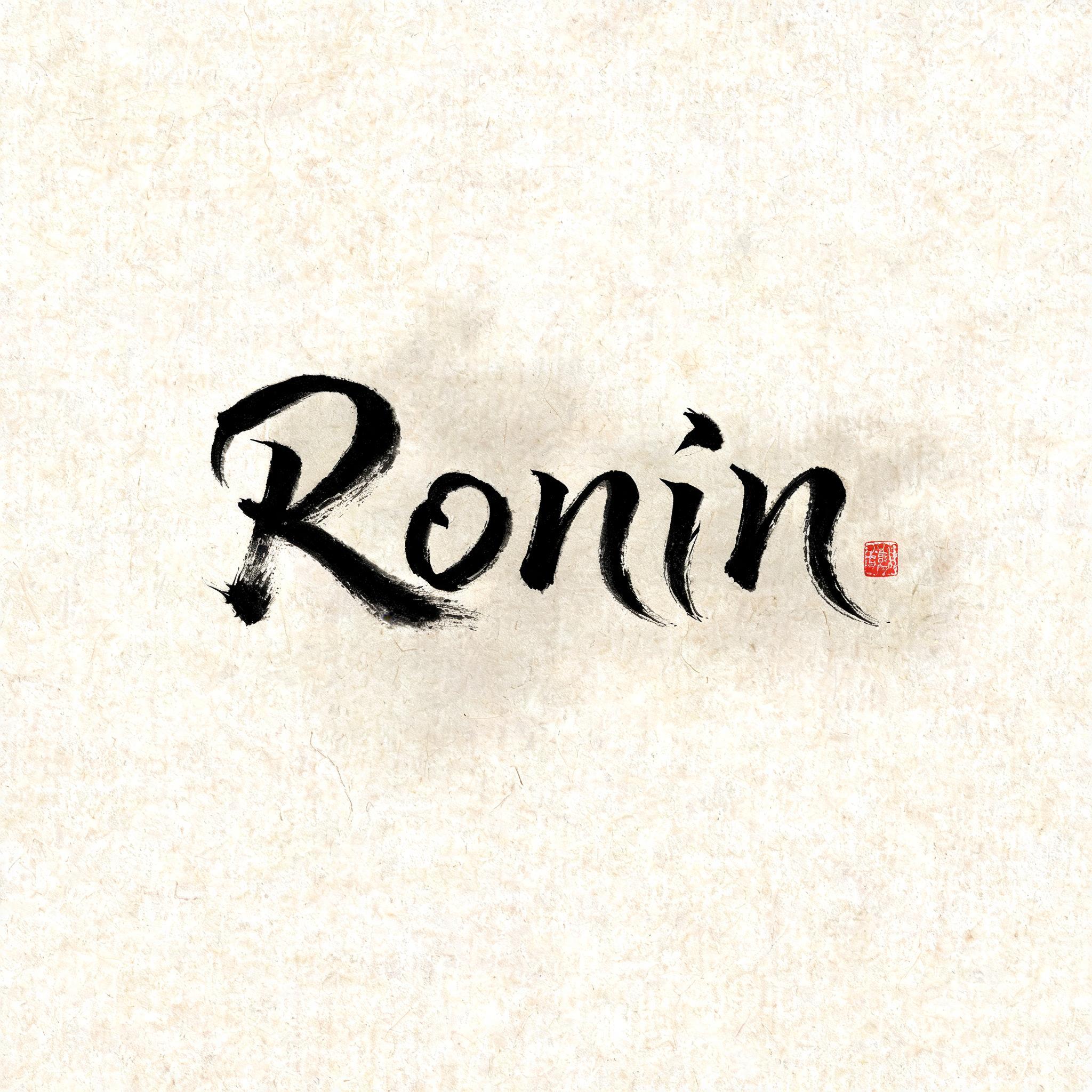
Ronin - 日本の墨筆 Text Effect


この作品と同じ BytePlus Seedream 5.0 を使用 · 15 クレジット











「Ronin」は FontVibe AI で作成した日本の墨筆の文字エフェクトです。日本の書道の墨筆による筆致をラテン文字に応用したスタイルです。深い墨黒のインクに本格的な筆のエネルギー、一方向に制御された筆運び、そして和紙の雰囲気が宿ります。日本食レストランのブランディング、タトゥーデザイン、アニメ、武道、文化系プロジェクトに最適です。
Japanese ink brush aesthetic — the visual language of sumi calligraphy on washi paper. INK MEDIUM: sumi pigment in deep black to charcoal range — richest density at mark centers, naturally transitioning outward as ink supply depletes. Fully matte, absorbed into paper surface, producing a tonal range from dense opaque black to transparent grey depending on dilution and brush load. PAPER SURFACE: natural washi — warm cream-white base with visible paper fiber structure giving slight texture. The absorbent surface creates the characteristic soft border quality of East Asian brush work at all mark edges. LIGHT ATMOSPHERE: soft diffuse north-facing studio light — the traditional calligrapher's light source. Even, shadowless, allowing the full tonal range of ink marks to read clearly. Warm cream paper tone contrasts against deep sumi black. AESTHETIC REGISTER: the ma principle — the space between and around marks is as considered as the marks themselves. Compositions have breathing room and deliberate quietness. When no specific material is defined by the font: default environment — deep sumi black marks on warm cream washi paper, soft diffuse overhead light, meditative studio atmosphere. Render the exact text “Ronin” as the sole hero lettering in saturated sumi ink on warm cream handmade washi paper. The brush marks carry decisive, loaded entry points of near-opaque carbon black, then break into charcoal-gray dry-brush streaks and translucent diluted edges as each stroke pulls away. Let absorbent paper fibers interrupt the pigment with feathered bleed, tiny uninked skips, and natural bristle striations; no glossy finish, no digital bevel, no ornamental border. Surround the lettering with expansive quiet paper field and a faint, irregular pale-gray ink wash suggesting wind-driven mist, kept subordinate to the text. Add only a few sparse, controlled ink flecks near the strongest stroke entries, never decorative splatter. A small weathered vermilion square seal impression may appear as a secondary accent, with slightly uneven stamped edges and faded pigment absorption. Soft diffuse north-window studio illumination reveals the warm pulp fibers and the full black-to-gray tonal range without cast shadows. Japanese shodo visual language, matte absorbed sumi pigment, deliberate ma negative space, high-resolution paper texture, restrained solitary warrior atmosphere.
用途: 浪人フォントジェネレーター
2026年9月9日に生成 · 2048 × 2048 · JPEG · BytePlus Seedream 5.0 · 制作者がシェア · 商用利用無料(CC BY 4.0)



