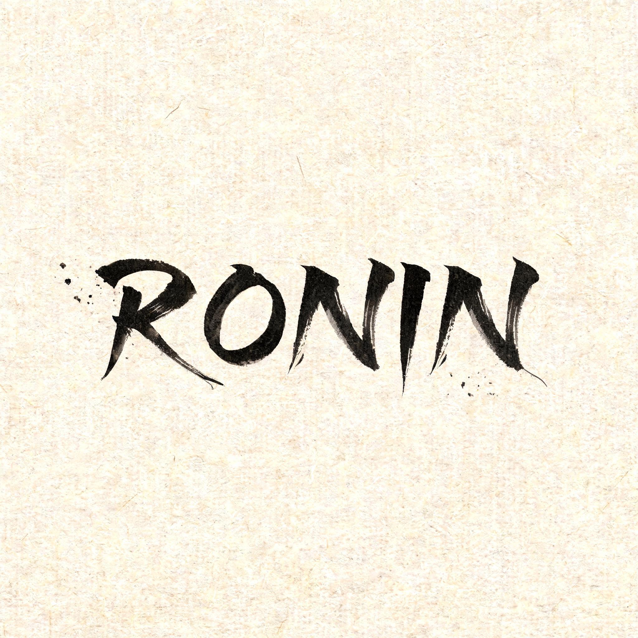
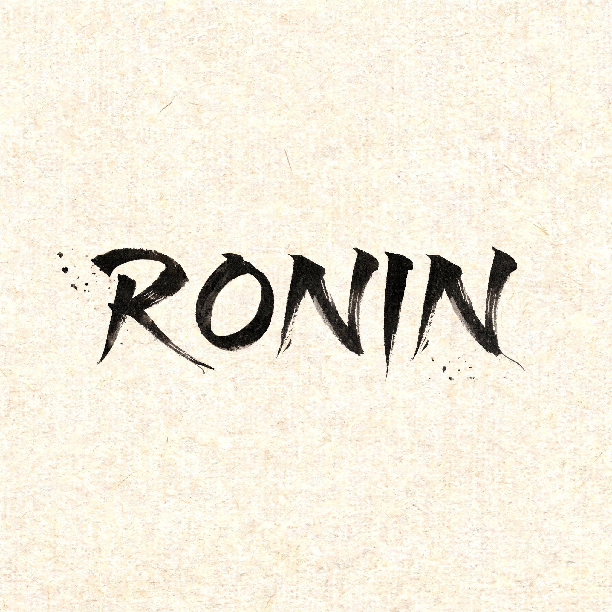
RONIN - 日本の墨筆 Text Effect


この作品と同じ BytePlus Seedream 5.0 を使用 · 15 クレジット











「RONIN」は FontVibe AI で作成した日本の墨筆の文字エフェクトです。日本の書道の墨筆による筆致をラテン文字に応用したスタイルです。深い墨黒のインクに本格的な筆のエネルギー、一方向に制御された筆運び、そして和紙の雰囲気が宿ります。日本食レストランのブランディング、タトゥーデザイン、アニメ、武道、文化系プロジェクトに最適です。
Create a square Japanese brush-lettering title card, viewed straight-on. Natural warm cream-white washi paper fills the entire frame, with clearly visible long paper fibers and subtle absorbent grain. Set only the exact word “RONIN” at the visual center, occupying about 62% of the canvas width and 25% of its height. Render “RONIN” in original classical Japanese shodo-inspired Western display letterforms, upright and widely spaced: definitive master-calligraphy construction, bold 5:1 thick-to-thin stroke contrast, rounded loaded-brush entries compressed into the paper, dense near-black pigment at each stroke core, controlled charcoal-grey dilution at the edges. Every letter is one decisive, uncorrected mark. Give the R, N, and final N long razor-sharp harai ink tails that pull outward and taper to hairline points; add restrained upward hane hooks on selected terminals. The O is a deliberate, slightly asymmetric enclosed brush loop with a rich black inner edge and pale grey dry-brush release on its outermost edge. The letters remain legible and separate, with generous quiet gaps between them. Sumi pigment is fully matte and visibly absorbed into washi: no gloss, no foil, no digital glow, no drop shadow. Place three to five tiny, sparse ink flecks near the left stroke entry and below the final tail only, as physical brush-load splatter; no decorative border, no symbols, no additional text. Preserve at least 55% open paper around the lettering. Soft diffuse north-facing studio light, even exposure, no cast shadows, crisp 8k paper texture. The visual priority is the black ink anatomy and sharp brush-tail geometry.
用途: 日本の筆フォント
2026年9月10日に生成 · 2048 × 2048 · JPEG · BytePlus Seedream 5.0 · レイアウト:禅 · 制作者がシェア · 商用利用無料(CC BY 4.0)



