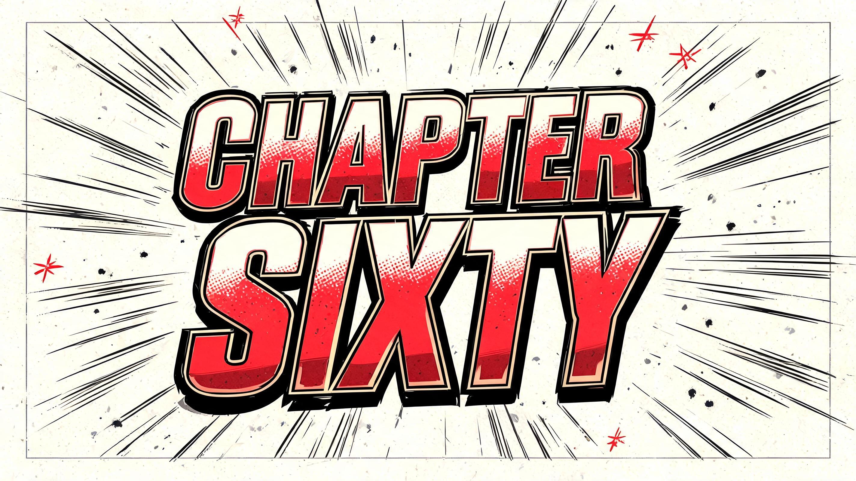
CHAPTER SIXTY - アニメ Text Effect


この作品と同じ BytePlus Seedream 5.0 を使用 · 15 クレジット

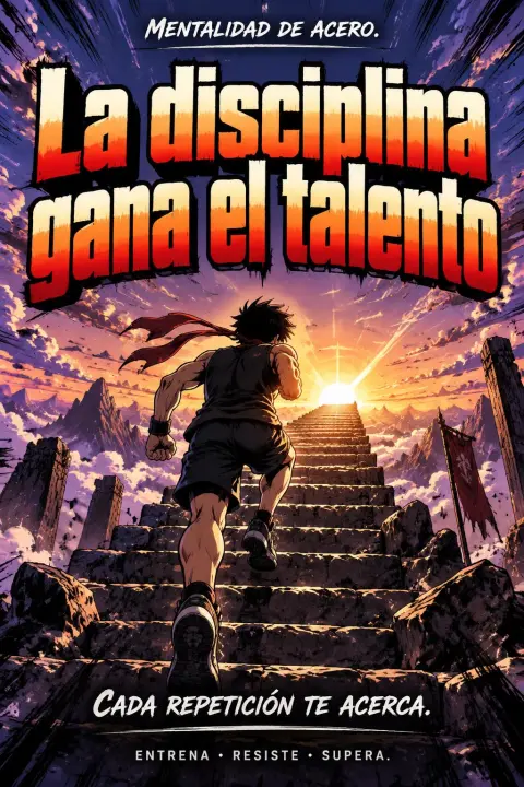
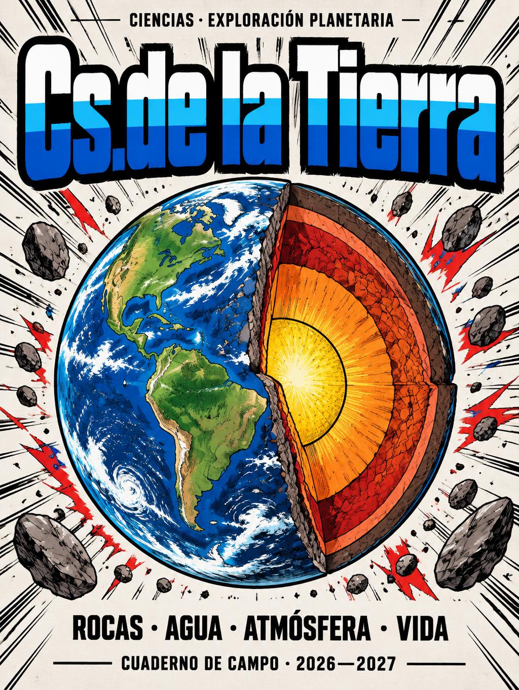
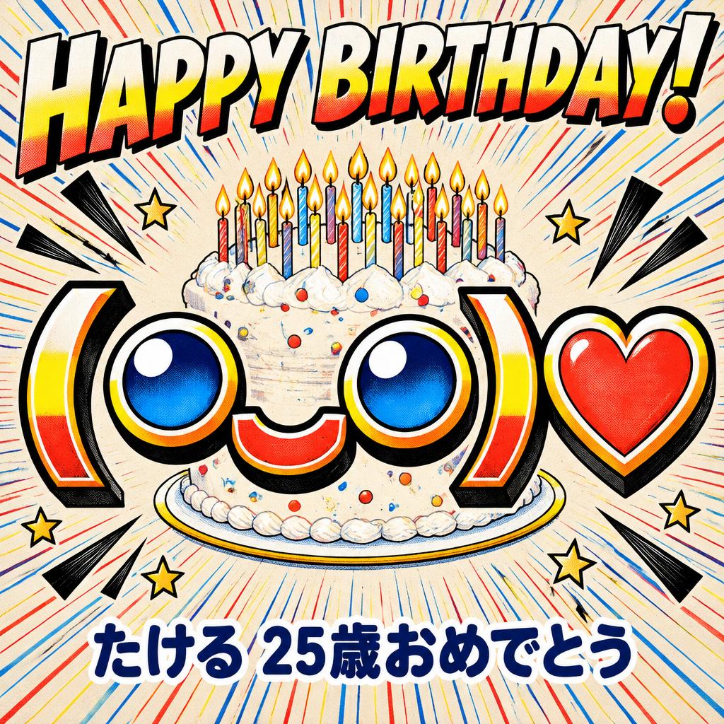
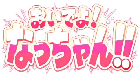
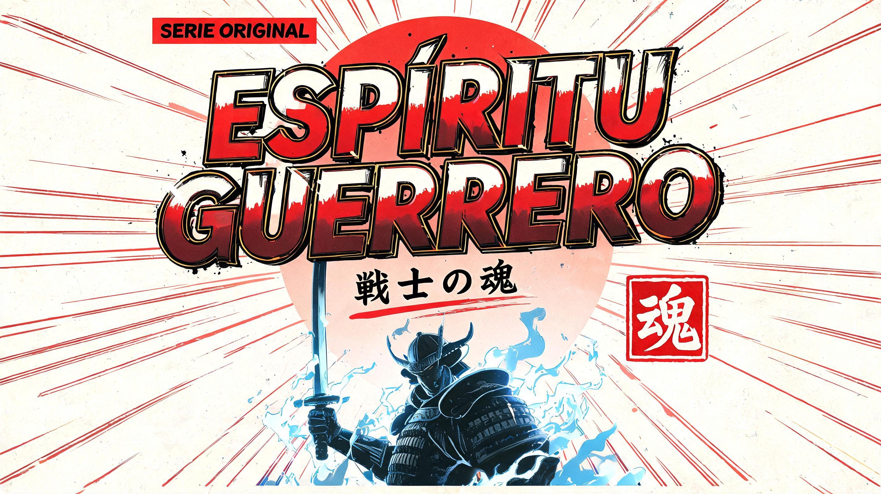

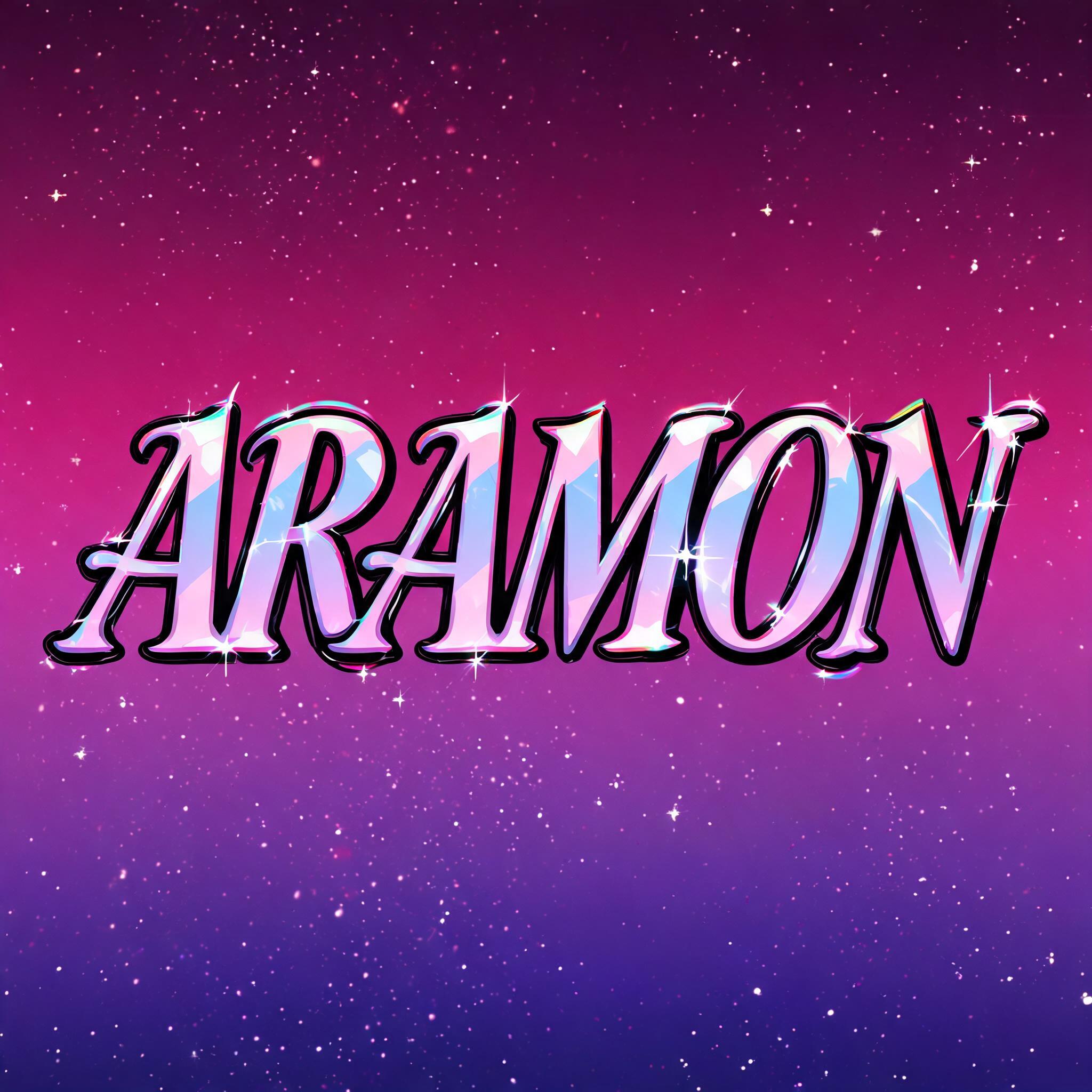
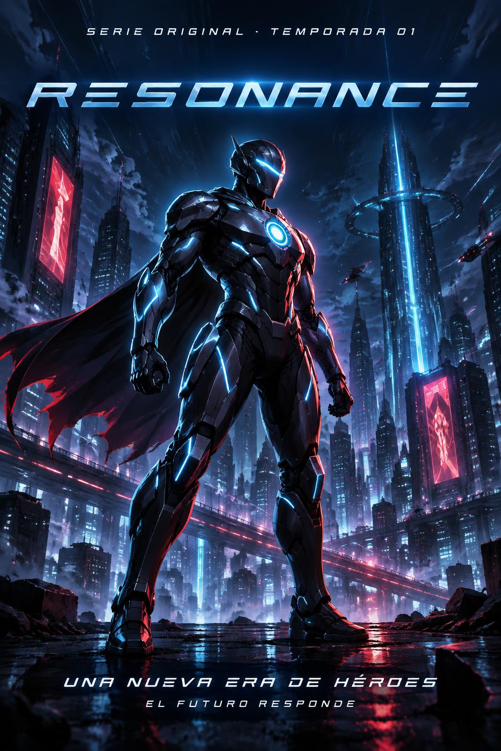
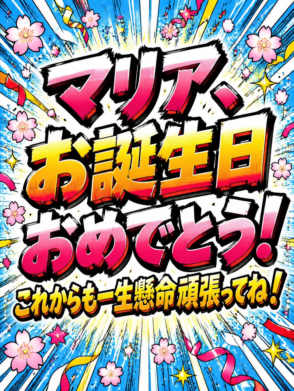
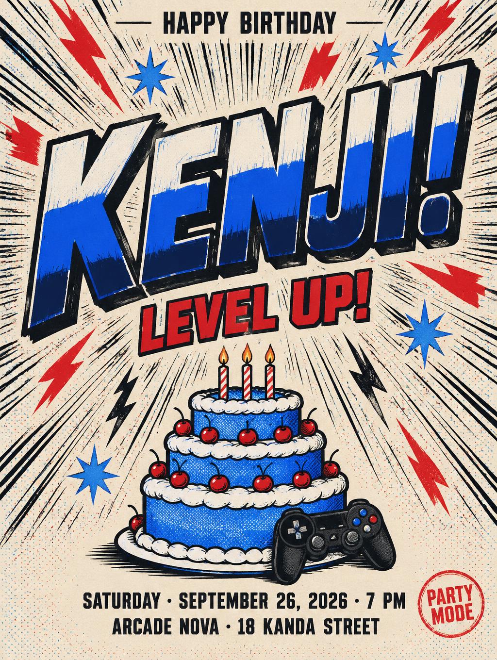
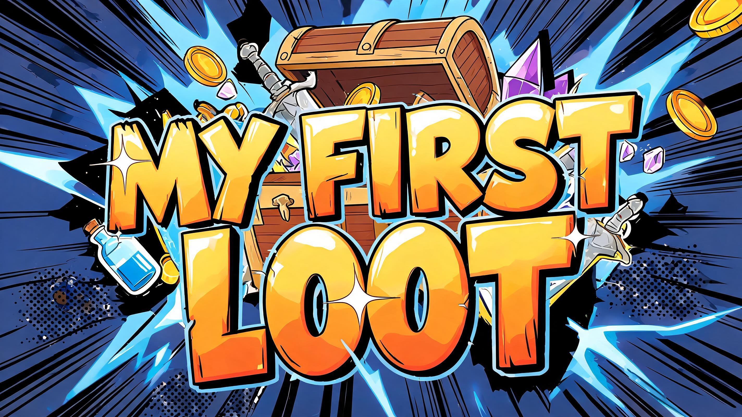
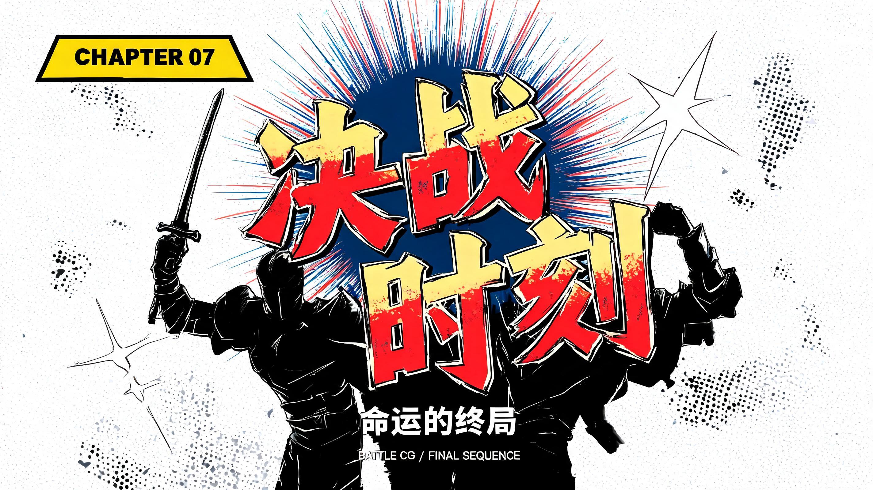
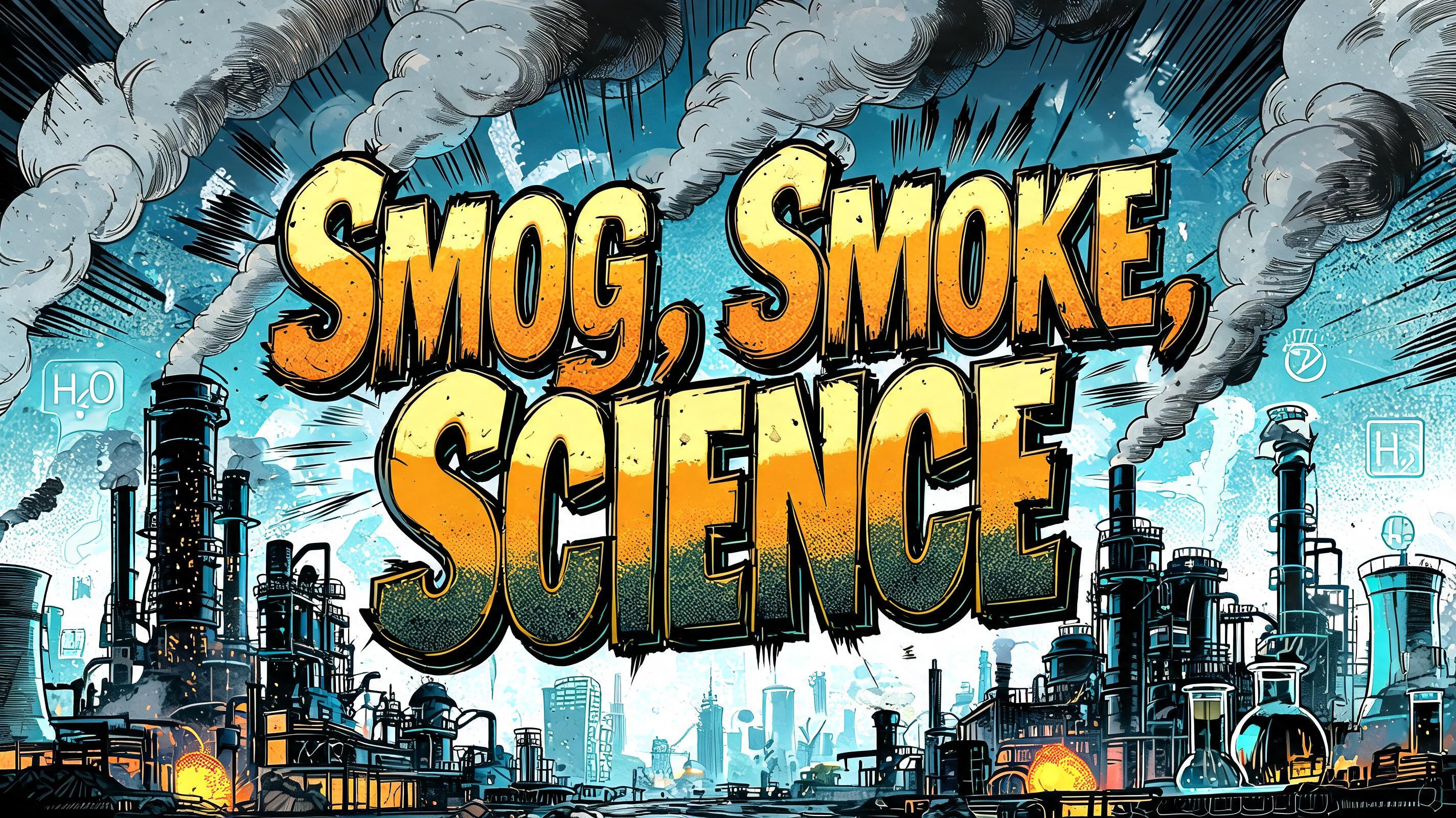
「CHAPTER SIXTY」は FontVibe AI で作成したアニメの文字エフェクトです。少年マンガのタイトル文字。手描きの太い黒フチ、ハイライトと影をくっきり分けたセルシェーディング、勢いよく傾いた文字と、白地に放射状の集中線。
Create a wide 16:9 Japanese shounen manga chapter-title graphic, print-ready title card with exact readable text only: “CHAPTER” on the upper line and “SIXTY” on the lower line. The two-line title occupies 76% of the canvas width and 62% of its height, centered, with SIXTY 15% larger than CHAPTER. Design custom ultra-bold condensed manga display lettering: thick black hand-inked outline with visible brush-pressure variation, slightly irregular inked outer edge, tight spacing, massive blunt terminals and compact counters. Every letter has pure flat offset-print three-zone cel shading: near-white upper highlight covering 30%, saturated scarlet-red central fill covering 50%, deep crimson lower shadow covering 20%; boundaries are knife-edge hard, no gradients, no soft airbrush, no metallic surface. Add a slim cream misregistration edge just inside selected black outlines and tiny halftone ink speckling within the red zones. Stage the lettering over a warm off-white manga-paper field. Dense black radial speed lines explode outward from behind the title, stopping cleanly before the outer margins; place red four-point impact marks and scattered ink flecks around the word block, never obscuring any letters. Add a thick uneven black ink shadow offset down-right by 2% of frame width to force the title forward. Keep 6% clean paper margin around all edges. High-contrast flat cel animation ink physics, crisp 600-DPI newsprint texture, no characters, no logos, no extra words, no photorealism, no gradients, no illegible text.
用途: マンガフォントジェネレーター
2026年9月13日に生成 · 2848 × 1600 · JPEG · BytePlus Seedream 5.0 · レイアウト:マッシブ · 制作者がシェア · 商用利用無料(CC BY 4.0)



