S - 日本の墨筆 Text Effect


この作品と同じ OpenAI GPT-Image-2.5 Sunburst を使用 · 15 クレジット











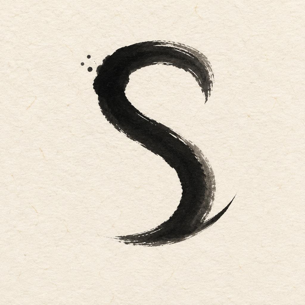
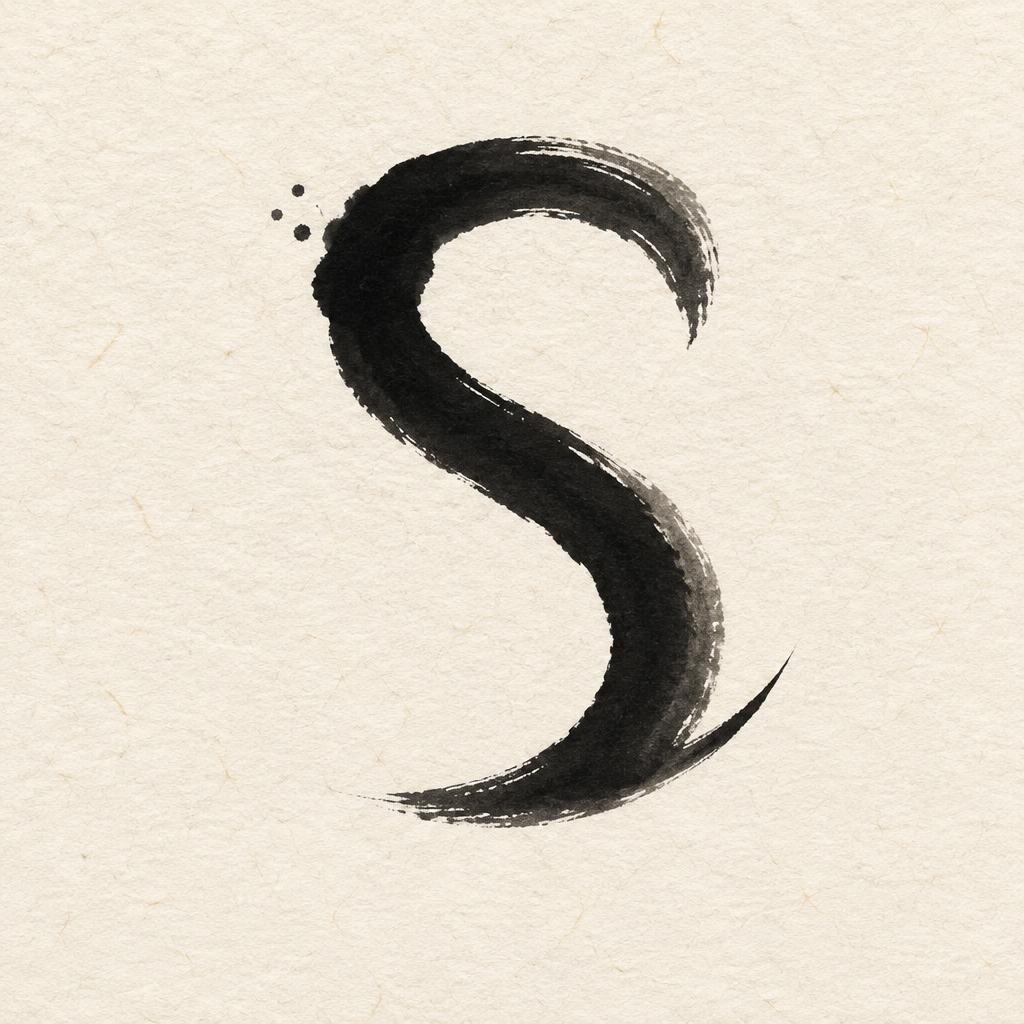
「S」は FontVibe AI で作成した日本の墨筆の文字エフェクトです。日本の書道の墨筆による筆致をラテン文字に応用したスタイルです。深い墨黒のインクに本格的な筆のエネルギー、一方向に制御された筆運び、そして和紙の雰囲気が宿ります。日本食レストランのブランディング、タトゥーデザイン、アニメ、武道、文化系プロジェクトに最適です。
Create a square Japanese calligraphy monogram print with exactly one visible text character: “S”. No other words, numbers, seals, or captions. Place the uppercase “S” slightly above the visual center, occupying 58% of the canvas height and 42% of its width. Render it as a definitive Western letter calligraphed by a master of classical Japanese shodo: upright proportions, one committed loaded-brush entry at the upper left, a controlled sweeping spine with a 5:1 thick-to-thin stroke contrast, dense near-black sumi core, subtle charcoal-gray dilution along the outer absorption edge, and a single precise harai tail that tapers to a fine upward-pointing tip at lower right. The strokes must read as one intentional, authoritative handwritten “S”, with no repeated outlines, no digital vector smoothness, no ornamental flourishes, and no Japanese characters. Use a warm cream-white handmade washi paper field with visible irregular plant fibers and slight absorbent grain. Let the ink sink matte into the paper: opaque black in the loaded stroke centers, transparent smoky gray where the brush runs dry at selected outer edges. Add only three tiny irregular ink specks near the upper-left entry point; leave the rest of the sheet clear. Soft diffuse north-facing studio light, fully shadowless, flat paper surface, no frame, no object props, no inkstone, no brush. Preserve at least 55% open paper area, with deliberate quiet margins. High-resolution editorial art print, straight-on overhead view.
用途: 日本語フォントジェネレーター
2026年9月20日に生成 · 1024 × 1024 · JPEG · OpenAI GPT-Image-2.5 Sunburst · レイアウト:禅 · 制作者がシェア · 商用利用無料(CC BY 4.0)



