HACHI SUSHI BAR - 日本の墨筆 Text Effect


この作品と同じ OpenAI GPT-Image-2.5 Sunburst を使用 · 15 クレジット











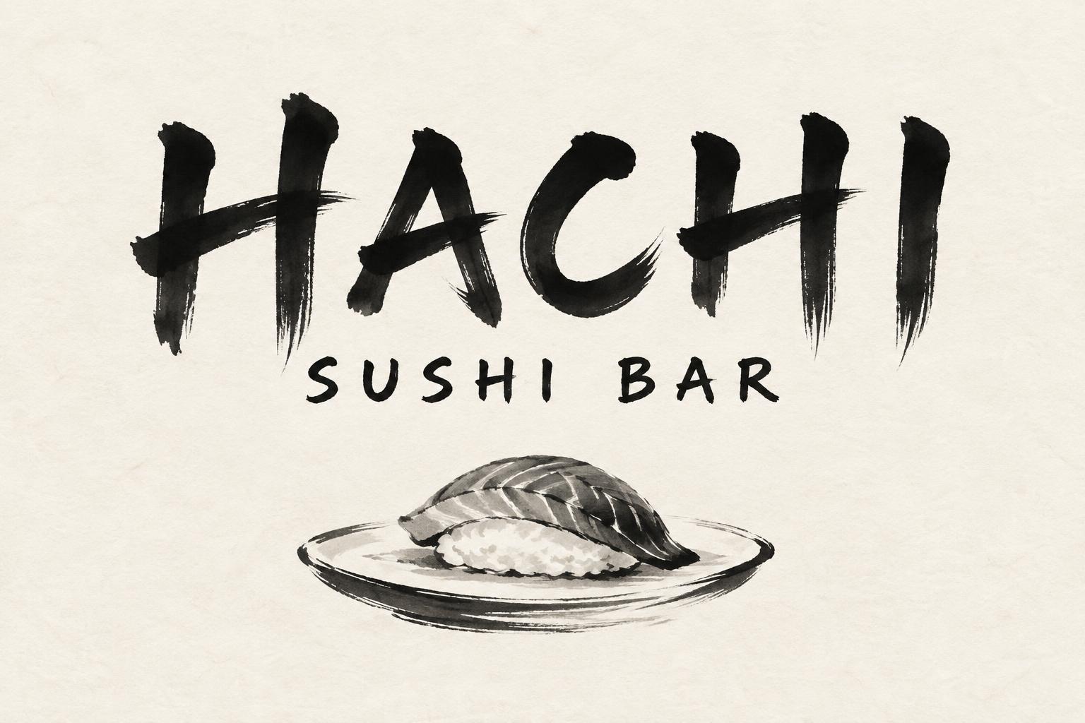
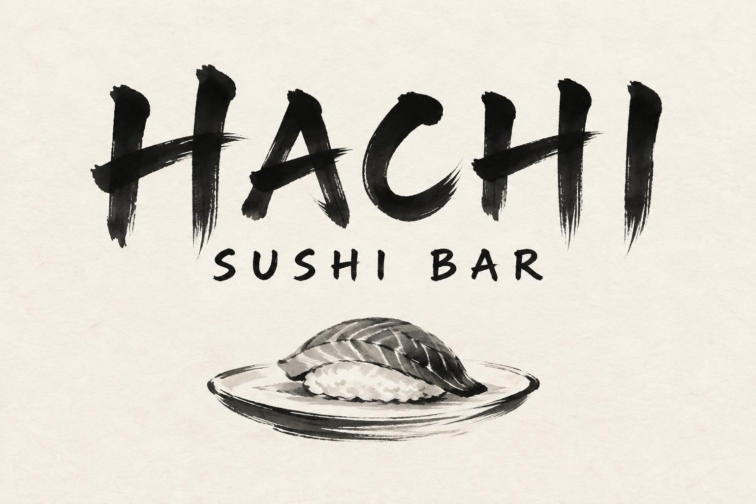
「HACHI SUSHI BAR」は FontVibe AI で作成した日本の墨筆の文字エフェクトです。日本の書道の墨筆による筆致をラテン文字に応用したスタイルです。深い墨黒のインクに本格的な筆のエネルギー、一方向に制御された筆運び、そして和紙の雰囲気が宿ります。日本食レストランのブランディング、タトゥーデザイン、アニメ、武道、文化系プロジェクトに最適です。
Create a finished horizontal counter sign for a sushi bar, 3:2 aspect ratio. Render only the exact wording “HACHI” and “SUSHI BAR”; no other lettering, characters, or invented marks. Set “HACHI” as the dominant headline, centered and large, with classical Japanese shodo brush-calligraphy letterforms in upright uppercase Latin: decisive single strokes, strong thick-to-thin contrast, controlled ink compression, carefully shaped tapered exits and open negative spaces. Use dense matte sumi black at the stroke cores, subtle dry-brush texture only at the edges, and natural gray fading where the brush runs out of ink. Set “SUSHI BAR” centered beneath in smaller, clear brush lettering with generous tracking. Build the sign on warm cream-white washi paper with visible, fine paper fibers and soft, absorbed ink edges. Place one small, recognizable sumi-brush illustration of a piece of nigiri on a simple dish below the type, rendered in restrained black and diluted gray brush marks; keep it secondary to the name. Compose with generous, deliberate empty space around all elements. Use soft, diffuse north-facing light with no hard shadows, glare, frame, color accents, seals, decorative flourishes, or extra props. Keep the lettering crisp and readable at counter distance. The overall image should read as a finished, restrained Japanese ink-brush counter sign, not a food photograph or a single isolated word.
用途: 日本の筆フォント
2026年9月29日に生成 · 1536 × 1024 · JPEG · OpenAI GPT-Image-2.5 Sunburst · レイアウト:禅 · 制作者がシェア · 商用利用無料(CC BY 4.0)



