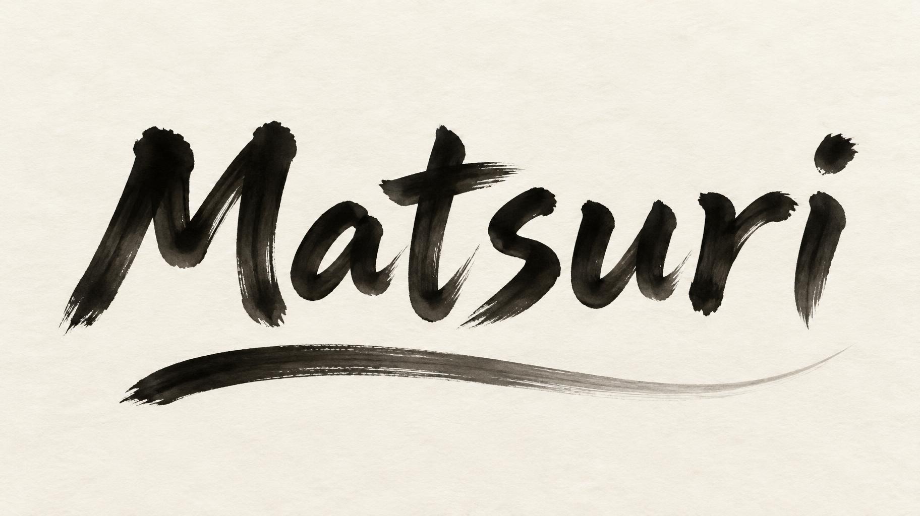
Matsuri - 日本の墨筆 Text Effect


この作品と同じ OpenAI GPT-Image-2.5 Sunburst を使用 · 15 クレジット











「Matsuri」は FontVibe AI で作成した日本の墨筆の文字エフェクトです。日本の書道の墨筆による筆致をラテン文字に応用したスタイルです。深い墨黒のインクに本格的な筆のエネルギー、一方向に制御された筆運び、そして和紙の雰囲気が宿ります。日本食レストランのブランディング、タトゥーデザイン、アニメ、武道、文化系プロジェクトに最適です。
Create a finished horizontal 16:9 festival banner, not a mockup. Render exactly one text string, spelled and cased exactly: “Matsuri”. No other text, characters, symbols, or lettering. Set “Matsuri” as the unmistakable focal title, centered horizontally and slightly above the vertical midpoint, filling about 70% of the banner width. Design the Latin letterforms as exemplary Japanese shodo brush calligraphy: upright and harmonious, with a bold 5:1 thick-to-thin stroke ratio, generous clear spacing, and each stroke executed once with masterful commitment. Show controlled loaded-brush entries, compressed turns, energetic sustained middles, and precise harai tapers or upward-flick terminals. The strokes are matte sumi ink, near-black and dense at their cores, softly grading to charcoal and faint gray at depleted edges; allow only a little dry-brush texture at the outermost edges. Place one long, restrained sumi brush sweep below the word, separate from the letters and tapering gracefully into a pale gray tail; it must read as one confident brushmark, not an ornament or underline rule. Set everything on warm cream-white washi with subtle visible fibers and softly absorbed ink edges. Soft diffuse north-facing light, even and shadowless, makes the ink’s tonal gradation clear. Preserve broad, deliberate empty margins and a quiet balance between the strong title and the trailing stroke. No red accents, props, borders, splatter, gradients, or extra decorative marks.
用途: 日本語風テキストジェネレーター
2026年10月17日に生成 · 1824 × 1024 · JPEG · OpenAI GPT-Image-2.5 Sunburst · レイアウト:Wide Ink Banner · 制作者がシェア · 商用利用無料(CC BY 4.0)



