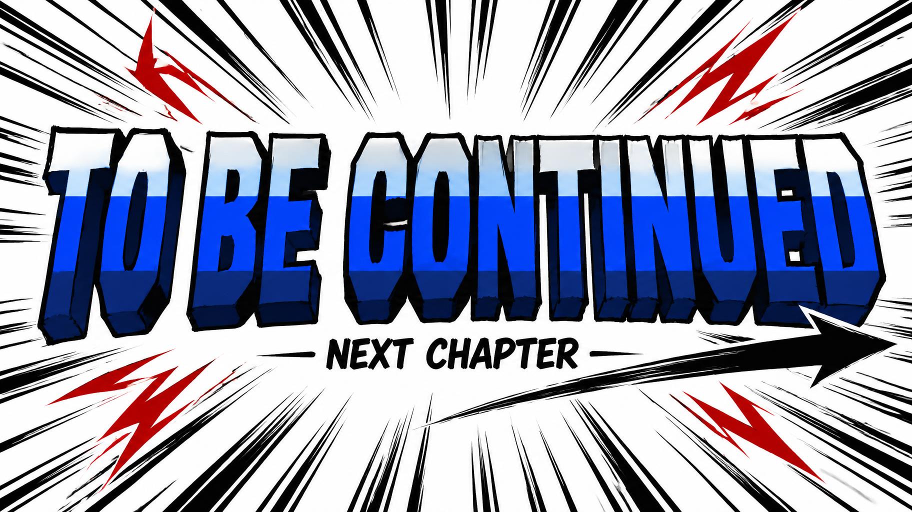
TO BE CONTINUED NEXT CHAPTER - アニメ Text Effect


この作品と同じ OpenAI GPT-Image-2.5 Sunburst を使用 · 15 クレジット

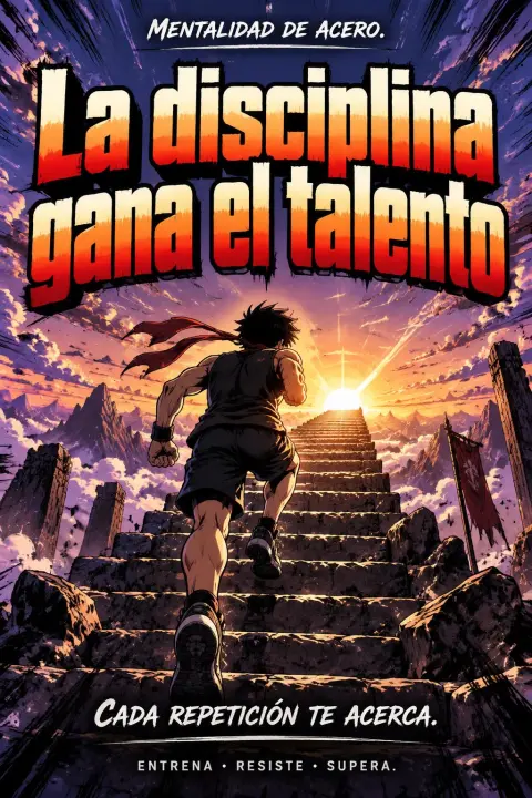
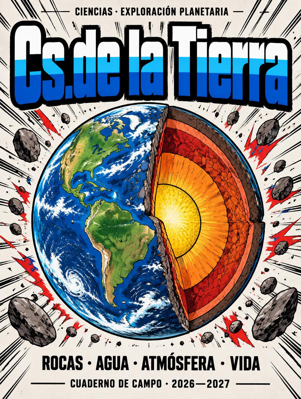
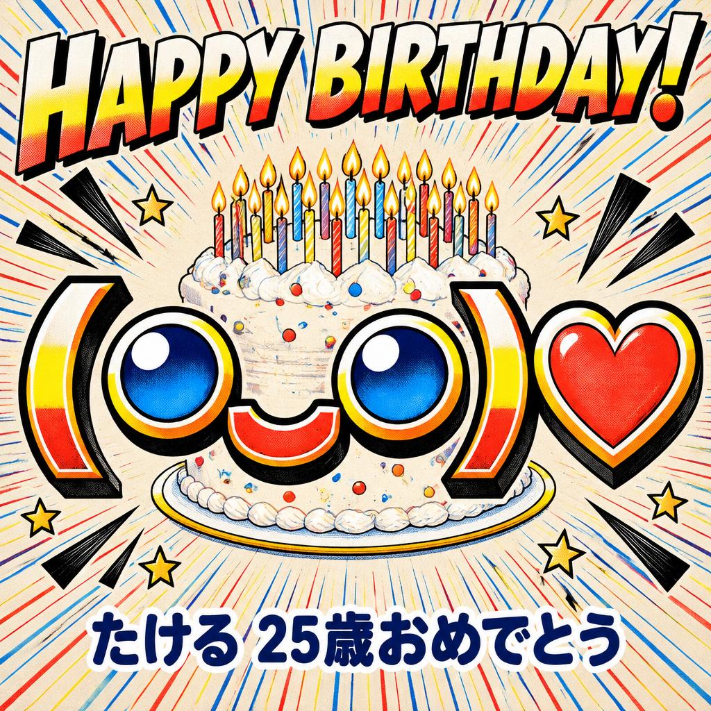
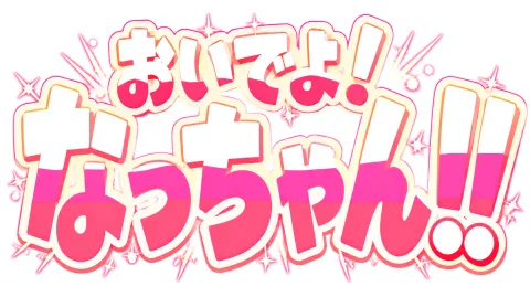
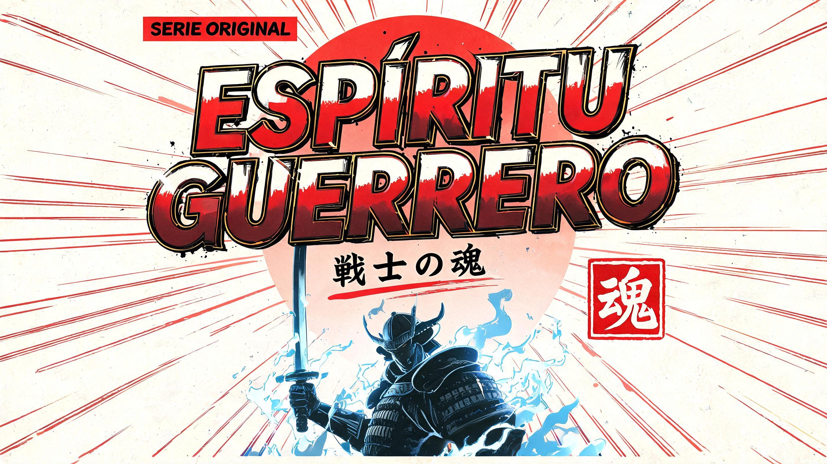

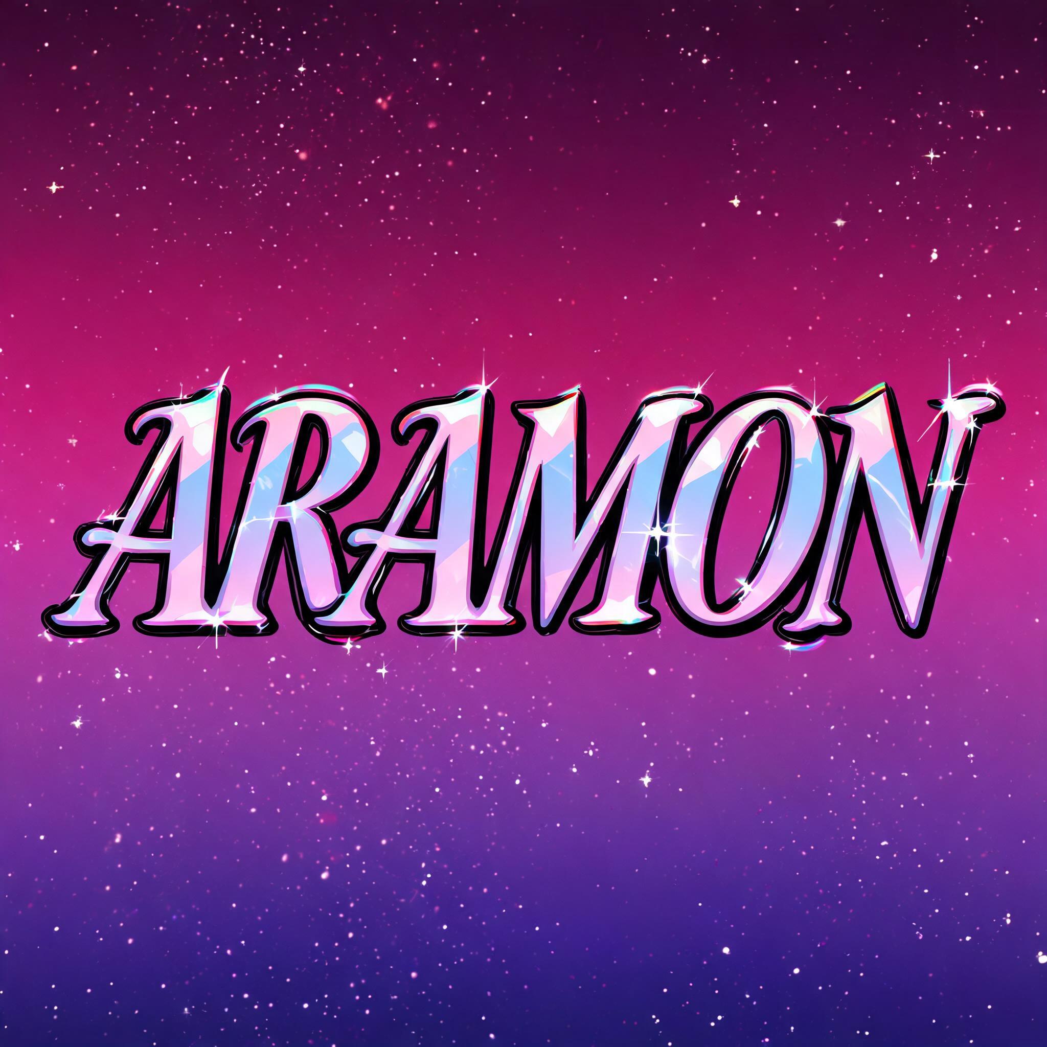
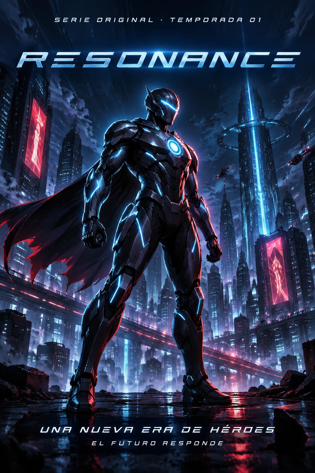
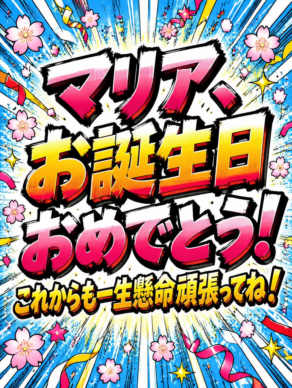
「TO BE CONTINUED NEXT CHAPTER」は FontVibe AI で作成したアニメの文字エフェクトです。少年マンガのタイトル文字。手描きの太い黒フチ、ハイライトと影をくっきり分けたセルシェーディング、勢いよく傾いた文字と、白地に放射状の集中線。
Create a finished 16:9 Japanese shounen manga end-panel title card. The exact headline reads “TO BE CONTINUED” in one line, large and immediately legible, with ultra-bold condensed display lettering, maximum stroke weight, slightly irregular hand-inked black outlines, and flat cel-shaded fills: near-white upper highlight, vivid electric-blue center, deep navy lower shadow. Keep every color boundary knife-edge sharp, with no gradients or soft blur. Let the title span about 84% of the canvas width and dominate the center. Add a smaller, neatly inked caption below it reading “NEXT CHAPTER”. Behind the title, use a clean white manga-paper field with dense black radial speed lines bursting outward from the lettering, a few sharp red impact marks, and a bold manga arrow sweeping toward the right edge to suggest the story continuing. Keep the speed lines and arrow behind the type so every letter stays readable; leave clear margins and a little open paper around the burst. Strong black-and-white contrast, saturated blue title fill, restrained red accents, energetic offset-print ink character, no extra words, no logos, no panels or characters.
用途: マンガフォントジェネレーター
2026年10月21日に生成 · 1824 × 1024 · JPEG · OpenAI GPT-Image-2.5 Sunburst · レイアウト:End Panel Burst · 制作者がシェア · 商用利用無料(CC BY 4.0)



