To Be Continued - アニメ Text Effect


この作品と同じ OpenAI GPT-Image-2.5 Sunburst を使用 · 15 クレジット

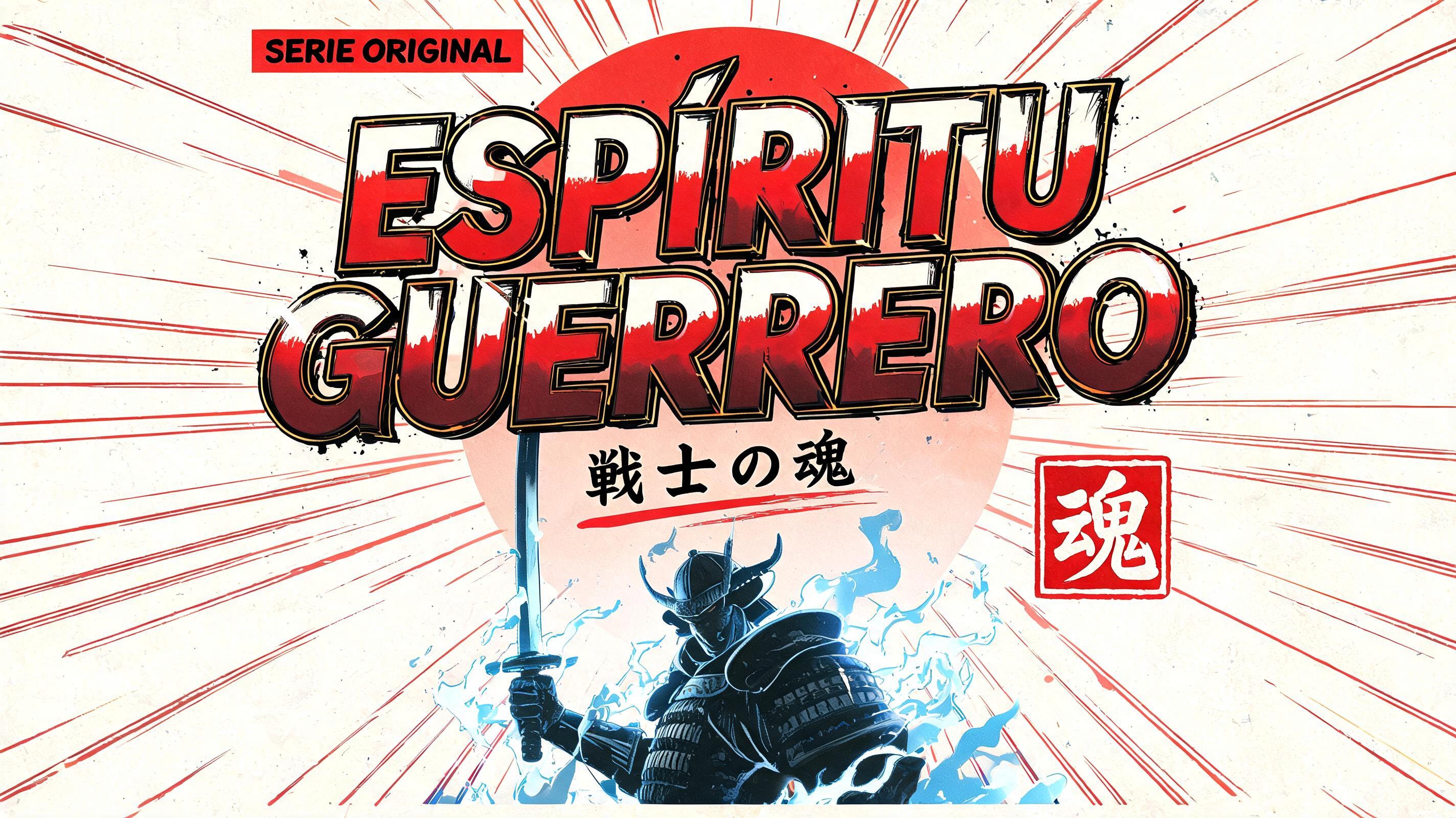

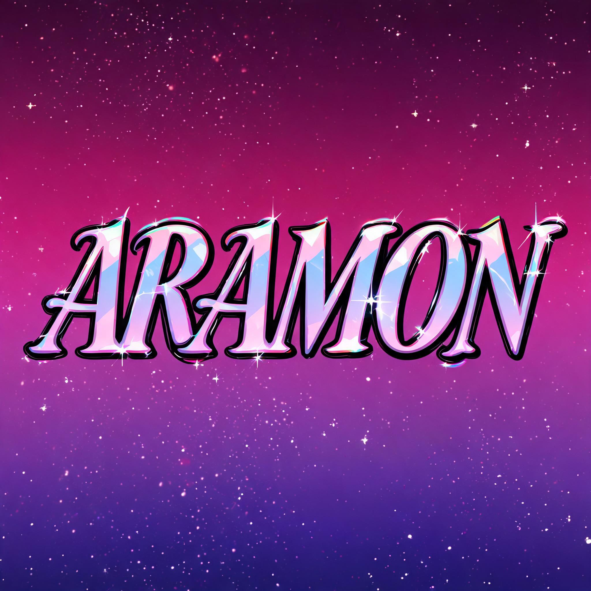
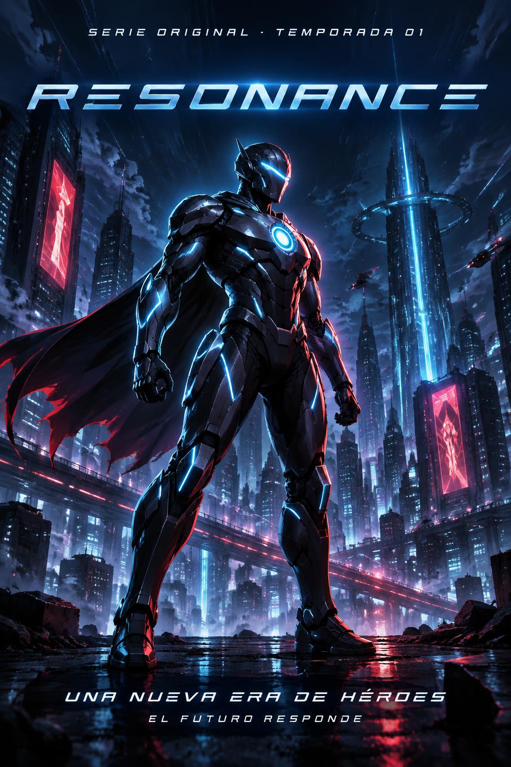
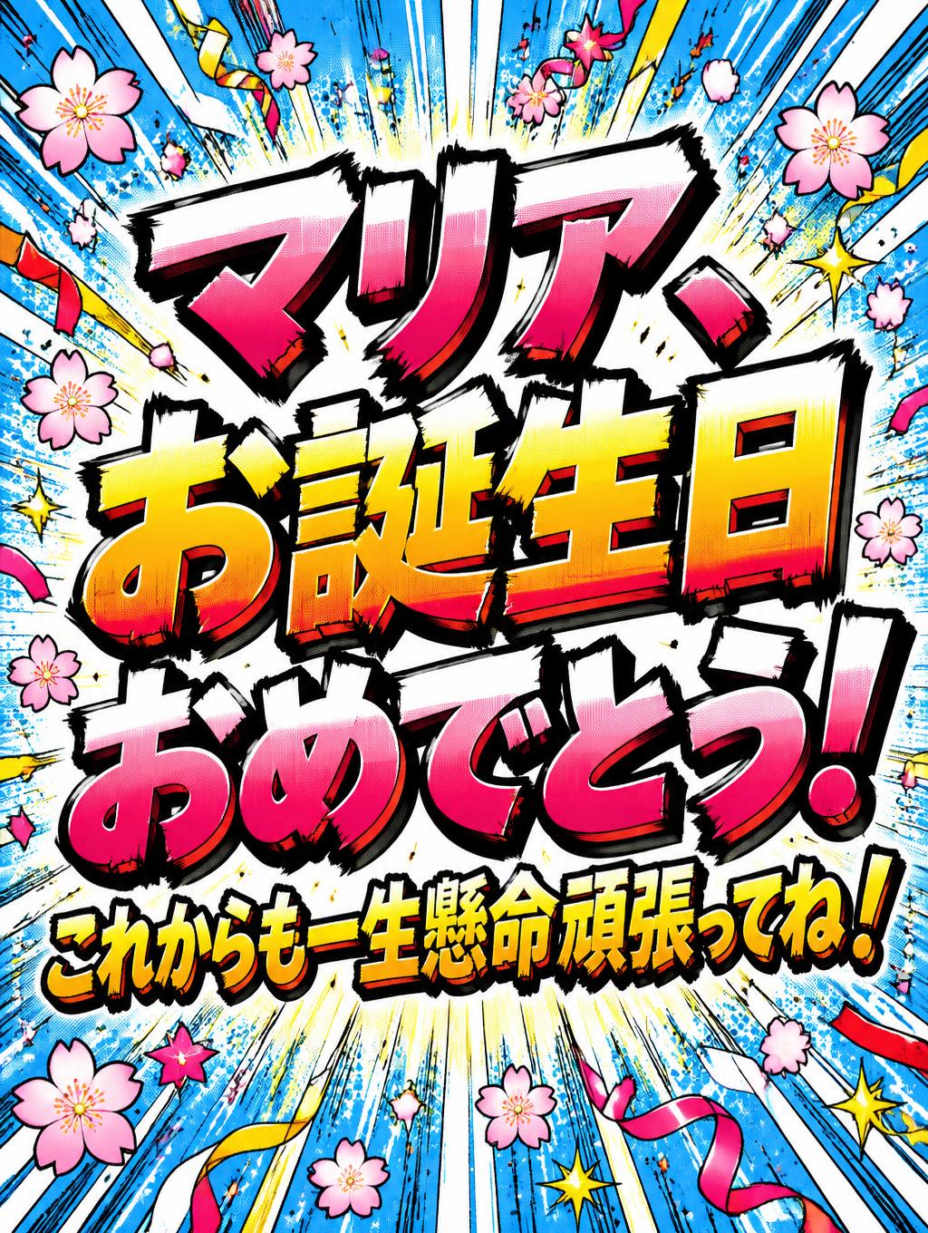
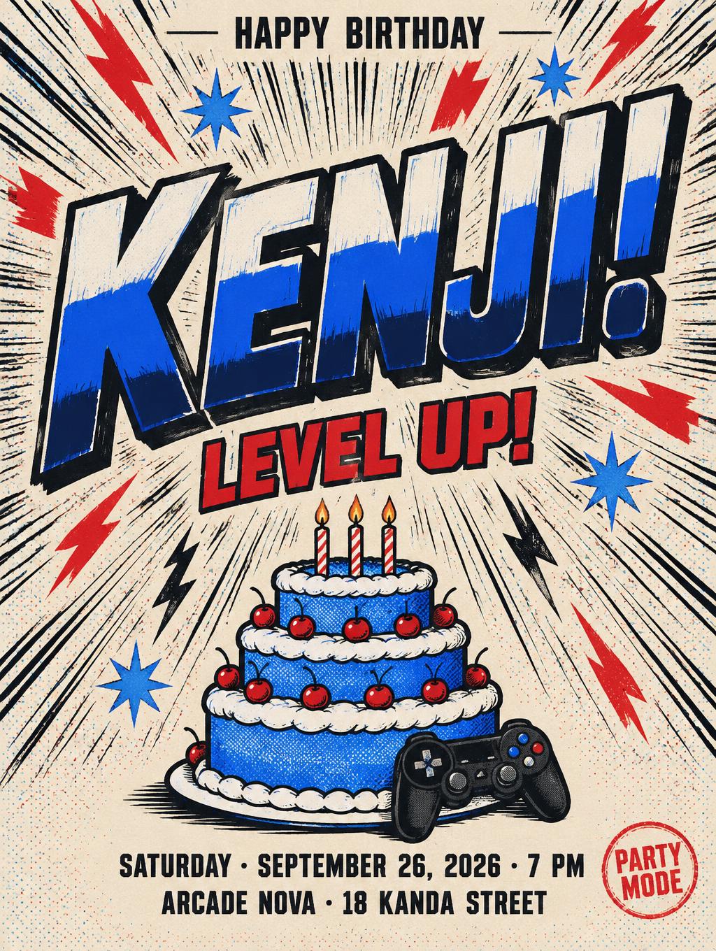
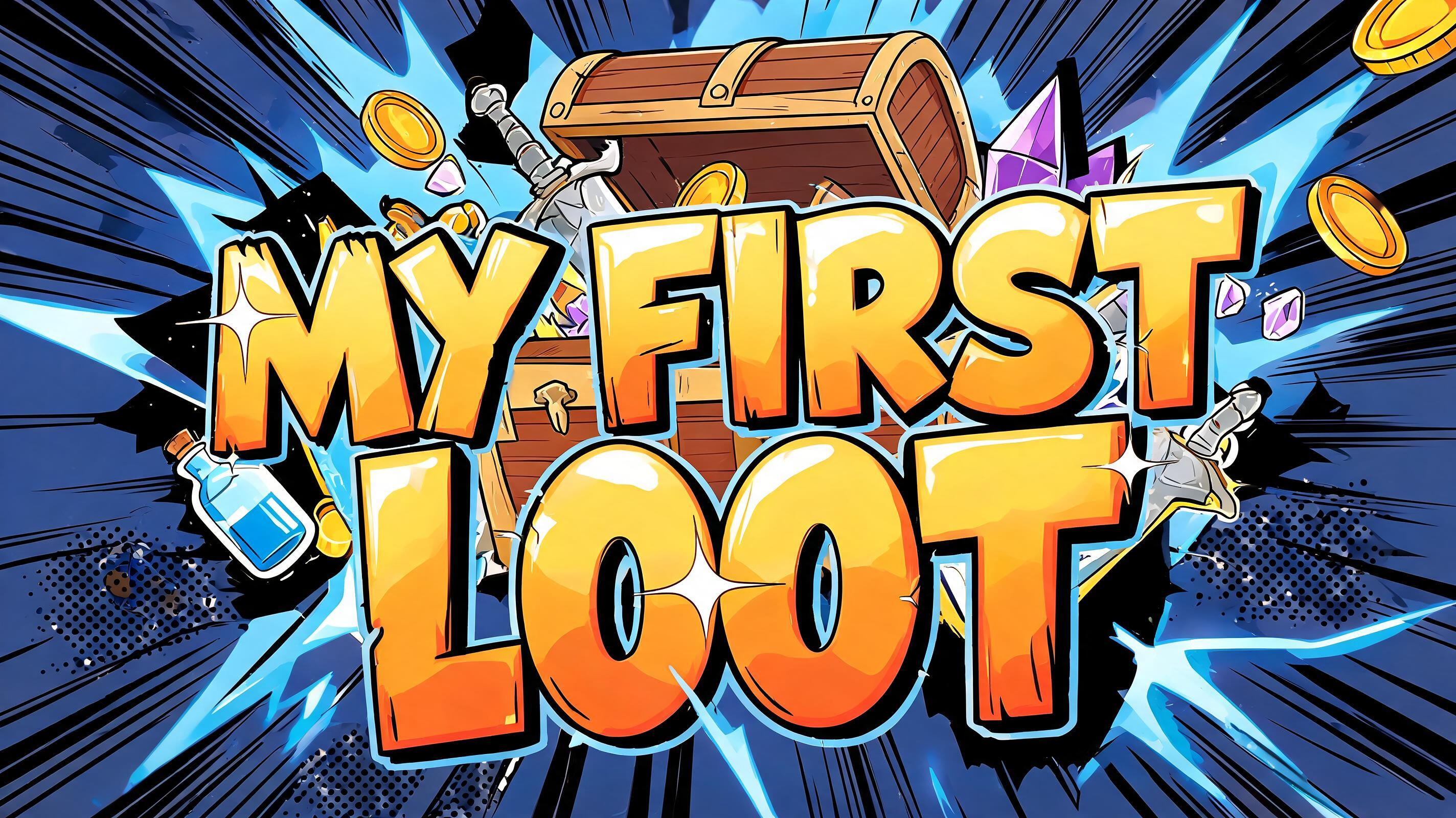
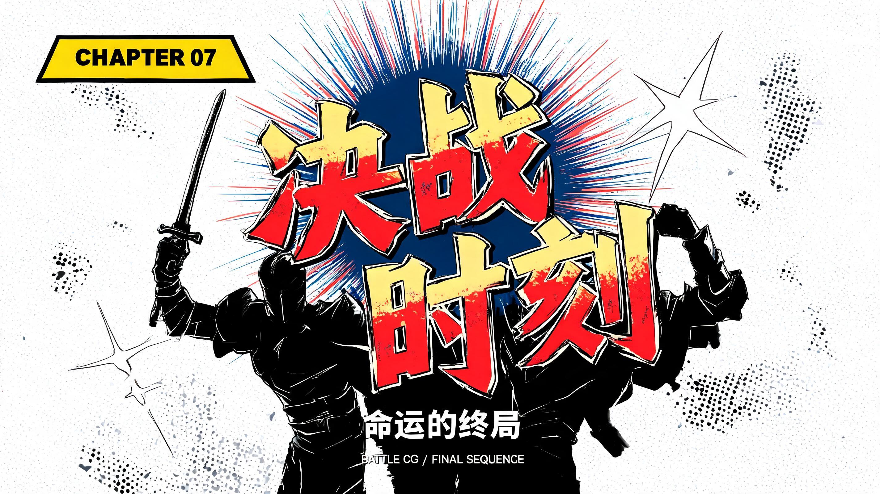
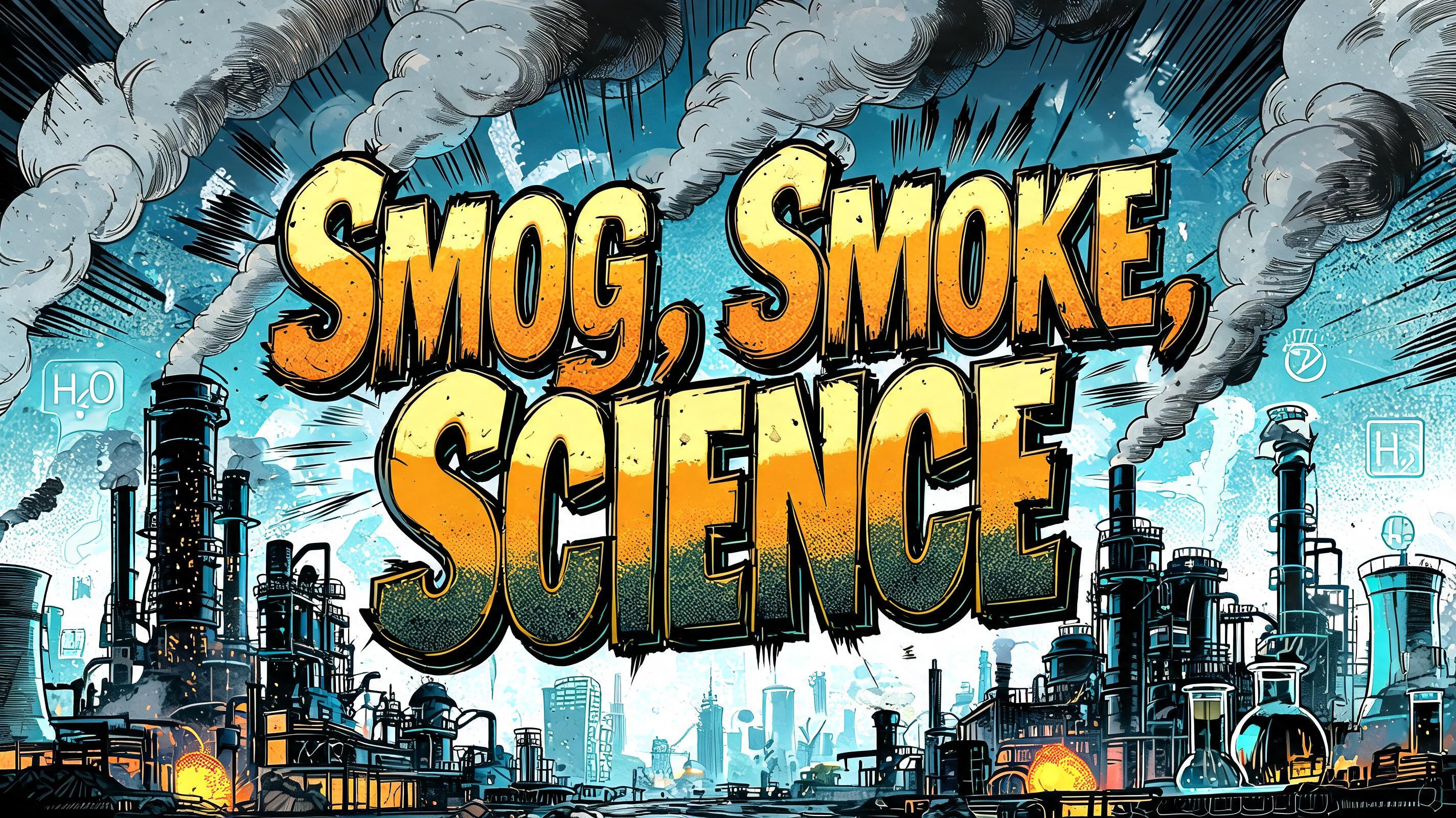
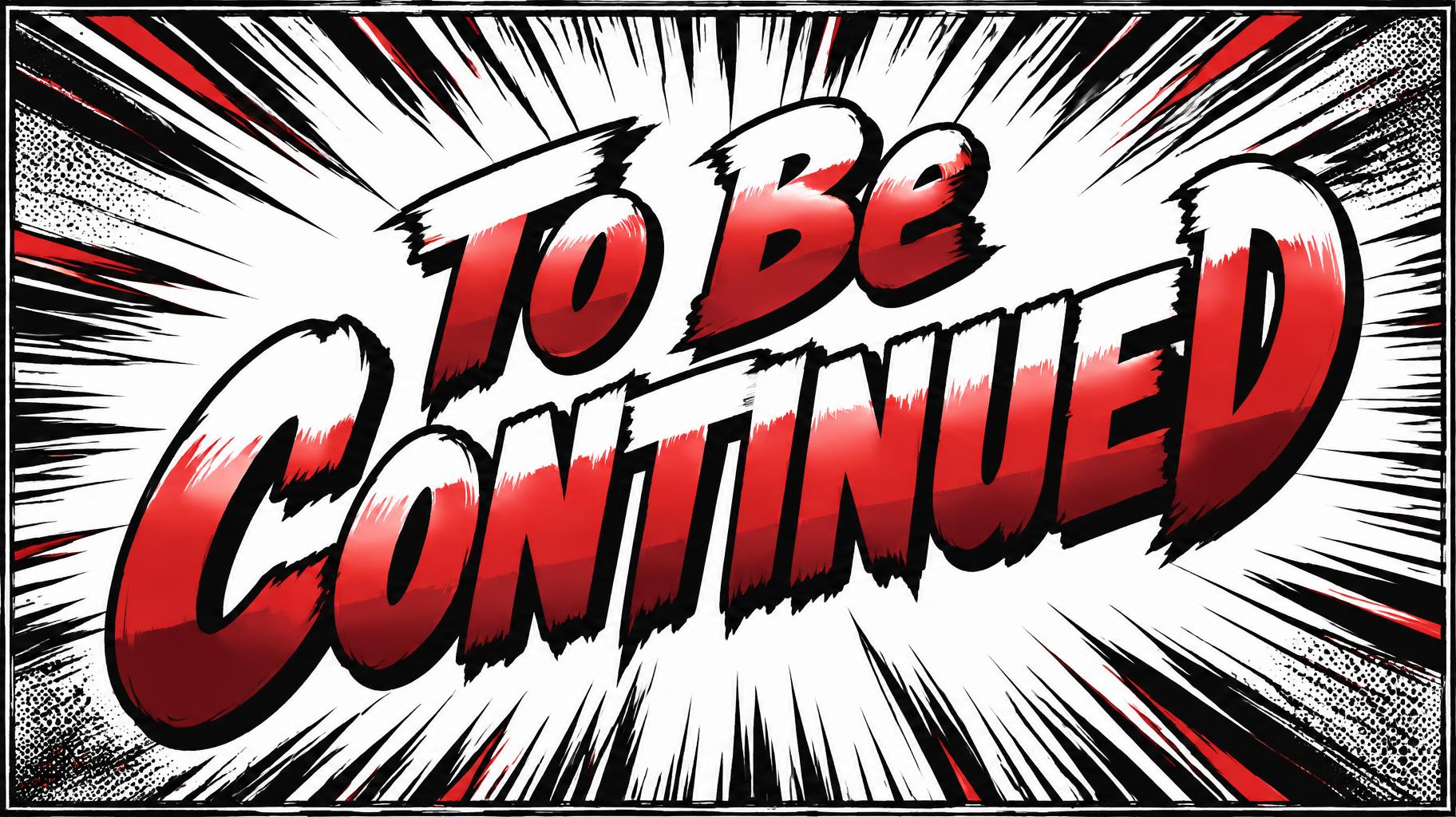
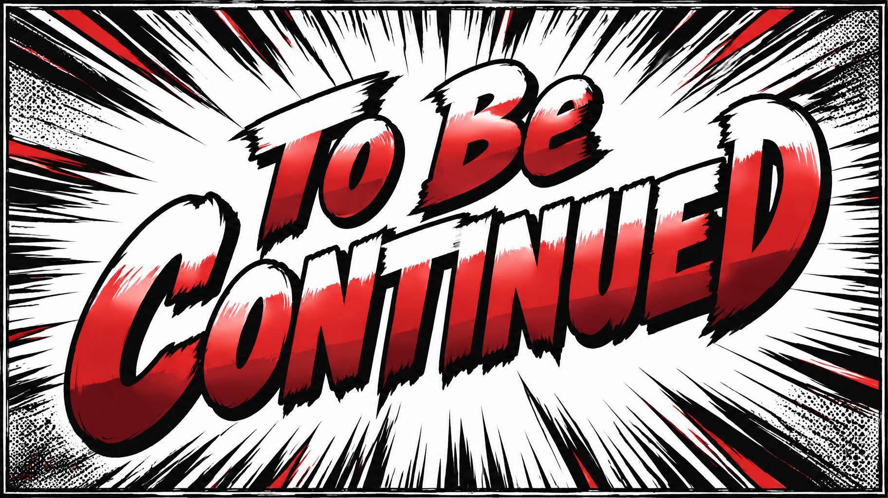
「To Be Continued」は FontVibe AI で作成したアニメの文字エフェクトです。少年マンガのタイトル文字。手描きの太い黒フチ、ハイライトと影をくっきり分けたセルシェーディング、勢いよく傾いた文字と、白地に放射状の集中線。
Create a finished, high-impact manga last-panel title graphic in a wide 16:9 composition. The only visible text must read exactly “To Be Continued”, with this capitalization and spelling. Set it on two compact lines, “To Be” above the larger, dominant “Continued”, and tilt the whole title upward from lower left to upper right by about 8 degrees. Make the headline the unmistakable focal point, occupying roughly 75% of the canvas width, with generous clear space around each letter so it remains instantly readable. Draw the letters as ultra-bold, condensed shounen manga title lettering with natural brush-pressure variation and slightly irregular hand-inked edges. Give every letter a thick, near-black ink outline. Fill each face with three crisp, flat cel-shaded zones: a narrow warm-white highlight across the upper portion, saturated vermilion-red through the middle, and deep crimson along the lower edge. Keep all color boundaries razor-sharp, with no gradients or soft glow; the letters should feel like vivid ink printed on manga paper. Behind the title, make a large jagged white impact burst with dense black radial speed lines shooting toward the frame edges, plus a few restrained vermilion accent strokes. Add subtle black halftone shading only in the far corners and a rough inked panel border to frame the moment as a dramatic final manga panel. Keep the burst and lines behind the lettering, never crossing or obscuring the words. High contrast, energetic, hand-inked, readable at a glance. No characters, logos, extra captions, numbers, or other text.
用途: マンガフォントジェネレーター
2026年10月22日に生成 · 1824 × 1024 · JPEG · OpenAI GPT-Image-2.5 Sunburst · レイアウト:Last-Panel Burst · 制作者がシェア · 商用利用無料(CC BY 4.0)



