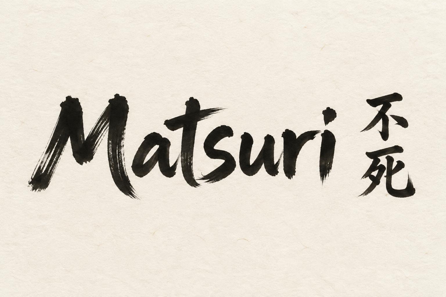
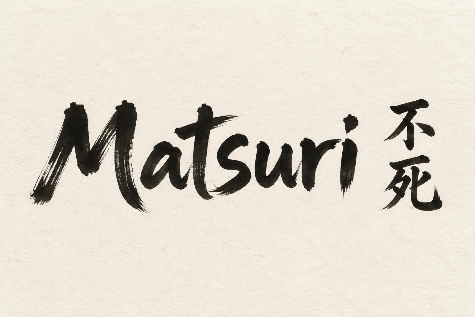
Matsuri 不死 - 日本の墨筆 Text Effect


この作品と同じ OpenAI GPT-Image-2.5 Sunburst を使用 · 15 クレジット











「Matsuri 不死」は FontVibe AI で作成した日本の墨筆の文字エフェクトです。日本の書道の墨筆による筆致をラテン文字に応用したスタイルです。深い墨黒のインクに本格的な筆のエネルギー、一方向に制御された筆運び、そして和紙の雰囲気が宿ります。日本食レストランのブランディング、タトゥーデザイン、アニメ、武道、文化系プロジェクトに最適です。
Create a finished, minimalist landscape festival banner on warm cream-white washi paper, with subtle visible paper fibres. Render exactly two text elements: the headline “Matsuri” in large, horizontal Japanese shodo brush lettering, and “不死” as two vertically stacked kanji, 不 above 死, to its right. Preserve the exact spelling and glyphs. Make “Matsuri” the dominant read, with the vertical kanji clearly legible as a secondary title mark. Give the Latin letters upright, harmonious proportions and generous spacing, with bold controlled strokes: dense sumi-black cores, a strong thick-to-thin contrast, gradual loaded-brush entries, steady mid-strokes, and precise tapered harai exits or hane hooks. The kanji should have the same decisive, master-calligrapher control. Keep every mark matte and absorbed into the washi, with slight dry-brush texture only at the outer edges and natural transitions from near-black to soft charcoal grey where the brush runs dry. Use soft, diffuse, shadowless studio light. Set the title slightly left of centre and the vertical kanji to its right, leaving broad, deliberate untouched paper around and between them. Restrained, authoritative festival-banner design; power balanced by stillness. No extra lettering, seals, borders, props, splatters, or ornamental marks.
用途: 日本語風テキストジェネレーター
2026年10月24日に生成 · 1536 × 1024 · JPEG · OpenAI GPT-Image-2.5 Sunburst · レイアウト:Washi Title Pair · 制作者がシェア · 商用利用無料(CC BY 4.0)



