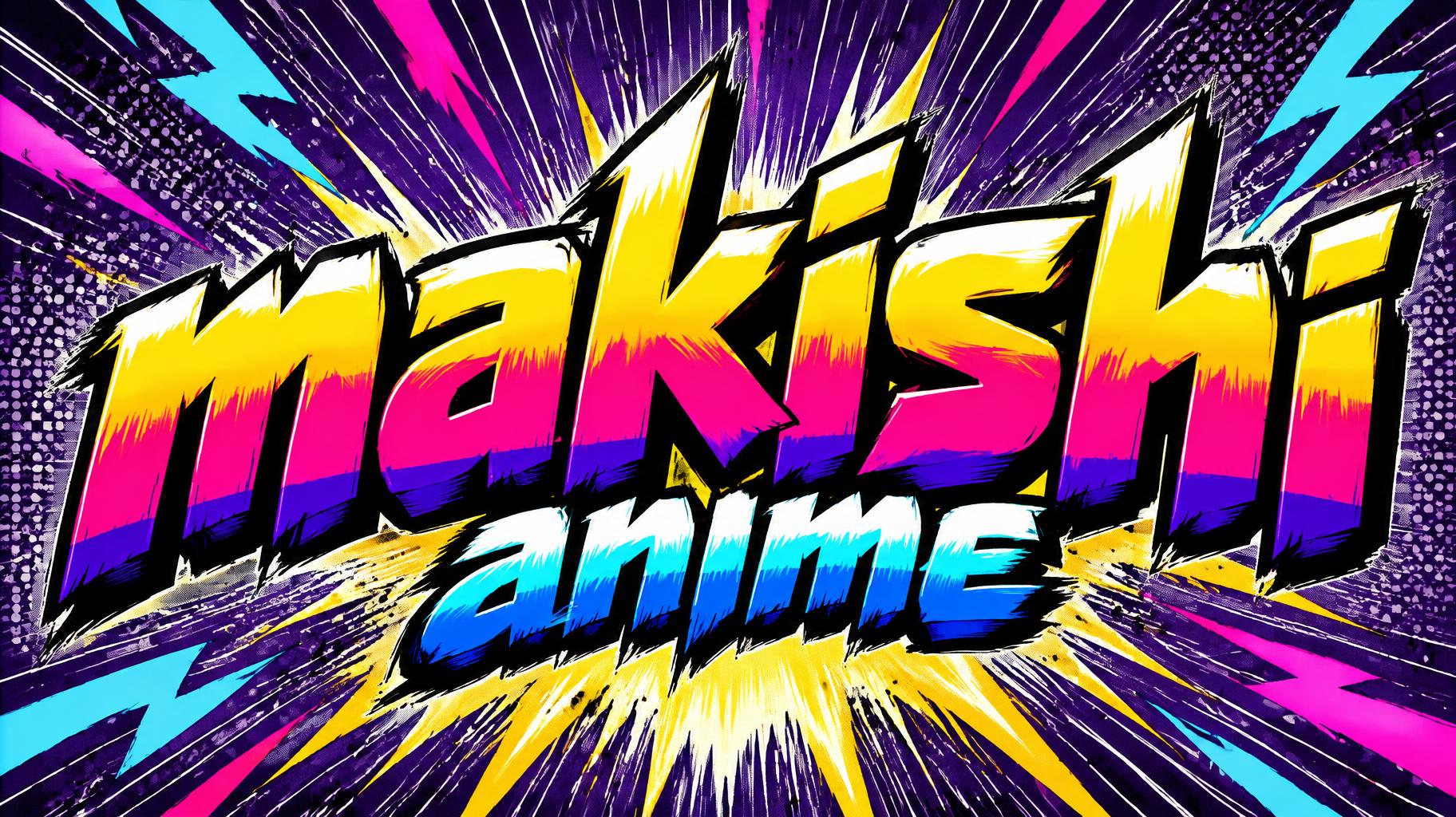
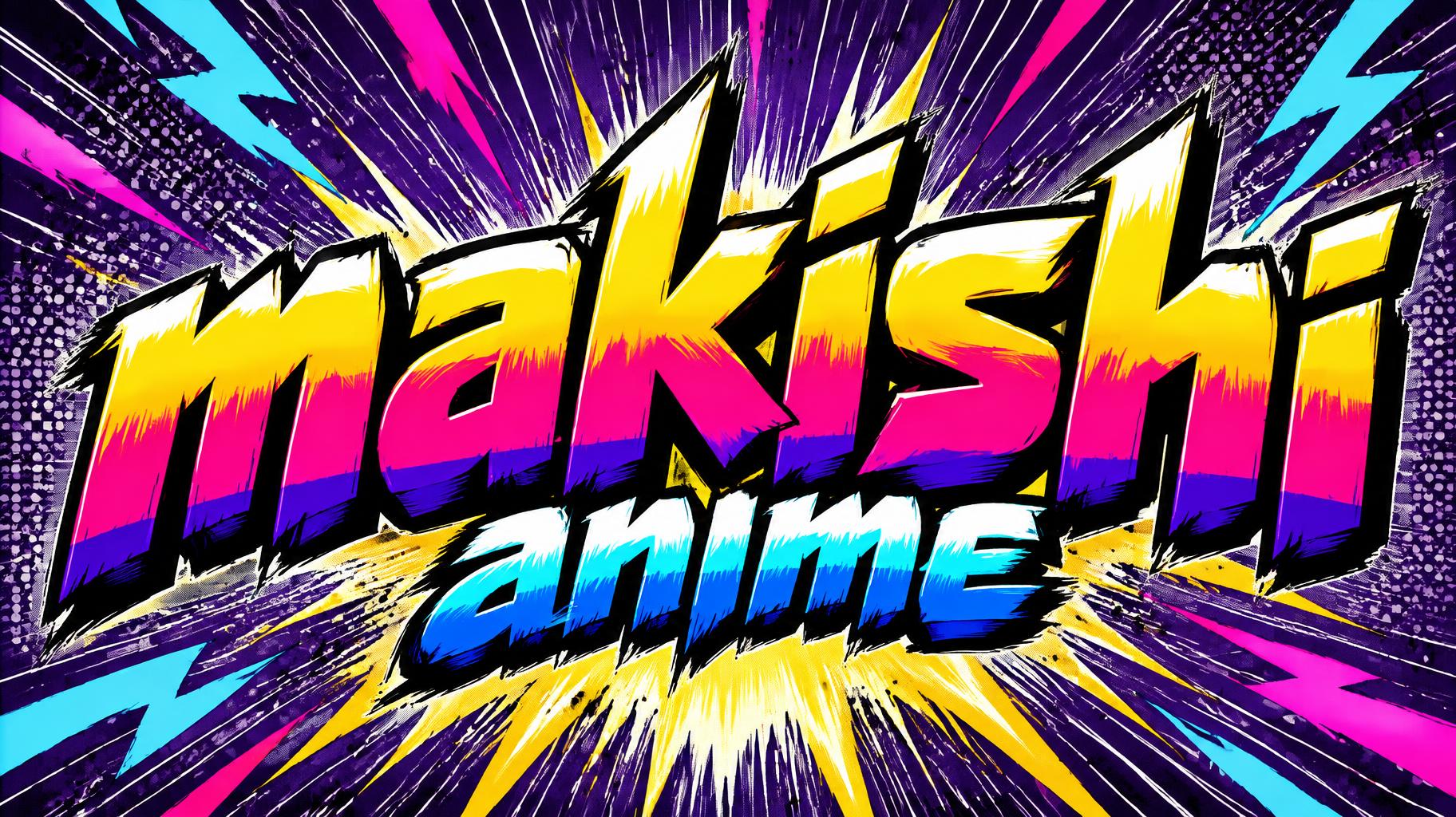
makishi anime - アニメ Text Effect


この作品と同じ OpenAI GPT-Image-2.5 Sunburst を使用 · 15 クレジット
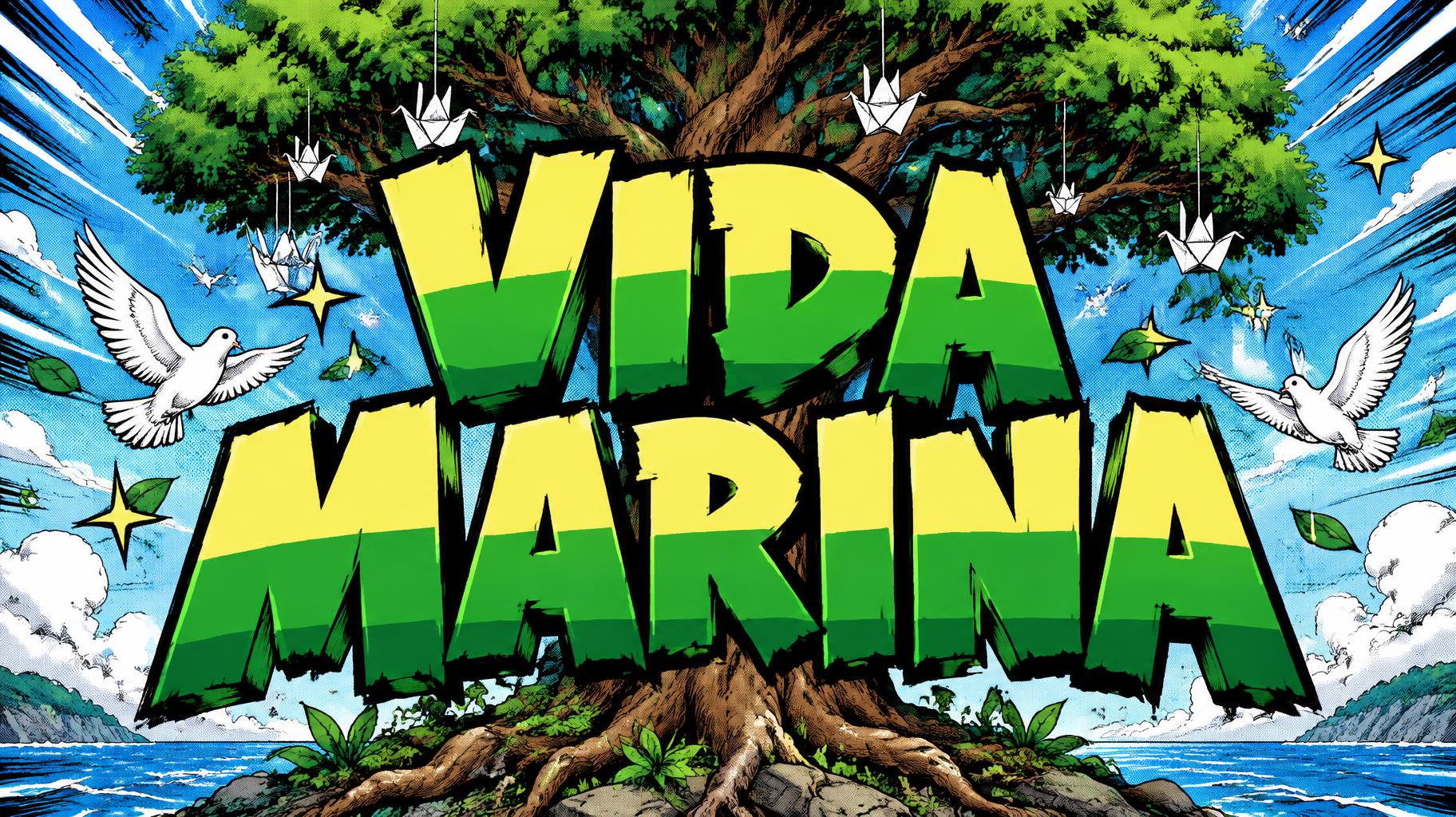


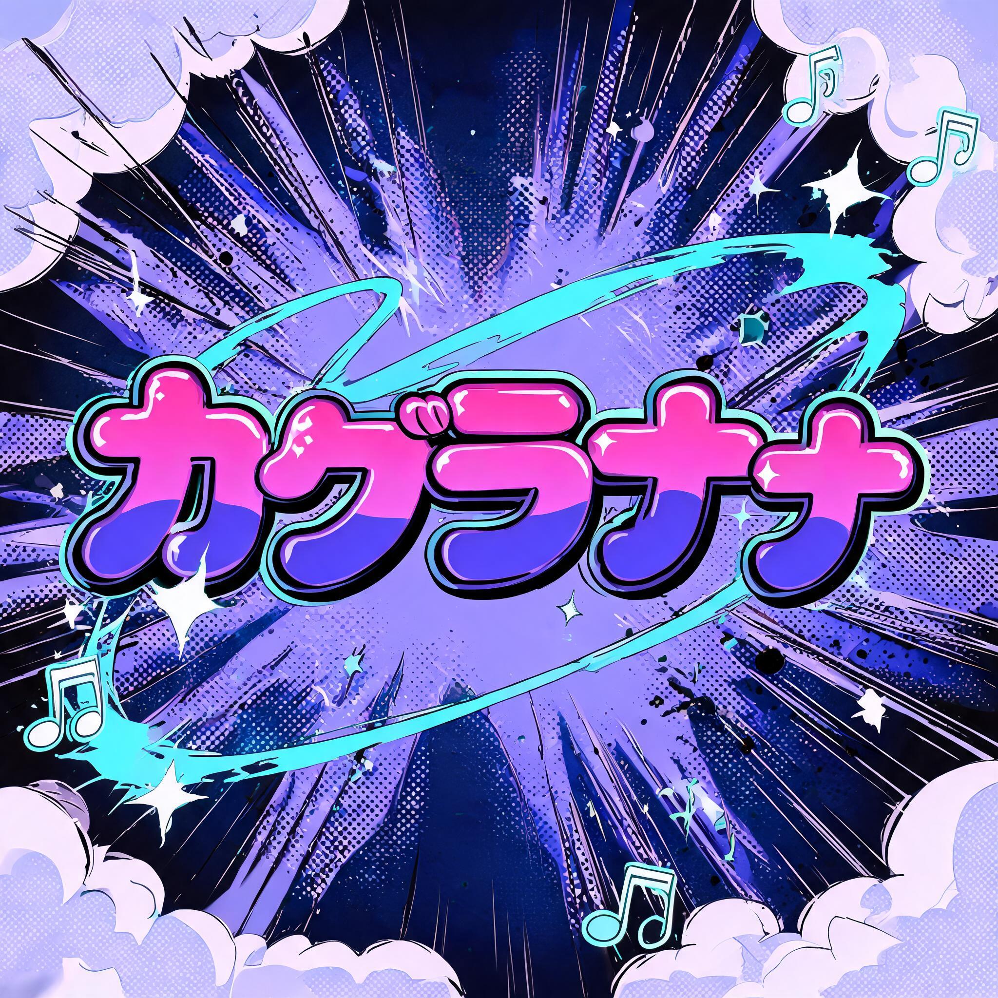
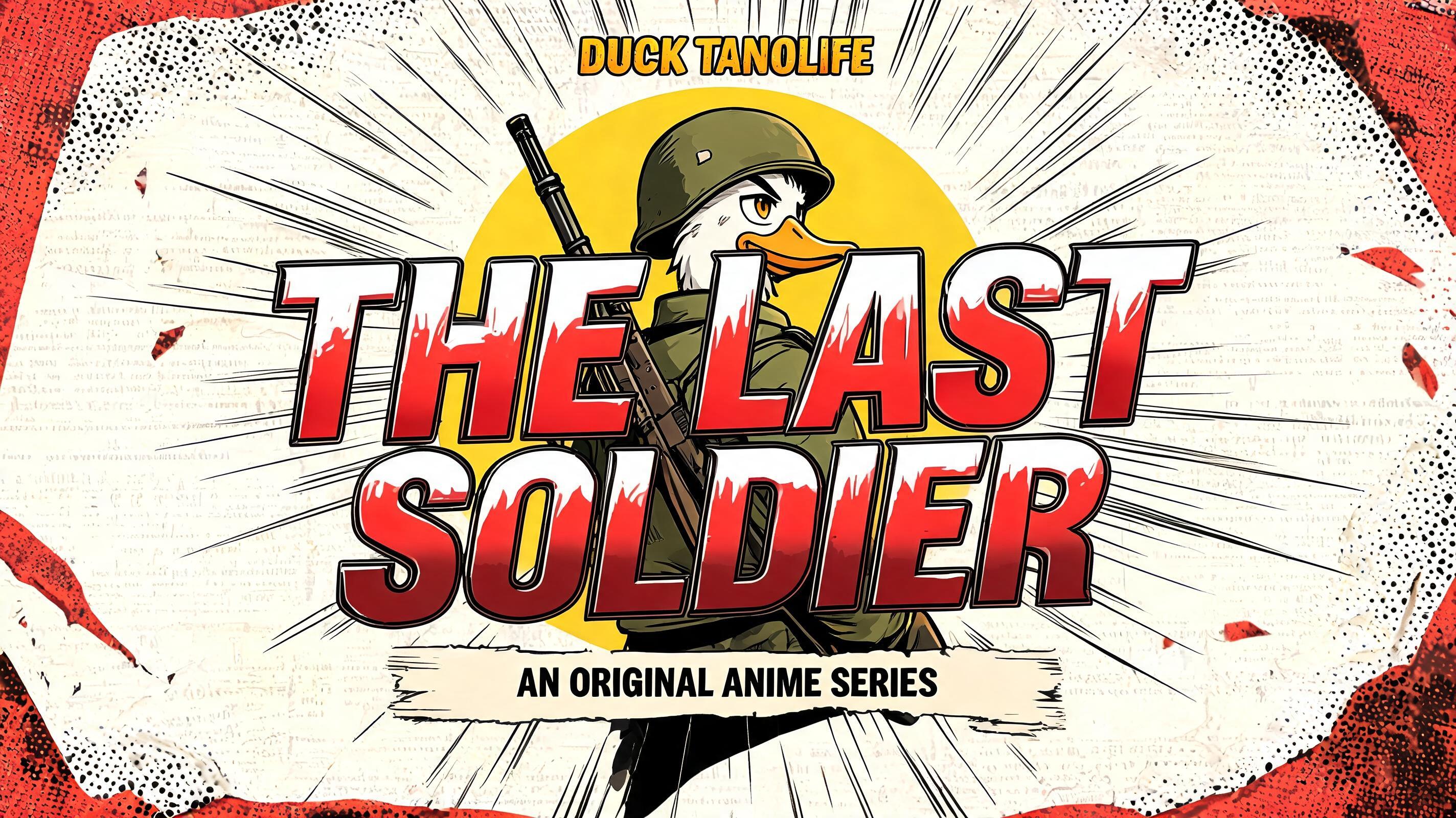
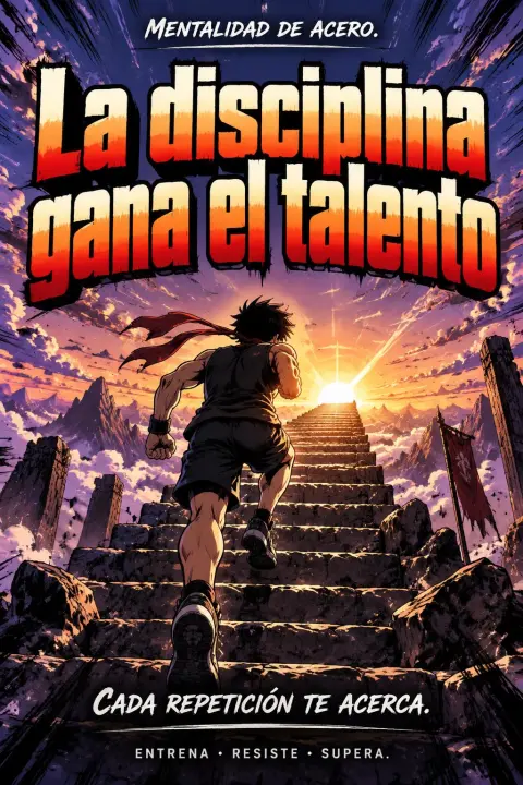
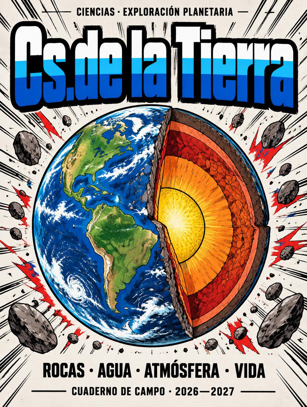
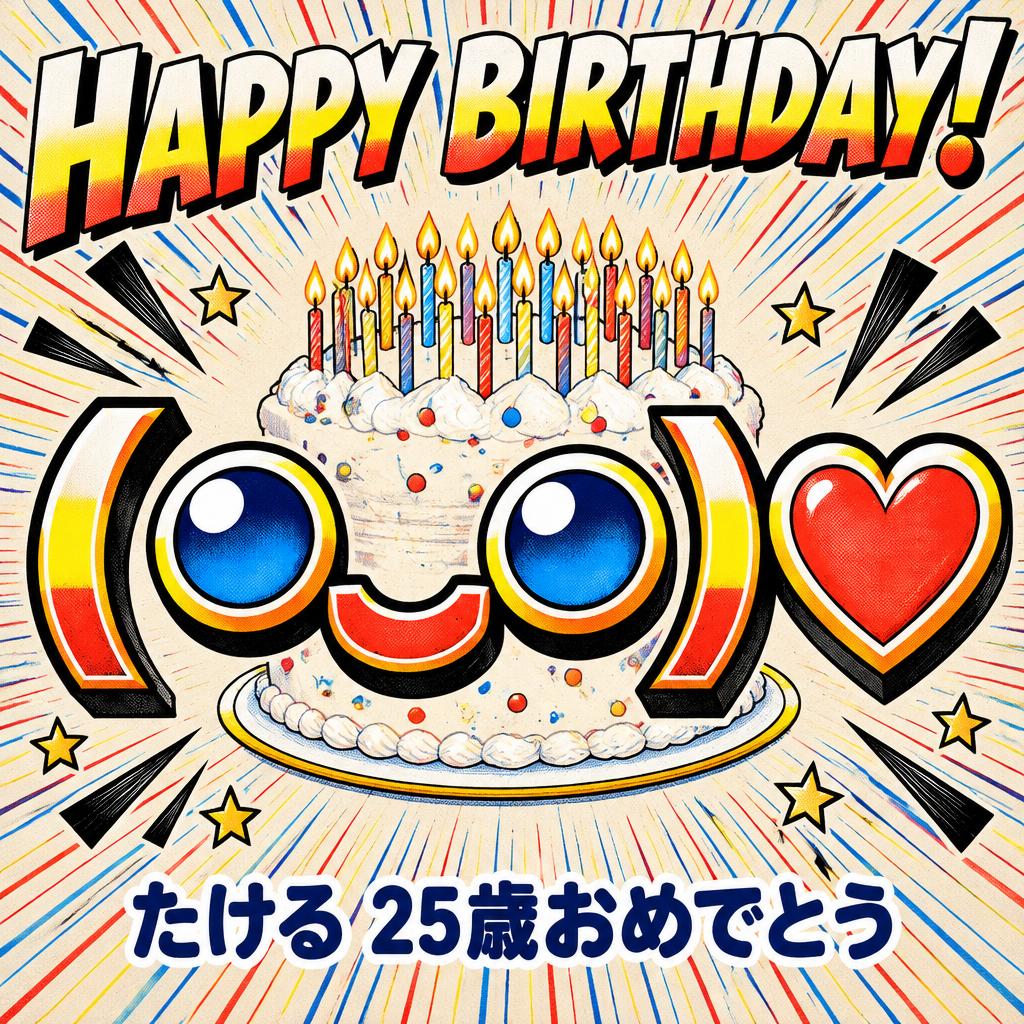
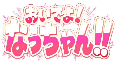
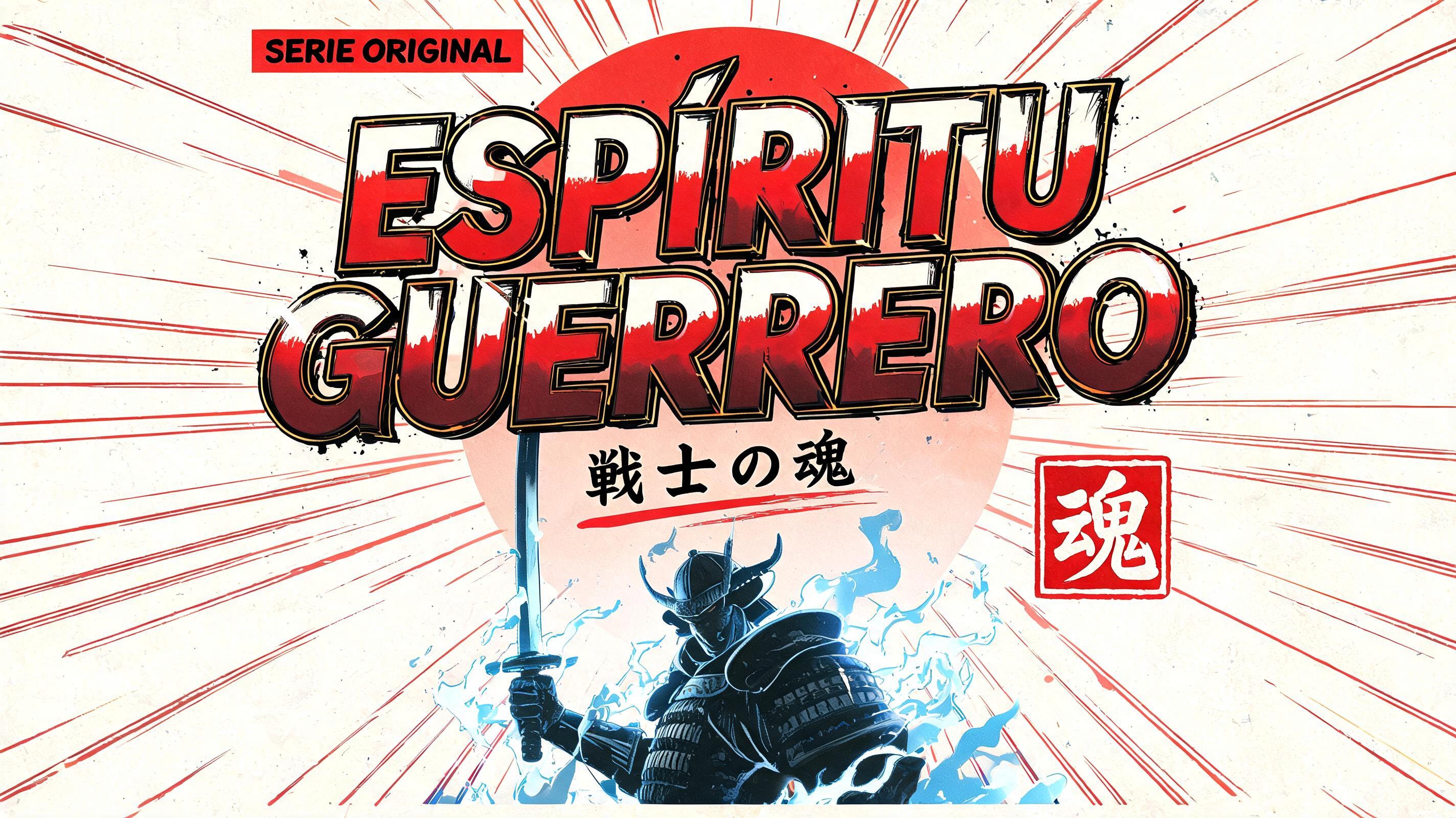

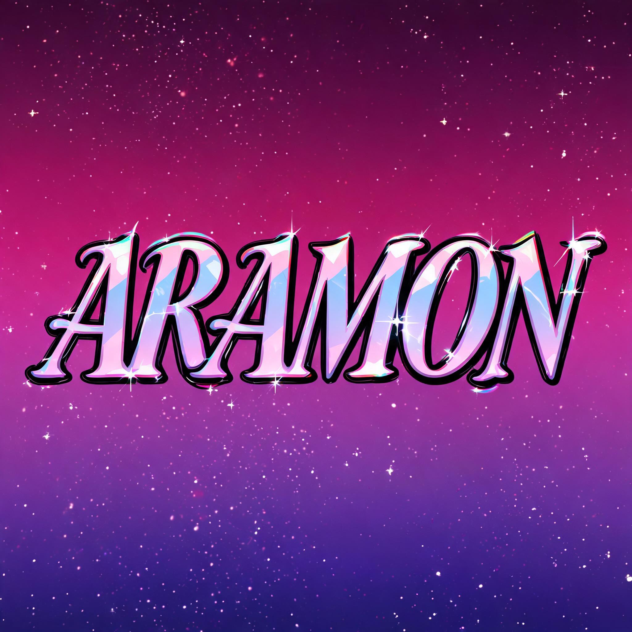
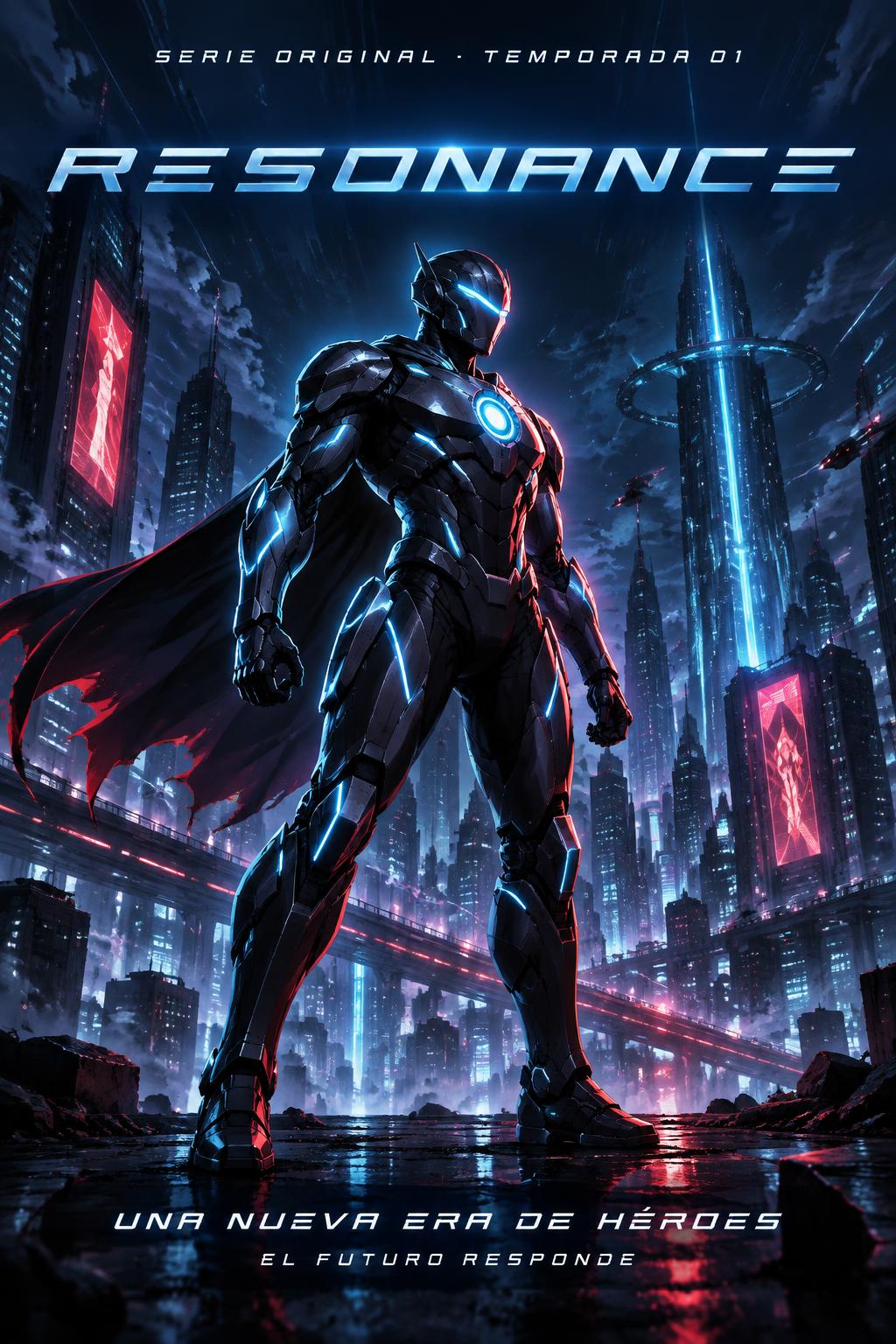
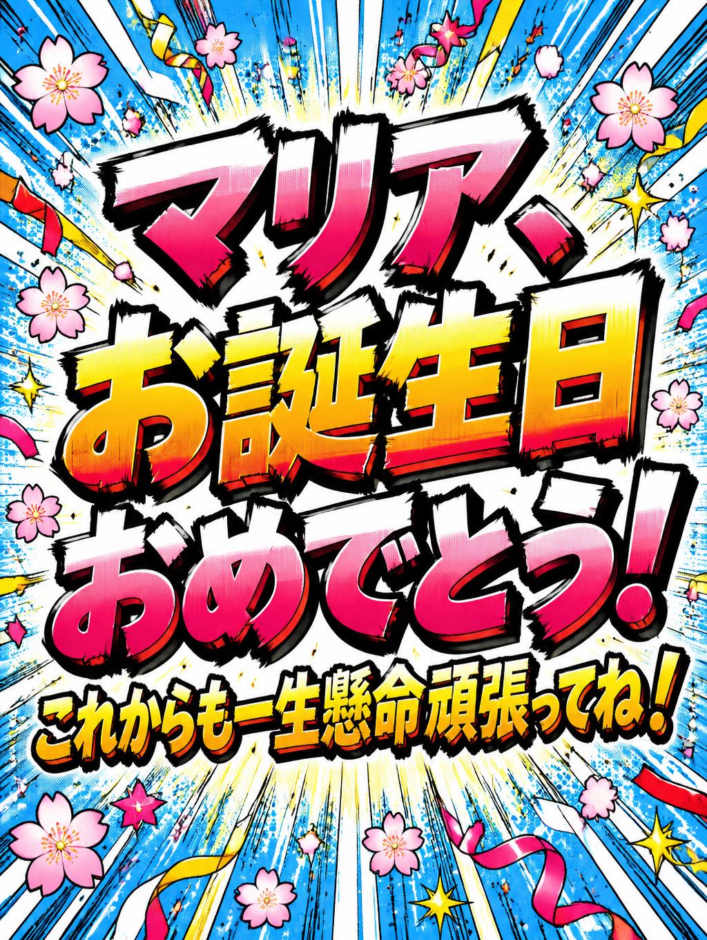
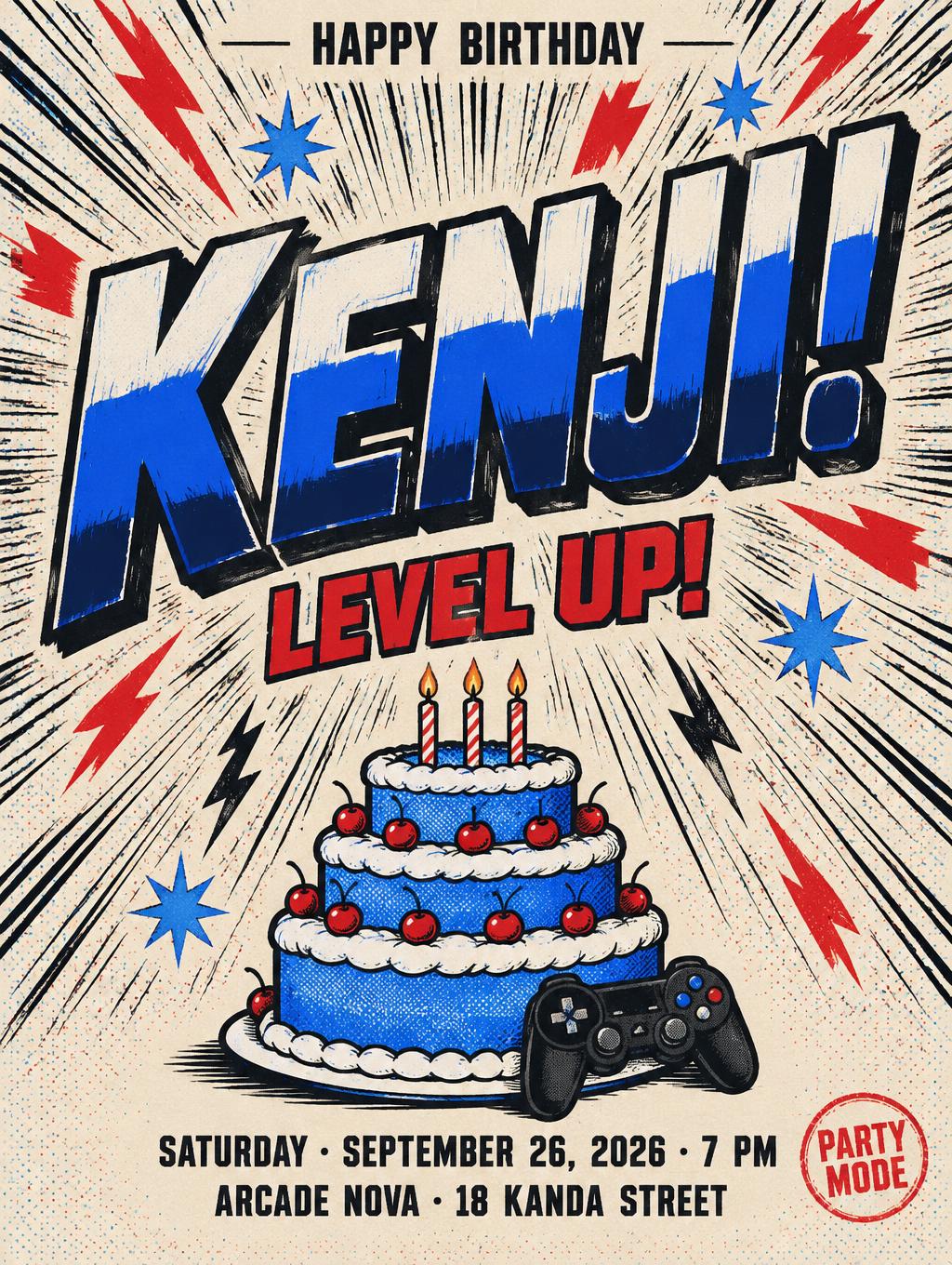
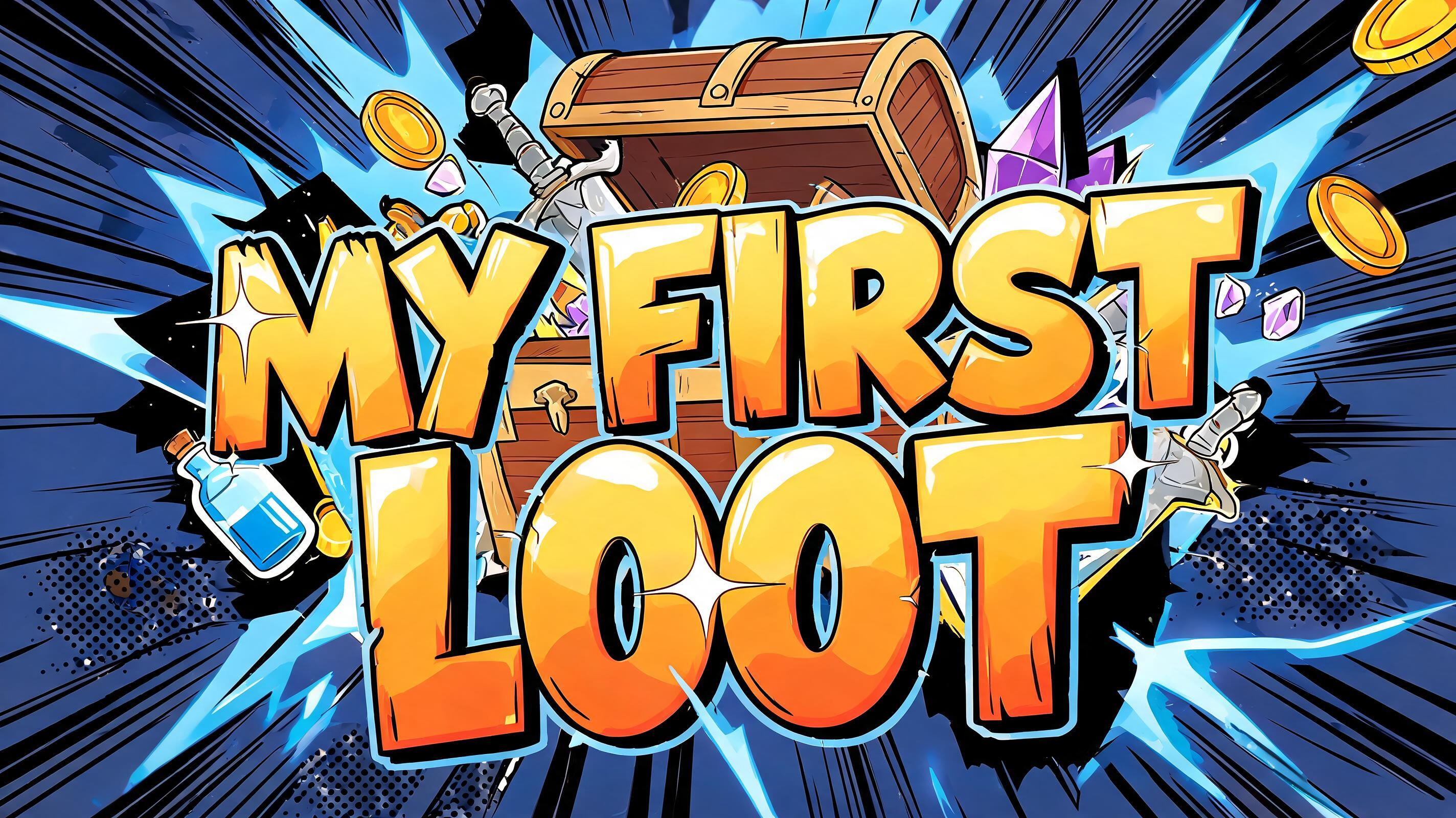
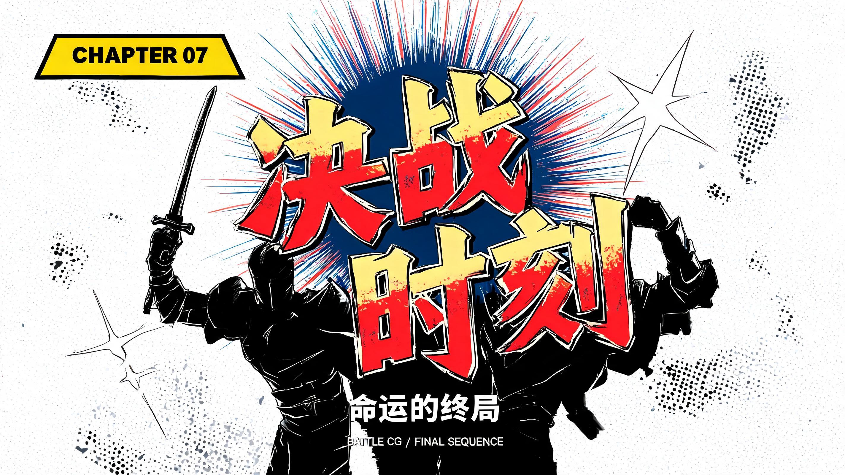
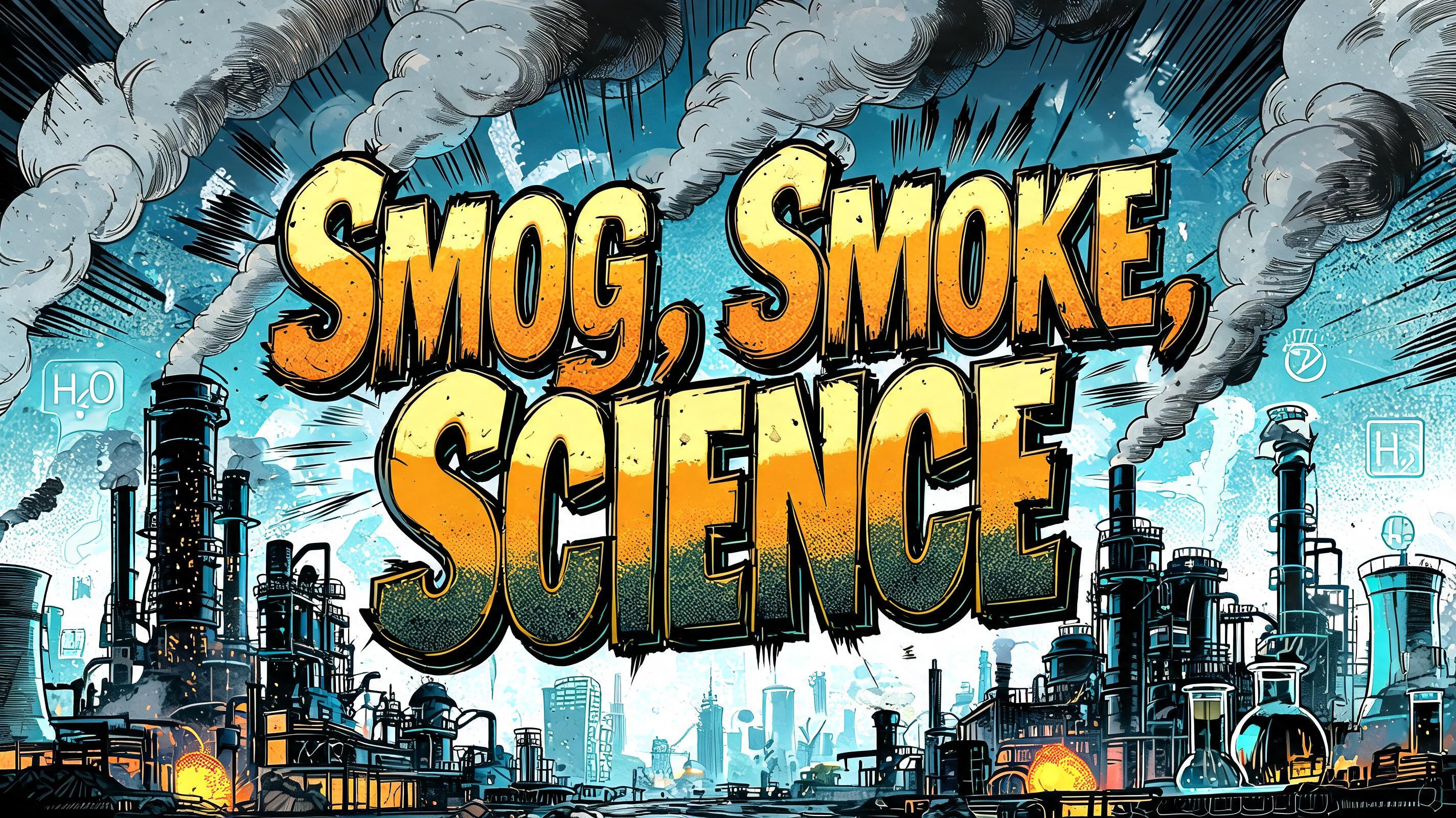
「makishi anime」は FontVibe AI で作成したアニメの文字エフェクトです。少年マンガのタイトル文字。手描きの太い黒フチ、ハイライトと影をくっきり分けたセルシェーディング、勢いよく傾いた文字と、白地に放射状の集中線。
rendered as Japanese shounen anime title treatment — bold hand-inked manga lettering with authentic cel-shaded visual energy. Letter construction follows classic Shonen Jump title card standards: thick black ink outline with natural brush-weight variation defining each letter boundary; flat cel-shading fill with three hard-edge zones — bright highlight zone on upper letter face, highly saturated primary color zone at center, deep shadow zone at lower edge; all zone boundaries knife-edge hard, zero gradient blur, pure flat offset-print ink physics. Energy signature: high-contrast color + thick ink outline = letters that look physically printed on manga paper. The typographic language of Dragon Ball, Naruto, One Piece, Demon Slayer, Jujutsu Kaisen title cards — maximum manga kinetic energy, iconic and immediately recognizable as Japanese anime title typography. LETTERFORM PRIORITY: when the chosen font carries its own treatment, that font's letterform shapes take priority and own the letters; this style governs the inked manga outline, the three-zone cel-shading and the kinetic energy. FALLBACK MATERIAL: if the font carries no material of its own, render the letters as bold hand-inked shounen title lettering with a thick black brush outline and hard three-zone cel-shading. COLOR PRIORITY: keep the font's own colors if specified; otherwise a high-saturation primary fill with hard highlight and shadow zones. Anime series title card for the rendered text “makishi anime” — “makishi” as the dominant hero line, with “anime” smaller beneath it as a compact subtitle, stacked and centered with a lively upward tilt. Saturated electric cyan, hot magenta, and sun-yellow cel-shaded color zones race across the title faces: brilliant upper highlights, intense midtone color, and deep indigo lower shadows, separated by razor-sharp hard edges. Every character is enclosed in a thick, expressive black ink contour with brush-weight variation, plus small offset ink accents that suggest hand-printed manga energy. Behind the lettering, a midnight violet manga panel sky erupts with dense radial speed lines, jagged starburst impact marks, scattered halftone dots, and a concentrated white-yellow energy flare at the baseline. Add a few angular cyan lightning streaks and magenta action slashes around the outer edges, never obstructing the words. The title occupies roughly 78% of the frame width with clean breathing room around its silhouette, delivering a high-energy shounen anime opening-card mood, crisp flat ink colors, dramatic contrast, and iconic chapter-title impact.
用途: アニメ風フォント
2026年10月25日に生成 · 1824 × 1024 · JPEG · OpenAI GPT-Image-2.5 Sunburst · 制作者がシェア · 商用利用無料(CC BY 4.0)



