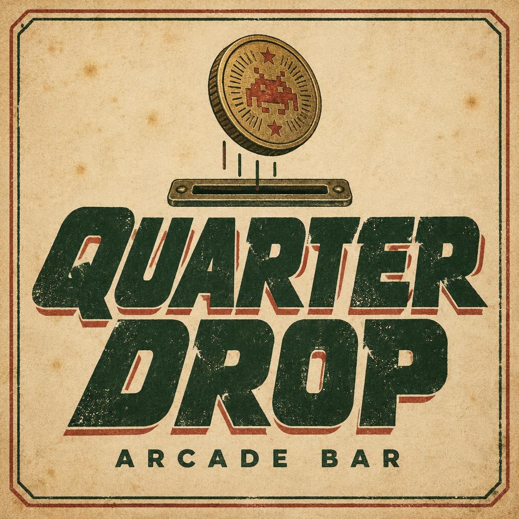
QUARTER DROP ARCADE BAR - ヴィンテージ Text Effect


この作品と同じ OpenAI GPT-Image-2.5 Sunburst を使用 · 15 クレジット


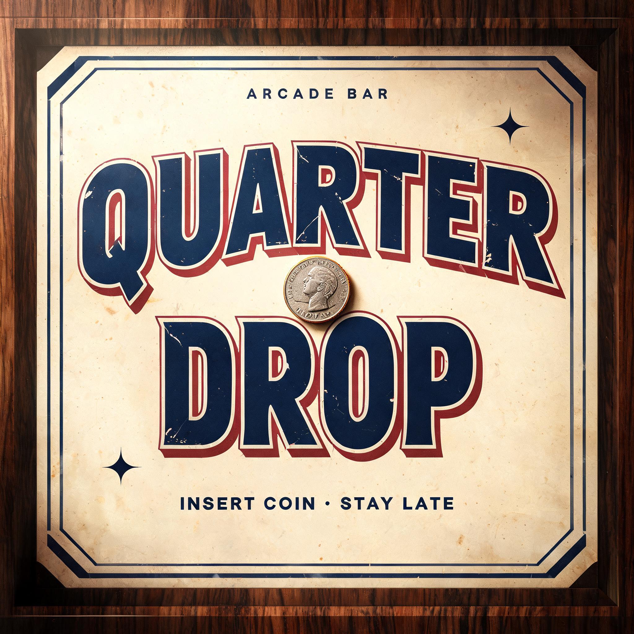
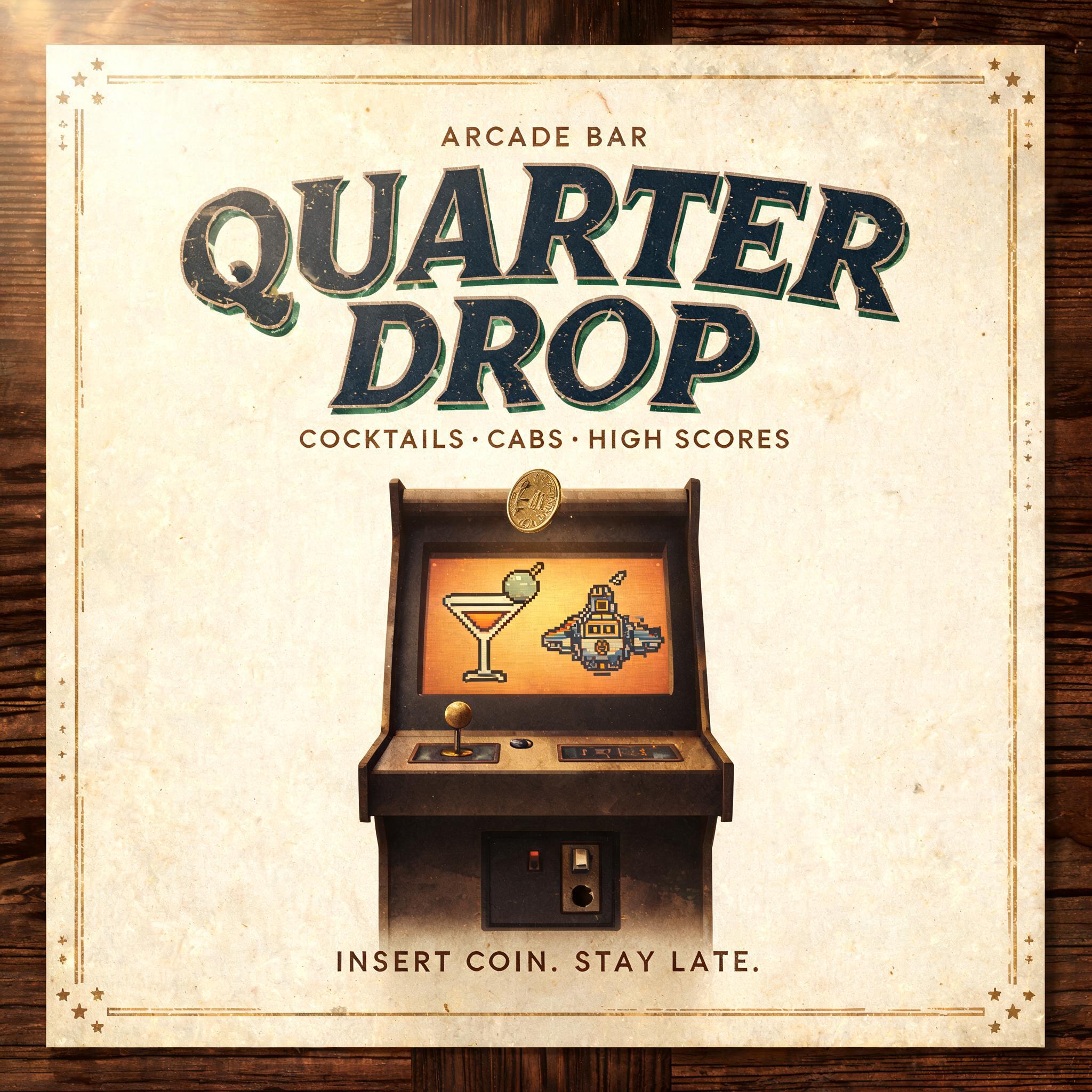
「QUARTER DROP ARCADE BAR」は FontVibe AI で作成したヴィンテージの文字エフェクトです。インクがわずかにかすれる活版でクリーム色のコットンカードに押し込んだセリフ体大文字。古い印刷機の版盤に置かれ、金属活字が散らばります。
Create a finished square logo lockup for the arcade bar named exactly “QUARTER DROP”. Set the headline on two centered lines, “QUARTER” above “DROP”, large and unmistakably dominant. Use broad, bold 1980s display lettering with confident wide proportions, dramatic diagonal-cut terminals, open counters, a slight forward lean and subtly perspective-compressed baselines. Give the letters a deep forest-green, softly broken letterpress impression in aged cotton paper; the lettering itself should show ink grain, tiny worn gaps and shallow pressed edges, not neon or glossy effects. Place a small illustrated brass arcade token above the title, caught just over a simple coin slot to suggest a quarter dropping in. Render it in muted antique gold with engraved radial lines and restrained faded-red details. Set the exact descriptor “ARCADE BAR” centered beneath the headline in small, widely spaced forest-green capitals. Use a warm cream paper ground with faint foxing, paper grain and soft amber illumination; add a restrained faded-red offset shadow to the headline and a thin, slightly worn heritage label border. Keep the overall palette muted and time-softened, with strong contrast for readability. Carefully balance the centered emblem, token, two-line name and descriptor with clean breathing room. The result should feel like an authentic vintage arcade-bar sign reinterpreted with unmistakable eighties arcade lettering. Render only these exact words: “QUARTER DROP” and “ARCADE BAR”. No other text, numbers, logos, or extra lettering.
用途: 80年代フォントジェネレーター
2026年10月25日に生成 · 1024 × 1024 · JPEG · OpenAI GPT-Image-2.5 Sunburst · レイアウト:Token Sign · 制作者がシェア · 商用利用無料(CC BY 4.0)


