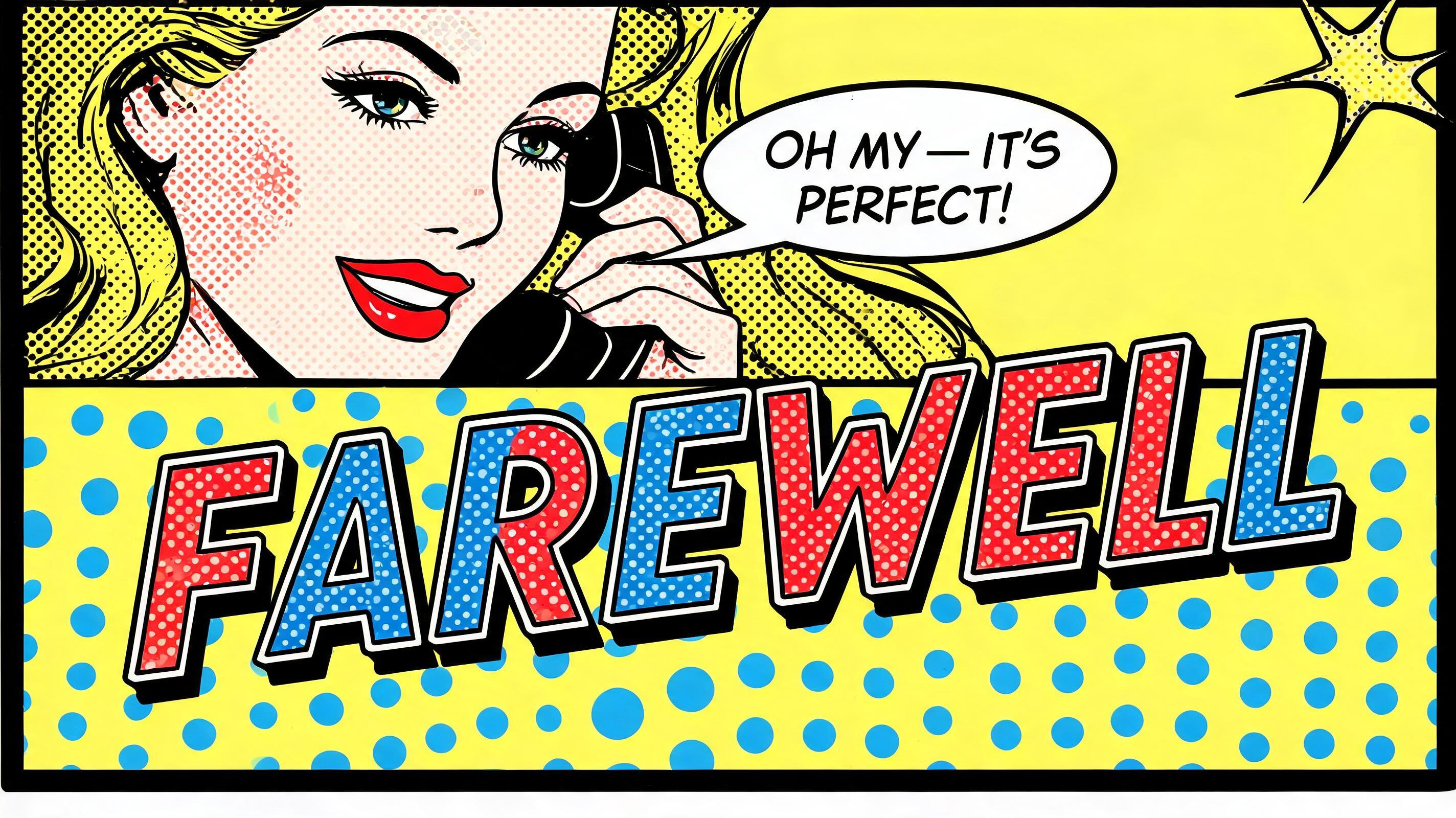
Farewell - ポップアート Text Effect


この作品と同じ BytePlus Seedream 5.0 を使用 · 15 クレジット








「Farewell」は FontVibe AI で作成したポップアートの文字エフェクトです。赤と黄のベタにベンデイドットを詰めたリキテンスタイン風コミック大文字。太い黒フチと硬いドロップシャドウ、青い水玉地の爆発形から飛び出します。
rendered in Roy Lichtenstein pop art style. Thick uniform black outline traces every letter contour and inner stroke — consistent weight, hard edge, zero softness. Letter fills use large Ben-Day halftone dots: dots individually visible, primary colors only (flat red, flat yellow, flat blue, flat white — no gradients, no metallics, no pastels). Graphic drop shadow offset 45° lower-right, solid black, hard edge. Entire image: zero blending, zero photographic realism, flat silk-screen aesthetic. High contrast, comic book energy. Ben-Day dots never touch the outline — always a bare white gap between dot fill and outline inner edge. No CMYK color mixing. 'Farewell' in bold pop art comic lettering centered in frame at 70% width, 16:9. Letters: thick uniform black outline, alternating flat red and flat blue letter fills, each fill area packed with large visible Ben-Day halftone dots in contrasting primary colors. Hard black 45° drop shadow, hard edge. Background: a large comic book panel layout — upper two-thirds: a Roy Lichtenstein-style illustration of a glamorous woman (blonde, graphic, flat colors, Ben-Day dot skin tones, thick black outlines) looking toward the text with an expression of delight, holding a phone, a small speech bubble near her reads 'Oh my — it's PERFECT!' in tiny comic lettering. Lower third: flat yellow field with scattered Ben-Day dots in blue, the 'Farewell' text floats above this zone. Bold black panel border around the entire frame. Small decorative starburst in corner. The illustration is clearly Lichtenstein-homage — flat, graphic, no photographic realism. The brand name feels like a pop art headline: bold, iconic, unforgettable.
2026年10月27日に生成 · 2848 × 1600 · JPEG · BytePlus Seedream 5.0 · 制作者がシェア · 商用利用無料(CC BY 4.0)


