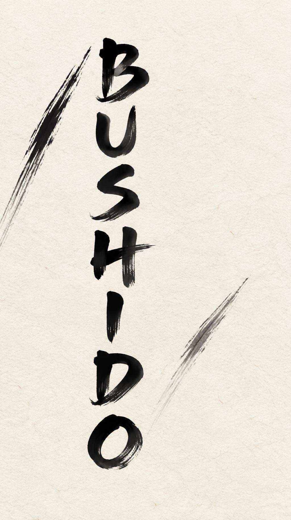
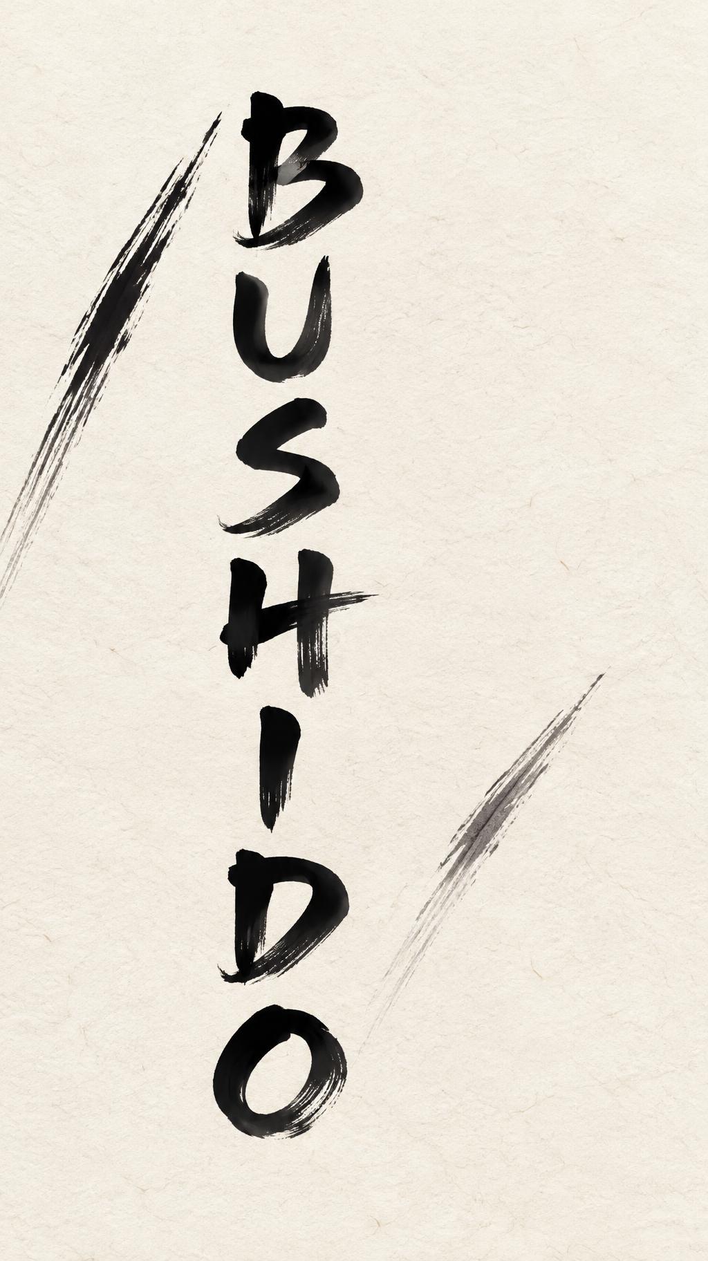
BUSHIDO - 日本の墨筆 Text Effect


この作品と同じ OpenAI GPT-Image-2.5 Sunburst を使用 · 15 クレジット











「BUSHIDO」は FontVibe AI で作成した日本の墨筆の文字エフェクトです。日本の書道の墨筆による筆致をラテン文字に応用したスタイルです。深い墨黒のインクに本格的な筆のエネルギー、一方向に制御された筆運び、そして和紙の雰囲気が宿ります。日本食レストランのブランディング、タトゥーデザイン、アニメ、武道、文化系プロジェクトに最適です。
Create a finished vertical title artwork on warm cream-white washi paper with fine visible fibers. The only text is exactly “BUSHIDO”. Set it vertically, one upright Latin character per line, reading top to bottom: B, U, S, H, I, D, O. Keep every letter unmistakably legible. Use masterful shodo display lettering: bold strokes with strong thick-to-thin contrast, harmonious proportions, deliberate spacing, and decisive single-pass brushwork. The ink is matte sumi, near-black and densest through each stroke’s core, softly absorbed at the edges with restrained dry-brush texture and occasional charcoal-gray fading at the stroke ends. Place the column just left of center, occupying about 40% of the canvas width and 72% of its height. Leave broad, quiet areas of empty paper around it. Add two purposeful, fast diagonal sumi brush slashes in the open space beside the letters: one dark, loaded entry tapering into a pale gray pull-away, the other shorter and lighter. They reinforce the title’s cutting energy without crossing or obscuring any character. Soft, even north-facing light; no cast shadows, props, border, seals, symbols, extra text, or decorative embellishment. Portrait 9:16.
用途: Samuraiフォント
2026年10月28日に生成 · 1024 × 1824 · JPEG · OpenAI GPT-Image-2.5 Sunburst · レイアウト:Vertical Ma Column · 制作者がシェア · 商用利用無料(CC BY 4.0)



