BED TIME GOOD MINUTES? - グランジ Text Effect


この作品と同じ OpenAI GPT-Image-2.5 Sunburst を使用 · 15 クレジット

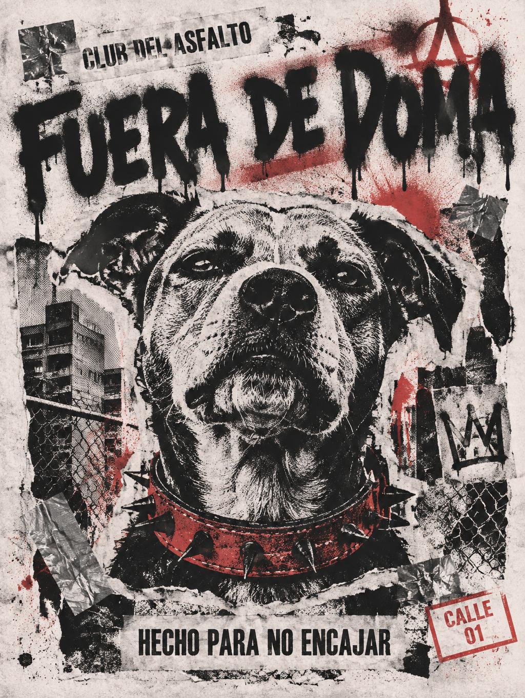
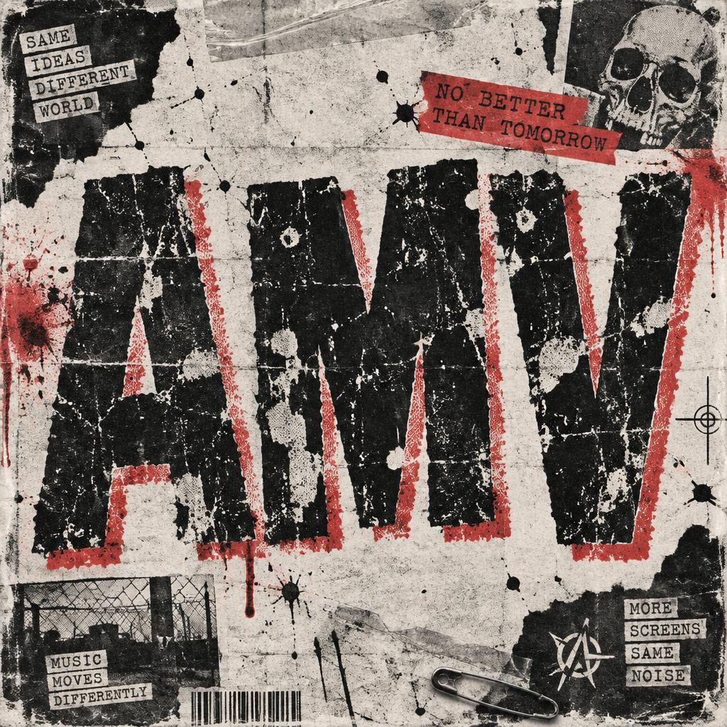
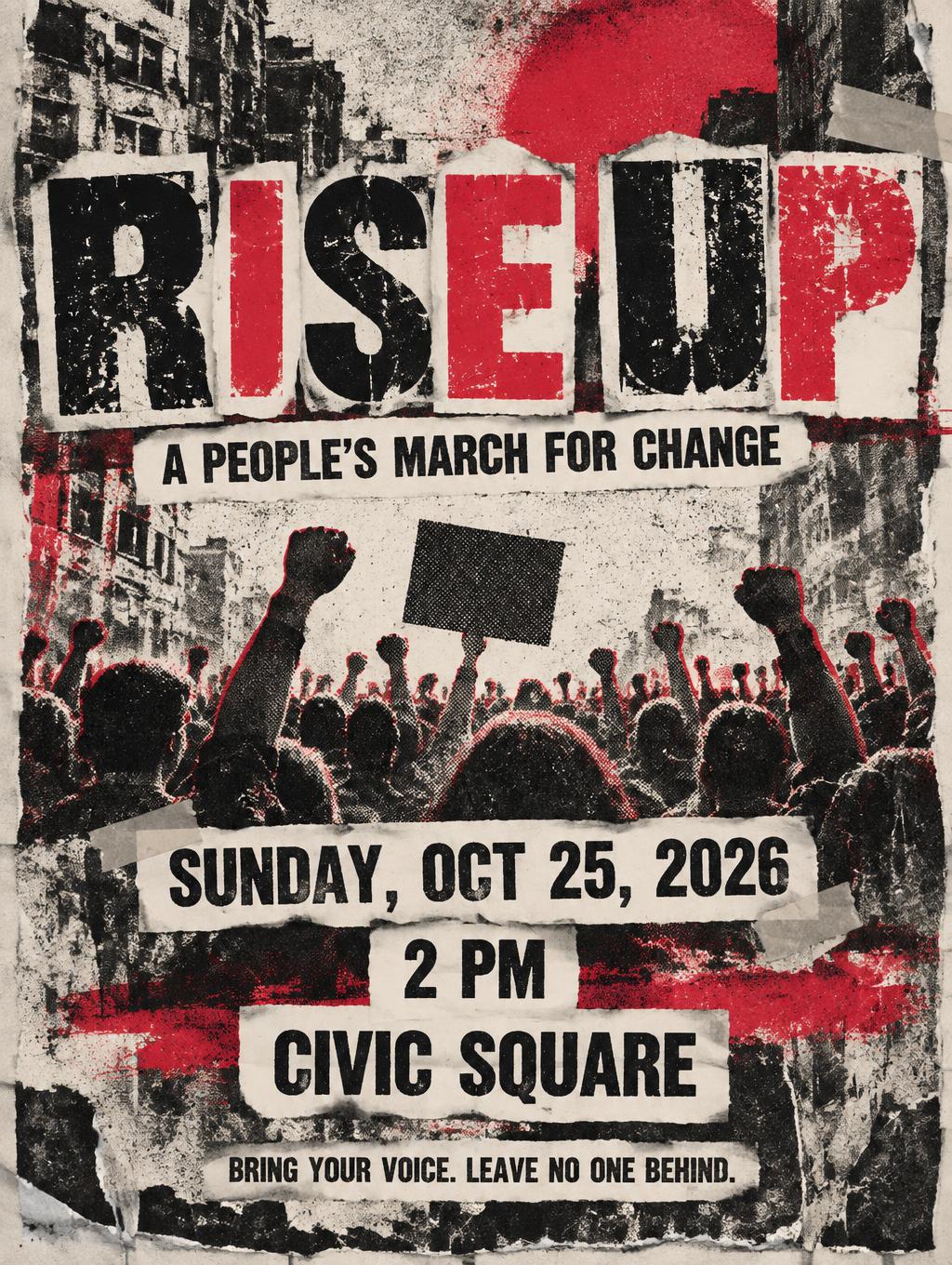
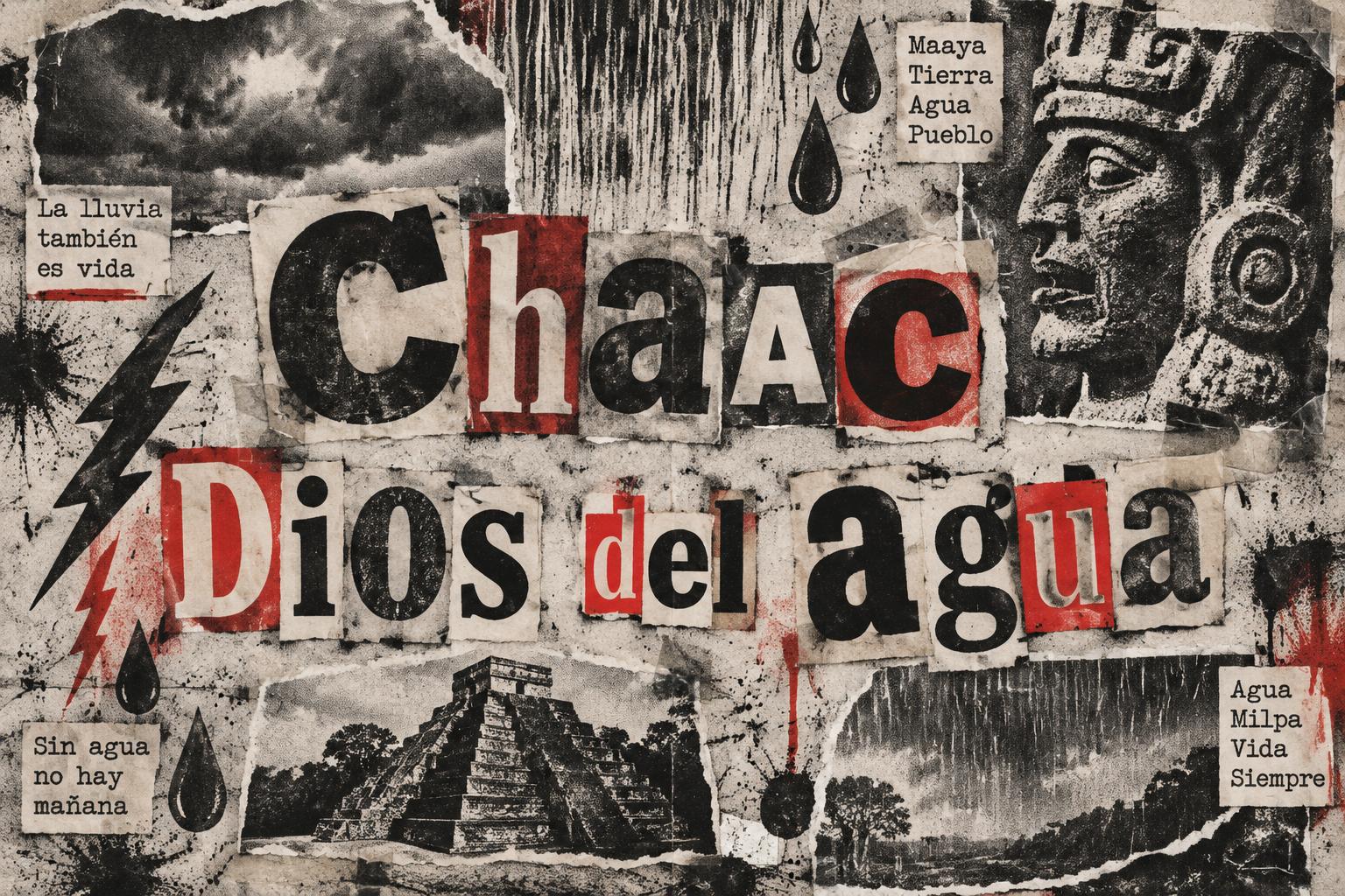
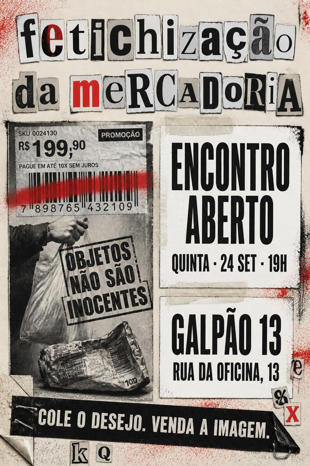
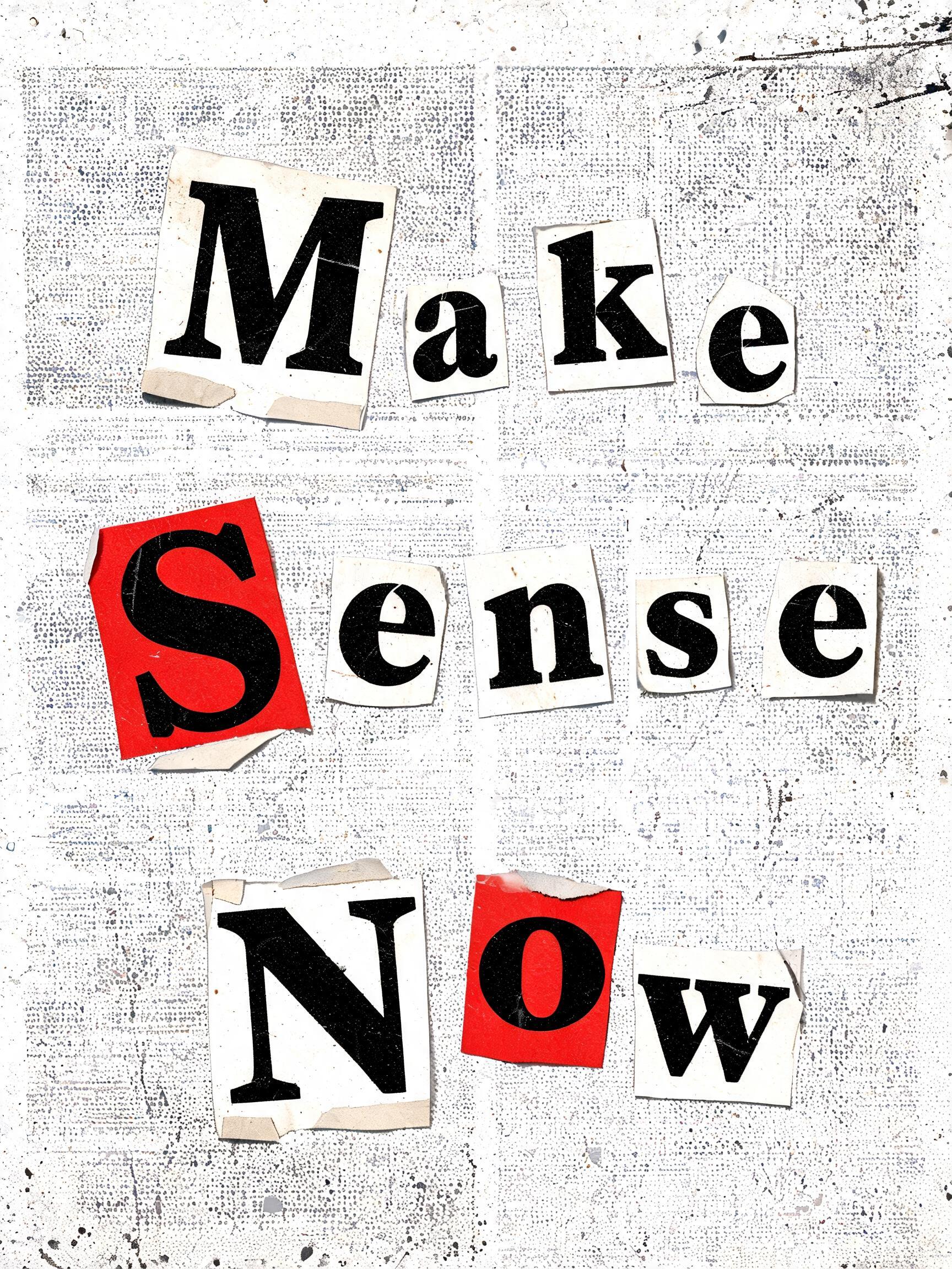
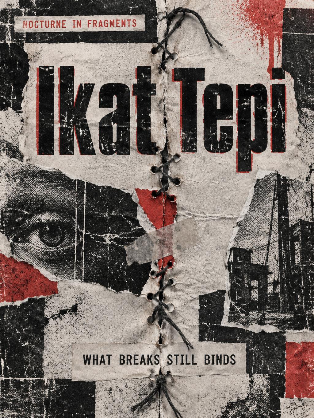
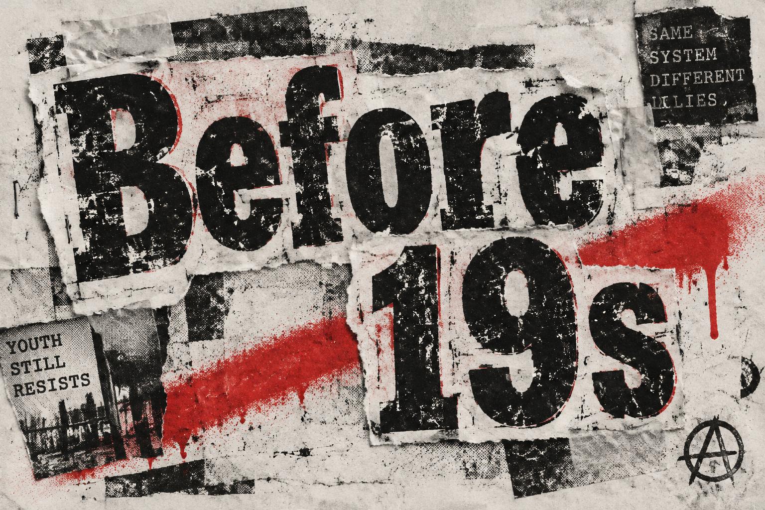
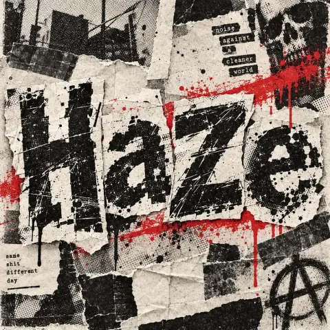
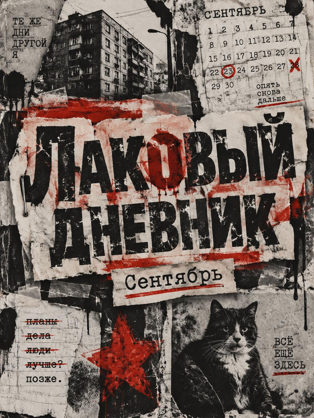
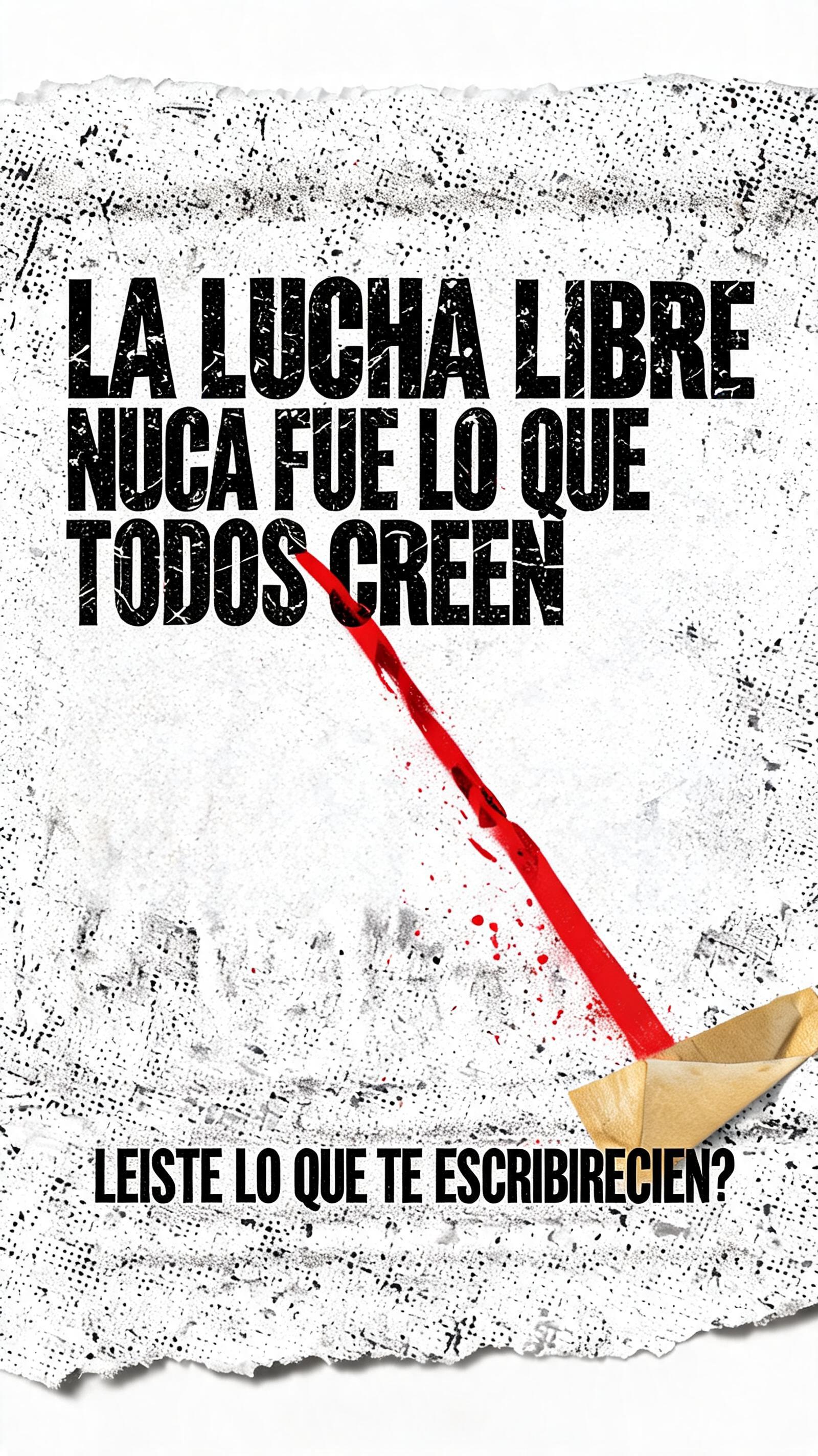
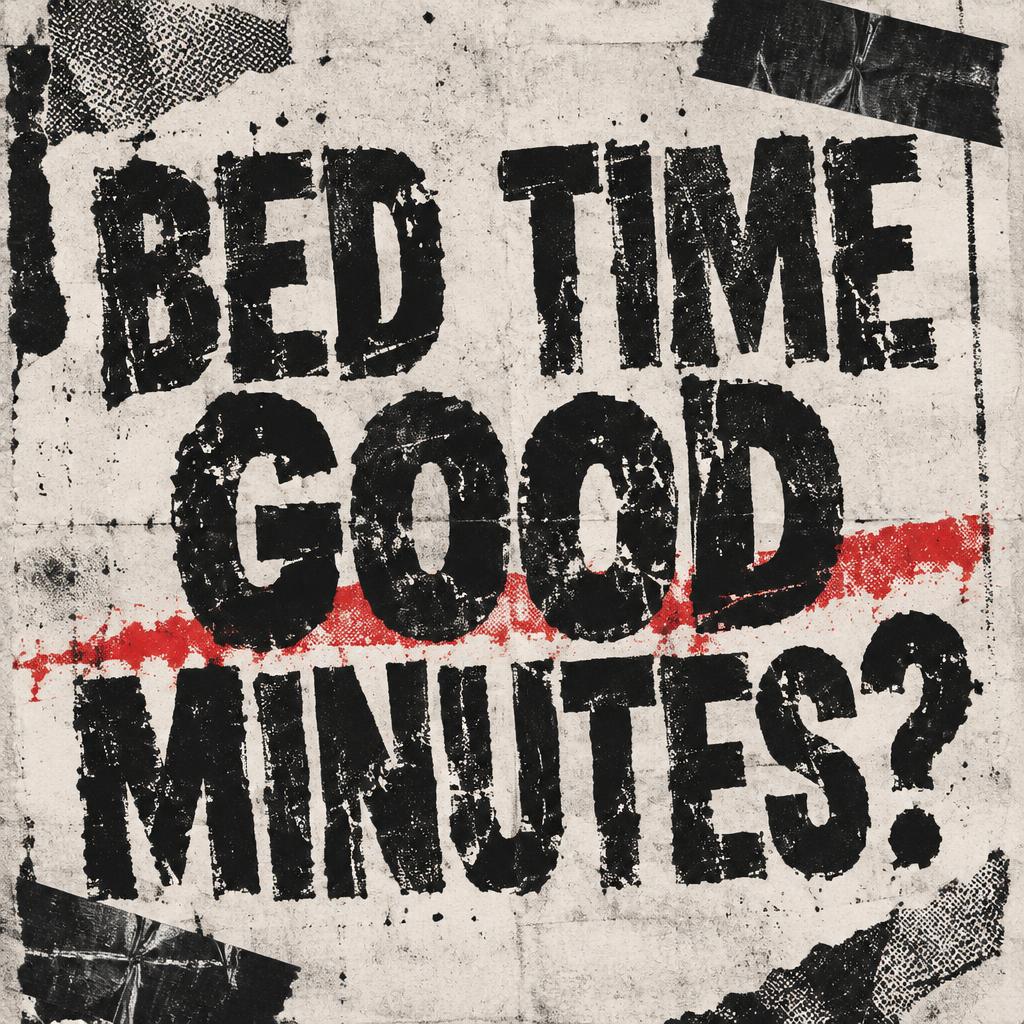
「BED TIME GOOD MINUTES?」は FontVibe AI で作成したグランジの文字エフェクトです。さまざまな新聞の活字を切り抜いた脅迫状風の文字。コピーした粗い紙にテープで貼り、ハーフトーンの粒、破れた縁、パンクな赤をひとさし。
a photocopied punk-zine world. PRINT: everything looks run through a cheap copier and pasted up by hand — coarse halftone dot screens, heavy black ink that bleeds and clogs, low-ink dropout and roller streaks, Xerox speckle and nth-generation blur on raw off-white newsprint and photocopy paper. TEXTURE: torn and scissor-cut paper edges, strips of tape, lifted corners, creases, scratches, smears and spray-paint overspray — the evidence of a hand working under pressure. LIMITED PALETTE: the cheap two-color reproduction palette — high-contrast black ink and raw off-white paper, with one punchy punk RED as the accent (occasionally a hit of acid yellow), printed slightly off-register. ENERGY: a layered cut-and-paste collage grammar, asymmetric and disrupted like a stapled zine. LETTERFORM PRIORITY: when the chosen font carries its own material or treatment (ransom-note collage, riso halftone, distressed, spray, stamp, ink-bleed), that font treatment takes absolute priority and owns the letters; this style governs the paper, print degradation, palette and surrounding collage. FALLBACK MATERIAL: if the font carries no material of its own, print the letters in heavy high-contrast black ink on raw off-white paper with photocopy grain, ink bleed and torn edges, so the grunge zine feel always reads. A square 1:1 photocopied punk-zine graphic on raw off-white paper. Keep the exact wording “BED TIME GOOD MINUTES?” as the only text, arranged in three compact lines—“BED TIME” above “GOOD” above “MINUTES?”—with the question mark clearly visible. Make the lettering the dominant element, large and tightly grouped, slightly disrupted by rough print texture without obscuring any characters. Surround it with a sparse cut-and-paste collage of torn paper scraps, a crooked strip of black tape, small scratches, and a single punchy punk-red slash. Use high-contrast black ink with coarse halftone dots, Xerox speckle, uneven ink bleed, roller streaks, and a few low-ink dropouts on the off-white ground; let the red print sit slightly off-register. Keep the composition asymmetric and handmade, with lively irregular edges and enough clean negative space around the words for instant legibility. No extra words, imagery, or polished digital finish; raw photocopied zine energy.
2026年10月30日に生成 · 1024 × 1024 · JPEG · OpenAI GPT-Image-2.5 Sunburst · 制作者がシェア · 商用利用無料(CC BY 4.0)


