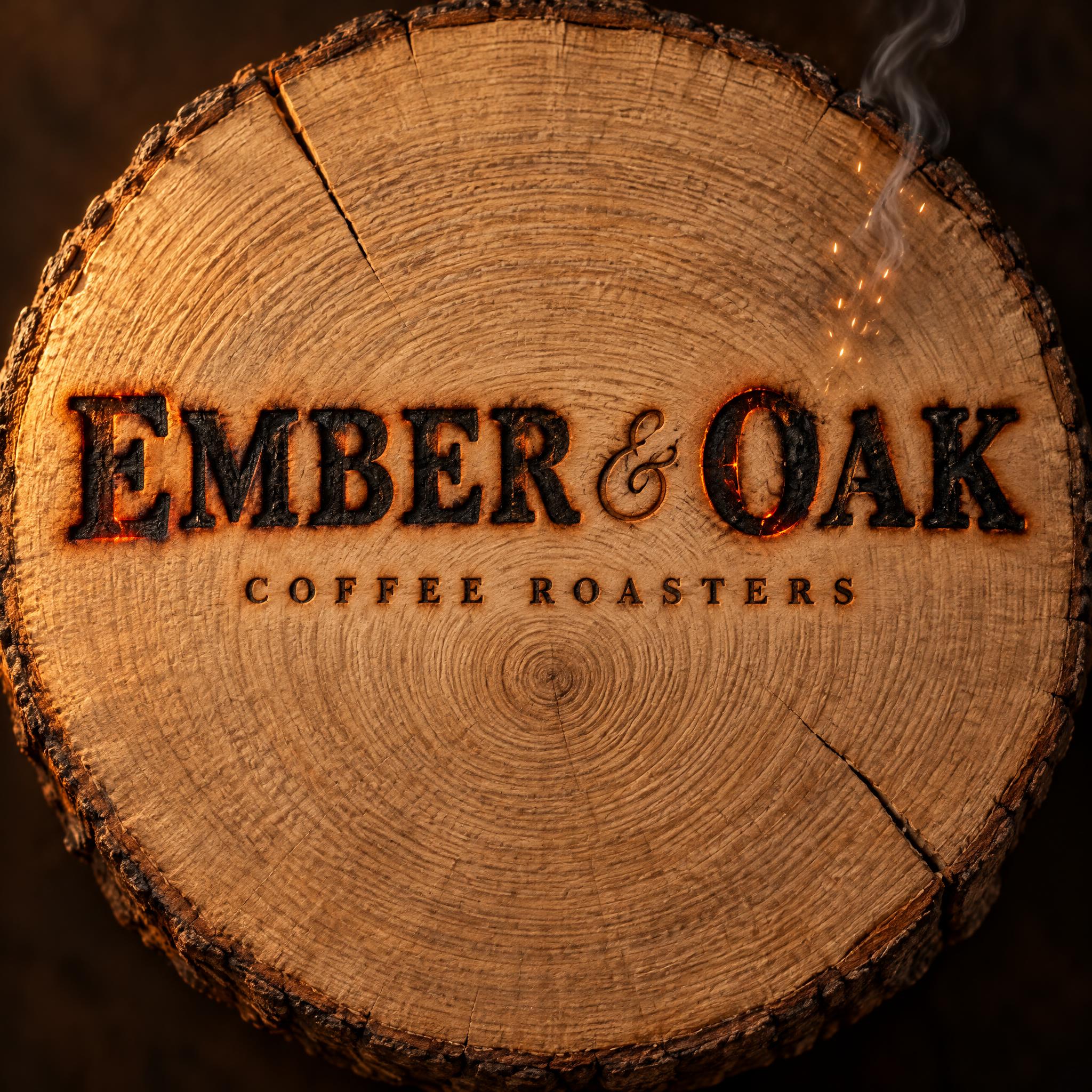
EMBER & OAK COFFEE ROASTERS - Custom-1 Text Effect
この作品と同じ OpenAI GPT-Image-2.5 Sunburst を使用 · 32 クレジット


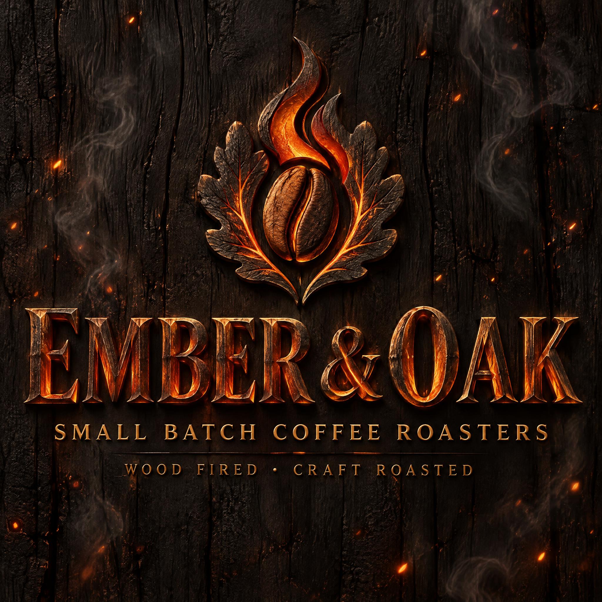


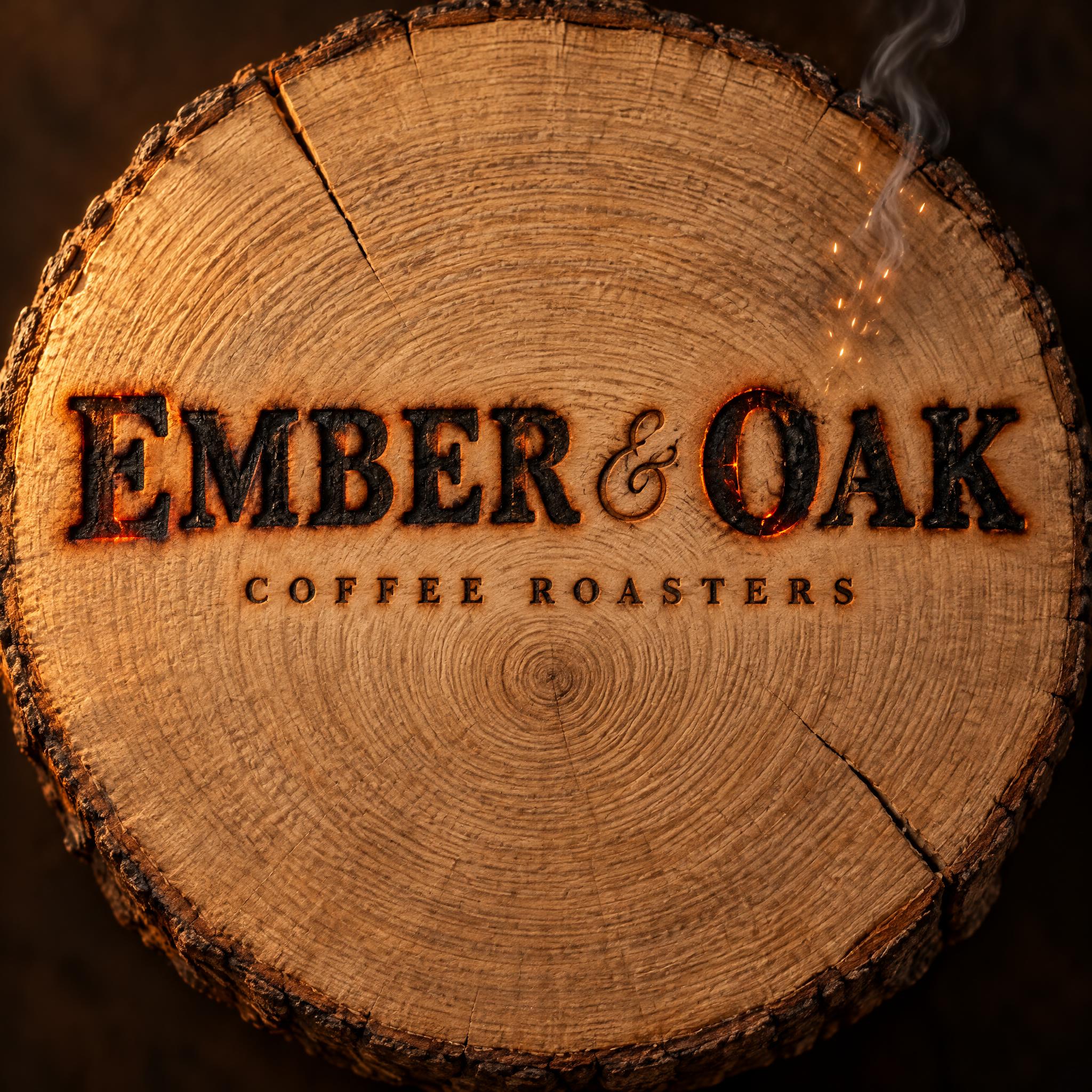
「EMBER & OAK COFFEE ROASTERS」は FontVibe AI で作成したCustom-1の文字エフェクトです。
A finished logo wordmark for a specialty coffee roastery, square format: the brand name branded into a slab of oak with a hot iron. SUBJECT: a thick round cross-section of pale end-grain oak (raw oak #B98B5E), seen almost straight on. It fills nearly the whole square with a slim margin of dark umber shadow (#1A120D fading to deep brown) all around. Fine concentric growth rings in toasted grain #6E4A2E radiate from a centre slightly below the middle. Two or three thin radial cracks run in from the bark edge. The surface is matte and finely textured. HEADLINE, burned into the wood, exactly: "EMBER & OAK". It is centred on the vertical axis in a wide band just above the middle of the round, spanning roughly three quarters of the width and clearly dominant. It uses sturdy wide old-style serif capitals at medium-heavy weight, with low stroke contrast, short bracketed slab-like serifs, open counters and generous letterspacing. The ampersand is a classic flourished italic-style ampersand, drawn noticeably lighter than the capitals. Every stroke is a recessed cavity a few millimetres deep. Its floor is matte charcoal black #1A120D with crackled carbon texture, its outer edges are soft and scorched, and a soft brown scorch halo surrounds each letter. Along the rim where char meets raw grain, a thin seam of live ember #FF8A1F still glows, brightest in the E's and the O. The letter silhouettes stay crisp, solid and highly legible: dark letters on pale wood. SUBHEAD, burned shallower directly beneath it, exactly: "COFFEE ROASTERS". It is set in the same serif as small capitals, very widely tracked and centred on the same axis, running only about half the headline's width with comfortable air between the two lines. It is cleanly singed in dark brown with a faint scorch halo and no ember glow, so it reads quiet and refined. ACCENT: in the upper right of the round, above the end of the headline, a small cluster of tiny spark-gold #FFD27A sparks drifts upward with one thin wisp of grey smoke curling off the hot char. It is delicate and never overlaps the lettering. LIGHT: warm, low raking side light from the left skims across the wood grain, picking out ring ridges and the depth of the burned cavities. The ember seams add their own small orange glow. The round's edges fall gently into the dark umber surround. The hierarchy comes from the scale contrast between the massive burned name and the small refined subhead. The design is calm, centred and handcrafted, limited to char black, oak, toasted brown and ember orange, so it would still read as a strong silhouette when printed small on a coffee bag or cup. No other text, no extra symbols, no illustration beyond the oak round, sparks and smoke.
2026年10月30日に生成 · 2048 × 2048 · JPEG · OpenAI GPT-Image-2.5 Sunburst · レイアウト:センター · 制作者がシェア · 商用利用無料(CC BY 4.0)