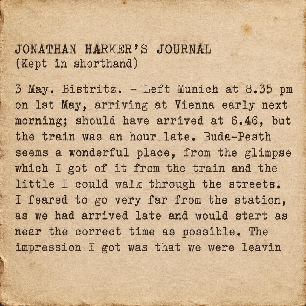
JONATHAN HARKER’S JOURNAL (Kept in shorthand) 3 May. Bistritz. – Left Munich at 8.35 pm on 1st May, arriving at Vienna early next morning; should have arrived at 6.46, but the train was an hour late. Buda-Pesth seems a wonderful place, from the glimpse which I got of it from the train and the little I could walk through the streets. I feared to go very far from the station, as we had arrived late and would start as near the correct time as possible. The impression I got was that we were leavin - タイプライター Text Effect


この作品と同じ OpenAI GPT-Image-2.5 Sunburst を使用 · 15 クレジット


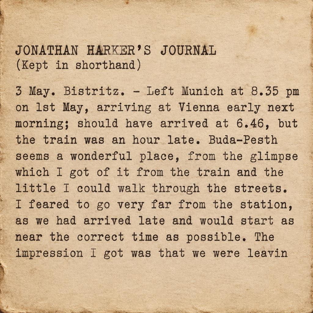
「JONATHAN HARKER’S JOURNAL (Kept in shorthand) 3 May. Bistritz. – Left Munich at 8.35 pm on 1st May, arriving at Vienna early next morning; should have arrived at 6.46, but the train was an hour late. Buda-Pesth seems a wonderful place, from the glimpse which I got of it from the train and the little I could walk through the streets. I feared to go very far from the station, as we had arrived late and would start as near the correct time as possible. The impression I got was that we were leavin」は FontVibe AI で作成したタイプライターの文字エフェクトです。クリーム色の紙に打ち込まれた等幅スラブセリフ。インクの濃淡のむら、リボンの質感、わずかな文字のずれ、柔らかな紙の繊維。
Monospaced typewriter letterforms with authentic mechanical key-strike impressions. Uneven ink distribution — some strokes darker, some lighter, ink thicker at stroke terminals. Aged cream bond paper surface with subtle fiber texture. Vintage Underwood No.5 aesthetic. Warm sepia-tinted black ink. Slightly irregular baseline alignment, individual letter spacing imperfections. Visible ribbon texture on letterforms. Clean vintage typewriter quality. Square 1:1. Typeset the exact text as a compact, left-aligned journal entry on aged cream bond paper, filling most of the frame with narrow margins. Set “JONATHAN HARKER’S JOURNAL” as the first line, followed by a smaller “(Kept in shorthand)” line, then the body text in closely spaced lines beneath, preserving its wording and punctuation: “3 May. Bistritz. – Left Munich at 8.35 pm on 1st May, arriving at Vienna early next morning; should have arrived at 6.46, but the train was an hour late. Buda-Pesth seems a wonderful place, from the glimpse which I got of it from the train and the little I could walk through the streets. I feared to go very far from the station, as we had arrived late and would start as near the correct time as possible. The impression I got was that we were leavin” Warm sepia-black ink carries authentic mechanical key-strike impressions, visibly uneven across each letter: darker, slightly thickened terminals and faintly broken mid-strokes where the typewriter ribbon ran dry. Subtle ribbon grain and shallow ink pressure marks sit in the paper fibers. Individual characters rest on a gently irregular baseline with minor spacing imperfections, preserving a physically typed, human document feel. Soft warm side light reveals the cream paper’s fine pulp texture and softly worn edges. No decorative elements, no additional text. Pure vintage Underwood No.5 typewriter typography.
2026年10月30日に生成 · 1024 × 1024 · JPEG · OpenAI GPT-Image-2.5 Sunburst · 制作者がシェア · 商用利用無料(CC BY 4.0)


