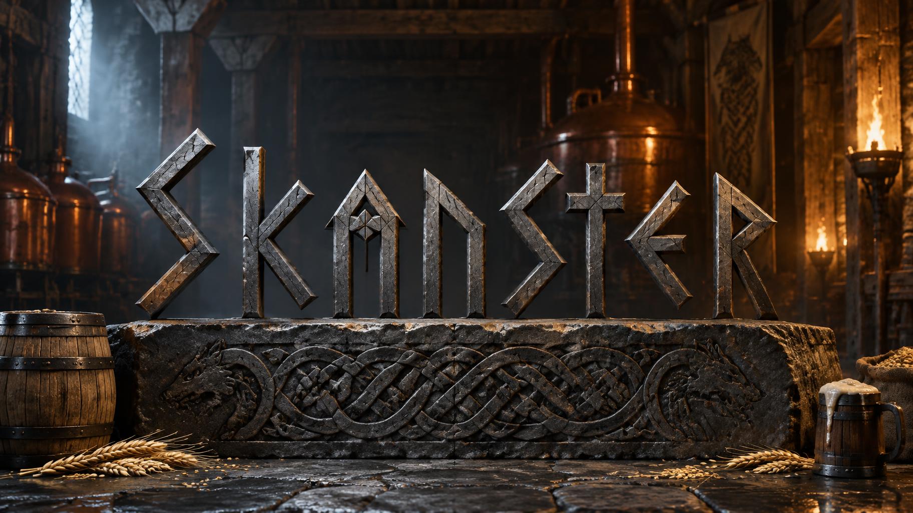
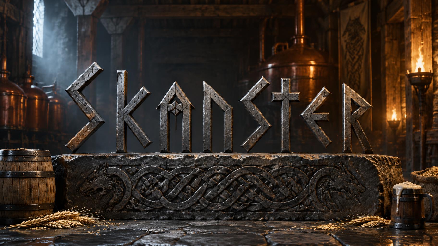
Skanster - バイキング Text Effect

この作品と同じ OpenAI GPT-Image-2.5 Sunburst を使用 · 15 クレジット
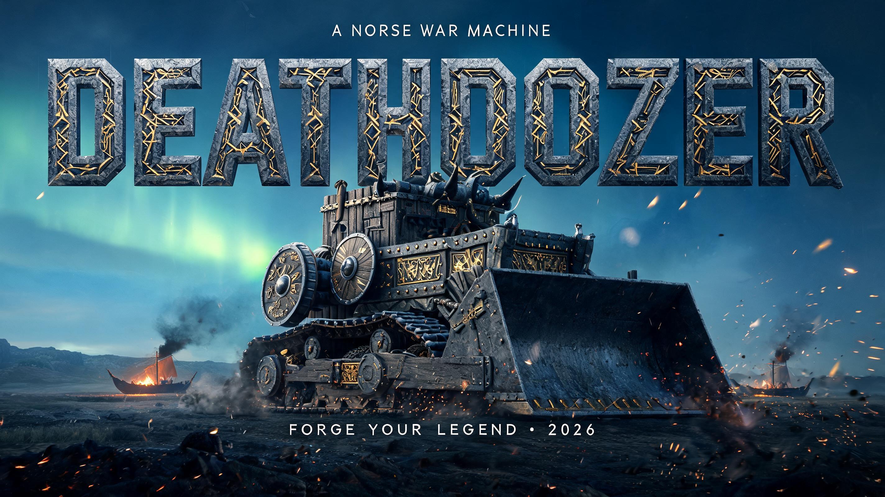
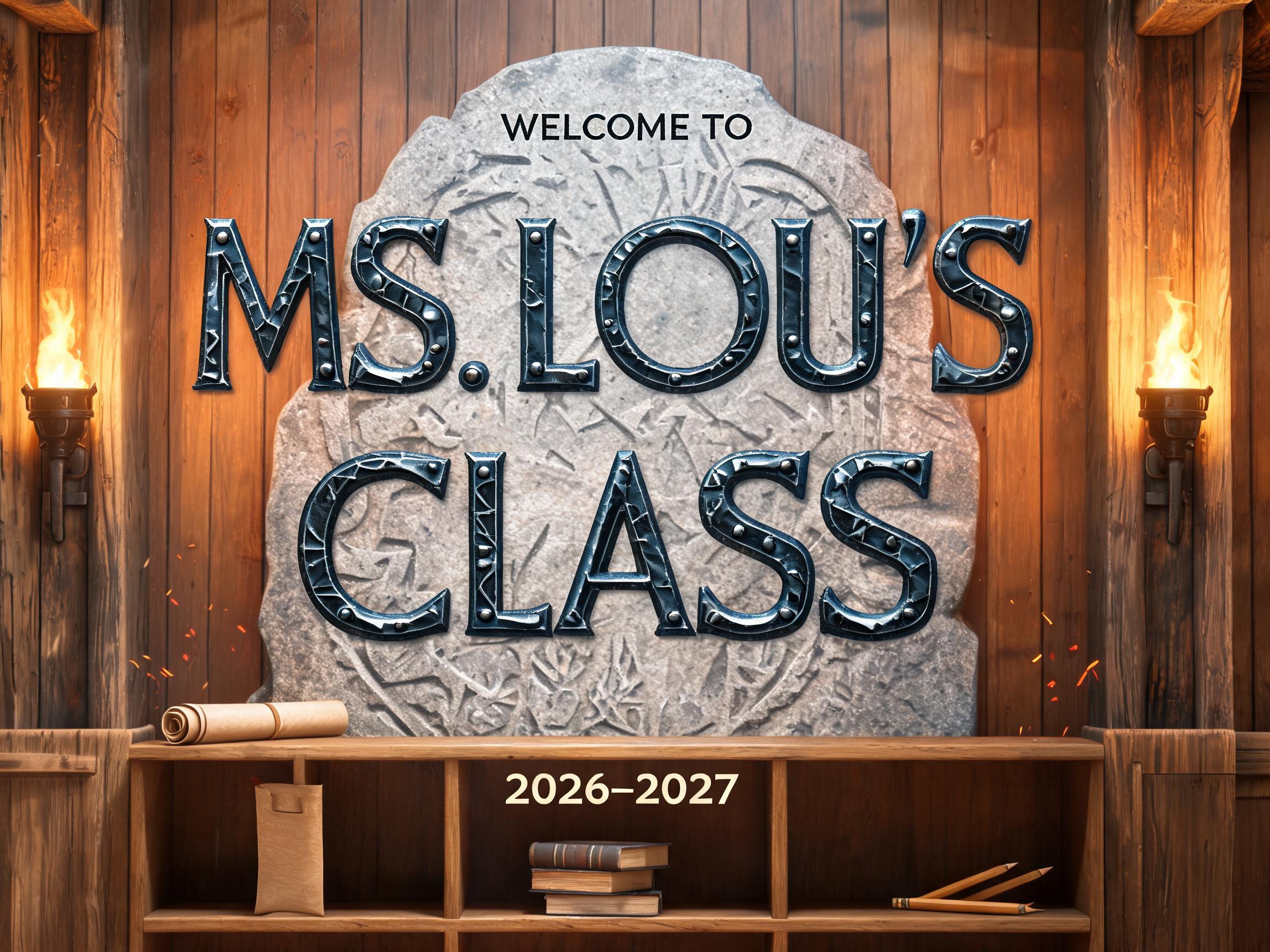

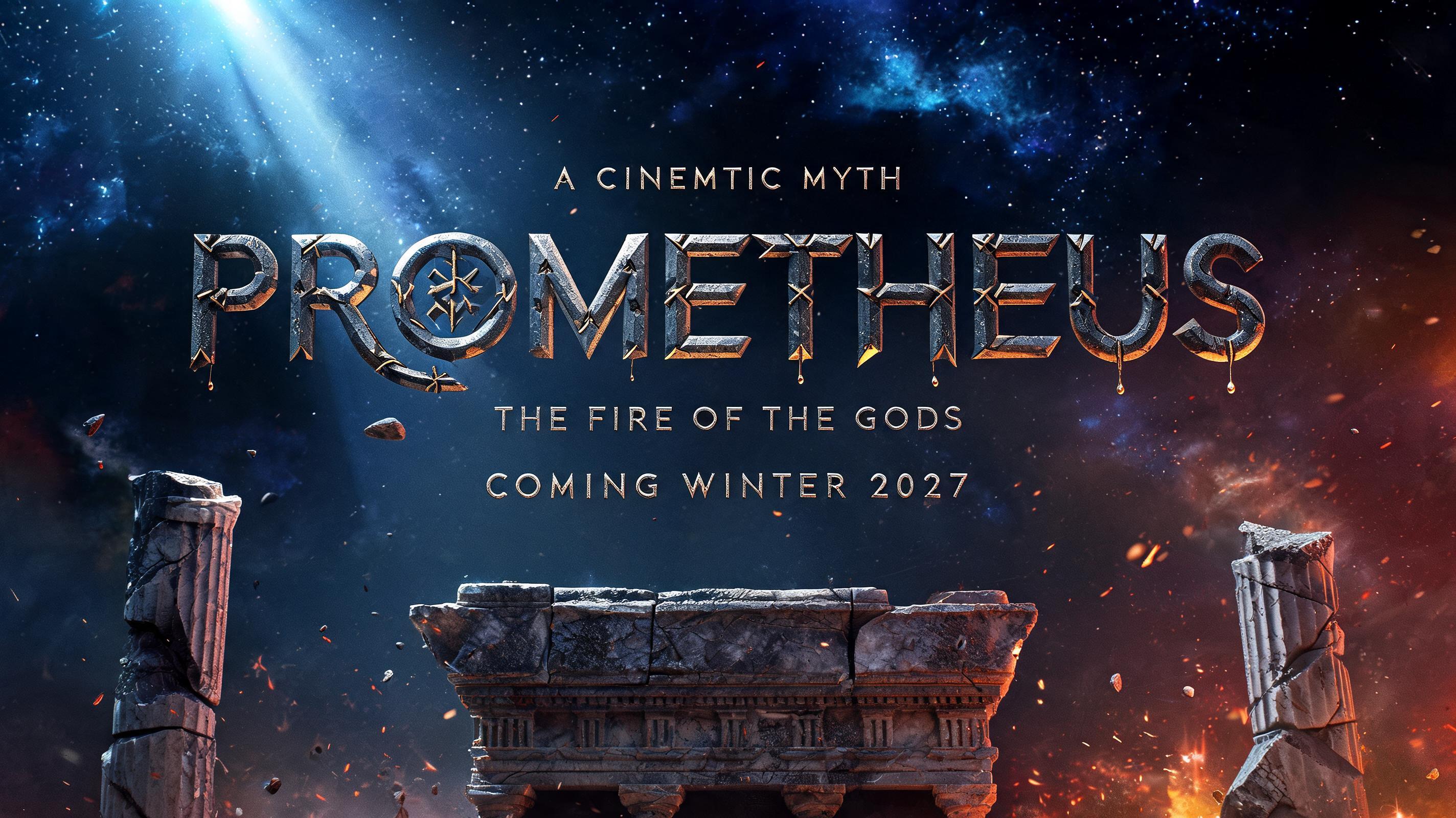
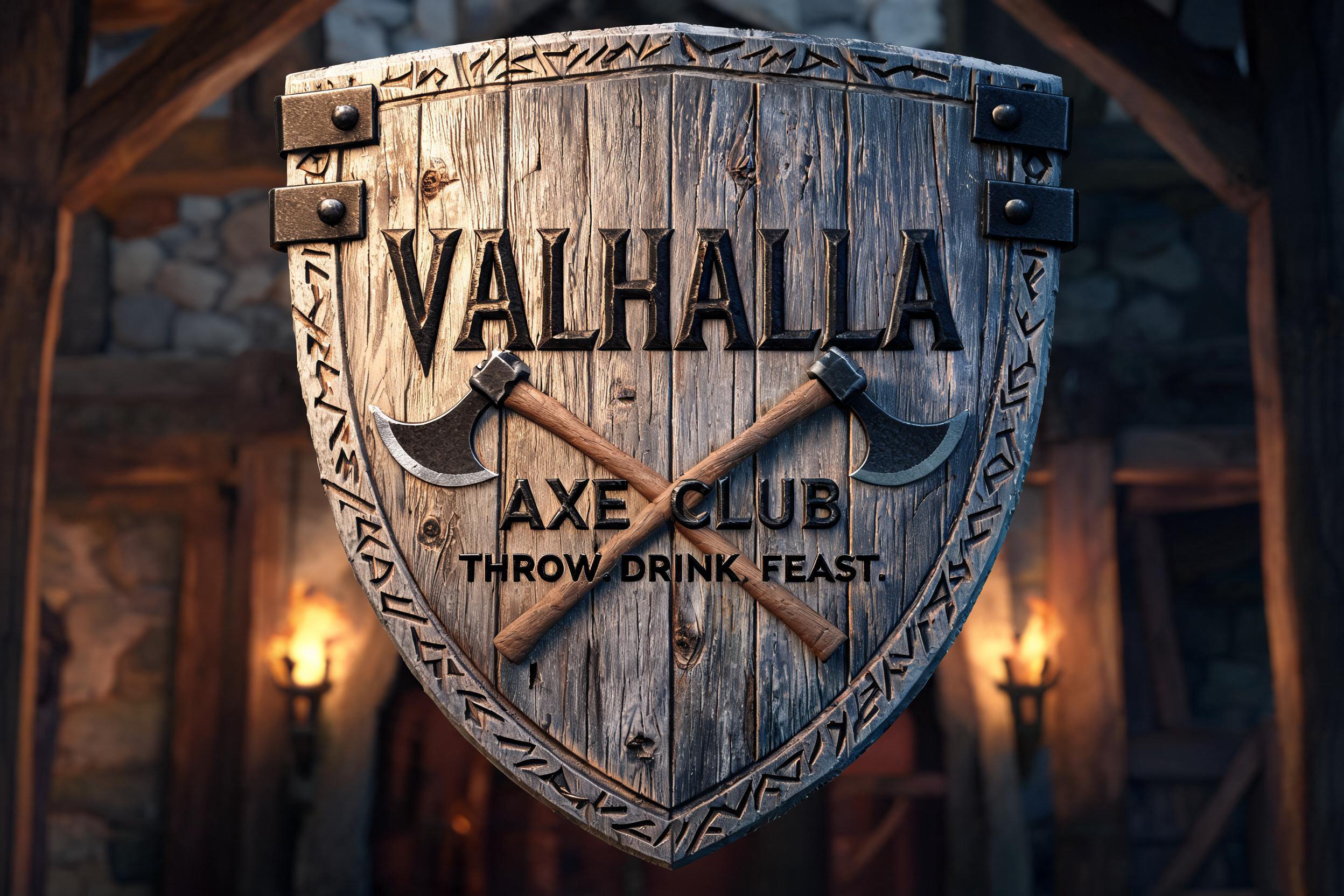
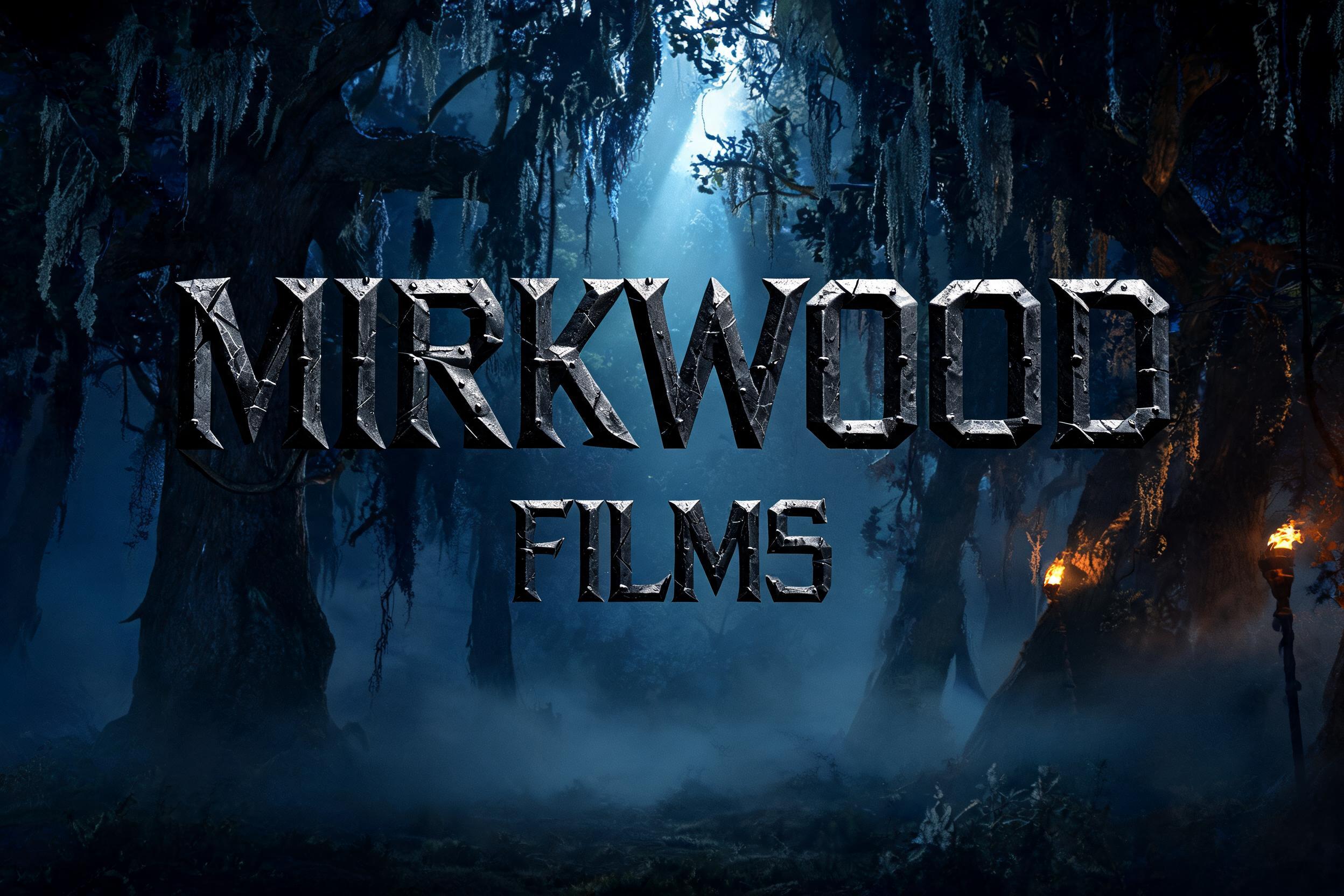
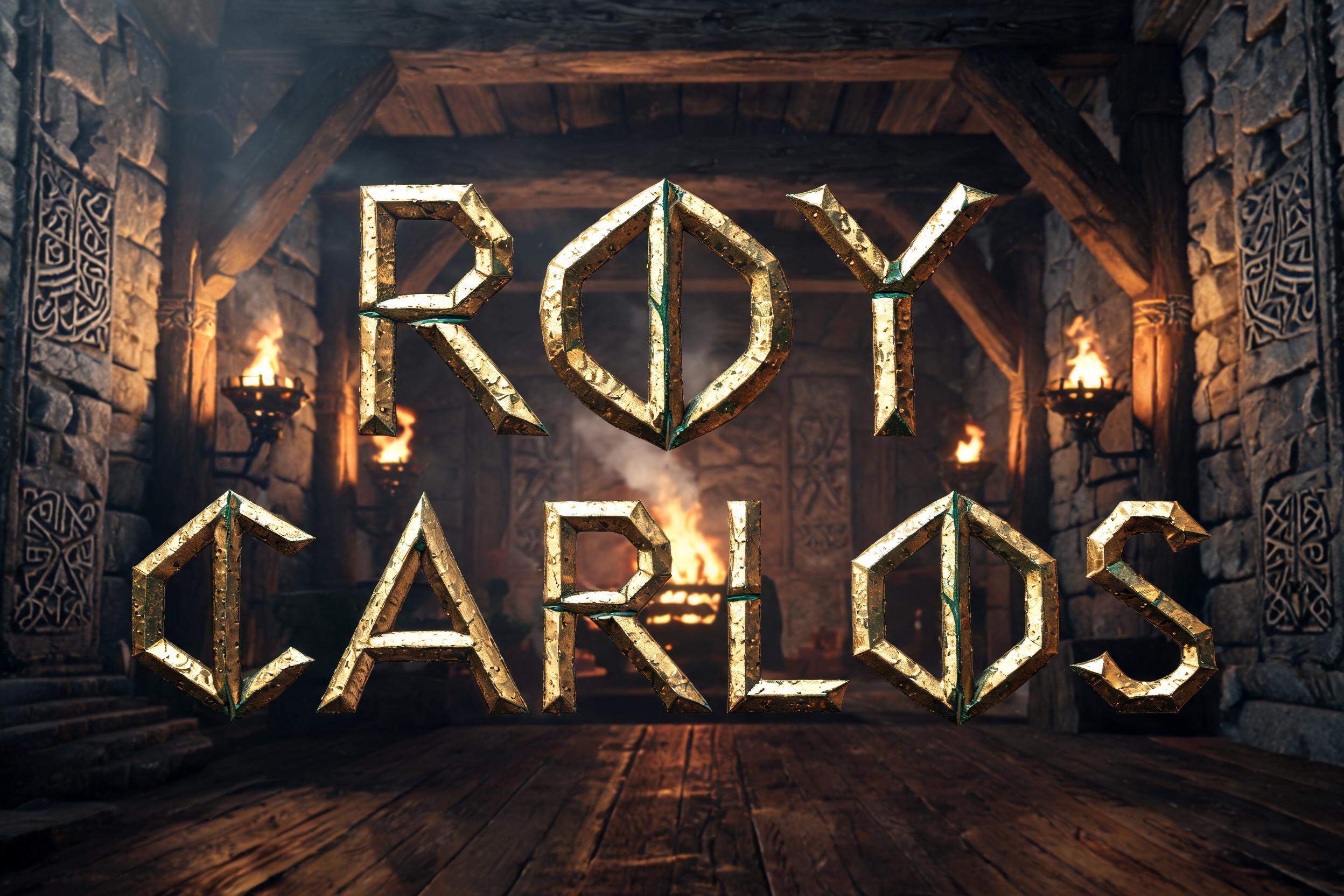

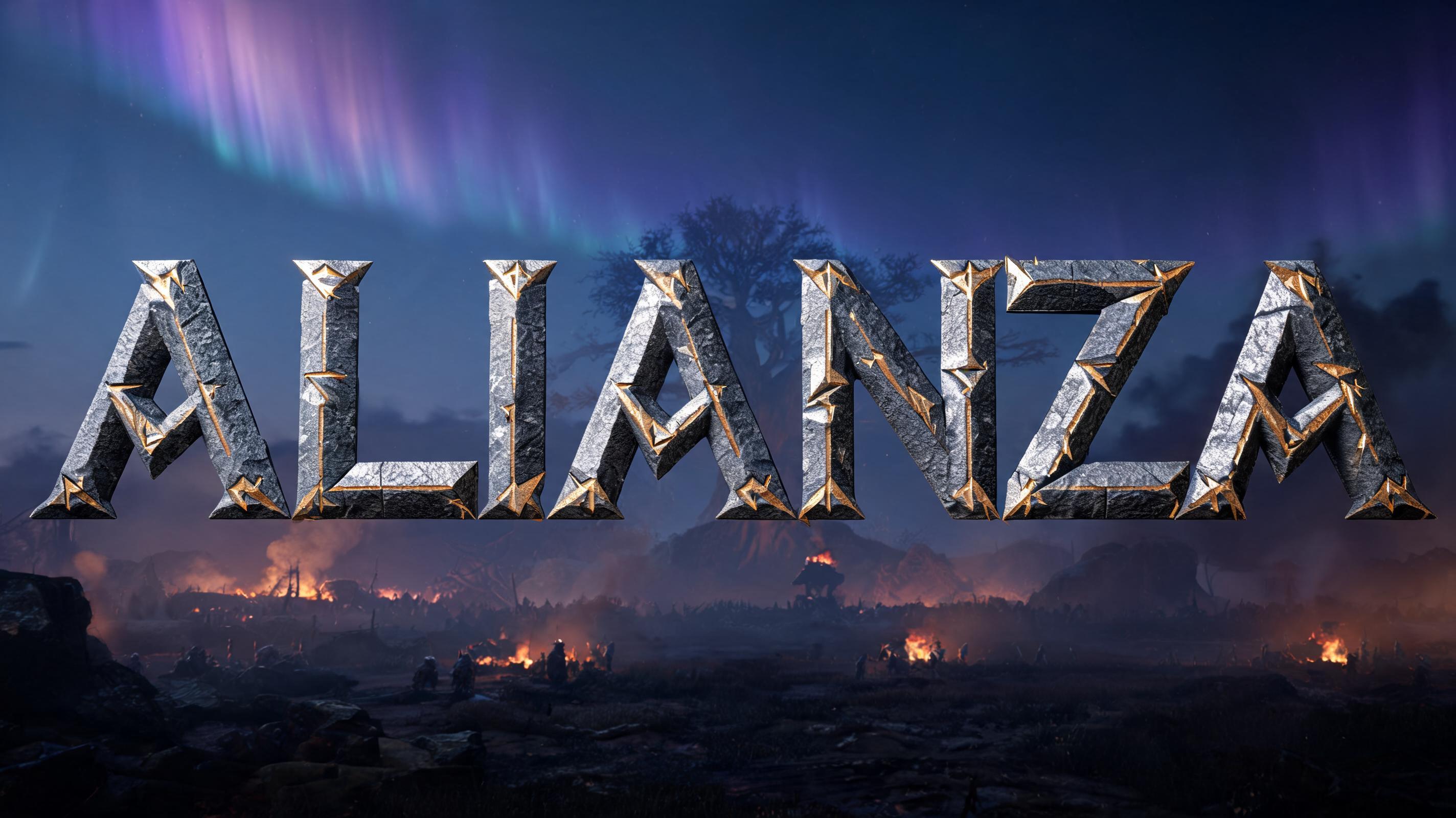

「Skanster」は FontVibe AI で作成したバイキングの文字エフェクトです。彫り込まれた石のテクスチャ、北欧のノットワーク模様、戦いで傷んだ金属の質感、そして古代スカンジナビアの美意識をまとった、北欧バイキングのルーン文字タイポグラフィです。
ancient Norse warrior aesthetic — stark angular geometry, battle-forged weight, the material permanence of things built to outlast kingdoms. Directional forge-light or cold torch-light that sculpts every letterform face into high relief. Color palette: iron-grey, aged bronze, cold granite, dark amber — no soft pastels, no unmotivated gradients. Every letter reads as an object with real physical mass. When no specific material is defined by the font: default to battle-worn dark iron — cold charcoal-grey letter body with visible forge-hammer surface texture, narrow cold specular highlight on the upper stroke edge, deep iron shadow on the underside, hairline stress-fracture lines along diagonal strokes. The Norse blacksmith's iron: heavy, angular, built for war. Create a premium Viking craft-brewery identity featuring the exact word “Skanster,” set on one commanding line and centered across the upper-middle of the composition. Make the lettering the unmistakable hero, large enough to span roughly three-quarters of the canvas width, with generous clear space around every edge. Set it within a richly atmospheric Norse brewery interior: monumental cold granite walls, dark oak beams, and softly receding copper brewing vessels that add depth without competing with the name. A heavy ancient runestone plinth beneath the lettering anchors the composition, its chipped angular edges catching a restrained amber glow. Place a small iron-bound wooden cask at one side and a few scattered barley heads near the base as quiet craft-brewery details, not additional focal points. Warm torchlight grazes the scene from the right, while cold steel-blue light filters through a narrow high opening from the left, separating warm firelit surfaces from shadowed stone. A faint haze and a few drifting sparks give the distant hall depth. Keep the background darker and less detailed behind the word so every character reads cleanly; no extra lettering, symbols, labels, or words. The finished image should feel like a distinctive, enduring Norse brewery brand mark, not a generic fantasy scene.
用途: ルーン文字フォントジェネレーター
2026年11月3日に生成 · 1824 × 1024 · JPEG · OpenAI GPT-Image-2.5 Sunburst · 制作者がシェア · 商用利用無料(CC BY 4.0)